
Hi, crafty friends. A few weeks ago, Amanda over at Amanda Jayne Designs asked me if I wanted to color up a few of her new images. I usually jump at the chance to color, and her images are often pretty small and really cute. I shared the coloring of this Little Friend image on Instagram, but I now have the finished card to share.
 I used the second largest die in the Watercolor Rectangle STAX die set from My Favorite Things to turn my colored piece into a panel with a fun edge. I added some layers of cardstock behind it and adhered it to a top fold card base I created from Berry Sorbet cardstock from Papertrey Ink.
 I used the Sweet Hello die from My Favorite Things to create my sentiment. I die cut four from white cardstock and one from Grapefruit cardstock from Concord & 9th and adhered them all together for a stacked, dimensional look. I stamped and white heat embossed a sub sentiment from the IWCL2017005 English stamp set from InkyWings on a strip of Berry Sorbet cardstock and added it to my die cut sentiment, making sure to put a few layers of cardstock behind it on the part that overhangs. I added a few sequins from the White Orchid Sequin Mix from Little Things from Lucy’s Cards, and put a dot of black Glaze pen from Sakura on the squirrel’s eye for a little bit of shine and dimension to finish off the card.
 I used a lot of colors for this simple image.
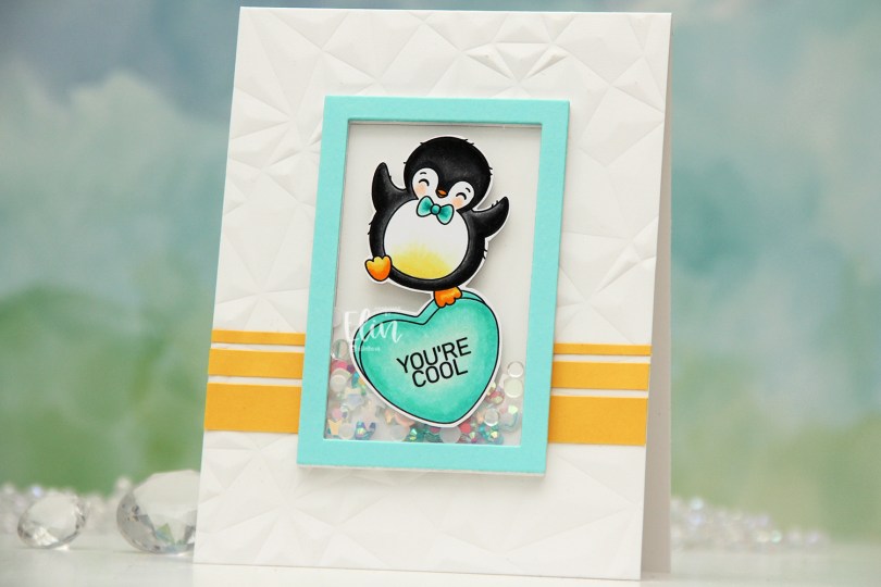
 I colored the penguin on the heart with Copics. You know me, I can’t resist a penguin stamp. I fussy cut around him, leaving a white trim around the edge and put him to the side while I worked on the rest of the card. I used the Crystal Distortion embossing folder from Simon Says Stamp to create some interest and texture to my card base, which I created from Stamper’s Select White cardstock from Papertrey Ink. I cut strips of Buttercup cardstock from Concord & 9th and added them towards the bottom of my card.
 I die cut a frame from the Classic Rectangle Frames die set from My Favorite Things several times from white cardstock (I think I have six or seven layers) and stacked them to create my shaker well, adding one of the centers back in to create a smooth back for my shaker well. I added a mix of the
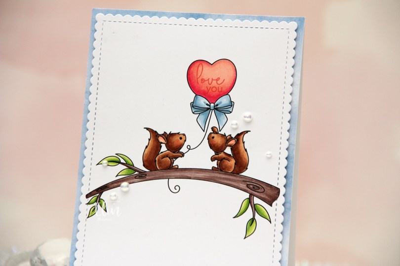
 I colored the image with my Copics and stamped love you from the Mini Messages stamp set from Mama Elephant using Berry Sorbet ink from Papertrey Ink, before using the panel die in the Blueprints 27 die set from My Favorite Things to cut it out and give it a nice scalloped edge with a faux stitch line on the inside.
 Onto a top fold white card base, I adhered a piece of blue patterned paper from the Watercolor Brights 6×6″ paper pad from My Favorite Things. I added a few layers of cardstock behind my large panel for a little bit of lift and adhered it to the card front, before finishing off simply with a few pearls from the Glossy Porcelain Mix from Little Things from Lucy’s Cards. Oh, and I also used a black glaze pen from Sakura to add a black dot to each of the eyes. This makes the eyes pop, and it adds shine and a little bit of dimension in real life, which you can’t really tell from the photo.
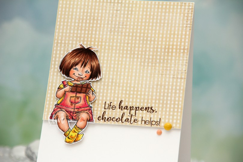
 I colored the image with Copics, fussy cut leaving a white border and created a very simple card for her to sit on. I pulled out a piece of patterned paper from the Coffee in the Arbour 6×6″ paper stack from Maja Design and cut it down to fill about 2/3 of the front of an A2 card.
 I stamped a sentiment from the Coffee and Chocolate stamp set from hÄnglar & Wings onto the bottom of the pattern using Dark Chocolate ink from Papertrey Ink. I added a few layers of cardstock behind the patterned paper for a bit of dimension, and did the same with the little girl, making sure to add a couple of extra layers behind her legs so they wouldn’t sag. I adhered her so she’s sitting right on the edge of the patterned paper and finished off the card with a couple of enamel dots from My Mind’s Eye. The yellow one is from the “Oxford Lane” pack, the peach from the “Sky’s the Limit” pack.
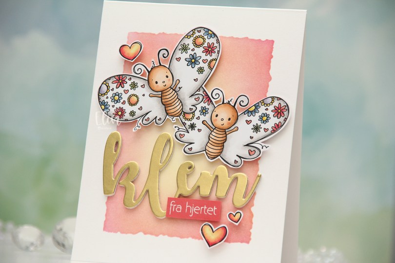
 I colored the butterflies (and the three hearts that are part of the image) with Copics and fussy cut them, leaving a thin white trim around the edge. Onto a top fold card base I created from Stamper’s Select White cardstock from Papertrey Ink, I ink blended the center of the card, using the Watercolor Rectangle stencil from My Favorite Things and various inks (Distress Ink Picked Raspberry, Distress Ink Worn Lipstick, Altenew Pink Pearl, Distress Ink Scattered Straw). I went with pink on the edge and yellow in the center to mimic the colors in the hearts.
 I die cut the word klem (hug) four times from white cardstock and once from Gold Shine cardstock from My Favorite Things, and stacked them for a layered look. I added foam tape to the back of my butterflies, adhered them top center on the card and put the stacked klem below them. I also added a sub sentiment from Norsk Stempelblad AS that I white heat embossed on a piece of Berry Sorbet cardstock from Papertrey Ink. I put a few layers of cardstock behind it for dimension and added it to the card, partly on top of the die cut, before embellishing with the colored hearts to finish.
 I colored up
  I stamped a sentiment from InkyWings using Pink Pearl ink from Altenew. The stamp actually has the word hugs in it too, but I opted for a die cut hugs, using the Sweet Sentiments die set from Altenew. I die cut four from Grapefruit cardstock and stacked them together for a dimensional look.
 I finished off with a couple of heart droplets from Little Things from Lucy’s Cards.
 Fairly simple color palette for this one.
 I changed the color of the words monkey see in Photoshop before printing the image. I then colored the image and letters with Copics and used the largest die in the Wonky Stitched Rectangle STAX die set from My Favorite Things to create some interest to the edges, as I was planning on leaving lots of white space.
 I adhered the panel to a top fold A2 card base I created from Ocean Tides cardstock from Papertrey Ink. I love this cardstock color, it’s great for every kind of card.
 I used the Fab Foliage die set from My Favorite Things to die cut different leaves in different colors of cardstock. I used Ocean Tides (it really works for everything), Green Parakeet and Spring Moss, all from Papertrey Ink. I even threw in some that I die cut from Heavyweight Translucent vellum from My Favorite Things.
 I cut some of the leaves down to fit my card and used a tiny bit of liquid glue at the base of each stem. This way the leaves have a bit of lift off the card, which also adds a little bit of interest.
 I finished off with crystals, sequins and pearls from the Starry Night mix from Little Things from Lucy’s Cards.
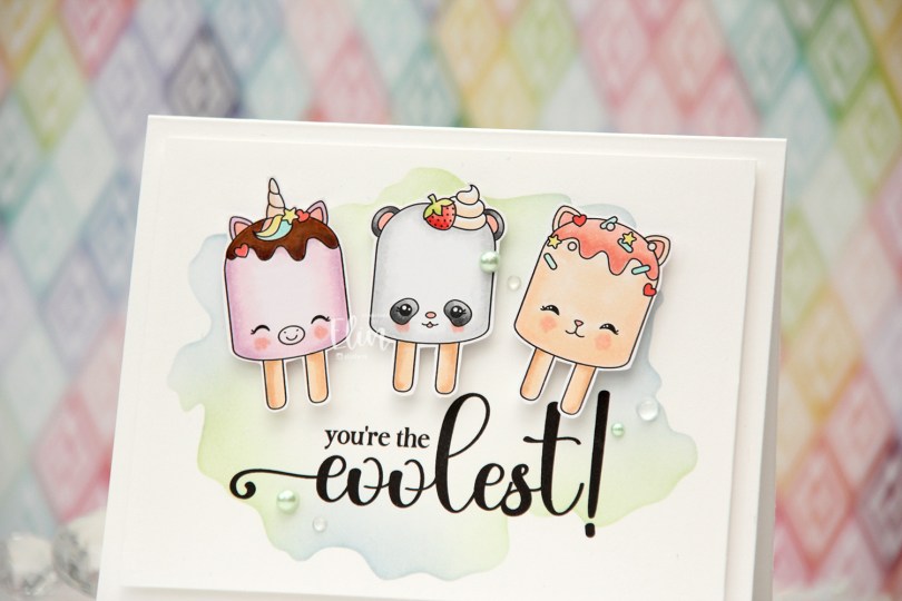
 I’ve made a cool card (pun intended) with the
  Using the Watercolor Wash Free Form stencil from My Favorite Things along with Icy Water and Frayed Leaf inks from Altenew, I did some very soft ink blending to create a little bit of interest to my background. I then ran the panel through my printer to add the sentiment, chopped off a little on each side of the panel and mounted it onto a top fold card base I created from Stamper’s Select White cardstock from Papertrey Ink.
 I put foam tape on the back of each of my popsicles and adhered them above the sentiment.
 I finished off the card with pearls, crystals and dew drops from the Fresh Mint mix from Little Things from Lucy’s Cards.
 Soft color palette for this one.
 I colored the image and fussy cut it right up against the black lines. When you do, you lose the cute little extra lines on the outside that is part of Rachelle’s signature, which is a bit of a shame, but for the card design I had planned, it was a necessary sacrifice. I could have kept a little white trim (and thus, the wispy lines) around the image, but I feel that would have made the image less of an integrated piece of the overall design, so I went with the close cut.
 Onto the card base, I ink blended Icy Water and Winter Lake inks from Altenew to create a soft blue sky. I die cut the Winter Forest cover die from Mama Elephant from Heavyweight vellum from My Favorite Things and adhered it on top. Using the same die, I also die cut the background from a couple of colors of gray cardstock. I used Mushroom from Concord & 9th and Soft Stone from Papertrey Ink and adhered the little gray notches into the openings of my vellum trees. On parts of the lighter ones, I ink blended with Charcoal ink from Hero Arts for a little variation in my grays.
 I adhered my little scene on top of the vellum trees. I glued it flat down on the edges and used 2 mm foam squares near the top of the image for some dimension. I used a black glaze pen to add some shine to their eyes, and added a white dot on top once the black was dry using a Gelly Roll 05.
 I die cut the Winter Forest cover die one final time, this time from white cardstock. I cut away the trees, but kept the frame and slope near the bottom and stamped a sentiment from the Together stamp set from Purple Onion Designs using Gravel Gray ink from My Favorite Things.
 This image is so sweet and can be used for a variety of occasions. Rachelle’s images always have such a cosy vibe, and this one fits perfectly with all the other images she’s illustrated.
 I see I’ve forgotten to add the greens I used in my Copic graphic. They were YG17, YG03, YG01 and G40.
 Meet
Meet  I colored the scene with Copics, cropped down the panel and white heat embossed a sentiment from the coordinating sentiment set using VersaMark ink and Super fine detail embossing powder from Ranger. I added a few white dots to the wave using a Sharpie and put the panel to the side while I worked on the rest of the card.
 I thought the Stitched Ripple Backdrop die from Lawn Fawn would work perfectly for a subtle wave pattern in the background. It’s a landscape oriented die and I wanted a portrait oriented card, so I die cut it twice from Stamper’s Select White cardstock from Papertrey Ink, before adding colored strips along the seam for a little bit of added interest. I colored the strips with a few of the Copics I used for my scene and used a die from the Blueprints 27 die set from My Favorite Things to turn them into strips of the same width.
 I mounted my scene to the center of the card using foam tape, before embellishing with sequins and raindrops from Little Things from Lucy’s Cards. The sequins are from her Ice Water mix.
 The finished card is a simple looking one. I love adding dimension, the sequins and raindrops work perfectly with the colors and Kalei’s making the most of her summer. I hope you are too 🙂 And if you’re in the Southern hemisphere in the middle of winter right now, I feel your pain.
 I tend to go overboard whenever I color skies or water.