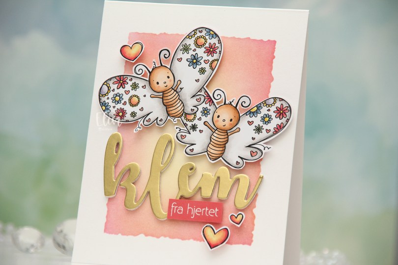
Hi, crafty friends. Today’s card is another one of those happy ones. We’ve been buried in snow in Oslo so far this winter, there’s more coming, and there’s nothing like the dead of winter to make me want to make happy, cheerful cards using spring and summer colors. Rachelle Anne Miller to the rescue. This month’s release was definitely geared toward Valentine’s day, and I fell for Butterfly Kisses, which is a stamp of two butterflies with flower wings.
 I colored the butterflies (and the three hearts that are part of the image) with Copics and fussy cut them, leaving a thin white trim around the edge. Onto a top fold card base I created from Stamper’s Select White cardstock from Papertrey Ink, I ink blended the center of the card, using the Watercolor Rectangle stencil from My Favorite Things and various inks (Distress Ink Picked Raspberry, Distress Ink Worn Lipstick, Altenew Pink Pearl, Distress Ink Scattered Straw). I went with pink on the edge and yellow in the center to mimic the colors in the hearts.
 I die cut the word klem (hug) four times from white cardstock and once from Gold Shine cardstock from My Favorite Things, and stacked them for a layered look. I added foam tape to the back of my butterflies, adhered them top center on the card and put the stacked klem below them. I also added a sub sentiment from Norsk Stempelblad AS that I white heat embossed on a piece of Berry Sorbet cardstock from Papertrey Ink. I put a few layers of cardstock behind it for dimension and added it to the card, partly on top of the die cut, before embellishing with the colored hearts to finish.
![]() Bright and happy color palette for this one.
Bright and happy color palette for this one.

 I colored up
  I stamped a sentiment from InkyWings using Pink Pearl ink from Altenew. The stamp actually has the word hugs in it too, but I opted for a die cut hugs, using the Sweet Sentiments die set from Altenew. I die cut four from Grapefruit cardstock and stacked them together for a dimensional look.
 I finished off with a couple of heart droplets from Little Things from Lucy’s Cards.
 Fairly simple color palette for this one.
 I changed the color of the words monkey see in Photoshop before printing the image. I then colored the image and letters with Copics and used the largest die in the Wonky Stitched Rectangle STAX die set from My Favorite Things to create some interest to the edges, as I was planning on leaving lots of white space.
 I adhered the panel to a top fold A2 card base I created from Ocean Tides cardstock from Papertrey Ink. I love this cardstock color, it’s great for every kind of card.
 I used the Fab Foliage die set from My Favorite Things to die cut different leaves in different colors of cardstock. I used Ocean Tides (it really works for everything), Green Parakeet and Spring Moss, all from Papertrey Ink. I even threw in some that I die cut from Heavyweight Translucent vellum from My Favorite Things.
 I cut some of the leaves down to fit my card and used a tiny bit of liquid glue at the base of each stem. This way the leaves have a bit of lift off the card, which also adds a little bit of interest.
 I finished off with crystals, sequins and pearls from the Starry Night mix from Little Things from Lucy’s Cards.
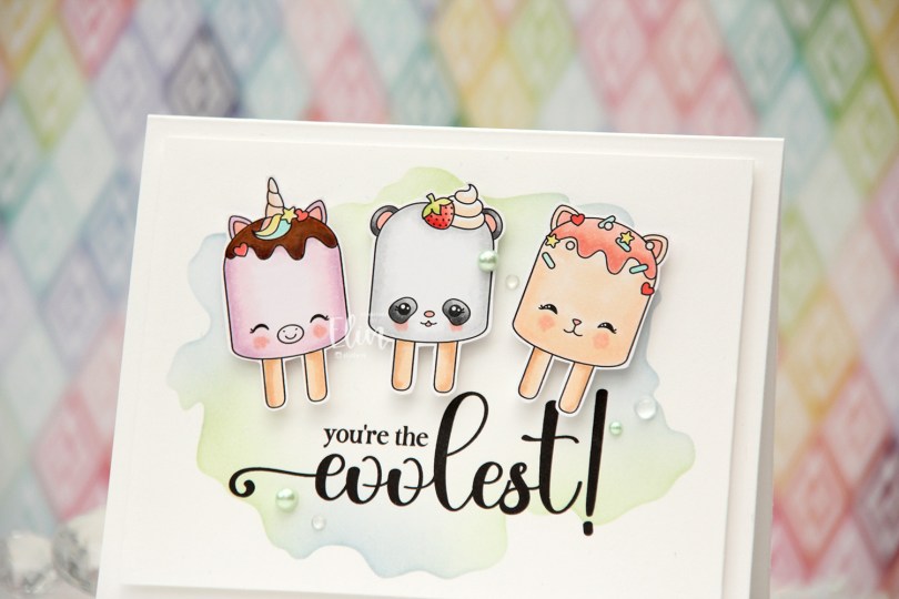
 I’ve made a cool card (pun intended) with the
  Using the Watercolor Wash Free Form stencil from My Favorite Things along with Icy Water and Frayed Leaf inks from Altenew, I did some very soft ink blending to create a little bit of interest to my background. I then ran the panel through my printer to add the sentiment, chopped off a little on each side of the panel and mounted it onto a top fold card base I created from Stamper’s Select White cardstock from Papertrey Ink.
 I put foam tape on the back of each of my popsicles and adhered them above the sentiment.
 I finished off the card with pearls, crystals and dew drops from the Fresh Mint mix from Little Things from Lucy’s Cards.
 Soft color palette for this one.
 I colored the image and fussy cut it right up against the black lines. When you do, you lose the cute little extra lines on the outside that is part of Rachelle’s signature, which is a bit of a shame, but for the card design I had planned, it was a necessary sacrifice. I could have kept a little white trim (and thus, the wispy lines) around the image, but I feel that would have made the image less of an integrated piece of the overall design, so I went with the close cut.
 Onto the card base, I ink blended Icy Water and Winter Lake inks from Altenew to create a soft blue sky. I die cut the Winter Forest cover die from Mama Elephant from Heavyweight vellum from My Favorite Things and adhered it on top. Using the same die, I also die cut the background from a couple of colors of gray cardstock. I used Mushroom from Concord & 9th and Soft Stone from Papertrey Ink and adhered the little gray notches into the openings of my vellum trees. On parts of the lighter ones, I ink blended with Charcoal ink from Hero Arts for a little variation in my grays.
 I adhered my little scene on top of the vellum trees. I glued it flat down on the edges and used 2 mm foam squares near the top of the image for some dimension. I used a black glaze pen to add some shine to their eyes, and added a white dot on top once the black was dry using a Gelly Roll 05.
 I die cut the Winter Forest cover die one final time, this time from white cardstock. I cut away the trees, but kept the frame and slope near the bottom and stamped a sentiment from the Together stamp set from Purple Onion Designs using Gravel Gray ink from My Favorite Things.
 This image is so sweet and can be used for a variety of occasions. Rachelle’s images always have such a cosy vibe, and this one fits perfectly with all the other images she’s illustrated.
 I see I’ve forgotten to add the greens I used in my Copic graphic. They were YG17, YG03, YG01 and G40.
 Meet
Meet  I colored the scene with Copics, cropped down the panel and white heat embossed a sentiment from the coordinating sentiment set using VersaMark ink and Super fine detail embossing powder from Ranger. I added a few white dots to the wave using a Sharpie and put the panel to the side while I worked on the rest of the card.
 I thought the Stitched Ripple Backdrop die from Lawn Fawn would work perfectly for a subtle wave pattern in the background. It’s a landscape oriented die and I wanted a portrait oriented card, so I die cut it twice from Stamper’s Select White cardstock from Papertrey Ink, before adding colored strips along the seam for a little bit of added interest. I colored the strips with a few of the Copics I used for my scene and used a die from the Blueprints 27 die set from My Favorite Things to turn them into strips of the same width.
 I mounted my scene to the center of the card using foam tape, before embellishing with sequins and raindrops from Little Things from Lucy’s Cards. The sequins are from her Ice Water mix.
 The finished card is a simple looking one. I love adding dimension, the sequins and raindrops work perfectly with the colors and Kalei’s making the most of her summer. I hope you are too 🙂 And if you’re in the Southern hemisphere in the middle of winter right now, I feel your pain.
 I tend to go overboard whenever I color skies or water.
 I love hydrangeas, and this image was is one I just HAD to color. Even though I’m more confident with my Copics because I use them so much, I love the soft look and those edges lines you get with watercolor. I stamped the image on a piece of Fabriano Artistico Extra White watercolor paper using Obsidian ink from Altenew. This is a pigment ink, which makes it perfect for embossing. I sprinkled on clear embossing powder from Ranger and melted the powder.
 I grabbed a couple of paint brushes and my Mijello Mission Gold watercolor set and mixed pinks and purples for my flowers, and a bunch of different greens for the stems and leaves. I’m no expert watercolorist (if you want to watch an expert watercolor, head over to Debby Hughes’
  This stamp set actually comes with a couple of additional leaves and petals and dies to cut them out, but there’s no die for this large image. Fussy cutting it was easy enough, though. I stamped and white heat embossed a sentiment from the stamp set onto a piece of True Black cardstock from Papertrey Ink. I dry embossed a piece of patterned paper from the Watercolor Wishes 6×6 inch paper pack from Lawn Fawn using the Geometric Landscape stencil from Altenew. I wanted a little bit of texture to create interest in the background without distracting from the main image, and this did the trick.
 I added a few more layers of cardstock behind my black strip for dimension, popped the flower up on foam tape and finished off the card with a few faceted pearls. Or are they gems? No matter what they are, they’re gorgeous, and I have a feeling I’ll use up the entire pack of these in no time, I love them so much.
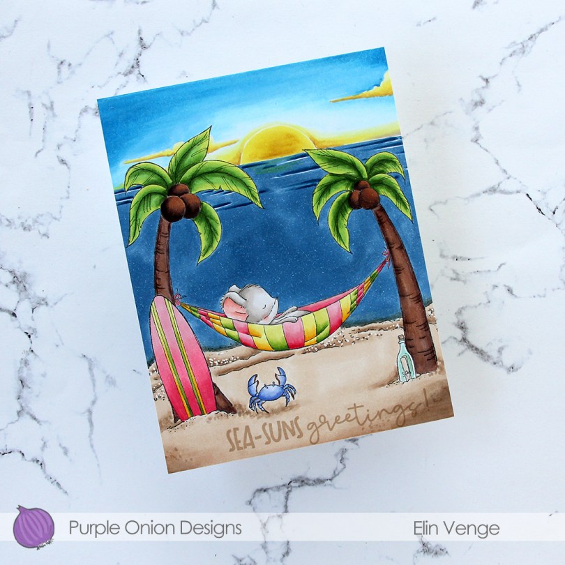
 Meet
Meet  Whenever I color scenes like this, I always start with the background elements. For this card, I started with the sky and sun, then colored the ocean, the sand and the palm trees, leaving the accessories and the mouse for last. These are the most colorful elements. I even opted to color the crab blue. I didn’t want it to be brown and not show up in the sand, so I decided a blue swimmer crab was a good fit for this scene. It stands out against the other elements in the foreground, but still works with the overall design, because there’s already lots of blue on the card with the ocean and sky. Three completely different blue combos, but they work together still. Also, the blue swimmer crab makes me want to move back to Australia, even though it’s winter in Australia at the moment, and soooo cold (at least winter’s cold in Adelaide, where I used to live)!
 I’ve used the sunrise sunset background on more than half the cards I’ve made with this release, and I’ve tried to color it differently for each card. I love love love the versatility of this stamp, and never in a million years did I guess in advance that this would wind up being my favorite stamp of them all, but there you go. It’s just THAT good.
 To finish off the card, I stamped a sentiment from the coordinating
  Lots of colors used for this one, and I realize I’ve even left out a few in my graphic. I used W3, W1 and W00 for the mouse, in addition to R21 and R000 for his cheek and ears.
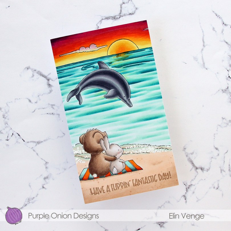
 I wanted a bit of a dramatic sunset for this card, and also for the critters (
 I adhered my colored panel to a card base I created from Stamper’s Select White cardstock from Papertrey Ink, stamped a sentiment from the
  Lots of colors for this one.
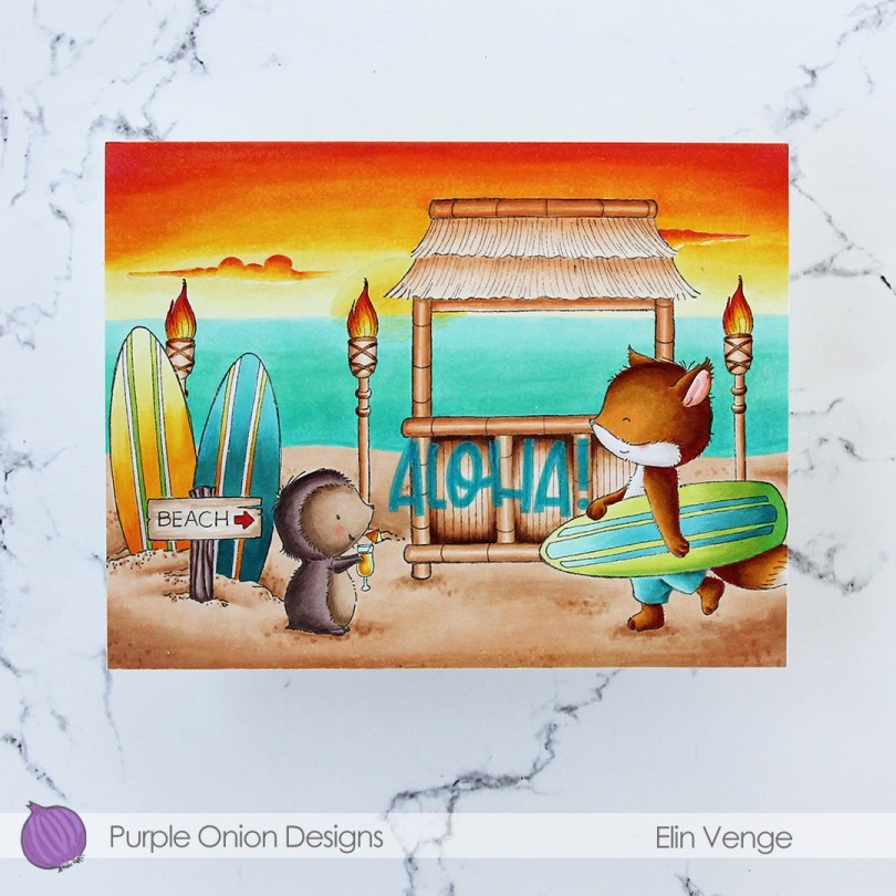
 I did a ton of masking for this card. I love creating stories in my head with these images, then stamping them and making them come to life.
  I colored in my scene using Copics, then stamped the
  I used a lot of colors for this card.