
Hi, crafty friends. I have an elegant, clean and simple card to share with you today, featuring the Vases of Flowers stamp set from Lili of the Valley. This set came out last week and it’s such a good one!! I chose one of the 13 vase images that comes in the stamp set. I colored it and fussy cut it, before putting it aside to work on the rest of my card.
 I created a white card base from Stamper’s Select White cardstock from Papertrey Ink, and on the left side of the card, between the center and the bottom, I placed a circle I die cut from the Watercolor Wishes paper pack from Lawn Fawn. I cut off the piece of the circle the left of the fold, I actually created a side fold card this time. I die cut a leaf cluster from heavyweight translucent vellum from My Favorite Things using a die from Kort & Godt, and I also die cut for you from the Sweet Sentiments die set from Altenew from Berry Sorbet cardstock from Papertrey Ink. I stacked four die cuts for each of the words, so they’d stand out on my card. I put foam tape on the back of my colored vase, added the vellum behind it and adhered it to my die cut patterned paper circle. The vellum leaves are only adhered to the card behind the vase, the rest is floating. I added my die cut sentiment and finished off the card by adding Nuvo Jewel Drops in the Limoncello color to the yellow berries in my vase.
 Super simple color palette for this one.

 I actually made a 4 Bar card this time, which is a smaller size than my regular A2 cards. It’s 3 1/2 x 4 7/8″ and it’s basically a one layer card. I admit I added my panel to a card base, but I don’t like working directly on my card base, and Copics bleed through most cardstocks. I don’t want my coloring to be visible from the inside of the card, and adhering the full size panel to the card keeps that from happening.
 I colored the image with Copics and added a watercolor circle around it to fill in some of the white space on the card. There’s still plenty of white space left. I added a sentiment from the stamp set and finished off with a couple of sequins from the Seaglass mix of sequins from Simon Says Stamp.
 Super simple color palette to go with this super simple card.
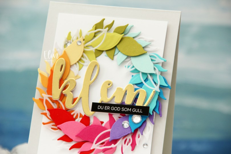
 Kort & Godt Die 335 is a die set with two leaves. One is an open outline, the other closed, and I actually used both for this card. I die cut the open one a few times from Heavyweight Translucent vellum from My Favorite Things, and nestled them in between the solid colored ones, which are (in order from the top going clockwise) Papertrey Ink (PTI) Simply Chartreuse, PTI Aqua Mist, PTI Hawaiian Shores, Simon Says Stamp Island Blue, PTI Amethyst Allure, PTI Raspberry Fizz, PTI Hibiscus Burst, Concord & 9th Poppy, PTI Orange Zest, PTI Summer Sunrise, PTI Harvest Gold, PTI Limeade Ice.
 I lightly traced a circle die onto a white cardstock panel that I needed to adhere my wreath to. I only glued down the end of the stem for each of the leaf die cuts and did my best to arrange them evenly around the circle, with the vellum pieces after every third colored leaf.
 Using foam tape, I adhered the white panel with my wreath onto a card base I created from Soft Stone cardstock from Papertrey Ink for a neutral on neutral look.
 Using Kort & Godt DIE 244, I die cut the word klem (translation: hug) from gold cardstock (Gold Shine cardstock from My Favorite Things), as well as four additional ones from white cardstock to stack behind the gold for added strength and dimension.
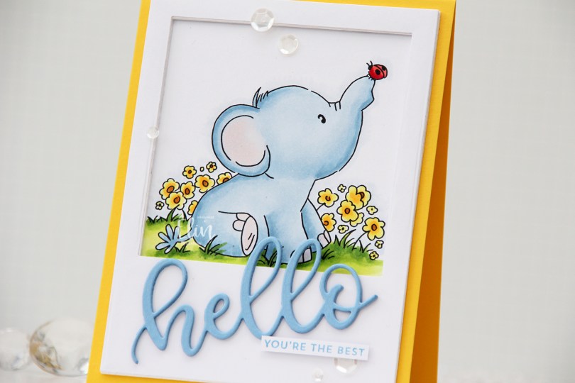
 Once I colored the first of these elephant stamps blue, I just couldn’t stop, so here’s another blue one for you. I chose a very similar color palette to what I’ve used for my other cards with this set, but this time, I opted for a yellow card, creating a top fold card base from Bright Buttercup cardstock from Papertrey Ink.
 I colored the image with Copics, and created a large polaroid frame using a rectangle die from Waffle Flower, as well as a square die from Lifestyle Crafts. I taped the two dies together and die cut several layers of white cardstock that I stacked for a dimensional look. I love dimension on my cards. I used the Sweet hello die from My Favorite Things to die cut three layers of Periwinkle cardstock from Hero Arts, which I also stacked. I added the die cut at an angle and paired it with a sub sentiment from the Itty Bitty Basics stamp set from My Favorite Things, stamped in Blue Yonder ink, also from My Favorite Things. I finished off the card with a visual triangle of sequins from the White Orchid sequin mix from Little Things from Lucy’s Cards.
 Like I said initially: similar color palette to the ones I’ve used for the previous elephant cards. I also used B90, which is a color I’ve created myself.
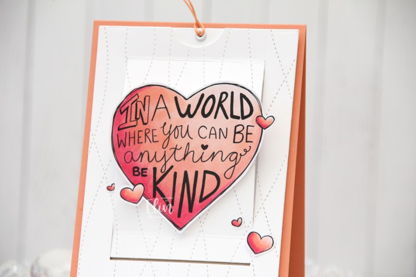
 As you might be able to tell from the front, this isn’t a regular card. It’s a slider card. At first I wasn’t sure how to turn this particular stamp into a card, but then I had a lightbulb moment and realized it was perfect for a slider card.
 I colored the images with Copics, did some fussy cutting leaving a think white border and put my pieces aside while I worked on the rest of the card.
 When you pull on the string at the top, these mice from the Be Kind stamp are revealed. Nice little surprise there, huh? The slider mechanism itself is made using the Slider Surprise die set from My Favorite Things, but you could easily do this on your own, it’s not difficult. They’re straight cut lines and just a few score lines.
 I wanted a little texture to my white cardstock, and used the Stitched Ripple Backdrop die from Lawn Fawn, which creates these faux stitch lines across the panel. In hindsight, I realize I probably should have dry embossed it only and not die cut it, because where the stitched lines intersect with the die cut edge of the part that folds up, it kind of snags a little. It’s not a huge deal, but it’s enough to make me think simply dry embossing would have been enough.
 In the opening, I added a piece of Gold Foil Pinstripe washi tape from Altenew for the mice to have a little bit of a grounding element, then adhered the mice using liquid glue. The top die cut panel is mounted on foam tape, and everything adhered to a top fold card base I created from Melon Berry cardstock from Papertrey Ink.
 Probably the simplest color palette I’ve ever used on a card.
 Isn’t this the cutest elephant image you ever did see? Saying hello to his little ladybug, I just couldn’t resist. I colored in the image with my Copics and used a stitched border die from Lawn Fawn to create a little interest to the top and bottom of my panel.
 I put foam tape on the back and was initially planning on a big die cut word, but it didn’t really work for the card, so I stamped a small sentiment in the grass instead, using Sour Apple ink from My Favorite Things. The sentiment itself is from InkyWings.
 Onto a quarter piece of white cardstock from Papertrey Ink, I stamped the Scattered Triangles Background stamp from My Favorite Things using Sour Apple ink near the bottom and Blue Yonder ink, also from My Favorite Things, near the top. I adhered my stamped background onto a top fold card base I created from Stamper’s Select White cardstock from Papertrey Ink and mounted my colored panel on top.
 This cute elephant might be even cuter because I colored him blue. There’s a reason blue’s my favorite color, everything just looks better when it’s blue.
 I decided not to add any embellishments to the card, I really wanted the elephant to be the star.
 Simple color palette for this one. I also used B90 for the elephant, which is a color I’ve created myself.
 I colored the image in a very pastel color palette, before trimming the panel down to 3 7/8 x 5 1/2″, added foam tape on the back and mounted it on an A6 (4 5/8 x 6 1/4″) top fold white card base that I covered with a piece of Aqua Sky cardstock from Concord & 9th.
 This card was a bit of an evolution. I originally wanted to use a bigger kite and a different sentiment, but the larger kite was too big for my image (AND for my card) and the sentiment I initially wanted to use was too big for this smaller kite, so I had to improvise. I used a die from the kite builder die set from Concord & 9th, and stamped a sentiment from the Kite Strings stamp set, also from Concord & 9th, using VersaFine Onyx Black ink. I then die cut the word hello twice from white cardstock using the Sweet Sentiments die set from Altenew, stacked the two together and added the word above the stamped sentiment and popped the kite on some 1 mm foam squares for a tiny bit of dimension.
 My card felt kind of empty at this point, I had even more white space than I wanted, and I needed a fix. My color buddy and general crafty assistant Liz suggested adding clouds. Using the Cloud 1 & 2 die set from Papertrey Ink, I die cut three clouds from vellum. I tucked one behind the kite and added tiny slivers of 1 mm foam squares behind the other two for a little bit of dimension, before strategically placing sequins from the Ice Water mix from Little Things from Lucy’s Cards to hide the foam squares and finish the card.
 This card didn’t turn out the way I planned, but sometimes, that’s actually a good thing. I like the clouds, the sequins and my other revisions to my original idea. And I will never cease to be amazed at how good clouds always look die cut from vellum. It’s the best!
 I didn’t use a lot of markers for this one.
 This image was so quick and easy to color up. It’s a digital stamp from Lili of the Valley, entitled
  I colored the image with Copics, trimmed a little bit off the edges of my panel and adhered it to a card base I created from Berry Sorbet cardstock from Papertrey Ink. I used the same color cardstock to die cut the words for you using a die in the Sweet Sentiments die set from Altenew. I stacked two on top of each other to give a little bit of dimension, without it being too much, before finishing the card with a gems from a pack of Color Essentials gems (in opal) from Spellbinders. I also added a dot of black Glaze pen to the eye of the little bee for a little bit of shine.

 I used the largest die in the A2 Double Stitched Rectangle STAX die set from My Favorite Things to give the edges of the panel a little bit of detail. Onto a white top fold card base, I adhered a quarter panel of Blueberry cardstock from My Favorite Things. I put foam tape on the back of my colored, die cut panel, tied some Blueberry divine twine from Whisker Graphics around the panel and adhered it to the center of the blue card front, before finishing off with a few enamel dots from Papirdesign.
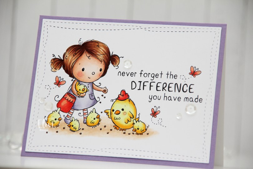
 I did fairly simple Copic coloring for this, die cut my panel and added it to a white card base I’d covered with a quarter sheet of Winter Wisteria cardstock from Papertrey Ink.
 This image with its sentiment deserved to steal the show on its own, so I embellished very sparingly with a few sequins from the White Orchid sequin mix from Little Things from Lucy’s Cards.