
Hi, crafty friends. It seems I’m alternating between summer vibes and holiday cards these days, and I’m perfectly happy with that arrangement. Today’s card belongs in the former category, even though it doesn’t really feel like summer today. It’s 15 degrees, and even though the sun is trying its best, I think the cloud cover might end up winning. No reason to worry, though, because there’s not a single cloud in sight in my card today.
 Meet Kalei. She’s from the Charmed by the Sea summer release from Purple Onion Designs, and I paired her with the Rip Curl wave from the same collection.
 I colored the scene with Copics, cropped down the panel and white heat embossed a sentiment from the coordinating sentiment set using VersaMark ink and Super fine detail embossing powder from Ranger. I added a few white dots to the wave using a Sharpie and put the panel to the side while I worked on the rest of the card.
 I thought the Stitched Ripple Backdrop die from Lawn Fawn would work perfectly for a subtle wave pattern in the background. It’s a landscape oriented die and I wanted a portrait oriented card, so I die cut it twice from Stamper’s Select White cardstock from Papertrey Ink, before adding colored strips along the seam for a little bit of added interest. I colored the strips with a few of the Copics I used for my scene and used a die from the Blueprints 27 die set from My Favorite Things to turn them into strips of the same width.
 I mounted my scene to the center of the card using foam tape, before embellishing with sequins and raindrops from Little Things from Lucy’s Cards. The sequins are from her Ice Water mix.
 The finished card is a simple looking one. I love adding dimension, the sequins and raindrops work perfectly with the colors and Kalei’s making the most of her summer. I hope you are too 🙂 And if you’re in the Southern hemisphere in the middle of winter right now, I feel your pain.
 I tend to go overboard whenever I color skies or water.

 I love hydrangeas, and this image was is one I just HAD to color. Even though I’m more confident with my Copics because I use them so much, I love the soft look and those edges lines you get with watercolor. I stamped the image on a piece of Fabriano Artistico Extra White watercolor paper using Obsidian ink from Altenew. This is a pigment ink, which makes it perfect for embossing. I sprinkled on clear embossing powder from Ranger and melted the powder.
 I grabbed a couple of paint brushes and my Mijello Mission Gold watercolor set and mixed pinks and purples for my flowers, and a bunch of different greens for the stems and leaves. I’m no expert watercolorist (if you want to watch an expert watercolor, head over to Debby Hughes’
  This stamp set actually comes with a couple of additional leaves and petals and dies to cut them out, but there’s no die for this large image. Fussy cutting it was easy enough, though. I stamped and white heat embossed a sentiment from the stamp set onto a piece of True Black cardstock from Papertrey Ink. I dry embossed a piece of patterned paper from the Watercolor Wishes 6×6 inch paper pack from Lawn Fawn using the Geometric Landscape stencil from Altenew. I wanted a little bit of texture to create interest in the background without distracting from the main image, and this did the trick.
 I added a few more layers of cardstock behind my black strip for dimension, popped the flower up on foam tape and finished off the card with a few faceted pearls. Or are they gems? No matter what they are, they’re gorgeous, and I have a feeling I’ll use up the entire pack of these in no time, I love them so much.
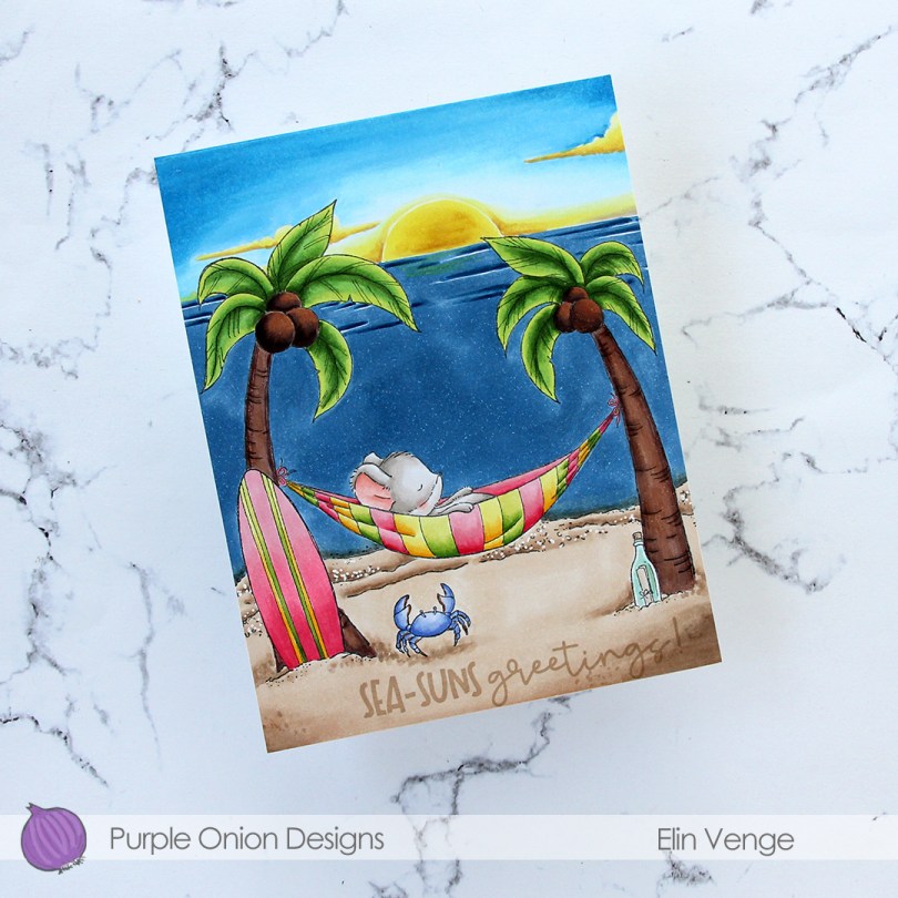
 Meet
Meet  Whenever I color scenes like this, I always start with the background elements. For this card, I started with the sky and sun, then colored the ocean, the sand and the palm trees, leaving the accessories and the mouse for last. These are the most colorful elements. I even opted to color the crab blue. I didn’t want it to be brown and not show up in the sand, so I decided a blue swimmer crab was a good fit for this scene. It stands out against the other elements in the foreground, but still works with the overall design, because there’s already lots of blue on the card with the ocean and sky. Three completely different blue combos, but they work together still. Also, the blue swimmer crab makes me want to move back to Australia, even though it’s winter in Australia at the moment, and soooo cold (at least winter’s cold in Adelaide, where I used to live)!
 I’ve used the sunrise sunset background on more than half the cards I’ve made with this release, and I’ve tried to color it differently for each card. I love love love the versatility of this stamp, and never in a million years did I guess in advance that this would wind up being my favorite stamp of them all, but there you go. It’s just THAT good.
 To finish off the card, I stamped a sentiment from the coordinating
  Lots of colors used for this one, and I realize I’ve even left out a few in my graphic. I used W3, W1 and W00 for the mouse, in addition to R21 and R000 for his cheek and ears.
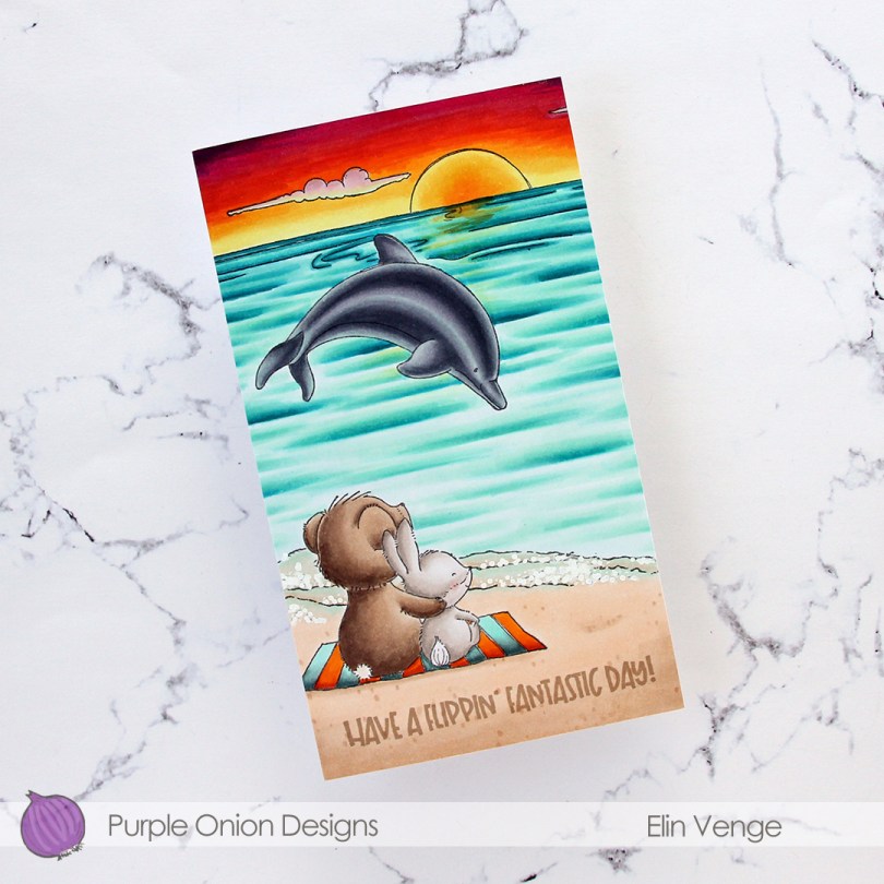
 I wanted a bit of a dramatic sunset for this card, and also for the critters (
 I adhered my colored panel to a card base I created from Stamper’s Select White cardstock from Papertrey Ink, stamped a sentiment from the
  Lots of colors for this one.
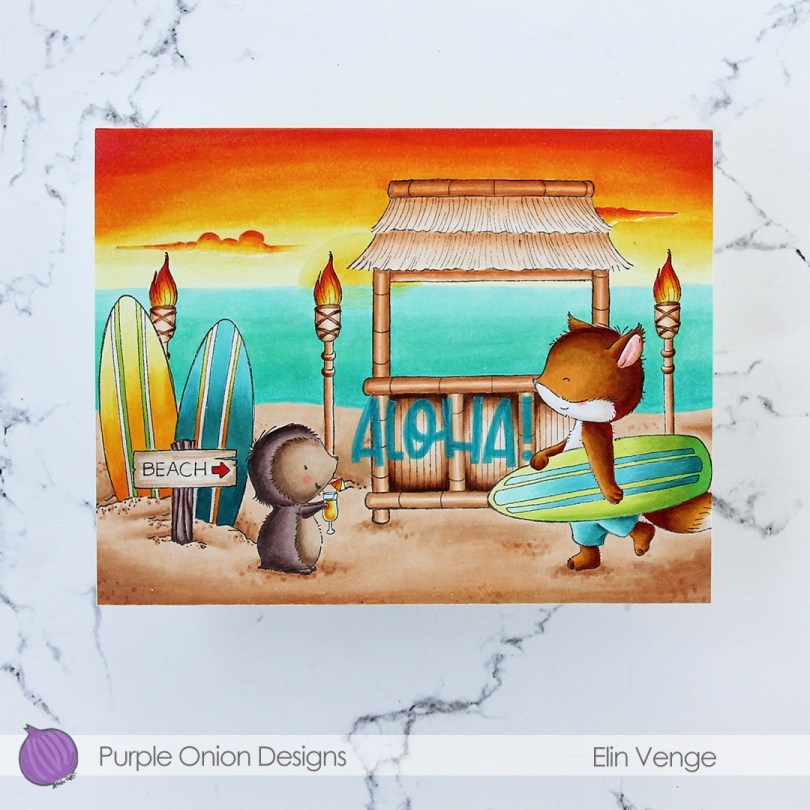
 I did a ton of masking for this card. I love creating stories in my head with these images, then stamping them and making them come to life.
  I colored in my scene using Copics, then stamped the
  I used a lot of colors for this card.
 I created a white card base from Stamper’s Select White cardstock from Papertrey Ink, and on the left side of the card, between the center and the bottom, I placed a circle I die cut from the Watercolor Wishes paper pack from Lawn Fawn. I cut off the piece of the circle the left of the fold, I actually created a side fold card this time. I die cut a leaf cluster from heavyweight translucent vellum from My Favorite Things using a die from Kort & Godt, and I also die cut for you from the Sweet Sentiments die set from Altenew from Berry Sorbet cardstock from Papertrey Ink. I stacked four die cuts for each of the words, so they’d stand out on my card. I put foam tape on the back of my colored vase, added the vellum behind it and adhered it to my die cut patterned paper circle. The vellum leaves are only adhered to the card behind the vase, the rest is floating. I added my die cut sentiment and finished off the card by adding Nuvo Jewel Drops in the Limoncello color to the yellow berries in my vase.
 Super simple color palette for this one.
 I actually made a 4 Bar card this time, which is a smaller size than my regular A2 cards. It’s 3 1/2 x 4 7/8″ and it’s basically a one layer card. I admit I added my panel to a card base, but I don’t like working directly on my card base, and Copics bleed through most cardstocks. I don’t want my coloring to be visible from the inside of the card, and adhering the full size panel to the card keeps that from happening.
 I colored the image with Copics and added a watercolor circle around it to fill in some of the white space on the card. There’s still plenty of white space left. I added a sentiment from the stamp set and finished off with a couple of sequins from the Seaglass mix of sequins from Simon Says Stamp.
 Super simple color palette to go with this super simple card.
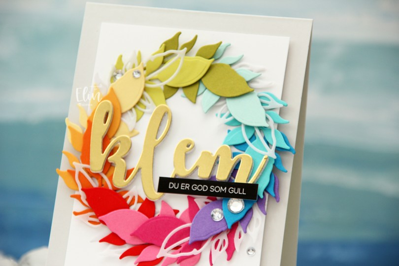
 Kort & Godt Die 335 is a die set with two leaves. One is an open outline, the other closed, and I actually used both for this card. I die cut the open one a few times from Heavyweight Translucent vellum from My Favorite Things, and nestled them in between the solid colored ones, which are (in order from the top going clockwise) Papertrey Ink (PTI) Simply Chartreuse, PTI Aqua Mist, PTI Hawaiian Shores, Simon Says Stamp Island Blue, PTI Amethyst Allure, PTI Raspberry Fizz, PTI Hibiscus Burst, Concord & 9th Poppy, PTI Orange Zest, PTI Summer Sunrise, PTI Harvest Gold, PTI Limeade Ice.
 I lightly traced a circle die onto a white cardstock panel that I needed to adhere my wreath to. I only glued down the end of the stem for each of the leaf die cuts and did my best to arrange them evenly around the circle, with the vellum pieces after every third colored leaf.
 Using foam tape, I adhered the white panel with my wreath onto a card base I created from Soft Stone cardstock from Papertrey Ink for a neutral on neutral look.
 Using Kort & Godt DIE 244, I die cut the word klem (translation: hug) from gold cardstock (Gold Shine cardstock from My Favorite Things), as well as four additional ones from white cardstock to stack behind the gold for added strength and dimension.
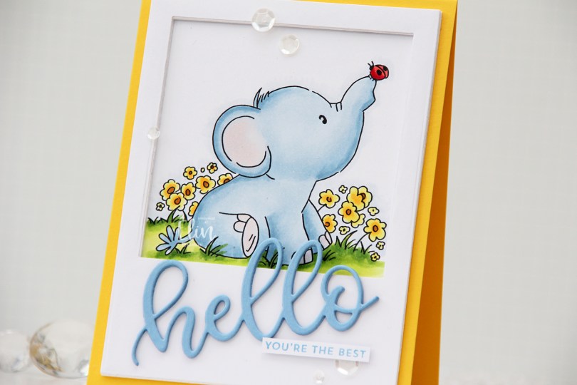
 Once I colored the first of these elephant stamps blue, I just couldn’t stop, so here’s another blue one for you. I chose a very similar color palette to what I’ve used for my other cards with this set, but this time, I opted for a yellow card, creating a top fold card base from Bright Buttercup cardstock from Papertrey Ink.
 I colored the image with Copics, and created a large polaroid frame using a rectangle die from Waffle Flower, as well as a square die from Lifestyle Crafts. I taped the two dies together and die cut several layers of white cardstock that I stacked for a dimensional look. I love dimension on my cards. I used the Sweet hello die from My Favorite Things to die cut three layers of Periwinkle cardstock from Hero Arts, which I also stacked. I added the die cut at an angle and paired it with a sub sentiment from the Itty Bitty Basics stamp set from My Favorite Things, stamped in Blue Yonder ink, also from My Favorite Things. I finished off the card with a visual triangle of sequins from the White Orchid sequin mix from Little Things from Lucy’s Cards.
 Like I said initially: similar color palette to the ones I’ve used for the previous elephant cards. I also used B90, which is a color I’ve created myself.
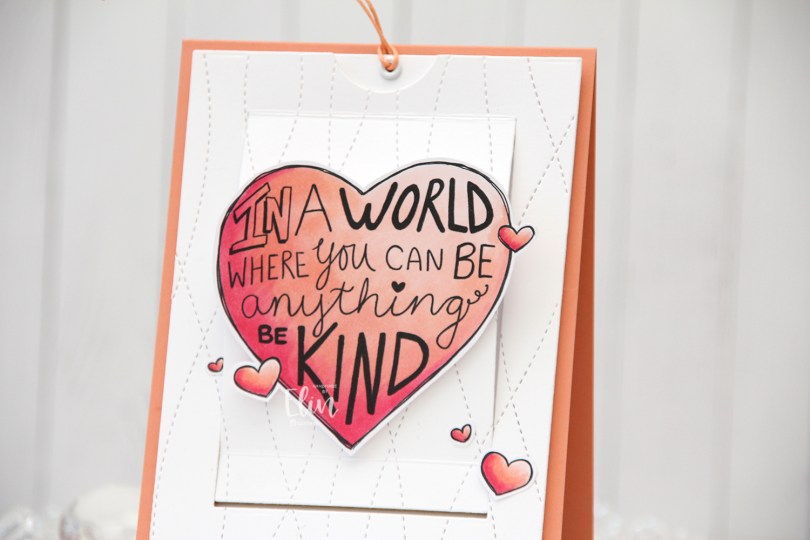
 As you might be able to tell from the front, this isn’t a regular card. It’s a slider card. At first I wasn’t sure how to turn this particular stamp into a card, but then I had a lightbulb moment and realized it was perfect for a slider card.
 I colored the images with Copics, did some fussy cutting leaving a think white border and put my pieces aside while I worked on the rest of the card.
 When you pull on the string at the top, these mice from the Be Kind stamp are revealed. Nice little surprise there, huh? The slider mechanism itself is made using the Slider Surprise die set from My Favorite Things, but you could easily do this on your own, it’s not difficult. They’re straight cut lines and just a few score lines.
 I wanted a little texture to my white cardstock, and used the Stitched Ripple Backdrop die from Lawn Fawn, which creates these faux stitch lines across the panel. In hindsight, I realize I probably should have dry embossed it only and not die cut it, because where the stitched lines intersect with the die cut edge of the part that folds up, it kind of snags a little. It’s not a huge deal, but it’s enough to make me think simply dry embossing would have been enough.
 In the opening, I added a piece of Gold Foil Pinstripe washi tape from Altenew for the mice to have a little bit of a grounding element, then adhered the mice using liquid glue. The top die cut panel is mounted on foam tape, and everything adhered to a top fold card base I created from Melon Berry cardstock from Papertrey Ink.
 Probably the simplest color palette I’ve ever used on a card.