
Hi, crafty friends. There’s a new release from Lili of the Valley coming in just a couple of days. It’s just one stamp set, but it’s the most adorable set ever. Four elephant images that work for a variety of occasions, and I’ve got a sweet hello card to share today with my favorite of the four images.
 Isn’t this the cutest elephant image you ever did see? Saying hello to his little ladybug, I just couldn’t resist. I colored in the image with my Copics and used a stitched border die from Lawn Fawn to create a little interest to the top and bottom of my panel.
 I put foam tape on the back and was initially planning on a big die cut word, but it didn’t really work for the card, so I stamped a small sentiment in the grass instead, using Sour Apple ink from My Favorite Things. The sentiment itself is from InkyWings.
 Onto a quarter piece of white cardstock from Papertrey Ink, I stamped the Scattered Triangles Background stamp from My Favorite Things using Sour Apple ink near the bottom and Blue Yonder ink, also from My Favorite Things, near the top. I adhered my stamped background onto a top fold card base I created from Stamper’s Select White cardstock from Papertrey Ink and mounted my colored panel on top.
 This cute elephant might be even cuter because I colored him blue. There’s a reason blue’s my favorite color, everything just looks better when it’s blue.
 I decided not to add any embellishments to the card, I really wanted the elephant to be the star.
 Simple color palette for this one. I also used B90 for the elephant, which is a color I’ve created myself.

 I colored the image in a very pastel color palette, before trimming the panel down to 3 7/8 x 5 1/2″, added foam tape on the back and mounted it on an A6 (4 5/8 x 6 1/4″) top fold white card base that I covered with a piece of Aqua Sky cardstock from Concord & 9th.
 This card was a bit of an evolution. I originally wanted to use a bigger kite and a different sentiment, but the larger kite was too big for my image (AND for my card) and the sentiment I initially wanted to use was too big for this smaller kite, so I had to improvise. I used a die from the kite builder die set from Concord & 9th, and stamped a sentiment from the Kite Strings stamp set, also from Concord & 9th, using VersaFine Onyx Black ink. I then die cut the word hello twice from white cardstock using the Sweet Sentiments die set from Altenew, stacked the two together and added the word above the stamped sentiment and popped the kite on some 1 mm foam squares for a tiny bit of dimension.
 My card felt kind of empty at this point, I had even more white space than I wanted, and I needed a fix. My color buddy and general crafty assistant Liz suggested adding clouds. Using the Cloud 1 & 2 die set from Papertrey Ink, I die cut three clouds from vellum. I tucked one behind the kite and added tiny slivers of 1 mm foam squares behind the other two for a little bit of dimension, before strategically placing sequins from the Ice Water mix from Little Things from Lucy’s Cards to hide the foam squares and finish the card.
 This card didn’t turn out the way I planned, but sometimes, that’s actually a good thing. I like the clouds, the sequins and my other revisions to my original idea. And I will never cease to be amazed at how good clouds always look die cut from vellum. It’s the best!
 I didn’t use a lot of markers for this one.
 This image was so quick and easy to color up. It’s a digital stamp from Lili of the Valley, entitled
  I colored the image with Copics, trimmed a little bit off the edges of my panel and adhered it to a card base I created from Berry Sorbet cardstock from Papertrey Ink. I used the same color cardstock to die cut the words for you using a die in the Sweet Sentiments die set from Altenew. I stacked two on top of each other to give a little bit of dimension, without it being too much, before finishing the card with a gems from a pack of Color Essentials gems (in opal) from Spellbinders. I also added a dot of black Glaze pen to the eye of the little bee for a little bit of shine.

 I used the largest die in the A2 Double Stitched Rectangle STAX die set from My Favorite Things to give the edges of the panel a little bit of detail. Onto a white top fold card base, I adhered a quarter panel of Blueberry cardstock from My Favorite Things. I put foam tape on the back of my colored, die cut panel, tied some Blueberry divine twine from Whisker Graphics around the panel and adhered it to the center of the blue card front, before finishing off with a few enamel dots from Papirdesign.
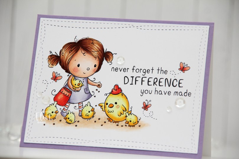
 I did fairly simple Copic coloring for this, die cut my panel and added it to a white card base I’d covered with a quarter sheet of Winter Wisteria cardstock from Papertrey Ink.
 This image with its sentiment deserved to steal the show on its own, so I embellished very sparingly with a few sequins from the White Orchid sequin mix from Little Things from Lucy’s Cards.
 I added a bunny to the top of the teacup stack and colored the image with Copics, before fussy cutting, leaving a thin white border around the edge. I used a black glaze pen from Sakura to add shine and a tiny bit of dimension to the bunny’s eyes, then a white dot of Gelly Roll 05 on top of the black, once the black was dry. The glaze pen dries fairly quickly once applied, so I didn’t have to wait long.
 I adhered a panel of Blueberry cardstock from My Favorite Things to my white card base. Using a die in the A2 Double Stitched Rectangle STAX die set, also from My Favorite Things, I die cut a piece of patterned paper from Sunny Studio to adhere on top of the blue. This patterned paper is from the Subtle Grey Tones pack, and it really is subtle.
 I realized I hadn’t made any of my signature clusters in a while, and decided to pull out my die cut scraps of patterned paper and have a play. These patterned papers are from Sunny Studio (more from the subtle grey pack), Kaisercraft (light blue with dots), Papirdesign (dark blue with smaller dots) and Maja Design (pink floral), all die cut using a combination of the Happy Days Ticket Stubs die from XCut and the Fishtail Flag Frames dies from My Favorite Things. I used a mini paper doily from Doodlebug to mat my little clusters, and embellished with sequins from Pretty Pink Posh and Simon Says Stamp.
 The sentiment is from the Coffee and Chocolate stamp set from hÄnglar & Wings, white heat embossed on a strip of the same color cardstock I used for the card front. I then die cut it using one of the dies in the Itty Bitty Banners die set from My Favorite Things.
 The interactive element that I mentioned at the beginning of the post is actually the image. As you can see in this photo, it sits pretty high off the base. The reason for that is that it’s on an action wobble, so it’ll shake and move once you help it along a tiny bit.
 Fairly simple color palette for this one.
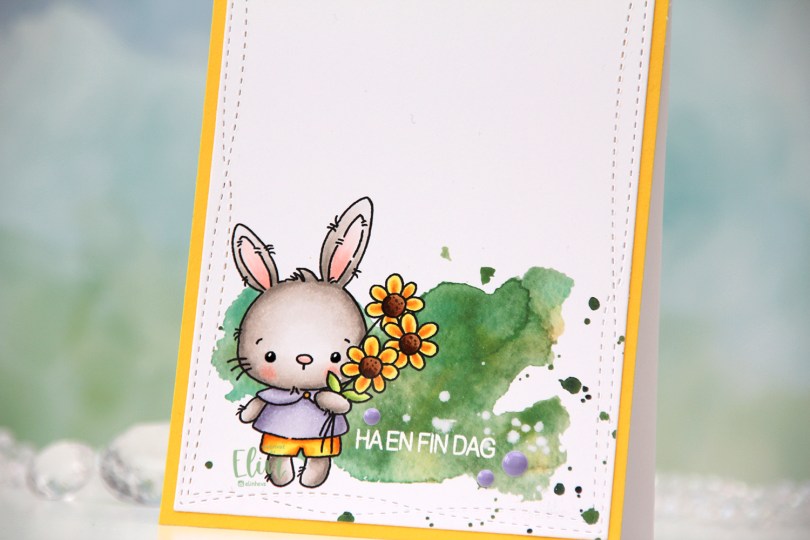
 How adorable is this little bunny holding a bouquet of flowers? I definitely used spring colors for this, and even went complementary with my Copics. I’m not really a fan of complementary colors, so I tend to stay away from them, but it worked for this card. Adding the green watercolor in the background helps too, that way the purple and yellow aren’t competing as much for the attention.
 I die cut my finished panel using the largest die in the Wonky Stitched Rectangle STAX set from My Favorite Things. I then stamped and white heat embossed a sentiment from Huldra Designstudio right onto the green watercolor.
 I adhered the panel onto a piece of Bright Buttercup cardstock from Papertrey Ink, and adhered that to a top fold white card base, also created using Papertrey Ink cardstock. They have the best cardstock!
 To finish the card I added a few enamel dots from the Enchanted Garden pack from Altenew, and created shine and a tiny bit of dimension to the bunny’s eyes by first using a black glaze pen, then a white Gelly Roll 05 once the black was dry.
 The eyes really shine. I love adding these tiny details, especially on cards that are this simple.
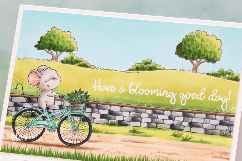
 I love how happy this mouse looks riding that bike. Stacey Yacula has a way of creating characters that really come to life, I’m such a big fan of her style.
 I stamped Anna, added a mask, then stamped the stone wall. Both were stamped with Extreme Black ink from My Favorite Things, which is a Copic friendly ink. I then used second generation stamping with the country side background, this time with Memento Espresso Truffle ink for a somewhat softer look.
 I colored in my scene using Copics, then stamped and white heat embossed a sentiment from the
  I used a white Gelly Roll 05 to create the white dot “flowers” in the background and added my panel to a top folding white card base I created. The finished card measures 6 x 4″.
 This is a very mail friendly card. No embellishments, it’s almost one layer and sooo simple.
 Quite a few Copics, but that usually happens with these full scene cards I create with Purple Onion stamps.
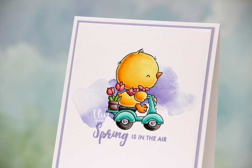

 Just below the image, I decided to stamp a sentiment. This one is from the Paint-A-Flower: Hydrangea stamp set from Altenew, inked up in Wild Wisteria ink from Gina K Designs AND Winter Wisteria ink from Papertrey Ink. The Gina K ink is a little too blue for what I for this card, while the Papertrey Ink color is a little too pink. By stamping them on top of one another, I get the perfect color for my card.
 Using the Additional A2 Layers dies from Waffle Flower Crafts, I turned my simple colored piece into a slightly smaller panel, which I adhered to a panel of Wild Wisteria cardstock from My Favorite Things.
 I added my double panel to a white card base, and my card was complete. I wanted my whites to match, and actually covered up the card base with another piece of X-Press It blending card, which is what I use for my Copic coloring.
 This is a very flat, very mail friendly card. I don’t make many of those, but I really wanted the chick to shine.
 Simple, springy color palette, even though it doesn’t really feel like spring. It started snowing Friday night, snowed all through the night and a good chunk of yesterday, before the snow turned into rain, and then later fog. It’s so foggy right now I can barely see the buildings across the street. 18 days into spring, and it feels more like winter than ever before.
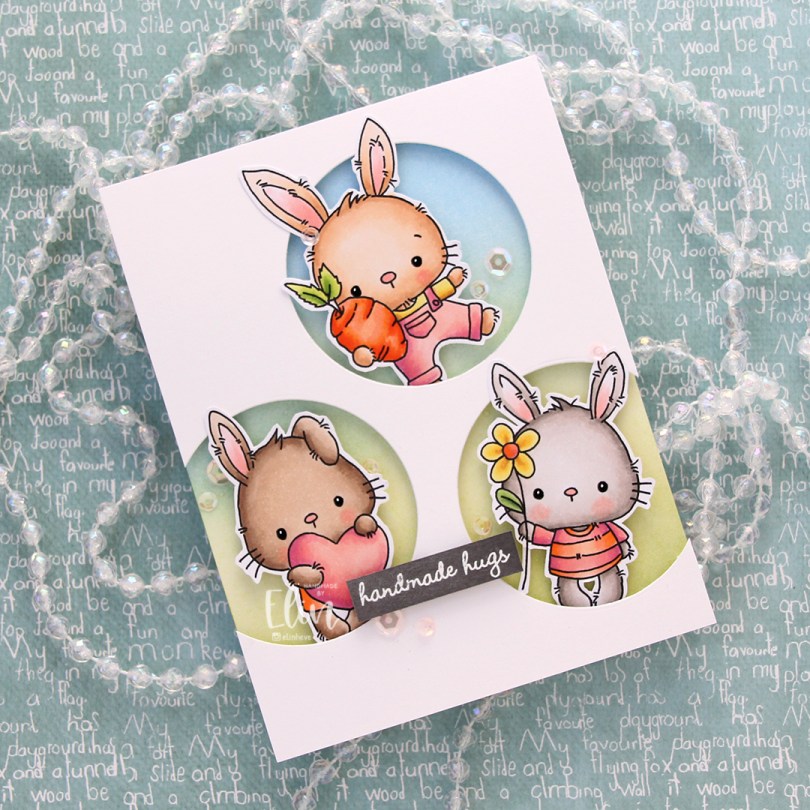
 These guys are from the
  Onto the card base, I ink blended Fresh Leaf and Eastern Sky inks from Altenew to create a soft background that went from green to blue. I then added splatters of my sheer shimmer spray from Imagine. It’s not really visible in the photos, but in real life it adds a bit of sparkle.
 I die cut three circle openings in a quarter piece of white cardstock and mounted it with foam tape to the card base.
 I added foam tape to the back of my critters, popping each of them into the circle openings. I stamped and white heat embossed a sentiment from InkyWings onto a piece of Mushroom cardstock from Concord & 9th, mounted it on foam tape and added it to the card.
 To finish off the card I added sequins from the Rosy Glow mix from Little Things from Lucy’s Cards.
 Such a simple color palette for this one. Aside from the colors of the fur, which differ for each bunny, I used the same colors throughout.