
Hi, crafty friends. I’m sharing with you a super simple birthday card today, featuring this dragon eating ice cream from Lili of the Valley. This was the card we gave my nephew for his birthday this week. The first birthday card I ever made was for him for his first birthday. It featured a green dragon which I actually drew myself and colored in using Pantone markers. This week he turned 14, and even though this dragon is a bit childlike, it still feels like a nod back to that first one. Plus, he’s eating ice cream, you can’t go wrong with ice cream, and my nephew loves ice cream, so it was kind of perfect.
 I printed the dragon on a piece of X-Press It blending card and colored him with my Copics, before using the largest die in the A2 Stitched Rectangles STAX 1 die set from My Favorite Things. I covered my card base with a 4 1/4 x 5 1/2″ piece of patterned paper from Kaisercraft (Charmed from the Key to my Heart collection) to match the green. I cut the panel with the dragon at funky angles at the top and left side to create a convex quadrilateral that I mounted on foam tape in the top left corner of the card.
 Using a scrap of patterned paper from the Fremtidsdrømmer collection from Papirdesign, I die cut Gratulerer using the Gratulerer med dagen 3 die set, also from Papirdesign. I die cut an additional 3 layers of white cardstock to glue behind it, but decided that even that wasn’t enough dimension, so I cut tiny slivers of clear foam tape from Rabbit Hole Designs to add to the back of the letters. That did the trick, and it looks like the die cut is floating. I stamped a sub sentiment from the A06 stamp set from Norsk Stempelblad AS onto another piece of the same patterned paper using Jalapeño Popper ink from My Favorite Things, cut it down to a strip, added a couple of white cardstock strips behind it and more of the clear foam tape to make it float, before finishing off the card with a few enamel dots from the Pocketful of Sunshine pack from Altenew.
 Fairly simple color palette, but I went through too many teal colors before I decided on the right one for the straws and the sprinkles.

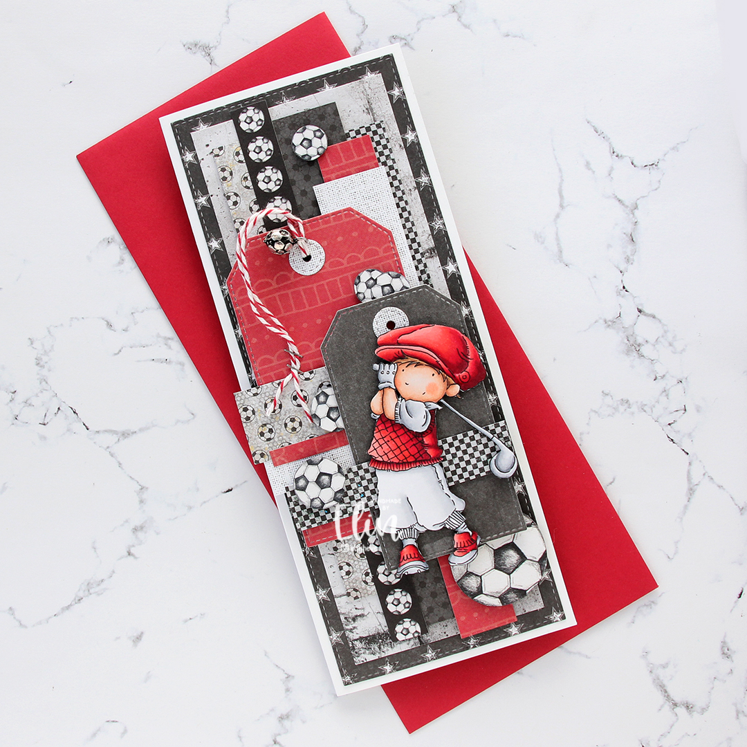
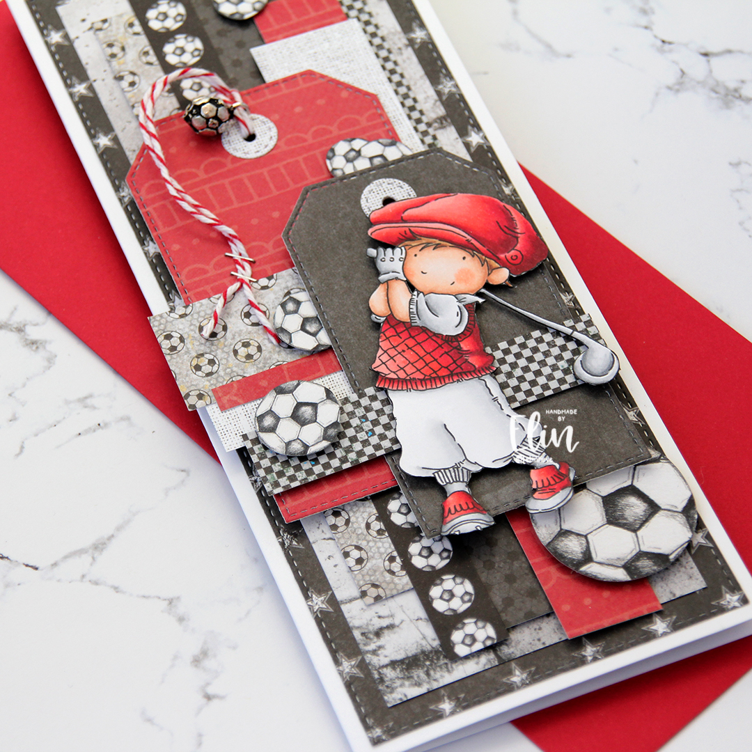


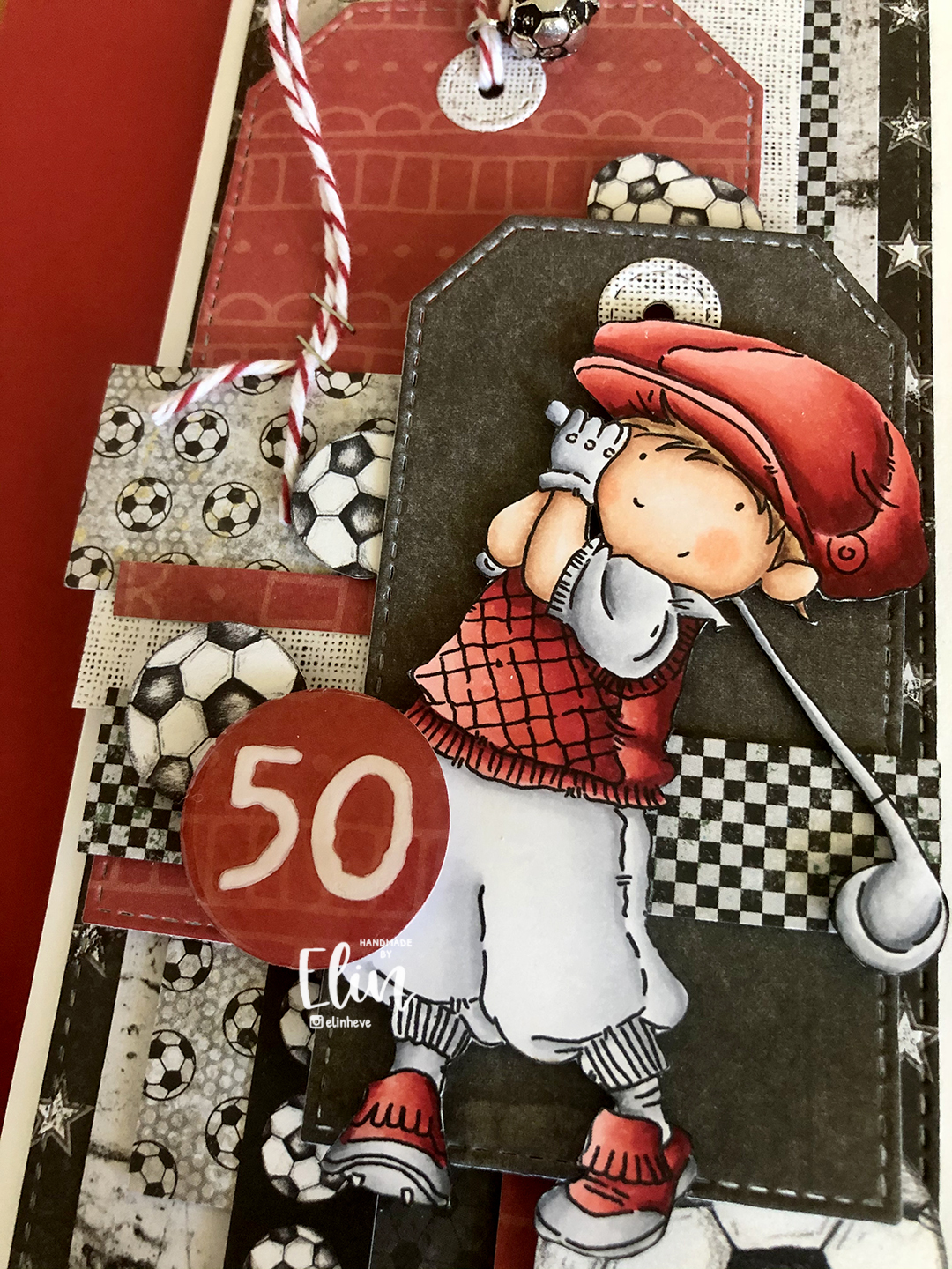
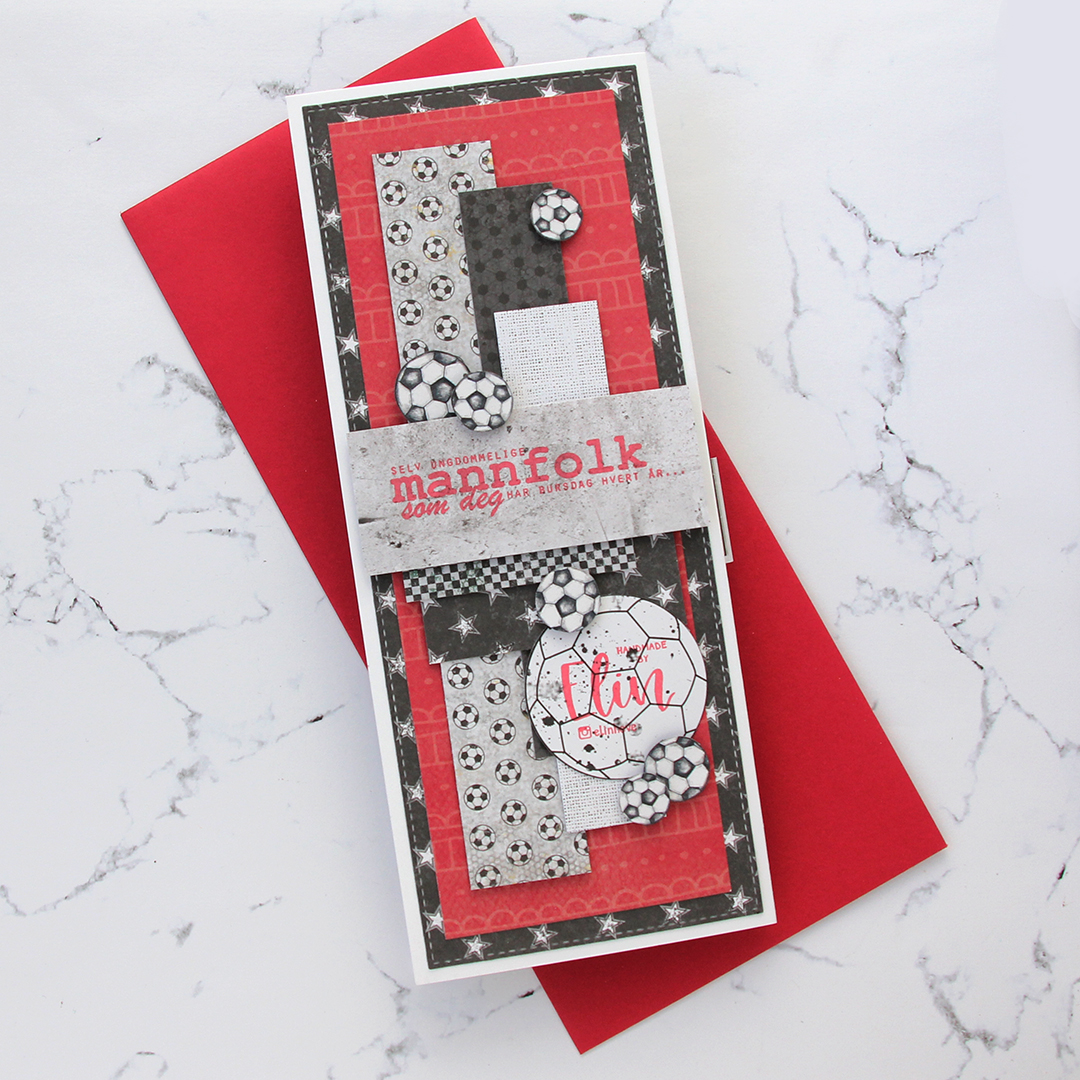
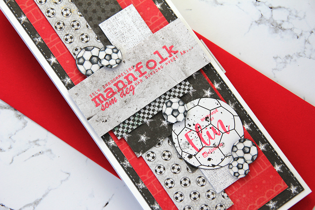

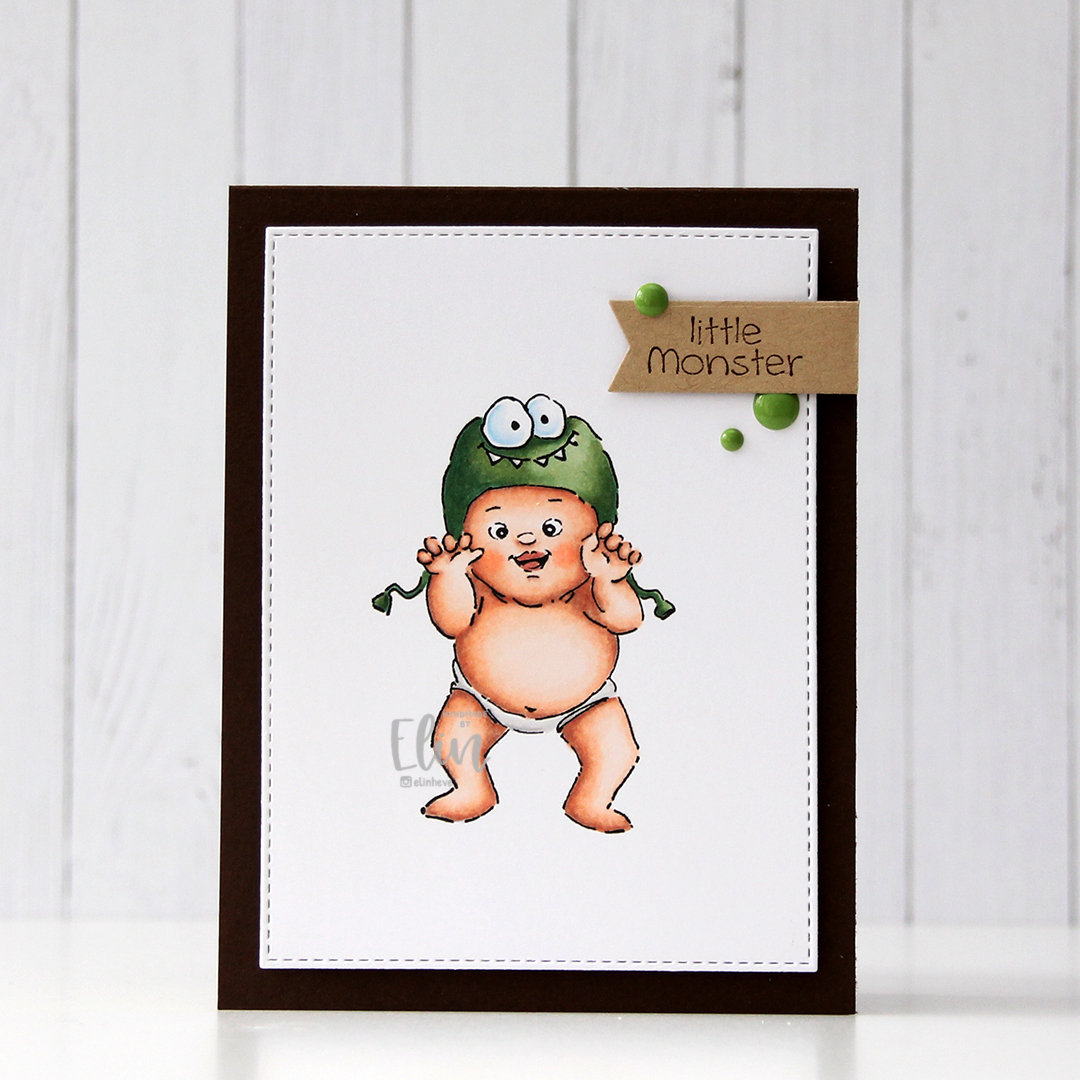


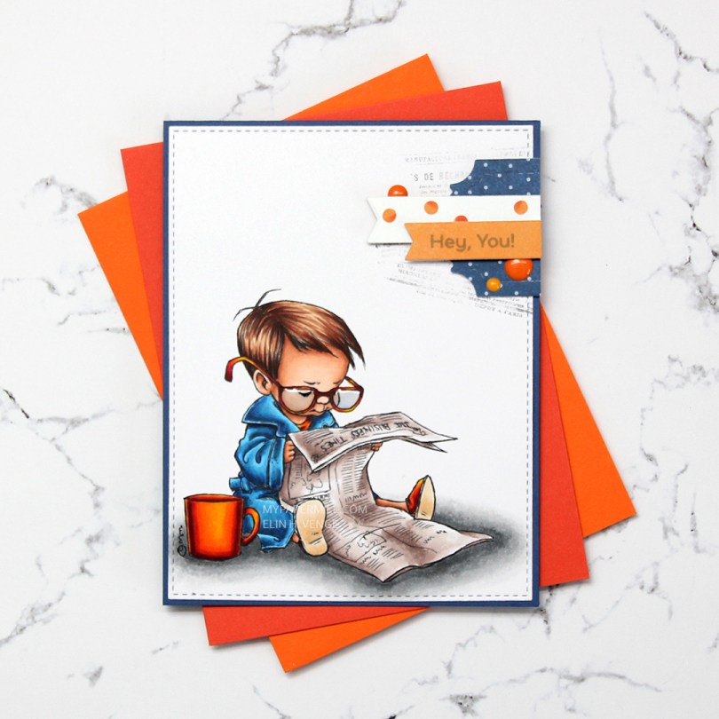
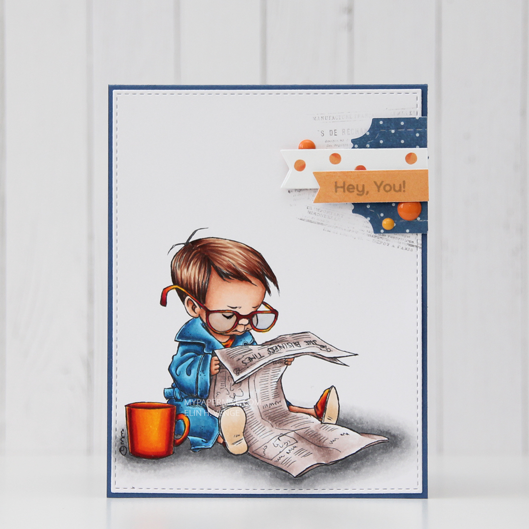 I colored up the boy version of
 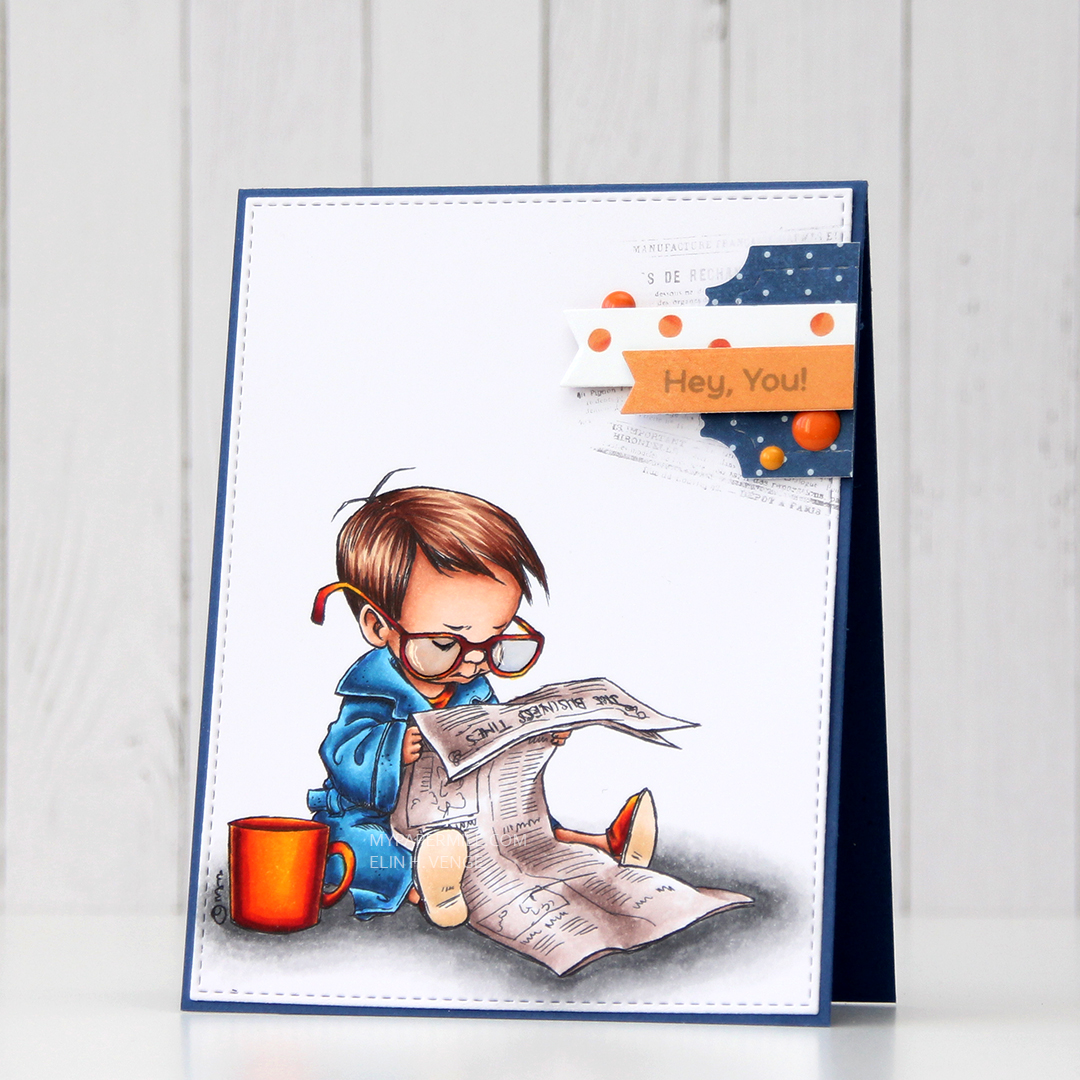 Near the top right corner, I randomly stamped part of an old background stamp from Tim Holtz and Stampers Anonymous. I thought the small text on the stamp would pair well with the newspaper in the image and stamped pieces of it at an angle with Memento Espresso Truffle ink. I didn’t even put the stamp in my Misti or on an acrylic block, I bunched it in my hand and stamped, giving it less of a rigid feel, since the stamping is uneven. I added my colored and stamped panel onto a card base made from Blueberry card stock from My Favorite Things, and a small cluster on top of my stamping.
 I die cut some patterned paper scraps with a couple of dies from XCut and My Favorite Things to create my cluster. The blue piece is from Papirdesign, the other two from the Happy Birthday collection from P13. I stamped a sentiment from the Bitty Bears stamp set from My Favorite Things onto the orange banner using Hero Arts Soft Granite ink. I finished off with three enamel dots from Papirdesign and added Glossy Accents to the boy’s glasses.
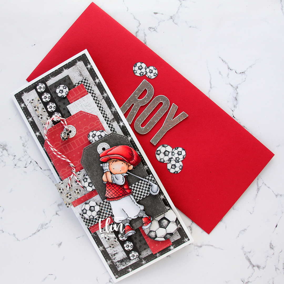
 Not a huge amount of colors. For the soles of his slippers I actually used the two lightest colors that I used for his hair (E31 and 30).
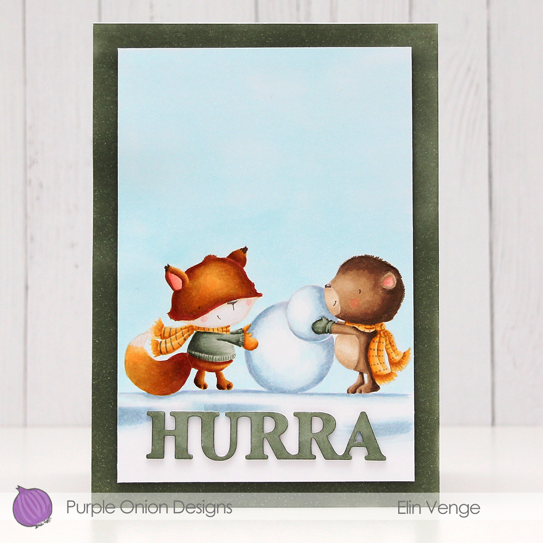 For today’s card I really wanted to include both
 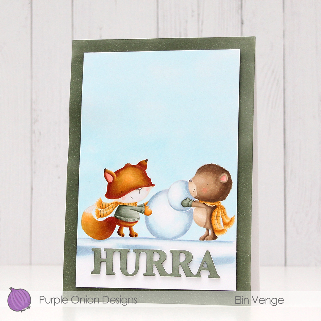 I stamped the bear using fadeout ink from Inkon3 and masked him, before stamping the fox in the same ink. While I still had the stamps in my MISTI, I stamped their eyes, mouths and noses using Memento Espresso Truffle ink. This saved me from having to draw the details back in after my coloring, which could have potentially ruined the entire scene. I used my Copics to color everything, and trimmed the panel down slightly. I used one of the greens from the image on the edges of a 5×7″ piece of X-Press It blending card to make the card front match the image, as I didn’t have any card stock in the right shade of green. For the die cut HURRA (die from Kort & Godt), I scribbled one of the green Copics onto a scrap piece of X-Press It before die cutting. I added another three white die cuts behind it for dimension, and used foam tape on the back of the colored panel to give it a little lift up from the card base.
 As usual, I used lots of colors for the snow (everything in this graphic before E44), but that’s just how I roll.
 I colored up the image with my Copics. Nothing unusual about that, but these blues are brighter than the ones I normally use. The colored panel was too narrow to fill the width of a regular card, so I decided to put a frame around it. I used one of the wood frame nested dies from Hero Arts to create my frame from Classic Kraft card stock from Papertrey Ink, and built up layers by adding a few more frames behind the top one. I created a card bas from Lush Lagoon card stock from Papertrey Ink, and used the By the numbers impression, also from PTI, to create a debossed look to the card base. There’s quite a bit of blue showing outside the frame, so I wanted a little bit of texture there.
 Using Limelight card stock from My Favorite Things, I die cut the number (from the By the numbers die set from Papertrey Ink) four times and stacked them for a dimensional look. I adhered the number to the frame using liquid glue, and glued a white heat embossed black sentiment strip on top, with two more layers of black card stock behind that, for even more dimension.
 I added a bunch of green enamel dots from Papirdesign, and rummaged through my old patterned paper for one I could make an envelope from. I struck gold with this green one from Pion Design from 2010. I don’t use a lot of patterned paper anymore (at least not big pieces), but I can’t exactly throw it away, either, so I figure it’s perfect to create envelopes from. This way, they get used!
 Super bright colors. Well, except for all the browns. I actually used five colors for his sheriff’s badge before I ended up with a color I liked.
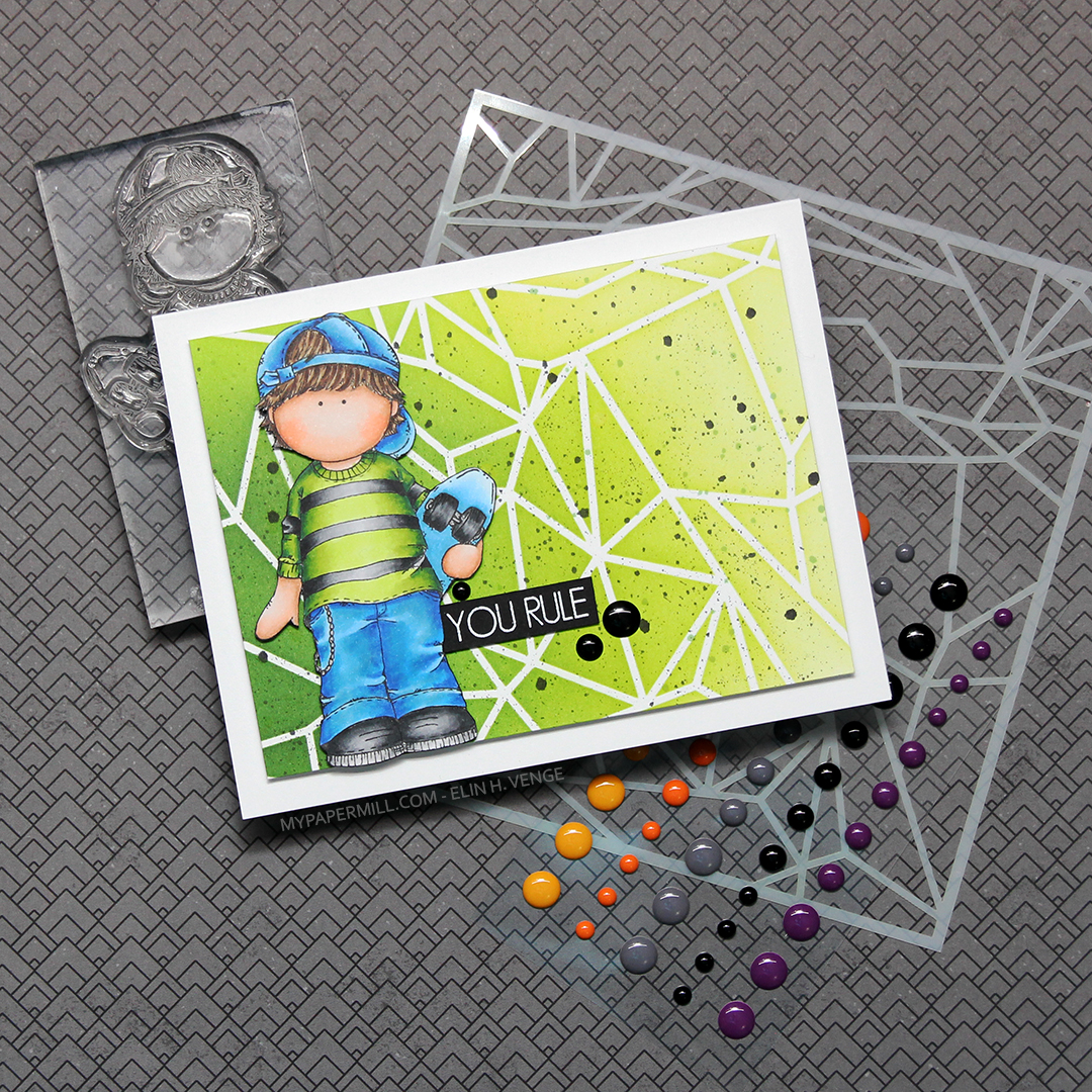 I colored the skater boy using Copics, then fussy cut him right up against the black stamped lines.
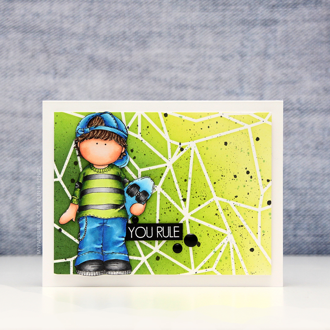 I don’t often use green as my main color in my cards, but on boy cards, I think it’s one of the best colors out there, even better than blue. And coming from me, that’s saying a lot. For this one, I used the Geometric Landscape stencil from Altenew, along with five different colors of Altenew ink for my background; Bamboo, Parrot, Grass Field, Shadow Creek and Evergreen. I smooshed the Grass Field onto an acrylic block and added some water to it, before using a paint brush to create green paint splatter in the background. I also pulled out my Black Marble ink spray from Ranger (Dylusions) and did the same with that.
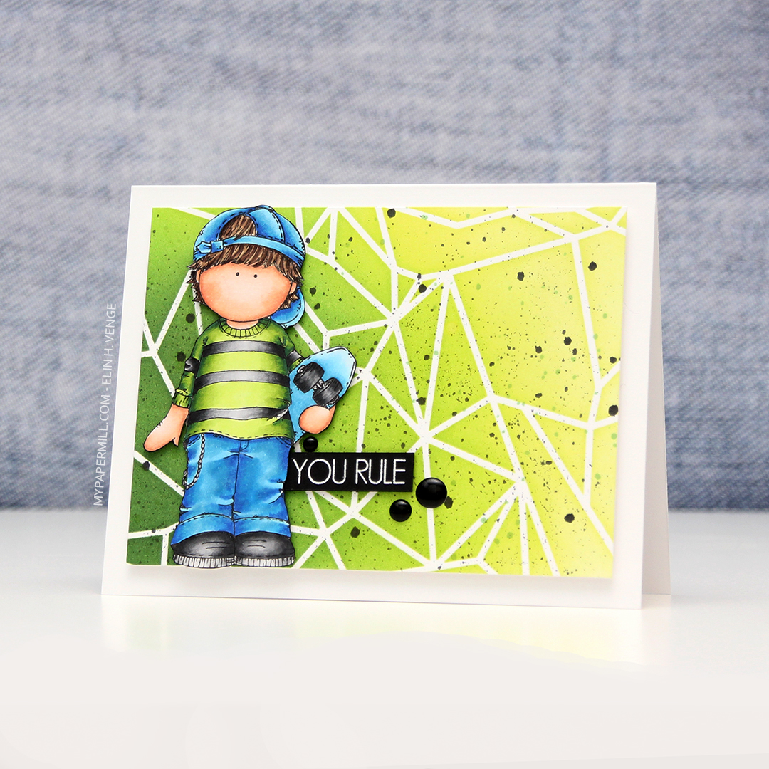 I mounted my ink blended background to a white card base using lots of foam tape, before adding the skater boy on top using some
  Blues, greens, gray and a little bit of skin and hair.
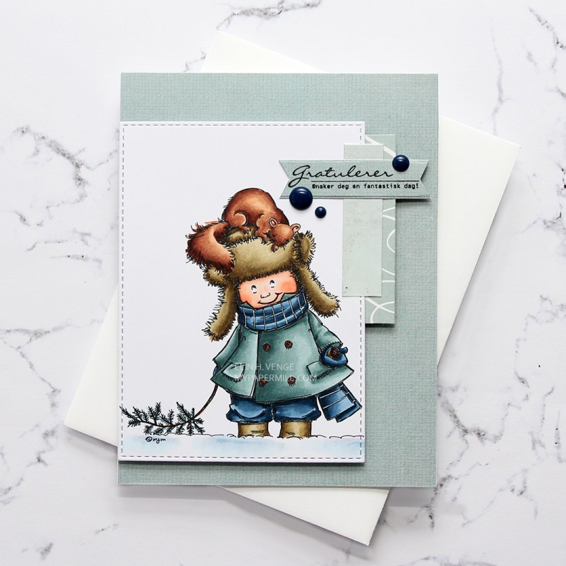
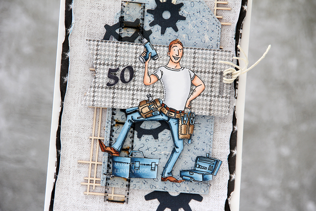
 I went with a combo of cool Copic colors and even used the E80s, which I hardly ever use. I cut my colored piece down using a faux stitch rectangle die from My Favorite Things.
 I used some old scraps of patterned paper to create this card. On my desk I have a container of scraps of patterned paper that I’ve cut down to 4 1/4 x 5 1/2″, making them very convenient to use. The paper I used to cover the entire front of the white card base is from My Mind’s Eye (it’s the same sheet as the one I used for the sentiment banner), the one with the white lines running through it is from Autumn Leaves, from their Manhattan line, which happens to be from 2007. I definitely have some old papers in my stash. The lightest piece is from Kaisercraft. I decided to add dark blue enamel dots from Papirdesign to break a little from the monochromatic patterned paper I had going, and also to reintroduce the blue from the image, even though I really like the grayish teal of the jacket and the patterned paper scraps.
 I stamped the sentiment from Norsk Stempelblad AS using VersaFine Onyx Black ink and die cut it using one of the fishtail flag frames dies from My Favorite Things.
 Quick and easy coloring of this one without too many colors. As usual when I color snow, quite a few of the colors were used for the snow alone. I also used BG71 on the jacket, which is a color I’ve made myself.