Hi, crafty friends. I’m back with one of those cards I make once in a blue moon, which happens to be a type of card I used to make all the time back in the day (I realize I’m making myself sound really old by saying that). It’s a 6×6″ card, but still not square.
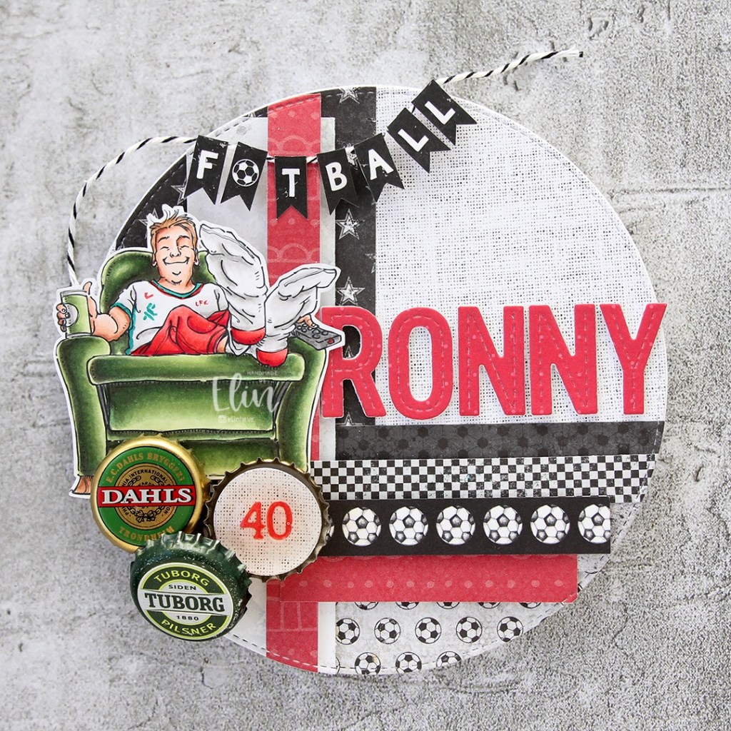
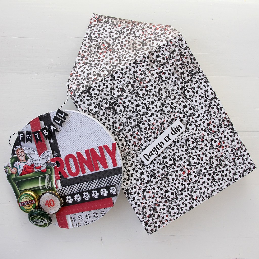
 The card was made on order for a superintendent turning 60. I was told he likes wine, good food, sunny, warm weather and enjoying life and was given free reign to do as I pleased. Mr. Fixit from Mo Manning seemed like the perfect choice for an image to color.
 I rarely use patterned papers on my cards anymore, and certainly not pieces this big, but I love the XXL Square Frames Frilly #10 die set from GoKreate, the dies in the set are perfect for creating shaped cards. I use two 12×12″ sheets of patterned paper to make one of these cards, and this time I used the Drivers License patterned paper from the Denim & Friends collection as well as the Tough but sweet sheet from the Denim & Girls collection, both from Maja Design. I can cut two of the larger shapes and two of the smaller shapes from one sheet, so the insides of the card are reverse.
 I colored the image in colors that went with the patterned paper, adding a bit of red to catch the eye and writing the words on his t shirt with a black Copic friendly pen. I thought the pun would tick the “loves wine” box.
 I used foam tape to add the smaller shape to the larger one, and also to add the die cut circle to the smaller shape. I stamped postmarks from various cities in the world using Memento Rich Cocoa ink to add a little bit of interest to the circle and the panel behind it. I figure if the guy loves warm, sunny weather, he probably also loves to travel, there’s not a whole lot of warm days in Oslo over the course of a year.
 I added some metal embellishments from Tim Holtz in a bit of a cluster near the bottom left “corner”, as well as his age, die cut and put on a 1″ circle with an epoxy sticker on top for a bit of added dimension.
 I hid a die cut tag behind my image. I used to do this all the time, and it’s a fun way to add a sentiment without having to find space for it on the front of the card. The sentiment is from the Til mannen stamp set from Norsk Stempelblad AS. The dies I used for the tag and reinforcer are old ones from Magnolia. I tied a bow from twill onto the tag, and some cutlery charms to the twill bow using natural twine from May Arts. I thought the cutlery was perfect for a food lover, I have so many treasures in my stash that I forget about until I go looking for something to use.
 The inside of the card are pretty simple. The same patterned paper as the front, only with the reverse size. I used more of the postmark stamps from Marianne Design, as well as a sentiment from the Gratulerer stamp set from Norsk Stempelblad AS. There’s plenty of space for a personal message on the second circle, which only has the postmark stamps on the edges.
 The back of the card is also simple. Another sentiment from Norsk Stempelblad AS, this time it’s the B03 stamp set. I love their stamp sets and use them more than any other of my Norwegian sentiment stamps. They’re hard to get your hands on because the company is no longer in business, but they’re the best sentiments out there.
 Simple color palette.
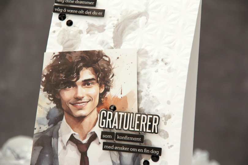
 I started by choosing an image to be the focal point of my card. I ink smooshed Gravel Gray and Eiffel Tower inks from My Favorite Things onto the background to mimic the background in the photo. This adds a little bit of interest to the background without being too distracting. I also used the Kaleidoscope embossing folder from Simon Says Stamp on the card base for added texture.
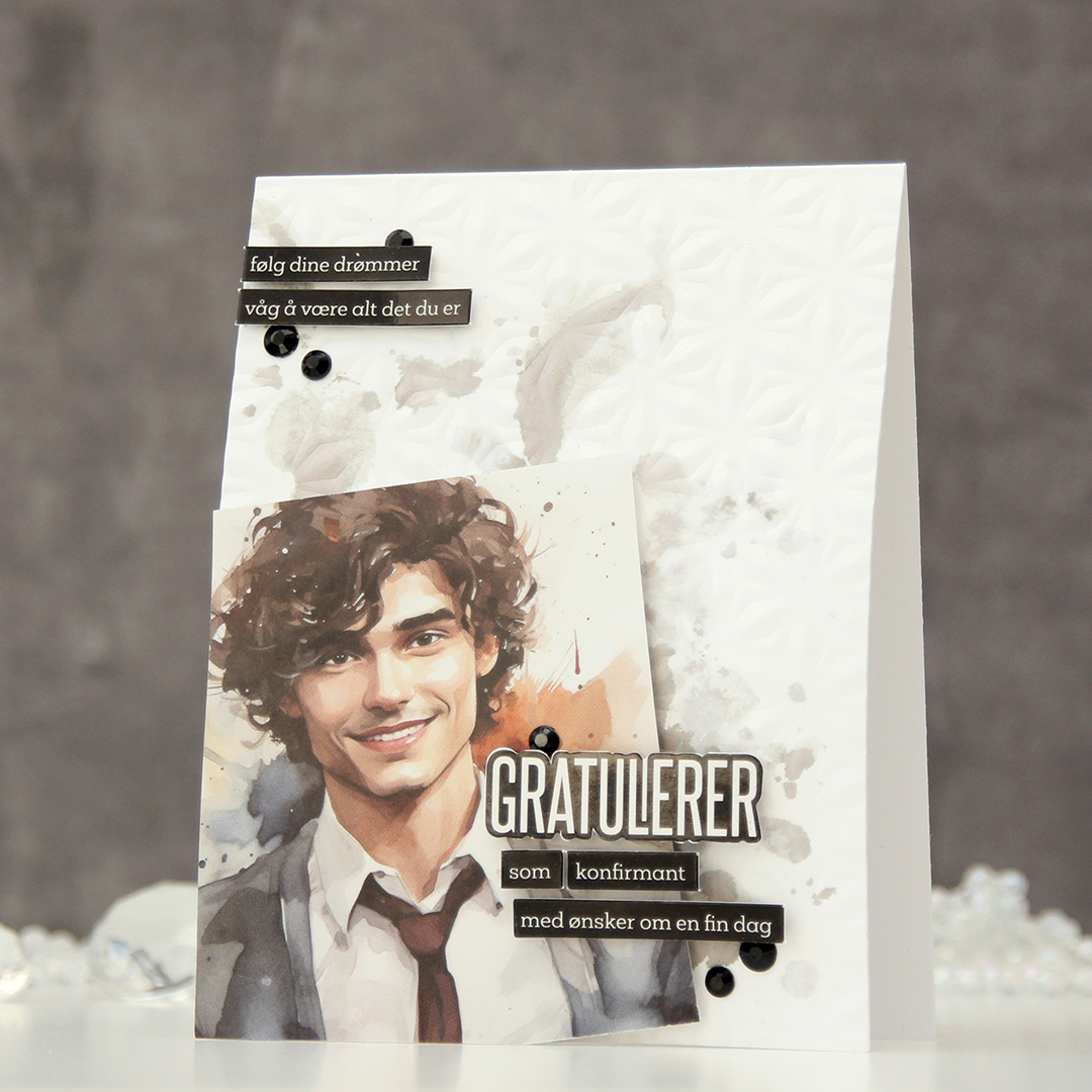 I placed the image at an angle in the bottom left corner of the card and cut off the excess hanging off the side and the bottom. I decided to mount it on foam tape for a little more interest, then used pre printed stickers to add my sentiments. I love these things, they make adding sentiments soooo easy. I put foam squares on the back of these for even more lift off the card base – dimension is life, after all. I used black gems to frame the sentiments as a finishing touch.
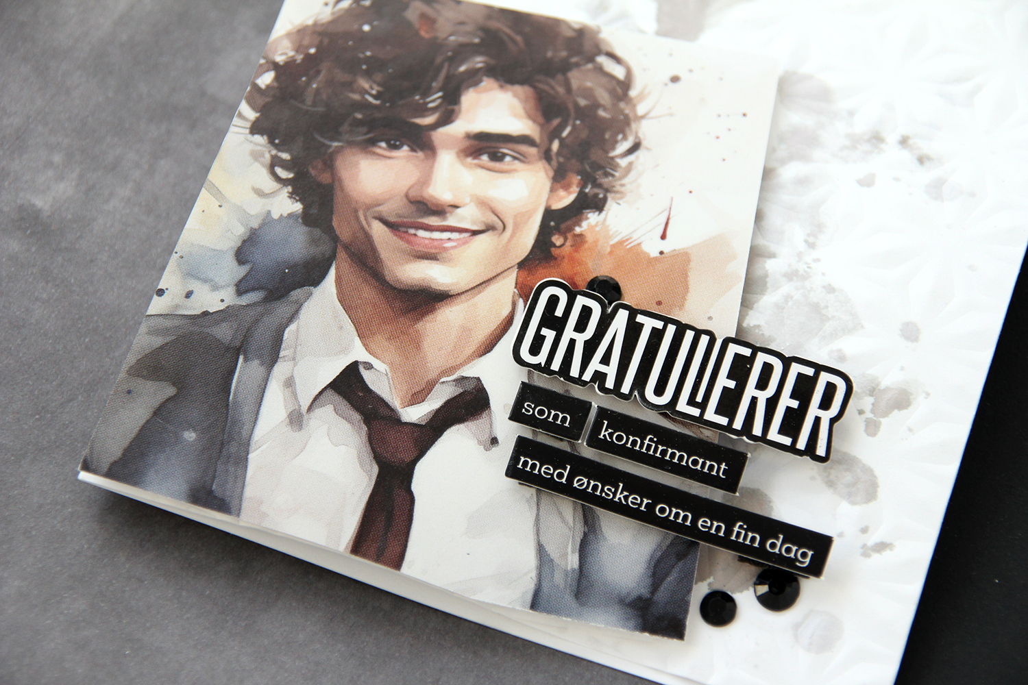 Dimension really is life!
 I die cut the word konfirmant and the individual letters for the recipient’s name in white cardstock and adhered them to a black envelope. The black and white ties in with the card nicely.
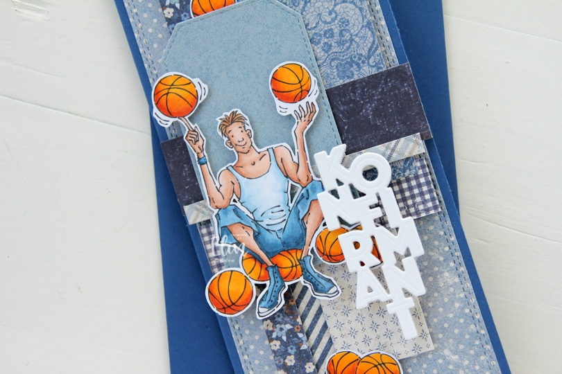
 I made a slimline card this time. I created a background from blue scraps from several collections from Maja Design – Denim & Friends, Denim & Girls, Fika and Vintage Autumn Basics are all represented. One of the things I like about the Maja Design patterned paper is that papers match across collections. They’re also made from really good heavyweight paper, which is another tick in the pro column for me. I used the Slimline Double Stitched Rectangle STAX die set from My Favorite Things to create the panel in the back and also the Stitched Traditional Tag STAX die set, also from MFT, to create the tags.
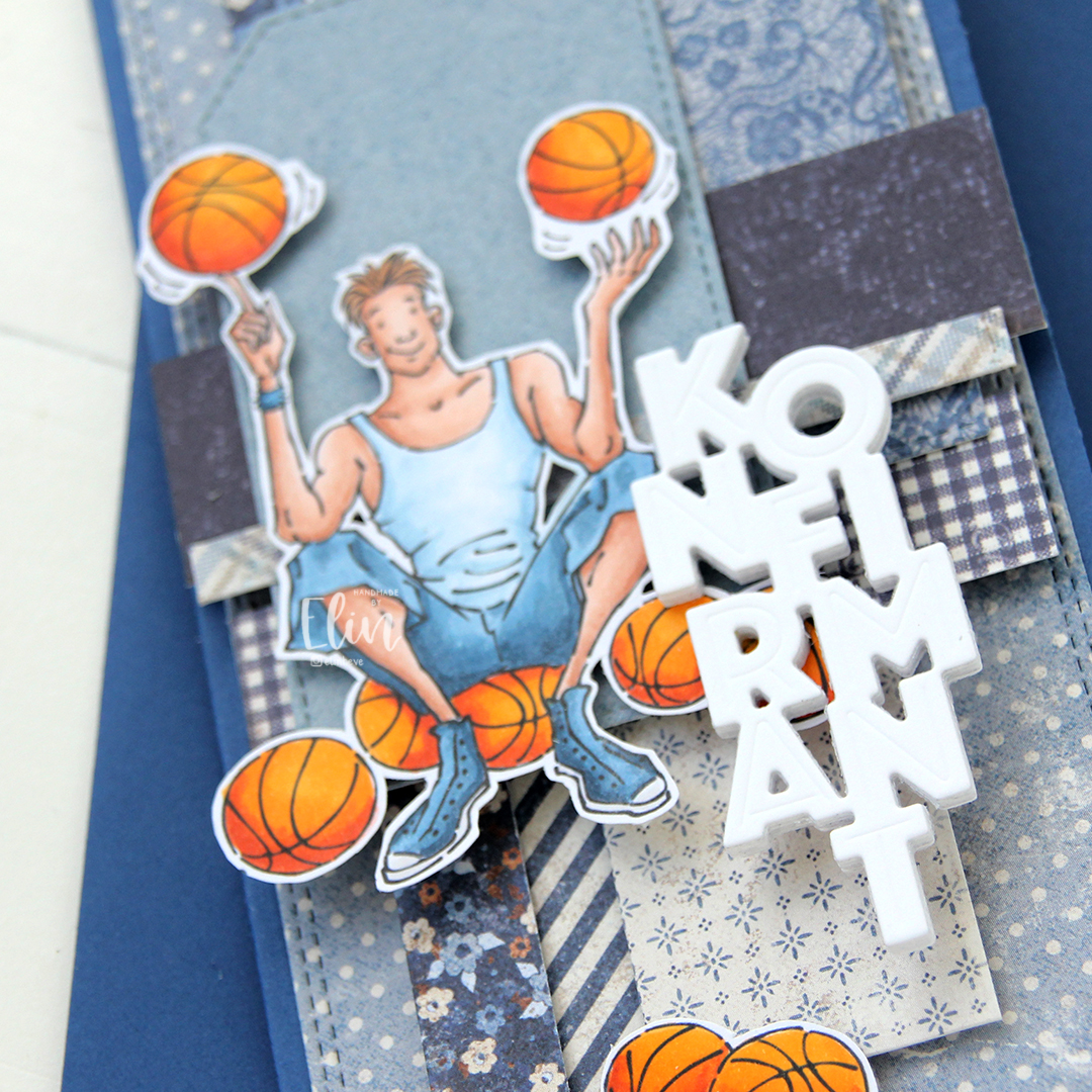 I added the image on top of one of the tags and scattered a few more basketballs around to work as embellishments. The orange really stands out against the blue background. To finish off I die cut the Konfirmant 5 die from Papirdesign six times from white cardstock and stacked them for a dimensional look. I adhered it on top of the image, and it floats above the card further down.
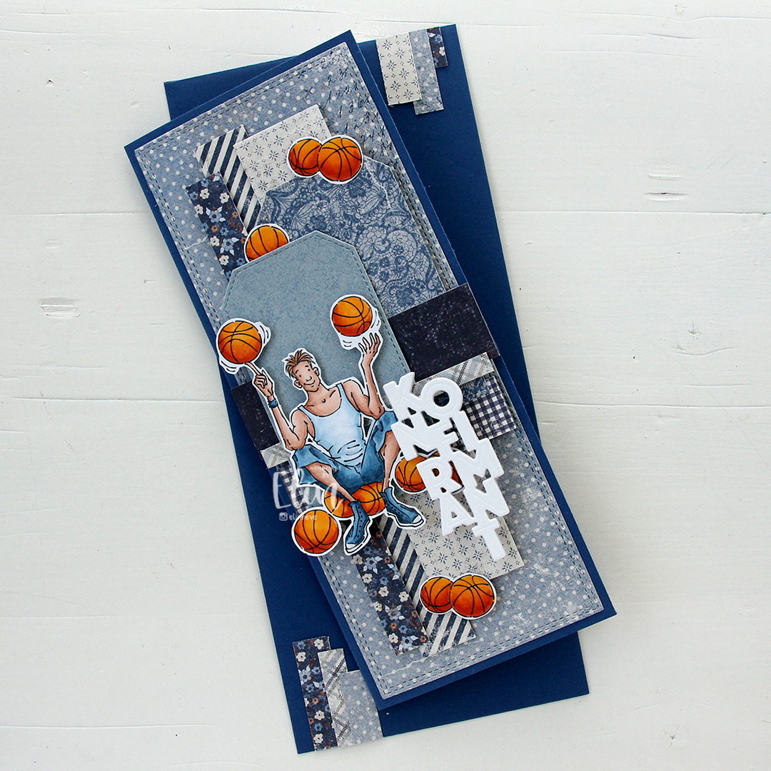
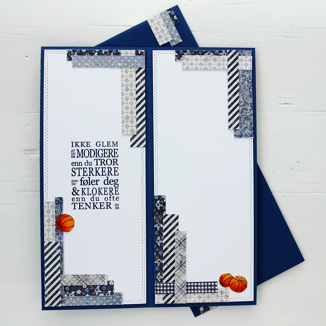 Whenever I make cards to order, I always decorate the inside too. I used the largest slimline double stitched rectangle die to create the white panels on the inside, adding more strips of patterned paper to continue the look from the front of the card and also fill the pages a little. Slimline cards are large, and the added elements make it less daunting to have to come up with a message for the recipient. On one side, I stamped a sentiment from the Konf. 01 stamp set from Norsk Stempelblad using Blue Beyond ink from My Favorite Things, the right side still has plenty of room for a personal message. I also included more basketballs.
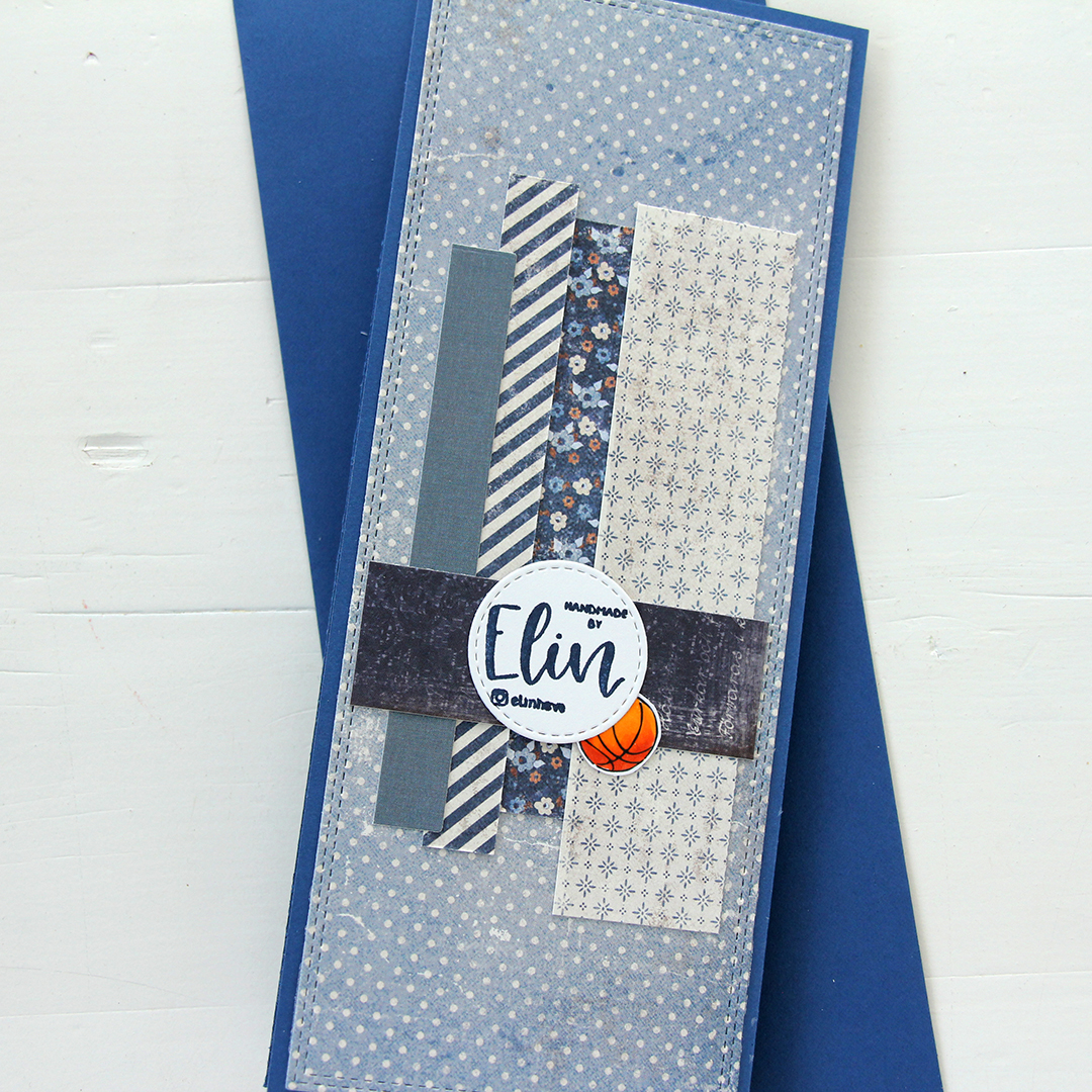 For the back of the card, I used a few strips of patterned paper I had left, die cut a white cardstock circle using the Stitched Circle STAX die set from My Favorite Things and stamped my personal stamp in the center of it using Blue Beyond ink from MFT. The card base is also from My Favorite Things, it’s made from Blueberry cardstock, and the envelope is also in that same Blueberry color.
 Limited color palette for this one.
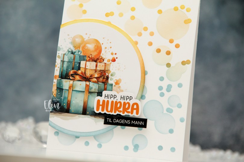

 I mounted my circles on foam tape, cut off the excess, then added a couple of pre cut stickers to finish off the card. I love these stickers!
 It’s confirmation season, and my nephew’s confirmation was September 10th. I made several cards for him, and this is one of them. I thought this image was the perfect one to use, nothing says fifteen year old boy like a guy with his phone in his hand, school books hidden away and a bowl of snacks on the armrest. The controller tucked away is a nice touch too. We don’t wear shoes indoors in Norway, but the rest is pretty spot on.
 I created a background for my colored image using a variety of stamps, inks and even a stencil. I started with the Abstract Triangle Background stamp from My Favorite Things that I stamped in Orange Peel ink from Simon Says Stamp. I didn’t want the stamp to cover the entire background and made sure to stamp it in the lower left corner and have it fade as it went up and to the right. I then took a confirmation stamp from the A05 stamp set from Norsk Stempelblad AS and repeatedly stamped it on top of the stamping I’d already done using VersaMark ink, before sprinkling on super fine detail embossing powder from Ranger and melting the powder with my heat gun. I then used the Watercolor Wash Free Form stencil from My Favorite Things and ink blended using Spiced Marmalade and Mustard Seed distress inks.
 I fussy cut my image leaving a white trim and mounted it on foam tape on top of the stamping and ink blending I’d done. I die cut the Hullmønster die from Papirdesign twice; once from Cornflower cardstock and once from Sour Apple cardstock, both from My Favorite Things. I tore them both up, tucking a couple of pieces behind the image for a little bit of added interest.
 I used the Konfirmant 2 die from Papirdesign to die cut five times from cardstock for a stacked look, placing a layer die cut from True Black cardstock from Papertrey Ink on top of the stack. I adhered it to the card using liquid glue, placing the beginning of the word on top of Noah’s pant leg to make it all fit.
 I added some sentiment stickers from Kort & Godt to fill the space at the bottom of the card a little. They’re originally a bit bigger than this and white with black letters, but I used a Copic marker to color them blue to make them stand out against the white background a little and also cut them down slightly. The banners with the stars are also Kort & Godt stickers.
 In the top right corner, I created a little cluster with die cut pieces and those stickers, before finishing off the card with a few Papirdesign enamel dots. Onto a Limelight envelope from My Favorite Things, I adhered white die cut letters (dies from Papirdesign) to spell his name and stamped Konfirmant from the Konf. 02 stamp set from Norsk Stempelblad AS using Limelight ink from My Favorite Things.
 On the inside, I stamped a sentiment from the Konf. 02 stamp set from Norsk Stempelblad AS using Orange Peel ink from Simon Says Stamp. I also adhered number stickers from Papirdesign to get the date on there. The right hand side has plenty of space for a personal message.
 Fun, bright color palette for this one.
 I decided to cut off about half of the bench. Since I’m only using one of the kids, I didn’t need the whole thing. If you want, there’s also a
  I adhered my panel directly to a card base I created from Green Parakeet cardstock from Papertrey Ink. I stamped a sentiment from Norsk Stempelblad AS onto a strip of the same color cardstock using Green Apple ink from Simon Says Stamp and put the sentiment aside while I worked on the rest of my card.
 I die cut the word hipp 8 times from Tropical Teal cardstock from Papertrey Ink using a die from Kort og Godt, and created two stacks of four each for a dimensional look. I adhered my stacked die cuts to the card and put the green cardstock strip on top of the bottom hipp.
 To finish off the card I added a few enamel dots from Papirdesign. I decided to go for orange ones to pick up the color from the little boy’s ice cream.
 It’s a fairly simple card, but the clouds add a little something to the white space, and the die cuts and dots add dimension.
 For such a small image, I used a lot of colors.
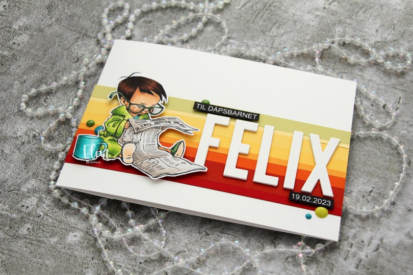
 I colored the image with My Copics and decided to fussy cut around it this time. I tend to turn my colored pieces into panels for my card and work from there, but I wanted to do something a little different today.
 I left a white border around the image to make it easier on myself. You tend to lose some of the details in the hair if you cut up close to the line, and I wanted to keep the hair intact. I also added Glossy Accents to his glasses for shine and a touch of dimension.
 I wanted to include his name on the card, but had printed my image fairly large. My solution was to make a landscape A7 card (7×5″). I rarely make landscape cards (trickier to photograph) and the same goes for A7, but it’s fun to shake things up. I also shook things up by adding cardstock strips going across the card. I tried with cool colors first, but the image got lost, so I went through my solid colors of cardstock again and made a version with warm tones. From top to bottom they are:
 I used the Impact Alphabet die set from My Favorite Things to spell the name. I die cut four of each letter and stacked them for a dimensional look, gluing them right onto the stripped background, before adding the sentiment and date in white on black.
 I mounted the image on foam tape and added a few enamel dots from Altenew (teal dots from the Cool Summer Night pack) and Papirdesign to finish the card.


 I used flowers from different companies (I honestly don’t know where these are from, I’ve had them for 10+ years, but I’m thinking most of these are from Wild Orchid Crafts. The ruffled roses are really old ones from Kort & Godt, and I think the teal ones might be from I am roses, though I’m not entirely sure), removed the yellow centers from the teal ones and replaced them with white pearls from Papirdesign.
 Both insides share the same layout, and so does the back. I printed a sentiment to go on the back, as well as the date, and a few more flowers. These cards that I make with decorations on all four sides are thick, flowers add a ton of dimension. I used old patterned paper from Maja Design for this card. The Vintage Spring Basics collection and the Vintage Summer Basics collection are both collections that Maja Design released over 10 years ago. Back then, I used plenty of patterned paper, and especially Maja Design. Their paper is such good quality, and I love their use of pattern and color. My style has changed considerably, and I rarely use large pieces of patterned paper anymore, but I still have a lot, and Maja Design is still a favorite.

 I colored up this image nearly a year ago, so it was about time I put it to good use on a card. Using the largest die in the A2 Stitched Rectangles STAX 1 set from My Favorite Things, I turned it into a panel with the faux stitch edge that I love to use on my cards. There’s something about faux stitching dies that make the cards look more finished. It’s a nice, subtle detail. I adhered the panel to a top fold card base I created from Blueberry cardstock from My Favorite Things.
 From the same color cardstock, I die cut the sentiment using the Dagen er din die from Papirdesign. I stacked four die cuts for a dimensional look and added a few blue enamel dots from Papirdesign to finish off the card.
 Blues and greens for the win for this one. I’ve always been a fan of analogous color combinations, they’re very harmonious.