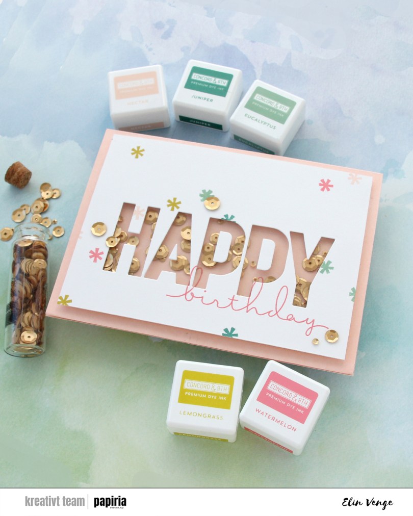
Hi, crafty friends! Today is Mother’s Day in Norway, and I probably should have thought ahead enough to make a Mother’s Day card to share today, but I’m not always a good thinkaheader and have a birthday card to share instead. My design is pretty generic, though, and it would be easy to swap out “birthday” for “Mother’s Day”. I even think the color scheme is perfect for mother’s day.

So many things went wrong in the creation of this card, but I fixed/covered up most of my mistakes and I’m pretty happy with the end result. I started by stamping birthday from the All the birthdays stamp set from Concord & 9th onto an A6 panel of Stamper’s Select White cardstock from Papertrey Ink, as well as onto a piece of Nectar cardstock from Concord & 9th that was large enough to cover the shaker area. I didn’t want to stamp it directly onto the card base, that would have made it harder to line up. More on that later. So far, so good, right? I then die cut the HAPPY from the Happy Birthday words dies from Kristina Werner into my white panel, and kept the counters of the A and the Ps to put back in later. Things were still going according to plan. There’s a small asterisk looking stamp in the All the birthdays stamp set. I wanted to stamp that randomly across my white panel and pulled out an acrylic block. We used to stamp with acrylic blocks all the time before the Misti was invented. I’m not a ding dong, surely, I’m capable of stamping this tiny stamp a few times with an acrylic block without messing up, right? Turns out I AM a ding dong and royally messed up on the Eucalyptus colored asterisk above the A and P. Pretty much in the middle of the card, isn’t that typical? I knew I was going to add sequins, and I could strategically place one to cover up my boo boo. I cut off 3/16″ on all sides to allow the card base color to work as a frame once the card was complete.
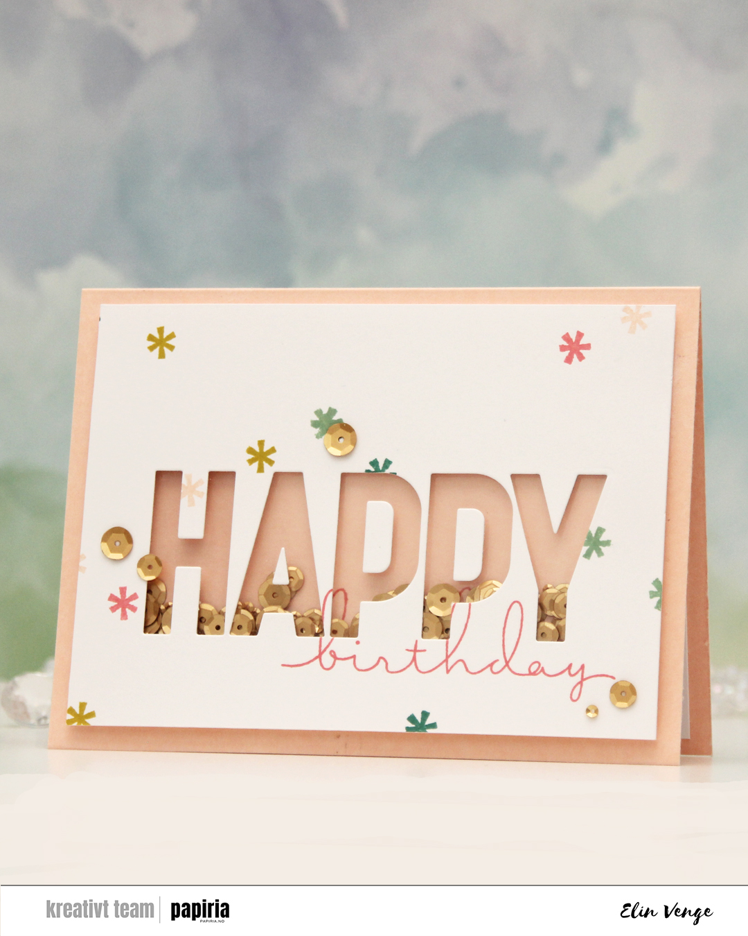
I then adhered a piece of acetate behind my letters, glued the counters (interior pieces of the letters) back in onto the acetate, flipped the panel over and added tons of foam tape around the shaker window pretty close to the window, even putting tiny strips behind the counters of the Ps, before putting a few sequins from Altenew into the shaker well before sealing it shut with another piece of acetate. I made sure to add the sequins the right side up. That was not a good idea, but I didn’t realize at the time and adhered my shaker piece onto the stamped piece of Nectar cardstock to line up the stamping on the two pieces. The problem with the sequins all facing the same way is that once they shook around, they clumped together like stacks and were pretty much impossible to separate by flicking the card. The other mistake? Adding the foam tape so close to the letters and behind the counters, my sequins didn’t really have a chance to move much. I had adhered everything to the card base at this point.
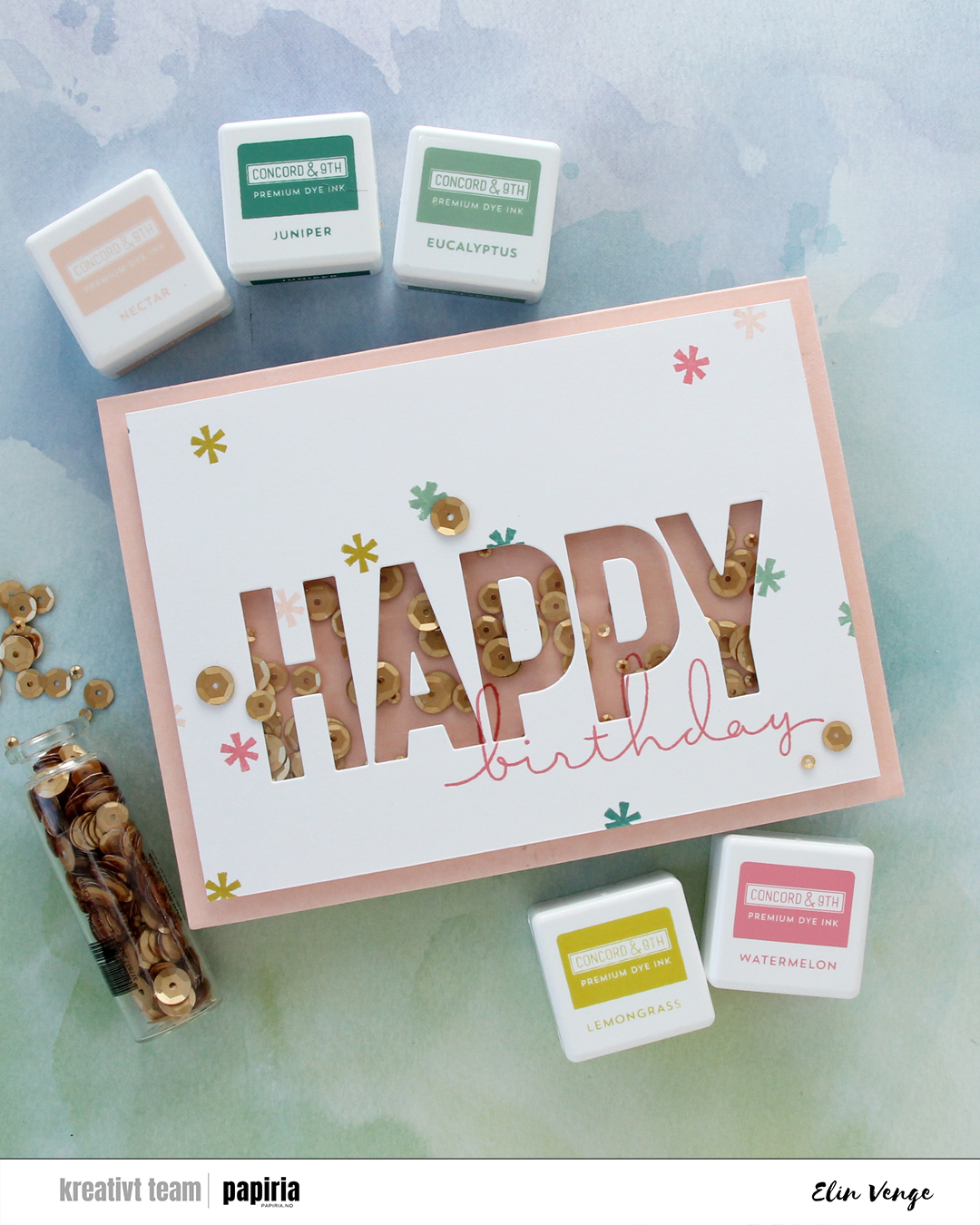
I’m not shy with glue when adhering things, but I was able to slide a thin 6″ steel ruler under my shaker panel and basically used it as a saw to cut it away from the card base, cutting horizontally so I would preserve the card base as well as I could. I didn’t have another sheet of Nectar cardstock to create a new A6 card base, so this was the way to fix it. I then pulled off the nectar piece with the stamping, then the back acetate piece, which took with it a few of the small pieces of foam tape that were in the way anyway, and then I emptied out the sequins, made sure there were no sticky pieces left behind, put sequins back into the now rectangular shaker window, this time randomly with some upside down and some right side up – and I added way more sequins too, before sealing it shut with a new piece of acetate. The piece of Nectar cardstock I’d stamped on initially had crease lines after being pulled off, so I had to restamp birthday on a new piece of Nectar. Evidently, I didn’t put the stamp into the Misti the same way as I had the first time, because the new stamping wouldn’t really line up with the old stamping – part of the nature of photopolymer stamps, they’re soft and can be curved. The loops on the b and h don’t perfectly line up with the stamping on the white panel the way they initially did, but this is me embracing imperfection, I wasn’t redoing the white panel too.
 I adhered my shaker panel to the card base and cut a couple of additional white panels to put on the inside of the card. This means I have a white panel to write my personal message, the card is a little sturdier because it’s now thicker, and the piece I adhered on the back of the front covers up the fact that I could actually see through parts of the card base after my little sawing earlier. Not shy about glue, remember? Yeah, the glue does its job, and I tore parts of it down to almost printer paper thickness. I added sequins to the front of the card (one covering up my stamping mishap) and I was done. At least I thought so… I was happy with the card, but then noticed as I was writing up the blog post for Papiria that the counter of the second P had slipped a little and wasn’t in the right spot anymore. It was bugging me. It was *really* bugging me, so I peeled it off, die cut a new one that I adhered in the right spot and took a couple of new photos. You can still see the droopy counter in the first two photos here, but that’s my card. I got there in the end.
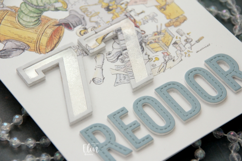
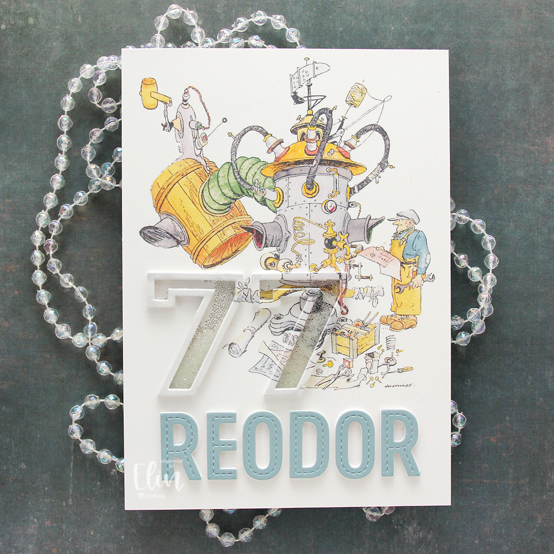 The Flåklypa universe has had a big resurgence in the past 10-15 years or so. Additional movies have come out based on the original and there’s a bit of merchandise available. I have a few calendars, and for this card, I used a calendar page with Reodor looking at his latest machine, wrench and technical drawing in hand. I sampled the color on his shirt to create a colored cardstock to match, and die cut the letters for the name Reodor using the In Stitches Alphabet die set from My Favorite Things. I die cut a few layers from white and the top layer from my custom colored cardstock and added them below the image.
 For the shaker portion of the card, I used the Outline Numbers and Solid Numbers die sets from My Favorite Things. I die cut the outline from the image as well as a few from white cardstock, and used the solid number die for the acetate. I used microbeads for shaker filler and colored the top layer with a layer of a very pale grey Copic marker to make it stand out a little against the background. The card was very well received, and my parents have actually framed it and put it on display in their dining room.
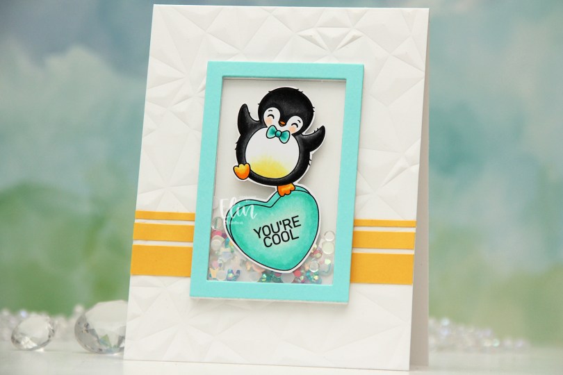
 I colored the penguin on the heart with Copics. You know me, I can’t resist a penguin stamp. I fussy cut around him, leaving a white trim around the edge and put him to the side while I worked on the rest of the card. I used the Crystal Distortion embossing folder from Simon Says Stamp to create some interest and texture to my card base, which I created from Stamper’s Select White cardstock from Papertrey Ink. I cut strips of Buttercup cardstock from Concord & 9th and added them towards the bottom of my card.
 I die cut a frame from the Classic Rectangle Frames die set from My Favorite Things several times from white cardstock (I think I have six or seven layers) and stacked them to create my shaker well, adding one of the centers back in to create a smooth back for my shaker well. I added a mix of the
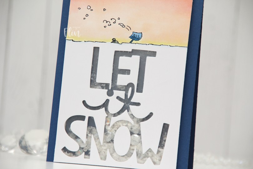
 I really don’t want the sentiment to come true right now, I don’t remember there ever coming this much snow in the city in such a short time, and I’d very much like to not have to walk to work tomorrow. I saw plenty of people out with their shovels today when I walked home, their cars were snowed in, their driveways were full of snow and they could barely open their front doors. It’s winter, we get it, but it’s enough now, we don’t need more snow.
 I’m done venting. I think. I was originally planning on adding a stacked die cut where all the snow is, but then I came up with the idea of a shaker card instead. It’s kind of like the little person under the beanie is trapped inside the shaker with all the shaker bits, which I thought was a fun concept.
 I used the Giant Let It Snow die from Lawn Fawn, covered my window with acetate and filled my shaker well with Distress Mica Flakes, a little bit of Rock Candy Distress Glitter and a small pile of embellishments from the Starry Night mix from Little Things from Lucy’s Cards.
 I added my shaker panel to a top fold card base I created from Blueberry cardstock from My Favorite Things and decided not to add anything else.
 Very simple color palette for this one.
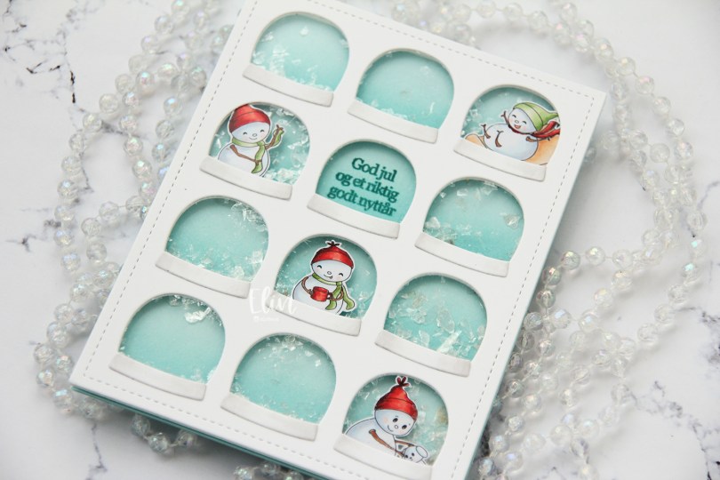
 I chose four of the snowmen in the set and scaled them to fit inside the windows on this Globies Grid Cover die from Mama Elephant. I colored them with Copics and fussy cut them leaving a thin white border.
 I die cut the cover die from Stamper’s Select White cardstock from Papertrey Ink, added acetate to the back and adhered my snowmen to the back of the acetate in a few of the windows. Onto a panel of Sno Cone cardstock from My Favorite Things, I did some very subtle ink blending at the bottom of each row of snowglobes, using Sno Cone ink, also from My Favorite Things. The ink blending adds a little gradient to each of the snowglobes. I stamped a sentiment from the Julehilsen stamp set from Norsk Stempelblad AS using Caribbean Sea ink from My Favorite Things.
 I flipped the front over, added foam tape to the back of my windows and sealed the globe with the sentiment shut so no shaker bits would be in that particular window. I added a sprinkling of Distress Mica Flakes to each of the remaining 11 windows and carefully placed my ink stamped and ink blended panel onto the exposed adhesive to close my shaker wells.
 I adhered my front to a top fold card base I created from Sno Cone cardstock from My Favorite Things. To finish the card, I die cut the bases for the snow globes from white cardstock and added a little bit of subtle shading on the edges with a T0 Copic marker, as well as the colorless blender.
 These snowmen are super tiny, it’s a miracle I used so many colors. I may have gotten carried away with the red in particular. Five colors for these tiny areas is probably way too many, but there you go.
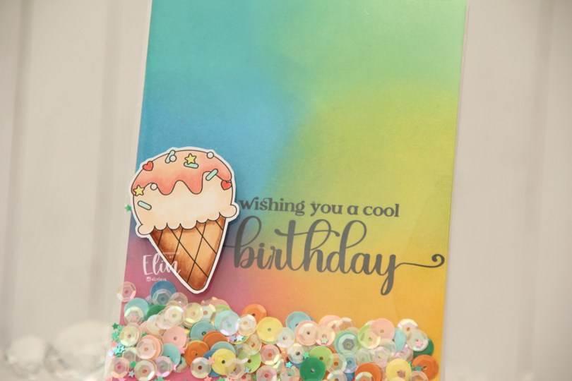
 Everyone loves ice cream, right? I colored up this one using my Copics, and fussy cut around it leaving a thin white border. The border makes it stand out against the colorful ink blended background.
 Speaking of backgrounds – I ink blended Distress Oxide Inks (Peacock Feathers, Cracked Pistachio, Twisted Citron, Fossilized Amber, Picked Raspberry and Salty Ocean) across a quarter sheet of Stamper’s Select White cardstock from Papertrey Ink. I heat set the panel to make sure it was dry, before running it through my printer to add the sentiment.
 The large stamp storage pockets from Avery Elle are 5 1/2″ wide, making them perfect for full A2 size shaker cards. I cut slivers off the panel to make it go in a little easier, then turned it on its side and put it at the bottom of the storage pocket. I cut the pocket down to about 5″, scored at the 4 1/4″ mark and folded it over. I actually cut the back of the storage pocket at the 4 1/4″ point to make it easier to fold. I cut the corners of the remaining flap, filled the pocket with sequins and confetti and glued the pocket shut on the back, before adhering it to a top fold card base I created from Stamper’s Select White cardstock from Papertrey Ink.
 I added the ice cream on top of the shaker pocket using foam tape, and that finishes the card. The sequins and confetti I used are a mix of different brands. The opaque ones are from Studio Calico, and I’ve probably had them for almost 10 years, the same with the iridescent cream colored sequins. Those are from UiT Hobby, and the little star confetti is from Søstrene Grene, they’ve also been in my stash for many years.
 Simple color palette for this one.
 I stamped and colored the surfboard eight times, and fussy cut them all right up against the stamped lines. I put them aside while I worked on the rest of my card.
 I used the Big Happy Birthday die from My Favorite Things to die cut into a 5×7″ piece of Soft Stone cardstock from Papertrey Ink. I put acetate behind it and added the counters of the letters back into place on top of the acetate, using the actual letters as placement guides, before doubling up on foam tape on the back of the cardstock for a deep shaker well.
 On a piece of X-Press It blending card, I stamped the palm trees from the
  I added seven of my surfboards to the bottom of my panel and adhered it all to a top fold card base I created from Stamper’s Select White cardstock from Papertrey Ink.
 I couldn’t fit all my surfboards on the front of the card, so I glued the last one to the inside next to a sentiment from the
  Lots of colors for this one.
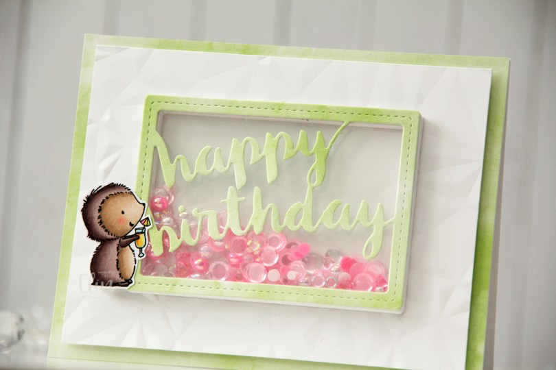
 I stamped Mimi using Extreme Black ink from My Favorite Things, colored her with Copics and stamped on top using Obsidian ink from Altenew, which is a super crisp pigment ink that doesn’t play well with alcohol markers, but is perfect for stamping at the end after the coloring’s done. I fussy cut her leaving a white trim, and put her to the side while I worked on the rest of the card.
 I chose one of the green papers in the Watercolor Wash 6×6″ paper pad from My Favorite Things to cover the front of a landscape oriented top fold A2 card base I created from Stamper’s Select White cardstock from Papertrey Ink. I cut down a white piece of cardstock and created texture using the Crystal Distortion embossing folder from Simon Says Stamp, before mounting the panel in the center of the card front using lots of foam tape.
 I then used the Stitched Happy Birthday Rectangle die from Memory Box to die cut once from the green patterned paper I’d already used and 10 or 11 times (I lost count) from white cardstock to create a shaker well. I cut the words out of the white frames, stacked them, added acetate to the back of my layered frame and adhered it in the center of the card. I then filled the shaker well with the Candy mix from Little Things from Lucy’s Cards. This mix has pearls, little flower shapes, sequins without holes, some hearts and raindrops. I topped it with another piece of acetate, then adhered the patterned paper die cut on top.
 By creating the well from so many layers of cardstock, my little embellishment mix has a lot of room to shake around. A few of the pieces in there are quite large, and I didn’t want any of them getting stuck.
 I added Mimi to the side of the frame. I put three layers of foam tape behind her for dimension, so she’d be level with the frame. This card has a lot of dimension, it’s almost 1/2″ at its thickest.
 Simple color palette for Mimi, she’s pretty quick to color.
 I decided to use the macaron from the stamp set. There’s actually a large and a small one in the set. I used the large one, and I stacked seven on top of one another, so I could add lots of different colors to them. It’s an odd rainbow, but I think it works, and I kept the coloring very simple. I fussy cut my stack of macarons, leaving a thin white border and put it aside while I worked on the rest of my card.
 I cut down a piece of patterned paper from the Ink Drops – Vivid paper pad from Craft Consortium. I chose this particular sheet because the colors I used for the macarons are well represented in the paper. I printed the sentiment directly onto the patterned paper and adhered it to a top fold card base I created from Stamper’s Select White cardstock from Papertrey Ink. I die cut the largest frame in the Classic Rectangle Frames die set from My Favorite Things 9 times from white cardstock. I stacked them and adhered them to the card front, before adding sequins and gems to the well. The sequin mix I used is the Vanilla Kiss mix from Little Things from Lucy’s Cards. I adhered a few around my sentiment to keep them from falling to the bottom, then sealed my shaker well with a piece of acetate from Simon Says Stamp. I added one final white die cut frame on top of the acetate for a clean look and also adhered the stack of macarons to finish the card.
 By creating thick walls for my well, the sequins, gems and pearls really have a lot of space to shake around. I made sure to place the large pearls and gems the right side up before I added the acetate, so they wouldn’t turn around on me. The smaller ones do, but as long as the big ones show their good side, I’m okay with that.
 Very sherbety color palette for this one. Three colors for each macaron.

 I colored the image with Copics, then used a craft knife to cut away the insides of the letters. I used a die from the Stitched borders die set from Lawn Fawn to create a defined edge on my colored panel and added a piece of acetate from Simon Says Stamp behind the letters. I’d made sure to keep the counters on the Rs intact when I did my cutting, so I could add them back in once the acetate was in place.
 I used Cornflower cardstock from My Favorite Things to create the shaker well. I doubled up on foam tape and put sequins and confetti from the Icicle Sequin mix from Hero Arts in the well, then adhered the window on top.
 I created a top fold A2 landscape card base using Cornflower cardstock once again. I stamped the Paint Splatter background stamp from My Favorite Things onto the card base using Fresh Snow hybrid ink from Papertrey Ink, and adhered my shaker panel on top. Easy peasy.
 By doubling up on the foam tape, the sequins and confetti have lots of room to shake.
 Super simple color palette for this one.