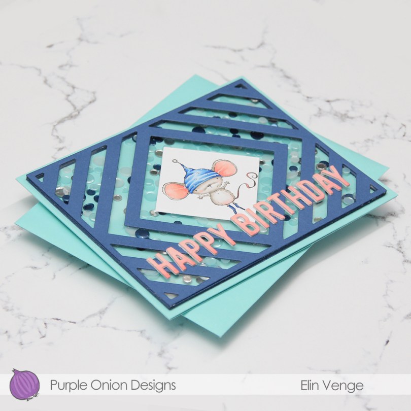
Hi, everyone! I’ve got another wintery birthday card to share today, featuring this adorable mouse Holly from Purple Onion Designs. Isn’t she the cutest? My favorite part is actually her socks, such a genius idea from Stacey to put socks on her feet. It’s all in the details.
 My sister’s birthday’s in a few weeks, and I thought this was the perfect card for her. She used to have the nickname “musa” (the mouse) when we were kids. Our cousin, a few months younger, was also quite a bit bigger, earning her the nickname “rotta” (the rat). Of the two, I think my sister got the better nickname.
This card was a bit of an evolution, and is not what I’d call my typical style After I’d colored the image, I had the idea to use this Framed Greetings Cover-Up die from My Favorite Things, but when it was time to actually create the card, I was out of ideas. I die cut the cover frame from Blueberry card stock from My Favorite Things, and was still stuck. Finding the Winter Days Confetti mix from Pretty Pink Posh in my stash led me to the shaker card idea, which, in turn, led me to the Summer Splash card base to match the confetti. An idea was born.
 I die cut the frame five more times, cutting away the interior pieces and stacking the frames to form the walls of my shaker. The frame is quite thin, so I didn’t trust myself enough with a ruler and a craft knife to create five identical frames. Die cutting seemed safer and quicker. I’ve kept all the pieces and am planning on using them in the future for a card or two.
Once everything was cut, I was stuck again. I was originally going to make this a portrait oriented card, they’re definitely my “go to”, but I struggled with finding a sentiment. I realized that if I rotated my card to be a landscape card, the “Happy birthday” letters from the Slimline Scallop Frame die set from Simon Says Stamp would fit the width of the card perfectly. I die cut two layers from white card stock, and one layer from X-Press It that I’d colored with the same colors I used for the ears of the mouse. The pink pops against the teal and blue in the background.
 There’s quite a bit of dimension in this. Card base, five layers of walls for the shaker, a piece of acetate, die cut cover frame on top, then three layers of letters. Dimension is life!
 Limited color palette with such a small image.

 I colored in the candles using a rainbow color palette. Using the largest die in the Slimline Scallop Frame die set from Simon Says Stamp, I die cut six frames from white card stock and glued them together in a stack to form the walls for my shaker card. Into the shaker, I put some micro beads, some flat, iridescent sequins and quite a few “diamonds” from Kort & Godt, before adding a piece of acetate to seal the shaker. I die cut one last scallop frame to put on top, this time from a super glittery silver card stock from Kort & Godt. It’s very sparkly, and the glitter doesn’t rub off, I love it. I die cut Happy birthday from the same cardstock and adhered the letters onto the acetate to finish the card.
 Lots of colors for this one. That happens with rainbows 🙂
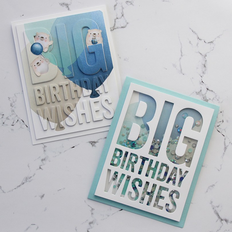
 I have a great crafty friend who suggested I
  Starting with the raised die cut inlay card, I did some serious ink blending. I love the look of ink blending, but I have a shoulder that protests every time I do it, meaning it doesn’t happen every day. I don’t have colored inks from MFT, so I used the brands I have and made it work. I used Hero Arts Wet Cement and Papertrey Ink Soft Stone inks for the gray balloon, Papertrey Ink Hawaiian Shores and Distress Ink Speckled Egg for the teal balloon, and Altenew Dark Night, Azurite, Ultramarine and Eastern Sky for the blue balloon.
 Once the panel was inked, I used the Big Birthday Wishes die to die cut the panel, making sure to keep all the little pieces for the stacked inlay technique. I die cut five more pieces from white card stock and stacked all the individual letters, putting the inked piece on top, giving me a total of six layers for each letter. I no line colored a few of the bears from the Bitty Bears stamp set to look like polar bears, and added them to the big letters at the top.
 For the second card I used the same color inks to ink blend the balloons, cut off the edges to make it a smaller panel and used the negative of a die cut for the shaker window. I built up the walls of the shaker using thin strips of white card stock. I’m not a fan of foam tape for shaker windows, I prefer to take the extra time and effort to build dimension with cardstock. It’s fiddly and time consuming, but I love it!
 I glued the negative die cut onto a piece of acetate, and filled the shaker with the Starry Sky Mix of jewels from Pretty Pink Posh before adding the piece of acetate and negative die cut on top, sealing in the jewels. The colors of the jewels are perfect for the color palette I was going for. I glued the finished shaker piece onto a top fold card base I made from Berrylicious card stock, and my card was finished.
 I had so much fun creating these two cards, but will admit that I struggled with which bears to use, I’d colored all but one bear from the stamp set. Indecisive is my middle name. So is procrastinator, perfectionist and a whole bunch of other descriptors.
 All the bears (except for the one that couldn’t fit on this panel) all colored up like polar bears. While the stamps were still in my Misti, I used a Memento Rich Cocoa dual marker on the eyes, noses and mouths and stamped them on top of the fadeout ink from Inkon3 I’d already used. This is a trick I like to use, and it saves me from having to draw eyes and mouths in after my coloring and risk ruining my images.

 I stamped, colored and diecut the bunny a couple of days ago, so he was ready to go. I wanted the background stamp from that same stamp set to be in the shaker, and also going across. The shaker portion was stamped using Extreme Black ink, then colored with Copics, while the parts on the outside were stamped and white heat embossed on vellum and colored on the back. You don’t want to ruin the tips of your Copics by touching the embossing, so the back’s a great option when using vellum, because it still shows through.
 I like my shakers done a certain way. I use a die slightly bigger than my shaker window to die cut several times from white cardstock. I stack my negative die cuts (for this card it was 7), glue them together and glue a thin strip of cardstock to the inside of my negative diecut stack. That way, none of the sequins or other bits in the shaker get stuck anywhere, but can shake freely in their little confined space.
 I used a sequin mix from Hero Arts for the inside of the shaker. It’s a mix of matte white sequins and clear sequins, as well as iridescent star confetti. I’m not usually a fan of iridescent elements on my cards, but for a night time Christmas shaker, I don’t mind.
 Not too many Copics used for this one! And the red one that says B97 should say R27, I must have undone the correct one before I saved my graphic in Photoshop.
 This is a small, but mighty one. It may look very unassuming as a 2-3/4″ square shaker card, but there’s a secret. It opens up to be quite big in the end. The shaker itself is filled with sequins, gems and a few die cuts in colored cardstock die cut using one of the dies in the Tag Builder Blueprint 5 set. I cut them down a little with my scissors and cut the ends off so they wouldn’t get tangled inside the shaker.
 The gorilla from the Picture Perfect Party Animals stamp set covers the entire front, but there’s a magnetic flap on the back, and once you undo that, more is revealed.
 Flip the gorilla over, and you’ve got more animals ready to join the party. I used the yellow polka dot pattern from the Party Patterns paper pad for even more fun and a way to get even more happy color into my card. These three panels are flaps that open to the sides (two to the right and one to the left) to reveal even more…
 The last three (technically four, since there are two parrots in that one selfie) animals are ready to party. They’re tucked inside pockets, and I’ve stamped a couple of the sentiments that come with the stamp set onto Razzle Berry heavyweight cardstock from MFT and heat embossed them. That pink really packs a punch. I die cut my sentiments using the largest of the Fishtail Flag Frames dies, and cut down another patterned paper from the Party Patterns paper pad to strips that included the yellow, green and pink colors that I have throughout my card. I also added some die cut streamers from the Tag Builder Blueprint 5 die set using Razzle Berry, Pineapple and Limelight cardstock, all from MFT.
 You can pull the selfies out of their pockets, and there’s room to write a personal message to the birthday boy or girl on the back of the selfies. The best thing about this card is that no specialty dies are required, this is all done with a paper trimmer, score board, bone folder, craft knife and a steel ruler. I prefer the craft knife and steel ruler over the paper trimmer, but that goes way back to my days of creating architectural models. Those knives are handy!
 There you have it, my entry for the Innovation Master category for MFT’s annual superstar contest.
 I try very hard not to have favorites, but I can’t help it.
  I used the largest of the Stitched Rectangles STAX dies from My Favorite Things to create the front of the shaker, then the oval dies from the Card Front Designs die set from Neat & Tangled to create the actual window and the frame around it. I doubled up on my foam tape, and used acetate from Hot off the Press to create my window. I used the Urban Chic mix from Little Things from Lucy’s Cards for my filling.
 This really shakes, those sequins have a lot of room to move freely. I stamped an InkyWings sentiment using Ocean Tides ink from Papertrey Ink (which matches the Ocean Tides cardstock SO well) on a scrap piece of X-Press It (I wanted the white to match the white in the image) and mounted it on 1mm foam squares onto the front of my card, and it was finished.
 Det er ingen tvil om at jeg liker å lage enkle kort, men mine enkle kort er ofte ikke så enkle som man skulle tro ved første øyekast. Dette er et sånt kort. Jeg startet med å stemple monstrene fra
  Jeg lagde bakgrunnen ved å maskere alle fire kantene, før jeg gikk inn med forskjellige farger Distress Ink med
  Mer pirkearbeid. Jeg stanset ut en
  Til slutt gjensto kun å lime fast monstrene med 3D-puter og å få på en hilsen. Jeg stemplet og embosset en
 Anyone who knows me knows that I’m terrible at sticking to schedules. Seriously awful. And every year I tell myself to get started on Christmas cards early and make them throughout the year to avoid being swamped come November. Every year I’m swamped in November because I fail to make them throughout the year. I’m off to a good start this year though, I’m starting with this
  I printed my bear onto X-Press It blending card (the best paper for Copic coloring) and colored it with Copics. Normally, I probably would have made his hat blue, but I wanted a dark blue background, so I needed a color that would pop against it. Anyone who knows me would also know that I’m not a fan of red for Christmas cards, but in 2019 I made quite a few Christmas cards with red in them anyway, and I guess I’m starting the new year with it, too. Not to worry, though, I’ll get back to my regular blue eventually, it IS the color of the year, after all.
 I diecut a front panel with faux stitching around the edges and a nice big window in the top center. I stamped a Norsk Stempelblad AS sentiment using Papertrey Ink Scarlet Jewel Ink, added acetate behind my window and glued it to the front of my card using two layers of craft foam to really make those sequins and other few elements inside the window shake!
 I love the dimension you get on such a simple card by doubling up the foam, it makes a big difference, and everything inside the window moves more freely.
 I’m a bit of a perfectionist, so I made sure all the sequins were turned the right way before I glued my shaker shut. I used a combination of two different mixes from Little Things from Lucy’s Cards. Most of the elements are from the
  Not a whole lot of colors on this image. I also used R52, which is a color I’ve made myself.
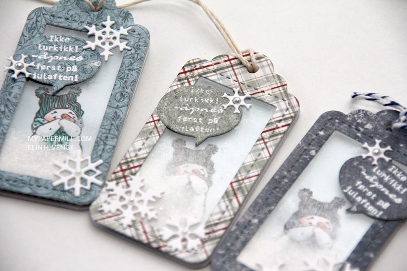
 I used a die set from Lawn Fawn for the tags and the speech bubbles, and found some scraps of patterned paper from Maja Design that I put to good use on these.
 I added distress glitter in the shaker area, giving the feel of snow. The sentiment reads “Don’t peek! To be opened on Christmas Eve!” The speech bubble was just big enough for it to fit. I added a few snowflakes diecut with a Marianne Design die before gluing a Kort & Godt pearl in the center of each.
 I’ve always loved this little snowman. I’ve always thought he looks kind of shy, but with the distress glitter working as snow in the shaker, it looks like he’s blowing hot air on his hands to try to stay warm – probably not the best thing for a snowman to do 😉
 Since they’re gift tags, they need To and From on the back. I’ve stamped a few different Norsk Stempelblad AS ones with different colored inks, each to sort of match the rest of the tag and the snowman on front.
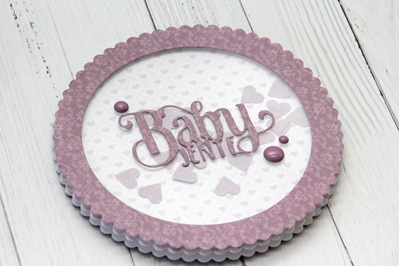
 Jeg har laget et rundt kort denne gangen, med en bølgekant rundt det hele. Jeg stanset ut kortbasen min dobbelt, så mønsterarket med hjertene i bakgrunnen, og også det som jeg har brukt til rammen på fronten. Jeg brukte en sirkeldie til å stanse ut hull fra det lilla mønsterarket.
 Jeg stanset ut ordet Babyjente i det samme mønsterarket som jeg brukte på rammen og fylte shakeren min med små, søte hjerter. Jeg pyntet veldig enkelt med noen lilla dotter.
 Innsidene har jeg gjort ganske enkle, med flere bølgekantsirkler og en liten tekst fra et utklippsark.
 Baksiden har jeg også gjort veldig enkel, med enda en bølgesirkel stanset ut fra utklippsarket, proppet opp på noen 3D-puter.