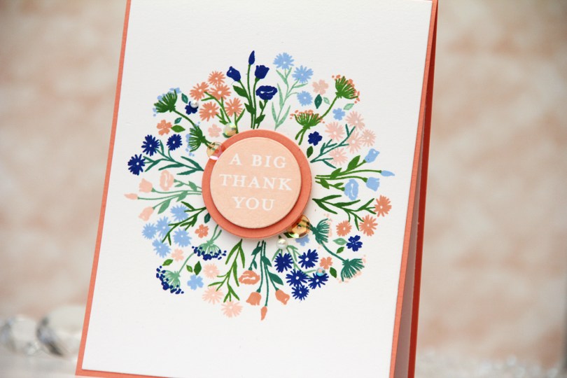
Hi, crafty friends! A few weeks ago, I spent a crafty session playing with the Bouquet turnabout stamp set from Concord & 9th. I tried a bunch of different color combos and turned a couple of my panels into cards. Today I’m sharing one of them.
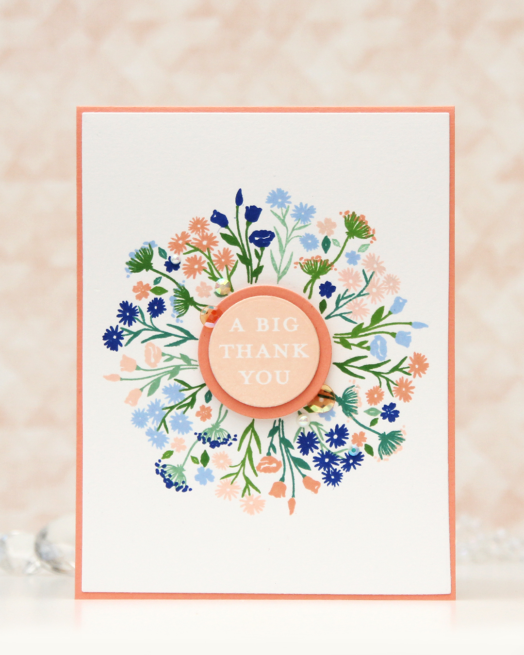 I’ve been made aware that this beautiful peach is my signature color. I kind of thought it would be blue, it’s my favorite color, after all, but I don’t make as many blue cards as I used to. Anyway, peach works with just about everything. It’s great with blue, it works really well with green and it’s also dynamite with pinks and yellows. It’s just a really good color. For this card I teamed it up with blue. More specifically, Capri and Bluebell from Concord & 9th, which were both in the new color release this spring. Capri is the most amazing color!!
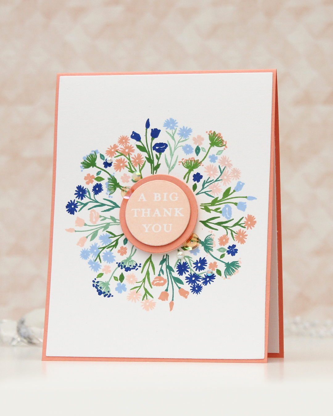
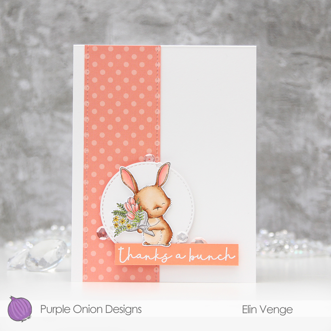
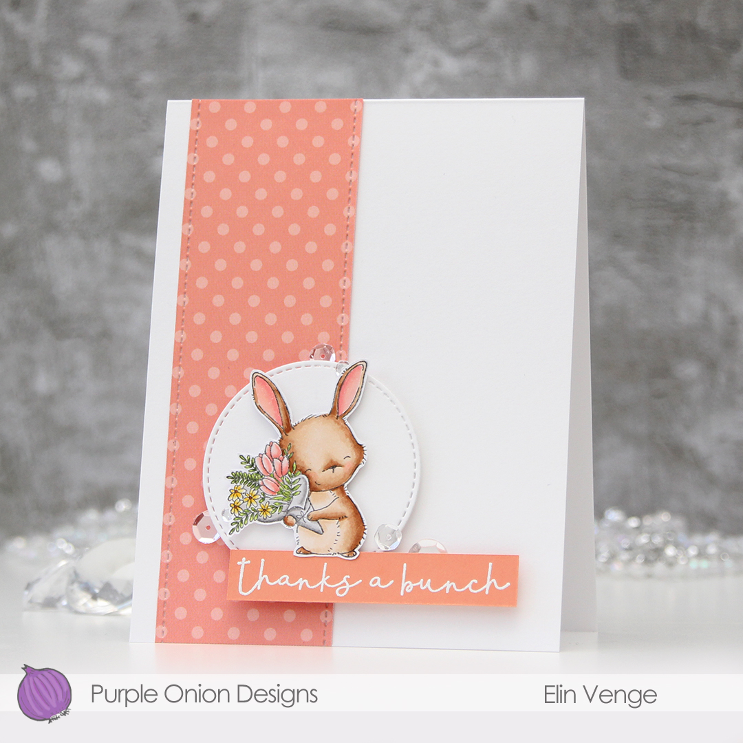
The Bouquet turnabout set is a little different, as the turnabout itself is actually two separate stamps. There’s one turnabout for the stems and the greenery, and there’s another for the actual flowers. I inked up the greenery with Eucalyptus, Juniper, Parsley and Basil, turning for each color. For the florals, I used Nectar, Grapefruit, Bluebell and Capri, all from Concord & 9th. You’d think it would be messy with eight colors together on one card, but it worked really well.
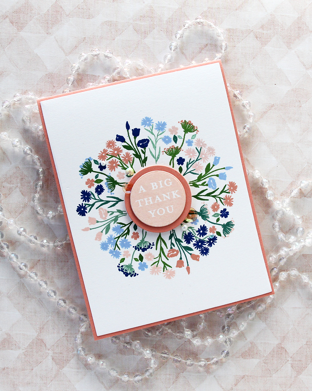 I cut my panel down using the largest die in the Additional A2 Layers die set from Waffle Flower and adhered it to an A2 card base I created from Grapefruit cardstock from Concord & 9th. I stamped one of the sentiments in the Bouquet turnabout stamp set using Nectar ink, die cut it with a circle die, then mounted it on a die cut circle from Grapefruit cardstock, which I then mounted in the center of the card.
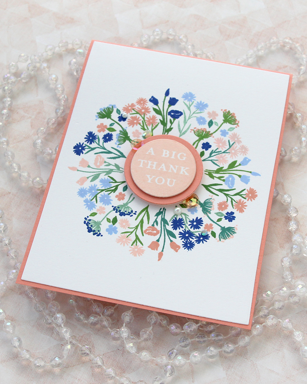 I finished off the card with a few pearls, gems and sequins from the Melon mix from Little Things from Lucy’s Cards.

 Enough housekeeping. I colored this cute panda and the bamboo in the background onto X-Press It blending card using Copics, before stamping a small sentiment from the Mini Messages stamp set from Mama Elephant using Obsidian ink from Altenew.
 I adhered my colored piece to a top fold white card base and used the Leafy Cover die from Mama Elephant to die cut a frame from Green Parakeet cardstock from Papertrey Ink. I strategically cut off a few leaves that did too good of a job of hiding my panda, before adhering the frame on top of the image.
 I added a black glaze pen to his eyes and nose, before going in with a Gelly Roll 05 once the black was dry. I love the extra shine and dimension it adds to the image, even if it doesn’t show up in the photos. What does show up, however, is the embellishment mix. This is the Spring Leaves mix from Little Things from Lucy’s Cards. I purposefully underexposed my photo as I was taking the picture to avoid blowing out the light areas during editing. It’s a trick I learned today from Mona Tóth (@mona.toth on Instagram), and it blows my mind that willingly making the photos look dark as you shoot makes them that much better in the end – but it totally works!
 I didn’t use too many Copics for this one.
 I used the panda peeking out from behind a fence or a wall or whatever you’d like it to be, as well as the bamboo. I used the bamboo multiple times to create a “wall” of bamboo behind my panda. I created mirrored versions so they wouldn’t all look the same, and I made sure to make them different heights. I erased the bottom of the bamboo so they’d end at the horizontal lines going out from the paws of the panda. Once I printed my image, I used a 0.35 Copic multiliner to extend the horizontal lines, making it look like a wall. I colored in my image, making sure to use a couple of green combos for the bamboo leaves for a little bit of variety.
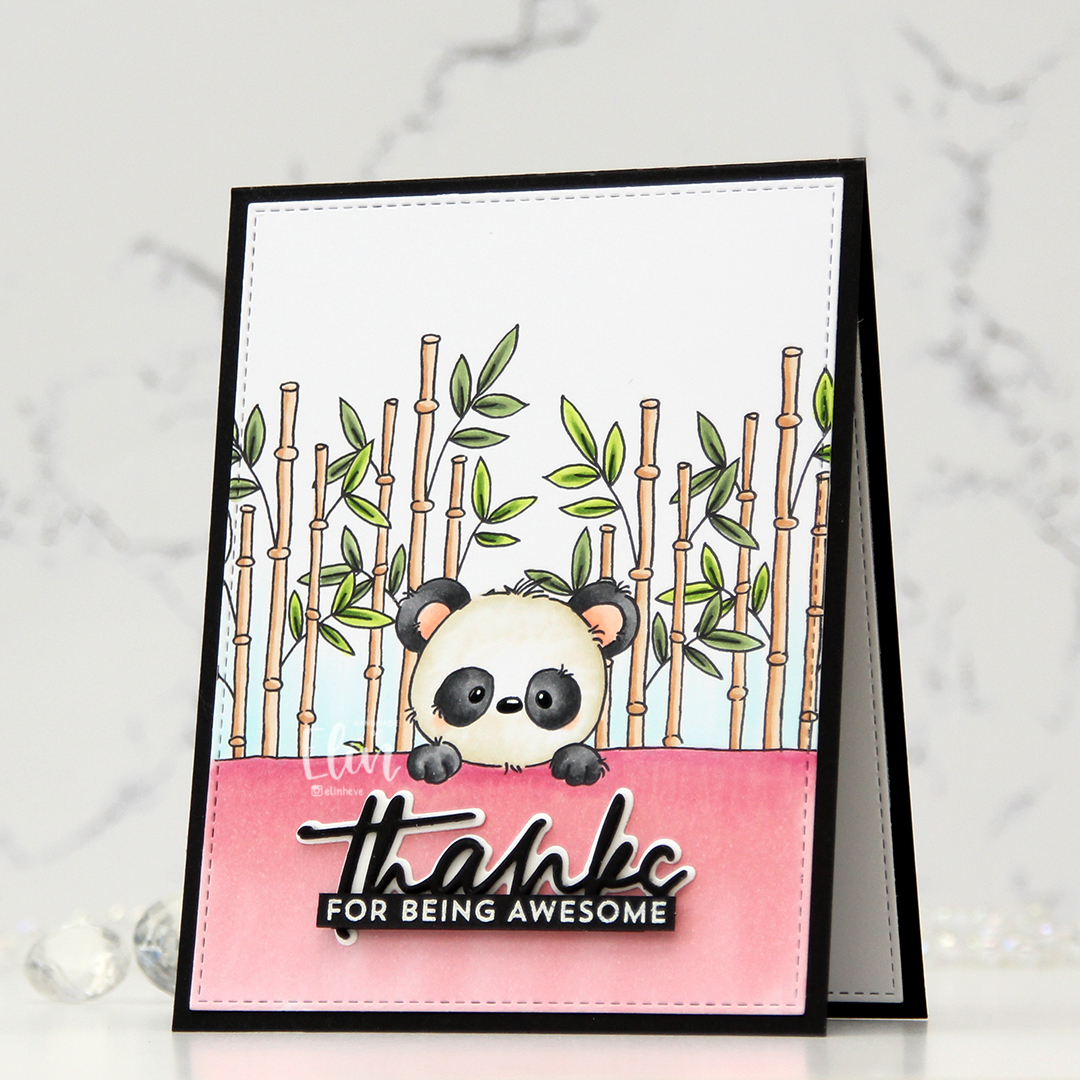 I used the largest die in the A2 Stitched Rectangle STAX Set 2 die set from My Favorite Things to create a nice faux stitch border around the edge, before adhering it to a black card base I created from True Black cardstock from Papertrey Ink. With my pink wall, I felt like I had to make a baby card, but I didn’t want to, so I opted for the black. I used the Sweet Sentiments die set from Altenew to die cut my thanks word. I stacked three black die cuts for dimension and die cut the shadow from Stamper’s Select White cardstock, also from Papertrey Ink. I rarely use shadow dies, but I knew I was going to white heat emboss the rest of the sentiment, so I figured it would work. I also tend to pop up my sentiments, but actually adhered this one flat down onto the card. It still has dimension because of the stacking. I stamped and white heat embossed a sentiment from the Bitty Thanks & Gratitude stamp set from My Favorite Things, cut it down to a strip and adhered it on top of my stacked die cut. I put an extra strip behind it for a little bit of strength. I also added a black glaze pen to the eyes and nose, before going in with a white Gelly Roll 05 on top once the black was dry. This adds some shine to my little panda. I decided not to add any embellishments to this card, which is really rare for me.
 I colored Tofu with Copics and fussy cut him leaving a thin white border. Onto my card base I stamped the Touch of Texture background stamp from My Favorite Things in VersaMark ink, sprinkled on Iridescent Sparkle embossing powder from JudiKins and heat embossed for a subtle texture on the white card base.
 I wanted an angled panel near the bottom of my card, so I stamped a sentiment from the Bitty Thanks & Gratitude stamp set from My Favorite Things, using Sour Apple ink on Sour Apple cardstock, both from My Favorite Things. I glued a piece of patterned paper below it and mounted it to my card base. I wish I remember where this patterned paper was from, but it came in a mystery box from Simon Says Stamp and there was no label on the packaging, so I don’t know. I put my little cat on foam tape and finished off with a few sequins from the Waterfall mix from Little Things from Lucy’s Cards.
 I’ve used this image a few times in the past, but I’ve never colored the penguins blue, which kind of blew my mind when I realized. I decided to remedy that and created soft blue penguins and a corally pink scarf. I cut my panel down to a square, die cut a heart in the center using a die from Papirdesign and mounted the negative onto a square card base I created from Berry Sorbet cardstock from Papertrey Ink.
 Onto my colored heart, I stamped a sentiment from the Mini Messages stamp set from Mama Elephant using Berry Sorbet ink from Papertrey Ink. I adhered the heart to the card front and added a few sequins from the Starry Night mix from Little Things from Lucy’s Cards to finish my card.
 Oh, and before I forget, I used a super simple color palette for this one.
 I stamped the wreath on a piece of Rustic Cream cardstock from Papertrey Ink, before coloring with pencils. Yes, you read that right, I broke out my Prismacolors and did pencil coloring. I don’t use my pencils very often. Copics are my “go to” coloring medium, but every now and then, I shake things up.
 I fussy cut around the finished piece, leaving a white border along the edge and cutting the open part at the top right as if my colored panel was a circle. I didn’t want to cut away the interior, and this seemed faster, easier and better. I created a 4 1/4″ square card base and used the Caleidoscope embossing folder from Simon Says Stamp to create a little bit of texture in the background, before mounting the wreath on foam tape.
 I stamped and white heat embossed a sentiment from the Mini Messages stamp set from Mama Elephant onto a piece of Cornflower cardstock from My Favorite Things, before using a nested circle die to turn it into a circle. I put a few foam squares behind it and adhered it to a part of the wreath where it wouldn’t cover up too many of the flowers.
 To finish the card, I added a generous amount of Papirdesign pearls for some shine.
 I colored the donut with my Copics and fussy cut it, leaving a thin white border around the edge. I printed a panel of several donuts in light gray for a bit of added interest in the background, popped up my panel onto a card base I created from Rustic Cream cardstock from Papertrey Ink, while I worked on the rest of the card.
 Using the Parker alphabet die set from Memory Box, I die cut the letters to spell sweet from Grapesicle cardstock from My Favorite Things. I stacked six of each for a dimensional look.
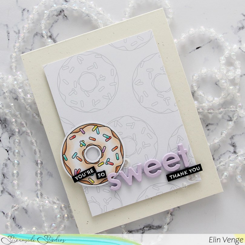 I stamped and white heat embossed partial sentiments from the Itty Bitty Basics and Itty Bitty Gifting stamp sets from My Favorite Things to complete my sentiment, adhered it all to the card and finished with a few sequins from the White Orchid Sequin mix from Little Things From Lucy’s Cards.
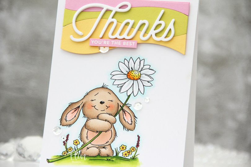
 I used the
  Once my coloring was done, I adhered it to a top fold A2 card base I created from white cardstock. Using the Snow Drifts Cover-Up die from My Favorite Things, I die cut three wavy pieces from solid colors Of cardstock to go towards the top of my card. I used Limeade Ice, Lovely Lady and Harvest Gold, all from Papertrey Ink. I butted them right up against each other, added them to a backer so I could handle one piece instead of three and mounted them on foam tape. I then die cut the Thanks from the Twice the Thanks die set from My Favorite Things four times from white cardstock from PTI. I love the cardstock from Papertrey Ink, it’s my favorite!! Onto a strip of Lovely Lady cardstock, I white heat embossed a sub sentiment from the Itty Bitty Basics stamp set from My Favorite Things and mounted it below my stacked Thanks die cut. To finish I added a few Sparkling Clear Sequins from Pretty Pink Posh.
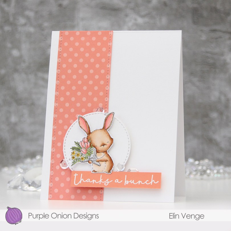


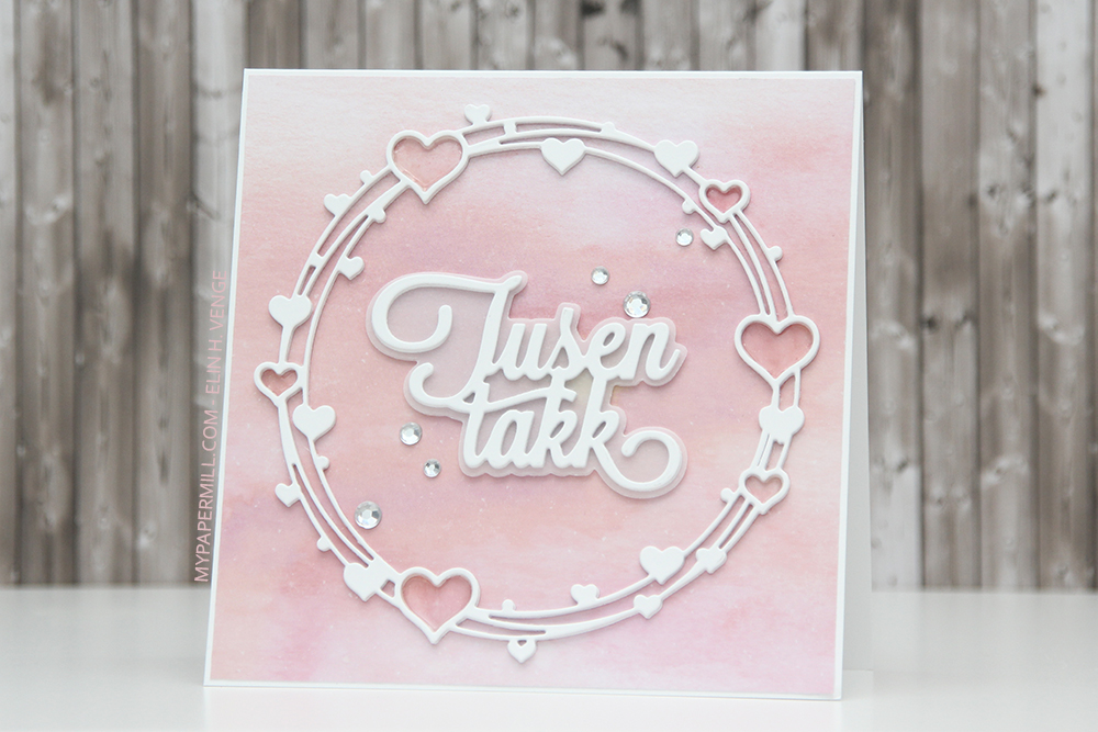 Et av mine “varemerker” er kort som ser enkle ut, men som likevel tar en del tid å lage, så jeg tenkte det var på sin plass å avslutte med et sånt et. Et mønsterark, to dies (tre hvis man regner skyggen bak tusen takk) og noen krystaller.
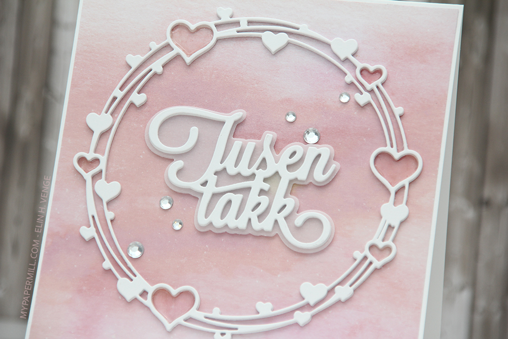 Jeg startet med å stanse ut hjertesirkelen i hvit kartong fire ganger, og limte alle lagene oppå hverandre. Jeg gjorde det samme med tusen takk, men limte kun tre oppå hverandre, så vellumen under, og to nye lag med tusen takk under der igjen. Da kommer alt litt lengre opp fra mønsterarket bak og synes bedre enn om det var limt rett på.
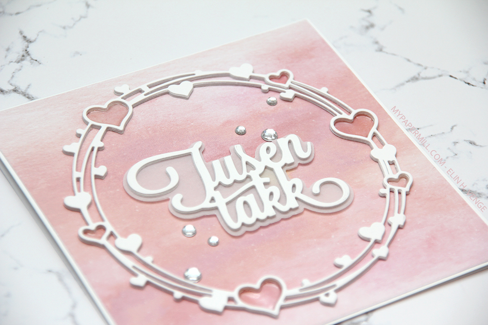 I de åpne hjertene på rammen la jeg først et lag Wink of Stella glitterpensel, så et lag med Glossy Accents over. Glitter er vanskelig å få frem på bilder (spesielt når bildene er tatt sent på kvelden, som er tilfellet med disse, men i virkeligheten glitrer hjertene akkurat passe mye. Til slutt pyntet jeg med krystaller på en diagonal inni hjertesirkelen.