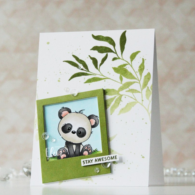
Hi, crafty friends. I’m back today with a card featuring one of the cute pandas from Lili of the Valley. I really love these guys!
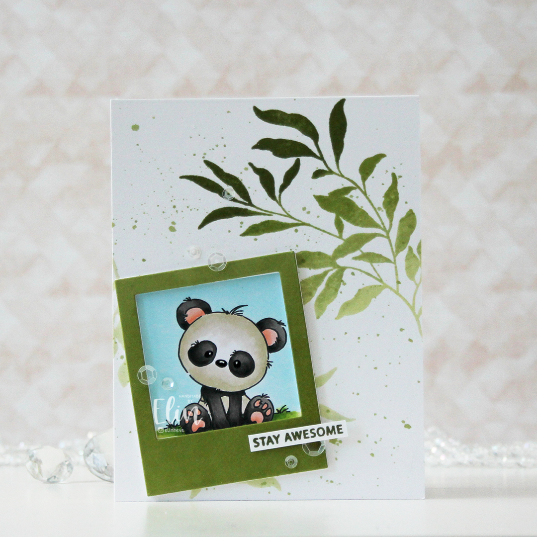 I printed my panda onto X-Press It blending card, colored him with Copics and used a black glaze pen, then a white Gelly Roll 05 to create shine and a little bit of dimension in his eyes and nose. I then used the Polaroid Shaker Frame die from My Favorite Things to create the perfect spot for him by die cutting a few layers from white cardstock and one layer from cardstock that I colored green with one of the inks in the Jade Greens family of fresh dye inks from Altenew.
 Using the Leaf Clusters stamp set from Altenew, I stamped one of the leaf clusters onto my white card base with various greens to create an ombre look. I used Pistachio, Misty Sage, Mossy Meadow and Green Opal inks, all from that same Jade Greens family of Fresh dye inks. I actually stamped it twice, but the polaroid covers most of the one I stamped in the bottom left corner. I also used the inks to create a little ink splatter on the background.
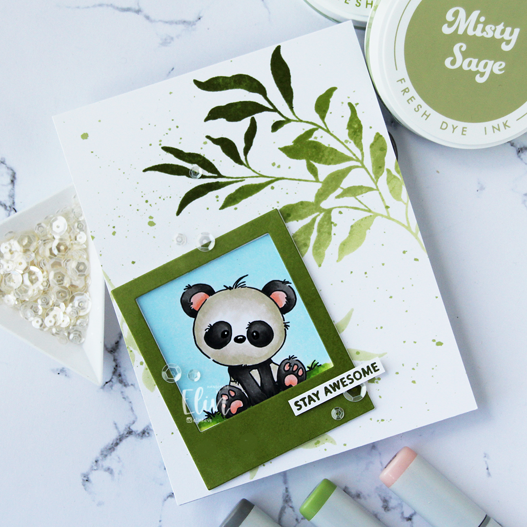 I stamped a sentiment from the Leaf Clusters stamp set in Green Opal ink, cut it down to a strip and added a couple of strips behind it for strength and dimension, before finishing off the card with a visual triangle of sequins from the White Orchid Sequin mix from Little Things from Lucy’s Cards.
 It’s no secret that I love dimension on my cards, and my three layer sentiment on top of the four layer polaroid frame add enough weight for this to require extra postage, but that’s true of most of my cards.
 These pandas tend to make for some pretty simple color combos.

 I colored the image with my Copics, before using the Notebook Edge die from My Favorite Things to create a fun border at the bottom. I used a black glaze pen to add shine and dimension to their eyes, then went in with a Gelly Roll 05 once the black was dry. I fussy cut around the image, and the stems of the sunflowers actually dictated the width of this card, which only measures about 3 1/4 x 4 3/4″. If you include the flowers hanging off the edge, it’s a little wider than 4 1/4″, so I might need to put it in a larger envelope.
 I used the Raised Sentiments 3D embossing folder from Altenew on a piece of Harbor cardstock from Concord & 9th to create a little interest in the background, cut it down and adhered it to a top fold white card base. I mounted my colored piece on top using foam tape, I’m a big fan of dimension on cards.
 I die cut one of the dies from the Blooming Delight die set from Altenew from True Black cardstock from Papertrey Ink. I cut five, put two together, and stacked the remaining three, so I had two somewhat dimensional die cuts. I die cut the shadow layer from Heavyweight Translucent Vellum from My Favorite Things, adhered the stack with 3 behind it and the stack with the 2 on top. This creates a nice shadow around the shadow die without the use of foam tape.
 I white heat embossed a sentiment from the Pristine Peonies stamp set from Altenew, cut it down to a strip, added a few more strips behind it for dimension and adhered it below my die cut to complete the sentiment (the stamp actually says
  Fairly soft color palette for this one.
 I stamped Mulligan and Bogey using Extreme Black ink from My Favorite Things, before covering them with masks and stamping the
  When I color large scenes like this, I always start with the background. I colored the sky first, then the green. There’s a lot of green in this one, and even thought I used different green combos for different elements and tried a new combo for the majority of the green, most of it blends together in the end and looks pretty much like the same color.
 On Bogey, I repeated the colors I used for the clouds on her outfit. Repeating colors creates a more cohesive design, and the end result isn’t rainbow vomit, which can easily happen if you don’t restrain yourself from using every color under the sun. I even used the pinks on a few details in Mulligan’s outfit, and colored the rest of his outfit blue. I chose a dark blue combo for his pants and hat, and used the lightest color in that combination as the darkest color for the lighter blue on his sweater and shoes. This way, the color isn’t the same across his entire outfit, but I’m not introducing a new color. It’s a great way to avoid rainbow vomit.
 To finish off the card, I stamped a sentiment from
  See? Not a whole lot of colors, given this is a full A2 size panel that’s all covered with color.
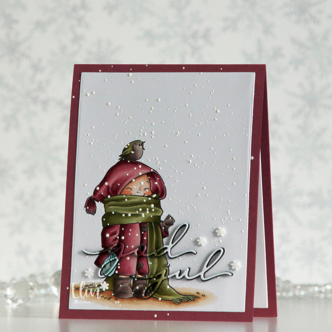 I printed the image on a piece of X-Press It blending card, colored it with my Copics and used a die in the Additional A2 Layers die set from Waffle Flower to trim the rectangle down a bit. You could also use a trimmer for this. Into the panel, I die cut the words god jul using dies from Kort & Godt. The two words are actually from separate die sets, but work perfectly together like this.
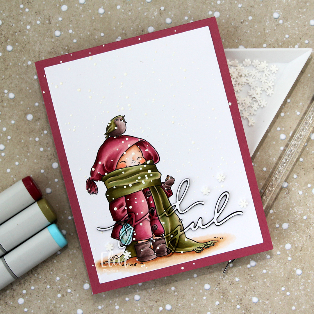 I adhered my panel to a top fold card base I created from Autumn Rose cardstock from Papertrey Ink, paper pieced the counters back into place, sprinkled on Chunky White embossing enamel from Stampendous and heated the granules from the back. I should have done this before adhering my panel to the card base to spend less time with the heat gun (melting the powder through two layers of cardstock takes significantly longer than doing it through just the one layer), but I honestly forgot about it. It does work through two layers, it’s just a matter of patience.
 Once my snow was in place, I die cut four layers of each of the words from black cardstock. I stacked them, added the colored one on top and puzzle pieced them in where they belonged, before adding a few Snowdrift sprinkles from Little Things from Lucy’s Cards to finish the card.
 Pink and dirty green. This is about as close as I (willingly) get to using red and green together on a card.
 Enough housekeeping. I colored this cute panda and the bamboo in the background onto X-Press It blending card using Copics, before stamping a small sentiment from the Mini Messages stamp set from Mama Elephant using Obsidian ink from Altenew.
 I adhered my colored piece to a top fold white card base and used the Leafy Cover die from Mama Elephant to die cut a frame from Green Parakeet cardstock from Papertrey Ink. I strategically cut off a few leaves that did too good of a job of hiding my panda, before adhering the frame on top of the image.
 I added a black glaze pen to his eyes and nose, before going in with a Gelly Roll 05 once the black was dry. I love the extra shine and dimension it adds to the image, even if it doesn’t show up in the photos. What does show up, however, is the embellishment mix. This is the Spring Leaves mix from Little Things from Lucy’s Cards. I purposefully underexposed my photo as I was taking the picture to avoid blowing out the light areas during editing. It’s a trick I learned today from Mona Tóth (@mona.toth on Instagram), and it blows my mind that willingly making the photos look dark as you shoot makes them that much better in the end – but it totally works!
 I didn’t use too many Copics for this one.
 I printed my image on X-Press It blending card and colored it with Copics. I chose a soft blue green for the balloon itself, and vibrant colors for the florals to make them pop. Using the largest die in the Blueprints 27 die set from My Favorite Things, I turned my image into a panel with a nice scalloped border with faux stitching, put lots of foam tape on the back and mounted it to a card base I covered with a quarter sheet of Wildberry cardstock from Concord & 9th.
 I die cut hello from the Blooming Delight die set from Altenew four times from white cardstock and once from Wildberry cardstock, stacked all the layers together and adhered my sentiment, before finishing with a few opal gems from Spellbinders.
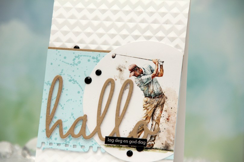
 I die cut my golfer using a basic circle die and decided to use the colors in the image for the elements of my card. This is always a good idea if you want a cohesive design. I die cut a torn paper edge from Powder cardstock from Concord & 9th, before stamping a small background stamp repeatedly across the panel using Powder ink. The image has spatters on it, and I figured this would mimic that. The tone on tone stamping creates a little bit of interest to the blue cardstock without being too distracting. I adhered a strip of Wheat cardstock, also from C9, to the top of the blue panel to give it a more defined edge against the white card base, before adding a couple of layers of cardstock behind it for dimension. I adhered it to a top fold card base I dry embossed using the Angled Mosaic embossing folder from Altenew. This creates a bit of textures and adds interest without distracting.
 I glued my circle onto the blue cardstock, lopped off the excess and adhered a stacked die cut word on top. I die cut three layers from white cardstock and one from Wheat cardstock. To finish off the card, I added a black sentiment sticker strip and a few black crystals in different sizes.
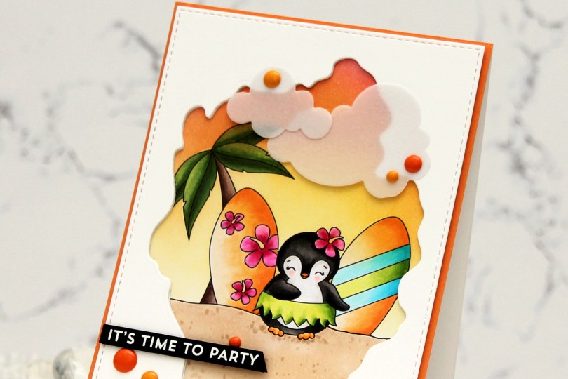
 I created my little scene with the palm tree, a couple of surfboards and a penguin. I can never resist a penguin, and this one has a hula skirt – I was sold! I colored my scene with Copics, and the plan I had initially went out the window. I was going to color the base of the surfboards in a light yellow, almost white, but then I came up with this soft orange combo and totally changed everything else to fit. Instead of a soft blue sky, I ink blended a sunset using Honeysuckle, Clementine and Buttercup inks from Concord and 9th. I then used the largest die in the A2 Stitched Rectangle STAX 1 set from My Favorite Things, along with the Watercolor Wash Free Form die, also from MFT, to create a rectangular panel with a fun window. I die cut a couple more to stack behind the front panel to create a little bit of dimension, before adhering it all to my colored image.
 I adhered a quarter sheet of Clementine cardstock from Concord & 9th directly to a top fold card base and glued my scene in the center. This created a bit of an orange border around the image. I then die cut Cloud 1 & 2 from Papertrey Ink out of Heavyweight Translucent vellum from My Favorite Things. I love die cut vellum clouds. This vellum is super thick, so the glue I put behind it doesn’t even show through, but I still placed enamel dots strategically on top. Old habit, I guess. These enamel dots are actually from a Halloween pack from Papirdesign. Onto a piece of True Black cardstock from Papertrey Ink, I stamped and white heat embossed a sentiment from the Bitty Birthday Wishes stamp set from My Favorite Things. I cut it down to a strip, added a couple of extra layers of cardstock behind it and adhered it to my card.
 I used quite a few Copics for this one.
 I colored the image with my Copics before cutting out a couple of quick masks for the deer and bunny. I ink blended a soft blue circle behind them, using the Watercolor Circle stencil from My Favorite Things and ink (Harbor ink from Concord and 9th) that was left on my light blue blender brush from my last project. Using a die in the Additional A2 Layers die set from Waffle Flower, I cut my panel down, added four layers of cardstock behind it for dimension and put it aside while I worked on the rest of my card.
 To a top fold white card base, I adhered a piece of patterned paper from the Watercolor Wash 6×6 paper pad from My Favorite Things and added my stacked panel in the center. Using a die from the Sweet Sentiments die set from Altenew, I die cut for you twice from white cardstock and once from the patterned paper. I stacked the die cuts and glued my sentiment right above the deer. The green patterned paper is very soft, but by stacking the die cuts, the sentiment still stands out a little. I added a bit of black Glaze pen to the eyes and finished off the card with pearls from the Fresh Mint mix from Little Things from Lucy’s Cards.
 I colored up my image with Copics, before stamping on top of the black lines with Obsidian ink from Altenew to darken up the lines even further. I fussy cut the image, leaving a bit of white trim around the edges, then put it aside while I worked on the rest of my card. Using the Snow Drifts Cover-Up die from My Favorite Things, I die cut three segments of the die from three shades of blue cardstock (Cornflower, Lazy Day and Blue Breeze, all from My Favorite Things). Even though it’s a snow die, it totally works for waves, I think. I inked up the top of each die cut using matching inks (Cornflower and Lazy Day from MFT for the darkest and middle color cardstock, Harbor ink from Concord & 9th for the lightest). I added ink splatter to all three using Cornflower ink and also Concord & 9th White. I adhered them to a scrap of cardstock to make them work as one die cut instead of three separate ones.
 I used the Ray of Light stencil from My Favorite Things to ink blend yellow ink onto a piece of Stamper’s Select White cardstock from Papertrey Ink. I used Harvest Gold ink from Papertrey Ink, and added a little bit of Sunshine ink from Simon Says Stamp near the top for a little more intensity. I then used what I had left on my ink blending brush to cover the entire thing, I didn’t want the background to be stark white, and this worked beautifully. I added ink splatter once again using the Sunshins ink, cut the panel down and stamped a sentiment from the