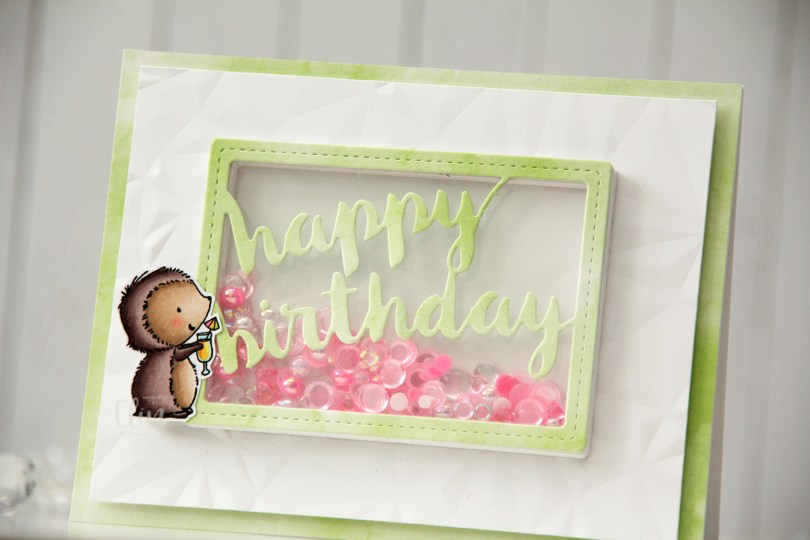
Hi, crafty friends. I’m back with a super simple card, featuring Mimi from Purple Onion Designs. She was part of this year’s spring release, and she’s just adorable with the umbrella drink in her hand.
 I stamped Mimi using Extreme Black ink from My Favorite Things, colored her with Copics and stamped on top using Obsidian ink from Altenew, which is a super crisp pigment ink that doesn’t play well with alcohol markers, but is perfect for stamping at the end after the coloring’s done. I fussy cut her leaving a white trim, and put her to the side while I worked on the rest of the card.
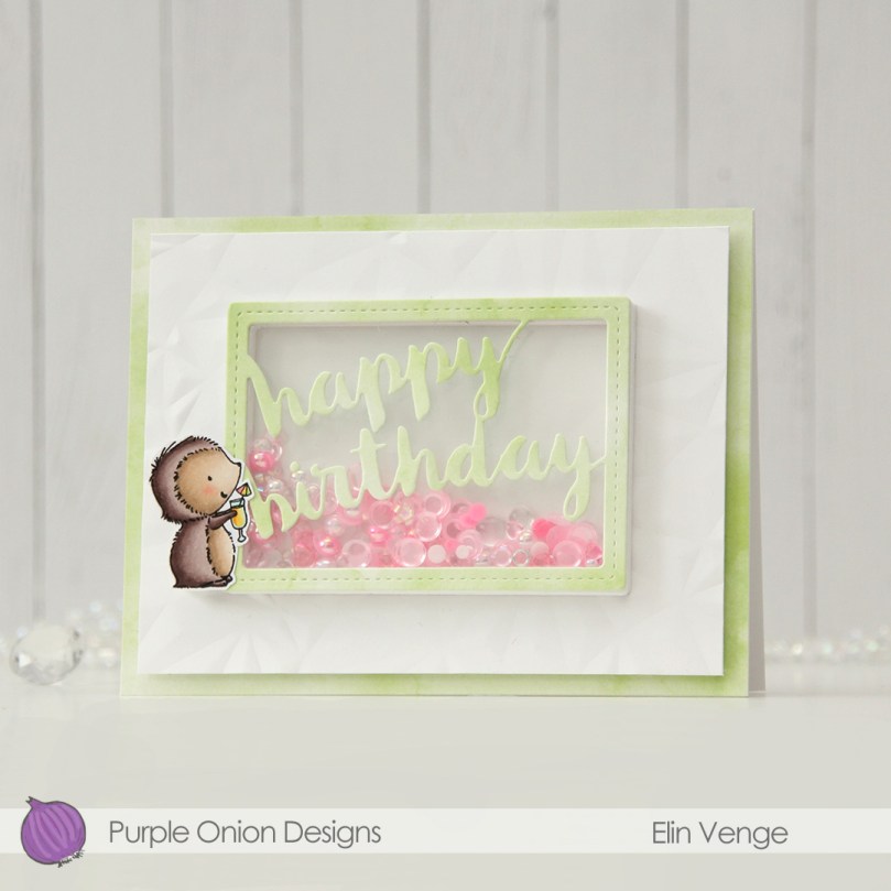 I chose one of the green papers in the Watercolor Wash 6×6″ paper pad from My Favorite Things to cover the front of a landscape oriented top fold A2 card base I created from Stamper’s Select White cardstock from Papertrey Ink. I cut down a white piece of cardstock and created texture using the Crystal Distortion embossing folder from Simon Says Stamp, before mounting the panel in the center of the card front using lots of foam tape.
 I then used the Stitched Happy Birthday Rectangle die from Memory Box to die cut once from the green patterned paper I’d already used and 10 or 11 times (I lost count) from white cardstock to create a shaker well. I cut the words out of the white frames, stacked them, added acetate to the back of my layered frame and adhered it in the center of the card. I then filled the shaker well with the Candy mix from Little Things from Lucy’s Cards. This mix has pearls, little flower shapes, sequins without holes, some hearts and raindrops. I topped it with another piece of acetate, then adhered the patterned paper die cut on top.
 By creating the well from so many layers of cardstock, my little embellishment mix has a lot of room to shake around. A few of the pieces in there are quite large, and I didn’t want any of them getting stuck.
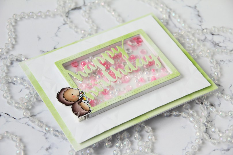 I added Mimi to the side of the frame. I put three layers of foam tape behind her for dimension, so she’d be level with the frame. This card has a lot of dimension, it’s almost 1/2″ at its thickest.
 Simple color palette for Mimi, she’s pretty quick to color.
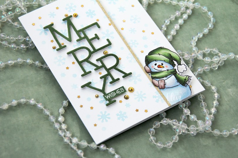
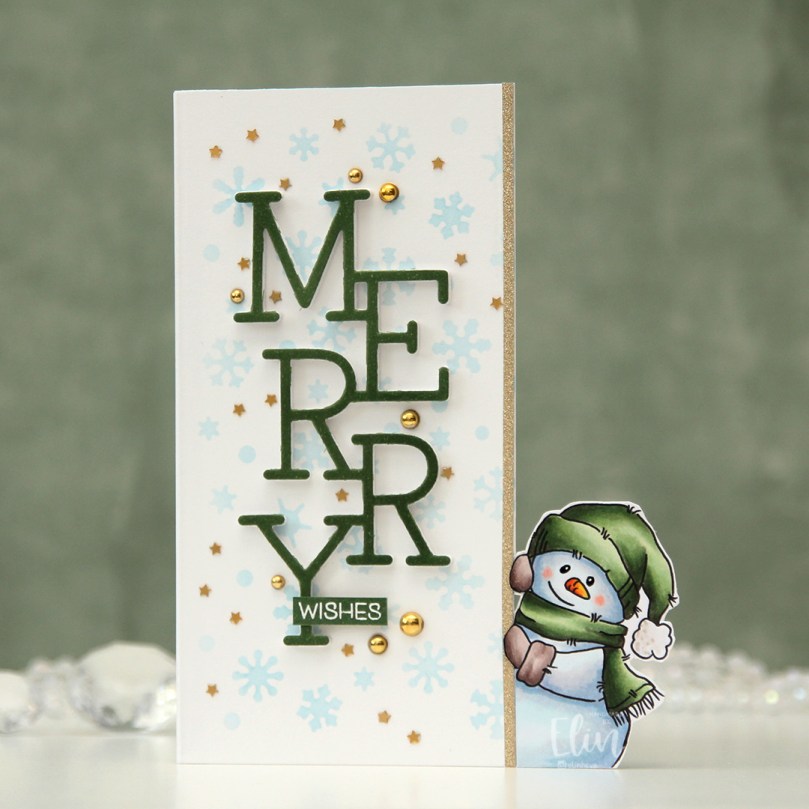
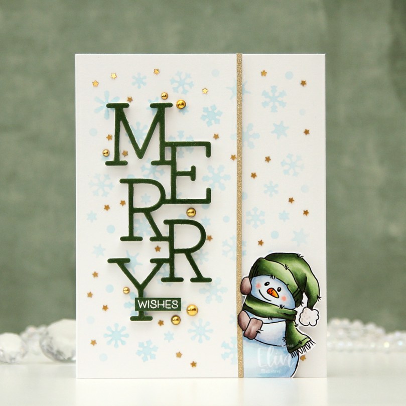 This is the card closed. I created this by gluing 2 side fold A2 card bases together; the half with the snowman with the fold on the left and the other one with the fold on the right.
 I used the Snowflake Confetti fancy die from Hero Arts to die cut from Gina K Masking Magic to create a stencil to ink blend through. I used Iceberg ink from Altenew to create subtle blue snowflakes in the background on the front of the card to the left of the snowman and also on the other flap.
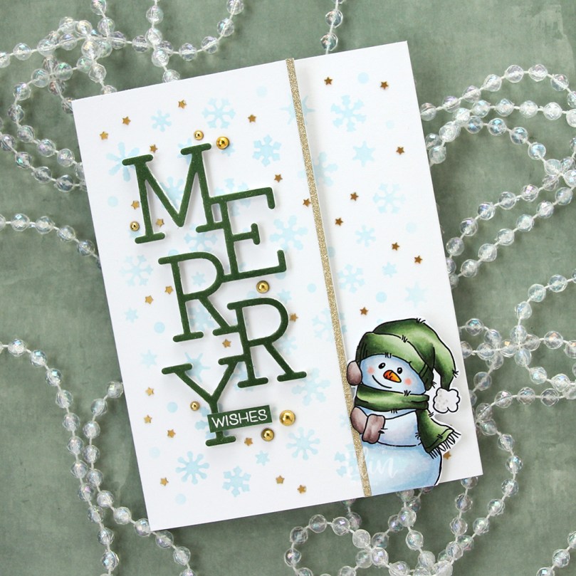 I adhered an 1/8″ gold glitter cardstock strip from Kort & Godt for the snowman to hold on to for a defining edge and used the Stacked Merry die from My Favorite Things to die cut 6 times for a stacked look. 5 layers from white cardstock, the top layer from a piece of X-Press It blending card that I colored to match the green on the snowman. I stacked the six layers and adhered them in the center of the left front panel, stamped and white heat embossed a sub sentiment from the
 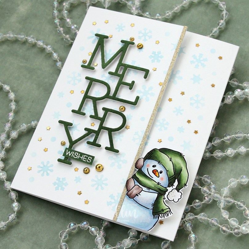 I embellished with a combination of gold pearls around the sentiment and tiny confetti stars all across the background. Both are from the Vanilla Kiss mix from Little Things from Lucy’s Cards. I also added a bit of black glaze pen to the eyes of the snowman. It adds a tiny bit of dimension and some shine. Once dry, I went over with a dot of white, using a Gelly Roll 05.
 On the inside flap, behind the snowman, I stamped another sentiment from the Christmas Greetings stamp set from Lili of the Valley, this time using Jalapeño Popper ink from My Favorite Things.
 Simple color palette for this one. Lots of colors for the snow, though, I can’t seem to help it.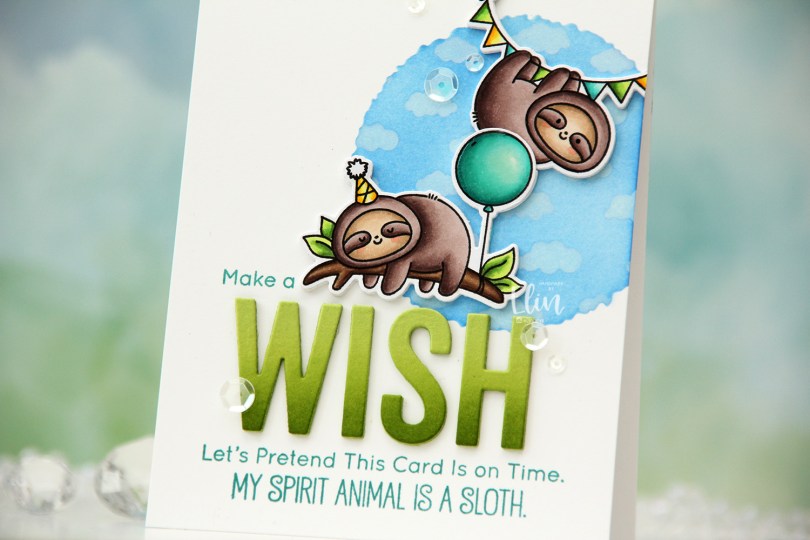
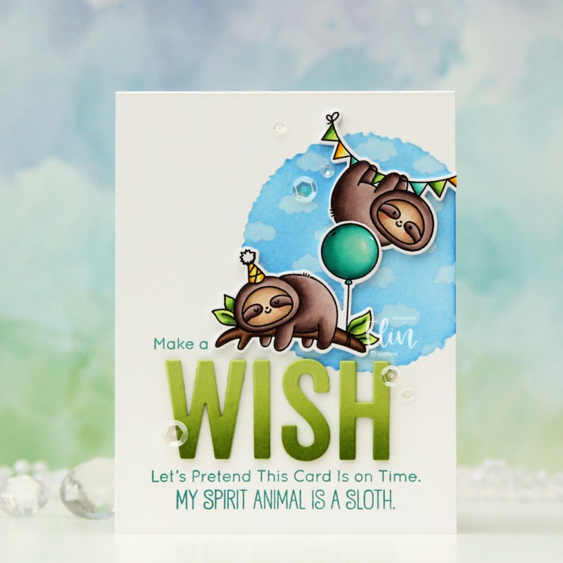 I colored up these two sloths from the Hang Out and Celebrate stamp set. I stamped using Extreme Black ink from My Favorite Things, which is a hybrid ink safe to use with alcohol markers. I colored the sloths with Copics, then re-stamped over the black lines, this time using Obsidian ink from Altenew. This is a pigment ink that is super crisp, but it’s not compatible with Copics, so I need to stamp with an alcohol friendly ink first, do my coloring, then stamp on top with the pigment ink. Once the ink was dry I used the coordinating dies to cut out these cute sloths.
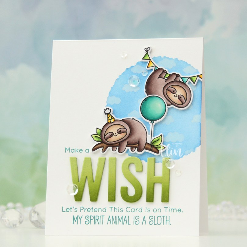 I created an A2 top fold card base from Stamper’s Select White cardstock from Papertrey Ink and decided to do a little ink blending near the top right. Using the Watercolor Circle stencil from My Favorite Things (which was also new in the July release), I ink blended Eastern Sky and Iceberg inks from Altenew to create a soft sky. I eventually realized it needed to be darker for my clouds to show up over top, so I also went in with Ultramarine, which is one shade darker than Eastern Sky. These three blues are all in the same color family from Altenew.
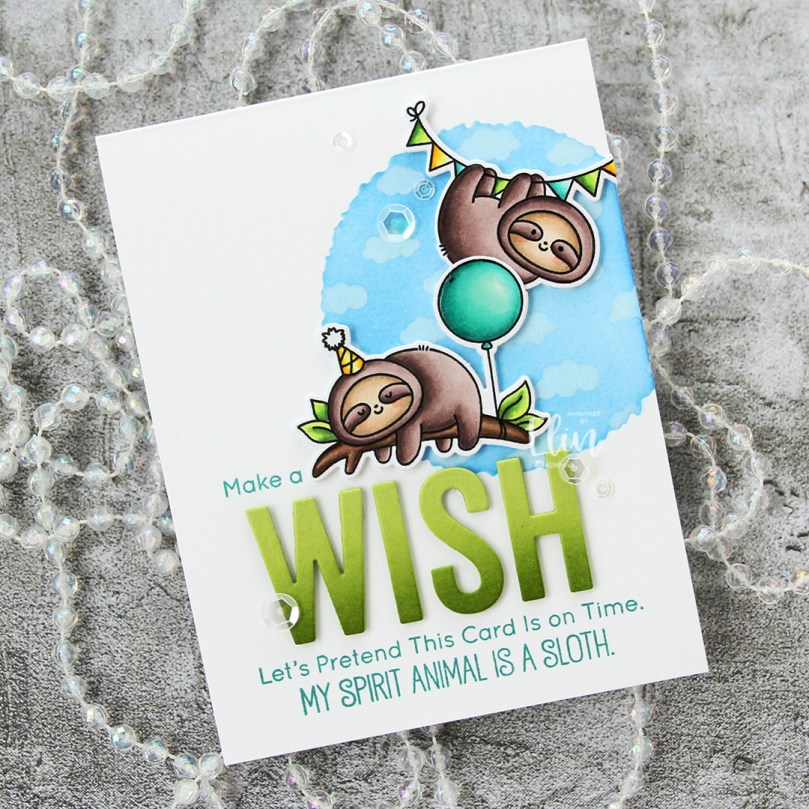 With the circle mask still in place, I added the Tiny Clouds stencil from My Favorite Things on top, and used Fresh Snow hybrid ink from Papertrey Ink to create soft clouds on top of the blue I’d already ink blended.
 At the bottom center of the card, I stamped a sentiment from the stamp set with the sloths, this time using Caribbean Sea ink from My Favorite Things. I also stamped “Make a” from the older Birthday Chicks stamp set and adhered die cut letters between my stamping to complete the sentiment. I die cut the word with from the Wish Big Today die that also came out in the July release from My Favorite Things (it was such a good release). I used Sour Apple cardstock, and at the base of the letters I ink blended using Sour Apple ink, and a little bit of Jalapeño Popper ink for extra oomph. I put three additional die cuts behind each letter and adhered them to my card.
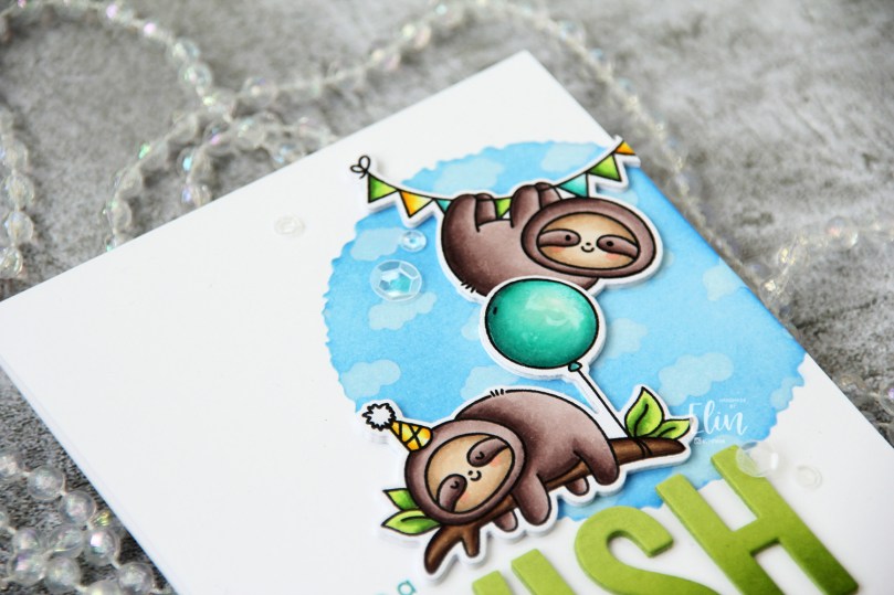 Time for the sloths. I die cut three additional layers of cardstock to go behind each of my die cut sloths, and glued them directly to the card base. I cut off a portion of the balloon on the back layers, so I could overlap the colored one with the other sloth. I added a dot of black glaze pen to the eyes of the sloth that’s awake, and Glossy Accents to the balloon for a bit of shine.
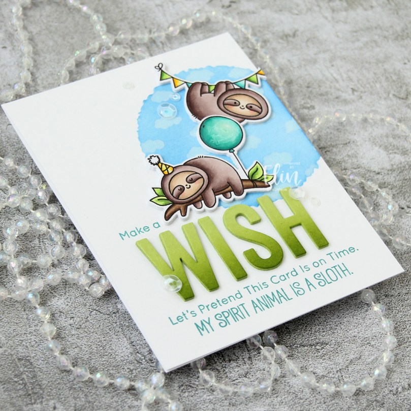 To finish off the card I used some sequins from the Waterfall mix from Little Things from Lucy’s Cards. I packed a lot into this card, and the sentiment wound up taking much more space than I’d sketched out in advance, but I still like it. This is the part where I usually show a graphic of the Copics I used, but I simply can’t locate the post-It I used to write them down.
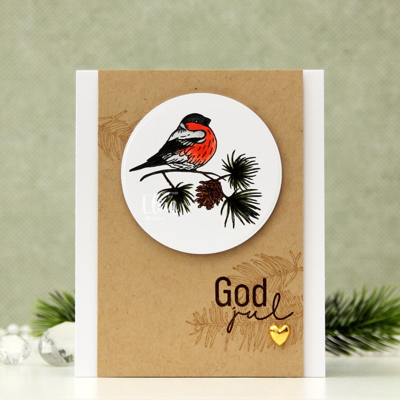 I started by stamping this bird on a piece of X-Press It blending card using Extreme Black ink from My Favorite Things. I colored the bird to look like a bullfinch using my Copics. In this little corner of the world, no bird says Christmas like a bullfinch. Once I finished my coloring, I stamped on top of my initial stamping, this time using Obsidian ink from Altenew to get really crisp lines. I love how crisp this ink is. It’s not compatible with Copics, so I need to stamp after my coloring’s complete, but that’s not a problem with a stamp positioning tool.
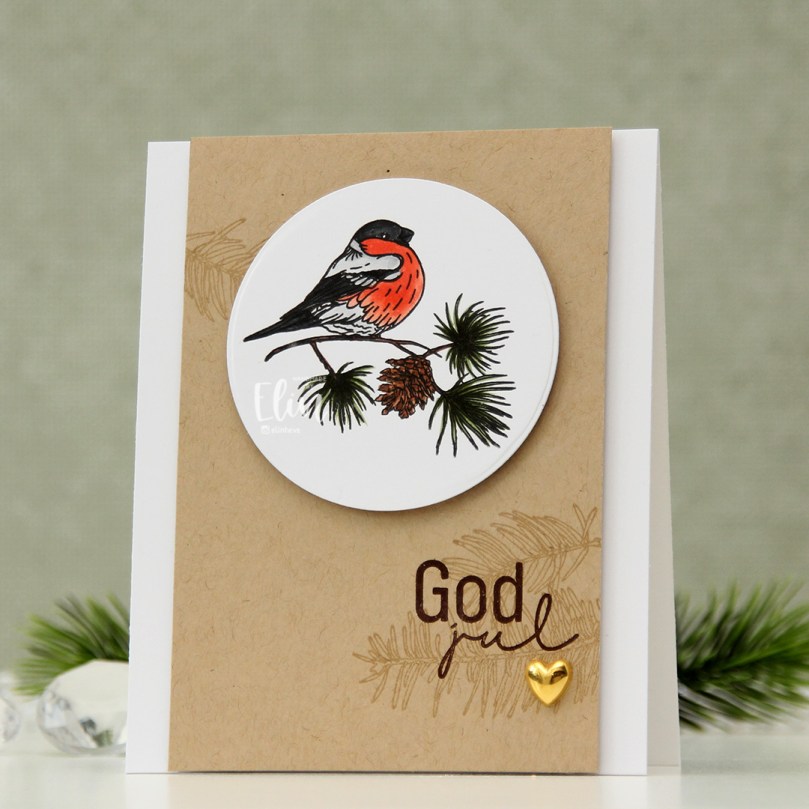 Onto a piece of Classic Kraft cardstock from Papertrey Ink, I stamped a few branches using Classic Kraft ink for a soft backdrop for my sentiment, which I stamped in Dark Chocolate ink, also from Papertrey Ink. I popped up the 3 1/2″ wide kraft panel in the center of a top fold white cardbase using foam tape, added foam tape behind my die cut image and placed it near the top center of the card, before finishing off with a gold heart for a little bit of embellishment.
 Simple color palette for this image.
 Hot pink and orange/yellow/gold. It’s not a Christmas color palette you see every day, and when I did the actual coloring, I wasn’t sold on this. I wasn’t sold when the card was done, either, but it’s grown on me, and I’m now in a place where I like it. That might change again, though, ask me tomorrow 😉
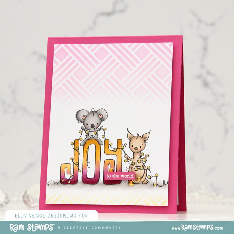 I printed the image on the bottom half of a quarter sheet of X-Press It blending card, did my coloring, then used the Basket Weave stencil from My Favorite Things to add a little bit of interest to the panel. Above the image, I used Puffy Heart and Rose Quartz inks from Altenew, underneath the image I used Scattered Straw Distress Ink. I trimmed off 1/4″ on each side and mounted it with foam tape onto a card base I created from Ripe Raspberry cardstock from My Favorite Things.
 I added black glaze to the eyes for some shine and Glossy Accents to the lightbulbs, before stamping and white heat embossing a sentiment from the Holiday Messages stamp set from Mama Elephant onto a scrap piece of pink cardstock. I cut the sentiment down to a strip, added a few more layers behind it and added it to my card, before finishing off with a few gold jewels from the Fesitivities mix from Little Things from Lucy’s Cards.
 The Glaze, Glossy Accents, sub sentiment and gems all work together to add interest to what is otherwise a very simple card.
 The coloring is pretty simple too 🙂
 I stamped three of the little penguins using Extreme Black ink from My Favorite Things, colored them all in using my Copics, then restamped using Obsidian ink from Altenew, which is a pigment ink that stamps extra crisp and extra dark to bring the details of the linework back in.
 Onto a separate piece of cardstock, I stamped a sentiment from the Mini messages stamp set from Mama Elephant using Hunter Green ink from Altenew.
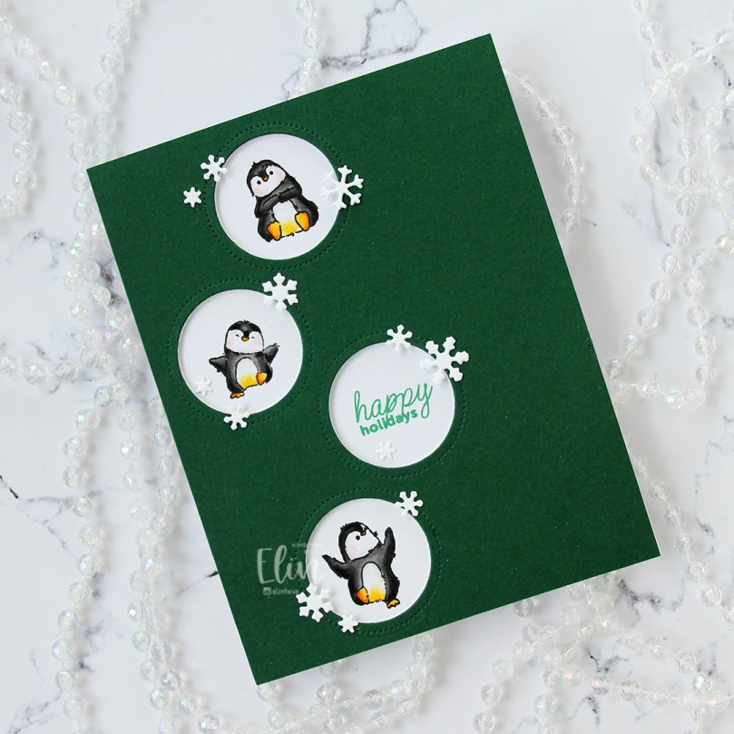 Using the Circle Frames die from Avery Elle, I die cut the openings from Evergreen cardstock from Concord & 9th. I also die cut a few panels from white cardstock to layer behind the green, so my penguins would be recessed a little bit.
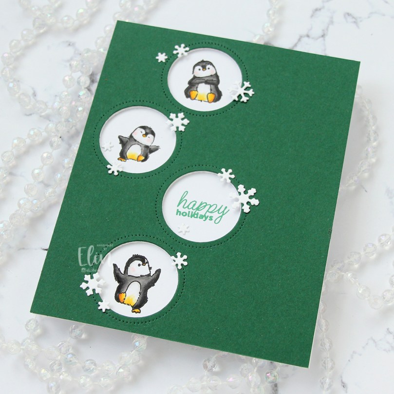 Using the Snowflake Confetti Fancy die from Hero Arts, I die cut a bunch of snowflakes from white cardstock (Stamper’s Select White from Papertrey Ink, which I also used for my card base) that I adhered around my circle openings to draw the eyes in toward those cute penguins and the sentiment. Easy peasy card, right?
 Quick and easy peasy to color too.
 I love hydrangeas, and this image was is one I just HAD to color. Even though I’m more confident with my Copics because I use them so much, I love the soft look and those edges lines you get with watercolor. I stamped the image on a piece of Fabriano Artistico Extra White watercolor paper using Obsidian ink from Altenew. This is a pigment ink, which makes it perfect for embossing. I sprinkled on clear embossing powder from Ranger and melted the powder.
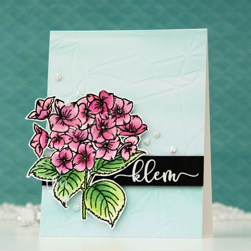 I grabbed a couple of paint brushes and my Mijello Mission Gold watercolor set and mixed pinks and purples for my flowers, and a bunch of different greens for the stems and leaves. I’m no expert watercolorist (if you want to watch an expert watercolor, head over to Debby Hughes’
 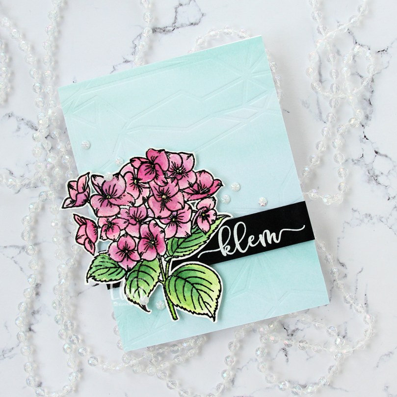 This stamp set actually comes with a couple of additional leaves and petals and dies to cut them out, but there’s no die for this large image. Fussy cutting it was easy enough, though. I stamped and white heat embossed a sentiment from the stamp set onto a piece of True Black cardstock from Papertrey Ink. I dry embossed a piece of patterned paper from the Watercolor Wishes 6×6 inch paper pack from Lawn Fawn using the Geometric Landscape stencil from Altenew. I wanted a little bit of texture to create interest in the background without distracting from the main image, and this did the trick.
 I added a few more layers of cardstock behind my black strip for dimension, popped the flower up on foam tape and finished off the card with a few faceted pearls. Or are they gems? No matter what they are, they’re gorgeous, and I have a feeling I’ll use up the entire pack of these in no time, I love them so much.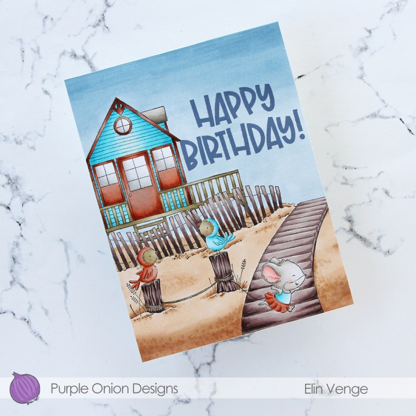
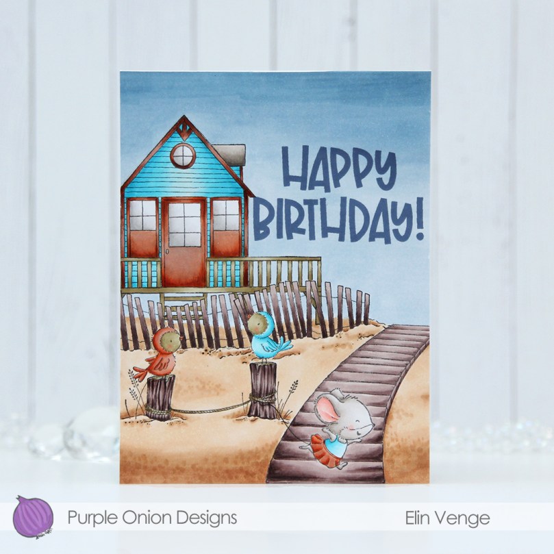 This time, I made a birthday card. I stamped and masked
 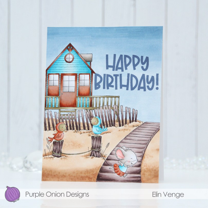 I had the scene all figured out, but struggled with the colors for this one. I’m usually confident in my color choices, but had a hard time with this card. I didn’t want to repeat the color combinations I’d used for the cards I’d already made using stamps from this release, and the combo I tried just didn’t work with the bright aqua. The door, windows and the trim of the beach house all have so many layers of different colors, and the end result is a mottled, rusty look. The rusty look, while not what I was going for, is cool, and I leaned into it by coloring one of the birds in the same color, as well as Iris’ skirt.
 The end result is more of a fall vibe than a summer feel, but some people still go to the beach late in the season, and little Iris looks like she’s running away, so that part at least feels appropriate.
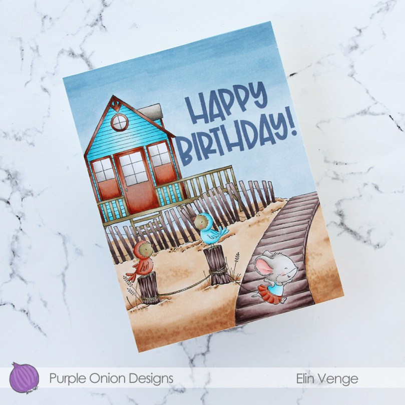 To finish off the card I stamped a sentiment from the coordinating
  Fairly limited color palette, actually, considering how many colors I tried for the beach house trim.
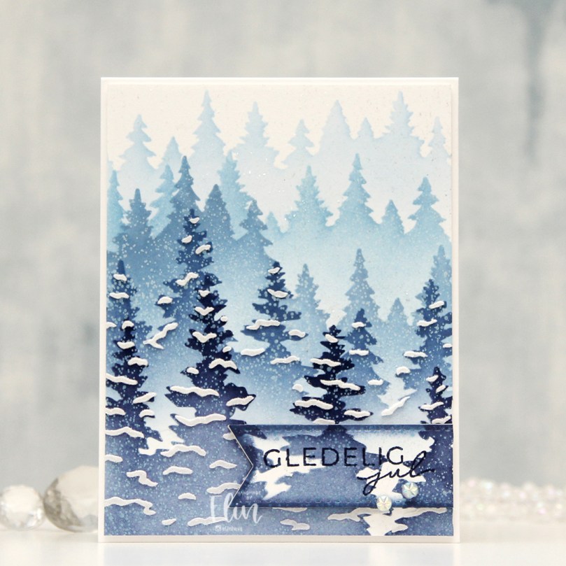 I started with a quarter sheet of Stamper’s Select White cardstock, the Wintry Forest stencil set from Pinkfresh Studio and the Northern Shore color family from Altenew. The stencil set has 6 different stencils that you layer to create a gorgeous wintry forest. I started with stencil number 1 (the Pinkfresh Studio stencils are numbered, which makes it really easy) and Polar Bear ink, which is the lightest of the four colors in the Northern Shore color family. I then moved on to stencil number 2, but didn’t change the color. Since I had to stretch my four colors and use them on five stencils (the last stencil adds snow on the trees), I kept the lightest one for this second layer and ink blended with a heavier hand, which makes the color appear darker. I used stencil number 3 with Icy Water ink, which is the next shade, then stencil number 4 with Winter Lake ink, and finally stencil number 5 with Arctic Mountain ink, which is the darkest color in this set of four gorgeous blues.
 On top of the ink blending, I stamped a snow flurry background stamp from Kort & Godt (M-428) using Fresh Snow hybrid ink from Papertrey Ink, which added lots of white snowy dots to my background. I then used a die in the DIE240 set from Kort & Godt to die cut the banner directly from my background. I put it to the side, placed the last stencil on my background and spread a layer of Light & Fluffy modeling paste from The Crafter’s Workshop through the stencil, before sprinkling on Rock Candy Distress Glitter and let that dry. Onto my banner, I stamped a sentiment from the M-467 stamp set from Kort & Godt using Arctic Mountain ink. I ink blended a little bit of Winter Lake ink to the edges to make it stand out a little bit more, added a stack of white die cuts behind it for dimension and adhered a couple of faceted iridescent pearls (ST178) to finish off the card.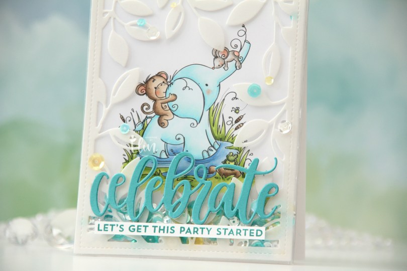
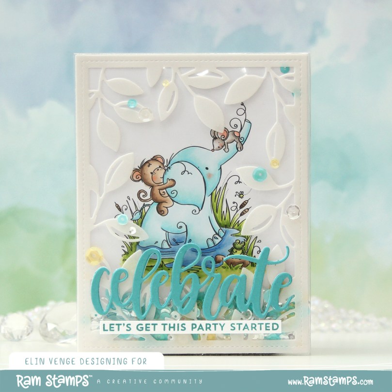 I actually decided to create a shaker card this time. I colored in the
  I put an adhesive sheet from Altenew on the back of a piece of heavyweight translucent vellum from My Favorite Things, before using the Leafy Cover die from Mama Elephant to die cut a frame to put on my card front. I cut off a couple of leaves where I thought they covered up too much of the image and adhered the rest directly onto the bottom of a large stamp storage pocket from Avery Elle. The storage pocket was just wide enough for my colored panel to fit when I turned it 90 degrees. I trimmed off a tiny bit of my panel (1/16″) so it would be less snug in the pocket, and cut off a couple of inches from the top of the pocket. This way I could put the panel inside the pocket, and there would only be one side of the pocket that needed to be sealed once my shaker bits were in place.
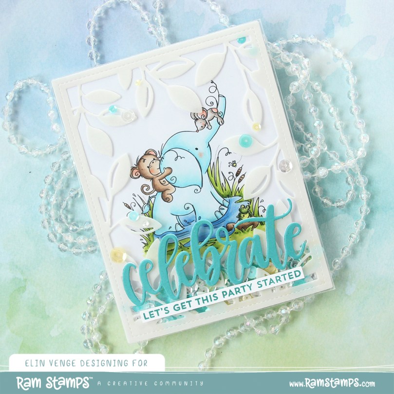 I adhered my shaker pocket to a top fold card base I created from Stamper’s Select White cardstock from Papertrey Ink. I die cut the sentiment using the Celebrate die from My Favorite Things. I used Caribbean Sea cardstock from My Favorite Things for the top layer and a few layers from white cardstock behind it for dimension. I also stamped a sentiment from the Bitty Birthday Wishes stamp set from My Favorite Things onto white cardstock using Caribbean Sea ink, also from My Favorite Things, turned it into a strip and placed it directly underneath the die cut word. To finish the card, I adhered some sequins from the Seashore mix from Little Things from Lucy’s Cards, as well as from the Seaglass mix from Simon Says Stamp. These two mixes work really well together, and they’re also what I used to fill my shaker.
 Speaking of, here they are. Full shaker cards are fun, and I’d say they’re a lot easier to create than regular shaker cards, where you need to create dimension for the shaker bits to shake around.
 The storage pocket works so well as a shaker pouch, and because of it, it gives everything a bit of a lift off the card. It looks like the vellum and the die cut sentiment both float on top, even though they’re both adhered directly to the pocket.
 Papirmølla