Hi, crafty friends! I’m back today with another card I created for Purple Onion Designs. This time it’s a wintery birthday card featuring Nora & Butter. I love these two, and they can be used for Christmas, for Valentine’s Day, so many great uses for this super adorable image.
 I wasn’t sure initially what colors to use on this, so I asked a friend for suggestions. Liz is my go to “color buddy”; if I don’t know what colors to choose for a project, she chooses the colors for me. It works the other way too, it’s a wonderful symbiosis.
 She suggested purple. She knows I don’t color a lot with purple. It’s not that I don’t like purple, I think purple’s pretty, it’s just soooo hard to photograph well, so I tend to avoid it for that reason. This time I didn’t, though. I listened to her and chose a V combo with my Copics I thought worked well.
 Once my coloring was complete, I die cut the Stitched Snowflake Circle Frame from Memory Box five times from white cardstock. I wanted to make a shaker card, and I find that stacking layers works better than foam tape. I eventually ditched my shaker idea, but still kept my stacked die cut window for a dimensional frame. I did layering of cardstock to the outside of the frame too, making the entire white front panel flush. I added more stitching detail using the largest die in the A2 Stitched Rectangles STAX 2 set from My Favorite Things and adhered all my layers onto a card base I created from Winter Wisteria cardstock from Papertrey Ink.
 For my sentiment I die cut the wishes die from Mama Elephant twice from the same purple cardstock I used for my base, before stamping a sentiment from the Warming Winter Thoughts sentiment set from Purple Onion Designs. I used a combination of Lavender Fields ink from Altenew and Winter Wisteria ink from Papertrey Ink for my stamped sentiment, before I cut it down to manageable strips to add to my card. No embellishments on this card, I thought the snowflake frame and die cut sentiment were enough.
 Very muted color palette for this one, but wintery cards tend to be somewhat muted.
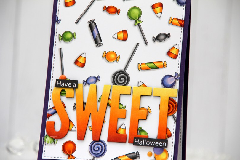
 In the stamp set, there are three fairies, a few ghosts, an adorable bat (yes, it’s adorable) and various accessories. Among them are different candies. I created a panel of these candies, and colored them in with my Copics using very Halloween-y colors. That was last year.
 I wasn’t sure what to do with my colored background, but I didn’t want to cover too much of it, and opted for a very simple design. Using the largest die from the A2 Stitched Rectangles STAX 2 set from My Favorite Things, I turned my colored piece into a panel with a nice faux stitched edge. I love these faux stitch dies from MFT and use them for nearly every card I make. It adds such a wonderful detail. It’s all in the details, to paraphrase a famous German architect.
 I adhered my die cut panel onto a card base I created from Royal Velvet cardstock from Papertrey Ink. It’s a deep purple that goes well with the coloring.
 I created the remainder of my sentiment in Photoshop and printed it, cut it down to two strips and added them on top of the letters with an extra strip of black cardstock behind for a little added dimension and stability. I added three enamel dots from Papirdesign (yellow and orange) and Altenew (purple) to finish my card.
 Not a lot of colors for this one, and yet they’re very Halloween-y.
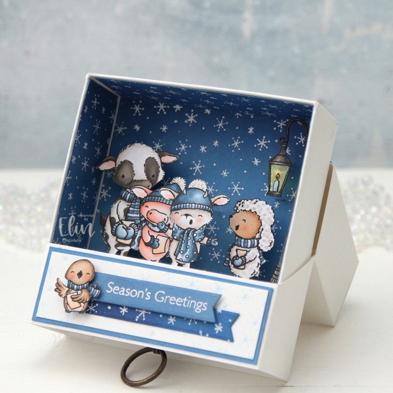
 I’ve made what looks like a pretty plain box for my Innovation Master entry this year. It measures 3 7/8 x 3 7/8″, and it’s 1 3/8″ deep. I like creating these three dimensional projects, but I prefer not having to use any specialty dies, so this project is made by scoring and folding what essentially starts out as rectangular pieces of cardstock. I’ve only used one die for this entire project, and it’s the smallest of the dies in the Fishtail Flag Frames die set to die cut the two banners that the cute little bird is sitting on.
 When you pull on the little handle at the end, you reveal a scene of more cute critters on the inside. I’ve used two stamp sets for this project. The sentiment and the stamped snowflakes are from the Flurry of Love stamp set that was released last year, all the colored critters are from the Christmas Carols stamp set that was part of this year’s September release. The snowflakes stamped in light blue on the “lid” and the ones heat embossed in white are the same ones stamped repeatedly to create backgrounds.
 The outer casing splits open and works as an easel of sorts to display this little scene on the inside. I stamped and colored all these critters with Copics, before fussy cutting them right up against the black stamped lines.
 I ink blended blue inks on the background to get a gradient of color, going from Blue Beyond at the top where it’s the darkest, then Cornflower in the middle and Blue Yonder at the bottom. The critters are more or less hiding the gradient, but it’s more visible in the die cut banner on the lid, where it goes from dark blue on the far left, to a lighter blue on the right.
 I cut away the center of the lantern and replaced it with acetate for it to be see through. I used a yellow Copic on the back of the acetate, and you can see the dark blue background and the white snowflakes through it. I added strips of acetate on the back of the critters to make a dimensional scene where the different animals are on different levels. The lamppost is at the very back, 1/4″ from the back, then the cow and sheep are both at 3/8″ from the back, the pig at 1/2″ and finally the goat at 7/8″. I’ve glued the acetate strips to the back of the background for them to be as hidden as I could. I only created small slits for the acetate to go through, you can spot a few of them behind the goat and the lamppost in this photo. I have a slit towards the top of each of the critters as well as one closer to the bottom, so they’ve all got two anchor points. The lamppost has three; one at the base and one at the top and the bottom of the actual lantern.
 As you can see, the drawer can be pulled out completely from the casing. I stamped the cobblestone image that comes in the Christmas Carols stamp set repeatedly on a piece of X-Press It blending card and colored it in, creating a ground for these critters to stand on. Here you also see the different levels of the animals better. This cobblestone image is perfect for repeat stamping, and it looks like one big stamp instead of a smaller one stamped four times. I love that you can create this effect with this stamp, because of how brilliantly it’s designed.
 I needed to place the critters fairly high up in this drawer to prevent them from being hidden behind the lid of the casing that covers it when it’s all standing up on display, so I decided to create a box within the drawer for a little surprise. It was just big enough for a small Snickers bar to fit.
 I didn’t use a whole lot of Copics for this, in spite of coloring so many images.
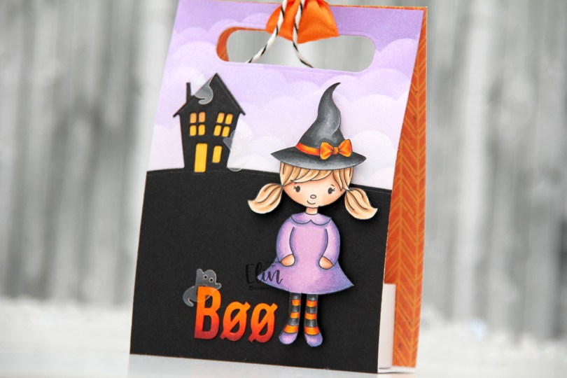
 This cute witch is part of the
  I did ink blending on this one, using the Slimline Cloud Edges stencil from My Favorite Things and inks from Altenew in the colors Deep Iris, Lavender Fields and Soft Lilac. I used the House on the Horizon die from Simon Says Stamp and die cut that from True Black cardstock from Papertrey Ink and adhered it directly onto my ink blended piece. Using a yellow Copic marker, I quickly colored in the windows and door of the house. I colored some white letter stickers from Papirdesign to match the orange on the girl, and adhered the letters next to her feet, before finishing off with a few ghosts from the Candy Corn mix from Little Things from Lucy’s Cards. I put a scrap piece of patterned paper on the inside back for a little extra visual interest, die cut holes through both layers and added a piece of ribbon and some twine to finish.
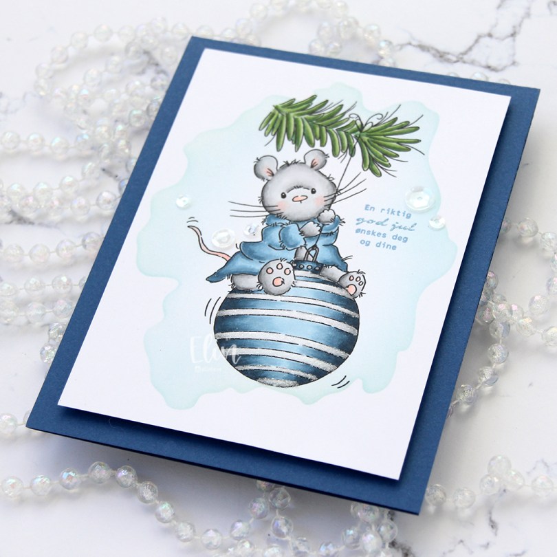
 Enough blabbing. I printed the cute mouse onto a 1/4 sheet of X-Press It blending card, which is my favorite for Copic coloring. Using a stencil from My Favorite Things and Iceberg ink from Altenew, I did some very light ink blending around the image for a little bit of added interest before I started coloring.
 Onto the “white” stripes on the bauble, I used my quickie glue pen from Sakura and sprinkled on Rock Candy Distress Glitter for a little bit of sparkle. You can kind of see it in this photo, but it’s more noticeable in real life.
 I cut my panel down, added lots of foam tape to the back and added it to a top fold A2 note card that I created from Blueberry cardstock from My Favorite Things. Sadly, this is one of their discontinued colors, but I have a pack of this cardstock that I absolutely love, and this color is just beautiful. It’s dark blue, but not too dark, and it’s just the right tone of blue.
 I stamped a sentiment from Norsk Stempelblad AS using Blue Yonder ink from My Favorite Things. I don’t have ink in the discontinued Blueberry color, and I didn’t want to use too dark of a blue ink, so I triple stamped using the Blue Yonder instead. It matches the robe pretty well.
 I added a few sequins from the White Orchid sequin mix from Little Things from Lucy’s Cards, and the card was done. Super simple.
 Super simple color palette, too.
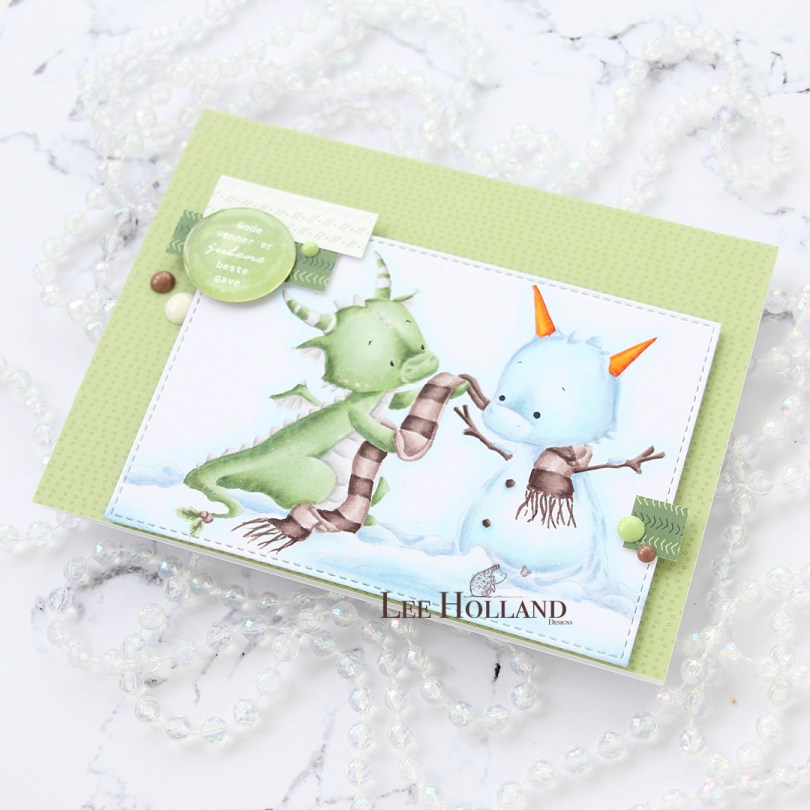
 I colored in my image using the no line technique. Before printing, I made all the lines in the image light gray except for the eyes and eyebrows, which I kept black. This is a great trick to color no line without having to worry about drawing things back in with a black pen and potentially getting things wonky and weird. I’ve done that once, starting over isn’t fun, so I’ve learned to get around it.
 I cut my colored piece down using a stitched rectangle die from My Favorite Things. I covered the card base with patterned paper from the Forever Green collection paper pack from ModaScrap and mounted my colored panel onto that using lots of foam tape.
 I cut a couple of strips of patterned paper from that same paper pack from ModaScrap and added them onto my colored panel. Using a green marker, I created a green colored cardstock piece to match my dragon, stamped my Norsk Stempelblad AS sentiment onto it, heat embossed it and used a circle punch to get it to a perfect 1″ circle, before adding an epoxy sticker on top for a little shine and dimension.
 To finish off my card I added a few enamel dots. The brown ones and the white are from Papirdesign, the green ones from Altenew.
 Not a whole heap of colors for this one.