Hi, everyone! This is my second post of the day. If you came here to see my Mo Manning post, you will find that here. This one’s a bit of a twofer, focusing on the big birthday wishes die from My Favorite Things, along with the Big Balloon stencil, also from MFT.
 I have a great crafty friend who suggested I play along with the current color challenge over at MFT. The color palette for the challenge was Blueberry, Berrylicious, Grout Gray and Sweet Tooth, and it’s a palette I find very appealing! I’ve done a raised diecut inlay using the big birthday wishes die and big balloon stencil once before, but it was with warmer tones (it’s this card) and some birthday monsters.
 Starting with the raised die cut inlay card, I did some serious ink blending. I love the look of ink blending, but I have a shoulder that protests every time I do it, meaning it doesn’t happen every day. I don’t have colored inks from MFT, so I used the brands I have and made it work. I used Hero Arts Wet Cement and Papertrey Ink Soft Stone inks for the gray balloon, Papertrey Ink Hawaiian Shores and Distress Ink Speckled Egg for the teal balloon, and Altenew Dark Night, Azurite, Ultramarine and Eastern Sky for the blue balloon.
 Once the panel was inked, I used the Big Birthday Wishes die to die cut the panel, making sure to keep all the little pieces for the stacked inlay technique. I die cut five more pieces from white card stock and stacked all the individual letters, putting the inked piece on top, giving me a total of six layers for each letter. I no line colored a few of the bears from the Bitty Bears stamp set to look like polar bears, and added them to the big letters at the top.
 For the second card I used the same color inks to ink blend the balloons, cut off the edges to make it a smaller panel and used the negative of a die cut for the shaker window. I built up the walls of the shaker using thin strips of white card stock. I’m not a fan of foam tape for shaker windows, I prefer to take the extra time and effort to build dimension with cardstock. It’s fiddly and time consuming, but I love it!
 I glued the negative die cut onto a piece of acetate, and filled the shaker with the Starry Sky Mix of jewels from Pretty Pink Posh before adding the piece of acetate and negative die cut on top, sealing in the jewels. The colors of the jewels are perfect for the color palette I was going for. I glued the finished shaker piece onto a top fold card base I made from Berrylicious card stock, and my card was finished.
 I had so much fun creating these two cards, but will admit that I struggled with which bears to use, I’d colored all but one bear from the stamp set. Indecisive is my middle name. So is procrastinator, perfectionist and a whole bunch of other descriptors.
 All the bears (except for the one that couldn’t fit on this panel) all colored up like polar bears. While the stamps were still in my Misti, I used a Memento Rich Cocoa dual marker on the eyes, noses and mouths and stamped them on top of the fadeout ink from Inkon3 I’d already used. This is a trick I like to use, and it saves me from having to draw eyes and mouths in after my coloring and risk ruining my images.
 Last, but not least, the colors I used. Not a lot, but enough to make these cute bears look like polar bears and for them to match the color palette for the MFT color challenge.

 I had trouble deciding whether to make a card for a baby girl or for a baby boy, so I decided to go somewhat neutral with a combo of yellow and green. I colored the image with my Copics, added a clear coat of glitter on the green areas using a Wink of Stella glitter brush.
 I stamped a sentiment from Norsk Stempelblad AS using Fresh Leaf ink from Altenew, and decided to even add some clear crystals of various sizes from the Crystal Collection from Little Things from Lucy’s Cards.
 I used a frame die from Mama Elephant and die cut 3 frames; two from white card stock and one from Lemon Tart card stock from Papertrey Ink, which is a very nice soft yellow. I glued all three frames together for a stacked look and spritzed the frame with a sheer shimmer spray from Imagine, before adhering the frame onto the colored piece, and then onto a white card base. I paired it with a Lemon Chiffon envelope from My Favorite Things. It’s not a perfect match, but it’s close enough.
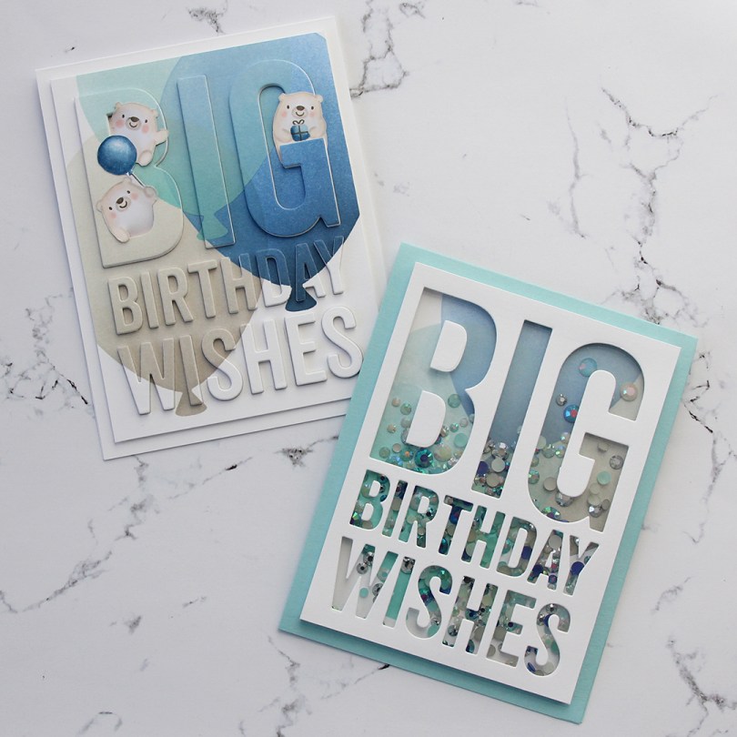
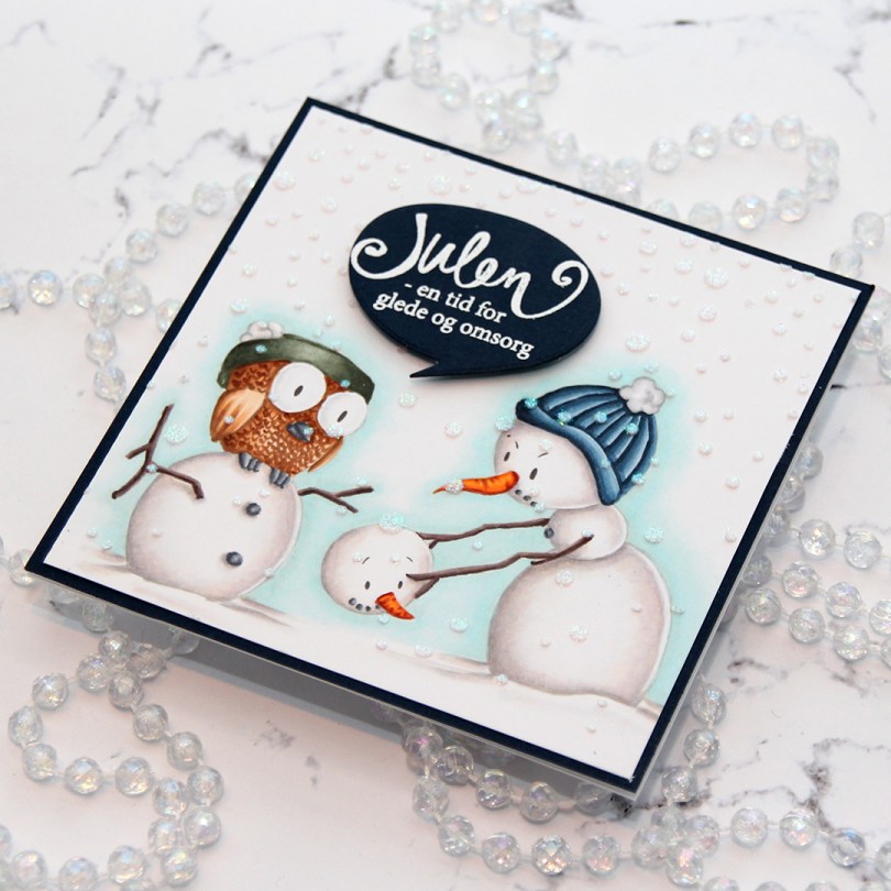
 I colored up this image for day 27 of Kathy Racoosin’s 30 day coloring challenge back in May. Yes, I colored a winter scene in May… BUT I wanted to feature as many different companies as possible during the coloring challenge, and the only ones I have from Kinda Cute are winter ones. I love making Christmas cards, so I really didn’t mind.
 I had initially planned on making an A2 landscape card, but it just wasn’t working, there was no natural place to put the sentiment. After I’d added the iridescent glitter paste over a Simon Says Stamp falling snow stencil and glued my panel to my cardbase, I chopped off 1-1/4″ on the right hand side of the card and then carefully went in with a craft knife to cut off an additional 1/16″ from my top layer. It works if you use a fresh blade and cut multiple times using very light pressure.
 I stamped and white heat embossed a Norsk Stempelblad AS sentiment onto more of that same Dark Indigo cardstock from Papertrey Ink that I used for my card front, before using a speech bubble die from Altenew to die cut. I mounted my speech bubble using some foam tape, and my card was finished.
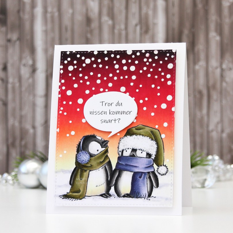


 The
The  I wanted something in the background, but nothing too distracting. White on white is such a classic look, and I diecut both the Layered Snowflake cover dies from Altenew (there’s
  I fussy cut around my colored image and mounted it on foam tape. This image is quite large, and even though there’s a lot of detail in the image, it’s very easy to fussy cut. I mounted it on a bit of an angle, making the leaves stick out from both sides of the card. I also white heat embossed a sentiment from the same stamps set on black cardstock and added that to my design.
 My last finishing touch was a few sparkling clear sequins from Pretty Pink Posh. Some of them tucked, in true Laura Bassen style, and I even used my scissors on one.
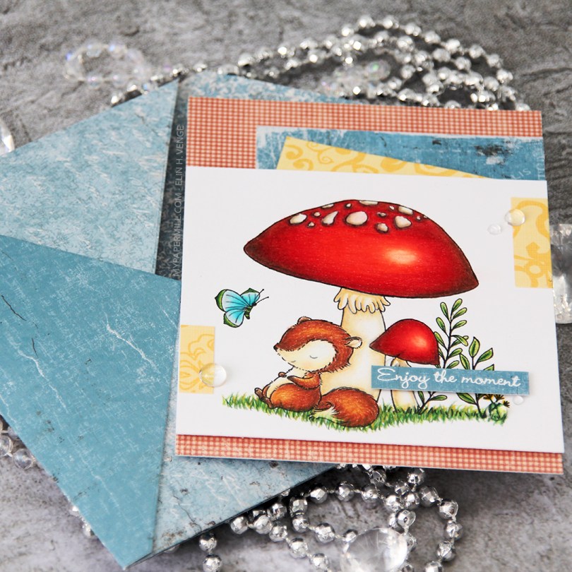
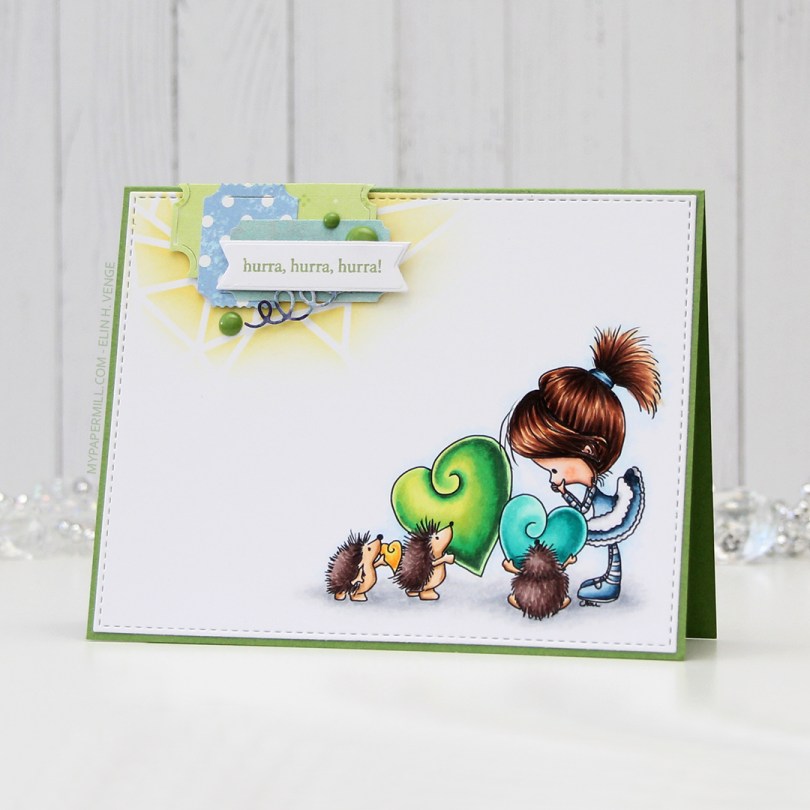
 This little fox scene is from the Always Bring a Smile set, designed for My Favorite Things by Stacey Yacula. I really love her characters, they’re so full of life, and this little guy looks like he’s taking a well deserved nap against the stem of that big mushroom. I actually stamped this on Stamper’s Select White cardstock from Papertrey Ink and pulled out my Prismacolor pencils to color him in for day 2 of the current round of Kathy Racoosin’s 30 day coloring challenge.
 I found some scraps of patterned paper in my stash (the red is from Pion Design, the tealy blue from Maja Design and the yellow from Chatterbox) and added them here and there on my card, before propping my panel with the cute fox onto the card front using foam tape. Lots of foam tape, I wasn’t shy! I stamped and white heat embossed a
  I added a few raindrops from Little Things from Lucy’s Cards around my sentiment and near those small yellow bits, and called it done. I had enough of those Maja Design scraps to make a matching envelope using the A2 V flap envelope dies from Simon Says Stamp.
 I don’t usually do anything to the back of my clean and simple (it’s somewhat clean and simple, this one?), but I recently bought this
 Jeg stemplet blomsterstempler fra Larger Than Life-settet til Papertrey Ink rett på kortbasen med rosafargene som er i Rose Petal-settet med stempelputer fra Altenew (fargene Cosmic Berry, Purple Wine, Puffy Heart og Rose Quartz).
 Jeg stanset ut et hvitt panel med juksesøm ved hjelp av en die fra My Favorite Things, og stanset ut et vindu fra dette panelet, også med en die fra My Favorite Things. Til slutt stemplet jeg en tekst fra Huldra designstudio med en av fargene jeg brukte på blomstene mine, limte hele panelet på kortets front med 3D-teip og kortet var ferdig. Enkelt, ikke sant?
 Jeg har brukt stempler fra Vintage Roses-settet til Altenew, stemplet i farger av Rose Petal og Tropical Forest-settene til Altenew. Jeg stanset ut rosene og bladene med matchende dies.
 Jeg har limt blomstene og bladene på kortbasen min med forskjellige dimensjoner bak for å få litt liv i et veldig enkelt oppsett. Jeg stemplet også en gratulerer-tekst på en hvit kartongstripe i samme farge som kortbasen og embosset den.
 Jeg lagde tekststripen min litt lengre enn bredden på kortet, så den stikker litt ut på hver ende. Den siste rosen limte jeg over tekststripen min.
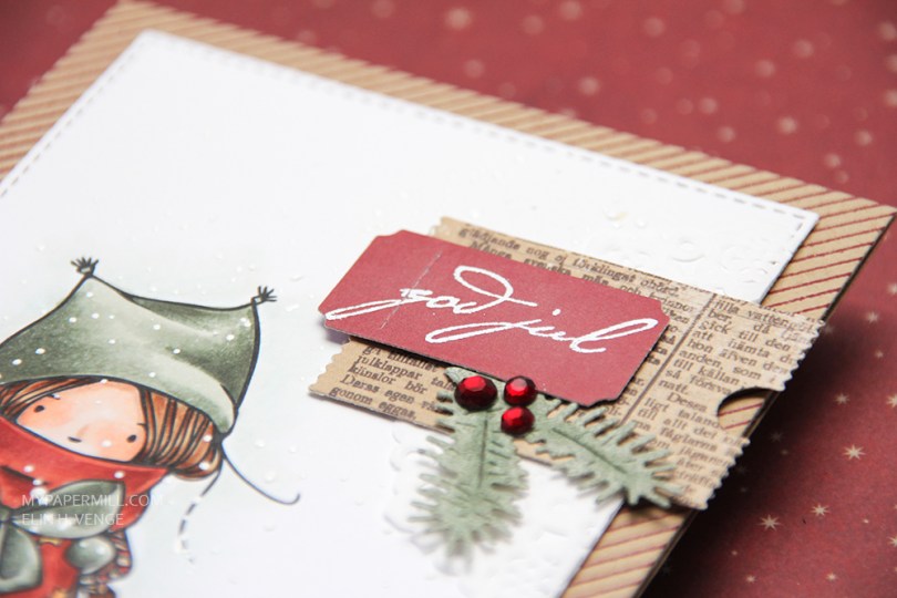
 I chose muted colors with lots of grays in them, diecut my colored panel with a stitched rectangle die from My Favorite Things and sprinkled on chunky white embossing enamel from Stampendous which I heat embossed. It gives the look of falling snow, which I really love for Christmas cards. No pattern, completely random, which really is how snow falls in real life.
 I added my panel to my card base using dimensional adhesive without too much dimension. The card base is Classic Kraft cardstock from Papertrey Ink. I stamped a pinstripe stamp from Altenew across it in Scarlet Jewel ink, also from Papertrey Ink.
 I tend to add little embellishment clusters on my simple cards, and this one is no different. Part of a mini doily from Doodlebug, some patterned paper diecut with a Docrafts die, a ticket with a white heat embossed sentiment from Papirdesign, and diecut pine branches from patterned paper. I added three Papirdesign crystals as a finishing touch.