Hi, crafty friends! It’s the third Thursday of the month, which means it’s #getcrackingonchristmas. This is an initiative from Jenn Shurkus to get us creating holiday cards all year instead of having to scramble last minute to get them done in November and December. This lets us use our holiday products, try out new things and enjoy the process! My card today features an adorable Christmas bear from a digi stamp set from Amanda Jayne Designs, as well as some other goodies.
 I colored the bear with Copics and used the Snowflakes and Ornament die set from Hero Arts to turn him into a Christmas ornament. Isn’t he adorable with his head tilted to the side? I covered the card base with a piece of Cranberry cardstock from Concord & 9th. This is the perfect Christmas red, and it goes really well with the colors on his hat, as well as the color I chose for the sentiment, which is also from Amanda Jayne Designs.

I used the Snowflake Confetti Fancy Die from Hero Arts to create a white background of snowflakes. I cut the panel down and adhered it to a piece of gold glitter cardstock from Kort & Godt Hobby, giving shine and sparkle to the snowflake openings. I mounted my gold cardstock to the center of the card using foam tape and added my colored bear ornament with more foam tape – there’s a lot of dimension going on here. I used the Gift bows dies from Kristina Werner to add a gold glitter bow to the top of the ornament. I also used a little bit of the gold glitter cardstock to mat the sentiment, which I adhered directly to the ornament to finish the card.
![]() For such a simple image, I sure used a lot of Copics.
For such a simple image, I sure used a lot of Copics.
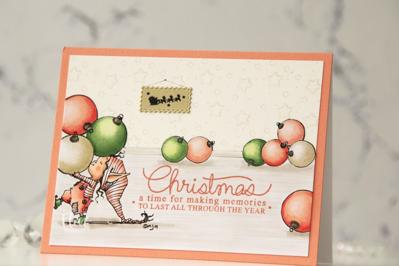
 I separated out the baubles from the image and did some copy paste work to create my scene. It’s one of the advantages of using digital stamps, and it makes them super versatile. I drew in a base board at the back with a black Copic multiliner and colored my scene.
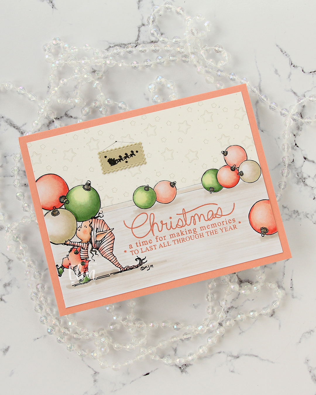 I fussy cut around the back bauble and base board and adhered my colored piece onto a piece of patterned paper from ModaScrap that acts as a wall paper for my background. To make it even more obvious that it’s supposed to be a wall, I stamped part of the Window Signs image from Purple Onion Designs using Altenew Obsidian ink onto a scrap piece of X-Press It blending card that I’d colored with one of the neutral colors (E81) I used for my baubles. I then die cut that using the Postage Collage Die set from Waffle Flower and adhered it to my wall, drawing in strings and a nail on the wall for it to hang from.
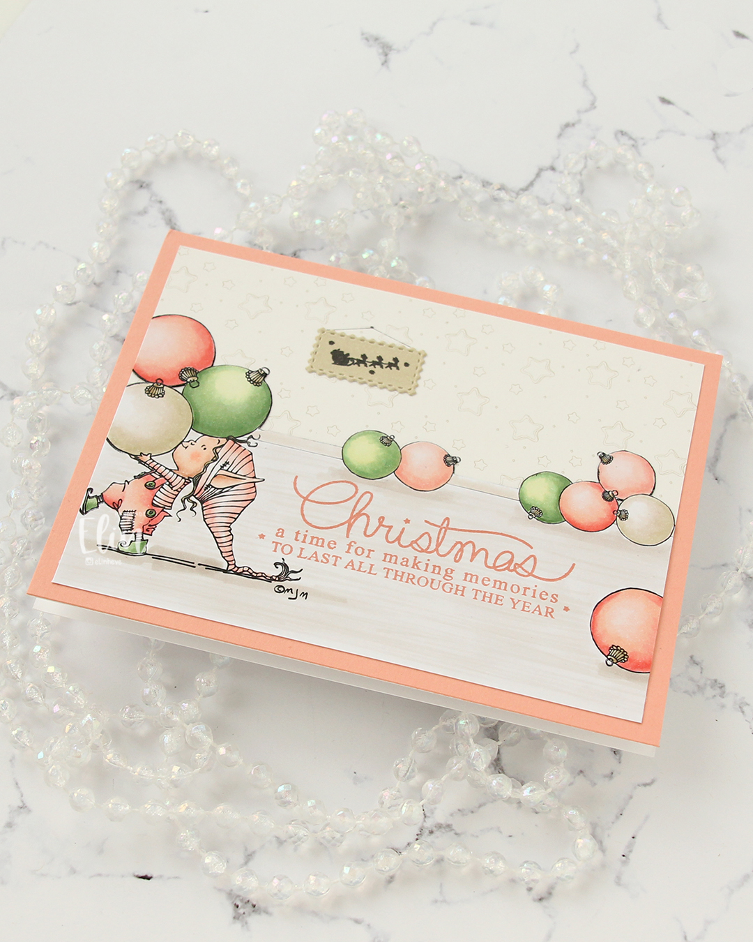 I stamped a sentiment from the Merry Greetings stamp set from Mama Elephant using Melon Berry ink from Papertrey Ink. It matches really well with the coloring. I adhered my scene to a card base covered with a quarter sheet of Grapefruit cardstock from Concord & 9th to create a matching frame and my card was finished.
 Limited Copic color palette for this one. I also used W3, W1 and W0, but I see now that I cut my graphic off too short, so they’re missing here.
 I started by running a panel of Stamper’s Select White cardstock from Papertrey Ink through my die cutting machine with the Kaleidoscope embossing folder from Simon Says Stamp for a subtle, textured background. I love white space on my cards, but that doesn’t mean it needs to be flat.
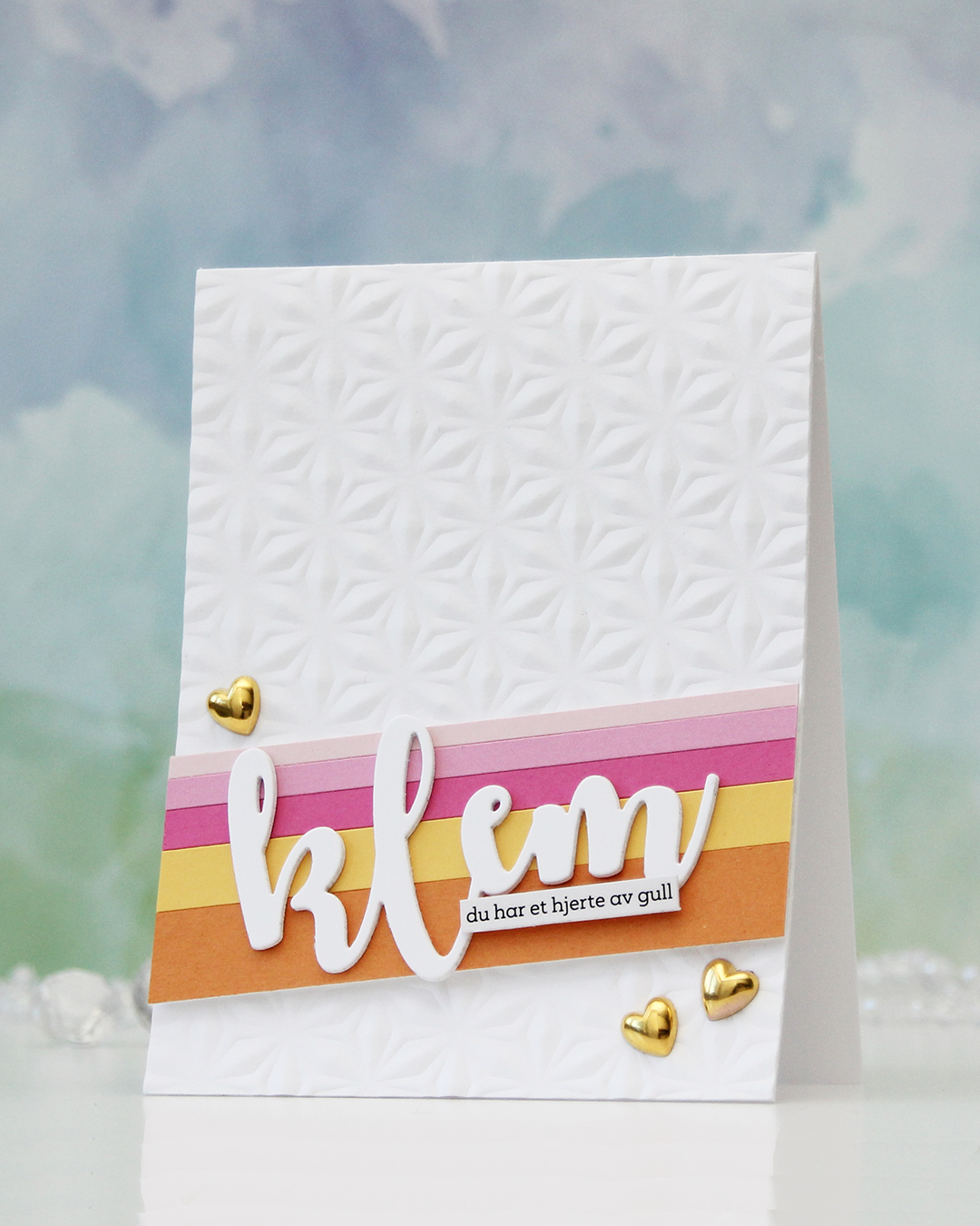 Next, I did some stripping. Cardstock stripping, that is. I cut a few colors of cardstock into different width strips. The colors I used are (top to bottom – all Concord & 9th cardstock): Ballet Slipper, Carnation, Sweet Pea, Buttercup and Clementine. I added the strips to a scrap of cardstock to keep them all together and mounted them at an angle using foam tape.
 I die cut the word klem (hug) three times from white cardstock and stacked them for dimension. I usually stack four, but I was using a scrap to die cut from and there was only room for three with the piece I used. Three layers work too!
 I love how this word die creates a space for a sub sentiment strip. You can put pretty much anything on the bottom of the last part of the die cut and still see the whole word. For this one I used a sentiment sticker strip and adhered a couple of layers of cardstock strips behind it for even more dimension, so it pops off the die cut a little. To finish off the card, I added a few gold heart, I thought they matched the sub sentiment (you have a heart of gold) nicely.
 I used a couple of the brand new cardstock colors from Concord & 9th (Brickyard and Pimento), along with a bunch of older ones (Sorbet, Grapefruit, Nectar, Eucalyptus, Rainforest) for the rest of the florals. I also used a little bit of vellum and some gold shine cardstock for the flower centers.
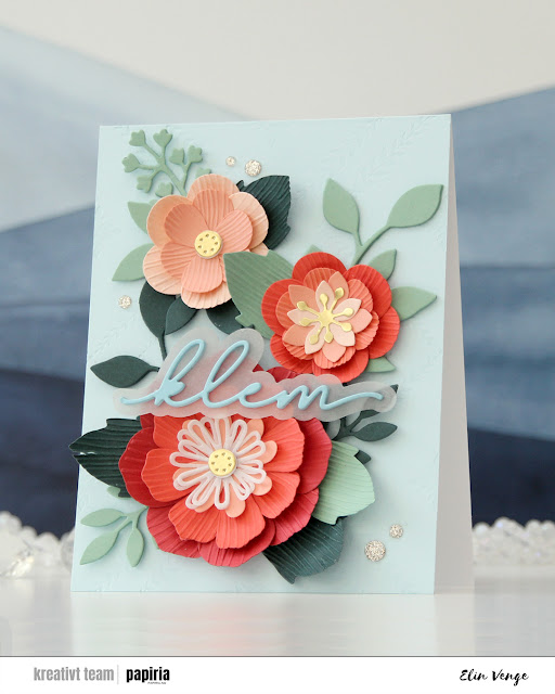 Once you’ve die cut the florals and greenery, you can use the embossing folder that coordinates to create texture on the petals and large leaves. They come out looking like crepe paper, and I love the look. There are many ways to assemble these flowers, and I created a bunch more that I wasn’t able to fit on this card. For the circular centers, I stacked some white die cuts behind the gold ones for dimension, and I curled all the petals and “crepe paper” leaves before assembly.
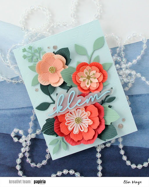 On the Powder panel that covers the card base, I wanted a little bit of texture. I used the Leafy Lattice press plate from Pinkfresh Studio with Polar Bear ink from Altenew for a subtle background – it’s so subtle it barely shows in the photos, it’s definitely more noticeable in real life. I probably could have gone a little bit darker with the ink, or ink up the press plate a second time and run it through again if I wanted it darker.
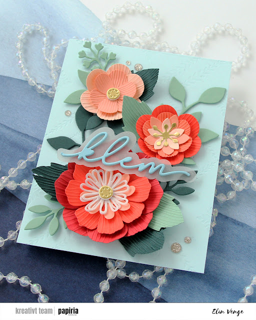 I adhered all my flowers and leaves with liquid glue, stacking the pieces in the background for strength and dimension. They’re only attached at the base of the sprigs, so they have som lift at the tips. I die cut a sentiment die from Kort & Godt four times from Harbor cardstock, stacked them, added a vellum shadow layer behind and glued my sentiment on top of the larger flower, before finishing off with a few champagne glitter drops from Pinkfresh Studio.
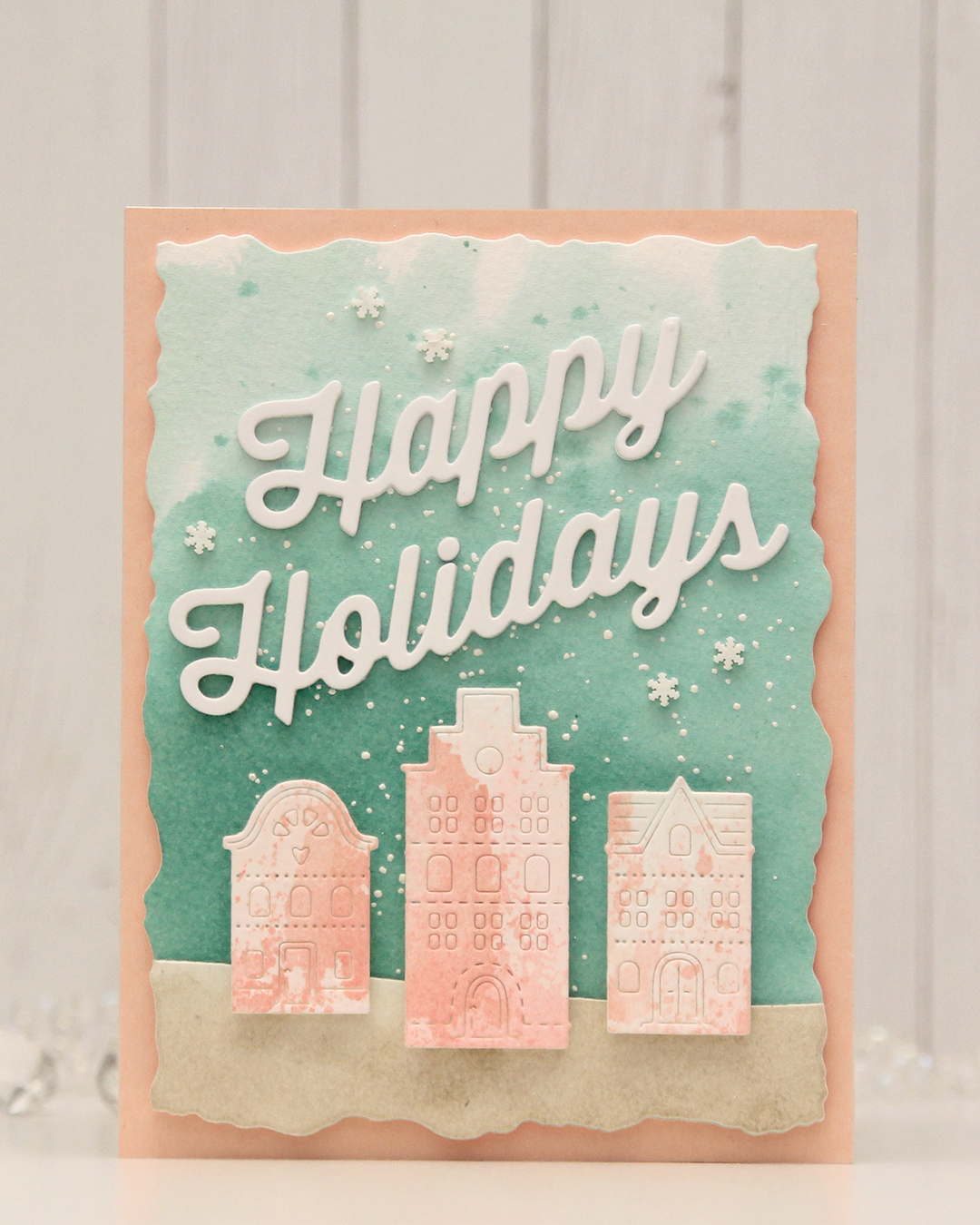 For this card, I really tried. I chose a color combo of Pebble, Ballet Slipper, Brickyard, Cranberry, Cobblestone and Tidepool from C9. I wanted to focus on Ballet Slipper, Cranberry and Tidepool for the Gummiapan diecut houses, but Tidepool and Ballet Slipper created mud when they mixed, while ink smooshed Cranberry looked like an episode of Dexter. I switched gears and ink smooshed Ballet Slipper on its own on watercolor paper. When it dried it looked like Grapefruit. So much for not using peach tones. I watercolored a background using Tidepool reinker and did the same with Pebble reinker on a separate piece of watercolor paper. Once dry, I die cut the Pebble piece with a curved landscape die from the Slim Card Basics die set from Mama Elephant, then layered the two pieces together and die cut them using the largest die in the Watercolor Rectangle STAX die set from My Favorite Things.
 I sprinkled on Chunky white embossing enamel from Stampendous onto the background, heat set it so the granules melted to look like snow, adhered the slope with 1 mm foam squares and mounted the entire panel onto a card base that I covered with a piece of Nectar cardstock from Concord & 9th. I tried Grapefruit first, but felt it was too dark against the background. I mounted the houses using foam tape, die cut and stacked four layers of Happy Holidays from the Jolly Holidays Greetings die set from Concord & 9th and adhered the greeting at an angle above the houses, before finishing off with Snowdrift Sprinkles from Little Things from Lucy’s Cards.
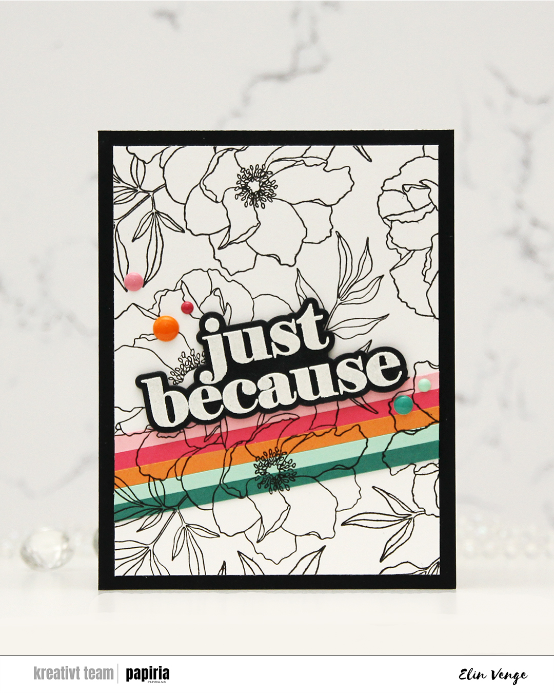 It’s no secret that I’m a fan of anything and everything Concord & 9th comes up with. This Blended petals set is an older one, a quick google search revealed a July 2022 release, but I hadn’t seen it before and picked it up just a few weeks ago. There’s a stamp set, a die set and a stencil set that all coordinate. I didn’t use the stencils today, but I definitely will in the future!
 I started by stamping the big floral image on a panel of white cardstock using Altenew Obsidian ink. This ink is very dark black and very crisp, and it’s perfect for outlines like this. I then “stripped it up” (thank you, Laura Bassen, for this term) with cardstock colors from C9. I cut 3/16″ strips from Juniper, Sea Glass, Clementine, Honeysuckle and Pink Lemonade cardstock. I butted the strips together and glued them to Post-it tape, which I then adhered temporarily to the white panel, so I could stamp in the exact same spot on my stripped piece.
 Once I’d completed my stamping, I adhered the Post-it tape with my strips properly with liquid glue and trimmed the panel down slightly, before adhering it to a black panel that covers the front of an A2 white card base. I stamped and heat embossed the large sentiment in the stamp set and cut it out with the die from the coordinating die set. I stacked another four black die cuts behind it for dimension, and adhered it to the top of my cardstock strips.
 To finish off the card, I rummaged through my enamel dots in search of colors to match. I have all the colors of the C9 enamel dots on their way to me. They would match perfectly, but the last time I tracked the shipment, they were in the UK. I used the Sea Shore enamel dots from Altenew for the ones that matched Juniper and Sea Glass, the Tea Party set from Altenew to sort of match the pinks and the orange one is from the Boy Crazy pack from My Mind’s Eye from 2013. I’ve loved enamel dots for a loooong time!
 I combined
  I didn’t want color on the entire piece and decided on coloring a strip that includes the largest part of the waterfall, the beaver and part of the mama swan. I used Zig clean color real brush markers to color, using the blender for some of it, but a size 4 round watercolor brush from Princeton, along with water, for most of it. The Zig colors I used are the following: 068 Deep Brown, 816 Soft Violet, 028 Pale Pink, 705 Peach Orange, 505 Yellow Ochre, 407 Grass Green, 406 Sage Green, 411 Cactus Green, 307 Aqua Blue, 315 Ultramarine and 910 Warm Gray 6.
 Once my coloring was complete, I cut the colored section apart from the rest. I adhered the uncolored sections onto a black mat I created from Black cardstock from Concord & 9th. Behind the colored panel, I stacked a few layers of cardstock for dimension and adhered it in between the other two pieces. I adhered my finished piece onto a card base that I created from Blue Beyond cardstock from My Favorite Things.
 I stamped and white heat embossed a sentiment from the
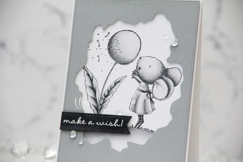
 I used grays for my coloring of this
 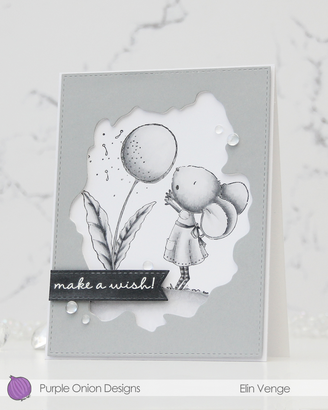 I used the Watercolor Wash Free Form die and the largest die in the A2 Stitched Rectangles STAX 1 set from My Favorite Things to cut a window opening and create the faux stitching on the edges of a piece of Dove cardstock from Concord & 9th. I used the Watercolor die to cut a few more layers from white cardstock to glue behind the grey for dimension.
 I scribbled a bit of N5 Copic marker on a scrap of Dove cardstock to make it a little darker, let it dry, then stamped and white heat embossed a sentiment from the A Beautiful Day Sentiment Set from Purple Onion Designs (unfortunately, I think the set’s discontinued, I couldn’t find it when searching the POD store). I then used one of the dies in the Essential Stitched Sentiment Strips die set from MFT to carry on the faux stitching look that I already had going. I added a few strips of cardstock behind it for even more dimension and adhered it in the bottom left of the card.
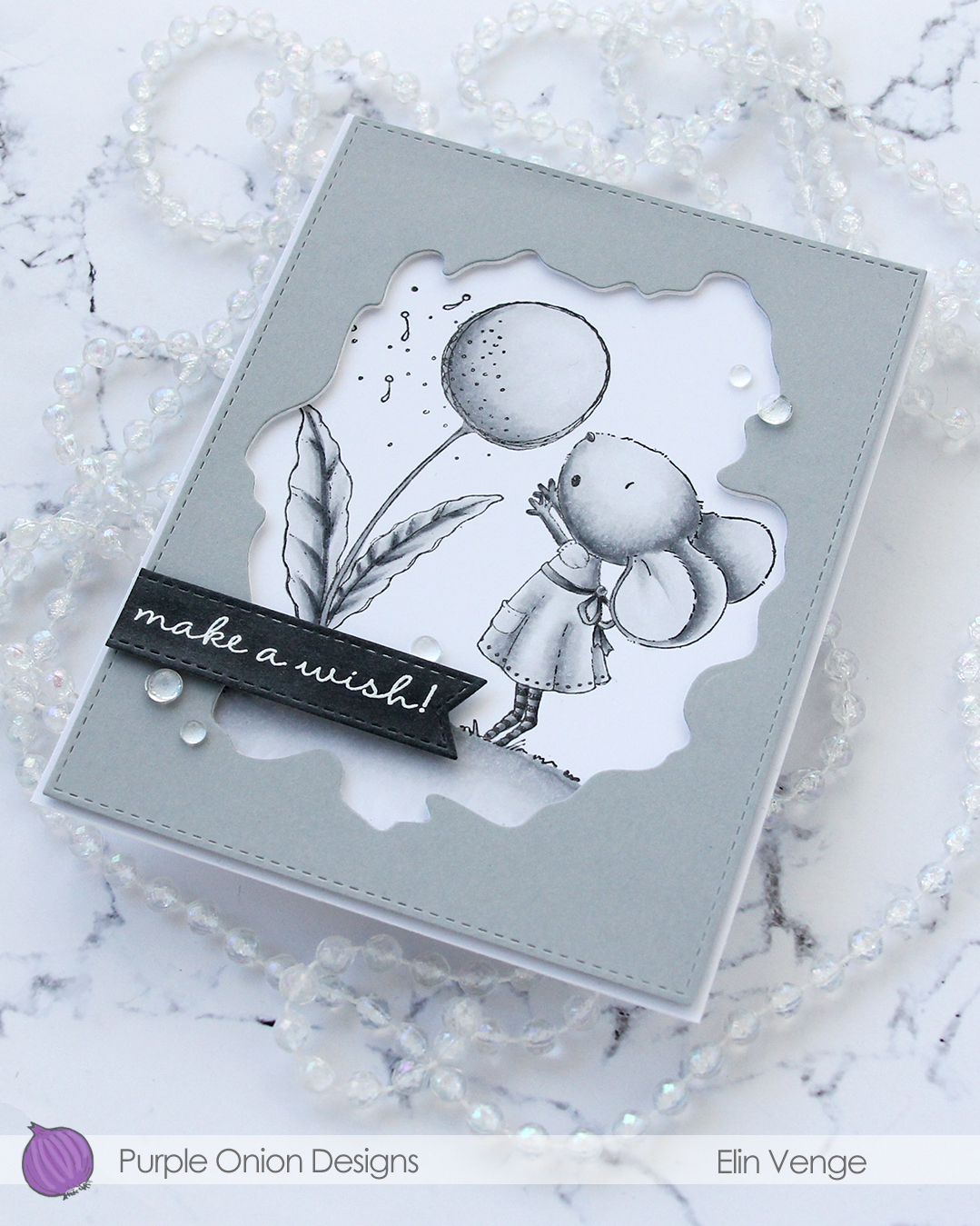 To finish off the card. I adhered a few Dew Drops from Concord & 9th. With greyscale coloring, grey cardstock, white heat embossing and clear dew drops, it looks like I took black and white photos of this card, but I promise I didn’t.
 I don’t think I’ve ever colored an image with less markers.
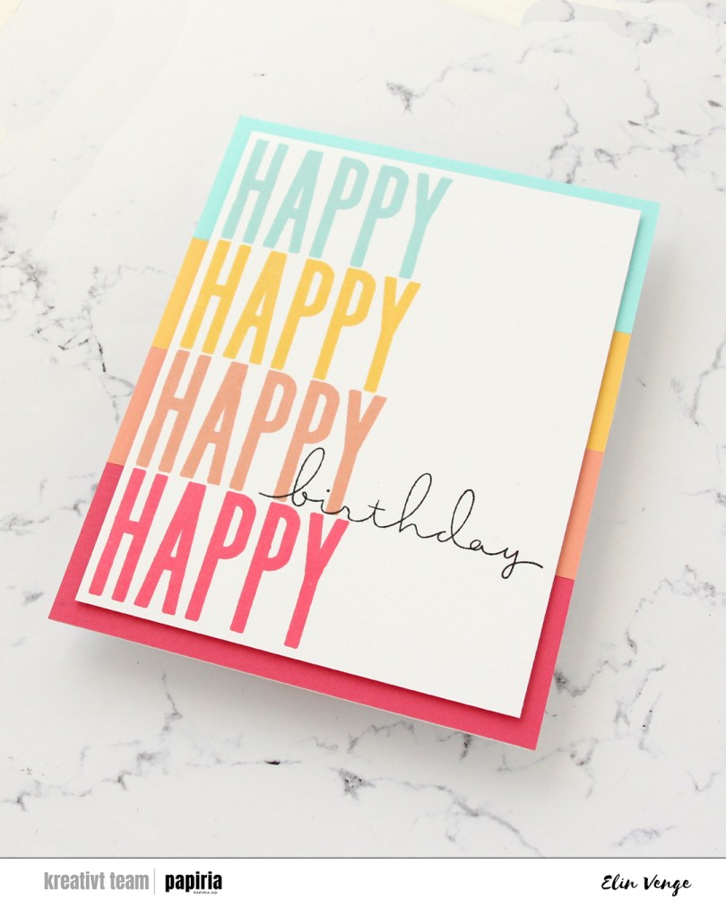
 First of all, this card is huge. It measures 5 1/2 x 7 1/4″. I started by stamping HAPPY from the All the birthdays stamp set from Concord & 9th onto half a sheet of Stamper’s Select White cardstock from Papertrey Ink. I used Aqua Sky, Buttercup, Grapefruit and Honeysuckle inks, all from Concord & 9th. It was easy to shift the cardstock up and down in my Misti to get them all lined up. I then stamped the scripty birthday word in the stamp set using Obsidian ink from Altenew, making sure that the bottom part of the letters matched up with the Grapefruit stamping.
 I trimmed down the panel, added a few more panels behind it for dimension and adhered it to my card front that I had covered with strips of cardstock colors in the same colors as my inking. I decided not to add any embellishments to this, sometimes you just need a simple card. This one would be super easy to create in a lot of different color combos. I’m longing for proper spring and summer, so mine’s with happy colors.
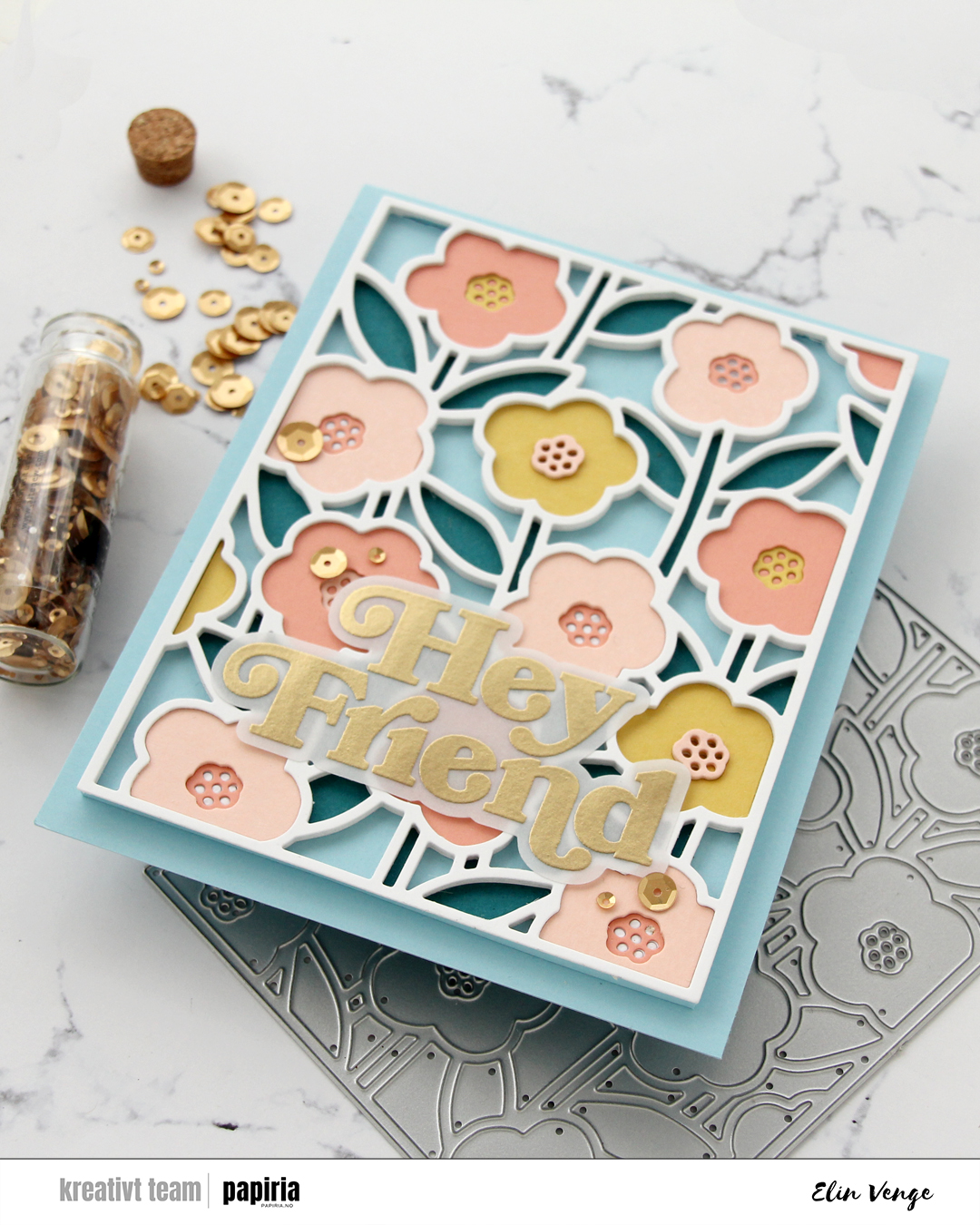
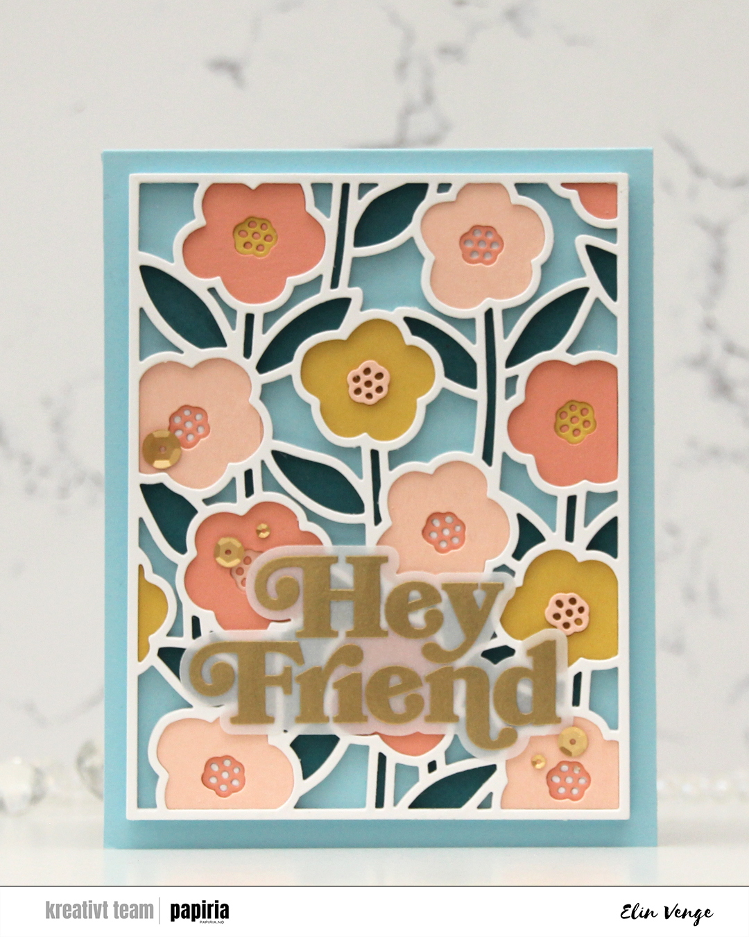 I love this Sweet Stems die set from Concord & 9th. It was part of their February release, and it’s so versatile. It has a separate coordinating stencil set (which I didn’t use for this card), which is great if you want lots of color, but not spend 512 hours on a card. The die set consists of a cover die, which is what I used here, and seven smaller dies. One of them cuts the outline for Hey Friend, which is a sentiment in the coordinating stamp set. I love when you can mix and match products like this.
 I used the cover die to cut a bajillion pieces from white cardstock (Stamper’s Select White from Papertrey Ink), then cut one panel each from Peacock, Honeycomb, Nectar and Grapefruit cardstock, all Concord & 9th colors. I started with one of the white outlines adhered to a piece of Harbor cardstock (also a C9 color), and puzzle pieced the stems and leaves into it with the Peacock color.
 In total, I stacked 6 white outlines and added the flowers and the flower centers at varying depths. The flowers are all slightly different shapes, but the centers are all the same, making them easy to stack.