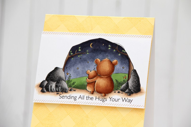
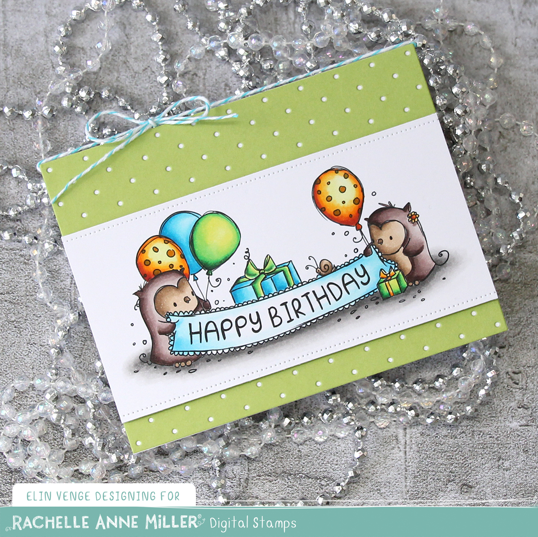
Hi, crafty friends! Rachelle Anne Miller has a new release out today, and I couldn’t pass up this Starry Night Bears image. I love the two bears looking up at the night sky, and the scene is so wonderfully framed, Rachelle knocked it out of the park with this one. If you use the code ELINVENGE at her store, you get 10 % off.
 I wanted the focus to be on the image and kept the rest of the card pretty simple. I stamped a sentiment from the Hugs Make Everything Better stamp set from My Favorite Things directly below my image using Smokey Shadow ink from Papertrey Ink. I wanted something a little bit softer than black, but I did stamp it twice, so maybe I should have used black after all. Close to the sentiment and close to the top of the scene I used one of the Stitched Borders dies from Lawn Fawn to create a decorative edge. I love faux stitching details on my cards, and this diagonal one is a fun change from the ones I normally use.
 Onto a panel of Lemon Tart cardstock from Papertrey Ink, I stamped the All Lined Up Diagonally Background stamp from My Favorite Things using Harvest Gold ink from Papertrey Ink, which is a tiny bit darker than the Lemon Tart. It adds subtle tone on tone interest to the background without distracting from the focal point of the image. I adhered the panel directly to a white top fold card base I created from Stamper’s Select White cardstock from Papertrey Ink and added my image towards the top of the card using foam tape for dimension.
 Simple color palette today. I also used BV27 for the sky, which is a color I’ve made myself.


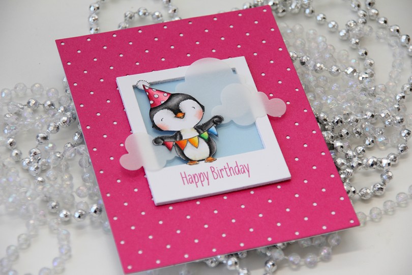
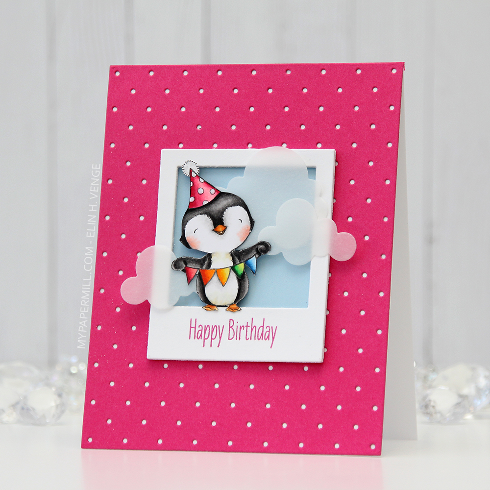 I love every image Stacey Yacula designs. This little penguin, from the
 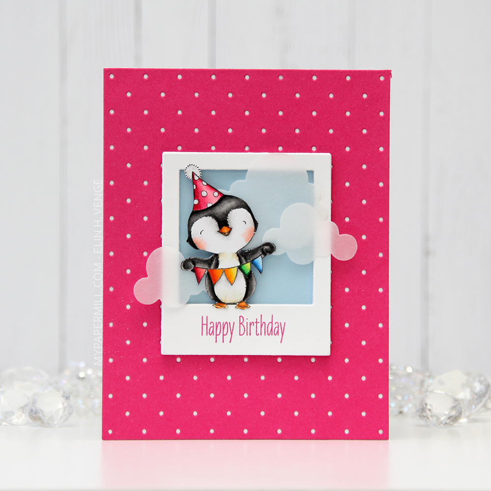 I created a polaroid frame by diecutting the
 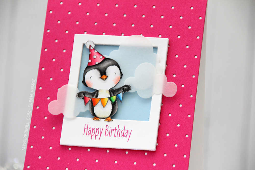 I wanted a little bit of interest to my background and diecut a piece of Raspberry Fizz cardstock from Papertrey Ink with the
 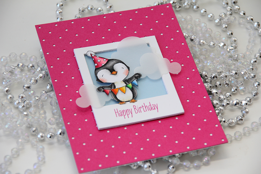 I glued my polaroid frame in the center of the card and added a few strategically placed vellum clouds. Because they hang off the edge of the frame, they break up the rigid rectangular look a little bit.
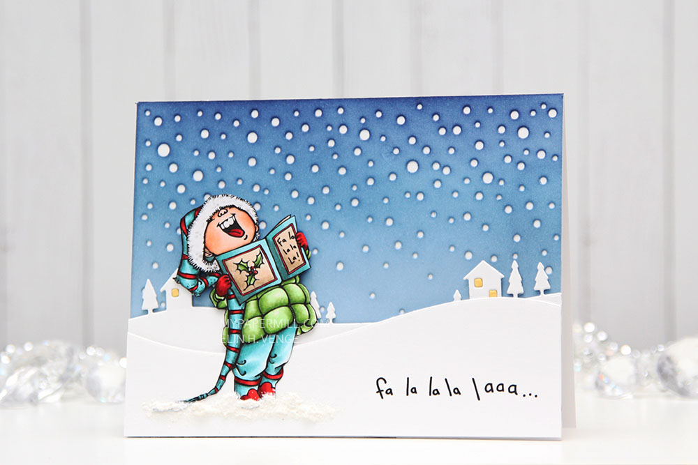
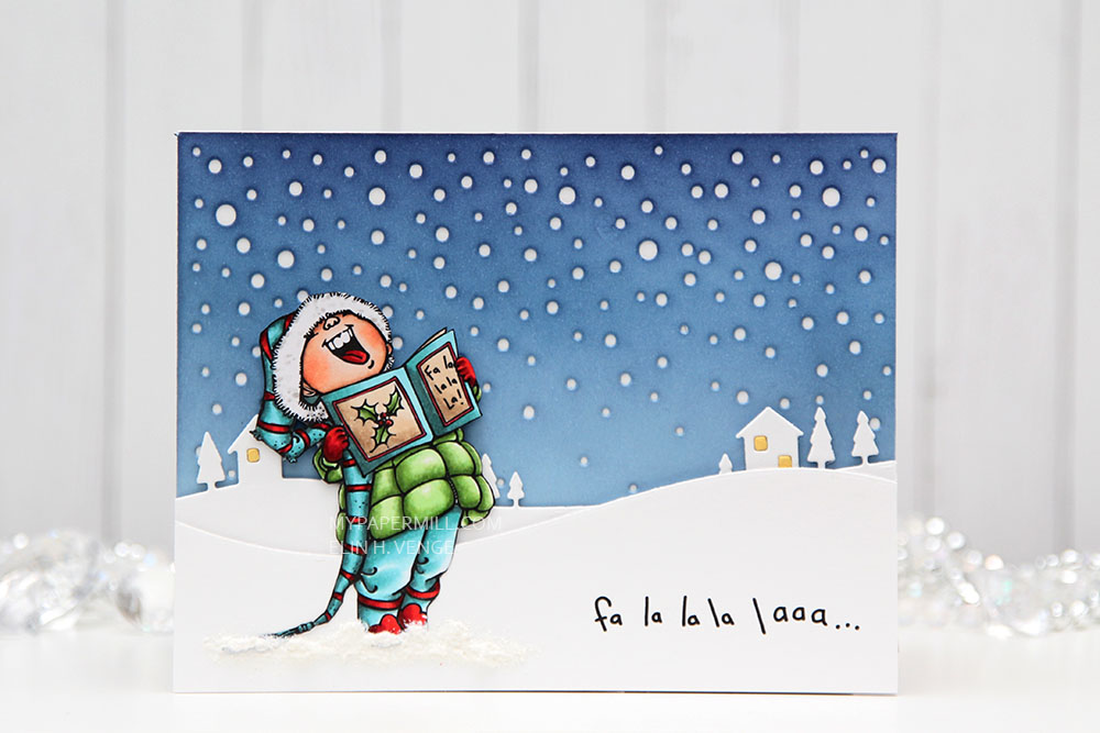 I diecut a panel of Spring Rain cardstock from Papertrey Ink using the Snowfall Backdrop die from Lawn Fawn and ink blended over the top. I used Chipped Sapphire Distress ink, Faded Jeans Distress ink, Stormy Sky distress ink and Spring Rain dye ink working my way from top to bottom, dark to light. I glued the piece straight onto my white cardbase.
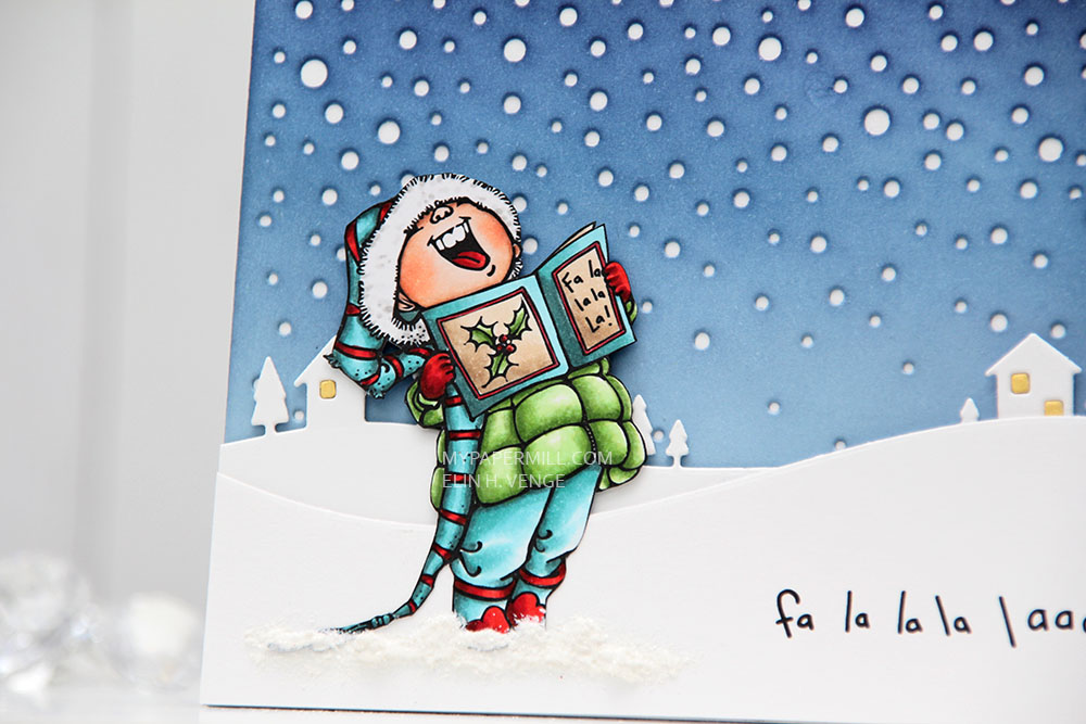 I used the Country Landscape die from Memory Box to diecut the background hills from Stamper’s Select White cardstock from Papertrey Ink. I used the same die to diecut the windows using Harvest Gold cardstock, also from PTI, and inlaid them. I popped the entire panel on low foam tape for a little bit of dimension. I then diecut my panel with the sentiment already printed using a die from the Stitched Hillside Borders die set from Lawn Fawn. I’m a huge fan of faux stitch dies, but since the Memory Box die doesn’t have the faux stitching, I didn’t want it on my top panel either, so I used the die upside down and glued this snow bank on with low foam tape. To ground my image I used snow paint just below it as snow, and sprinkled rock candy distress glitter on top while the snow paint was still wet.
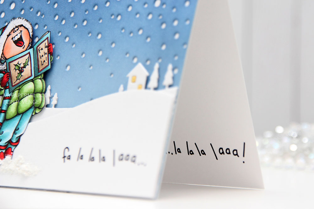 I changed up the sentiment a little. There’s an exclamation mark at the end, but I wanted that to be on the inside, so I added three dots instead and printed the same sentiment on the inside with the three dots in the beginning and the exclamation mark at the end.
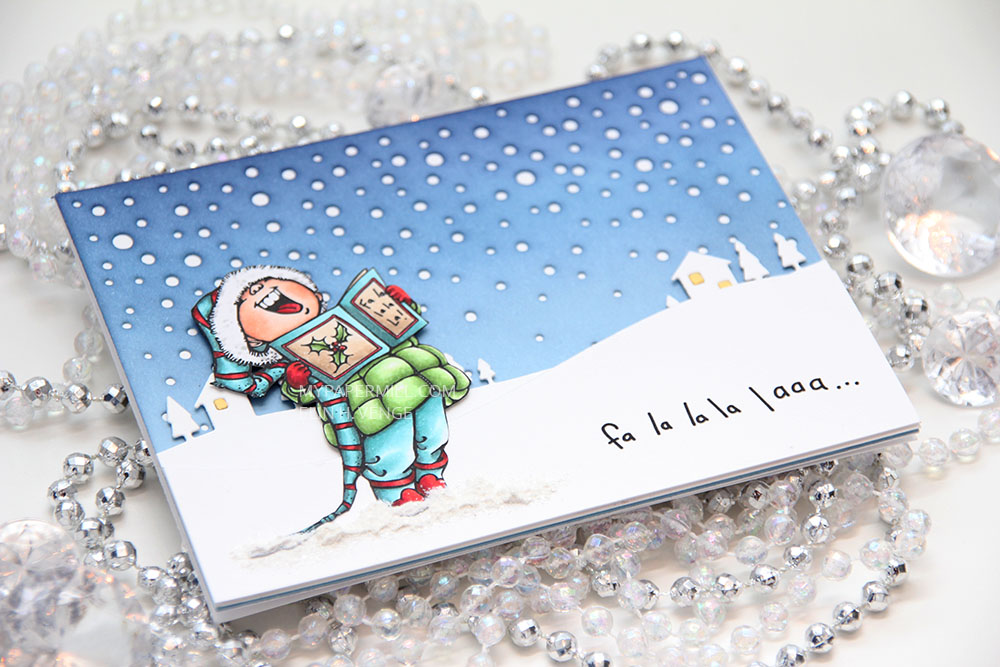 I was a little hesitant about using my blue background at first, because I didn’t think the image stood out enough against the blue. When I created the snow banks, the whole thing transformed, and I’m glad I stuck with the blue.
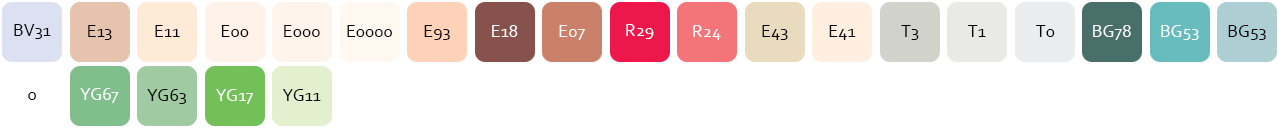 Not a lot of markers for this one.
 Med enkle kort kan man faktisk ikke gjøre feil, det syns så veldig godt, så jeg måtte være nøye med plasseringen av hjertene mine på dette kortet. De måtte alle være like langt fra høyrekanten, de måtte alle ha lik avstand mellom, og det måtte heller ikke være forskjell på avstanden fra det øverste hjertet til toppen og fra det nederste hjertet til bunnen. Pirk, med andre ord. Jeg er glad i pirk!
 Jeg brukte en die fra Lawn Fawn til å stanse ut alle hjertene i det hvite panelet mitt. Panelet er limt med lave 3D-puter til kartongen under, som er i fargen Melon Berry fra Papertrey Ink. I det nederste hjertet stanset jeg ut flere hjerter i Melon Berry-fargen og limte oppå hverandre, med en liten tekst fra Norsk Stempelblad stemplet og embosset på toppen. Til slutt pyntet jeg med paljetter fra Pretty Pink Posh på hjertet, og limte en diamant fra Kort & Godt i midten av hver.
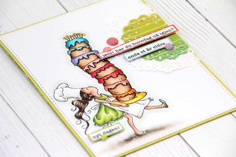
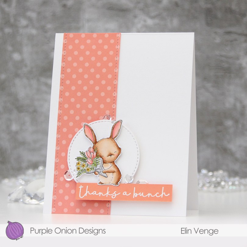
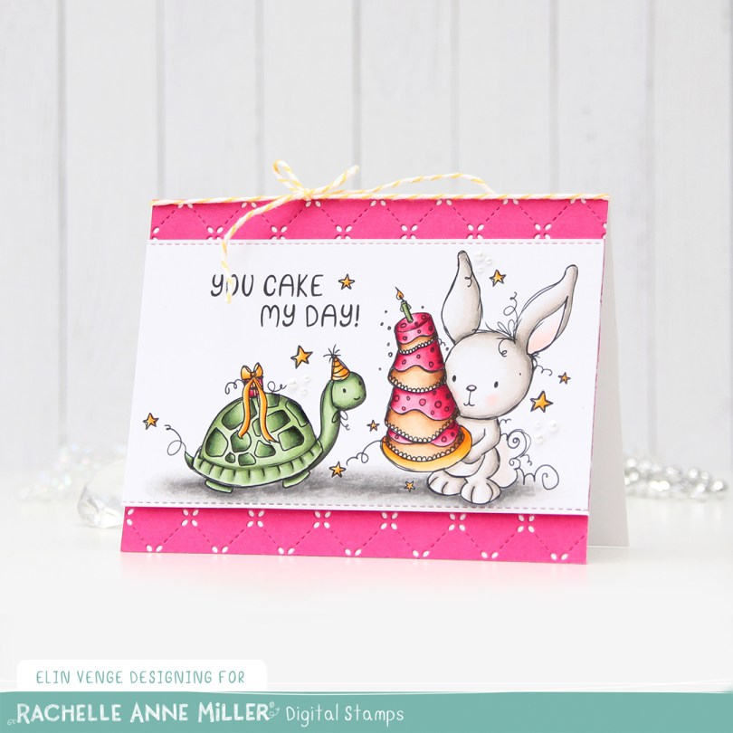
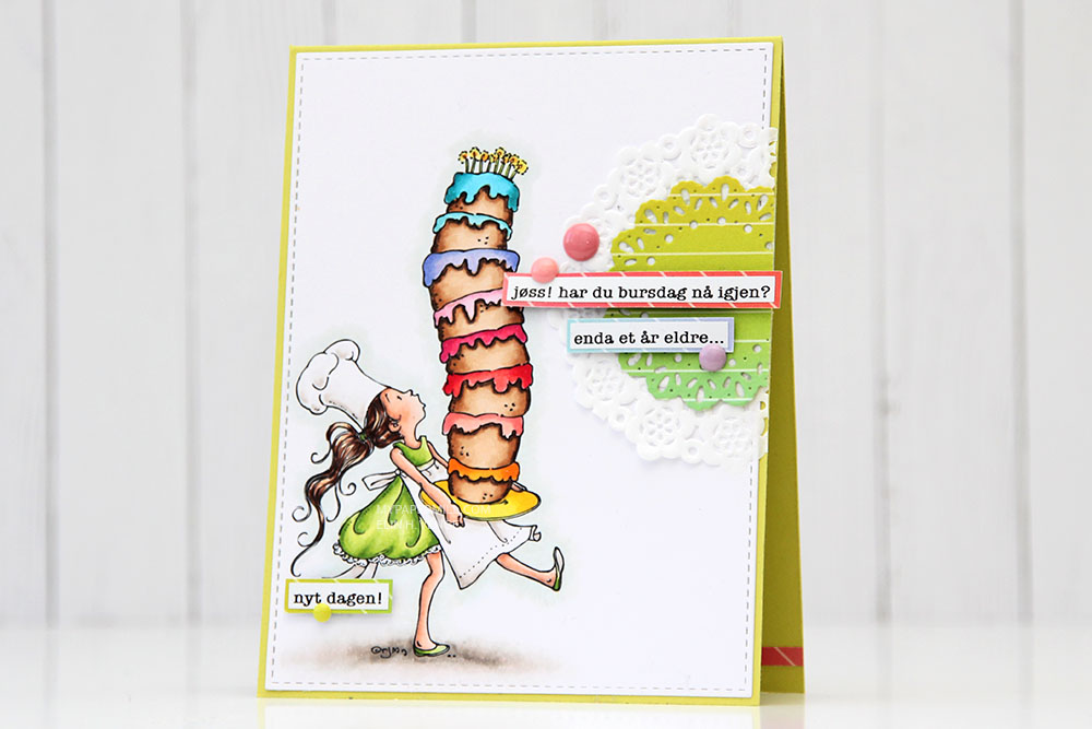 I wanted a very colorful cake, but had a hard time deciding what color her dress should be (and subsequently what color cardbase I needed). I went with a really bright green. It really is super bright. A Granny Smith apple is pale in comparison, this green is so vivid!
  I recently spent a crafty weekend with some really good crafty friends. I borrowed a die from one of them and a few sentiment strips from another.
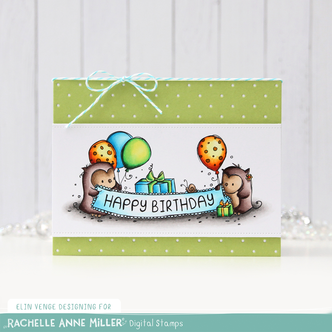
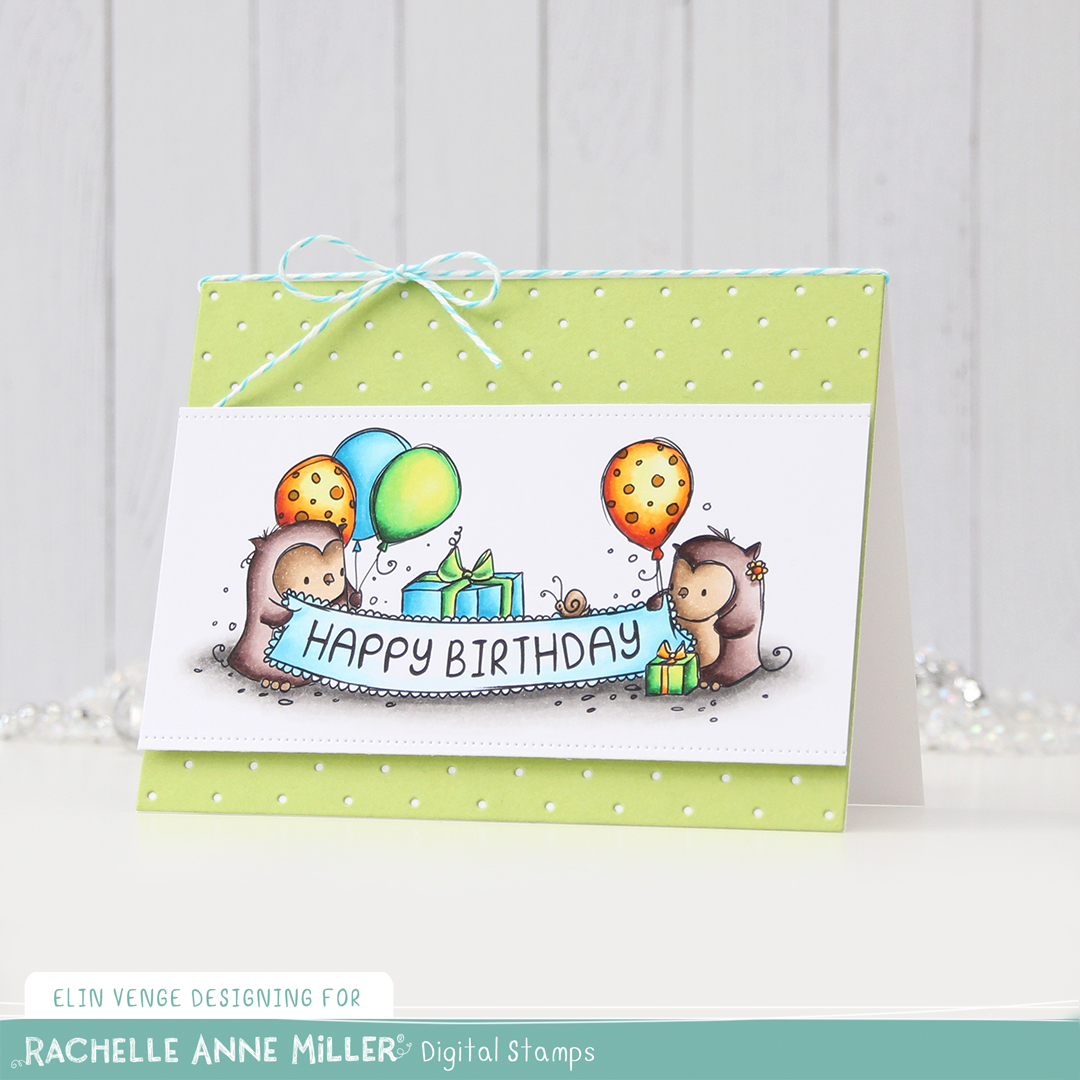
 I wanted to use enamel dots that matched the colors of the patterned paper matted behind the sentiment strips. The purple one matches better in real life, purple is a color that’s really hard to get right in photographs.
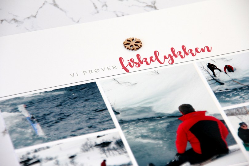
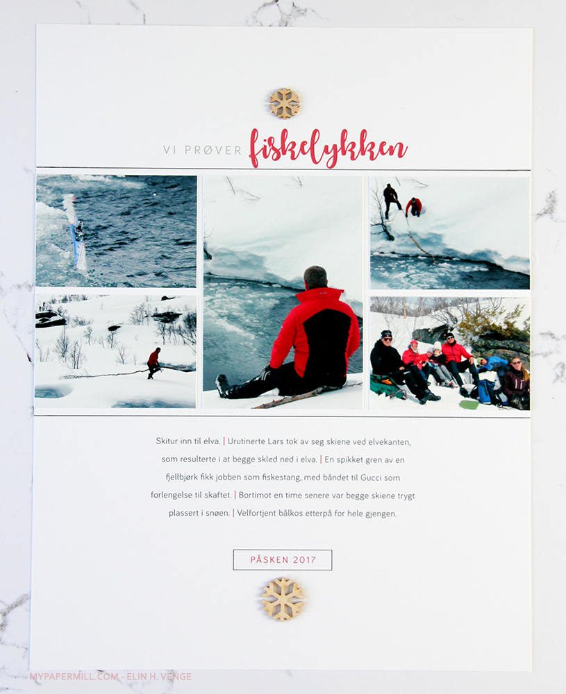 Dagens LO er dermed av det enkle slaget, men det er historien som er viktig å bevare for meg. Mannen til storesøs var en smule urutinert på hytta for et par påsker siden. Han tok nemlig av seg skiene på kanten ved elva da vi stoppet på tur – uten å sette opp skiene i snøen. Resultatet var selvsagt at begge skiene hans skled ned i elva. Han og pappa brukte en time på å fiske dem opp igjen, og det måtte det bli en liten historie av.
 Bildene er skrevet ut på fotopapir, resten av LOen rett ut fra Photoshop på Stampers Select White kartong fra Papertrey Ink. Det eneste jeg har brukt å pynte med er noen finérsnøfnugg fra Lawn Fawn. Det beste med å lage alt i Photoshop er at jeg kan få tekst og bilder til å matche. Jeg brukte den samme rødfargen som er på jakken til Lars på bildet til å skrive tittelen min.
 Ved å bruke den røde fargen på datomerkingen min og også på strekene mellom alle setningene får jeg en rød tråd gjennom hele layouten, selv om layouten i seg selv er veldig enkel.