Hei og hopp! Vi kom oss helt til tampen av året i år også før jeg viser et kort som ikke er laget på DT-oppdrag. Årets eneste, faktisk. Jeg fikk en bestilling på et bursdagskort til en hjemmesykepleier. Kortet skulle være humoristisk, ha vin som et morsomt innslag og masse glitter og stæsj. Jeg grublet lenge på hva jeg skulle gjøre. Veldig lenge. Til slutt satte jeg sammen dette kortet. Ifølge bestiller er det det kortet jeg noengang har laget som har passet mest perfekt, så jeg traff tydeligvis spikeren på hodet.
 Jeg hadde basisoppsettet relativt klart i hodet da jeg startet. Jeg fant frem det som for det meste var rester av ark fra Summertime-kolleksjonen til Maja Design og et motiv fra Art Impressions.
 Jeg lagde kortet som et 6×6″-kort med bretten på toppen (det er egentlig 6 x 5 7/8″ for å få plass til rygg på 1/4″), noe jeg ofte gjør med disse lag på lag-kortene mine med fargelagte motiver. Jeg lagde en lomme med plass til et par tager, og motivet var så stort at det dekket mesteparten av lommen.
 Motivet i seg selv er stemplet for å fargelegges med no lines-teknikk. Jeg maskerte bort noe av motivet. Sykepleieren til høyre holder nemlig egentlig i et krus. Jeg maskerte bort kruset og tegnet inn en vinflaske istedenfor, jeg skulle jo ha med vin på kortet. Selve motivet er fargelagt med Copics, og jeg har stanset ut det hele med en rektangeldie med juksesøm fra My Favorite Things. Det mørkeblå mønsterarket har også søm, nærmere bestemt sikksakksøm sydd på symaskinen øverst, og en rett søm nederst, så jeg kunne rive litt i mønsterarket og brette det litt bakover for bittelitt ekstra interesse.
 Jeg har pyntet med blomster fra Wild Orchid Crafts, Kort & Godt og North Star Design, samt noen blå diamanter, også fra Kort & Godt og et blått klistremerke fra Papirdesign som det står hurra for deg på.
 Tagene nedi lommen er stanset ut med dies fra Sizzix. På den mørkeblå har jeg stemplet et stempel fra Norsk Stempelblad AS med Enchanted Evening blekk fra Papertrey Ink. Den blomstrede tagen har en halvsirkel stanset ut på hver side, så det går an å træ en sammenbrettet pengeseddel inn på tagen. Bestiller skulle nemlig gi bort penger til jubilanten.
 Innsiden er ganske enkel. Jeg hadde ikke mye igjen av det mørkeblå mønsterarket, så det ble en tynn stripe bak tekstpanelet. Stempelet her kommer også fra Norsk Stempelblad AS, stemplet med samme blekkfarge som på tagen. Den andre innsiden har et helt likt panel med masse skriveplass.
 Enda et tekststempel fra Norsk Stempelblad AS er brukt på baksiden, med litt flere blomster.
 For å ta igjen noe fra forsiden har jeg fått med meg en rosa blomst og flere blå diamanter også her. Fortsatt var det lite igjen av det mørke mønsterarket, så det ble ikke mer enn en liten strimmel her heller. Det gjør ingenting, det blomstrete mønsterarket er så fint at det fortjener å få litt fokus.

 Jeg stemplet robotene rett på kortbasen med lysegrått blekk og lot dem være sånn uten å fargelegge dem. Jeg stanset ut et par bannere i mønsterpapir fra Denim & Friends-serien til Maja Design med dies fra My Favorite Things og embosset en tekst fra Norsk Stempelblad AS på det ene.
 Jeg limte på tannhjul fra idea-ology (mer Tim Holtz) og noen dotter fra Papirdesign i visuelle trekanter for å trekke øynene til teksten.
 Blått og brunt banner, blått og brunt i dotter og tannhjul. Selv om dette kortet ikke er voldsomt overdådig liker jeg å holde meg til en enkel fargepalett, det gir mer ro og harmoni på kortet. Her ser du også en liten sniktitt på innsiden, jeg brukte nemlig rammen til det blå banneret på innsiden av kortet.
 Jeg stemplet en tekst fra Papirdesign med mørkeblått blekk fra Papertrey Ink inni rammen min, og det er liksom det lille ekstra på kortets innside.
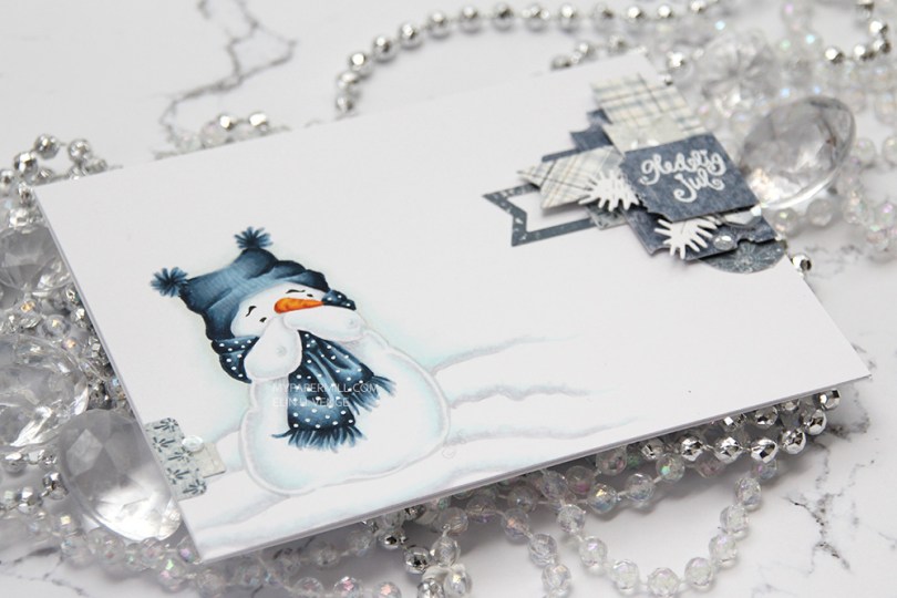

 I printed him out in soft gray lines to be able to color him up and get the lines disappearing, I love the soft look on no line coloring, espesially on snow. I glued my panel of X-Press It onto my top fold card base and added a very dimensional cluster of diecut patterned paper scraps from Maja Design. I stamped and white heat embossed a Norsk Stempelblad AS sentiment on that top ticket stub, and embellished very sparsely with some Sparkling Clear sequins from Pretty Pink Posh.
 I like making clusters like this, and it’s such a great way to use those tiny scraps, I’m sure we all have them. I rarely make my clusters this dimensional, but it’s kind of fun to see all the layers and view it from different angles.
 I didn’t use a lot of Copic colors for this one, it is a pretty simple image, after all. I hope you give clusters a try, they’re fun to make. And let’s not forget about that adorable snowman! Hope you have a nice day!
 I’ve made a tag for a Christmas present with the adorable
  I added snow with chunky white embossing powder, glued on the corner of a small paper doily and a diecut ticket stub from patterned paper on top of that with some 1 mm foam tape. I stamped a tiny Norsk Stempelblad AS sentiment with Scarlet Jewel ink from Papertrey Ink and decided to also add a few snowdrift sprinkles by Little Things from Lucy’s Cards. I love these tiny white clay snowflakes.
 Gift tags, by nature, need space for names. I stamped another Norsk Stempelblad AS stamp on another patterned paper ticket stub and mounted it to the back my tag using more of that 1 mm foam tape.
 I årets aprilnummer av Ett trykk hadde vi en artikkel med fokus på alternativ layout. Inspirasjonen bak hele artikkelen var et kort jeg hadde laget som Annie syns var fint fordi det hadde et annet oppsett en et vanlig kort. For meg var det ikke noe uvanlig med kortet eller andre kort av samme type som jeg lager, men jeg gjør tydeligvis noe litt spesielt av og til uten at jeg er klar over det selv. For meg var det derfor av en eller annen grunn vanskelig å lage kort med alternativ layout, siden jeg ikke helt skjønte hva som var så alternativt med noen av oppsettene mine i utgangspunktet. Likevel fikk jeg laget noen kort, og dette er ett av dem.
 Jeg kuttet korte kartongstrimler i fire forskjellige farger og limte dem på skrått tett i tett på kortbasen min. Over stemplet jeg et tekststempel fra Norsk Stempeblad AS i den samme fargen som den ene kartongen jeg hadde brukt, og det var hele forsiden på kortet. Jeg hadde litt rester av kartongstrimlene som jeg limte på kortets innsider.
 Er det alternativt? Eller er det et helt normalt, enkelt kort? Jeg lar deg få avgjøre.
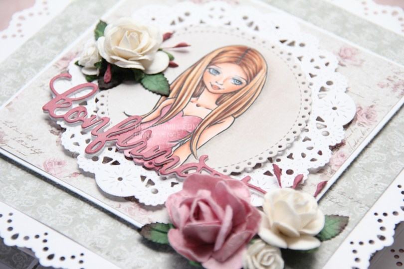
 I used Mo’s
  The pink I used for the dress matched perfectly with the roses in the Vintage Romance collection by Maja Design. I stacked white konfirmant diecuts on top of each other and finished off with a pink one on top colored with the darkest Copic I used for her dress. I’ve added dimension to pretty much all the panels, and a few flowers to embellish a little.
 When you pull on the front of the card, there’s a neat little suprise behind it, four accordian folded “walls”, one on each side. I stamped confirmation sentiments from Norsk Stempelblad AS in Papertrey Ink Autumn Rose ink on punched circles of patterned paper and added them to my accordian folds.
 Inside the “walls” of the card, I put a sentiment from Stempelglede, stamped in the same Autumn Rose ink from Papertrey Ink that I used on the punched circles.
 I colored my image years ago, so I have no idea which Copics I used. I added more contrast to the image at some point last year, but that doesn’t mean I remember any more. My memory’s pretty good, but not THAT good!
 I rummaged through my blue scraps of patterned paper for this card. The dark blue one is from the Muligheter collection by Papirdesign, and the paler blue is from the Denim & Friends collection by Maja Design.
 I chose stitched STAX sets from My Favorite Things (Stitched Rectangles STAX Set 2 and Stitched Circle STAX) to diecut all the panels on my card except for the blue circle I used as a mat for my sentiment, I used a Spellbinders die for that, it was the only “oddly” sized circle die I found in my stash, and it fit perfectly around my other circle with a 1/16″ border, which I happen to think is the perfect border size!
 I glued my matted sentiment circle to the card using foam tape, and decided to add a few dark blue Papirdesign enamel dots to add more circular elements.
 For once I decided to put something on the back. I don’t usually do that on my simple cards, but I really wanted to use that pale blue diecut strip I’d made, and I really love that Norsk Stempelblad AS sentiment (What? Aren’t you older?) that I stamped in Papertrey Ink Enchanted Evening ink.
 This card is large, it’s nearly 8 inches wide. Not what I normally do, but I really wanted to use all the birds.
 I stamped a Norsk Stempelblad AS sentiment in blue ink. I actually double stamped to get the right color. I used Salty Ocean Distress Oxide ink for my first stamping, and then Papertrey Ink Blueberry Sky on top. The combination matches the coloring of the images well, but looking at the photos, I’m thinking there’s a possibilty I should have gone with Enchanted Evening, which is the same color as the blue cardstock I used for my cardbase.
 The colors I used for my image. I actually used R39 to deepen my blues, it worked really well for that.
 I’ve colored up
  I diecut some scraps of Maja Design patterned paper from different Christmas collections and added them in a cluster in the top right corner. I’ve got Fröjdefull Jul, Home for the Holidays, and red monochromes from the Joyous Winterdays collection all in a neat little cluster, diecut with dies from Docrafts, Craft Emotions, and My Favorite Things.
 I white heat embossed a Norsk Stempelblad AS heart on one of the diecut pieces, and that’s my card for today.
 I’ll try to be better at including the colors I’ve used, so here they are.
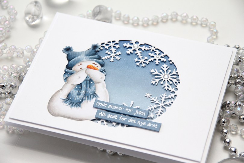
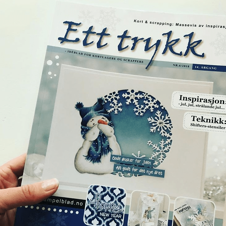 This card is actually published in the
  I made the cardbase with some Stamper’s Select White cardstock from Papertrey Ink. It’s my favorite white cardstock, nice and thick and bright white. I cut another panel of the same cardstock slightly smaller and diecut a window using a Hero Arts die. I ink blended my cardbase using three colors of blue dye ink; Papertrey Ink Spring Rain, and Stormy Sky and Faded Jeans Distress Ink from Ranger.
 I colored my snowman on X-Press It blending card using Copics (W4, W3, W1, W0, W00, C2, C1, C00, E000, B0000 for snow, B99, B97, B95, B93, B91 for the blue, and YR18, YR12, and Y35 for the carrot), before fussy cutting him and adding him to the left side of my diecut snowflake window.
 I ink blended a couple of strips of cardstock to make it match my blue background inside the circle. When the ink was dry I added a couple of