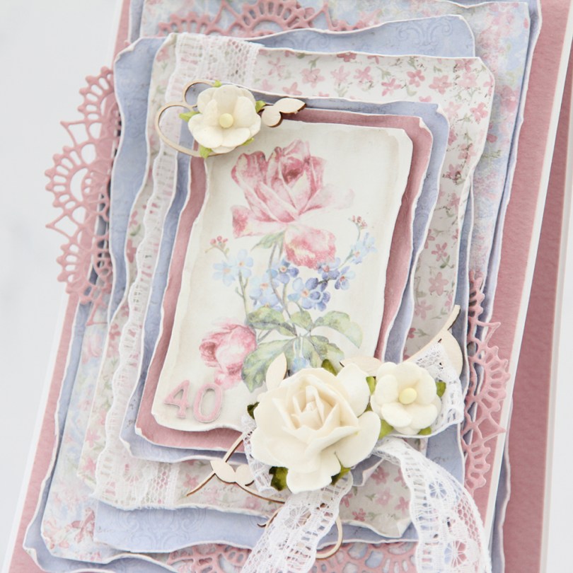
 There are two types of cards I love making more than any other: Christmas cards and birthday cards. I love making clean and simple cards, but also very layered ones with lots of patterned paper. Today’s card is one of those, made exclusively with papers from the Sofiero collection from Maja Design.
 One of the things I love the most about Maja Design paper is the quality of the paper they use. It’s almost as thick as cardstock, something I haven’t really found in other patterned papers. Their patterns are gorgous, too, making card making a breeze. The thick quality also means I can use a wet paint brush (with clean water) and run along the edges, before using my fingers to curl them slightly back. This is so much easier to do when the paper is wet, and so much easier to do with these good quality papers. Thinner paper won’t hold up as well to all that water. I love the look you achieve by doing this.
 I’m not an embellishment queen. I use a little bit on cards like this, but I rarely do a lot. This time, I used some pieces of chipboard from SnipArt and a few flowers to frame the image in the center of my card. I also used some lace to combat the rigid look you sometimes get when using just straight lines like square or rectangular panels.
 I also added a couple of diecut doilies to further break up the linear look, and added stacked diecut numbers to the bottom left of the focal point of the card. As you can tell from this photo, this is a card with lots of dimension, it’s not very mail friendly.
 I did a little bit of layering on the insides, as well. They are both the same, and those pink center panels provide plenty of room to write a personal message to the birthday girl.
 On the back of the card I stamped a sentiment from Norsk Stempelblad AS using Papertrey Ink Autumn Rose ink. The text is about butterflies, so I thought it fitting to add a few chipboard ones for a little bit of extra interest.
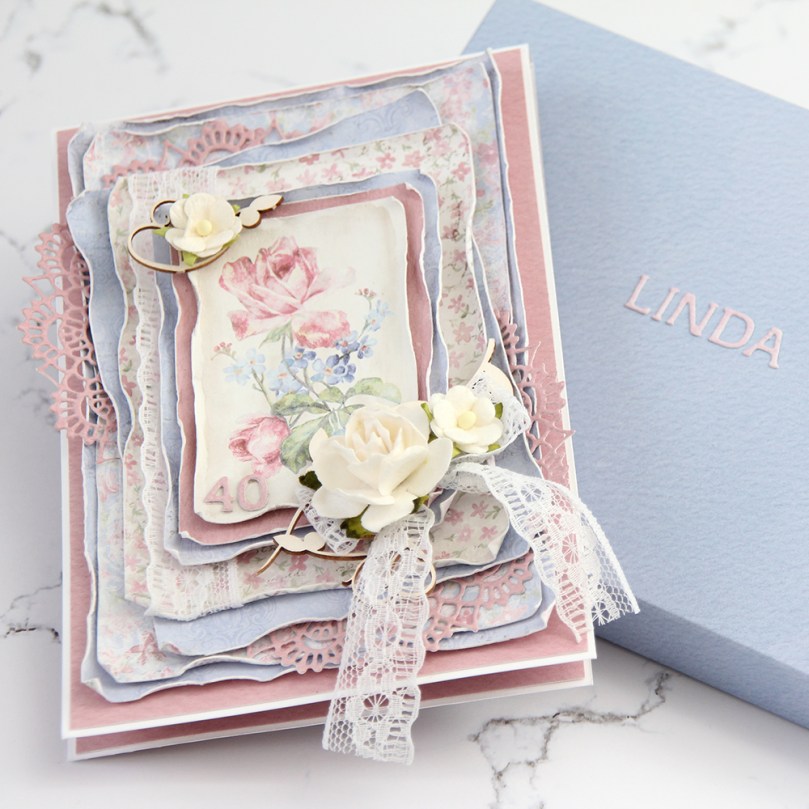 Even though my card isn’t very mail friendly, I needed something to put it in, so I made a box envelope to go with it and added the recipient’s name on the front of it. The card was hand delivered, so this works perfectly.
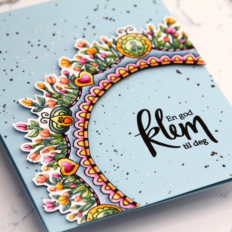
 This is a lot more artsy than what I normally do. I printed the image with an opacity setting of 25%, colored it with Copics and then used a Copic multiliner to add back in some black lines in selected areas before fussy cutting my image with a thin, white border on the outside and straight up to the black line on the inside.
 I used foam tape from Gina K to pop up my colored piece onto a cardbase I made from Spring Rain cardstock from Papertrey Ink.
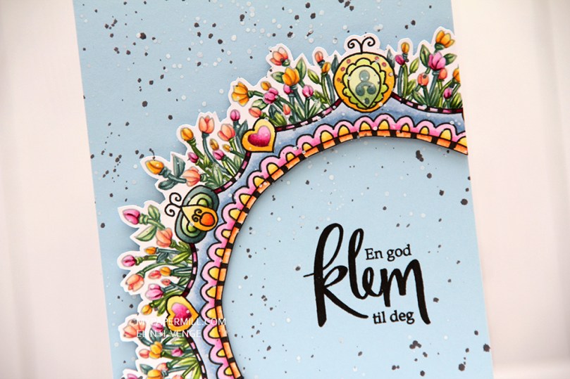 I stamped a Norsk Stempelblad AS sentiment using VersaFine Onyx Black ink, and added splatters across the entire card with white liquid watercolor from Hero Arts and a watered down black ink.
 Not exactly my usual style of card, this one. What do you think?
 I printed my image on a piece of X-Press It cut down to 4 1/4 x 5 1/2″. I colored my image with my Copics and used the largest of the stitched rectangle dies from My Favorite Things to cut it slightly smaller.
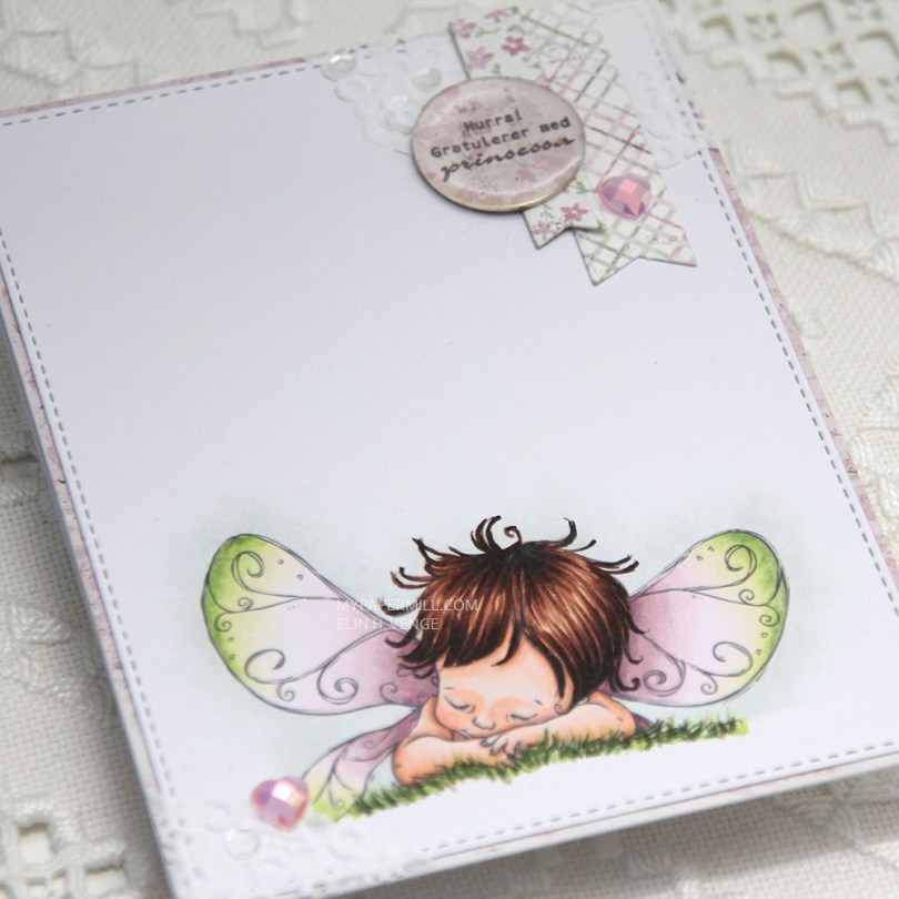
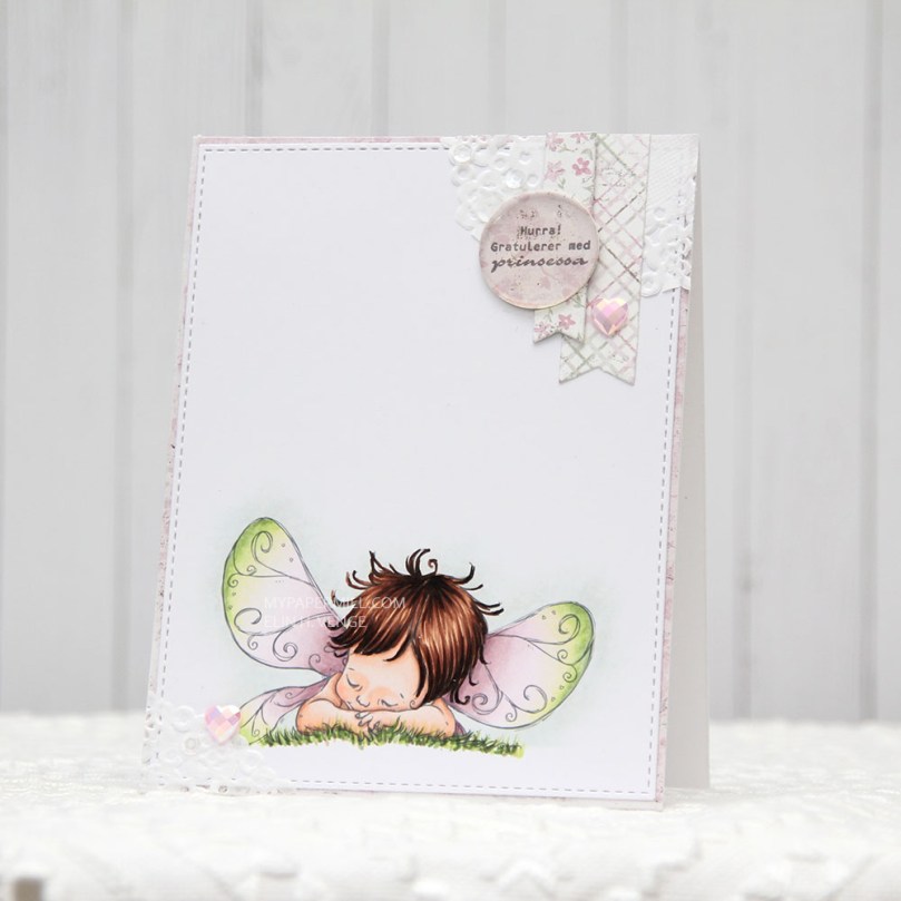 I’m also doing my best this year to use scraps of patterned paper. I have a basket of scraps that I’ve cut down to card front sizes, and I realized pink is the color I have the most of, which was the reason for my color choice today. I found a pink scrap in the basket that I wanted to use, colored my image in matching colors and took a bit of a dive into my smaller scraps to find pieces to use for my cluster. The circle with the sentiment is actually cut from the center of the patterned paper I used on the front of this card, which is a scrap from the Vintage Summer Basics collection from Maja Design. The diecut banners are from the Sofiero collection, the colors were perfect for this card.
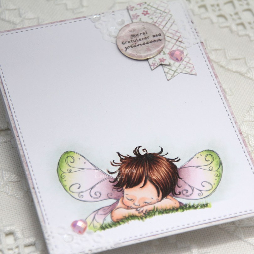 I used part of a Doodlebug mini paper doily in the top right corner as a base for my small cluster. I had a tiny bit left over and glued in the opposite corner. I embellished very simply with a couple of hearts from the Rosy Glow mix from Little Things from Lucy’s Cards and sequins from the White Orchid Sequin mix, also from Little Things from Lucy’s Cards. I added an epoxy pebble to the sentiment circle for a little bit of extra dimension and interest.

 Jeg startet ved å sverte distress oxide-blekk (fargene
  Jeg limte deretter
  Deretter skjærte jeg til en bit
  Jeg stanset ut det svertede panelet først, og deretter mosegummien med samme die. Jeg tar dette i to runder. Hvis jeg stanser ut begge samtidig blir ikke kuttekantene på mosegummien jevne, og jeg kan få rynker i kartongen siden presset under dermed ikke er jevnt. Ved å stanse ut i to omganger holder alt seg mye penere.
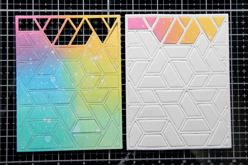 Den neste delen av jobben er litt pirkete. Her tok jeg ut hver bit av den svertede biten, fjernet beskyttelsespapiret fra den dobbeltsidige teipen på baksiden og limte den på tilsvarende bit mosegummi. Da alle bitene var på plass tok jeg flytende lim på baksiden av hver mosegummibit (forsiktig, så jeg ikke fikk lim på rammen) og limte det på frontpanelet på kortet mitt. Jeg la noe tungt oppå og sørget for at alt tørket ordentlig.
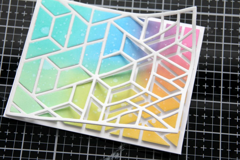 Deretter kunne jeg fjerne mosegummirammen forsiktig fra resten av kortet, og bitene ligger igjen der de skal.
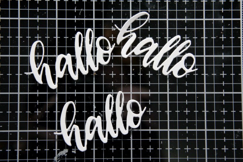 Jeg stanset ut en hallodie fra Papirdesign flere ganger i hvit kartong og limte dem oppå hverandre for dimensjon.
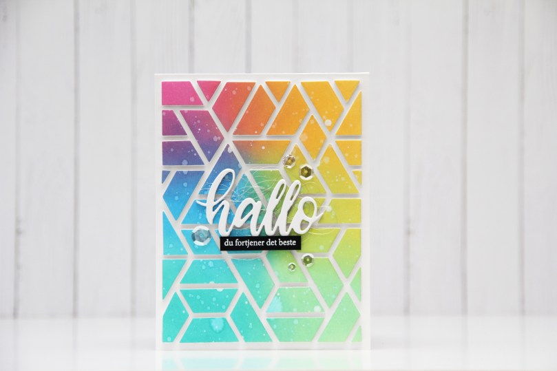 Da var det bare igjen å lime hallo på kortet, også her brukte jeg flytende lim, og lurte litt englehår fra Mester Grønn under for å lage litt mer liv i kortet.
 Jeg stemplet også en undertittel på svart kartong og embosset i hvitt. Det blir et ordentlig blikkfang på et såpass fargerikt kort. Jeg satte på tekststripen min med 3D-teip.
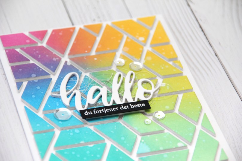 Noen paljetter fra Pretty Pink Posh er siste lille finish.
 Takket være at jeg limte alle bitene på kortet mens jeg fortsatt hadde rammen rundt er de nå perfekt plassert, og kortet er veldig rent selv om jeg har brukt mange farger.
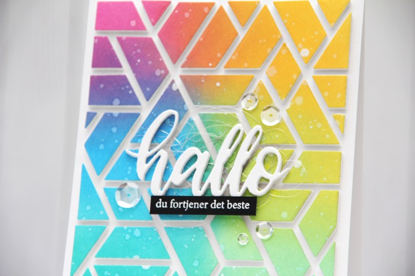 Det er ingen hemmelighet at jeg digger å fargelegge, men jeg digger også å lage kort som dette, selv om det er litt pirk å lime alle bitene sammen. Jeg er faktisk ganske glad i pirk også!
 Anyone who knows me knows that I’m terrible at sticking to schedules. Seriously awful. And every year I tell myself to get started on Christmas cards early and make them throughout the year to avoid being swamped come November. Every year I’m swamped in November because I fail to make them throughout the year. I’m off to a good start this year though, I’m starting with this
 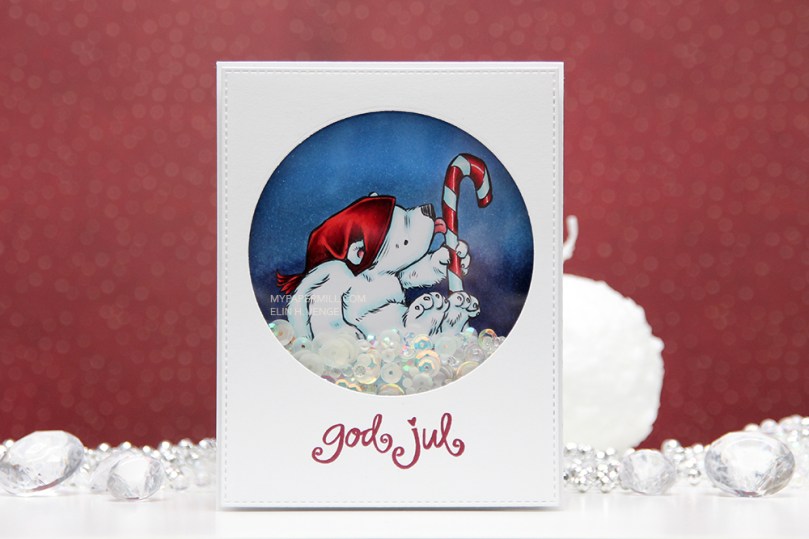 I printed my bear onto X-Press It blending card (the best paper for Copic coloring) and colored it with Copics. Normally, I probably would have made his hat blue, but I wanted a dark blue background, so I needed a color that would pop against it. Anyone who knows me would also know that I’m not a fan of red for Christmas cards, but in 2019 I made quite a few Christmas cards with red in them anyway, and I guess I’m starting the new year with it, too. Not to worry, though, I’ll get back to my regular blue eventually, it IS the color of the year, after all.
 I diecut a front panel with faux stitching around the edges and a nice big window in the top center. I stamped a Norsk Stempelblad AS sentiment using Papertrey Ink Scarlet Jewel Ink, added acetate behind my window and glued it to the front of my card using two layers of craft foam to really make those sequins and other few elements inside the window shake!
 I love the dimension you get on such a simple card by doubling up the foam, it makes a big difference, and everything inside the window moves more freely.
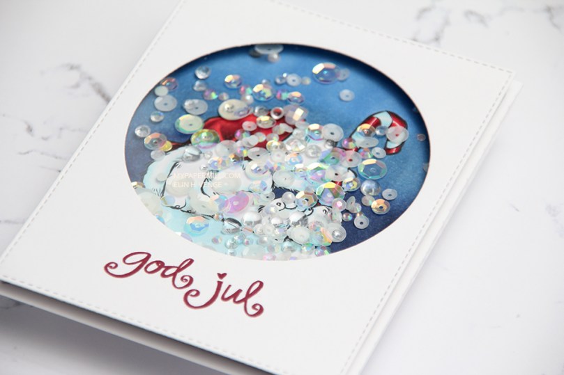 I’m a bit of a perfectionist, so I made sure all the sequins were turned the right way before I glued my shaker shut. I used a combination of two different mixes from Little Things from Lucy’s Cards. Most of the elements are from the
  Not a whole lot of colors on this image. I also used R52, which is a color I’ve made myself.
 It’s Mo day (aka Wednesday). One of the last things I did in 2019 was to clear away all the jars of flowers from the desk in my craft room (I had about 50 of them). I figured I don’t really use flowers all that much on my cards anymore, so I didn’t need them to be easily accessible and take up space on my desk. I put them in a cabinet right below the ceiling, I was able to cram all of them into one single cabinet. The last card I made in 2019 had flowers on it. We’re barely two weeks into the new year, and I’ve made another one with flowers. For both cards I had to climb on a ladder and pull out a bunch of jars to get to the flowers I wanted. Maybe removing those jars wasn’t such a good idea after all?
 Good idea or not, this was the card I made. I colored up Mo’s
  I partially die cut my image with some of the bubble hanging out, and glued it to my card using lots of foam tape. I haven’t used my frame dies from GoKreate in a while, so I thought I’d break them out for this one. I usually make my card from the third largest die in the set (the XXL Square Frilly Frames #10 set), but I want to see how far into 2020 I can get with using just scraps, and the third largest die in the set requires a full sheet of paper to die cut two pieces (front and back of the card). The next size down was the perfect size for this scrap of Maja Design patterned paper, and it was also a good size for the green patterned paper from Papirdesign that I used behind my image and on the insides of the card.
 Speaking of insides – I diecut an eyelet circle with a Cottage Cutz die, stamped a Norsk Stempelblad AS sentiment using Memento Sweet Plum ink and again used lots of foam tape. I even diecut a scrap strip of another purple piece of Maja Design patterned paper to go across.
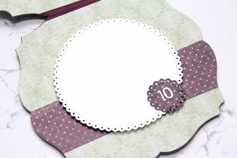 The second inside has plenty of space for a personal message, and I diecut another eyelet circle from patterned paper and added a couple of diecut numbers from Scrapmagasinet to my circle. I thought this card would be the perfect birthday card for my niece, she turns 10 in June!!
 I used the same design on the back, but used a green strip instead of a purple one. Another NSB sentiment, once again stamped in Memento Sweet Plum ink, and once again glued on with lots of foam tape.
 There’s quite a bit of dimension in this card, and with that great image as the focal point, I think this will be perfect for my niece!
 Lots and lots of Copics used for this one, but there are 15 colors in the heart bubble alone.
 I’ve got
  I quickly found out that the closest Copic color to that specific Pantone color is B99. How perfect is that, the B90s are my favorite blues in all the land. I colored my image and glued it to my card base with lots of foam tape. All I did embellishment wise was add a couple of those little diecut banners (they’re so wide you can hardly see the V shape) and enamel dots from Papirdesign. The white heat embossed sentiment is from Norsk Stempelblad AS.
 I love anything and everything blue – expect to be bombarded with lots of blue this year!

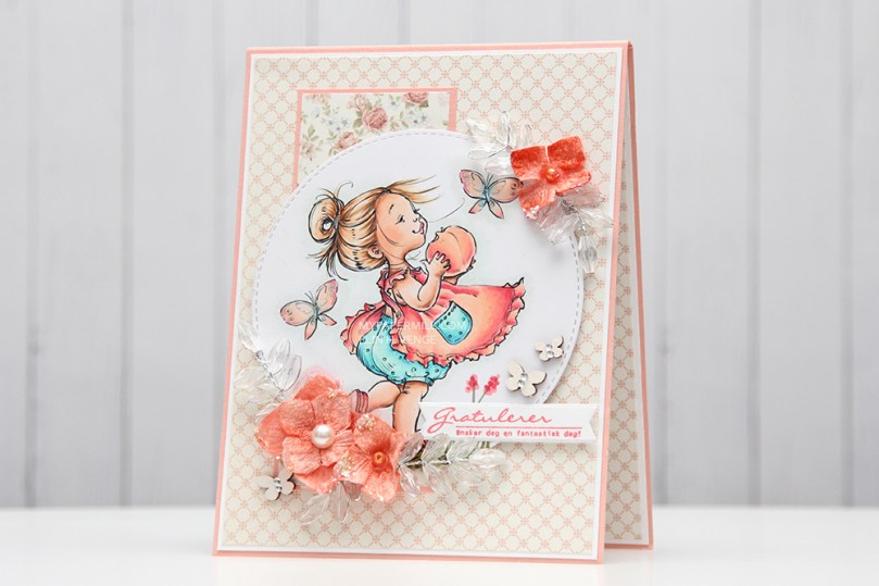 What’s more summery than peachy colors, flowers and butterflies? I colored up
  I’ve sort of gone back to my roots with this card. Layers (though not many), colored Bazzill card base, Pion Design patterned papers, flowers and those little clear acrylic branches are all things I used to use a lot, but rarely use any more. It’s fun to shake things up every once in a while, especially after making so many clean and simple Christmas cards.
 I don’t know what colors I used to color up my image, it’s been about eight months, after all. I may have written it down somewhere, but if I did, I don’t know where. I’m usually good at writing things down in a book, but I’m also known for some serious Post-it notes usage. I’m not sure where the Post-it went. Or even if there ever was a Post-it for this particular color combination on this particular image. What I do know is that it’s not in my book.
 I glued all my cardstock and patterned paper panels down using double sided tape. For the diecut image, I used foam tape, and lots of it. I was not shy. A roll of foam tape lasts forever, so I like to cover the entire back for even dimension with no sag. I think I bought ten rolls a couple of years ago. I’ve given one away and am halfway through my second roll, so I still have seven sitting in a cabinet in my craft room.
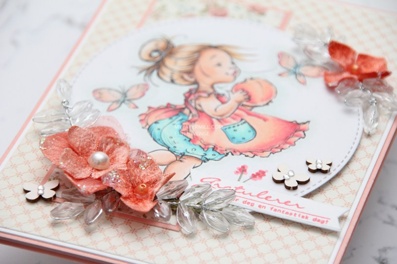 I used a hot glue gun to attach my flowers and those acrylic branches. I have a low temp hot glue gun that I love for things like this. It dries instantly and stays put. For the butterflies and the pearl in the center of the largest flower, I used connect glue from Gina K. It’s the best liquid glue out there, those butterflies aren’t going anywhere!
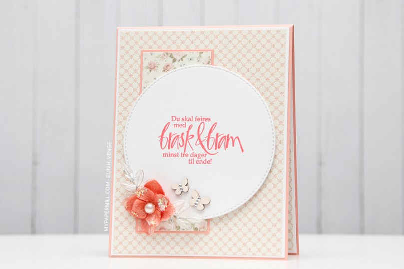 I used the same design on the insides and on the back of my card. There’s no dimension to the circles on the inside of the card, but I used foam tape on the back circle as well. A sentiment from Norsk Stempelblad AS stamped in a combination of VersaMark and two different colors of Distress Ink (Worn Lipstick and Abandoned Coral). Normally, I’m not a fan of distress ink used with clear stamps, they tend to bead up on the surface of the stamp, and the result you get isn’t the best. I didn’t have a peachy ink pad, however, and if you use VersaMark on the stamp and then distress ink right on top of that, you can reduce the beading and get a better stamping. Not perfect, but better than distress ink on its own. And much better than having to compromise and use black or brown or another color that wouldn’t go as well with the rest of the card.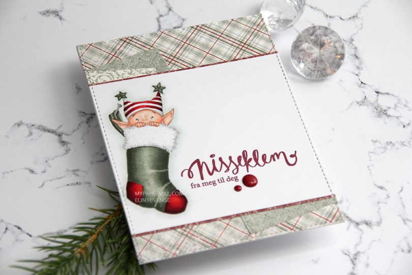
 I love coloring Mo’s images using the no line technique, and this one was no exception. I don’t remember what my initial plan was, but I printed the image in the top left corner of a 4 1/4 x 5 1/2″ panel, something I pretty much always do with my images. This time I struggled to come up with a card design that worked, so I wound up chopping off everything below the stocking, so I could use it along with pieces of patterned paper on the front of my card.
 I try using scraps for my cards, and the plaid patterned paper scrap from Maja Design was exactly 4 1/8″ long. I placed it carefully in the largest of the faux stitch rectangle dies from My Favorite Things for a nicely finished edge, and did the same for all the other pieces of paper, creating a seamless seam along all the edges.
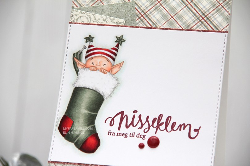 I stamped a sentiment from the B04 stamp set from Norsk Stempelblad AS using Papertrey Ink Scarlet Jewel ink and added a couple of Papirdesign enamel dots as a finishing touch.
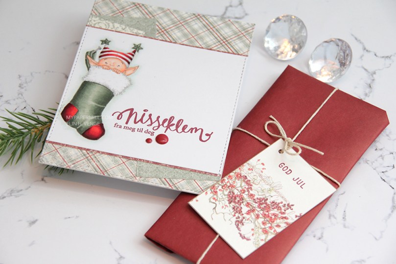 I mailed my card along with a small Christmas present for my secret Santa contribution at Copic Norge. I used another Norsk Stempelblad AS stamp set to stamp GOD JUL on the gift tag. Very simple.
 You’d think I’d use very few colors on such a small image, but no 😉 Considering 7 of these are for the skin alone, it’s no wonder I always use lots of markers!
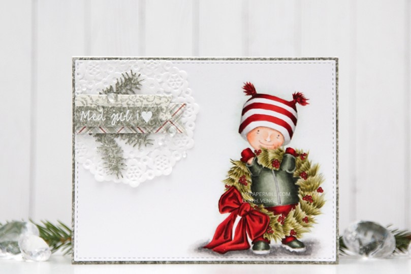 I used the largest of the dies from the Stitched Rectangles STAX 2 set from My Favorite Things to diecut the panel with my little guy, just for some subtle detail.
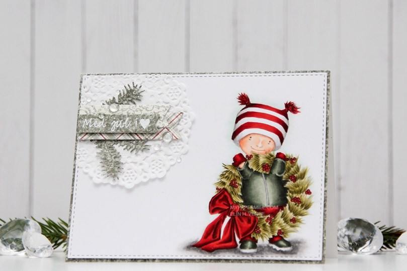 I covered the front of my card panel with a green piece of patterned paper and mounted my faux stitches colored panel with some low foam tape.
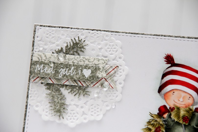 In the top left corner I made a very typical Elin cluster. I started with a Doodlebug Design mini doily for some softness, and made sure I didn’t glue it down completely. The little lift you get by not glueing it down is just enough. I diecut a few branches from that green patterned paper with a couple of CraftEmotions dies, a few banners with a die set from My Favorite Things and stamped a sentiment from Norsk Stempelblad AS that I white heat embossed. I finished with a few raindrops from Little Things from Lucy’s Cards.
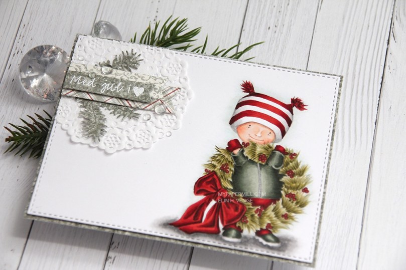 Mostly green and white, with a little hint of red. I’m not a huge fan of red for Christmas, but the combo of this deep brown based red and this grayish, blueish green works for me.

