Hi, everyone! Another Wednesday, and another Mo day around here. This time I have a little bit of Alphabet Soup to share with you.
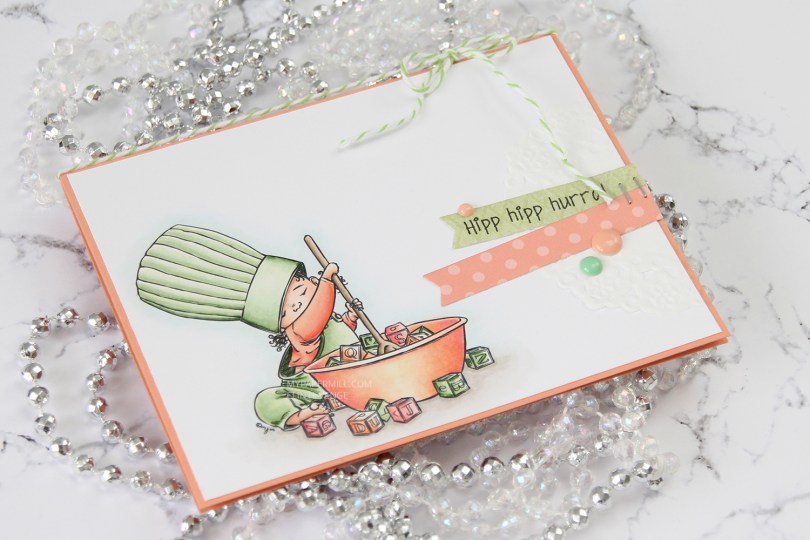
 I printed my image onto X-Press It blending card towards the bottom left corner of a quarter sheet. I colored it in with my Copics, before trimming it down to 5 3/8 x 4 1/8″. I wanted the Melon Berry cardbase from Papertrey Ink to show around the edges, and this size panel creates the perfect 1/16″ border on all four sides.
 If you’ve seen a card or two from me previously, you’ll no doubt know that I’m a fan of adding clusters on my cards. They vary in size and some are simpler than others, but they tend to have three things in common: a piece of a paper doily, fishtail banners and enamel dots or sequins. I also usually put my elements on straight, but this time I went for a less rigid look. I went through my patterned paper scraps and found a green piece from the Vintage Garden collection by Pion Design and diecut it using a fishtail flag frame die from My Favorite Things. I thought I’d have to go for just a piece of cardstock for the other banner, but then I remembered that I have a paper pack from Sunny Studio with pastel colors, and one of them fit perfectly.
 I stamped a Norsk Stempelblad AS sentiment onto the green banner using My Favorite Things Extreme Black ink and stapled the two banners together before gluing them onto the card. I added a string of Green Apple divine twine to the top of the card and a few My Mind’s Eye enamel dots to finish it off. In real life, the green dot looks closer to the greens I used in my image. Photos sometimes lie.

The color palette doesn’t lie, these are the Copics I used to color my image.


 I did what I usually do by diecutting the panel with the hippo using the largest of the stitched rectangle dies from MFT. This is the one die I use more than any other, and it gives such a nice look with that faux stitching around the edge and the 1/16″ border of the cardbase (in this case Berry Sorbet cardstock from Papertrey Ink) showing.
 I diecut a word die from Kort & Godt four times from Aqua Mist cardstock and glued them all together for a stacked look. There was just enough space above the head of that hippo for the word to fit nicely. I stamped and white heat embossed a Norsk Stempelblad AS sentiment on a piece of that Berry Sorbet cardstock and added three more layers behind that, so it’s flush with the word above.
 The small birds were also colored way back in 2018 for that same challenge as the hippo with the balloons. They didn’t have cheeks colored in, so I just went in with a couple of red markers and then a white pen on top to make them look like the first bird. I fussy cut both and added them to my sentiment to form a visual triangle. A few enamel dots from My Mind’s Eye finishes the card nicely. I usually know exactly where to put my enamel dots (or sequins or other small embellishments), but I was really stuck on this one and couldn’t find a good placement until
  Last, but not least, the Copics I used for this card.
 I printed
  I’m no stranger to adding clusters on my cards, so I pulled out half a paper doily from Doodlebug Design, more scraps of Maja Design patterned paper (the Vintage Summer Basics and Vintage Autumn Basics collections) and diecut a couple of banners using the Fishtail Flag Frames die set from My Favorite Things. I also stamped and white heat embossed a Norsk Stempelblad AS sentiment, before punching it out using my 1″ circle punch from EK Success. I added a pebble on top for an extra bit of dimension.
 I also added some sequins (from the Ice Water mix) and a couple of heart shaped drops (from the Crystal Collection – Glass mix) from Little Things from Lucy’s Cards, and my card was done.
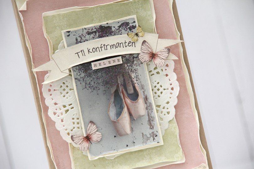
 I was able to scrounge up scraps of paper from three different paper collections from Pion Design: Grandma’s School Book, Till Mor, and Play Time. I wet and curled the edges to soften the look a bit, and also added a paper doily from Bo Bunny.
 Til konfirmanten is a stamp from Norsk Stempelblad AS. I stamped it using Espresso Truffle ink from Memento, I didn’t want it to be stark black, and that ink is a nice mix of grey and brown that I really like. I used some tiny letter stickers from Kaisercraft to add the girl’s name below the banner, and fussy cut a few butterflies from one of the patterned papers and glued them on.
 I kept the insides fairly simple. The sentiment stamp from Stempelglede is a Goethe quote (Magic is believing in yourself. If you can do that, you can make anything happen). The panel on the right side is perfect for a personal message.
 I decided to also keep the back of the card simple. I added another butterfly and stamped “Handmade” below in the same color ink that I used on the front of the card.
 This is one of Mo’s birthday fairies. Her name is Dee, and you can find it in the store
  I diecut my panel using the largest of the faux stitch rectangle dies from My Favorite Things. I think it’s the perfect size as it creates a 1/16″ border when I add it to my cardbase. The color scheme might not be typical of me, but the layout definitely is. I added half a mini paper doily from Doodlebug Design, diecut some scraps of pink patterned paper to go with my image using another favorite MFT die set (Fishtail Flag Frames) and stamped a Norsk Stempelblad AS birthday sentiment using Papertrey Ink Hibiscus Burst ink. The ink matches the cardstock, which is also Hibiscus Burst from Papertrey Ink.
 I added my banners using foam tape and embellished very simply with some sequins from Pretty Pink Posh. I even used my scissors on one to cut a little bit off and tucked it underneath that sentiment banner. Laura Bassen would be proud, haha.
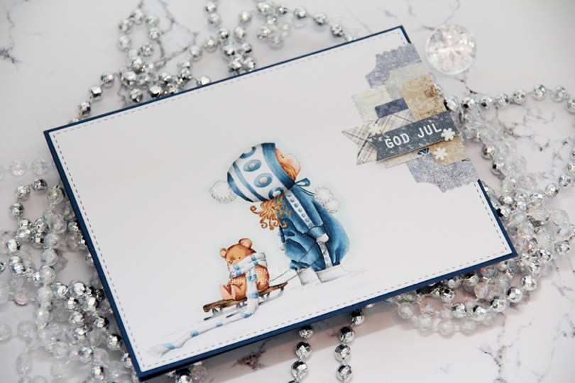
 I had to use my favorite color combination for Christmas on this one. Blue, grey and brown. I made my greys very light, so they look more white than grey, and I have to admit I kind of love the look! I printed the image with 15 % opacity and did no line coloring. I love no line coloring!
 This card is very “me”. The cardbase is made from Papertrey Ink Enchanted Evening cardstock, I used a die from My Favorite Things to add the faux stitching detail on the main panel, and I added a little cluster of diecut patterned paper scraps. I stamped and heat embossed a Norsk Stempelblad AS sentiment on one of the patterned paper pieces and added three snowdrift sprinkles from Little Things from Lucy’s Card as my finishing touch.
 Clean and simple with cluster, these cards come together so easily once the image is colored.
 I used quite a few colors for this simple image. Lots of different earth tones for different parts of the image, and two grey families.
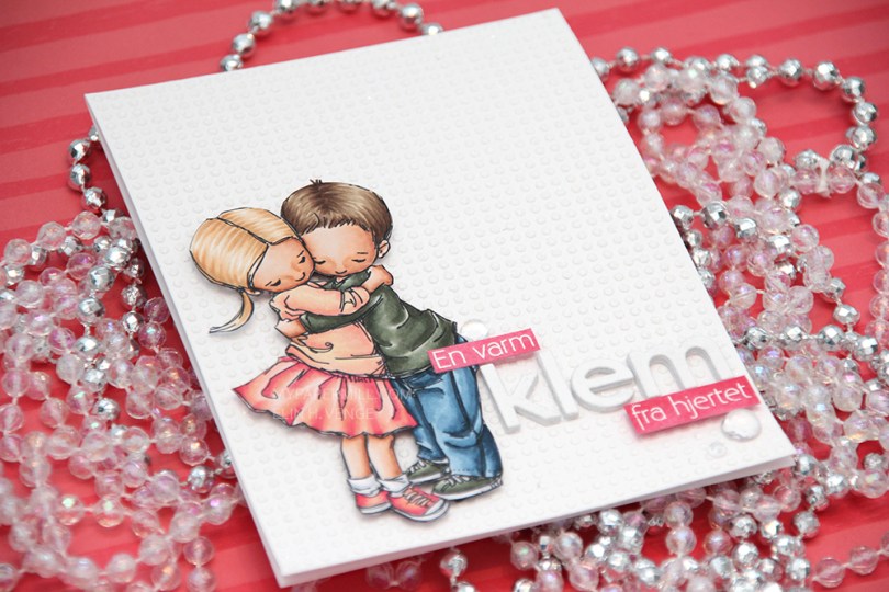
 I colored up
  This card is somewhat different for me. It has a lot of white space, which is fairly common for me, but I used a stencil and texture paste on the card base to change it up a bit, which definitely isn’t normal for me. I even sprinkled distress glitter all over the texture paste while it was still wet, so the card sparkles when you tilt it in the light. Glitter is a nightmare to photograph, though, so it doesn’t show up in the photos very well.
 I used the Parker alpha set from Memory box to diecut the word klem, which means hug in Norwegian. I diecut each letter five times and glued them together for a stacked, dimensional look. I created a couple of pink cardstock pieces by using one of the Copic markers I used on the skirt, stamped the remainder of my sentiment and heat embossed in white before glueing them on with clear foam tape.
 By adding part of my sentiment on top of the image, I get a more cohesive design than I would have if I had put my little sentiment strip above the word only. Just a little design tip. I finished off the card by adding a few raindrops from Little Things from Lucy’s Cards.
 These are all the Copics I used, and I must admit that I really love the pink and peach combos I came up with for this one.
 I colored up
  I’ve had this image for so long, and it really felt good to finally color it up. I used the largest of the dies in the Stitched Rectangles STAX (2) set from My Favorite Things, before heat embossing a Norsk Stempelblad AS sentiment in white using super fine detail embossing powder from Ranger.
 I love the look of those heart shaped raindrops from Little Things from Lucy’s Cards. They’re part of the crystal collection and add the perfect little touch to such a simple card.

 I turned my image into a card last night by stamping a sentiment, diecutting the entire panel with a faux stitch rectangle die, adding that to my card front and embellishing very sparingly with three clear crystals from the Ice Water mix from Little Things from Lucy’s Cards. That’s it.
 The sentiment is from the B04 stamp set from Norsk Stempelblad AS. I love the stamps Åshild has designed and am so glad I have so many different sets from them. I used Enchanted Evening ink from Papertrey Ink. It’s a beautiful dark blue color.
 Cards don’t get much simpler than this. And cards like this are so fun to make, too.
 Would you believe I used 10 (yes, ten) different colors for the fur?? Am I crazy?
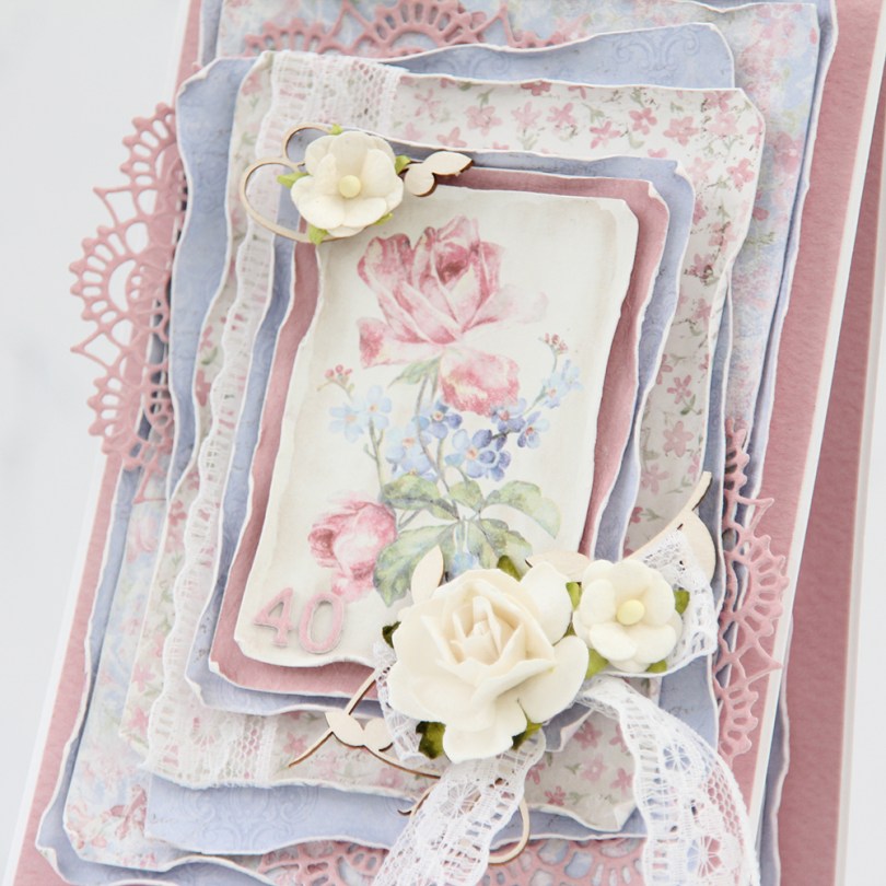
 There are two types of cards I love making more than any other: Christmas cards and birthday cards. I love making clean and simple cards, but also very layered ones with lots of patterned paper. Today’s card is one of those, made exclusively with papers from the Sofiero collection from Maja Design.
 One of the things I love the most about Maja Design paper is the quality of the paper they use. It’s almost as thick as cardstock, something I haven’t really found in other patterned papers. Their patterns are gorgous, too, making card making a breeze. The thick quality also means I can use a wet paint brush (with clean water) and run along the edges, before using my fingers to curl them slightly back. This is so much easier to do when the paper is wet, and so much easier to do with these good quality papers. Thinner paper won’t hold up as well to all that water. I love the look you achieve by doing this.
 I’m not an embellishment queen. I use a little bit on cards like this, but I rarely do a lot. This time, I used some pieces of chipboard from SnipArt and a few flowers to frame the image in the center of my card. I also used some lace to combat the rigid look you sometimes get when using just straight lines like square or rectangular panels.
 I also added a couple of diecut doilies to further break up the linear look, and added stacked diecut numbers to the bottom left of the focal point of the card. As you can tell from this photo, this is a card with lots of dimension, it’s not very mail friendly.
 I did a little bit of layering on the insides, as well. They are both the same, and those pink center panels provide plenty of room to write a personal message to the birthday girl.
 On the back of the card I stamped a sentiment from Norsk Stempelblad AS using Papertrey Ink Autumn Rose ink. The text is about butterflies, so I thought it fitting to add a few chipboard ones for a little bit of extra interest.
 Even though my card isn’t very mail friendly, I needed something to put it in, so I made a box envelope to go with it and added the recipient’s name on the front of it. The card was hand delivered, so this works perfectly.