Hi, everyone! I have a few cards to share today, all of them using just a few products. The Happy Birthday collection from P13 has some great images that are perfect for quick, easy birthday cards.
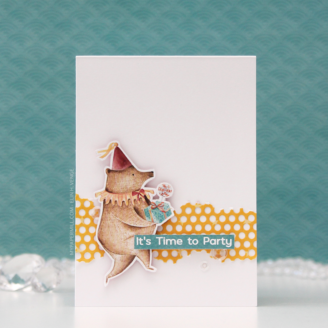 I’m starting with this bear, ready for a party! The papers in the P13 collections don’t have individual names, they just have numbers, and I fussy cut this bear from 05. I die cut a piece of 01 using a die from Papirdesign, tearing the edges for an uneven look and glued it straight onto my 4 bar top fold card base, before adding the bear with foam tape for dimension.
 03 in this collection from P13 has wide, diagonal stripes in different colors. I cut it down to strips, and used them to emboss my sentiments to get the perfect color matches. The sentiment on this card is from the Bitty Bears stamp set from My Favorite Things. I added the sentiment strip using foam tape, and finished off the card with some sequins from the White Orchid Sequin mix from Little Things from Lucy’s Cards.
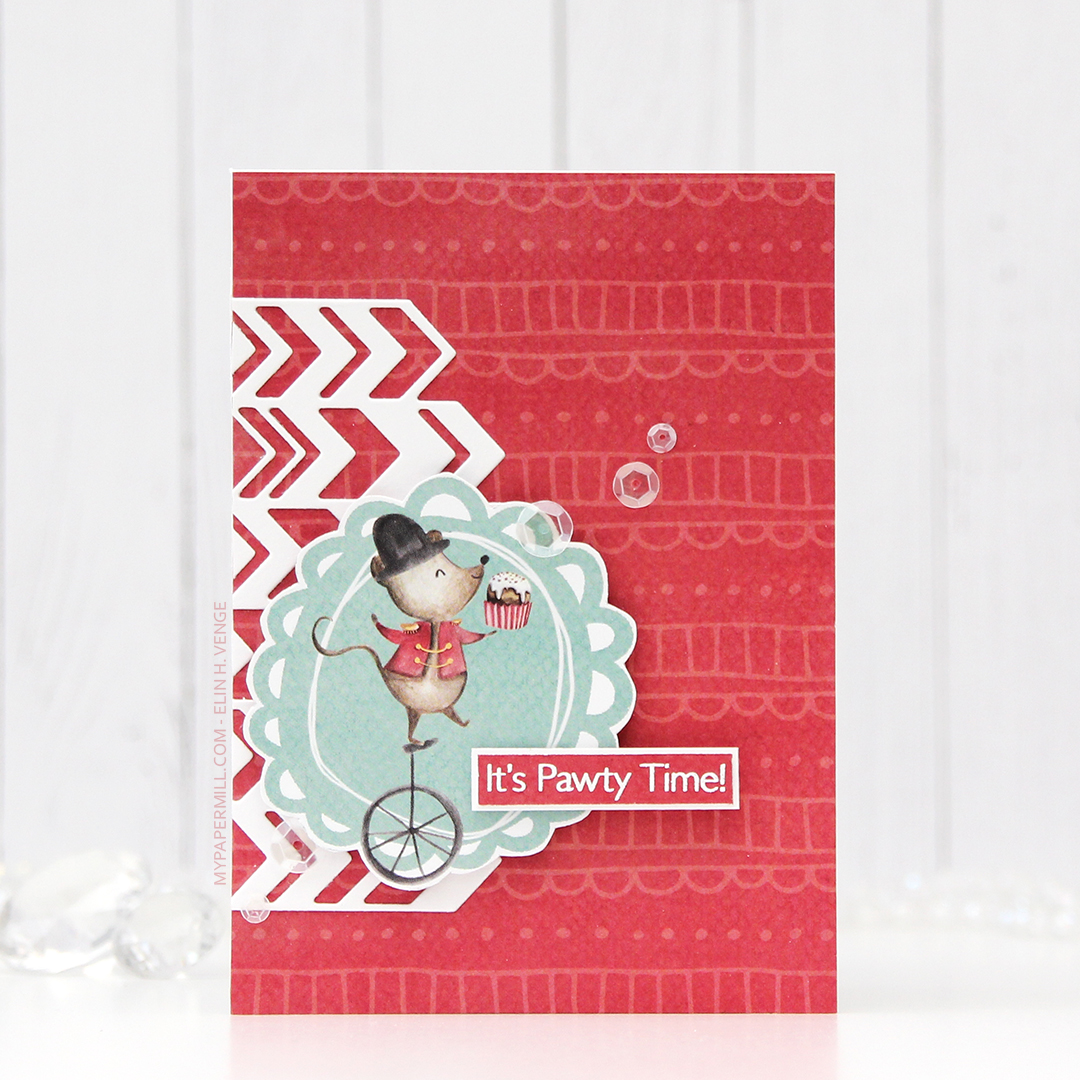 For my second card I covered the entire card front with the back of the 05 sheet. Most of the papers in this collection have lots of images on the front, and are more plain on the back, of course with colors that coordinate. The little mouse on a unicycle is from the 02 sheet, and again I used 03 to stamp my sentiment on. This sentiment is also from My Favorite Things, it’s from the Pawty Time stamp set.
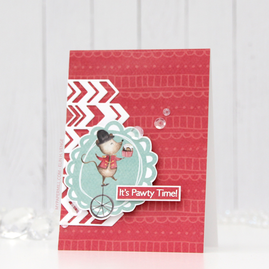 I die cut a chevron pattern from white card stock using a die from Papirdesign and adhered it directly to my patterned paper card front, before popping up the image on foam tape, and the sentiment on even more foam tape. Again I added sequins from the White Orchid Sequin mix to finish the card.
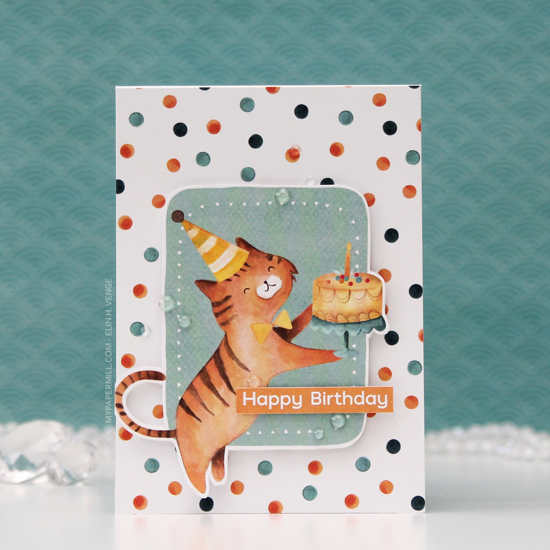 Card number 3. Now, I’m not sure whether this is a cat or a tiger, but whatever he is, he’s definitely ready to party. I fussy cut him from the 02 sheet, and I used the back of the same sheet to cover the card front. Once again, I popped the image on foam tape for dimension.
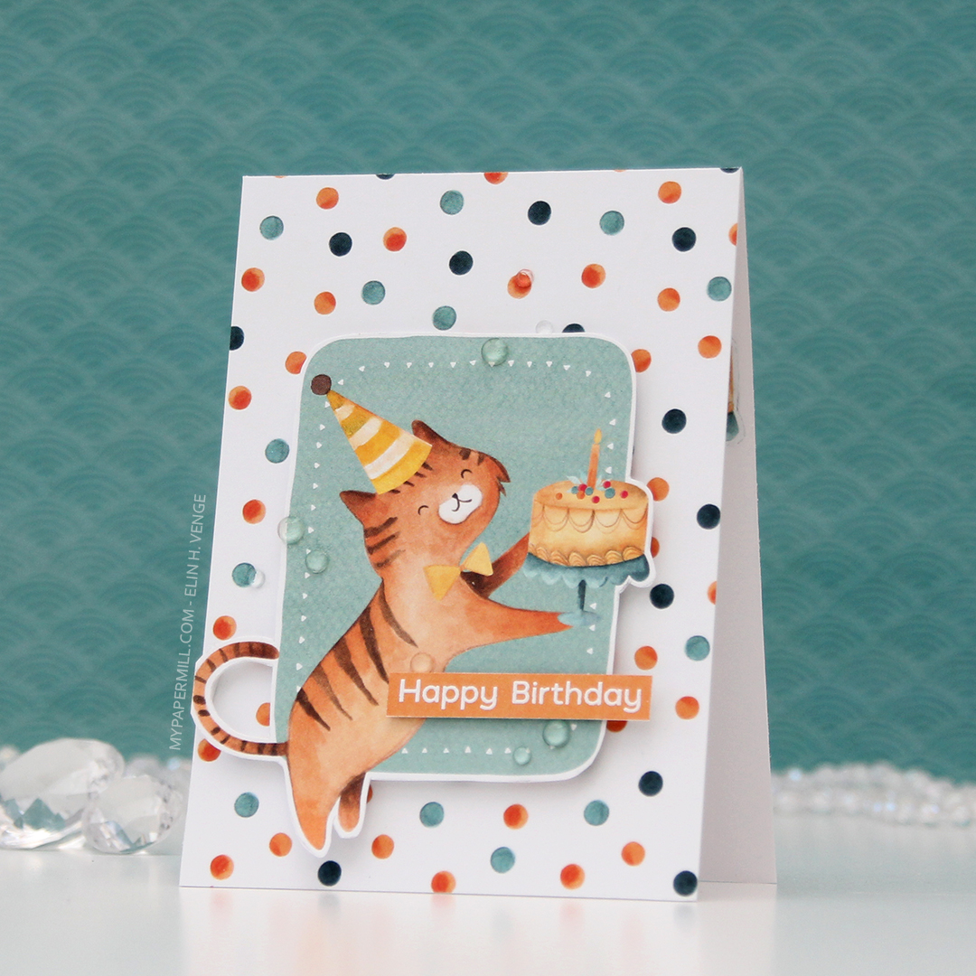 I used the Happy Birthday sentiment from the Bitty Bears stamp set again, and this time I used some clear gems from the Crystal Glass collection from Little Things from Lucy’s Cards to embellish.
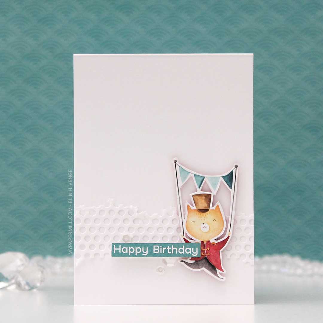 I made the last card for today very simple. I die cut the same hole pattern as I used for the first card, only this time in white card stock for a bit of textured interest in the background. The cat is from the 05 sheet, which I used a lot of for these cards.
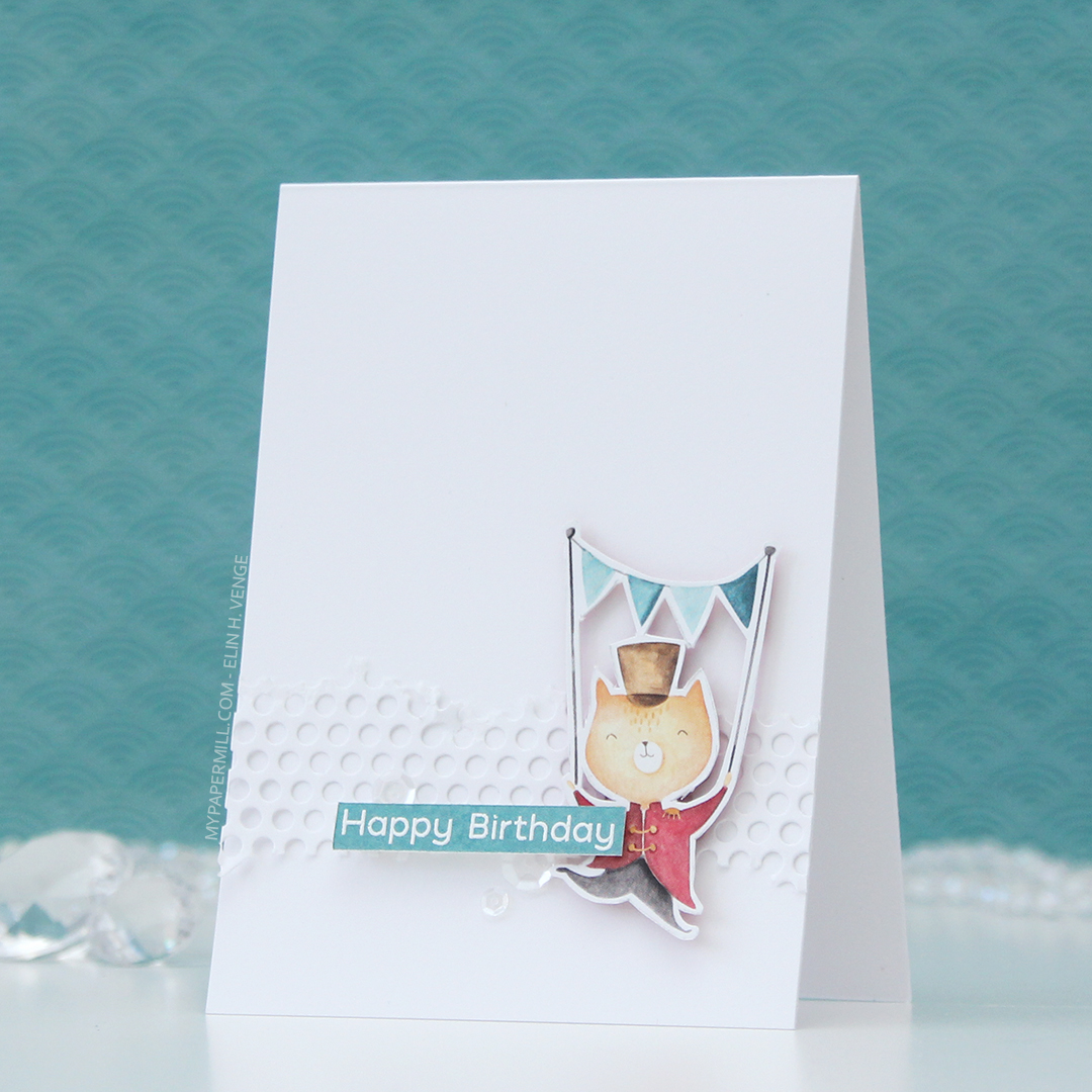 I added the cat using foam tape, the sentiment using more foam tape and those white sequins once again. These cards were so much fun to create, and I’ve got more in upcoming posts.
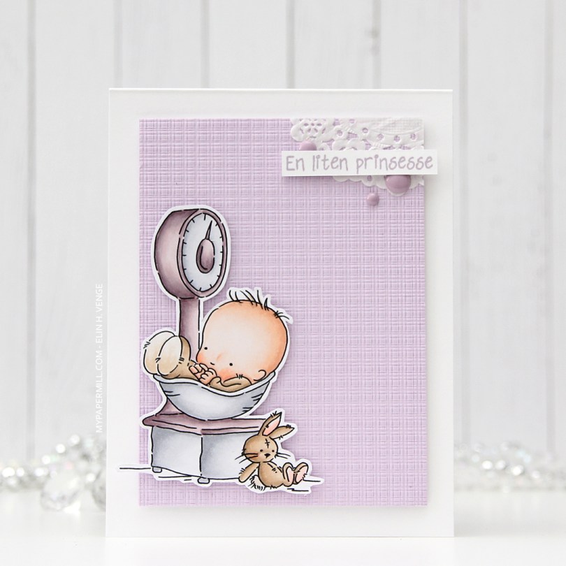

 Not a whole lot of Copics used for this image, it IS simple, after all. I also used V97, which is a color I’ve made myself.


 I started by coloring the polar bear (
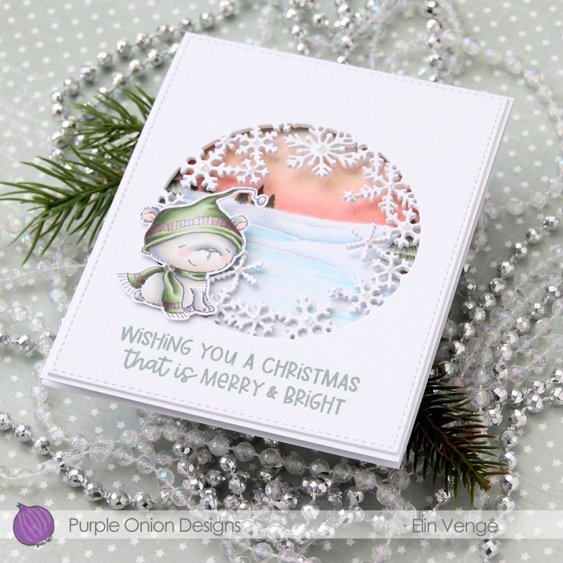
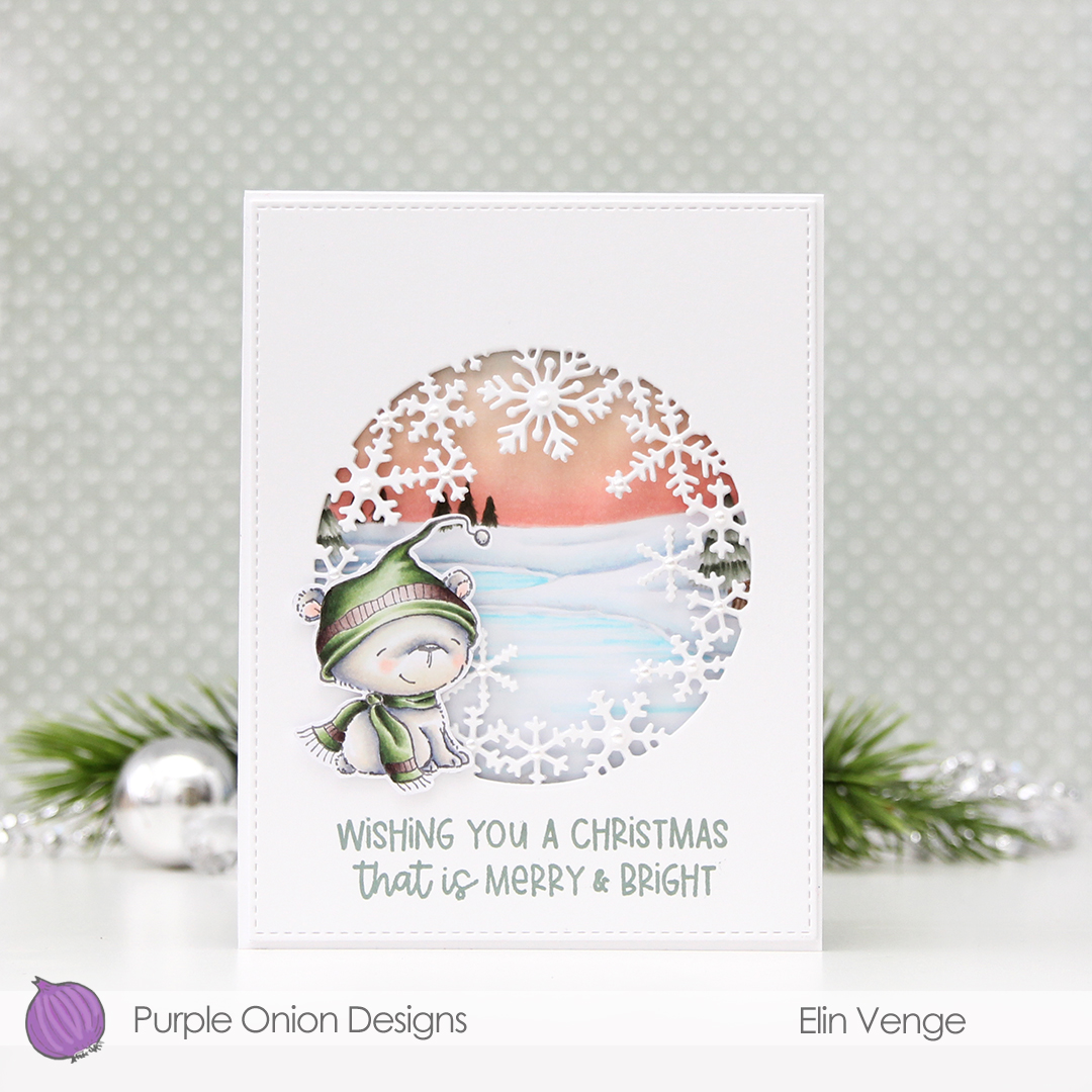
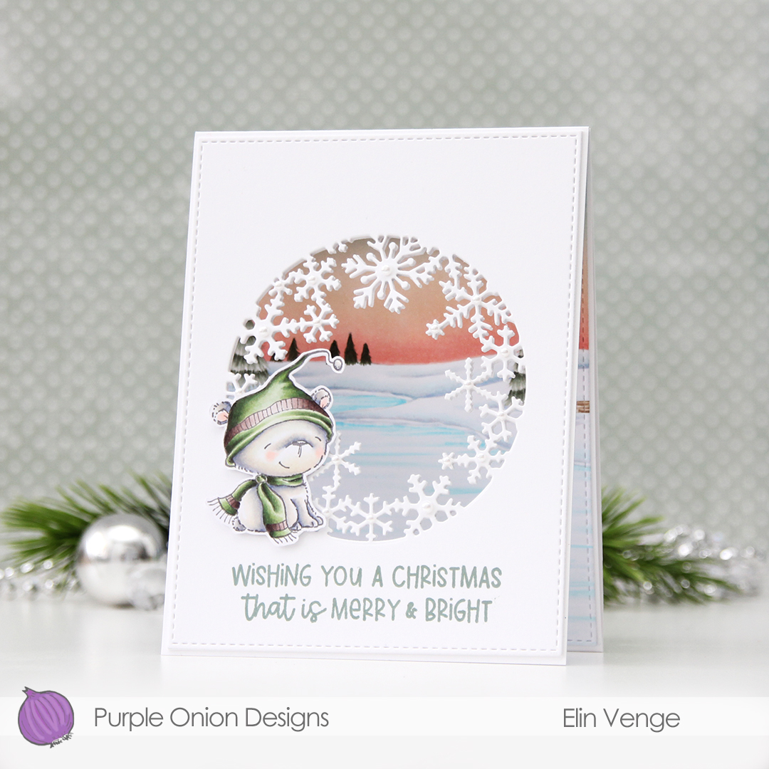 I love the snowflake circle die from Hero Arts and have used it many times before. I die cut a window into the center of the front of my card base, and at first thought that would be it. Once it morphed into a trifold, though, it was so back heavy that I needed an additional two die cut windows on top of the card base for some strength and stability. I used the largest of the A2 Stitched Rectangles from My Favorite Things to create a nice finished edge to the top layer.
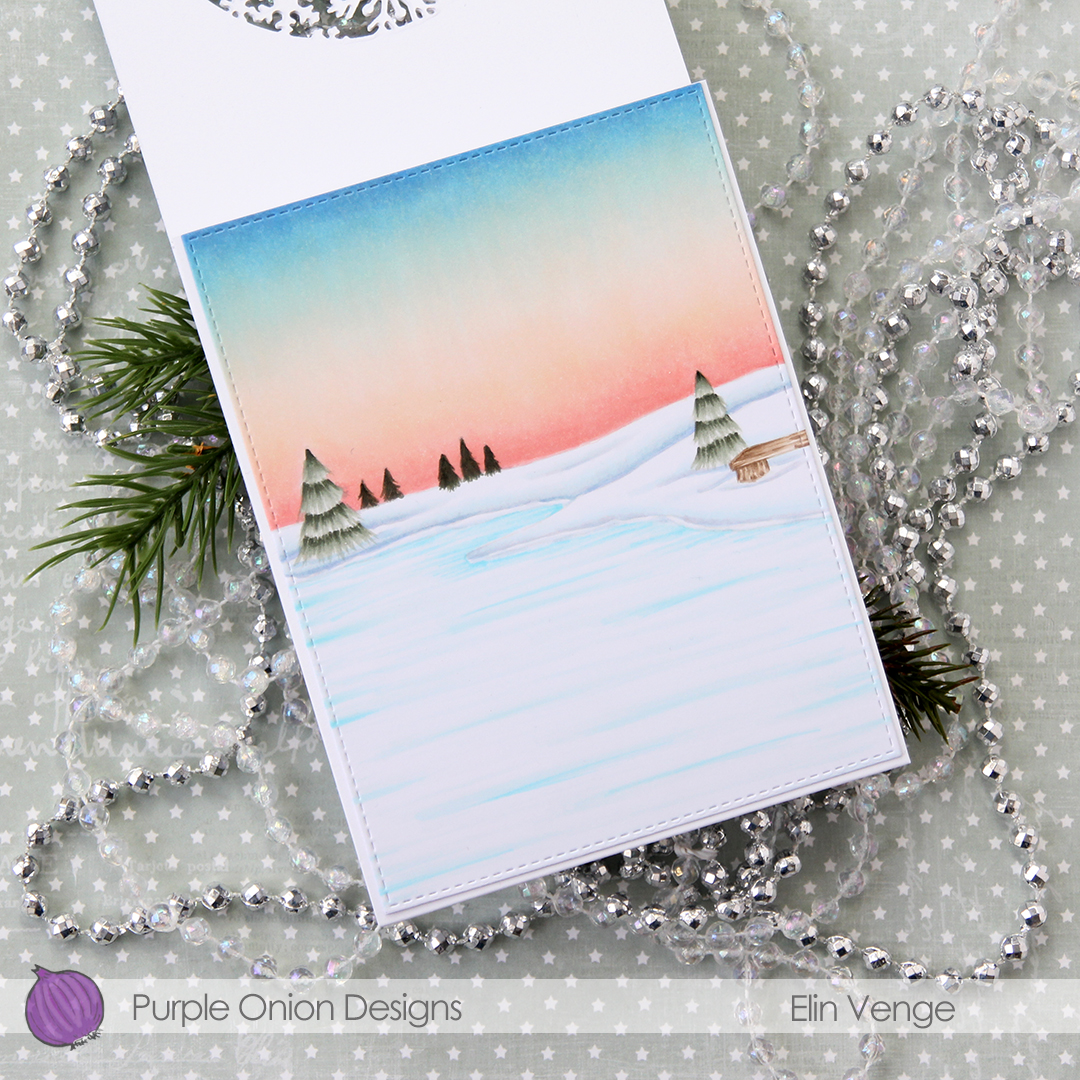 For the inside panel that you can see from the front, I stamped the
 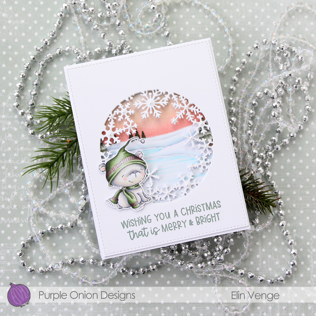 I stamped a sentiment from the
 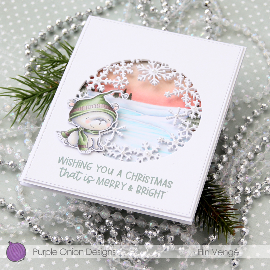 In this photo it’s pretty evident that the three layers of panels with die cut windows add a nice bit of dimension, as well as stability to what would otherwise be a pretty floppy card front, since the window is so big. I use 110 lb white card stock (Stamper’s Select White from Papertrey Ink), which is a nice, sturdy card stock, but with that big of a window, the only thing that will work is using several layers.
 I added white pearls from Kort & Godt to the center of the snowflakes. 3 mm pearls for the largest snowflakes, 2.5 mm pearls for all the others.
 Lots and lots of Copics for this one. I used 20 markers to color just the bear, 10 for his fur alone, which is a little bit crazy.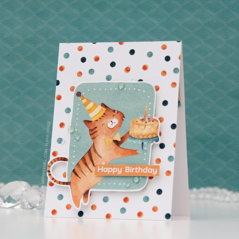
 As usual, I printed the image on X-Press It blending card and colored it in using my Copics. Once done coloring, I took the second largest die in the A2 Stitched Rectangles STAX 2 set from My Favorite Things to turn it into a panel with nice faux stitching along the edges. I mounted it with foam tape onto my card base.
 I stamped and white heat embossed a sentiment from InkyWings onto a tiny scrap of Raspberry Fizz card stock from Papertrey Ink. It was so small I barely even cut it smaller before adhering it to my card using Gina K foam tape, which isn’t as thick as the foam tape I used for my colored piece. I added some gems and sequins from the Iced Sherbet mix from Little Things from Lucy’s Cards, and my card was finished.
 Colors. Not a lot, but some, with an added confession. I made a very similar card to this about six months back, and I’ve used the exact same colors on this one, except for one. Being a little lazy this time, I didn’t want to redo the entire graphic because of one single marker, so this graphic is one I’ve used before. The only color in there that I didn’t use for this card was E13, simply because I forgot.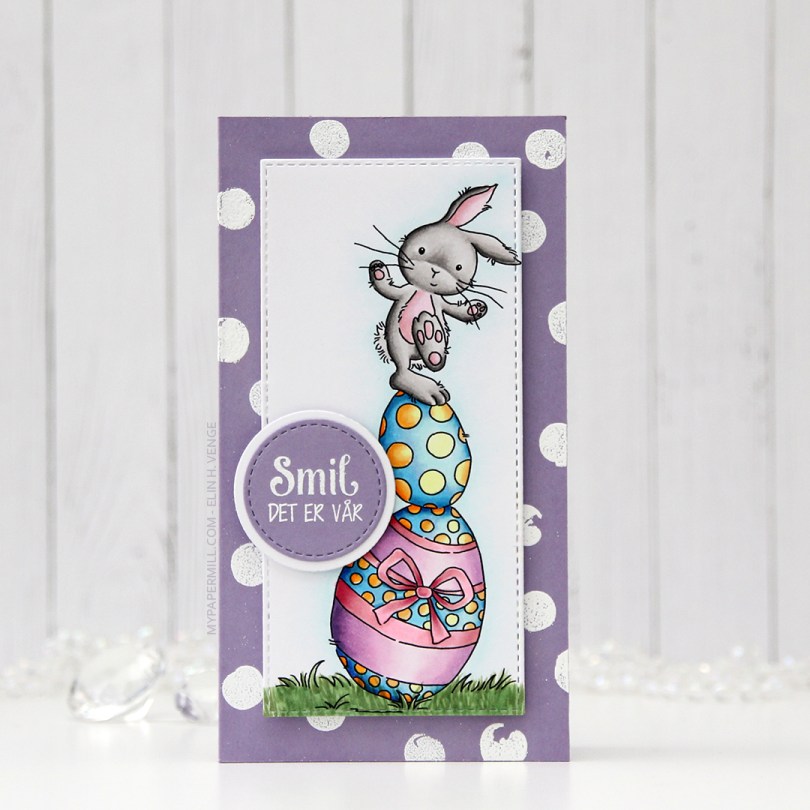
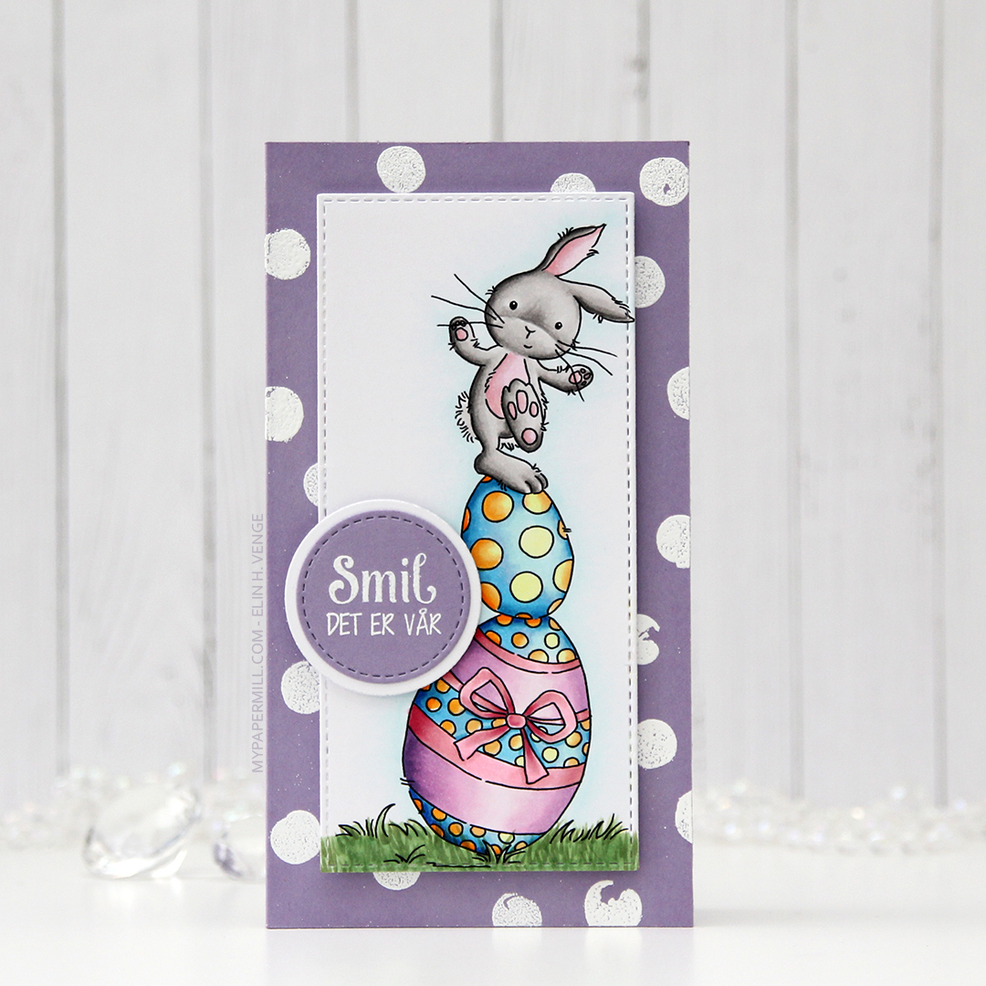 I colored the image in with my Copics and used partial die cutting with a die from My Favorite Things to turn it into a tall, slim panel. I stamped and white heat embossed a stamp from the Pinstripe stamp set from Altenew repeatedly on a card base I made out of Winter Wisteria card stock from Papertrey Ink, and added my colored piece in the center using foam tape. I stamped and white heat embossed a sentiment from Papirdesign onto a scrap piece of card stock, die cut it and matted it with a white circle, before using 1 mm foam squares to pop it off the colored piece just a bit. And that finished the card for today. Super simple.
 Lots of colors used for this one, for some reason.
 Soft, pastel colors throughout this one. I die cut the panel into a rectangle by doing partial die cutting twice with a stitched rectangle die from My Favorite Things. I don’t have any dies for mini slimline cards, but partial die cutting definitely works.
 I added the panel to a card base made from Lavender Moon card stock from Papertrey Ink. I die cut God påske (die from Papirdesign) four times; three from white card stock and once from Lavender Moon. I stacked them and centered my dimensional die cut as best I could above the image, before finishing off with some sequins from the White Orchid Sequin Mix from Little Things from Lucy’s Cards. I love her mixes, they’re awesome!
 My light Copic palette shouldn’t come as a surprise, pastels and spring go hand in hand.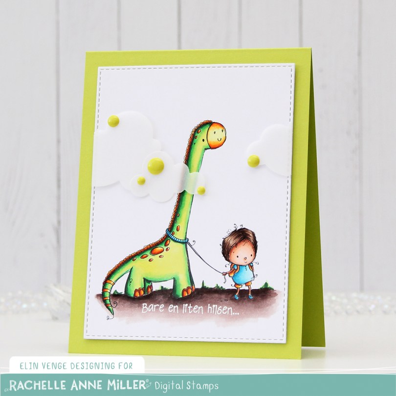
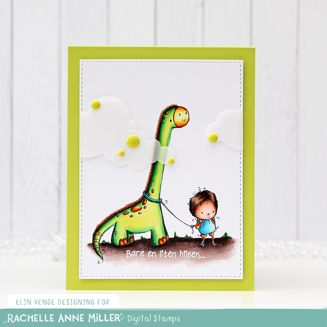 I colored up
 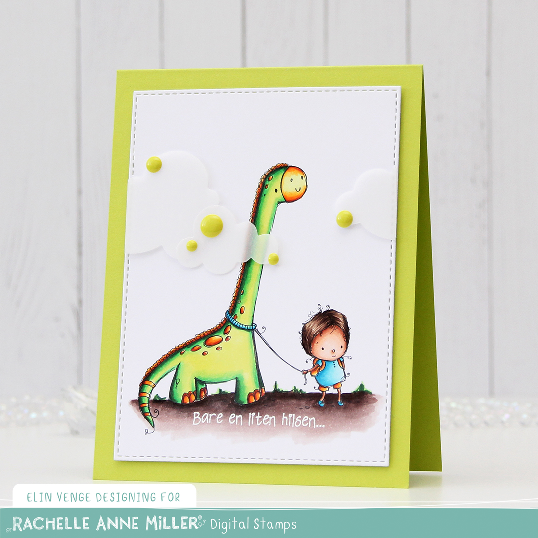 I added two layers of cardstock behind my colored piece, so it would stand out a little from my Limelight card base (colored card stock from My Favorite Things).
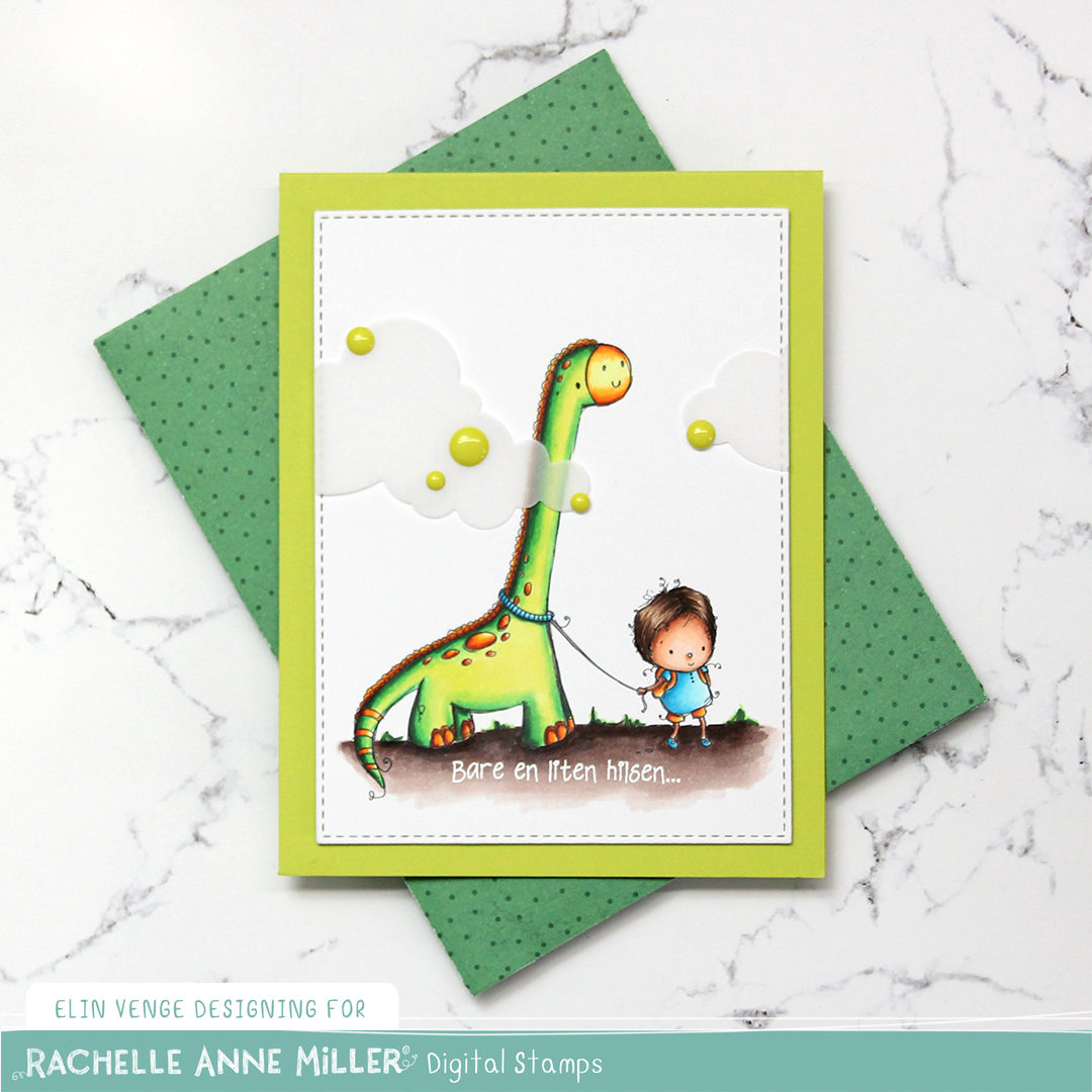 I added some vellum clouds on tiny pieces of foam tape, so it looks like the dinosaur’s neck is really long, I thought that was a fun little detail to add. Placed some enamel dots from Papirdesign in strategic places to cover the foam tape, and made an envelope from Papirdesign patterned paper using the A2 V flap envelope dies from Simon Says Stamp for the card to go in.
 Bright, bold Copics!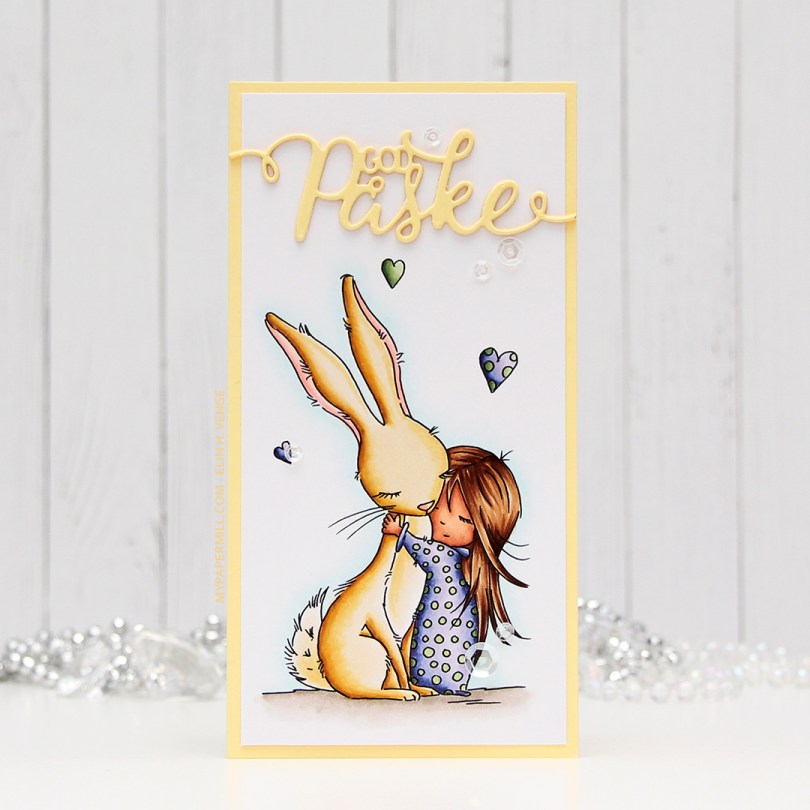
 I wanted a soft look to this, but at the same time, I also wanted to change things up a bit. I went with a darker skin tone than I normally do, and I really wanted a soft yellow bunny. I printed the image onto a piece of X-Press It blending card cut to 3×6″ for a mini slimline card. I adhered it to a card base I made from Lemon Tart card stock from Papertrey Ink with a 1/8″ border. I used the same color card stock to die cut “God påske” (Happy Easter in Norwegian) using a die from Papirdesign. I stacked three die cuts on top of each other and used a sparkle shimmer spray from Imagine to add lots of shimmer to the die cut. It has a really nice shimmer in real life, even though you can’t see it in the photo. To finish off the card I added a few sequins from the White Orchid sequin mix from Little Things from Lucy’s Cards.
 Part of me can’t believe I used five different greens for this one, but that tiny green heart? They all fit in there!
