Hi, crafty friends! I’m back today with a confirmation card I made on commission. I was told that the recipient does kickboxing, likes car races, swimming (lake or beach doesn’t matter as long as it’s water) and is a bit of a prankster. Lots of interests that I tried to incorporate into my card. They’re all very different interests, so I had a tough time figuring out what to do, but the card was a huge hit with the recipient, and that’s never a bad thing.
 I looked for a kickboixng image I could color up, as I wanted that to be the main focus on the card – it was his main hobby. I didn’t have one, nor could I find one, but I found this greyscale sketched image with boxing gloves that was perfect.
 The gloves cover the entire front of the card. I still needed something to color, because a black and white image isn’t very interesting on its own. I settled on Blast from Mo Manning, which was the perfect image for a prankster who loves water. I colored it up in very vibrant colors, making sure to include some red, which I thought would work great with the boxing theme AND the car racing theme. I fussy cut him and placed him on top of one of the gloves. He blended in with the background a little too much, so I decided to print the gloves again, this time with a very low opacity. I fussy cut the glove, scored it on one side and made it into a flap that opens. Put the colored image on top of this one, and now it didn’t get lost in the background. I also added a bit of Glossy Accents to the goggles for a bit of shine.
 I mounted the colored image on pieces of foam tape, making sure to add a magnet in a strategic spot to keep the flap from opening on its own. I put another magnet behind the image of the gloves to keep both magnets hidden. They’re still plenty strong enough to work through a couple of layers of cardstock.
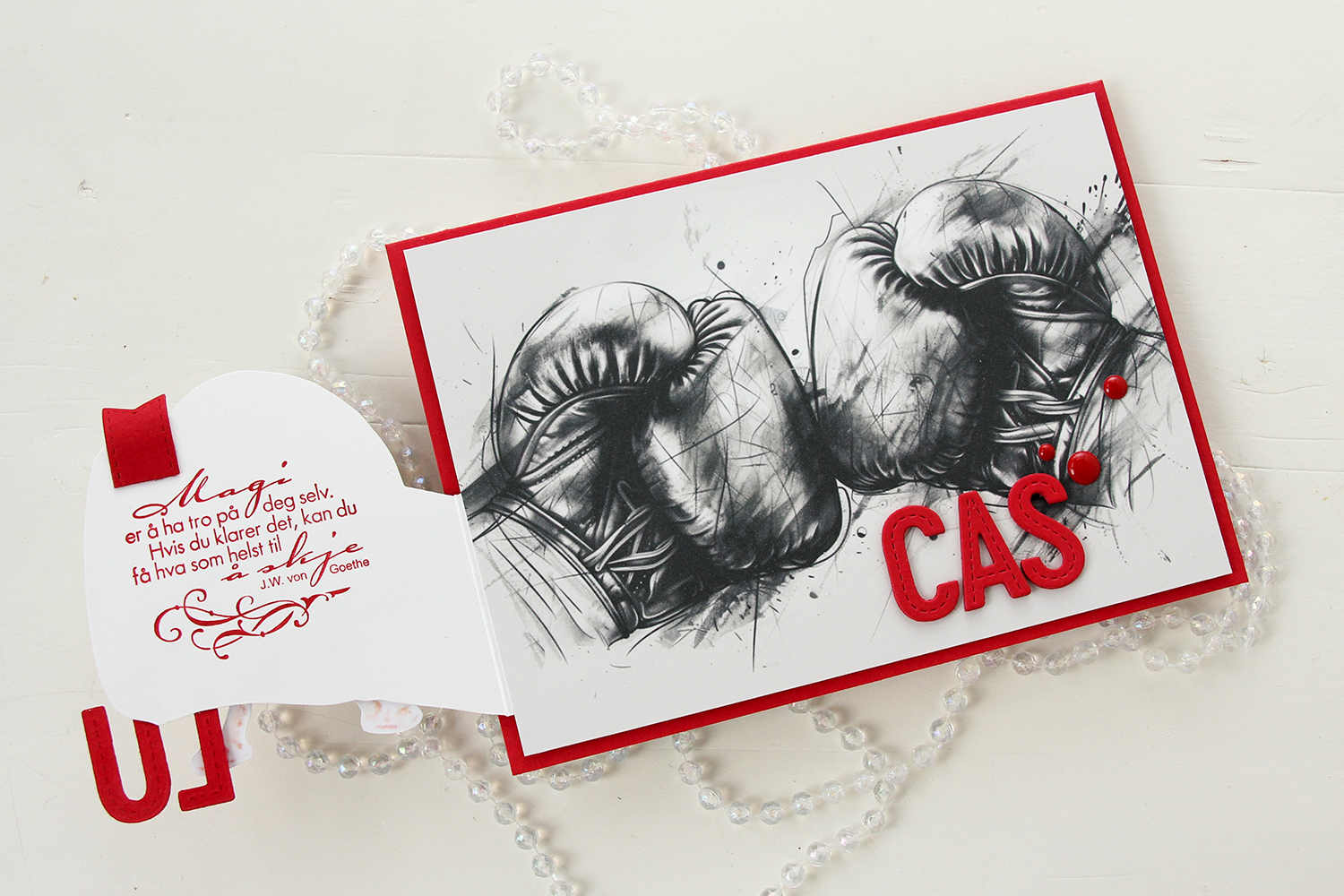 Once you open the glove fully, there’s a sentiment from an old confirmation stamp set from Stempelglede, stamped in Wild Cherry ink from My Favorite Things. I used one of the dies in the Essential Stitched Sentiment Strips die set from My Favorite Things to create a flag end to pull the glove open when the card is closed. The magnets are so strong, it won’t open on its own, and by adding the little flag end, it gives the recipient a little clue to look behind the glove.
 Back to the front of the card when it’s closed. I stamped an white heat embossed the word KONFIRMANT from the A05 stamp set from Norsk Stempelblad AS onto a piece of Red Hot cardstock from My Favorite Things, and then die cut it using a banner die from MFT – they have lots! I popped it up and made sure the end crossed into the image, to tie the two together. I did the same thing with my letters, die cut using the In Stitches Alphabet die set from My Favorite Things, also from Red Hot cardstock. I stacked a few layers for dimension and stability, the L and the U are only barely attached to the glove and the back of his left leg, so they needed a little bit of strength.
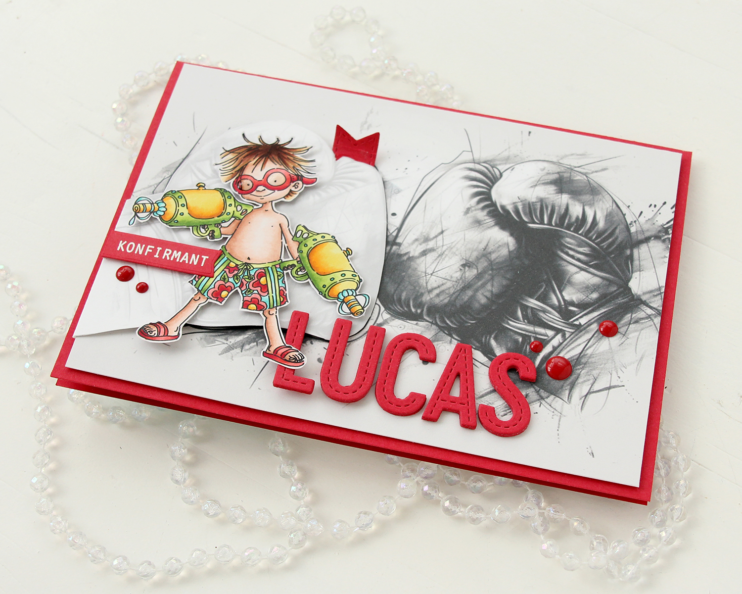 I finished off the front with a few red enamel dots from Papirdesign.
 On the inside, I printed and cut out a checkerboard pattern, which I thought worked well with the car racing theme. There’s still plenty of room to write a personal message. I also used the Wax Seals die set from Waffle Flower to create a rosette badge with a Norsk Stempelblad AS confirmation sentiment heat embossed in the center. I used the Itty Bitty Strips dies from My Favorite Things to create the ribbon ends hanging down from the actual rosette.
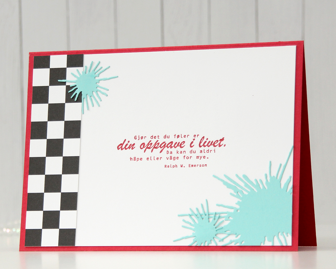 On the back of the card, I used more of that checkerboard pattern, stamped another confirmation sentiment (it’s actually an Emerson quote) and used the Splash die set from Papirdesign to create some water splashes from Summer Splash cardstock from My Favorite Things. I thought they tied in well with the super soakers in the colored image on the front of the card.
 A simple color palette to finish off. This card was a hard nut to crack, but once I got going I had a blast (no pun intended) creating it.
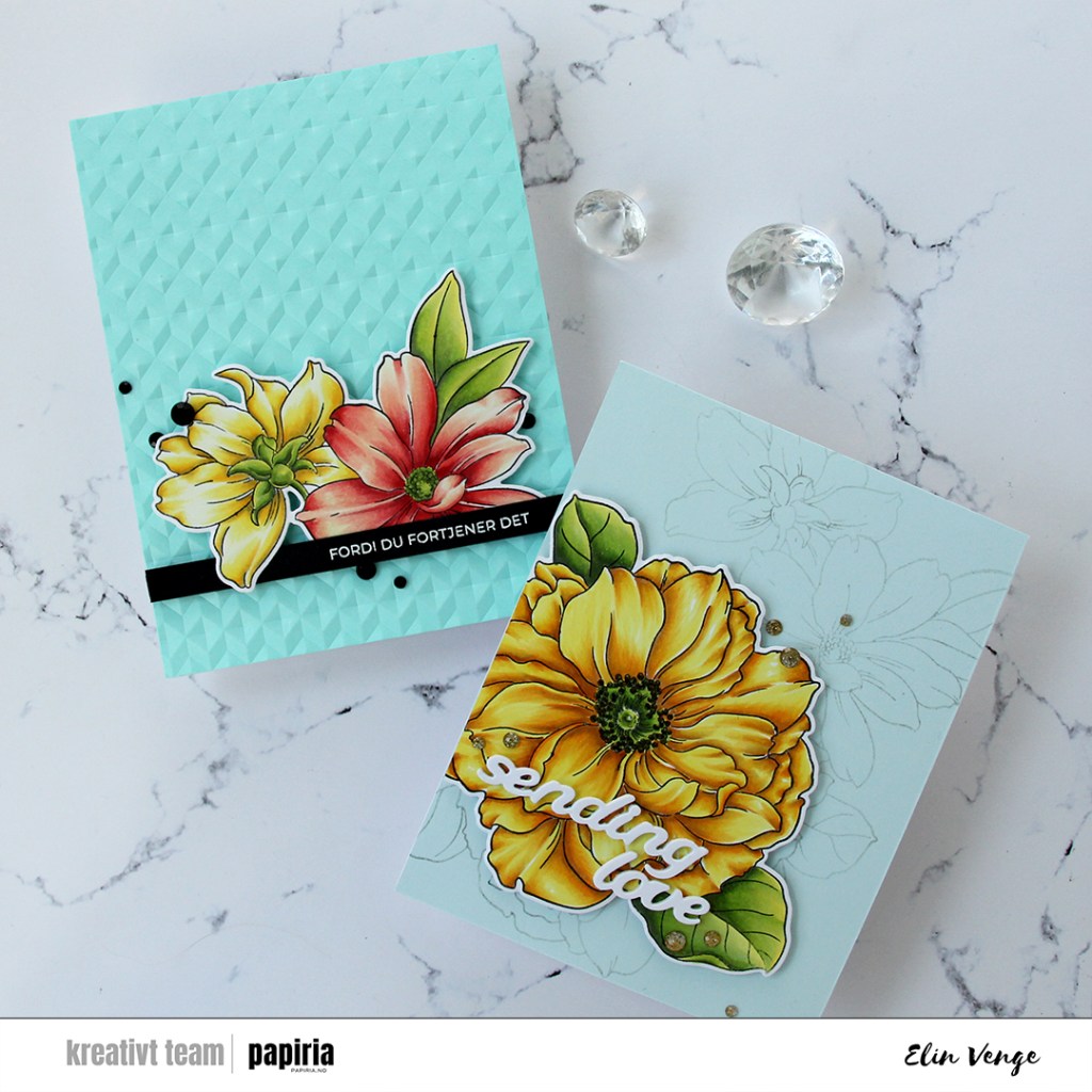
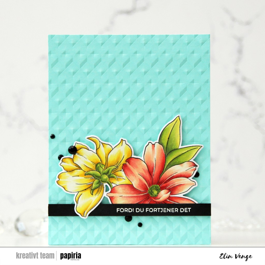
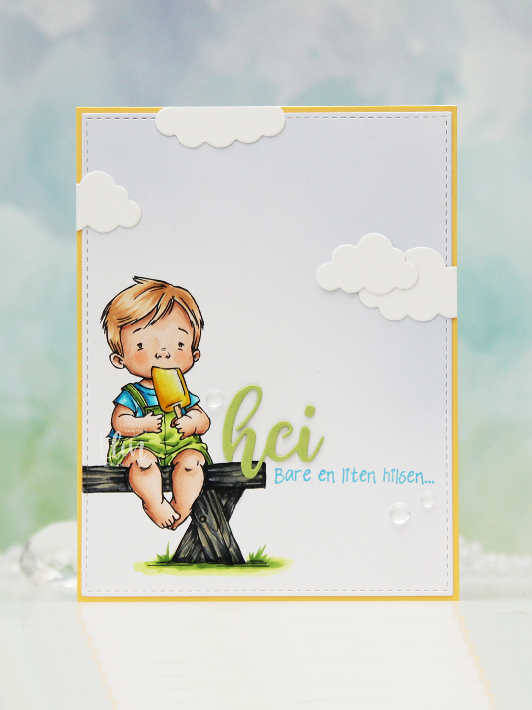 I colored the image with Copics, opting for the cool grays for the bench. I wasn’t planning on making it this dark originally, but when my C9 made a blob, dark was the only way to go. It still works, and I don’t think you can really see where the blob was. I used the largest die in the A2 Stitched Rectangles STAX 1 set from My Favorite Things to trim the panel down a little, then a large blending brush to add some soft blue to the background. I didn’t add any ink to the brush, I simply used whatever was left from a previous project.
 I stamped a sentiment from the Småtekster stamp set from Norsk Stempelblad AS next to the bench using Tide Blue ink from Altenew. I added my colored piece to a panel of Buttercup cardstock from Concord & 9th, which I then adhered to a top fold white card base. I die cut the word hei twice from Green Parakeet cardstock from Papertrey Ink, stacked them and adhered my double die cut next to the boy on the bench before adding a few die cut clouds and some dew drops. Both the cloud dies and dew drops are from Concord & 9th.
 I used quite a few colors for this very simple image.
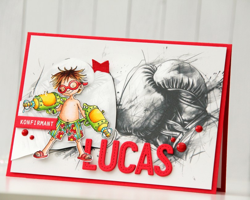
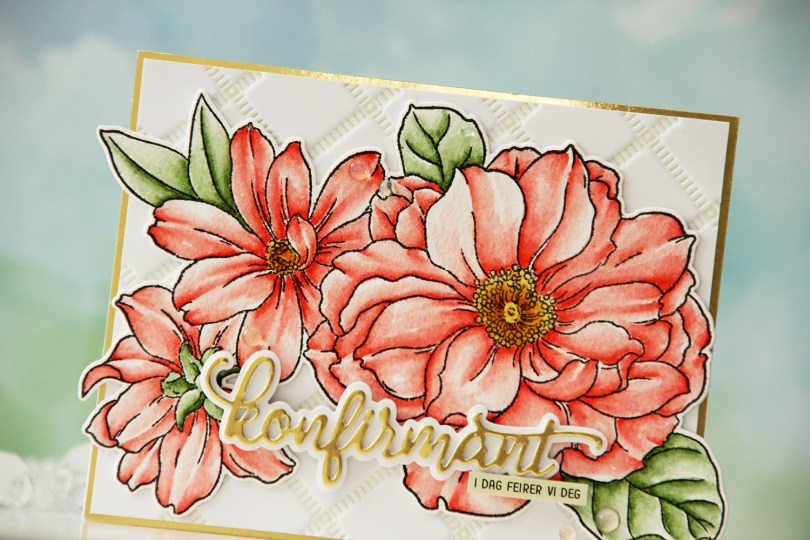
 I started by stamping the big floral stamp in the Blooming Delight stamp set from Altewew using Altenew Obsidian ink onto watercolor paper (cold pressed Fabriano Artístico), before coloring with Zig Clean Color Real Brush markers. When my coloring was complete, I die cut the flower with the coordinating die and also cut a few extra from white cardstock to build dimension.
 I used the Stippled Plaid press plate from Pinkfresh Studio with Pistachio ink from Altenew to create a subtle background. I matted it with some gold shine cardstock from My Favorite Things and adhered my florals pretty much in the center. The flowers stick out on both sides, but I just made a larger envelope to accomodate the larger size.
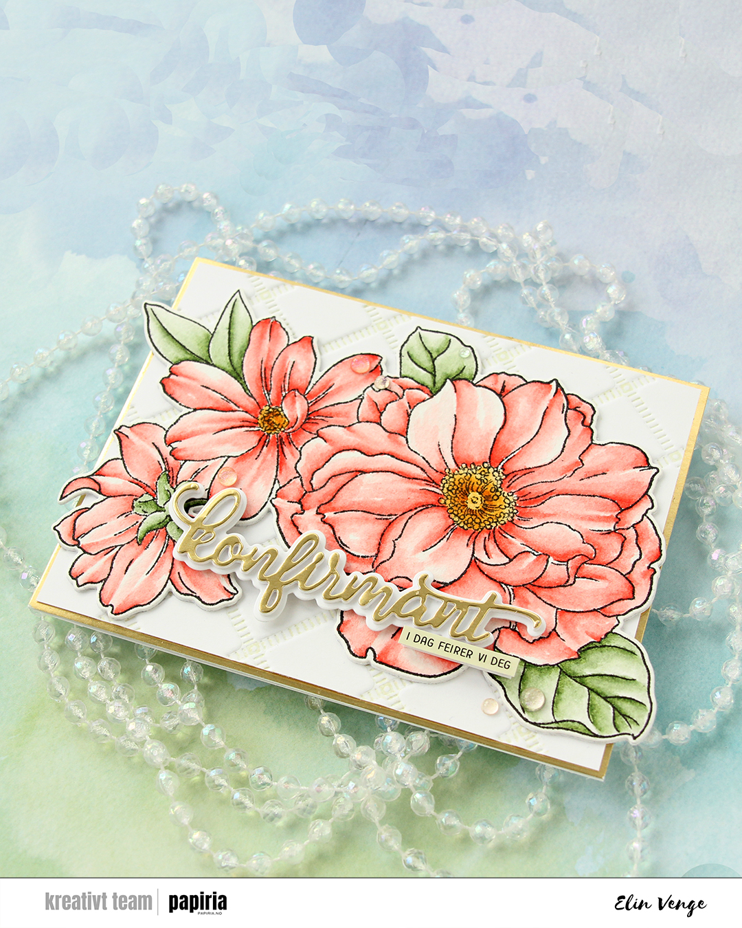 For the sentiment, I used a konfirmant die set from Papirdesign. I die cut the shadow layer from white cardstock and the word itself from the same gold cardstock that I used previously, with a few white die cuts stacked behind it for dimension. I even stacked a few behind the shadow, so it looks like the shadow floats on top of the flowers. For a sub sentiment, I used a sentiment sticker strip from Kort & Godt that I ink blended with Misty Sage ink from Altenew, before finishing off the card with a few Iridescent Dew Drops from Pinkfresh Studio.
 I combined
  I didn’t want color on the entire piece and decided on coloring a strip that includes the largest part of the waterfall, the beaver and part of the mama swan. I used Zig clean color real brush markers to color, using the blender for some of it, but a size 4 round watercolor brush from Princeton, along with water, for most of it. The Zig colors I used are the following: 068 Deep Brown, 816 Soft Violet, 028 Pale Pink, 705 Peach Orange, 505 Yellow Ochre, 407 Grass Green, 406 Sage Green, 411 Cactus Green, 307 Aqua Blue, 315 Ultramarine and 910 Warm Gray 6.
 Once my coloring was complete, I cut the colored section apart from the rest. I adhered the uncolored sections onto a black mat I created from Black cardstock from Concord & 9th. Behind the colored panel, I stacked a few layers of cardstock for dimension and adhered it in between the other two pieces. I adhered my finished piece onto a card base that I created from Blue Beyond cardstock from My Favorite Things.
 I stamped and white heat embossed a sentiment from the
 I started with a panel of white cardstock (Stamper’s Select White from Papertrey Ink) that I cut down slightly from a quarter sheet. I used a couple of dies from Papirdesign to do a dry emboss on my cardstock. I covered a white top fold card base with a quarter sheet of Harbor cardstock from Concord & 9th and layered my white dry embossed panel on top.
 I die cut the banner pieces in the Joyful Season die set from Concord & 9th from Harbor and Powder cardstock, before stamping a sentiment from the Merry Greetings builder stamp set from Kristina Werner onto the banner pieces using Harbor ink. I assembled the banner and added a few layers of cardstock behind it for dimension. I die cut a tree and a snowflake from the same dies that I used for my dry emboss background, both from Powder cardstock. I stacked two of each and glued them on top of its actual position in the embossed background, before finishing off with Opal gems from Spellbinders. Very simple.
 I started with the Snowfall Backdrop Landscape die from Lawn Fawn, which I die cut from white cardstock (Stamper’s Select White from Papertrey Ink). I did a bit of ink blending with Fresh Dye inks from Altenew, using Arctic Mountain, Winter Lake and Icy Water inks going from top to bottom for a gradient effect.
 I used the Snøkrystall ramme 2 die from Papirdesign to cut my border of trees and snowflakes. This die set actually has two borders – one that cuts out the trees and snowflakes I used here, and the other one does snowflakes and stars. I thought the trees went well with my snowfall backdrop, which is why I opted for that.
 I trimmed down my snowfall backdrop, adhered it to a white cardbase and layered my die cut border on top, before adding a sentiment that I created with the Juleklem die from Kort & Godt. I cut two layers from the same white cardstock I’ve used throughout the card and one layer from an ink blended piece using the same inks that i used for the sky for a very clean look. This card is so simple, and you could easily mass produce this if you wanted to. I only make one offs, but it’s totally up to you.
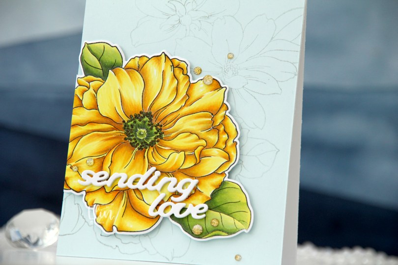


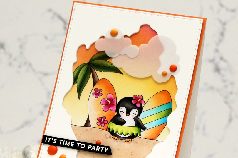
 I created my little scene with the palm tree, a couple of surfboards and a penguin. I can never resist a penguin, and this one has a hula skirt – I was sold! I colored my scene with Copics, and the plan I had initially went out the window. I was going to color the base of the surfboards in a light yellow, almost white, but then I came up with this soft orange combo and totally changed everything else to fit. Instead of a soft blue sky, I ink blended a sunset using Honeysuckle, Clementine and Buttercup inks from Concord and 9th. I then used the largest die in the A2 Stitched Rectangle STAX 1 set from My Favorite Things, along with the Watercolor Wash Free Form die, also from MFT, to create a rectangular panel with a fun window. I die cut a couple more to stack behind the front panel to create a little bit of dimension, before adhering it all to my colored image.
 I adhered a quarter sheet of Clementine cardstock from Concord & 9th directly to a top fold card base and glued my scene in the center. This created a bit of an orange border around the image. I then die cut Cloud 1 & 2 from Papertrey Ink out of Heavyweight Translucent vellum from My Favorite Things. I love die cut vellum clouds. This vellum is super thick, so the glue I put behind it doesn’t even show through, but I still placed enamel dots strategically on top. Old habit, I guess. These enamel dots are actually from a Halloween pack from Papirdesign. Onto a piece of True Black cardstock from Papertrey Ink, I stamped and white heat embossed a sentiment from the Bitty Birthday Wishes stamp set from My Favorite Things. I cut it down to a strip, added a couple of extra layers of cardstock behind it and adhered it to my card.
 I used quite a few Copics for this one.
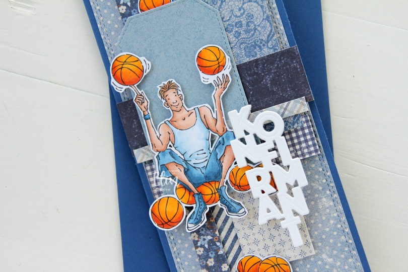
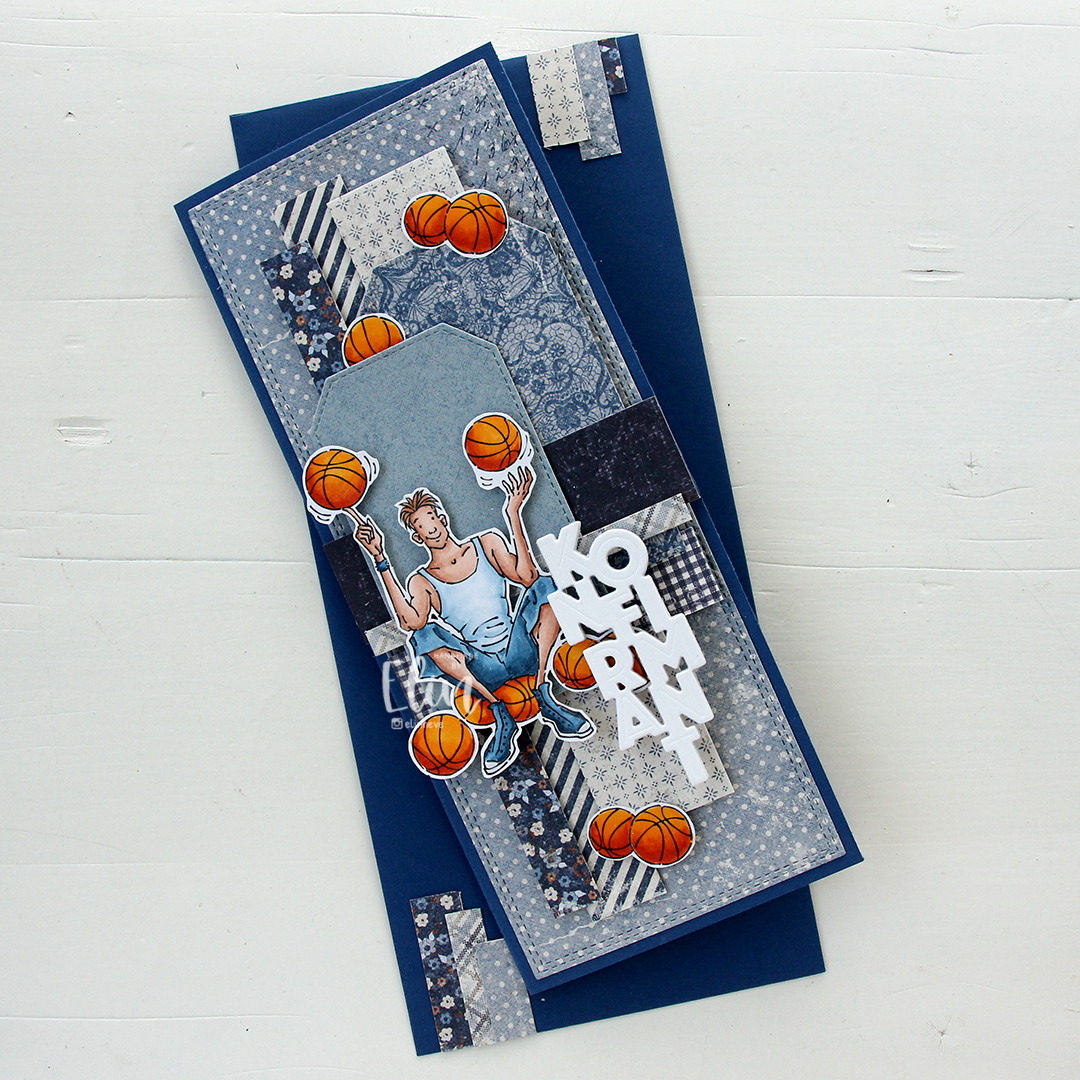 I made a slimline card this time. I created a background from blue scraps from several collections from Maja Design – Denim & Friends, Denim & Girls, Fika and Vintage Autumn Basics are all represented. One of the things I like about the Maja Design patterned paper is that papers match across collections. They’re also made from really good heavyweight paper, which is another tick in the pro column for me. I used the Slimline Double Stitched Rectangle STAX die set from My Favorite Things to create the panel in the back and also the Stitched Traditional Tag STAX die set, also from MFT, to create the tags.
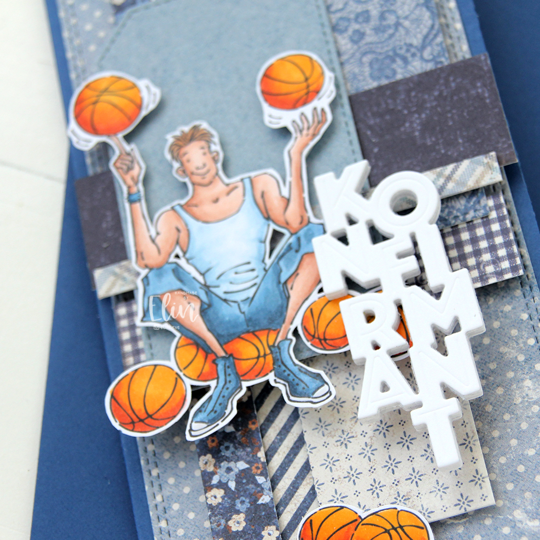 I added the image on top of one of the tags and scattered a few more basketballs around to work as embellishments. The orange really stands out against the blue background. To finish off I die cut the Konfirmant 5 die from Papirdesign six times from white cardstock and stacked them for a dimensional look. I adhered it on top of the image, and it floats above the card further down.
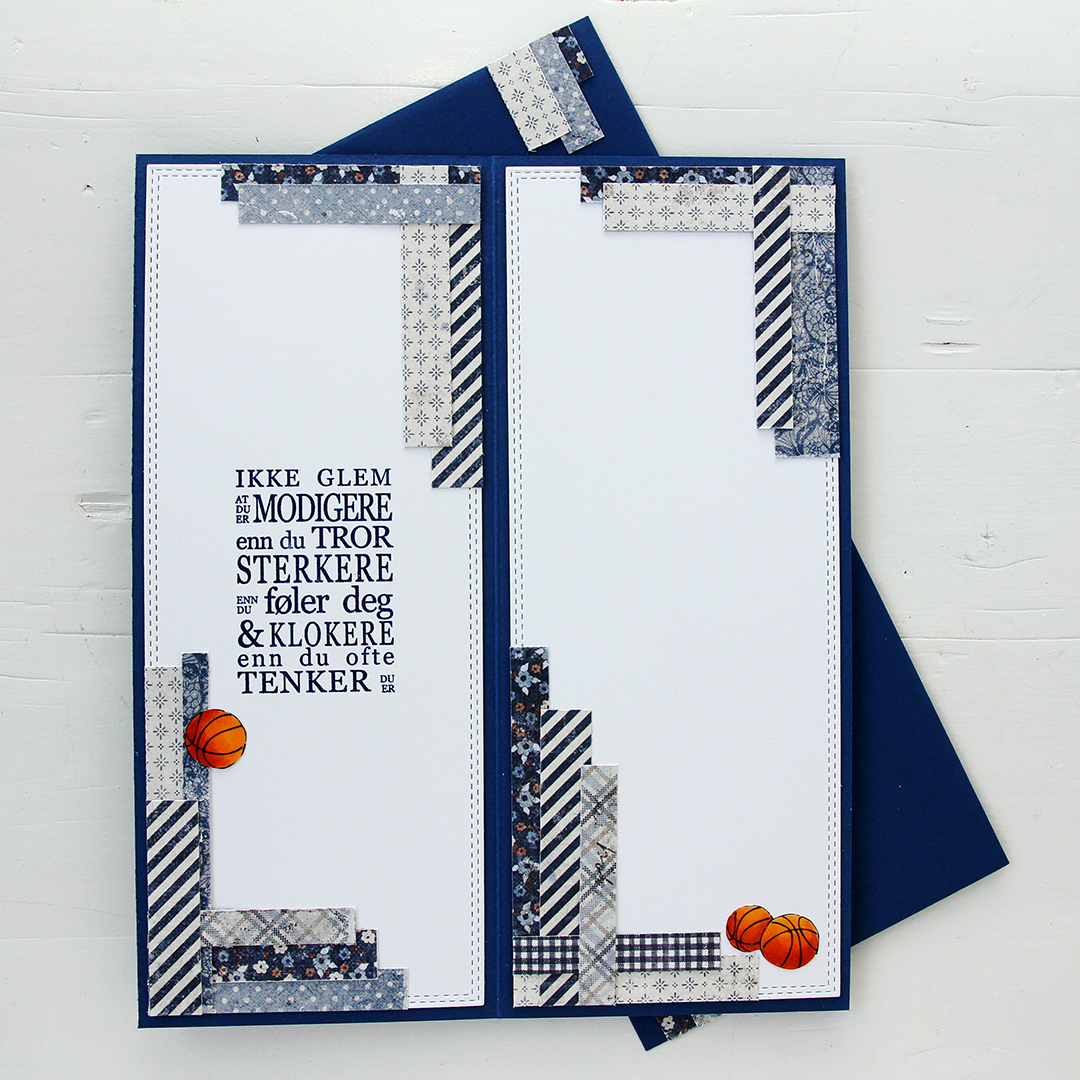 Whenever I make cards to order, I always decorate the inside too. I used the largest slimline double stitched rectangle die to create the white panels on the inside, adding more strips of patterned paper to continue the look from the front of the card and also fill the pages a little. Slimline cards are large, and the added elements make it less daunting to have to come up with a message for the recipient. On one side, I stamped a sentiment from the Konf. 01 stamp set from Norsk Stempelblad using Blue Beyond ink from My Favorite Things, the right side still has plenty of room for a personal message. I also included more basketballs.
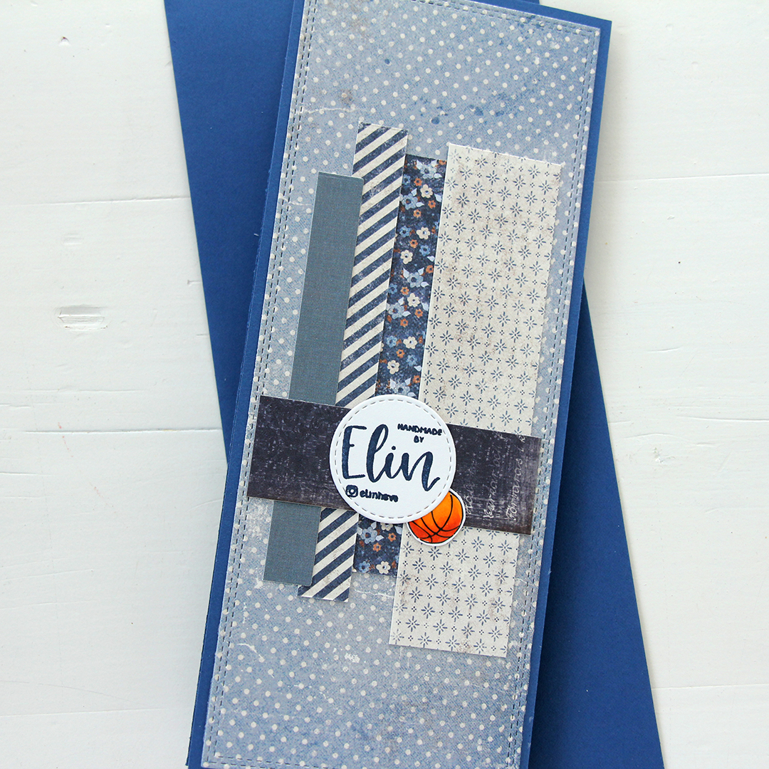 For the back of the card, I used a few strips of patterned paper I had left, die cut a white cardstock circle using the Stitched Circle STAX die set from My Favorite Things and stamped my personal stamp in the center of it using Blue Beyond ink from MFT. The card base is also from My Favorite Things, it’s made from Blueberry cardstock, and the envelope is also in that same Blueberry color.
 Limited color palette for this one.
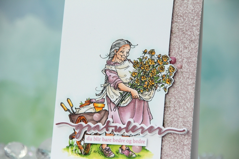
 I printed the image on X-Press It blending card and colored it with my Copics. I pulled out my RV90 series, which I used to use a lot ages ago, but haven’t really used much in recent years.
 Once my coloring was complete, I decided to cut off quite a bit on the right hand side of the panel, which meant doing some fussy cutting around the flowers. I don’t mind fussy cutting, and cutting on the border like this makes for a more dynamic design. Along the right hand side of a top fold card base, I adhered a scrap strip of patterned paper from the Vintage Romance collection from Maja Design, then popped my colored panel on the left.
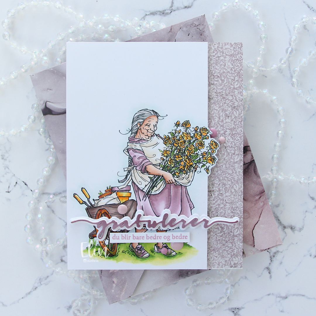 I die cut the Gratulerer 6 die from Papirdesign a few times. I die cut the shadow layer in white, then a few stacked of the word, before finishing off with a colored one. I actually colored this one with Copics on the scrap I cut off the panel. This is a neat trick if you want your colors to match, but don’t have the right cardstock color. I stamped a sentiment from the A06 stamp set from Norsk Stempelblad AS using Briar Rose ink from Concord & 9th, cut it down to a strip and adhered it below the die cut, adding a few strips of cardstock behind it for dimension. I finished off the card with a few enamel does from the Shades of Purple pack from Altenew.
 Using patterned paper from Craft Consortium along with a stamp, die and a few sentiment sticker strips from Kort & Godt, I created an envelope to match.