Hi, everyone! It’s the coldest time of year. The sun’s out, but the high pressure makes it even colder. I’m staying warm by not venturing out too much to actually FEEL the cold, but creating cards in the comfort of my craft room. I have a wintery birthday card to share today, using a couple of stamps from Purple Onion Designs.
 I stamped Birch using Memento Rich Cocoa ink and colored him with my Copics, before doing some fussy cutting. I knew I was going to have the blue polaroid frame behind him, so I did my best to leave a slim white border around him. I don’t know about you, but when I fussy cut, I find it much easier to cut right up against the line than to leave a white border. I even prefer the look of fussy cutting against the edge, but for him to stand out against the blue behind him, I needed that white. I actually used a pencil to trace around the bunny before cutting, so I didn’t accidentally cut off too much white or create an uneven trim.
 I used one of the Precious Polaroids dies from My Favorite Things, as well as a wishes die from Mama Elephant. I die cut both four times from Blue Yonder card stock from My Favorite Things and stacked them for a dimensional look. Directly onto the card base, I used a blender brush from Taylored Expressions with Classic Kraft ink from Papertrey Ink over a Tim Holtz mini layering stencil to create some interest in the background. I stamped selected words from two sentiments from the Warming Winter Thoughts stamp set from Purple Onion Designs using Papertrey Ink Blueberry Sky ink, and turned them into strips using my Cut-align ruler from Misti. That’s my favorite tool for creating perfect little sentiment strips. I glued an additional three layers of card stock strips behind each of the stamped strips, and glued them all on to the front of the card at various angles, to create a full sentence sentiment along with the stacked die cut, which is also adhered at a bit of an angle for a playful look. I finished with a couple of enamel dots from Papirdesign.
 I’m woefully short on envelopes to fit A2 cards, and definitely didn’t have any blue, kraft or white ones to go with my card, so I pulled out my A2 V Flap Envelope dies from Simon Says Stamp and created one using scraps of patterned paper from Papirdesign. Blue with snowflakes, can you get any better for a blue, wintery birthday card?
 Very limited color palette this time, but it’s no wonder given the size of the image. I also used B90 for the hat, which is a color I’ve made myself.
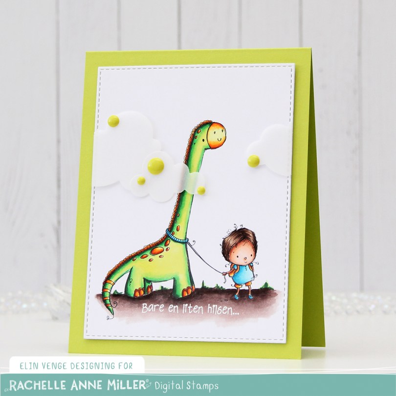
 I colored up Dinosaur from Rachelle Anne Miller, and this bright green is definitely one that you notice! The dinosaur actually reminded me of Littlefoot, and for some reason, I thought that he was green (he’s not, but Spike and Ducky are!). I die cut my colored piece down to a faux stitched rectangle using a die from My Favorite Things, before heat embossing a Norsk Stempelblad AS sentiment in white onto my colored ground.
 I added two layers of cardstock behind my colored piece, so it would stand out a little from my Limelight card base (colored card stock from My Favorite Things).
 I added some vellum clouds on tiny pieces of foam tape, so it looks like the dinosaur’s neck is really long, I thought that was a fun little detail to add. Placed some enamel dots from Papirdesign in strategic places to cover the foam tape, and made an envelope from Papirdesign patterned paper using the A2 V flap envelope dies from Simon Says Stamp for the card to go in.
 Bright, bold Copics!
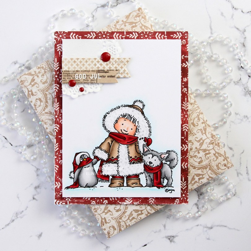
 I don’t know what’s going on with me, but I’ve made another red Christmas card. I love creating Christmas cards, but I’m not a fan of red, not even for Christmas. The best thing about creating cards is that they get sent to someone else, so even if I personally don’t like certain colors, I’m getting rid of them eventually anyway, so it doesn’t matter. 😉
 Once I’d colored the image with my Copics, I trimmed 1/4″ off each of the four sides and covered the back with foam tape. I found an old scrap of patterned paper from Magnolia that was already cut down to 4 1/4 x 5 1/2″, probably a reject from a previous project, but perfect for this one, the red matches my coloring! It has white “snowflakes” on it. These have 8 points, so they’re not actually snowflakes. There’s no such thing as an eight pointed snowflake (or a five pointed, for that matter), it has to do with how water molecules are formed.
 I die cut a couple of scraps of Maja Design patterned paper using two of the Fishtail Flag Frames dies from My Favorite Things. I stamped and white heat embossed a sentiment from Norsk Stempelblad AS onto one of the die cut banners, adhering it to the larger one using 1 mm foam squares for a little bit of dimension. I used the same foam squares on the back of the bigger one and glued both banners to part of a mini doily from Doodlebug adhered to the top left corner of my colored panel. I added a few enamel dots from Papirdesign, and my card was done.
 I found an old scrap of patterned paper from 3ndypapir that was just large enough to create an envelope from using the A2 V flap envelope dies from Simon Says Stamp. I thought the color matched the brown in my card nicely.
 Not a lot of colors used for this one.
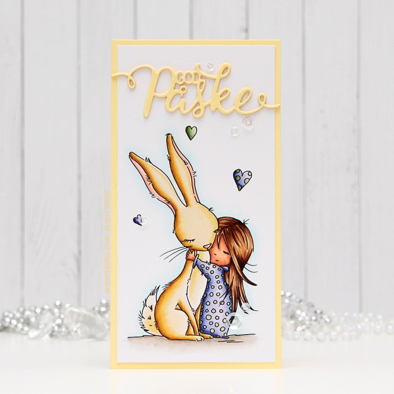
 I wanted a soft look to this, but at the same time, I also wanted to change things up a bit. I went with a darker skin tone than I normally do, and I really wanted a soft yellow bunny. I printed the image onto a piece of X-Press It blending card cut to 3×6″ for a mini slimline card. I adhered it to a card base I made from Lemon Tart card stock from Papertrey Ink with a 1/8″ border. I used the same color card stock to die cut “God påske” (Happy Easter in Norwegian) using a die from Papirdesign. I stacked three die cuts on top of each other and used a sparkle shimmer spray from Imagine to add lots of shimmer to the die cut. It has a really nice shimmer in real life, even though you can’t see it in the photo. To finish off the card I added a few sequins from the White Orchid sequin mix from Little Things from Lucy’s Cards.
 Part of me can’t believe I used five different greens for this one, but that tiny green heart? They all fit in there!
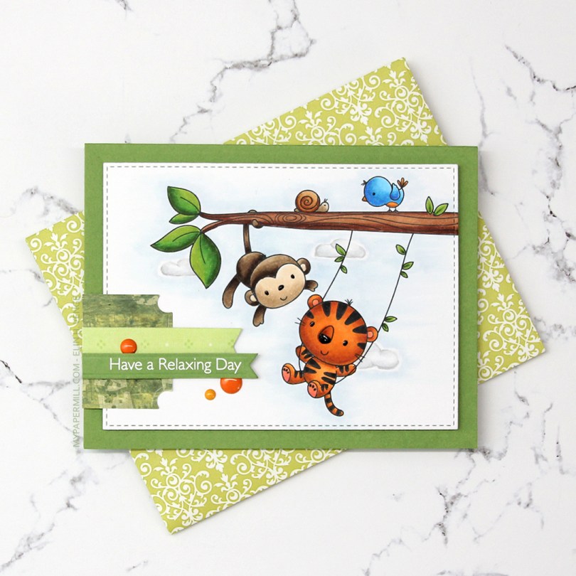
 I colored the image with Copics and die cut it using the second largest die in the A2 Stitched Rectangles STAX 2 set from My Favorite Things, before adding it to a card base made from Gumdrop Green Heavyweight card stock, also from MFT, using lots and lots of foam tape. I used a black Glaze pen to add some dimension and shine to their eyes and noses.
 I’m one of those people that use patterned paper on my cards. I don’t use lots, and I pretty much always use them for small clusters, but my ancient stash of patterned paper is shrinking ever so slightly with each card. I have a tub of die cut patterned paper scraps on my desk, and rummage through it to find the perfect pieces for my clusters. The dark green patterned paper I used here is actually from 2005, which was years before I started making cards. I stamped one of the sentiments from the Always Bring a Smile stamp set from My Favorite Things onto a separate piece of Gumdrop Green card stock and die cut it using one of the dies in the Slimline Starter die set. I finished off my card with a few enamel dots from Papirdesign to match the tiger and the details on the bird.
 Another great use of patterned paper is envelopes. I’ve nearly run out of colored envelopes for A2 cards, and I’m definitely out of white ones, but larger scraps of patterned paper are perfect for creating one of a kind envelopes. I used the A2 V flap envelope dies from Simon Says Stamp on this piece of patterned paper from 3ndypapir. Another old one, this paper’s from 2010.
 Lots of bright colors used for this one. I also used B40, which is a color I’ve created myself.
 I thought
  Using Memento Bamboo Leaves ink, I stamped a sentiment from Norsk Stempelblad AS inside one of the balloons, stamped again in VersaMark ink and clear heat embossed it. It makes it stand out a little more from the balloon. I die cut the panel using a die from the A2 Stitched Rectangles STAX 1 set from My Favorite Things and adhered it to a card base made from Sour Apple card stock from MFT using lots of foam tape for dimension.
 I added Sparkling Clear sequins from Pretty Pink Posh to three of the balloons, and my card was finished. All that was missing was an envelope. The only colored envelopes for A2 sized cards I have left are in warm tones, so I decided to make my own using the A2 V flap envelope dies from Simon Says Stamp with a scrap piece of patterned paper from Papirdesign.
 I thought the color of the patterned paper matched the blue balloons on the card so well, and it made the pile in my scrap drawer shrink ever so slightly, gotta love that!
 I kind of went overboard with the number of Copics used for each balloon, but I think it turned out pretty good in the end.
 I really enjoyed playing with the mini slimline format last week, so I wanted to create another mini slimline. Last time, I slightly miscalculated the measurements I needed to create the matching envelope, so I made this one a little bit smaller, so it fits inside the envelope from last week that was just a tad too small for that particular card. This one measures 3 3/8 x 5 7/8″. I didn’t want to mess with the scene too much, so I die cut a few clouds from vellum using dies from Papertrey Ink and white heat embossed a Norsk Stempelblad AS sentiment onto one of the clouds. I mounted the clouds onto tiny pieces of foam, and added enamel dots from Papirdesign on top in very strategic spots.
 I used a bright color palette for this one.
 I colored up the image with my Copics. Nothing unusual about that, but these blues are brighter than the ones I normally use. The colored panel was too narrow to fill the width of a regular card, so I decided to put a frame around it. I used one of the wood frame nested dies from Hero Arts to create my frame from Classic Kraft card stock from Papertrey Ink, and built up layers by adding a few more frames behind the top one. I created a card bas from Lush Lagoon card stock from Papertrey Ink, and used the By the numbers impression, also from PTI, to create a debossed look to the card base. There’s quite a bit of blue showing outside the frame, so I wanted a little bit of texture there.
 Using Limelight card stock from My Favorite Things, I die cut the number (from the By the numbers die set from Papertrey Ink) four times and stacked them for a dimensional look. I adhered the number to the frame using liquid glue, and glued a white heat embossed black sentiment strip on top, with two more layers of black card stock behind that, for even more dimension.
 I added a bunch of green enamel dots from Papirdesign, and rummaged through my old patterned paper for one I could make an envelope from. I struck gold with this green one from Pion Design from 2010. I don’t use a lot of patterned paper anymore (at least not big pieces), but I can’t exactly throw it away, either, so I figure it’s perfect to create envelopes from. This way, they get used!
 Super bright colors. Well, except for all the browns. I actually used five colors for his sheriff’s badge before I ended up with a color I liked.
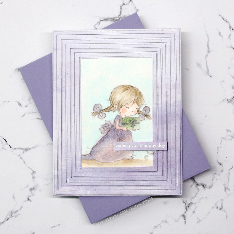
 Meet Grace. She comes in seven different poses, and each pose comes in a regular black lined version, and a more sketchy pencil style version, which is what I used for my card. I thought the sketchy look would be amazing with watercolor, but watercolor doesn’t play well with the ink in my printer, so I’ve totally cheated and used Copics. Well, Copic refills on watercolor paper, to be exact. Works like a charm and you get soft results, it’s fast to do and you don’t need a lot of colors. And for a sketchy style image like this, it doesn’t even matter if you go outside the lines a bit, it adds to that watercolor feel. I used this technique years ago (blog post
  I wanted all the focus to be on the image, and used the Fine Frames Cover die with some patterned paper from Papirdesign in a soft, matching purple, adding dimension behind every other frame (the wider ones), while gluing the others straight onto the card base.
 I stamped and white heat embossed a sentiment from the Statement Flowers stamp set from Altenew, before adding a few sequins from the White Orchid Sequin Mix from Little Things from Lucy’s Cards.
 Very limited color palette. I put a drop or two of color onto my glass work surface and picked up the color with a watercolor brush filled with blender solution instead of water. I have a watercolor brush just for blender solution.


 I adhered everything to my die cut panel, some directly, and some with a couple of more layers of paper behind them for added dimension. I added a couple of veneer snowflakes from Crafty Moly that I’d already white heat embossed with three layers of super detail embossing powder from Ranger. I used a piece of the strip of 12×12″ paper that has the barcode on it from Papirdesign. Their barcode strips are awesome. One side has the barcode and all the information, the other side of the strip actually has a design on it, so nothing needs to go to waste.
 I adhered everything onto a card base I made from Classic Kraft card stock from Papertrey Ink. I didn’t have any colored envelopes to match (and I’ve run out of white envelopes for A2 sized cards), so I used the A2 V Flap Envelope dies from Simon Says Stamp to create an envelope from some larger scraps of Maja Design patterned paper.
 As usual, I leave you with the Copics I used. In addition to B0000 and the blender, I also used B90, which is a color I’ve made myself, for the sky.