Hi, everyone! I’m back today with another card featuring a cutie from Mo Manning. This is Sheriff, and I turned him into a birthday card. The design of this card, and the super bright colors are a bit unusual for me, but I’m trying to use more of my supplies, and also use them differently than I have in the past. I also don’t normally put this many enamel dots on my cards. 7 is a LOT, I usually go for 2 or 3.
 I colored up the image with my Copics. Nothing unusual about that, but these blues are brighter than the ones I normally use. The colored panel was too narrow to fill the width of a regular card, so I decided to put a frame around it. I used one of the wood frame nested dies from Hero Arts to create my frame from Classic Kraft card stock from Papertrey Ink, and built up layers by adding a few more frames behind the top one. I created a card bas from Lush Lagoon card stock from Papertrey Ink, and used the By the numbers impression, also from PTI, to create a debossed look to the card base. There’s quite a bit of blue showing outside the frame, so I wanted a little bit of texture there.
 Using Limelight card stock from My Favorite Things, I die cut the number (from the By the numbers die set from Papertrey Ink) four times and stacked them for a dimensional look. I adhered the number to the frame using liquid glue, and glued a white heat embossed black sentiment strip on top, with two more layers of black card stock behind that, for even more dimension.
 I added a bunch of green enamel dots from Papirdesign, and rummaged through my old patterned paper for one I could make an envelope from. I struck gold with this green one from Pion Design from 2010. I don’t use a lot of patterned paper anymore (at least not big pieces), but I can’t exactly throw it away, either, so I figure it’s perfect to create envelopes from. This way, they get used!
 Super bright colors. Well, except for all the browns. I actually used five colors for his sheriff’s badge before I ended up with a color I liked.

 Soft, pastel colors throughout this one. I die cut the panel into a rectangle by doing partial die cutting twice with a stitched rectangle die from My Favorite Things. I don’t have any dies for mini slimline cards, but partial die cutting definitely works.
 I added the panel to a card base made from Lavender Moon card stock from Papertrey Ink. I die cut God påske (die from Papirdesign) four times; three from white card stock and once from Lavender Moon. I stacked them and centered my dimensional die cut as best I could above the image, before finishing off with some sequins from the White Orchid Sequin Mix from Little Things from Lucy’s Cards. I love her mixes, they’re awesome!
 My light Copic palette shouldn’t come as a surprise, pastels and spring go hand in hand.
 I colored the image with my Copics, cut the panel down quite a bit and put lots of foam tape on the back. I dug through my patterned paper Christmas scraps and found a blue piece from Papirdesign that was large enough to cover the card front, as well as a couple of smaller pieces from Maja Design.
 I stamped and white heat embossed a sentiment, before die cutting it with the mid size fishtail flag frame die from My Favorite Things. I added a few snowdrift sprinkles from Little Things from Lucy’s Cards, and my card was all done. Super simple, and one more card in the Christmas 2021 box. Feels good to have the pile grow!
 Nothing too fancy in my coloring today. The combo I used for the cat happens to be nearly identical to the one I used for the girl’s hair, I just omitted the darkest one.
 I colored the penguin with my Copics, fussy cut him and added 1 mm foam squares to the back. I created a fold over tag using the second largest die in the fold over tags nesting die set from We R Memory Keepers and some really old pink patterned paper from Magnolia.
 I created a tag to go inside the folded over tag using scraps of patterned paper from Papirdesign. Using one of the dies in the Tag Builder Blueprints 6 die set from My Favorite Things, I created the to/from circle using that pink patterned paper, and matted it with a white die cut circle. I probably didn’t need the white circle, I’m thinking the letters would have stood out more against the grey patterned paper, but what’s done is done. I still like the white.
 Fairly quick coloring on such a small image means I didn’t use a lot of markers. I originally colored his feet and beak orange/yellow, but didn’t like the look and covered it with grey. You can still see the orange shining through in the finished coloring. That, I don’t mind, for some reason, I just didn’t like the look of the orange alone. Some species of penguins have black feet anyway 😉
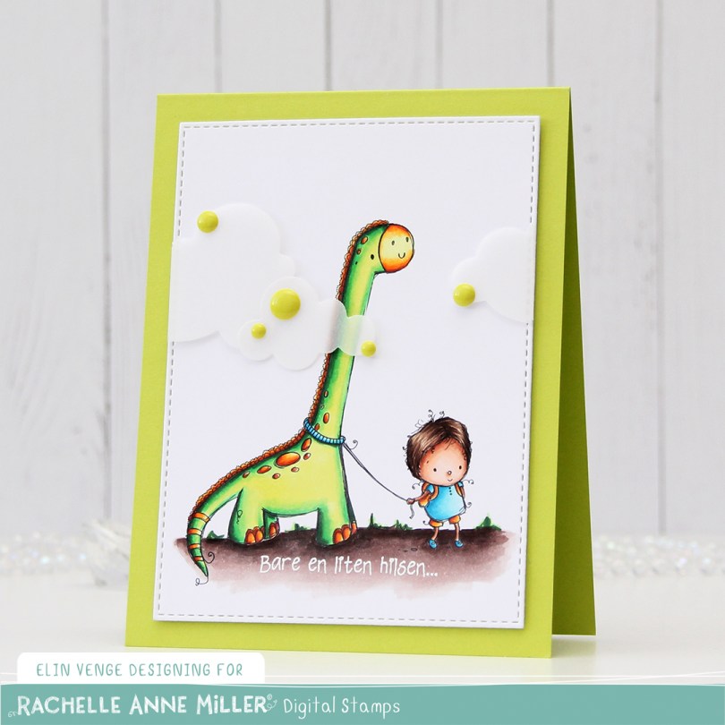
 I colored up
  I added two layers of cardstock behind my colored piece, so it would stand out a little from my Limelight card base (colored card stock from My Favorite Things).
 I added some vellum clouds on tiny pieces of foam tape, so it looks like the dinosaur’s neck is really long, I thought that was a fun little detail to add. Placed some enamel dots from Papirdesign in strategic places to cover the foam tape, and made an envelope from Papirdesign patterned paper using the A2 V flap envelope dies from Simon Says Stamp for the card to go in.
 Bright, bold Copics!
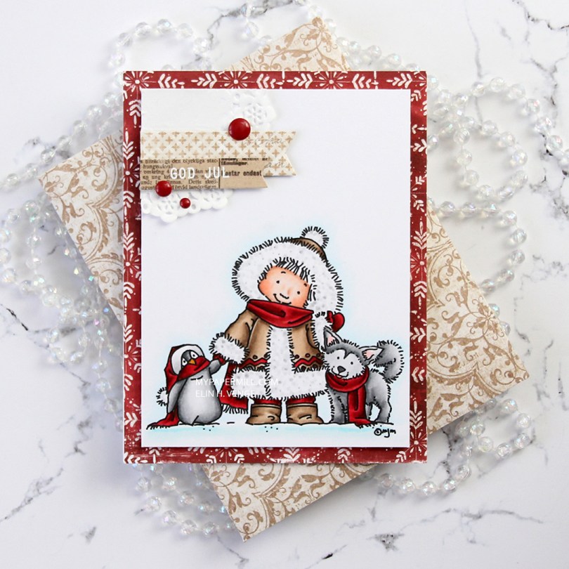
 I don’t know what’s going on with me, but I’ve made another red Christmas card. I love creating Christmas cards, but I’m not a fan of red, not even for Christmas. The best thing about creating cards is that they get sent to someone else, so even if I personally don’t like certain colors, I’m getting rid of them eventually anyway, so it doesn’t matter. 😉
 Once I’d colored the image with my Copics, I trimmed 1/4″ off each of the four sides and covered the back with foam tape. I found an old scrap of patterned paper from Magnolia that was already cut down to 4 1/4 x 5 1/2″, probably a reject from a previous project, but perfect for this one, the red matches my coloring! It has white “snowflakes” on it. These have 8 points, so they’re not actually snowflakes. There’s no such thing as an eight pointed snowflake (or a five pointed, for that matter), it has to do with how water molecules are formed.
 I die cut a couple of scraps of Maja Design patterned paper using two of the Fishtail Flag Frames dies from My Favorite Things. I stamped and white heat embossed a sentiment from Norsk Stempelblad AS onto one of the die cut banners, adhering it to the larger one using 1 mm foam squares for a little bit of dimension. I used the same foam squares on the back of the bigger one and glued both banners to part of a mini doily from Doodlebug adhered to the top left corner of my colored panel. I added a few enamel dots from Papirdesign, and my card was done.
 I found an old scrap of patterned paper from 3ndypapir that was just large enough to create an envelope from using the A2 V flap envelope dies from Simon Says Stamp. I thought the color matched the brown in my card nicely.
 Not a lot of colors used for this one.
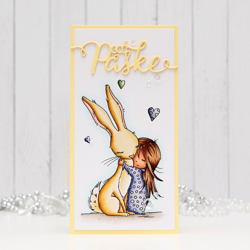
 I wanted a soft look to this, but at the same time, I also wanted to change things up a bit. I went with a darker skin tone than I normally do, and I really wanted a soft yellow bunny. I printed the image onto a piece of X-Press It blending card cut to 3×6″ for a mini slimline card. I adhered it to a card base I made from Lemon Tart card stock from Papertrey Ink with a 1/8″ border. I used the same color card stock to die cut “God påske” (Happy Easter in Norwegian) using a die from Papirdesign. I stacked three die cuts on top of each other and used a sparkle shimmer spray from Imagine to add lots of shimmer to the die cut. It has a really nice shimmer in real life, even though you can’t see it in the photo. To finish off the card I added a few sequins from the White Orchid sequin mix from Little Things from Lucy’s Cards.
 Part of me can’t believe I used five different greens for this one, but that tiny green heart? They all fit in there!
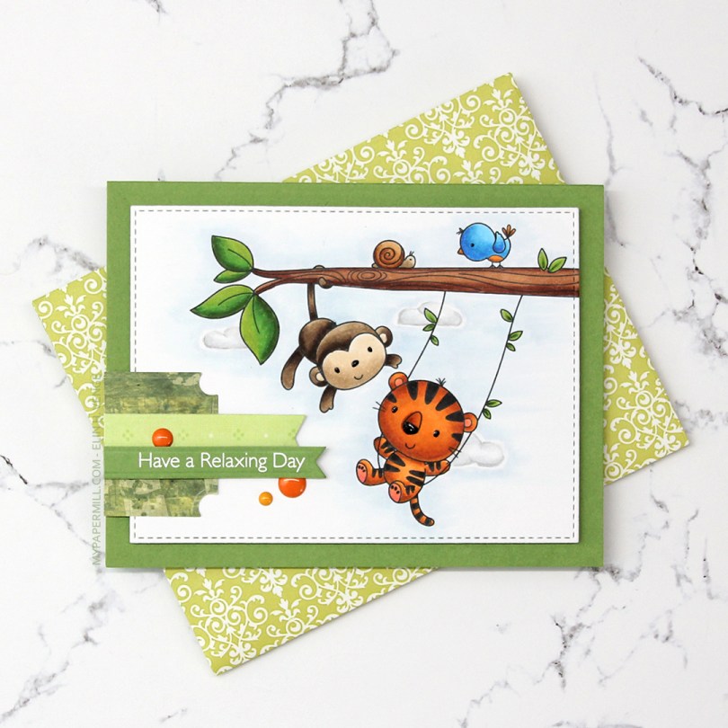
 I colored the image with Copics and die cut it using the second largest die in the A2 Stitched Rectangles STAX 2 set from My Favorite Things, before adding it to a card base made from Gumdrop Green Heavyweight card stock, also from MFT, using lots and lots of foam tape. I used a black Glaze pen to add some dimension and shine to their eyes and noses.
 I’m one of those people that use patterned paper on my cards. I don’t use lots, and I pretty much always use them for small clusters, but my ancient stash of patterned paper is shrinking ever so slightly with each card. I have a tub of die cut patterned paper scraps on my desk, and rummage through it to find the perfect pieces for my clusters. The dark green patterned paper I used here is actually from 2005, which was years before I started making cards. I stamped one of the sentiments from the Always Bring a Smile stamp set from My Favorite Things onto a separate piece of Gumdrop Green card stock and die cut it using one of the dies in the Slimline Starter die set. I finished off my card with a few enamel dots from Papirdesign to match the tiger and the details on the bird.
 Another great use of patterned paper is envelopes. I’ve nearly run out of colored envelopes for A2 cards, and I’m definitely out of white ones, but larger scraps of patterned paper are perfect for creating one of a kind envelopes. I used the A2 V flap envelope dies from Simon Says Stamp on this piece of patterned paper from 3ndypapir. Another old one, this paper’s from 2010.
 Lots of bright colors used for this one. I also used B40, which is a color I’ve created myself.
 I thought
  Using Memento Bamboo Leaves ink, I stamped a sentiment from Norsk Stempelblad AS inside one of the balloons, stamped again in VersaMark ink and clear heat embossed it. It makes it stand out a little more from the balloon. I die cut the panel using a die from the A2 Stitched Rectangles STAX 1 set from My Favorite Things and adhered it to a card base made from Sour Apple card stock from MFT using lots of foam tape for dimension.
 I added Sparkling Clear sequins from Pretty Pink Posh to three of the balloons, and my card was finished. All that was missing was an envelope. The only colored envelopes for A2 sized cards I have left are in warm tones, so I decided to make my own using the A2 V flap envelope dies from Simon Says Stamp with a scrap piece of patterned paper from Papirdesign.
 I thought the color of the patterned paper matched the blue balloons on the card so well, and it made the pile in my scrap drawer shrink ever so slightly, gotta love that!
 I kind of went overboard with the number of Copics used for each balloon, but I think it turned out pretty good in the end.
 I really enjoyed playing with the mini slimline format last week, so I wanted to create another mini slimline. Last time, I slightly miscalculated the measurements I needed to create the matching envelope, so I made this one a little bit smaller, so it fits inside the envelope from last week that was just a tad too small for that particular card. This one measures 3 3/8 x 5 7/8″. I didn’t want to mess with the scene too much, so I die cut a few clouds from vellum using dies from Papertrey Ink and white heat embossed a Norsk Stempelblad AS sentiment onto one of the clouds. I mounted the clouds onto tiny pieces of foam, and added enamel dots from Papirdesign on top in very strategic spots.
 I used a bright color palette for this one.
