Hi, there. I have a card to share featuring stamps from the brand new “A Happy Little Place” collection from Purple Onion Designs, illustrated by the one and only Stacey Yacula.

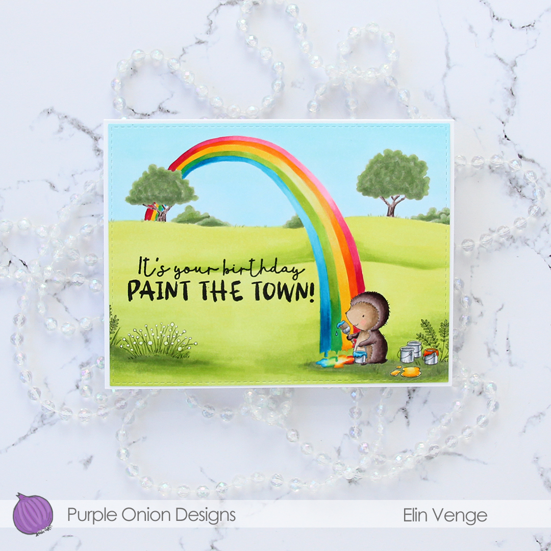
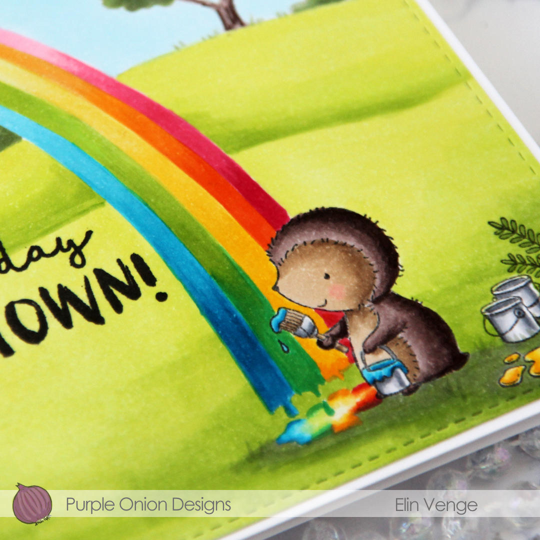
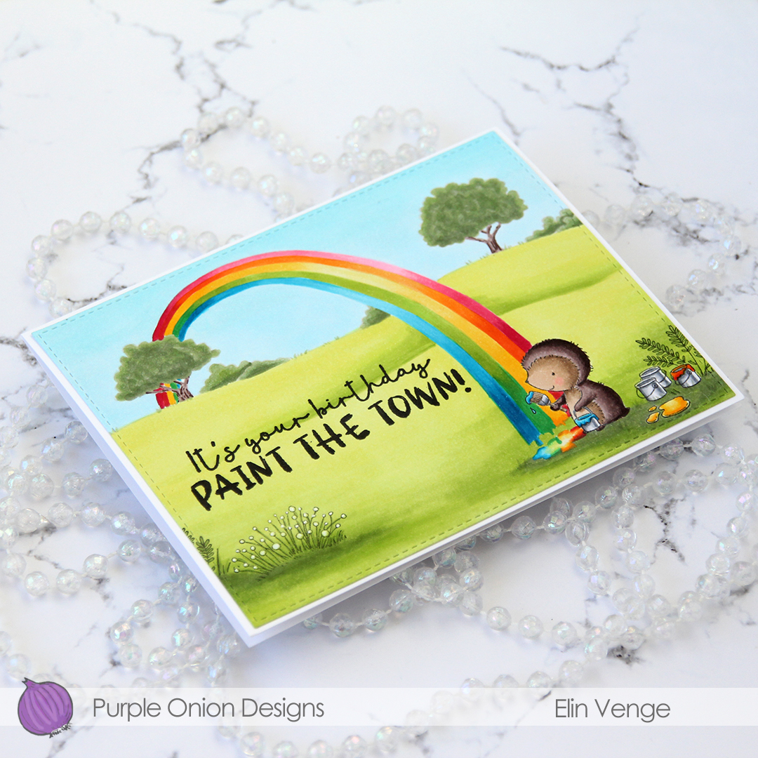
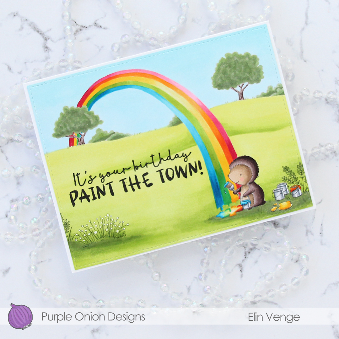
As soon as I saw Polly the hedgehog with her cans of paint, I knew exactly what I wanted to do. She needed to paint a rainbow. I don’t really free hand draw much on my cards, but arches aren’t too daunting.

I stamped Polly and her paint cans using Extreme Black ink from My Favorite Things, before masking the paint cans and stamping some country flowers behind them. Using a mechanical pencil, I drew in faint lines for the rainbow, before masking the section that needed to be in front of the countryside scene on the horizon, and then stamping that in fadeout ink from Inkon3 for a no line look in the background. I wanted the focus to be on the hedgehog and rainbow.

I colored in the entire scene with my Copics. To be honest I probably spent more time on the rainbow than anything else. I only have five arches, but it was tricky enough to try to color five (the bands are very thin) without the curves getting too jagged, I don’t even want to think about how hard it would have been with seven.

At the end of the rainbow, I created a dripping edge with a puddle of paint on the grass. Isn’t Polly cute holding that paint can and brush?

I stamped a sentiment from the “Around the town” sentiment set onto my colored piece using VersaFine Onyx Black ink, holding my breath as I did so. I didn’t want to mess up my panel and have to start over at this point.

I used the largest die in the A2 Stitched Rectangles STAX 2 set from My Favorite Things to turn my colored piece into a finished panel, making sure the ink in the sentiment was dry before running it through my Gemini Jr. I added my panel onto a white card base with a top fold, and my card was complete.

Lots and lots of Copics. That happens with rainbows 🙂


I started by coloring the polar bear (
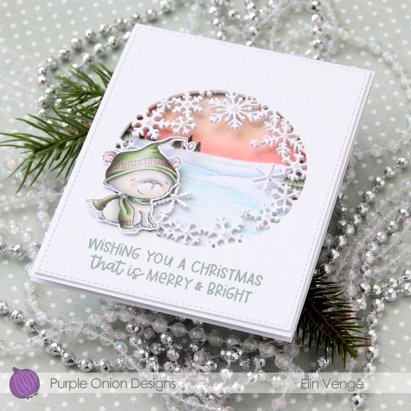
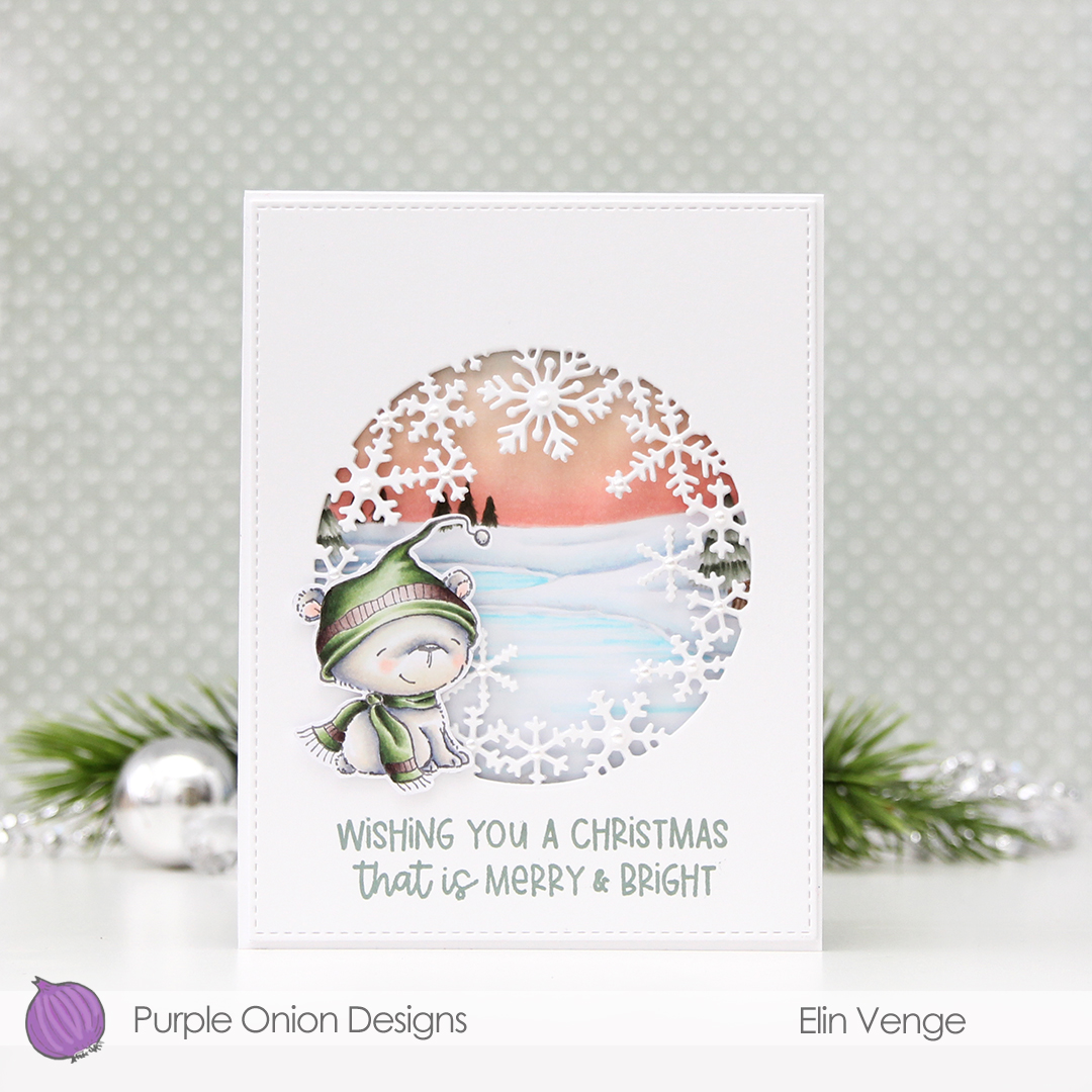
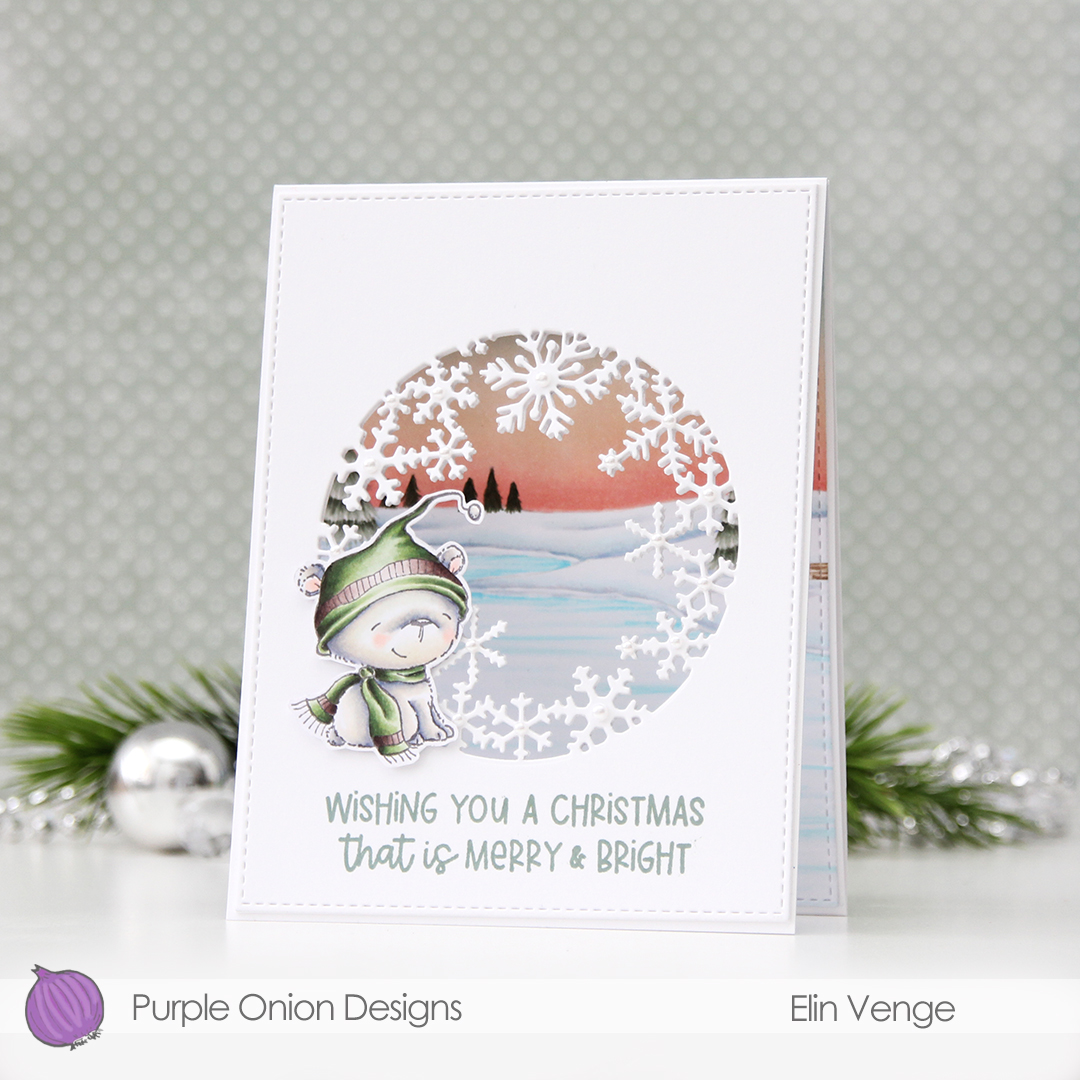
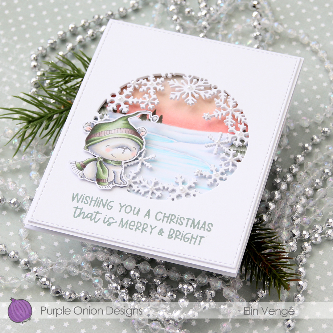
I love the snowflake circle die from Hero Arts and have used it many times before. I die cut a window into the center of the front of my card base, and at first thought that would be it. Once it morphed into a trifold, though, it was so back heavy that I needed an additional two die cut windows on top of the card base for some strength and stability. I used the largest of the A2 Stitched Rectangles from My Favorite Things to create a nice finished edge to the top layer.
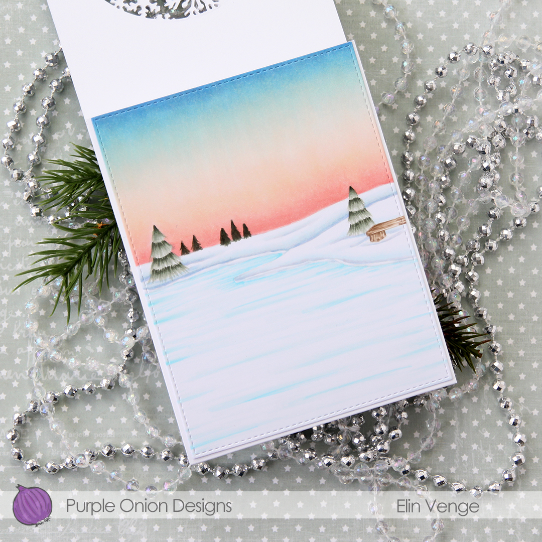
For the inside panel that you can see from the front, I stamped the
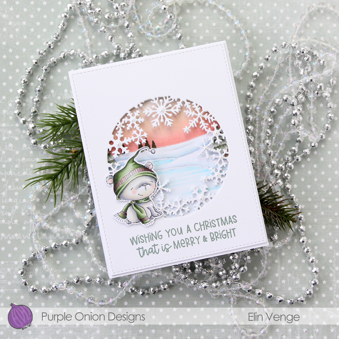
I stamped a sentiment from the
In this photo it’s pretty evident that the three layers of panels with die cut windows add a nice bit of dimension, as well as stability to what would otherwise be a pretty floppy card front, since the window is so big. I use 110 lb white card stock (Stamper’s Select White from Papertrey Ink), which is a nice, sturdy card stock, but with that big of a window, the only thing that will work is using several layers.
I added white pearls from Kort & Godt to the center of the snowflakes. 3 mm pearls for the largest snowflakes, 2.5 mm pearls for all the others.
Lots and lots of Copics for this one. I used 20 markers to color just the bear, 10 for his fur alone, which is a little bit crazy.
I colored the penguin with my Copics, fussy cut him and added 1 mm foam squares to the back. I created a fold over tag using the second largest die in the fold over tags nesting die set from We R Memory Keepers and some really old pink patterned paper from Magnolia.
I created a tag to go inside the folded over tag using scraps of patterned paper from Papirdesign. Using one of the dies in the Tag Builder Blueprints 6 die set from My Favorite Things, I created the to/from circle using that pink patterned paper, and matted it with a white die cut circle. I probably didn’t need the white circle, I’m thinking the letters would have stood out more against the grey patterned paper, but what’s done is done. I still like the white.
Fairly quick coloring on such a small image means I didn’t use a lot of markers. I originally colored his feet and beak orange/yellow, but didn’t like the look and covered it with grey. You can still see the orange shining through in the finished coloring. That, I don’t mind, for some reason, I just didn’t like the look of the orange alone. Some species of penguins have black feet anyway 😉
My card is heavily inspired by a card
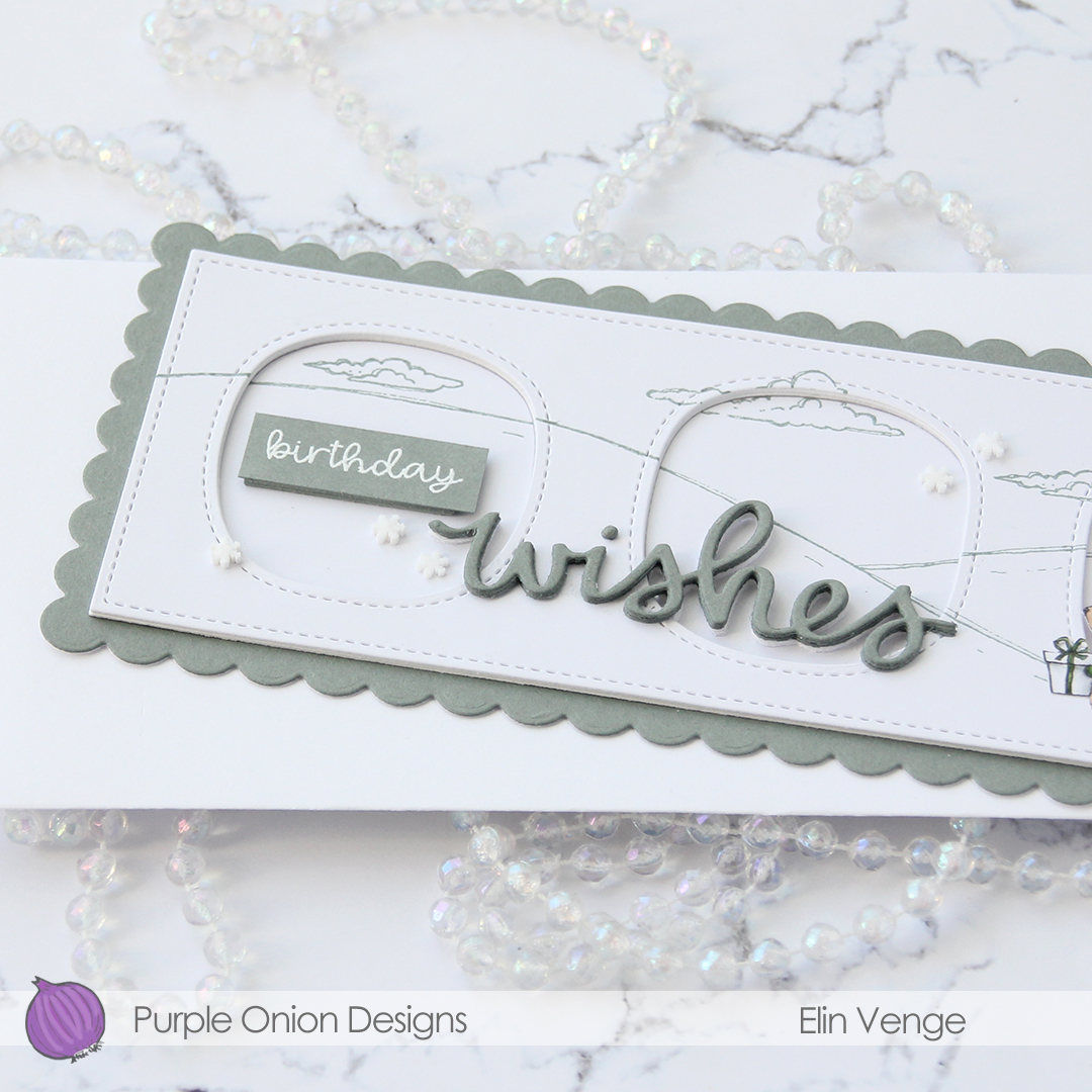
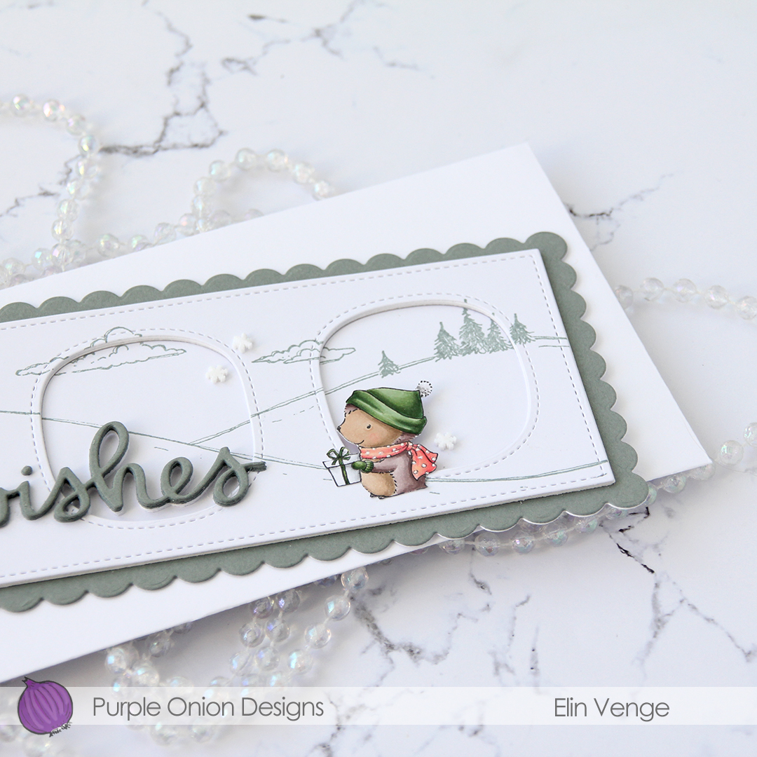
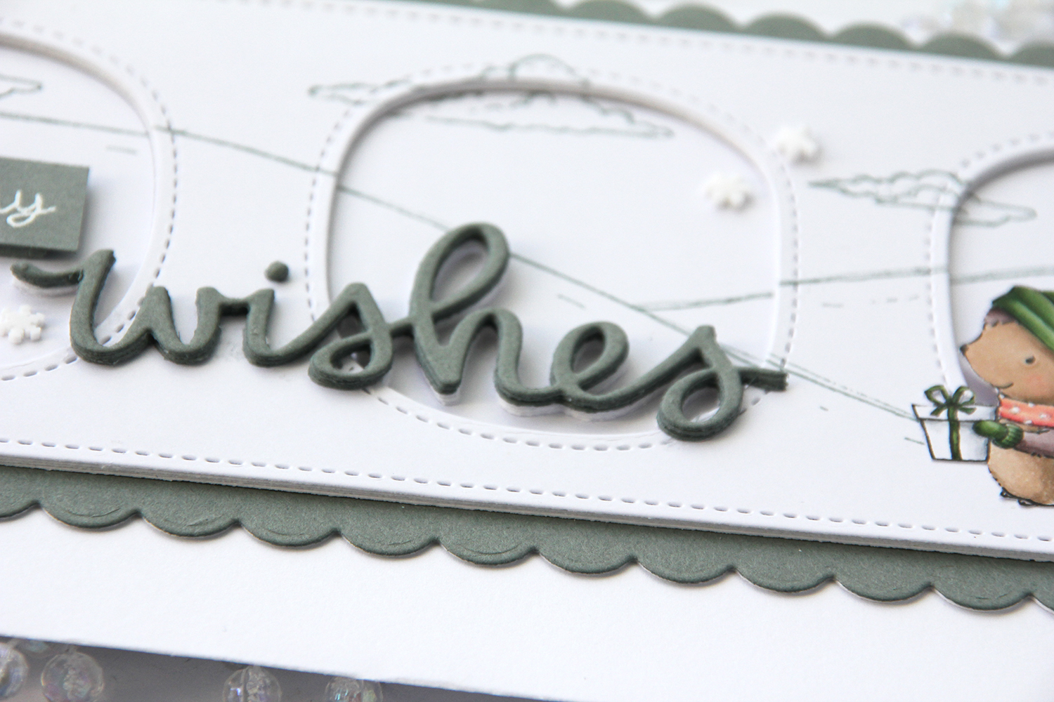
Tenia’s card had a wide piece of washi tape going in from the right near the top of the card, with a rectangle perpendicular to the washi with a couple of small colored flowers on top, a sentiment and a few enamel dots. Once I’d ink blended a little bit using Audrey Blue and Island Blue inks from Simon Says Stamp, I tried to add a rectangle to my card, but it was too long and too wide for my liking. I scrapped that idea and die cut a polaroid frame instead for my little hedgehog to sit in. I used the second smallest die from the Precious Polaroids die set from My Favorite Things, and stacked four on top of each other for dimension. The die cut was just big enough to stamp a sentiment onto. The shortest sentiment in the
I added a few snowdrift sprinkles from Little Things from Lucy’s Cards, and my card was complete. Lots of white space, a cute hedgehog and one more Christmas card in the bank for 2021. Doesn’t get much better than that!
Super limited color palette for this tiny image.
I went with a really bright pink, colored in the image with my Copics and did some serious fussy cutting, before adding 1 mm foam squares to the back. I also stamped one of the sentiments from the
From a piece of Bristol Smooth card stock, I used the largest of the dies in the Stitched Traditional Tag STAX die set from My Favorite Things, masked off a curved line towards the bottom and ink blended a gray sky using Charcoal, Soft Granite and Wet Cement ink from Hero Arts, as well as Soft Stone ink from Papertrey Ink. The Charcoal is fairly dark, but the Soft Stone super soft, giving a nice gradient feel. I sprinked on chunky white embossing enamel from Stampendous and heated the tag from behind to melt the granules for a snowy effect on my background.
Going direct to paper, I colored a scrap of Bristol Smooth with the Hibiscus Burst ink pad that I used for the sentiment, before using one of the tiny dies in the Tag Builder Blueprints 6 die set from My Favorite Things to create my reinforcement piece. I think the faux stitching on the circle matches the stitching on the tag perfectly, one of many reasons why I love my MFT dies, they’re so awesome to mix and match. I added a bit of Cotton Candy twine from Whisker Graphics and a charm from my stash near the top to complete the tag.
Not a lot of colors for this one, but I did my best to make the pink really pop against the other colors.
For today’s card I really wanted to include both
I stamped the bear using fadeout ink from Inkon3 and masked him, before stamping the fox in the same ink. While I still had the stamps in my MISTI, I stamped their eyes, mouths and noses using Memento Espresso Truffle ink. This saved me from having to draw the details back in after my coloring, which could have potentially ruined the entire scene. I used my Copics to color everything, and trimmed the panel down slightly. I used one of the greens from the image on the edges of a 5×7″ piece of X-Press It blending card to make the card front match the image, as I didn’t have any card stock in the right shade of green. For the die cut HURRA (die from Kort & Godt), I scribbled one of the green Copics onto a scrap piece of X-Press It before die cutting. I added another three white die cuts behind it for dimension, and used foam tape on the back of the colored panel to give it a little lift up from the card base.
As usual, I used lots of colors for the snow (everything in this graphic before E44), but that’s just how I roll.
My sister’s birthday’s in a few weeks, and I thought this was the perfect card for her. She used to have the nickname “musa” (the mouse) when we were kids. Our cousin, a few months younger, was also quite a bit bigger, earning her the nickname “rotta” (the rat). Of the two, I think my sister got the better nickname.
I die cut the frame five more times, cutting away the interior pieces and stacking the frames to form the walls of my shaker. The frame is quite thin, so I didn’t trust myself enough with a ruler and a craft knife to create five identical frames. Die cutting seemed safer and quicker. I’ve kept all the pieces and am planning on using them in the future for a card or two.
There’s quite a bit of dimension in this. Card base, five layers of walls for the shaker, a piece of acetate, die cut cover frame on top, then three layers of letters. Dimension is life!
Limited color palette with such a small image.