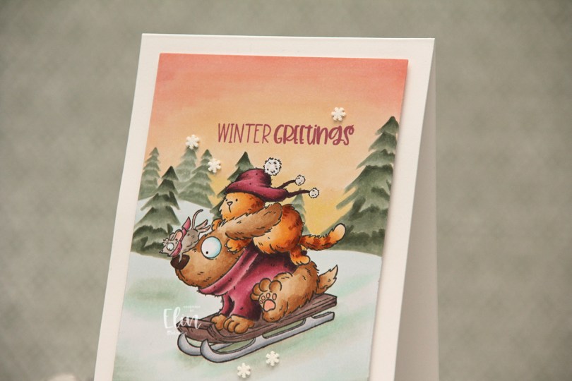
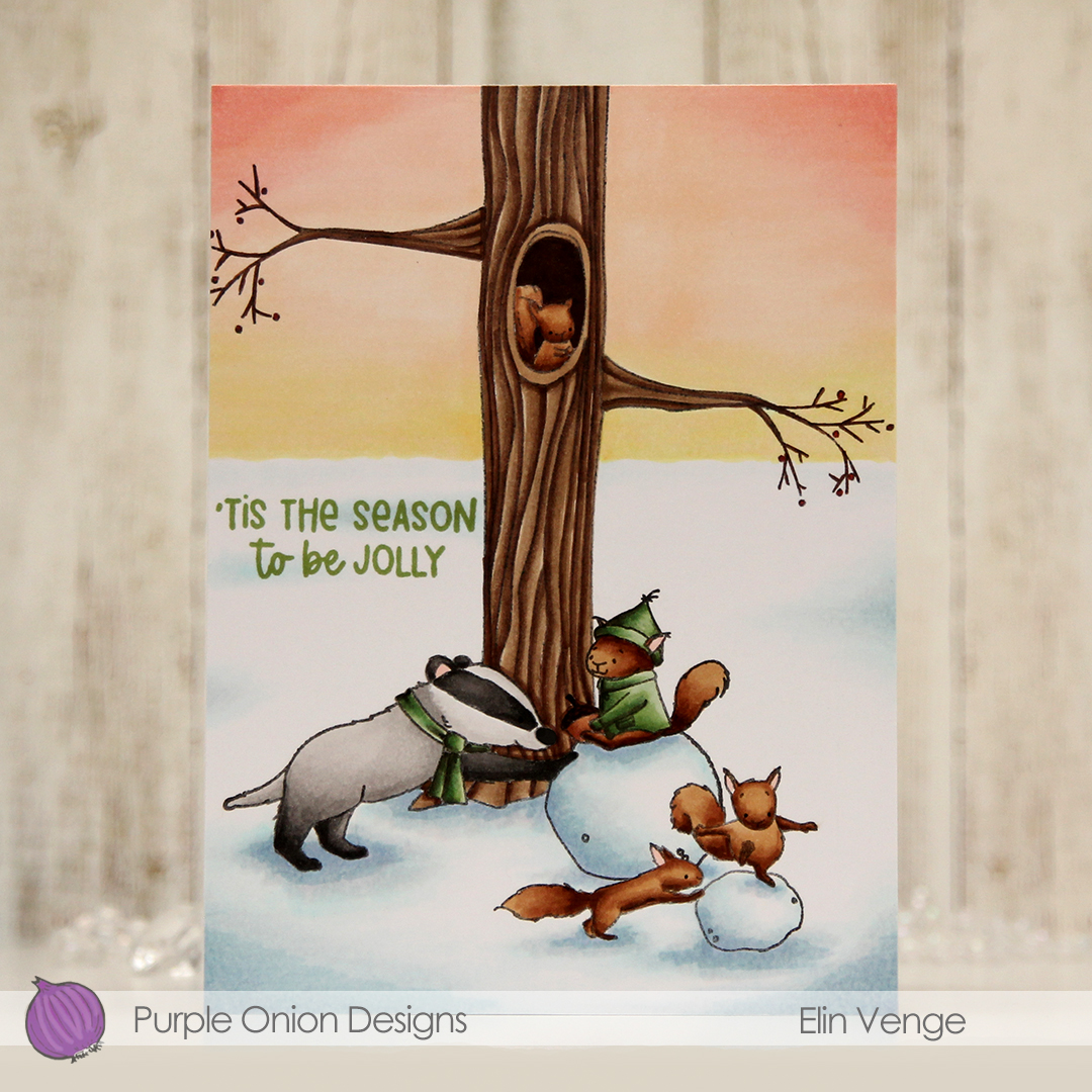
Hi, crafty friends. I’m sharing a fun winter card today featuring Tofu, Flappy & Mousy Fun in the Snow, which is a stamp from last year’s holiday collection of Pei’s images from Purple Onion Designs.
 This is one of those super simple cards. I stamped the image using Extreme Black ink from My Favorite Things and masked it before stamping the Winter Trees background in Fadeout ink from Inkon3 for a no line look in the background. I colored in my scene using Copics, before using one of the dies in the Additional A2 Layers die set from Waffle Flower to cut it down slightly.
 I stamped a sentiment from the Holiday Time Sentiment Set using Autumn Rose ink from Papertrey Ink, mounted my panel in the center of a top fold card base using foam tape and finished off with a few snowdrift sprinkles from Little Things from Lucy’s Cards. I love these sprinkles!!
 I stuck to a pretty limited color palette, I feel, but there’s still a lot of markers.

Today’s the last day of the annual holiday sale over at Purple Onion Designs, so this is a gentle reminder to head over there, fill your cart with stamps at 25 % off, and check out.

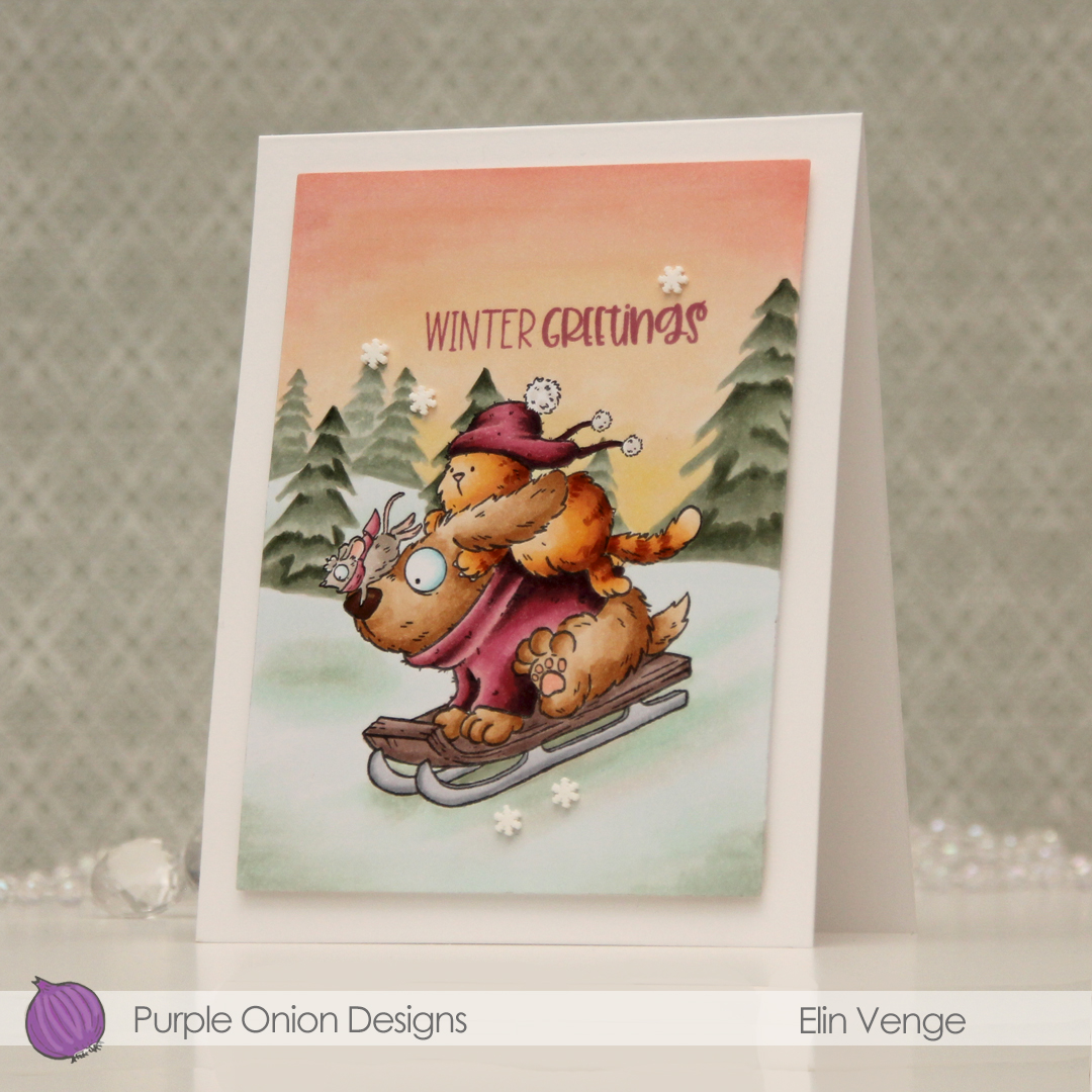
 This scene is created entirely with images from last years holiday collection from Stacey Yacula.
  I colored the entire scene with Copics, stamped the sentiment from the
  I used lots of Copics for this, and all the different gray families, actually.

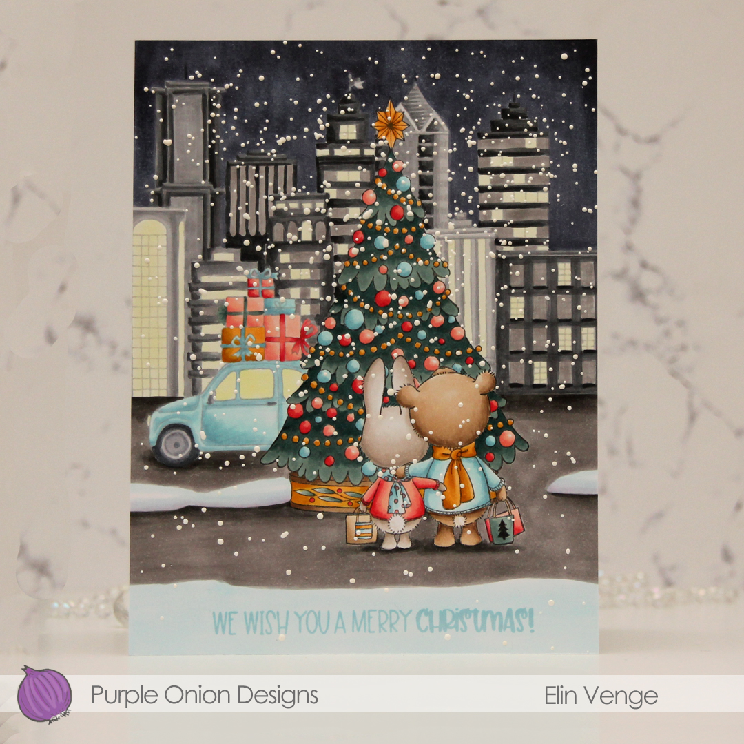
 I suggest you put this image in your cart, it’s so awesome. I colored it with my Copics, adding an actual no line horizon behind my critters to complete the wintry scene, before using a die from the Nesting Postage Stamps infinity die set from Hero Arts to turn it into a huge postage stamp. I then used the
  I created a top fold card base from Pure Poppy cardstock from Papertrey Ink, mounted my large postage stamp using lots of foam tape and adhered a few Snowdrift sprinkles from Little Things from Lucy’s Cards to finish.
 I actually used red markers for red this time, with a little bit of B14 where I wanted it to be darker than R29 can create on its own. I usually use earth tones for red, this was a fun change.
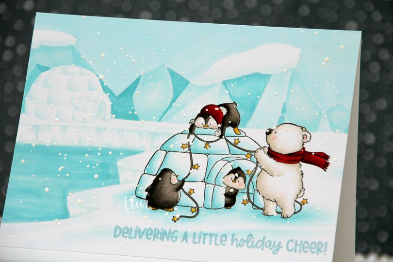
 I originally planned on creating a regular portrait oriented A2 card with this image, but I had this idea of another igloo in the distance, and it kind of evolved from there. I don’t usually create my own backgrounds for cards (I like background stamps that do all the work for me), but I had a blast with this one. Keeping the colors to a minimum certainly helped. I only used five Copics for the entire background.
 Once the background and the actual stamped image were both colored in, I stamped a sentiment from the
  Limited color palette for such a large card.
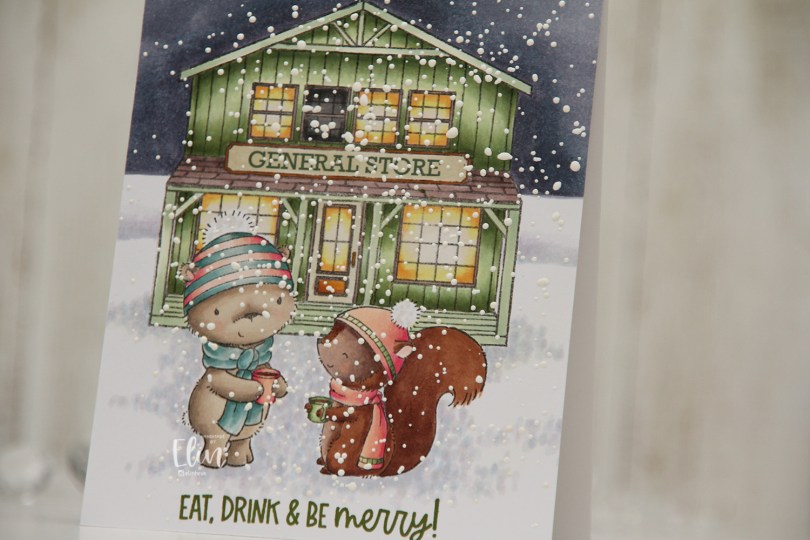
 Meet
Meet  Once everything was colored in, I stamped Santa’s Silhouette using Obsidian ink from Altenew. This is a pigment ink, which doesn’t really play well with Copics, so it’s best to use it once the coloring’s complete. I then stamped a sentiment from the Home for the Holidays sentiment set using Jalapeño Popper ink from My Favorite Things, before I sprinkled on chunky white embossing enamel from Stampendous, which I melted from the back for a textured snow look. I adhered my panel to a top fold card base and my card was complete.
 I used a lot of Copics for this scene. A lot.
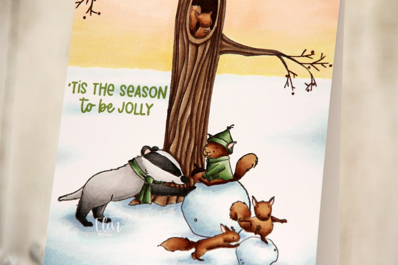
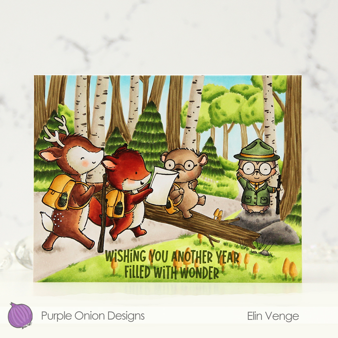
 I stamped and colored my critters (
 I stamped a sentiment from the older
  I used a lot of colors for this scene.
 I stamped this cute gang onto X-Press It blending card and colored them with Copics, then used the largest die in the A2 Rectangle STAX Set 2 from My Favorite Things to create my standard faux stitch edge. I stamped a sentiment from the
  I covered the critters with a mask, then used the Bokeh Elements Stencil Duo set from Waffle Flower to create some interest to the rest of the panel. I used Pistachio and Misty Sage fresh dye inks from Altenew for the green and started with Peachy Glow, also fresh ink from Altenew, for the smaller yellow dots. I suspect my stencil wasn’t clean from the last project, because the yellow seemed a bit too muddy for the look I was going for, so I went over with Scattered Straw Distress Ink, which helped. I then rotated the stencil 180 degrees and went in with Simon Hurley Solar Paste in the Golden Hour color. This paste goes on so easily and has a lot of shine. Once the paste was dry, I adhered my panel to a top fold card base I created from Sour Apple cardstock from My Favorite Things, and the card was complete.
 The solar paste adds so much shine that I decided not to add any embellishments to this card, making it very mail friendly.
 I didn’t use a ton of colors for this one.
 I stamped Mulligan and Bogey using Extreme Black ink from My Favorite Things, before covering them with masks and stamping the
  When I color large scenes like this, I always start with the background. I colored the sky first, then the green. There’s a lot of green in this one, and even thought I used different green combos for different elements and tried a new combo for the majority of the green, most of it blends together in the end and looks pretty much like the same color.
 On Bogey, I repeated the colors I used for the clouds on her outfit. Repeating colors creates a more cohesive design, and the end result isn’t rainbow vomit, which can easily happen if you don’t restrain yourself from using every color under the sun. I even used the pinks on a few details in Mulligan’s outfit, and colored the rest of his outfit blue. I chose a dark blue combo for his pants and hat, and used the lightest color in that combination as the darkest color for the lighter blue on his sweater and shoes. This way, the color isn’t the same across his entire outfit, but I’m not introducing a new color. It’s a great way to avoid rainbow vomit.
 To finish off the card, I stamped a sentiment from
  See? Not a whole lot of colors, given this is a full A2 size panel that’s all covered with color.
 I colored up my image with Copics, before stamping on top of the black lines with Obsidian ink from Altenew to darken up the lines even further. I fussy cut the image, leaving a bit of white trim around the edges, then put it aside while I worked on the rest of my card. Using the Snow Drifts Cover-Up die from My Favorite Things, I die cut three segments of the die from three shades of blue cardstock (Cornflower, Lazy Day and Blue Breeze, all from My Favorite Things). Even though it’s a snow die, it totally works for waves, I think. I inked up the top of each die cut using matching inks (Cornflower and Lazy Day from MFT for the darkest and middle color cardstock, Harbor ink from Concord & 9th for the lightest). I added ink splatter to all three using Cornflower ink and also Concord & 9th White. I adhered them to a scrap of cardstock to make them work as one die cut instead of three separate ones.
 I used the Ray of Light stencil from My Favorite Things to ink blend yellow ink onto a piece of Stamper’s Select White cardstock from Papertrey Ink. I used Harvest Gold ink from Papertrey Ink, and added a little bit of Sunshine ink from Simon Says Stamp near the top for a little more intensity. I then used what I had left on my ink blending brush to cover the entire thing, I didn’t want the background to be stark white, and this worked beautifully. I added ink splatter once again using the Sunshins ink, cut the panel down and stamped a sentiment from the
 I stamped and masked
  Once all my coloring was complete, I stamped on top of my critters, this time using Obsidian ink from Altenew. This is a very crisp pigment ink, and it makes the critters really stand out, but it’s not Copic friendly, so all the coloring needs to be complete when doing this. To finish off, I stamped a sentiment from
  Lots of Copics for this one.