Hi, crafty friends! It’s FINALLY starting to feel like summer. For the past week or so, we’ve had sunny weather and temperatures above 25. HEAVEN! We even had around 300 lightning strikes in the greater metropolitan area early Sunday morning. The thunder actually woke me up. I love thunder, so I spent around 20 minutes listening intently before falling back asleep. With the warm weather comes time spent at lakes, in the fjord or at the beach, and today’s card certainly fits that summer theme, featuring a few cuties from the new Lakewood collection at Purple Onion Designs, illustrated by Holly Mabutas.
 I stamped the Floatie gang, added a mask, stamped the floating swim raft and the Boat House, all using Altenew Obsidian ink on Fabriano Artístico cold pressed watercolor paper.
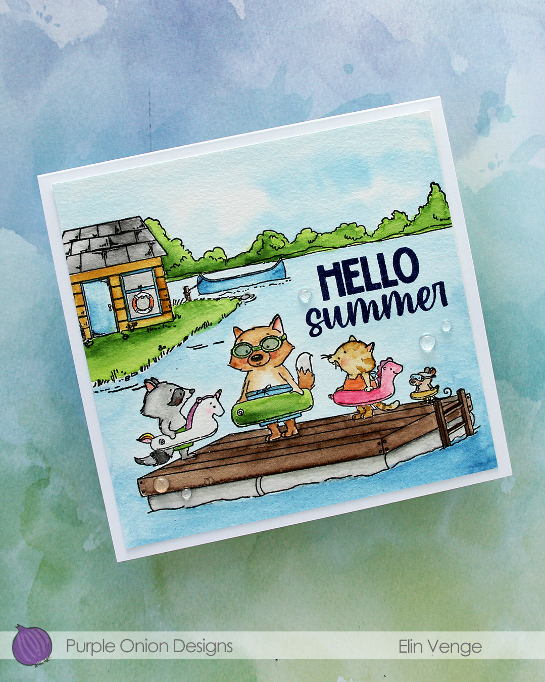 I used my Mijello Mission Gold watercolors and brushes in varying sizes to color in my scene, cut it down and stamped a sentiment from the Happy Hello sentiment set using Blueberry ink from Concord & 9th. Cold pressed watercolor paper is fairly textured, so I stamped it a few times for a crisp impression.
 I adhered the panel to a 5 3/4 x 5 1/2″ top fold card base I created from Stamper’s Select White cardstock from Papertrey Ink, before finishing off with a few Raindrops from Little Things from Lucy’s Cards.

 I stamped the image with black ink onto X-Press It blending card and colored it with Copics.
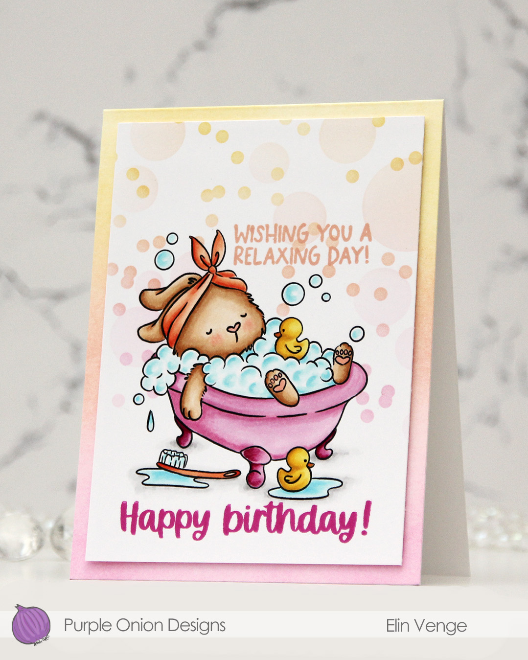 I added a mask to my image, then used the Bokeh Elements stencil duo from Waffle Flower to softly ink blend additional bubbles in an ombré effect in the background. I used Sweet Pea, Grapefruit and Buttercup inks, all colors from Concord & 9th, making sure to add slightly more color on the smaller circles than the large ones, while still keeping it fairly light.
 I stamped a sentiment from the
  I trimmed my panel down slightly and added it with of dimension to a top fold white card base that I ombré ink blended using the same three colors I used with the stencils. I did also add a dot of black Glaze pen to the eyes of the ducks for a finishing touch.
 Simple color palette for this one.
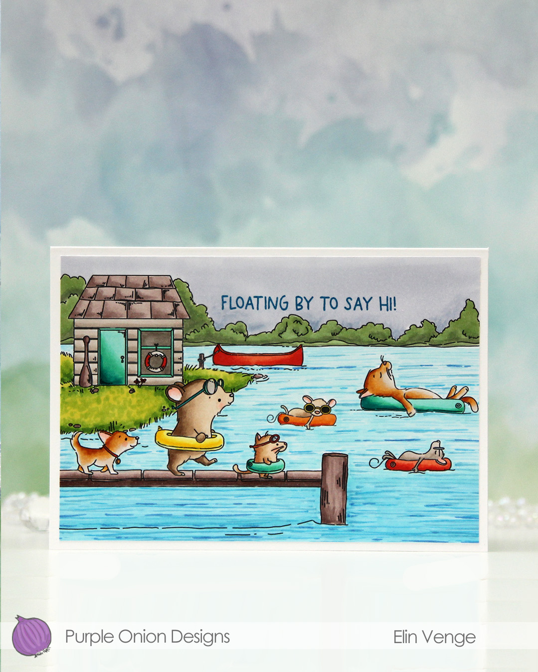 I fit a lot of images into this scene.
  I colored in my scene with Copics, opting for very vibrant colors for all the floating elements and the details on the boat house, while keeping the rest fairly muted. The lake is lighter the further back you get, and the sky is a bit moody off in the distance. I added a bit of black glaze pen to the eyes of the gang on the pier for a little bit of dimension and shine.
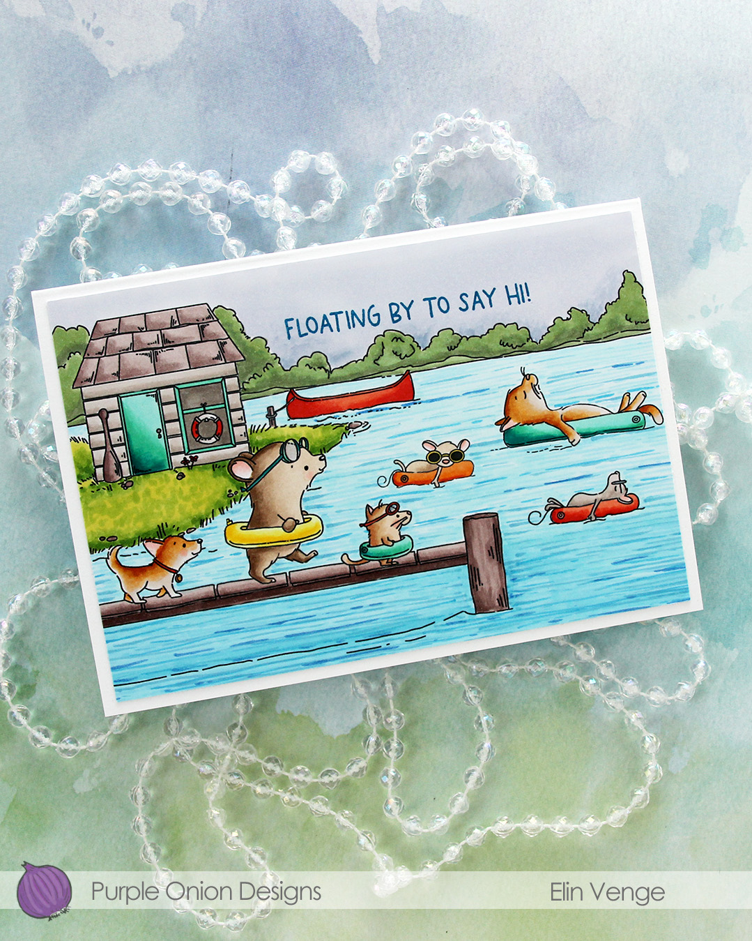 I stamped a sentiment from the
 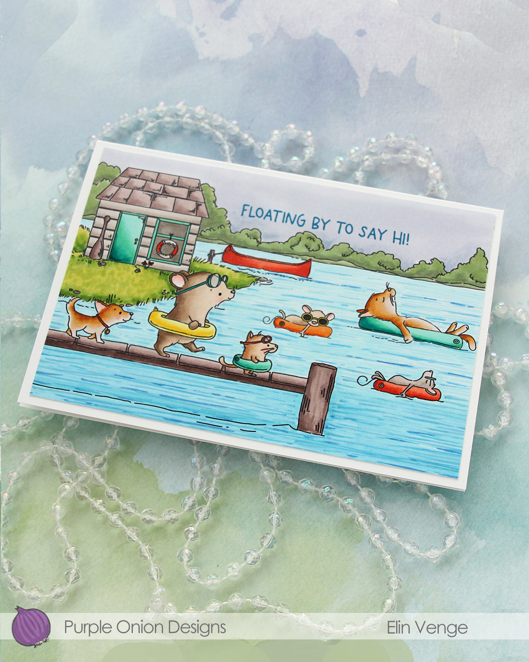 I adhered the panel to a card base that measures 6 1/8″ x 4 1/4″. This is an irregular size for a card, but when I create scenes like this, I let the scene dictate the size of the card. I can always make a custom envelope to fit.
 I used lots of Copics for this one.
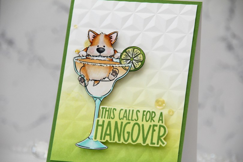
 I knew I had to color up this image as soon as I saw it. This is so adorable with the corgi hanging off the top of the glass. And so funny, and very typical of Pei’s illustration style. I love it!
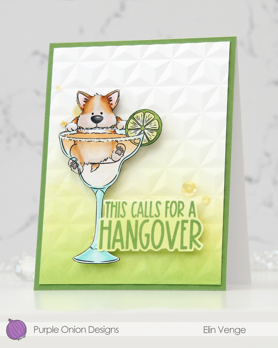 I colored the image with Copics, fussy cut him, then added VersaMarker pen to the rim of the glass and used white puff embossing powder from Wow! to mimic a salt rim. The embossing also adds some fun texture to the glass. I also used a black glaze pen to add a little bit of shine and dimension to his eyes.
 I ink blended Parsley and Starfruit inks from Concord & 9th onto a white cardstock panel for an ombré effect, then used the Geometric embossing folder from WRMK to create some subtle dimension. I added the panel to a card base I’d covered with Parsley cardstock from Concord & 9th, before mounting the image using foam tape.
 In this release there are also a few sentiment sets, and this one from the
  Simple color palette for this one. This was so fun to color!!!
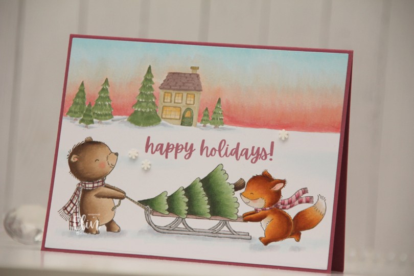
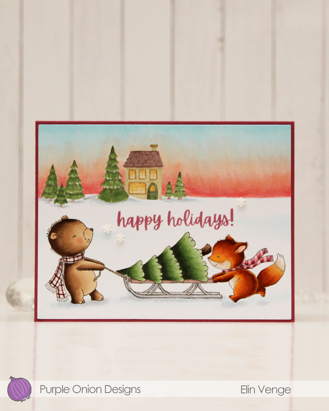 I colored these cuties with my Copics and did the same with
  I used the Additional A2 Layers die set from Waffle Flower to cut my panel down slightly, then adhered it to a card base I created from Autumn Rose cardstock from Papertrey Ink, before I added a few snowdrift sprinkles from Little Things from Lucy’s Cards.
 Lots of Copics for this one. I even created a new combo for the fox which requires less markers than the one I used to use.
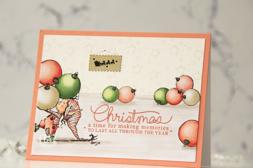
 I separated out the baubles from the image and did some copy paste work to create my scene. It’s one of the advantages of using digital stamps, and it makes them super versatile. I drew in a base board at the back with a black Copic multiliner and colored my scene.
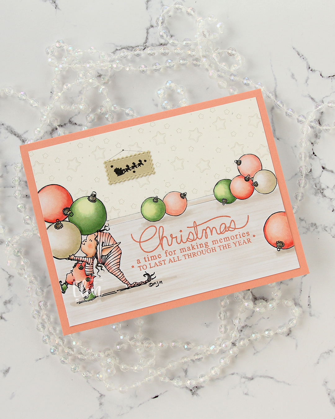 I fussy cut around the back bauble and base board and adhered my colored piece onto a piece of patterned paper from ModaScrap that acts as a wall paper for my background. To make it even more obvious that it’s supposed to be a wall, I stamped part of the Window Signs image from Purple Onion Designs using Altenew Obsidian ink onto a scrap piece of X-Press It blending card that I’d colored with one of the neutral colors (E81) I used for my baubles. I then die cut that using the Postage Collage Die set from Waffle Flower and adhered it to my wall, drawing in strings and a nail on the wall for it to hang from.
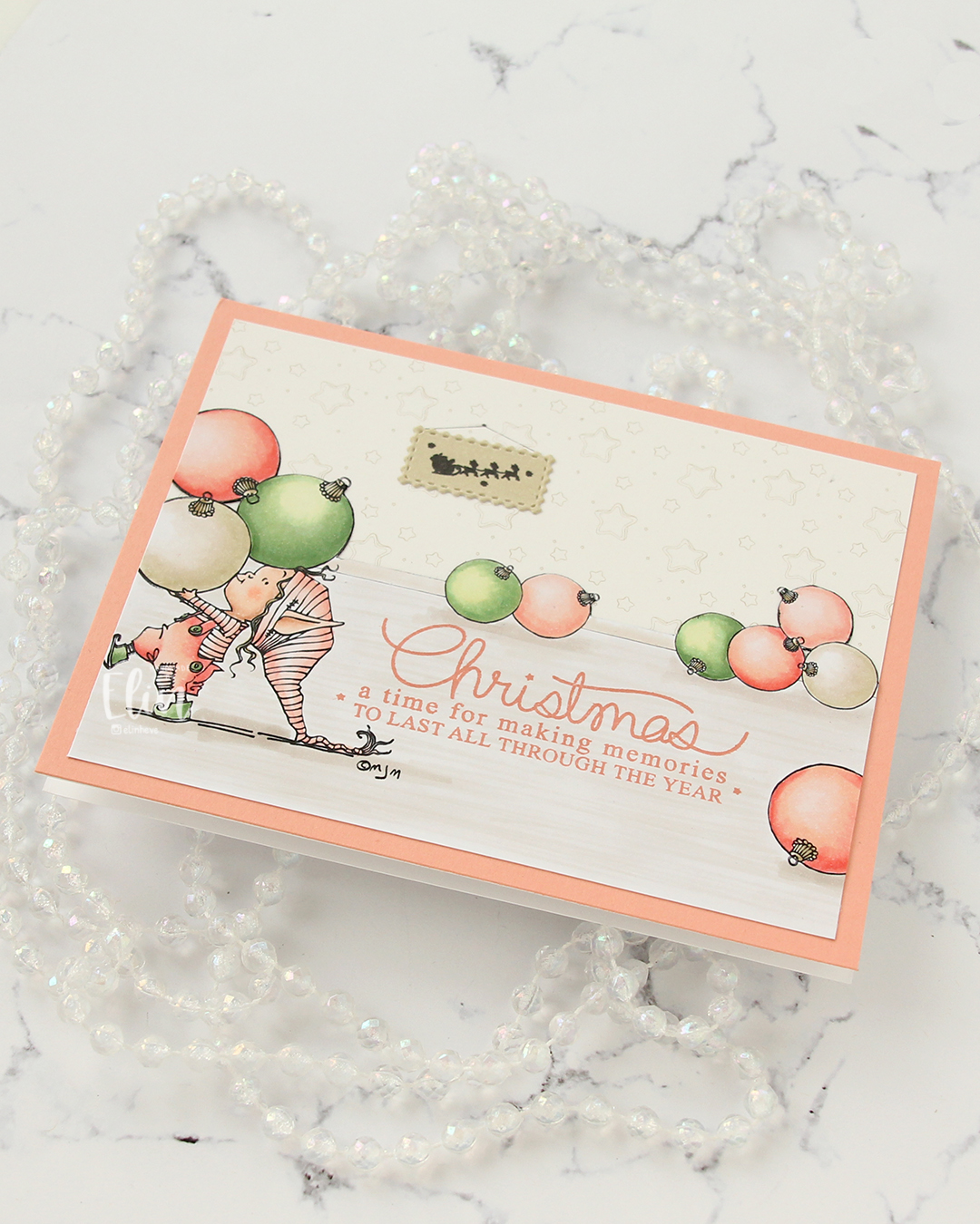 I stamped a sentiment from the Merry Greetings stamp set from Mama Elephant using Melon Berry ink from Papertrey Ink. It matches really well with the coloring. I adhered my scene to a card base covered with a quarter sheet of Grapefruit cardstock from Concord & 9th to create a matching frame and my card was finished.
 Limited Copic color palette for this one. I also used W3, W1 and W0, but I see now that I cut my graphic off too short, so they’re missing here.
 I added some tufts of grass to my coloring. The markers make it super easy because of their actual brush.
 Once all my coloring was dry, I stamped a sentiment from the

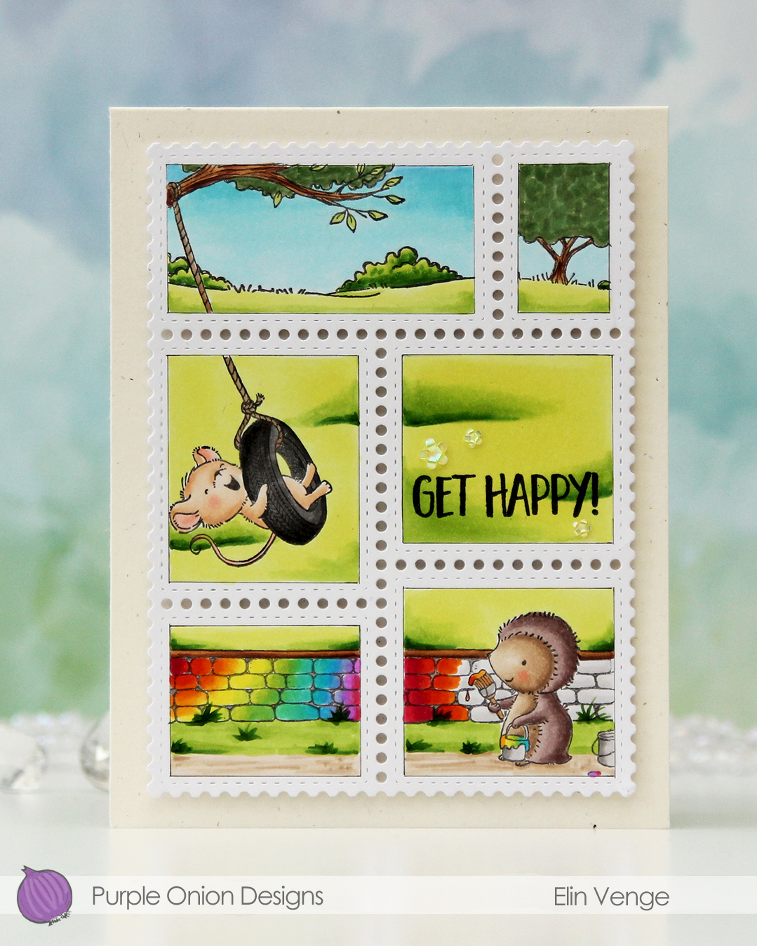 In addition to Polly and the stone wall, I also used
  Once my coloring was complete I stamped a sentiment from the Journey sentiment set from Purple Onion Designs using Altenew Obsidian ink.
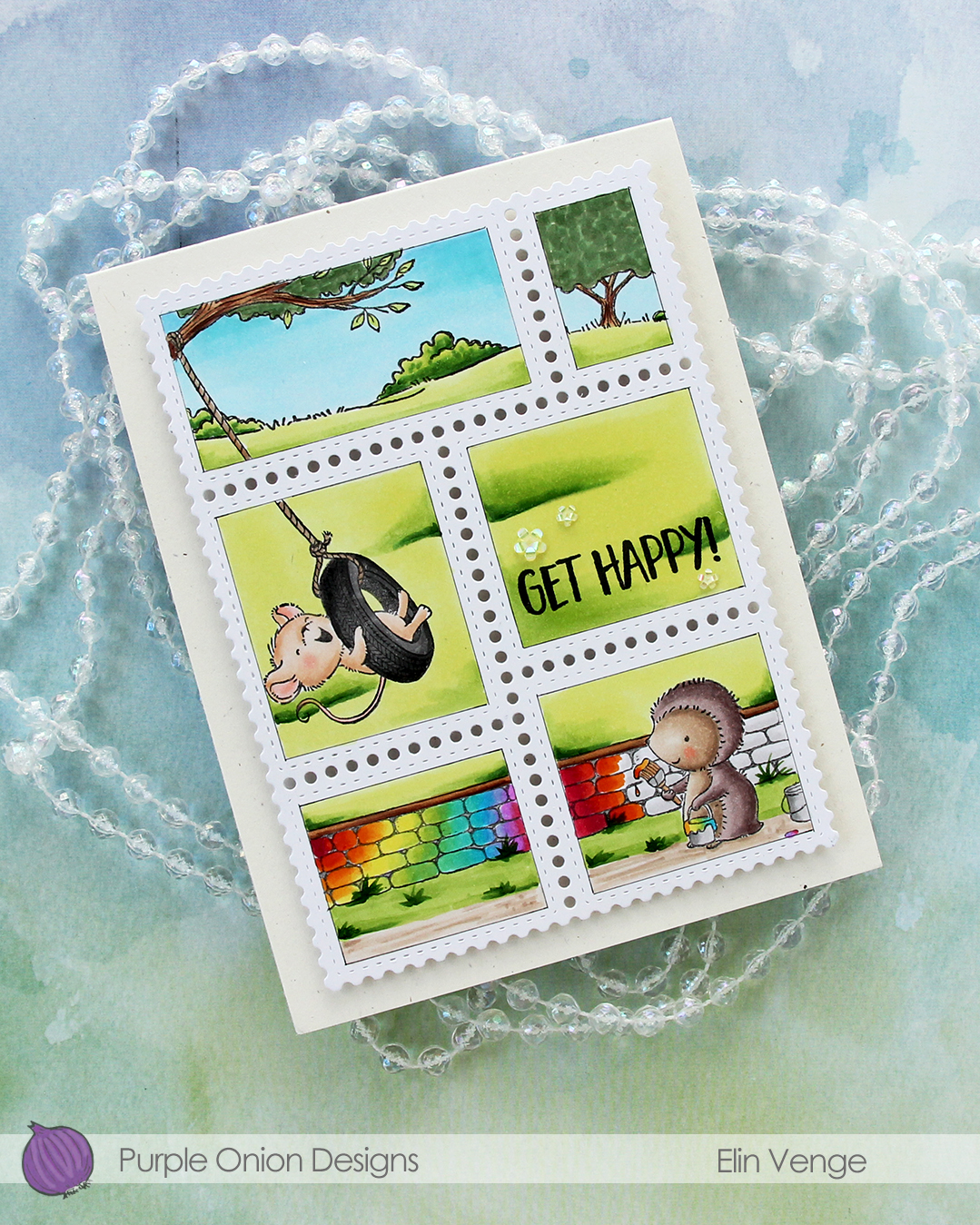 I stacked cardstock scraps behind each of the postage stamps for dimension and adhered everything to a card base I created from Rustic Cream cardstock from Papertrey Ink. I love this cardstock, I need to break it out more!!
 To finish off the card I embellished with iridescent flowers from the Spring Leaves mix from Little Things from Lucy’s Cards.
 Lots of Copics for this one.
 I combined
  I didn’t want color on the entire piece and decided on coloring a strip that includes the largest part of the waterfall, the beaver and part of the mama swan. I used Zig clean color real brush markers to color, using the blender for some of it, but a size 4 round watercolor brush from Princeton, along with water, for most of it. The Zig colors I used are the following: 068 Deep Brown, 816 Soft Violet, 028 Pale Pink, 705 Peach Orange, 505 Yellow Ochre, 407 Grass Green, 406 Sage Green, 411 Cactus Green, 307 Aqua Blue, 315 Ultramarine and 910 Warm Gray 6.
 Once my coloring was complete, I cut the colored section apart from the rest. I adhered the uncolored sections onto a black mat I created from Black cardstock from Concord & 9th. Behind the colored panel, I stacked a few layers of cardstock for dimension and adhered it in between the other two pieces. I adhered my finished piece onto a card base that I created from Blue Beyond cardstock from My Favorite Things.
 I stamped and white heat embossed a sentiment from the
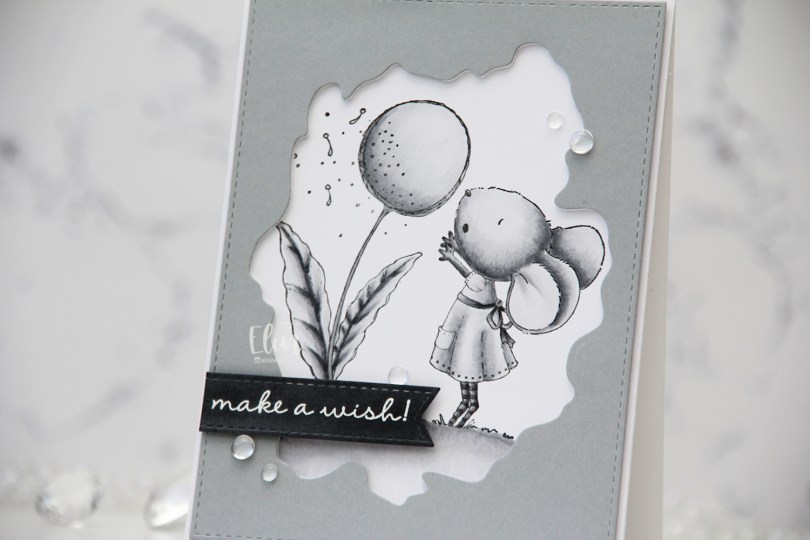
 I used grays for my coloring of this
 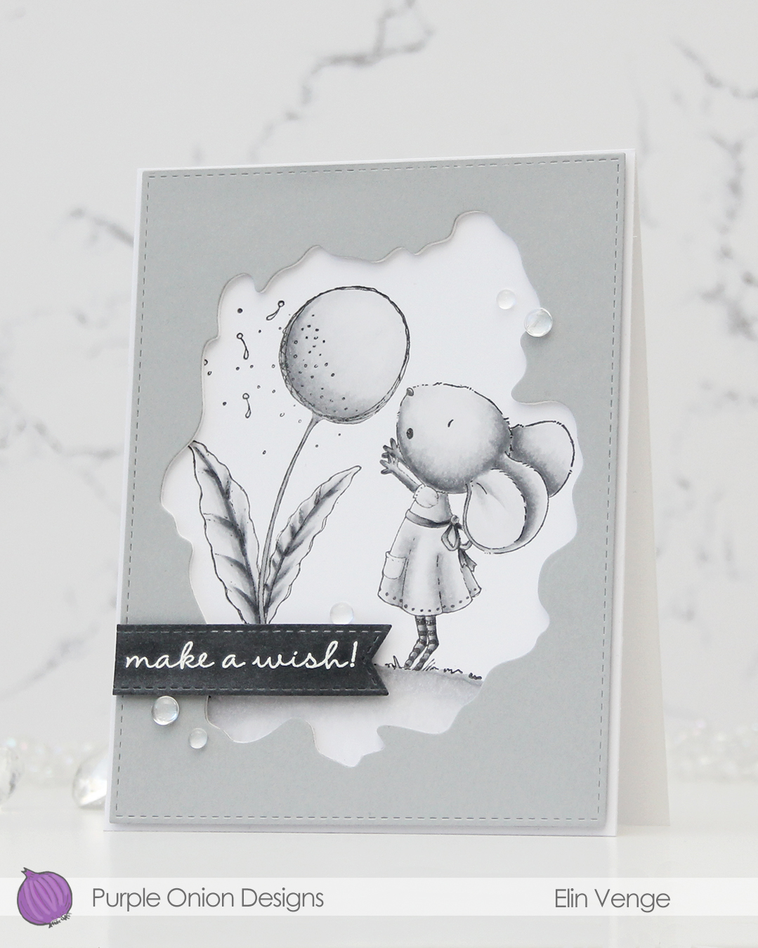 I used the Watercolor Wash Free Form die and the largest die in the A2 Stitched Rectangles STAX 1 set from My Favorite Things to cut a window opening and create the faux stitching on the edges of a piece of Dove cardstock from Concord & 9th. I used the Watercolor die to cut a few more layers from white cardstock to glue behind the grey for dimension.
 I scribbled a bit of N5 Copic marker on a scrap of Dove cardstock to make it a little darker, let it dry, then stamped and white heat embossed a sentiment from the A Beautiful Day Sentiment Set from Purple Onion Designs (unfortunately, I think the set’s discontinued, I couldn’t find it when searching the POD store). I then used one of the dies in the Essential Stitched Sentiment Strips die set from MFT to carry on the faux stitching look that I already had going. I added a few strips of cardstock behind it for even more dimension and adhered it in the bottom left of the card.
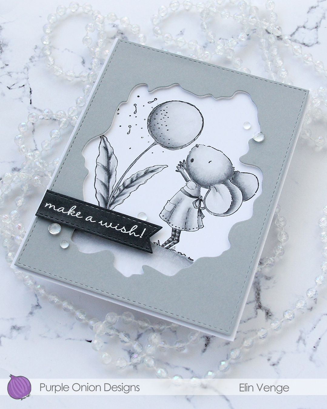 To finish off the card. I adhered a few Dew Drops from Concord & 9th. With greyscale coloring, grey cardstock, white heat embossing and clear dew drops, it looks like I took black and white photos of this card, but I promise I didn’t.
 I don’t think I’ve ever colored an image with less markers.