Hi, crafty friends. Christmas Eve is in exactly two months. Yikes. I’m trying to be prepared, but I still haven’t bought a single present. I’ve created gift tags for these imaginary presents, though, and today I’m sharing two with some really fun images Shari Bresciani illustrated for Purple Onion Designs.
 Shari Bresciani’s cast of characters is so fun and quirky. Michele at Purple Onion Designs is very good at finding illustrators with a distinct style. The left tag features Starla, Scruffy and Christmas Tree, and the right tag features Carrie and Snowman. I also added sentiments from the Holiday Blurbs II stamp set, the blurbs match these characters well.
 For both of my tags, I used the Wintry Forest stencil set from Pinkfresh Studio to create my background of blue trees. I used Polar Bear, Icy Water and Winter Lake inks from Altenew to create my trees, die cut my panel into tags using the Stitched Trad. Tag STAX die set from My Favorite Things, then sprinkled on Chunky White embossing enamel from Stampendous which I melted from the back for a snowy look.
 I love the expression on Scruffy’s face! This tree originally has a star on top, but I wanted Starla to add the star to the tree, so I cut off the star from the top and colored the cone shaped part of the star in green, so it looks like it’s the actual tree, even though the even curved line is a telltale sign that it’s not. I don’t think many people will notice, and even less will care.
 I stamped the sentiment using two ink colors from My Favorite Things: Jalapeño Popper and Sour Apple. I would have preferred a green tone with more blue in it, but I don’t have that in the ink formulation that’s best for this kind of mostly solid stamping. I find that the squishy ink pads that have become popular in recent years do better with this kind of stamping than the old firm felt pad type ink pads.
 Close to the sentiment, I added pearls from the Party Girl mix from Little Things from Lucy’s Cards. I was tempted to add lots of pearls in different colors to the tree too, to act as baubles, but opted not to.
 I threaded some satin ribbon through the tag hole and tied it with a piece of Natural twine from May Arts. I also added a couple of gold bells from my stash, I love tags that make that jingle sound.
 Lots of colors for this, even though I felt like I didn’t use too many.
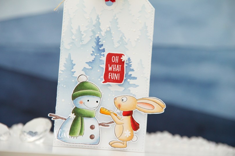 It’s Carrie’s turn. She goes so well with this snowman, you could almost think they’re one stamp and not two. I don’t mind when things hang off the edge of my cards or, in this case, tags. Will the ears and the branch get bent once this tag is on a present under the tree? Possibly. But I don’t mind, because I feel it adds to the design. If I had cut off the ears and branch to make everything fit inside the dimensions of the tag, this tag wouldn’t be as fun.
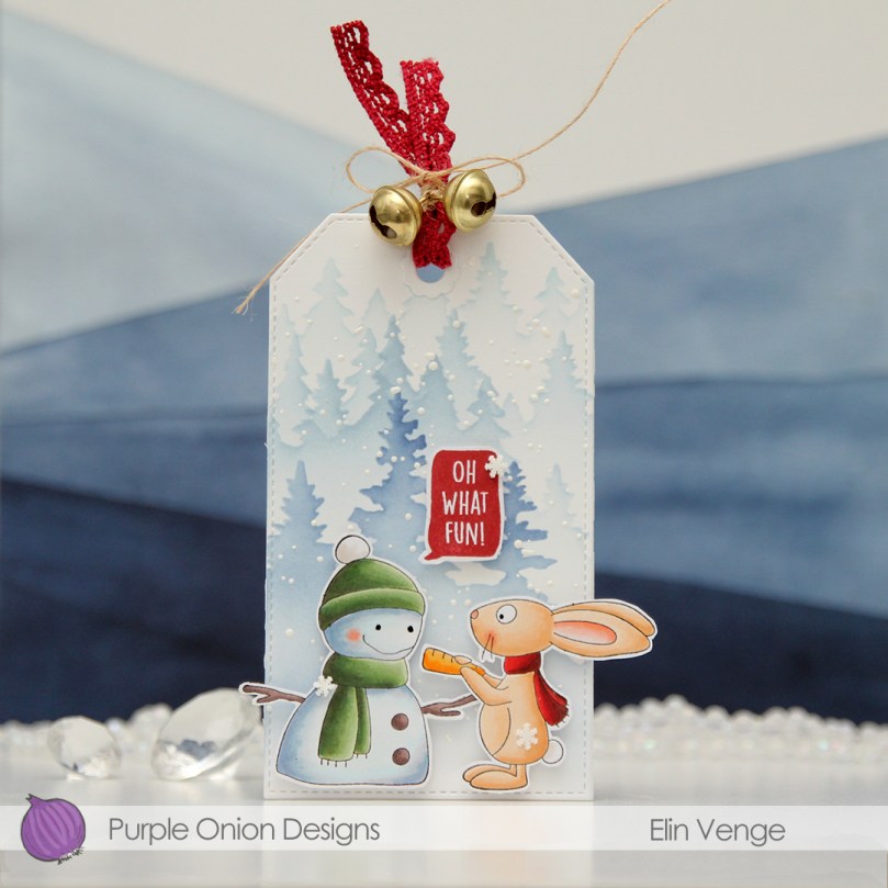 For this one, I stamped the sentiment in Amarena Cherry ink from My Favorite Things. It matches her scarf nicely.
 I managed to get something sticky in the middle of Carrie. There was no way to remove it, so I was very strategic about the placement of the clay snowflakes I added. They’re Snowdrift sprinkles from Little Things from Lucy’s Cards, and I love them.
 I threaded ribbon through the hole at the top of the tag, tied a bow around it using more of that Natural Twine from May Arts and added a couple of gold bells to the top. Different kind of bell than on the green tag, but they still make that wonderful sound.
 Lots of Copics for this one too. I just can’t help myself.
 For the back of the tags, I stamped To/From from the B06 stamp set from Norsk Stempelblad AS using Obsidian ink from Altenew. The remaining stamps are stamped in Classic Kraft and Dark Chocolate inks from Papertrey Ink. For some of it, I used second generation stamping. The circle stamp with 24.12 in the center and the tree stamp are both from Inkido. The little snowflakes are from North Star Design, the smaller circle stamp with God jul in the center is from Ladybug & Friends. Unless I’m mistaken, none of these companies are still in business. It’s kind of sad, but I’m very glad I have these stamps!
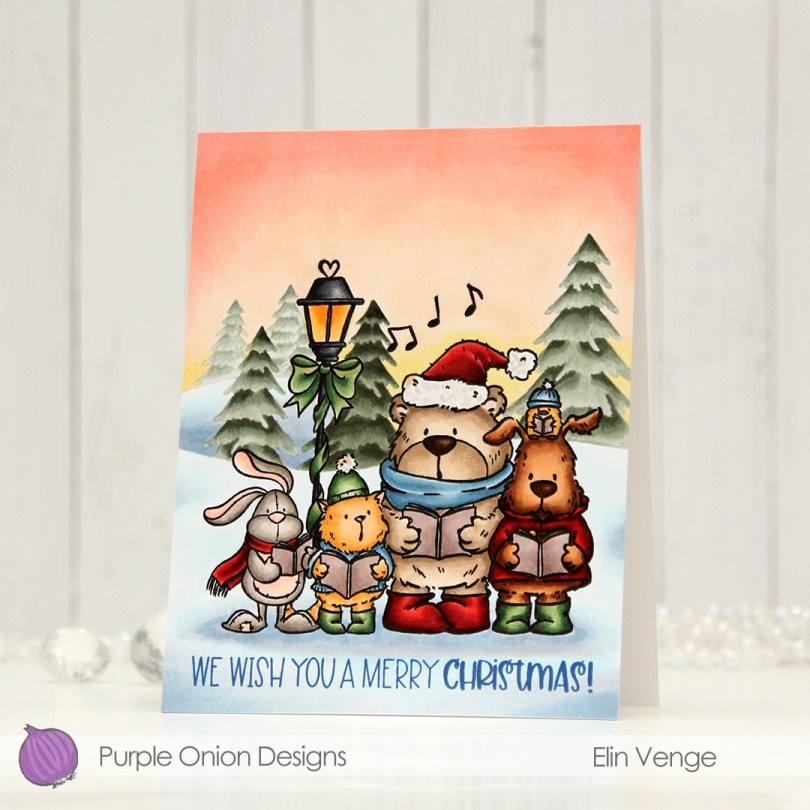
 I stamped my critters using Extreme Black ink from My Favorite Things, added a mask and stamped the trees in the background using Stormy Sky ink from Papertrey Ink. It’s a nice grayish green that goes really well with the colors I used for the coloring of the trees. I created my signature winter sunset behind it all, and did my best to create depth in the background by varying the intensity of the coloring of the trees. Once everything was colored, I stamped the critters again, this time using Obsidian ink from Altenew for a crisp, black outline.
 At the bottom, I stamped a sentiment from the Holiday Time sentiment set using Cornflower ink from My Favorite Things. The carolers are just the right size to fit on an A2 card with a little bit of air around them!
 I used lots of Copics for this one. Lots!!
 Meet
Meet 


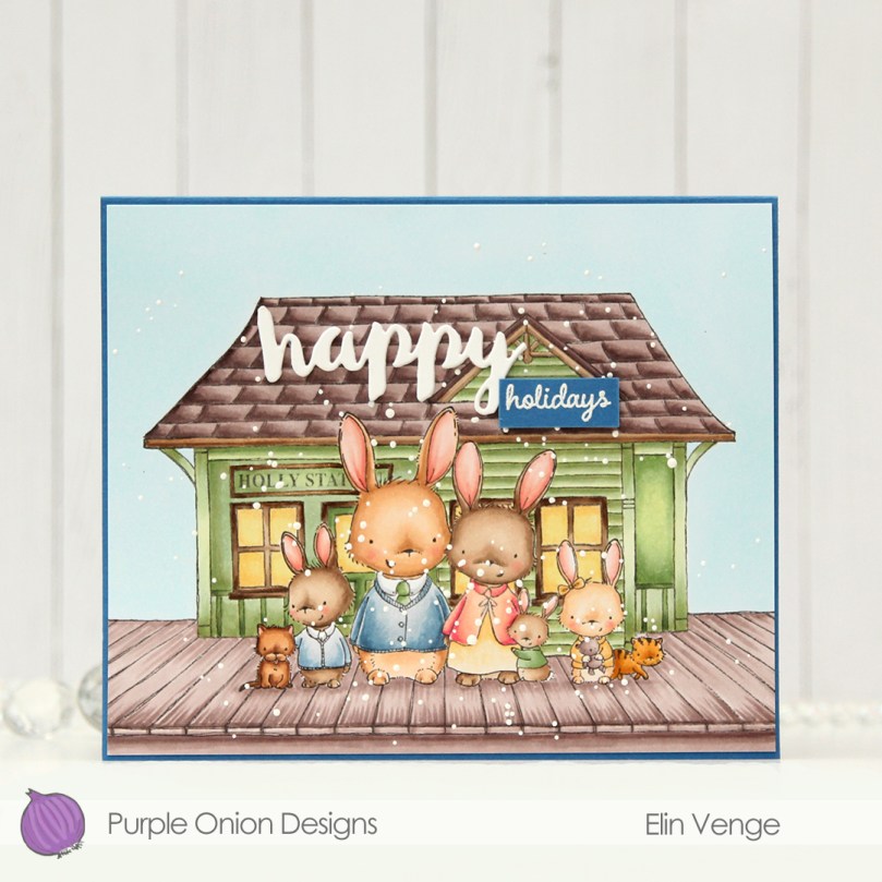 For this card I paired
  This is why! This image, taken from a TV advent calendar, is of the fictional character Skomaker Jens Petrus Andersen. He was the protagonist in this advent calendar and he lived (and had his shoe repair business) in this green house. If you’ve grown up in Norway after the ’70s (but before 2010), you undoubtedly know this character and this very green house. I get nostalgic just looking at the photo.
 Back to the card. Once my coloring was done, I added my panel to a card base I created from Cornflower cardstock from My Favorite Things. I used the Stitched Happy Birthday rectangle die from Memory Box to die cut the word happy. The die cuts a rectangle with the words happy birthday inside, but I wanted the word happy for my card and cut it away from the rest. I stacked a few for strength and dimension and adhered it to the roof of the train station, adding a white heat embossed sub sentiment from the
  Lots of Copics for this one.
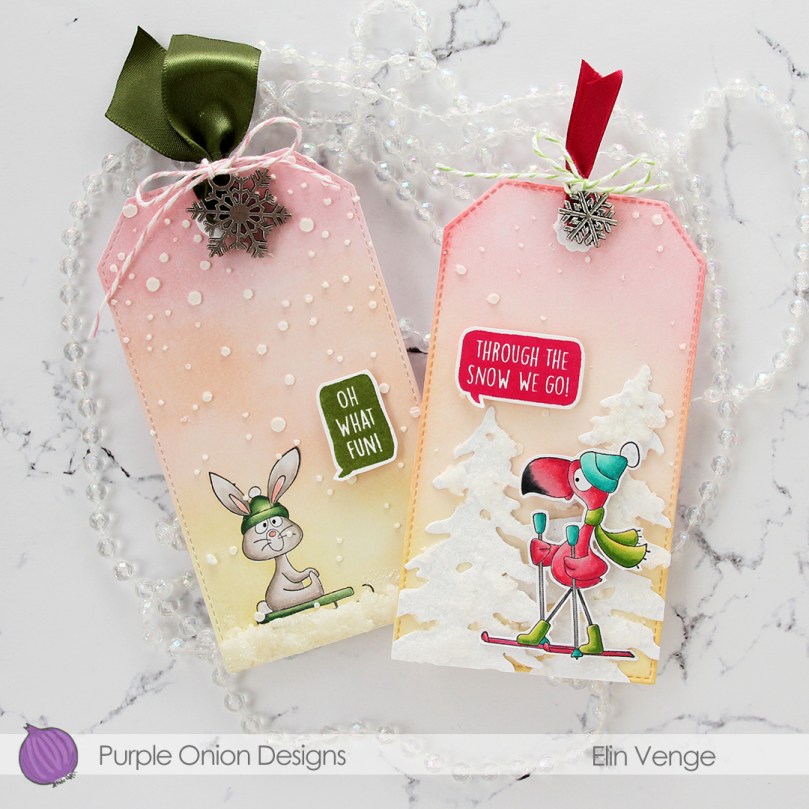 Meet
Meet 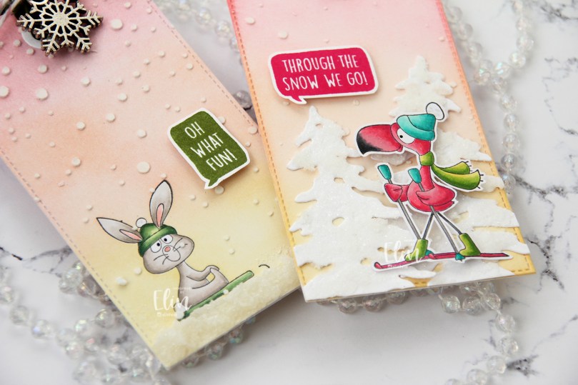 I paired them with sentiments from the
 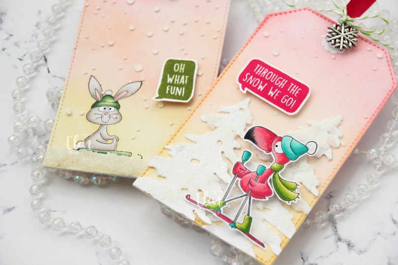 There are some differences between these. Kale is stamped and colored on the tag, while Flo is fussy cut and popped up. I used similar techniques for the background, but kept a lot of the same elements across both tags.
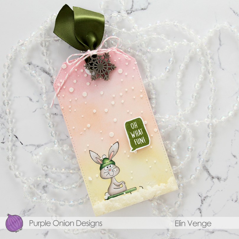 For Kale, I masked him off and ink blended around him using Coral Bliss and Pink Pearl inks from Altenew, as well as Scattered Straw Distress ink. I used the largest die in the Stitched Traditional Tag STAX set from My Favorite Things to turn him into a tag and then used the Falling Snow stencil from Simon Says Stamp with Light & Fluffy Modeling Paste from The Crafter’s Workshop to create snow coming down. I used Snowfall Grit-Paste from Ranger at the bottom of the tag and sprinkled on Rock Candy distress glitter before the paste dried. I then added a snowflake charm and some ribbon at the top of the tag and tied it together with Cotton Candy twine from Whisker Graphics.
 On the back of the tag I did soft ink blending using the same colors and stamped a to/from stamp from the B06 stamp set from Norsk Stempelblad AS using Coral Bliss ink from Altenew.
 Not a lot of colors used for this adorable bunny.
 I used the same tag die, stencil, paste and inks for blending on this tag, but decided to add a little extra. I die cut the Silhouette Snow Trees from Mama Elephant from Stamper’s Select White cardstock from Papertrey Ink, and on the trees I added Grit-Paste and Rock Candy Distress Glitter.
 I let the trees dry, used liquid glue to adhere them to the tag and added Flo on top using foam tape.
 I also used foam tape on the back of the speech bubble and used ribbon, a snowflake charm and some twine at the top for this one too.
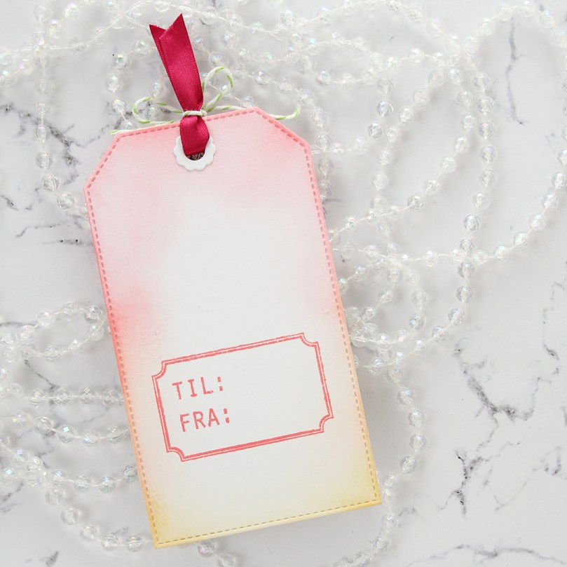 Another stamp from the B06 stamp set from Norsk Stempelblad AS on the back of this one.
 I used very bright colors for Flo.
 I stamped and colored the surfboard eight times, and fussy cut them all right up against the stamped lines. I put them aside while I worked on the rest of my card.
 I used the Big Happy Birthday die from My Favorite Things to die cut into a 5×7″ piece of Soft Stone cardstock from Papertrey Ink. I put acetate behind it and added the counters of the letters back into place on top of the acetate, using the actual letters as placement guides, before doubling up on foam tape on the back of the cardstock for a deep shaker well.
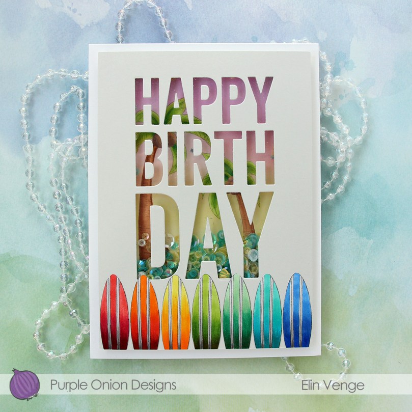 On a piece of X-Press It blending card, I stamped the palm trees from the
  I added seven of my surfboards to the bottom of my panel and adhered it all to a top fold card base I created from Stamper’s Select White cardstock from Papertrey Ink.
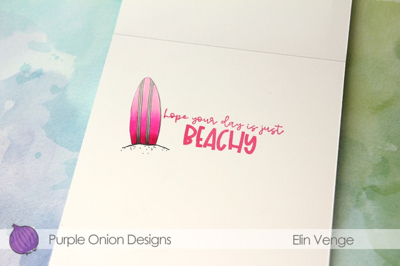 I couldn’t fit all my surfboards on the front of the card, so I glued the last one to the inside next to a sentiment from the
  Lots of colors for this one.
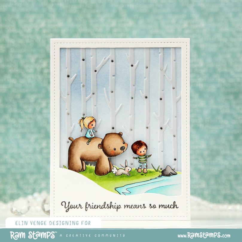 I colored the image and fussy cut it right up against the black lines. When you do, you lose the cute little extra lines on the outside that is part of Rachelle’s signature, which is a bit of a shame, but for the card design I had planned, it was a necessary sacrifice. I could have kept a little white trim (and thus, the wispy lines) around the image, but I feel that would have made the image less of an integrated piece of the overall design, so I went with the close cut.
 Onto the card base, I ink blended Icy Water and Winter Lake inks from Altenew to create a soft blue sky. I die cut the Winter Forest cover die from Mama Elephant from Heavyweight vellum from My Favorite Things and adhered it on top. Using the same die, I also die cut the background from a couple of colors of gray cardstock. I used Mushroom from Concord & 9th and Soft Stone from Papertrey Ink and adhered the little gray notches into the openings of my vellum trees. On parts of the lighter ones, I ink blended with Charcoal ink from Hero Arts for a little variation in my grays.
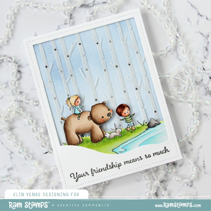 I adhered my little scene on top of the vellum trees. I glued it flat down on the edges and used 2 mm foam squares near the top of the image for some dimension. I used a black glaze pen to add some shine to their eyes, and added a white dot on top once the black was dry using a Gelly Roll 05.
 I die cut the Winter Forest cover die one final time, this time from white cardstock. I cut away the trees, but kept the frame and slope near the bottom and stamped a sentiment from the Together stamp set from Purple Onion Designs using Gravel Gray ink from My Favorite Things.
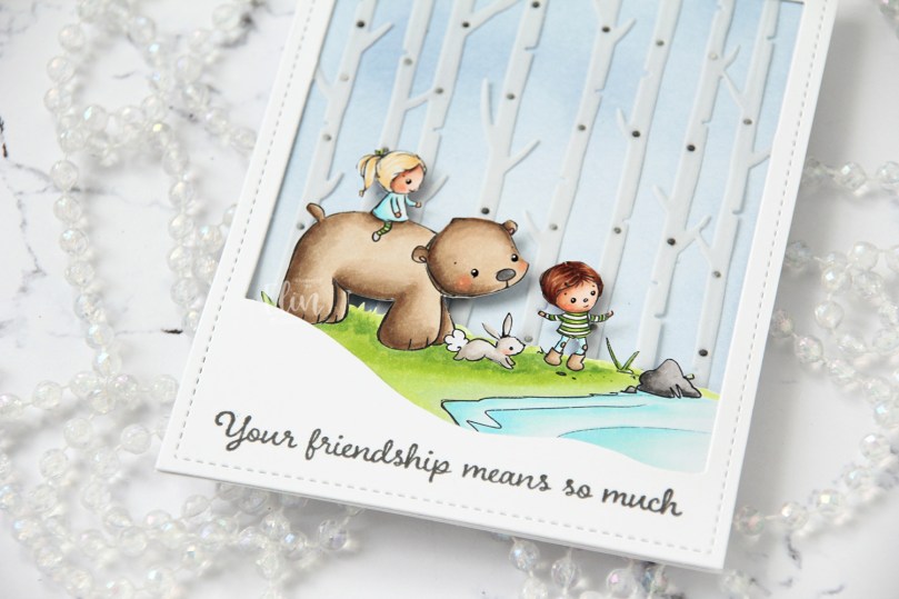 This image is so sweet and can be used for a variety of occasions. Rachelle’s images always have such a cosy vibe, and this one fits perfectly with all the other images she’s illustrated.
 I see I’ve forgotten to add the greens I used in my Copic graphic. They were YG17, YG03, YG01 and G40.
 Meet
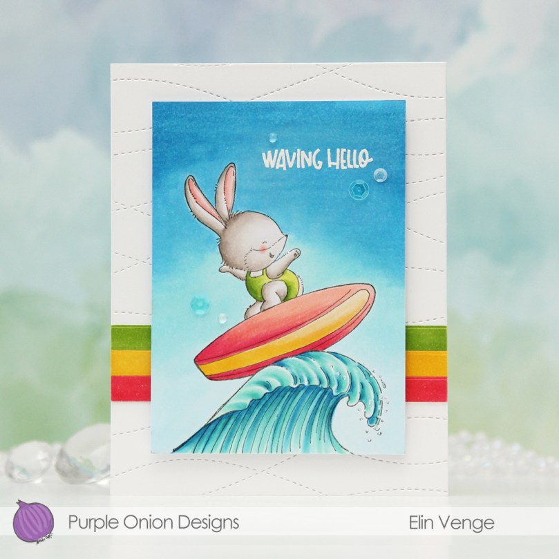
Meet 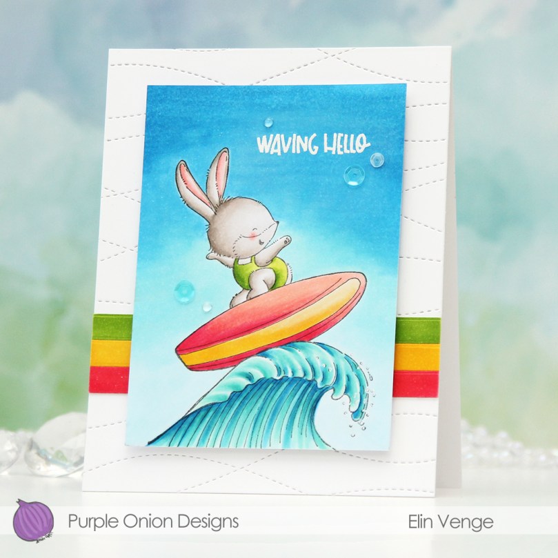 I colored the scene with Copics, cropped down the panel and white heat embossed a sentiment from the coordinating sentiment set using VersaMark ink and Super fine detail embossing powder from Ranger. I added a few white dots to the wave using a Sharpie and put the panel to the side while I worked on the rest of the card.
 I thought the Stitched Ripple Backdrop die from Lawn Fawn would work perfectly for a subtle wave pattern in the background. It’s a landscape oriented die and I wanted a portrait oriented card, so I die cut it twice from Stamper’s Select White cardstock from Papertrey Ink, before adding colored strips along the seam for a little bit of added interest. I colored the strips with a few of the Copics I used for my scene and used a die from the Blueprints 27 die set from My Favorite Things to turn them into strips of the same width.
 I mounted my scene to the center of the card using foam tape, before embellishing with sequins and raindrops from Little Things from Lucy’s Cards. The sequins are from her Ice Water mix.
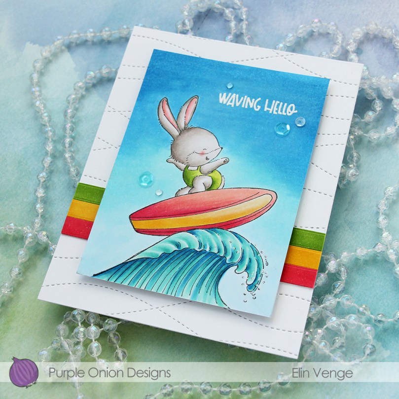 The finished card is a simple looking one. I love adding dimension, the sequins and raindrops work perfectly with the colors and Kalei’s making the most of her summer. I hope you are too 🙂 And if you’re in the Southern hemisphere in the middle of winter right now, I feel your pain.
 I tend to go overboard whenever I color skies or water.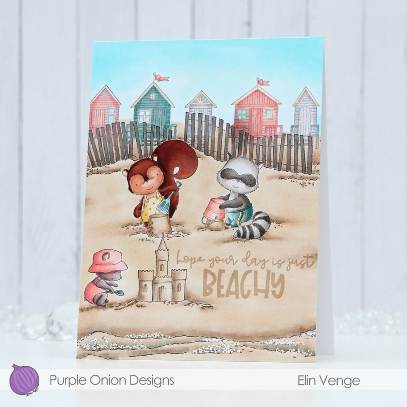

 I packed a lot of stamps into this one card, which is actually an A6 size card (4 5/8 x 6 1/4″). Whenever I create cards with new releases from Purple Onion Designs, I let the design of the card dictate the size of the card, whatever that turns out to be.
 I colored the scene with my Copics. I’d managed to overfill a marker when I refilled it, creating a big drop of blue ink on my peach colored cabana when I went to color in the window. At that point the sky, fences and beach were all colored, I only had the critters left and didn’t want to start over, so I made the fences darker and made the cabana darker too. It’s still visible, but I wanted the focus to be on the critters enjoying their time at the beach. If it had happened on a main element of my card, I probably would have started over.
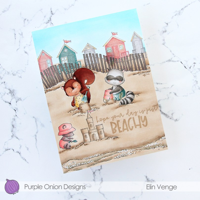 I used a white Sharpie to create foam from the waves coming in, and stamped a sentiment from the coordinating
  Fairly muted color palette for this one.
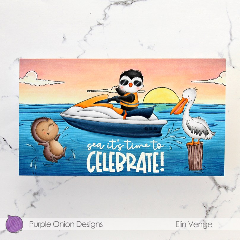 Meet
Meet  I colored in the scene with Copics, stamped the sentiment using VersaMark ink and sprinkled on Super fine detail embossing powder from Ranger, before melting in it from the back for a smooth look. Did you know that you get smoother embossed results if you use the heat gun from the back of the paper instead of the front? It makes quite a bit of difference, actually. I urge you to try it if you haven’t already.
 It looks like I wrote down the Copics I used for this card in a bit of a haste, because I see I’ve left out the blues, both for the water and the jetski. I made this card at the end of May, so I don’t really remember which ones I did use, but I believe it’s the B10 family (B18, 16, 14 and 12) for the water, and the B30 family (B39, 37 and 34) for the jetski.
 Papirmølla