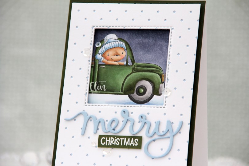
Hi, crafty friends! Yes, I’m aware that we’ve still got three and a half months until Christmas, but I love creating Christmas cards and just can’t stop.
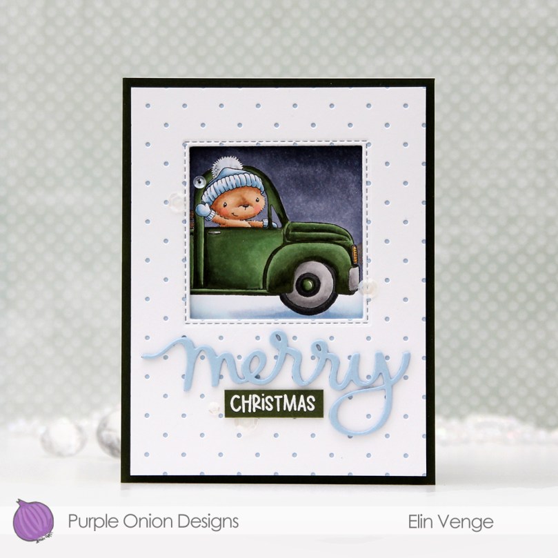 Old Betsy from Purple Onion Designs is such a great image. I love this pick up truck with the bear inside waving hello through the window. I’ve used it before on this card, which also featured lots of other images. This time, though, I only focused on this one image, and only used the front section of it too.
 Using the Itsy Bitsy Polka Dot Backdrop die from Lawn Fawn, I die cut a panel of white cardstock from Papertrey Ink to add a little bit of texture to the front of my card. I adhered it to a quarter panel of Blue Breeze cardstock from My Favorite Things, before using the Selfie Square die, also from My Favorite Things, to die cut a window in the top center.
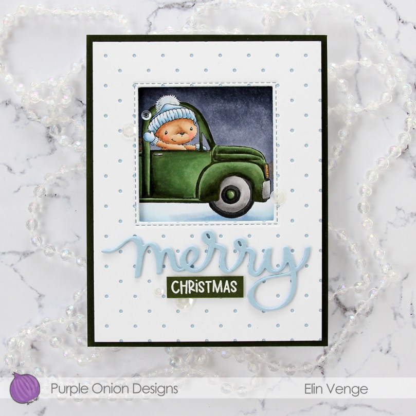 I put foam tape on the back of my polka dot panel and adhered it to my colored piece, making sure to line up the image so it would show trough the window the way I wanted it to. I then grabbed a quarter panel of Jalapeño Popper cardstock from My Favorite Things and used my G99 Copic marker and scribbled it close to the edge of the green cardstock to make the color match my car a little bit better. Green cardstock is tricky, and I don’t often find the right kind of green that I want for my projects. This was an easy hack, but if anyone out there has a suggestion for a green cardstock that is close in color to G99 (or G94), please let me know.
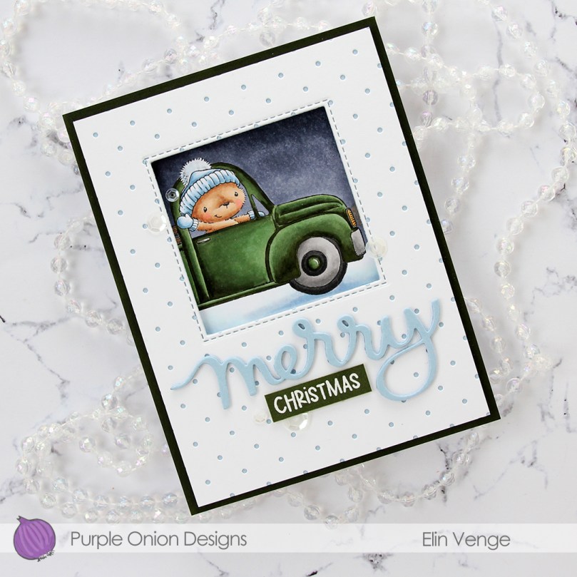 I adhered my improved green cardstock to an A2 top fold white note card and mounted the polka dot piece with the colored window using foam tape – lots of it. I then used the same Blue Breeze cardstock that I used previously to cut the word merry three times using the Merry Script die from Mama Elephant. I love their script dies! On the top layer I spritzed sheer shimmer craft spray from Imagine for a bit of sparkle to the letters. Unfortunately, details like that are tricky to photograph, but it’s definitely noticeable in real life, trust me 🙂
 Onto a leftover scrap of X-Press It blending card, I scribbled an even layer of G99 to create a dark green cardstock that would match my colored image. Onto it, I white heat embossed the word Christmas from the Holiday Messages Sentiment Set from Purple Onion Designs. I love the classy script die cut with the more playful block lettering of the heat embossed word. I added a couple of cardstock strips behind my sentiment strip for dimension and finished the card with a few sequins from the White Orchid Sequin mix from Little Things from Lucy’s Cards.
 I love my Copics and used quite a few for this rather simple image.

 I stamped April (the bunny on the swing), masked off the rope of the swing, stamped the
  When I color full panels like this, I usually color the sky blue, but I wanted to shake things up a little for this card and gave it a soft sunset vibe instead. I live far enough north that the sun doesn’t really set until really late at night in the summer, but a girl can pretend, right? Anything goes when it’s a card, it doesn’t have to be very realistic – not that a bunny on a swing (or one holding a flower for that matter) is very realistic to begin with.
 I lost track of how many layers of green I added for the grass. I wanted it to be light and soft looking almost fading into white in the background to make the foreground stand out, and darker in the foreground so the critters would look like they belonged to the scene. I started with the lighter colors for my blends, then kept introducing darker greens towards the bottom and fading up into the background until I found the intensity I was after.
 Once I finished coloring in the scene, I added a sentiment from the
 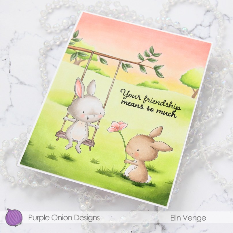 I trimmed off 1/16″ on all four sides of my colored panel and adhered it to a white card base I created from Stamper’s Select White cardstock from Papertrey Ink. I thought about leaving the panel a full size, but I really like the border the white cardstock gives, it’s a nice little frame.
 I find it odd that I rarely use more colors for full panels like this than just a simple image, but that tends to be how it is around here.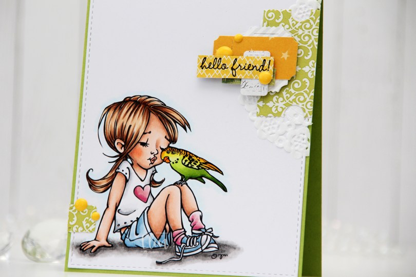
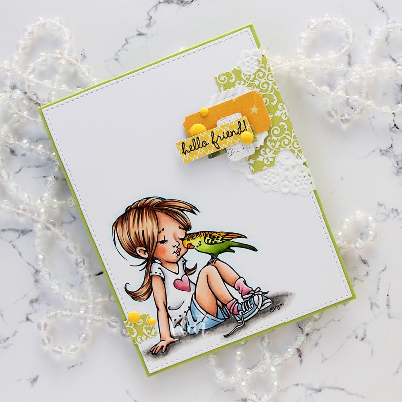
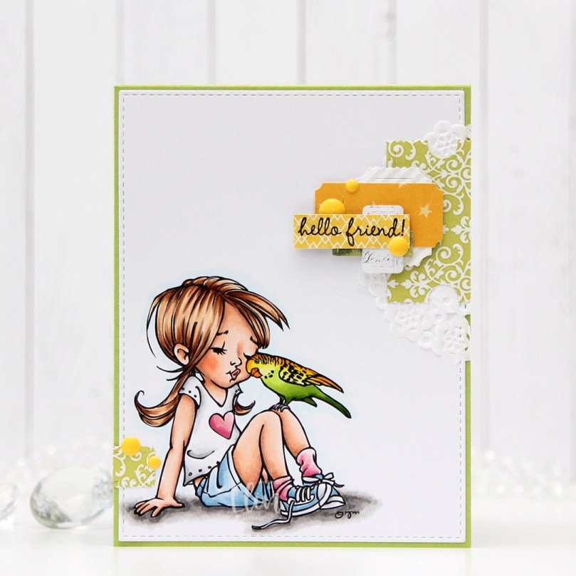 I colored the image with Copics and die cut the panel using the largest die in the A2 Stitched Rectangles STAX 1 die set from My Favorite Things, before adhering it to a card base I created from Sour Apple cardstock, also from My Favorite Things.
 On my cluster cards, I usually choose two to three colors from the image to create scraps from. This time I chose green and yellow with a little bit of gray. Neutrals are always a good thing to add. I keep die cut scraps in stamp storage pockets on my desk, sorted by color. Whenever I want to create a cluster, I choose the storage pockets with the colors I want, dump the contents on my desk and start PLAYING.
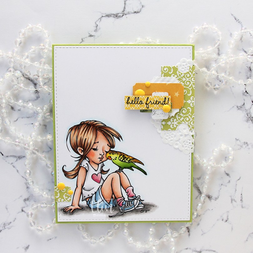 For this card I wound up using scraps from 3ndypapir, Karen Foster, Sunny Studio, P13, Magnolia and Papirdesign. By limiting the size and colors of my clusters, the design stays harmonious and you can’t tell that I’ve used patterned paper from 6 different companies. I adhere some directly to the layer below, some using foam squares. As a base, I used half a doily from Doodlebug Design that I had in a drawer. I love these tiny paper doilies, they’re perfect for this.
 Using VersaFine Onyx Black ink, I stamped a sentiment from the
  These cluster cards are so fun to make. They make my piles of scraps shrink EVER so slightly, but anything’s better than nothing, and I love the dimension they add to the card.
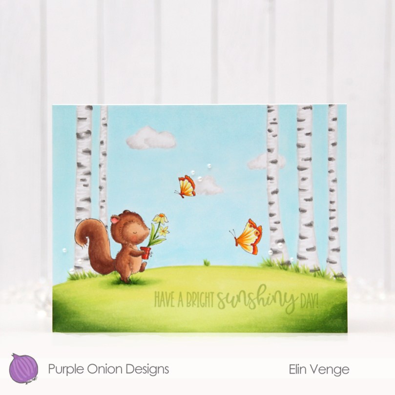
 I used quite a few colors for this one.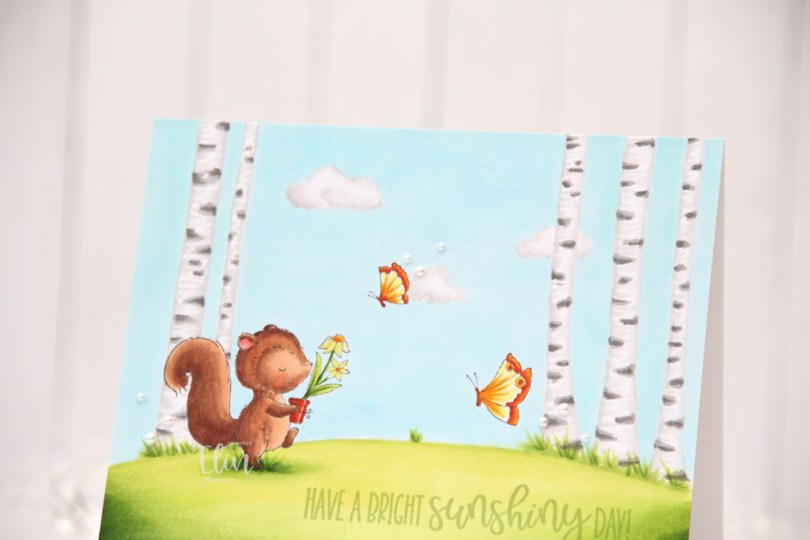
 I stamped
 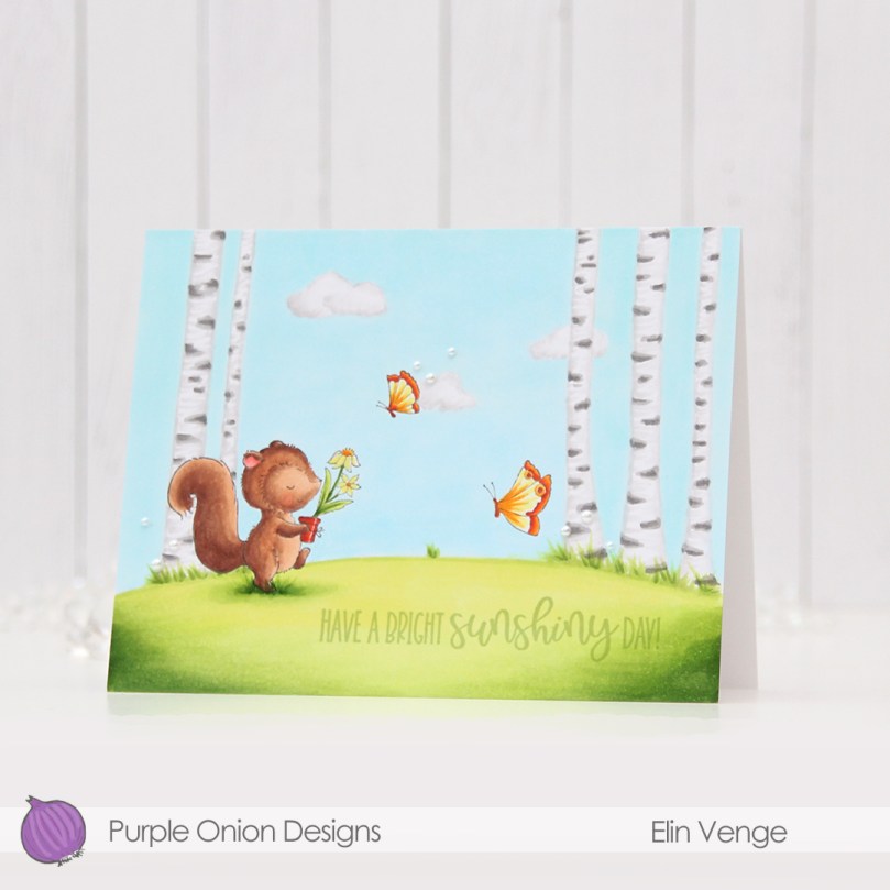 I colored the entire panel with Copics, deciding to add a few clouds in the sky as well as some visible blades of grass near the trees.
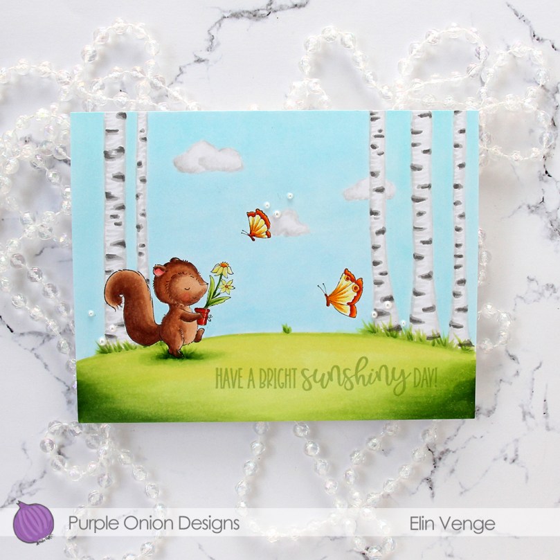 I adhered my colored panel onto a top fold landscape A2 card base I created from Stamper’s Select White cardstock from Papertrey Ink. I stamped a sentiment from the
 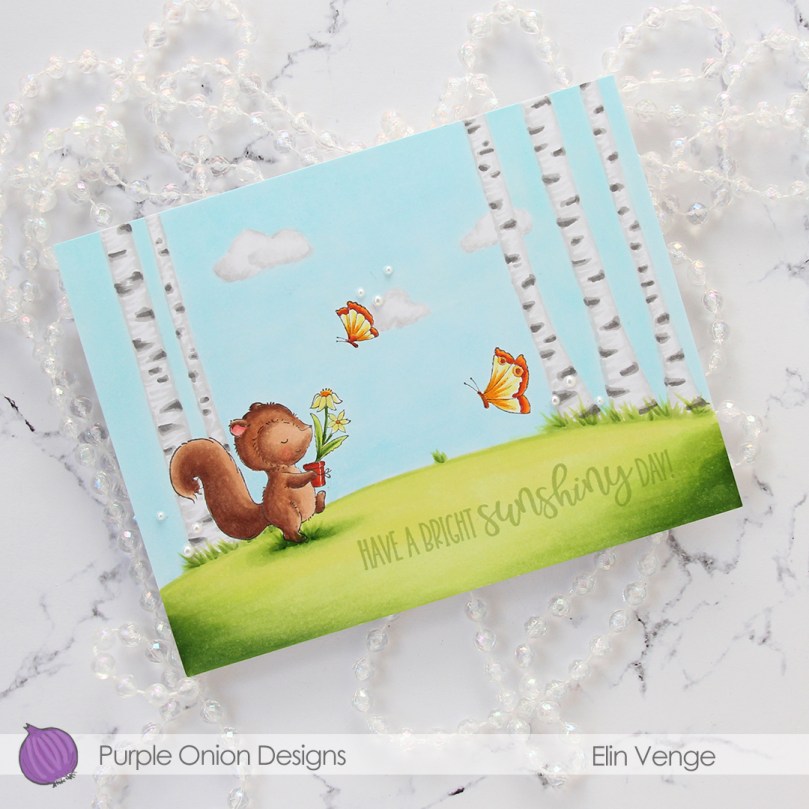 To finish off the card I added a few pearls from Kort & Godt in three different sizes (2 mm, 2.5 mm, 3 mm). Adding the pearls was actually my niece’s idea. I tend to go for sequins myself, but I love pearls too and hadn’t used these in a while, so it was good to break them out.
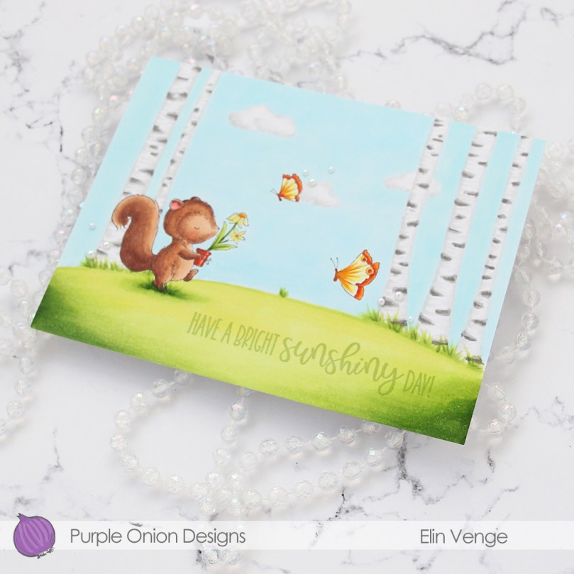 The lack of dimension makes this a very thin, lightweight card compared to my normal cards, which means this won’t have any problems going through the mail.
 Not a lot of colors given that the entire card front is colored.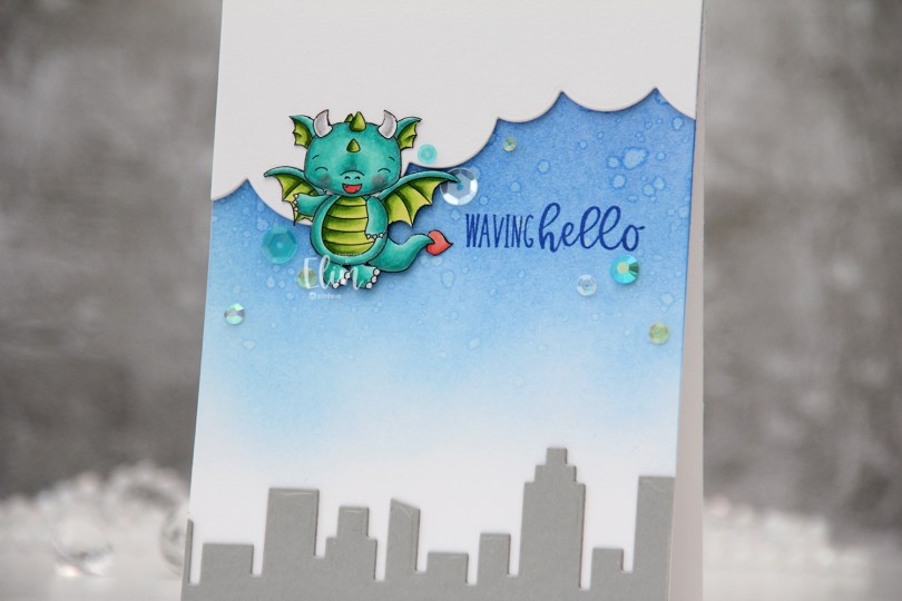
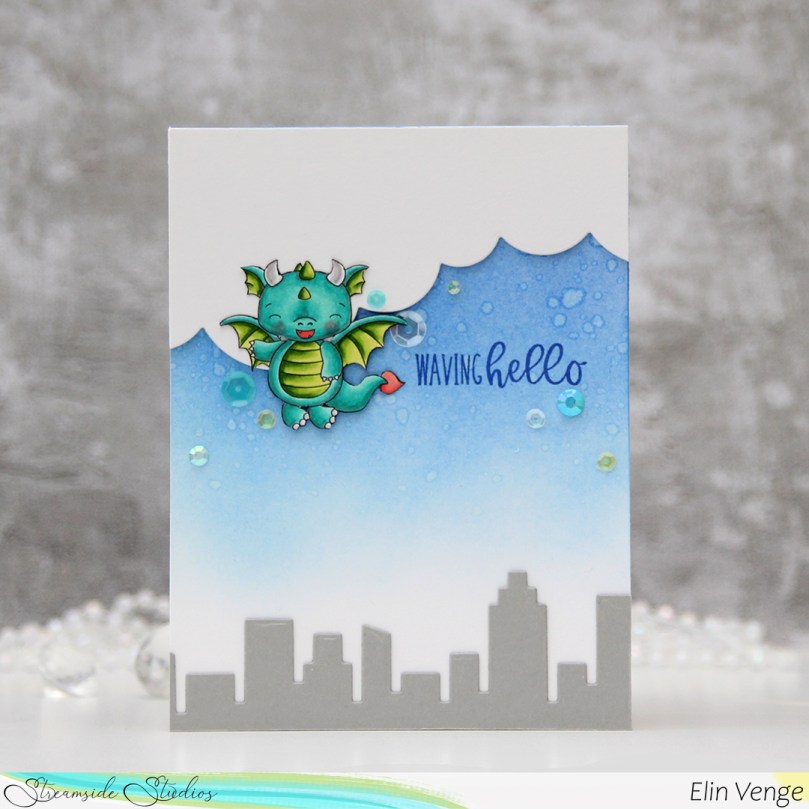 I colored the dragon with my Copics and fussy cut him right up against the black lines of the image. I put him aside while I worked on the rest of the card.
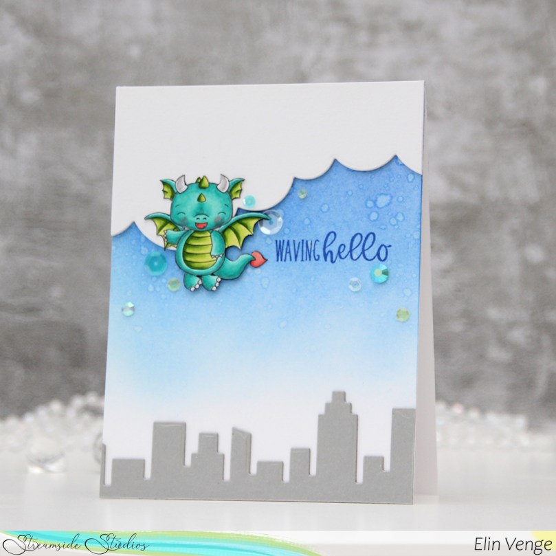 Onto a top fold white A2 card base I created from Stamper’s Select White cardstock from Papertrey Ink, I ink blended Azurite, Ultramarine and Eastern Sky inks (all from Altenew) towards the top of the card, fading to white near the bottom. I splashed some water droplets on top for a cool effect. Dye inks are water based and react with water, so this works with most inks you probably have. The darker the color, the bigger the impact.
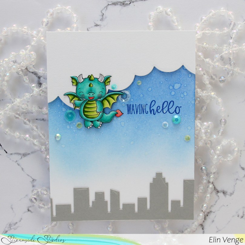 From Cement Gray cardstock from My Favorite Things, I die cut two layers of the skyscraper skyline in the Slim Film City die set from Mama Elephant and adhered them at the bottom of my card. Using the cloud die in the Slim Basics die set, also from Mama Elephant, I die cut the cloud shape three times from Stamper’s Select White cardstock, stacked them and adhered them to the top of the card.
 Onto the card base, I stamped a sentiment from the
  I adhered the dragon partially on top of the clouds, using foam squares behind the parts hanging off the clouds for even dimension, and sprinkled a few gems and sequins from the Seashore mix from Little Things from Lucy’s Cards around the dragon and sentiment to finish the card.
 Suuuuper simple color palette for this dragon.
 The image is called Bunny & Guinea: Snowman, and you’ll find it over in
  I used the Mega Snowflakes Cover die from Mama Elephant to die cut my frame. I stacked three for dimension and adhered it to my colored image, then adhered the whole thing to a top fold card base I created from Stamper’s Select White cardstock from Papertrey Ink.
 Using the Merry Script die from Mama Elephant, I die cut three from Hawaiian Shores cardstock from Papertrey Ink, and another three from the same white cardstock that I used elsewhere on the card. I stacked the colored die cuts and the white ones separately so that I could put the white ones behind the parts of the colored ones that aren’t on top of the white stacked die cut frame at the bottom.
 Onto a strip of Hawaiian Shores cardstock, I white heat embossed part of a sentiment from Purple Onion Designs and cut it down to fit my card, adding two more strips behind it so that the stamped part of the sentiment would be flush with the die cut part.
 I added a few snowdrift sprinkles from Little Things from Lucy’s Cards to finish the card.
 Simple color palette.
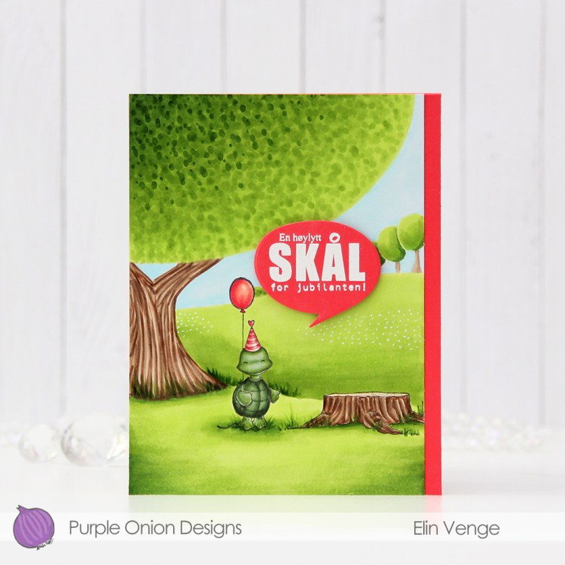 This time I’m keeping the focus on
  I used a lot of green for this card. Not too many markers, but I feel like most of the card is green. I actually had to refill all the greens I used for the fields and trees halfway through. They hadn’t been refilled in a couple of years, so it was about time, I use these greens a lot.
 I needed a pop of color to counteract all the green and decided on a corally pink color combination that I used for the party hat and balloon. I dug through my colored cardstock looking for a match, and wound up with Fire Coral cardstock from My Favorite Things. I created a top fold A2 card base from it and adhered my colored panel onto it to the left side, it wasn’t wide enough to cover the entire card front.
 In the fall of 2020 I was running seriously low on X-Press It blending card, which is the only cardstock I use for my Copic coloring. It was hard to get hold of back then, but I lucked out and got a pack from Amazon UK. It was A4, which kind of blew my mind a little bit. Up until that point, I didn’t even know A4 X-Press It existed, I’ve always bought letter size. A4 is less wide and taller than letter size, which means I only get two panels that cover an A2 card front from one sheet. I used one of the narrower pieces on this card, which left me with about 1/4″ extra width on the card base. I debated cutting it off, but I feel like the pink strip on the right provides a little bit of balance, the card would be very green without it.
 Onto a separate piece of Fire Coral cardstock, I stamped and white heat embossed a sentiment from the Til mannen stamp set from Norsk Stempelblad AS, before die cutting it using a speech bubble die from Altenew. I popped it up on 1/16″ foam squares from Gina K for a tiny bit of dimension.
 You’d think that with a close to full panel of coloring that I’d use a lot more colors than this, but the four greens near the left end of this graphic were all I used for the grass and the trees, which covers most of the card.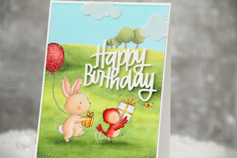
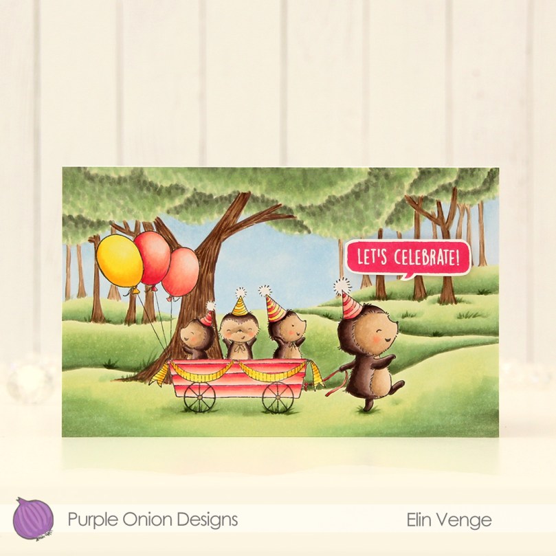
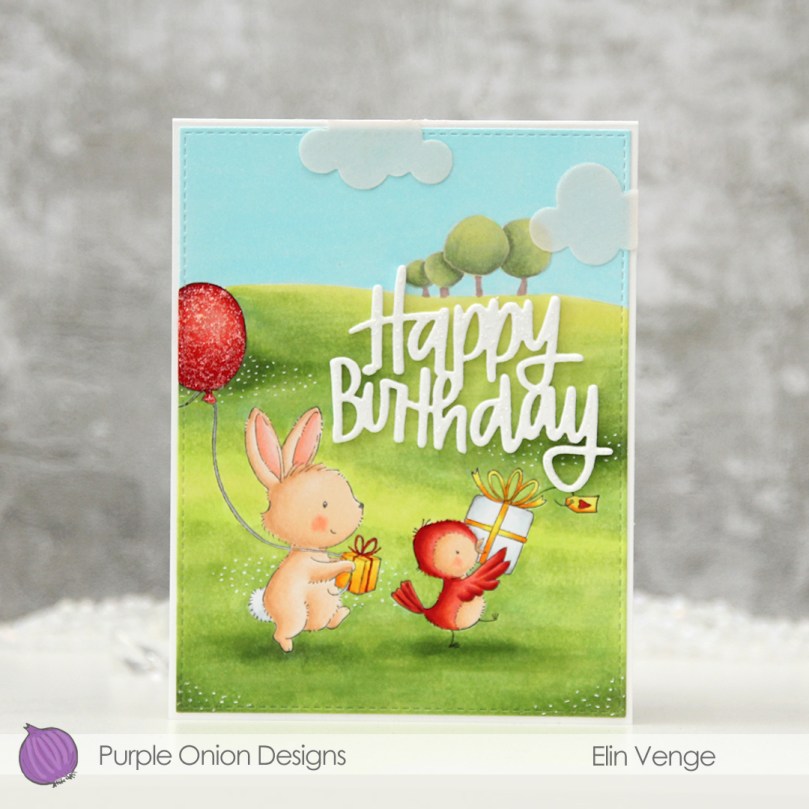 I really wanted to create a birthday card with
 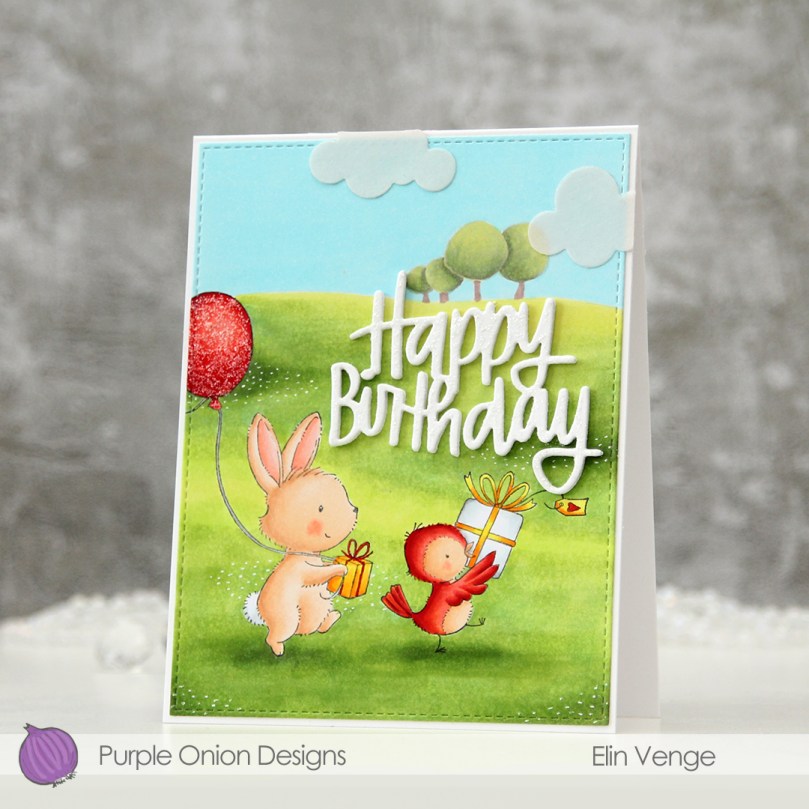 I colored in my scene using Copics. I started with the sky (I don’t even remember what color I used there, sorry), before coloring the trees, the ground, then the critters. I struggled with my colors on this one. I wanted the trees to be a muted green way back in the distance, but the colors I used felt too gray, so I added a couple of more vibrant greens to make them come alive a little bit more.
 I managed to make the same mistake with the ground. I originally wanted a muted green, because most of the green backgrounds I’ve colored using stamps from this release have been very vibrant. As it turns out, I’m not as big a fan of the muted green look when it’s down on paper as opposed to what I envision in my head before I start. I was originally only going to use three green markers for the ground, I ended up with eight, and I’m still not entirely happy with it. It’s messier than what I’m used to, and I struggled with the blending.
 I used the largest die from the A2 Stitched Rectangles STAX 1 set from My Favorite Things to turn my colored panel into one with a nice faux stitch edge, and adhered it to a top fold A2 card base I created from Stamper’s Select White cardstock from Papertrey Ink. I love the look of the faux stitch with that thin white border going around the edge. For my sentiment I die cut the Happy Birthday Brush Script die from Simon Says Stamp four times from white cardstock and glued them together for a stacked, dimensional look, and I had just the right spot to adhere it to the card.
 At that point I thought the card was a little plain and decided to add some “flowers” by drawing in white dots in a few clusters on the green grass. This adds a little bit of interest, but I still didn’t think it was enough, so I pulled out my Frosted Lace Stickles and added a thick layer to the balloon, before deciding to also add it to the die cut letters. This helped a little more, but I felt like I needed another element in the sky, it was still pretty plain. Using the Cloud 1 & 2 die set from Papertrey Ink, I die cut four small clouds from vellum. I glued two and two together and adhered them to the sky, which really helped pull the entire design together. This was an evolution of a card (I also colored the bird yellow to begin with, but decided I wanted it red and colored red over the yellow), but it came together in the end.
 I used quite a few Copics for this one. I have a feeling I may have used B00 for the sky, but I’m not entirely sure.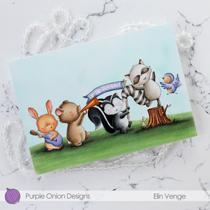
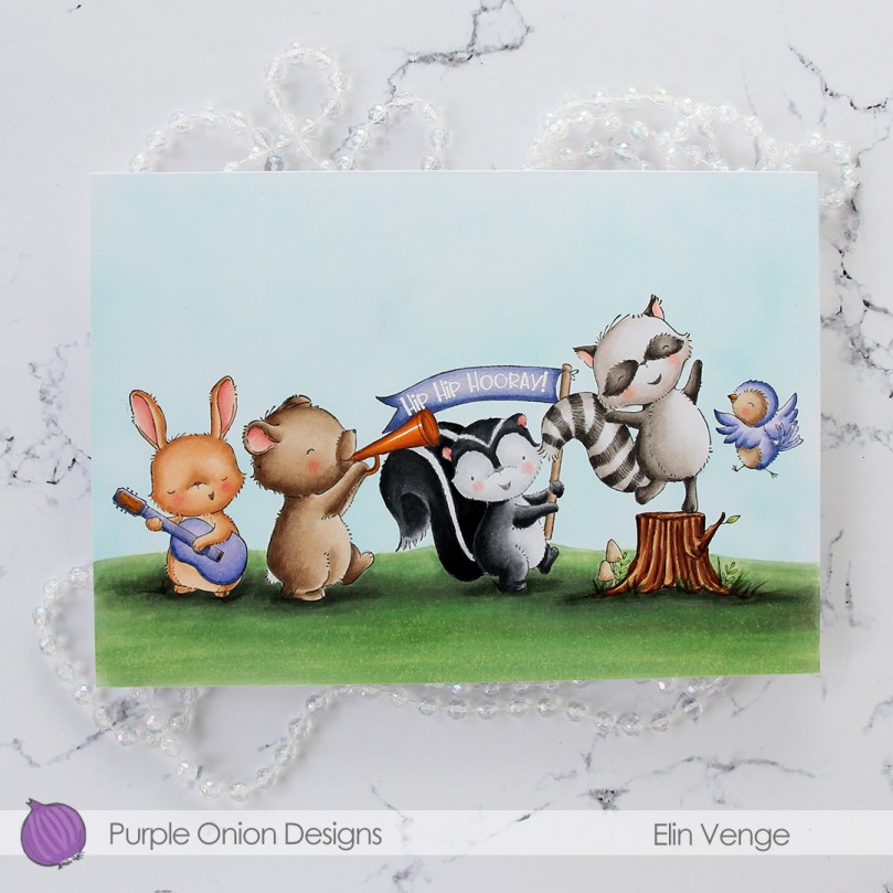 I stamped and masked all these critters. From left to right we have
 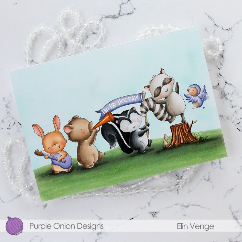 There are two sentiments that come with Petunia that you can stamp in the banner. One is the hip hip hooray!, which I white heat embossed, the other says Happy birthday! This card is a bit of an odd size. I needed it big to fit all my images, and it measures 7 1/4 x 5 1/16″. I probably could have trimmed off a little bit on the sides and on the bottom (or top) to make it an even A7 size, but this is what I wound up with. I’ll probably make my own envelope to fit anyway.
 Lots of Copics used for this one. I tried to make the colors of the critters different even though I have two brown ones and two gray ones. I love the Copic range of earth tones and gray tones, it really does allow you the option to create different colors within the same color family.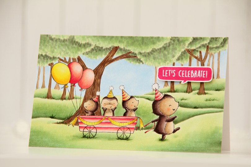
 I stamped the image using Extreme Black ink from My Favorite Things, before creating a mask, adding that on top and stamping the
  I colored in my scene using Copics and stamped a sentiment from the older
  Last, but not least – the Copics I used. I also used B30 (which is a color I’ve created myself) for the sky in addition to B32.
