
Hi, everyone! I’ve got another card to share today featuring an adorable Rachelle Anne Miller digital stamp. This time, I used Snowman Hug and turned it into a wintery birthday card.
 I started by coloring my little snowman and his friend using my Copics. I went with a bit of a split complementary color scheme on this one. I’m no fan of complementary colors, but split complementary are infinitely better, and blue green (which I used for the snow on the snowman), purple and orange are split complementary colors. I didn’t want a bright orange, though, so I went more coral, and I love how it turned out.
 I used a faux stitch rectangle die from My Favorite Things to turn my colored piece into a nice panel. I love these dies, they add such a finished look. I sprinkled on a moderate amount of chunky white embossing enamel from Stampendous and melted the powder. I love the snowy look this gives.
 I mounted my die cut piece onto a card base made from Lavender Fields cardstock from My Favorite Things using plenty of foam tape. This color perfectly matched the purple in my image, something I always try to accomplish in my cards for a nice, cohesive design. I die cut and stacked four Hurra from Melon Berry cardstock from Papertrey Ink using a Kort & Godt die. I love stacking die cuts, it adds a super nice look of dimension. I also white heat embossed a sub sentiment from Norsk Stempelblad AS onto more of that Lavender Fields cardstock, and stacked that, as well, making it flush with the die cut word.
 I added a couple of sparkling clear sequins from Pretty Pink Posh and my card was complete. I cut a little bit off the largest one with my scissors to make it look like it’s tucked behind that sentiment strip.
 Last, but not least, the Copic markers I used to color my image. I also used B40 and BG71, which are colors I’ve made myself.
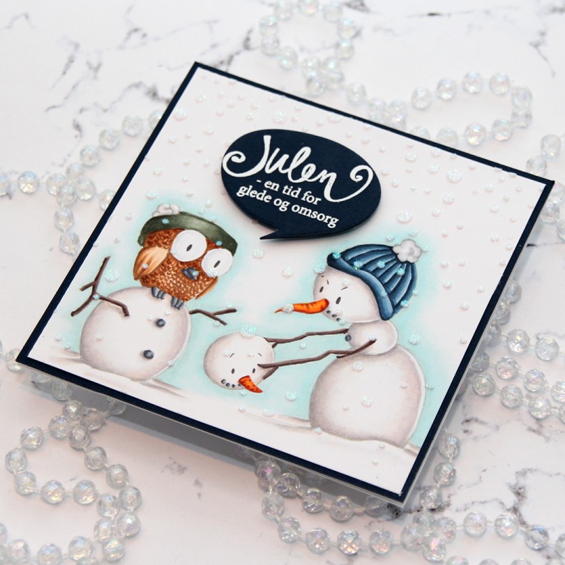
 I colored up this image for day 27 of Kathy Racoosin’s 30 day coloring challenge back in May. Yes, I colored a winter scene in May… BUT I wanted to feature as many different companies as possible during the coloring challenge, and the only ones I have from Kinda Cute are winter ones. I love making Christmas cards, so I really didn’t mind.
 I had initially planned on making an A2 landscape card, but it just wasn’t working, there was no natural place to put the sentiment. After I’d added the iridescent glitter paste over a Simon Says Stamp falling snow stencil and glued my panel to my cardbase, I chopped off 1-1/4″ on the right hand side of the card and then carefully went in with a craft knife to cut off an additional 1/16″ from my top layer. It works if you use a fresh blade and cut multiple times using very light pressure.
 I stamped and white heat embossed a Norsk Stempelblad AS sentiment onto more of that same Dark Indigo cardstock from Papertrey Ink that I used for my card front, before using a speech bubble die from Altenew to die cut. I mounted my speech bubble using some foam tape, and my card was finished.
 This card was a bit of an evolution. Things really didn’t go my way, but I was able to fix it all in the end. The piece of Papertrey Ink Stormy Sea card stock I was planning to use was a teeny tiny bit smaller than I needed to be (and I’m running seriously low on that particular color), so I used a die from Waffle Flower to cut it down a little, and it’s now 4-1/8 x 5-3/8″. I cut the center portion out to use for later, no one will ever know that there’s a whole in the center of it. I glued it to a top folding white card base, creating a nice 1/16″ border around the perimeter. Problem number 1 solved.
 Problem number 2: My hair was wet from showering when I started assembling this card, and there was a drop of water that fell on the bear’s head. Solution: Sprinkle on chunky white embossing powder from Stampendous and melt the powder with my heat gun…
 … which led me to problem number 3. My heat gun was too hot and I burned the panel. It’s not super visible in the photo, but it tuned the piece yellowish right underneath the pole. Solution: use Copics to color the snow under the bear in a similar color, making everything look intentional.
 My final struggle was figuring out where to put the sentiment from Norsk Stempelblad AS. I wanted it on the right side of the card, but it just wasn’t working, so I stamped and heat embossed it a second time with the fishtail end on the right and put it on foam tape on the left side of the front instead. I think it worked pretty well. I added a few snowdrift sprinkles from Little Things From Lucy’s Cards as my final touches.
 This first one might not even technically be a proper slimline card. It’s about 7-3/4 x 3-3/4″. I’ve used beautiful patterned paper from P13 for both my cards. I wanted the paper to be the hero, so I didn’t do too much to it. The sheet I used for this card is
  I used a
  My second card uses a different part of that same sheet of patterned paper, as well as the same slimline die from Pinkfresh Studio. The sentiment is even die cut using a die from the same set as the sentiment on my first card.
 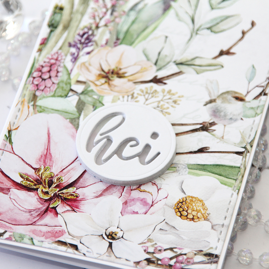 On this one I have four layers stacked on top of each other, then a vellum circle, then another four layers of the negative word die, making this sentiment really stand out as a statement on my card.
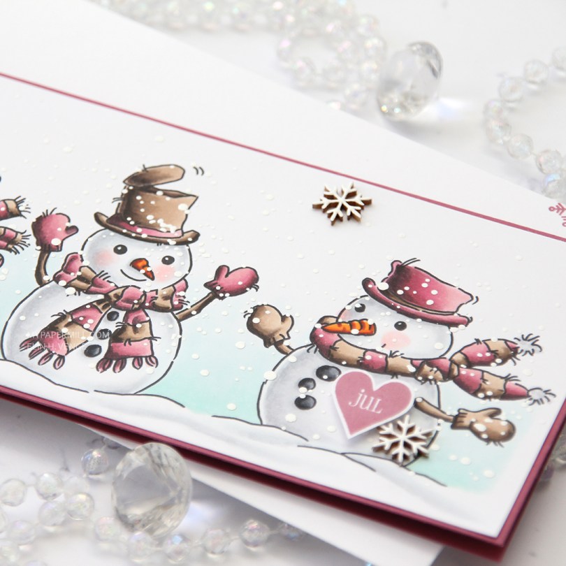
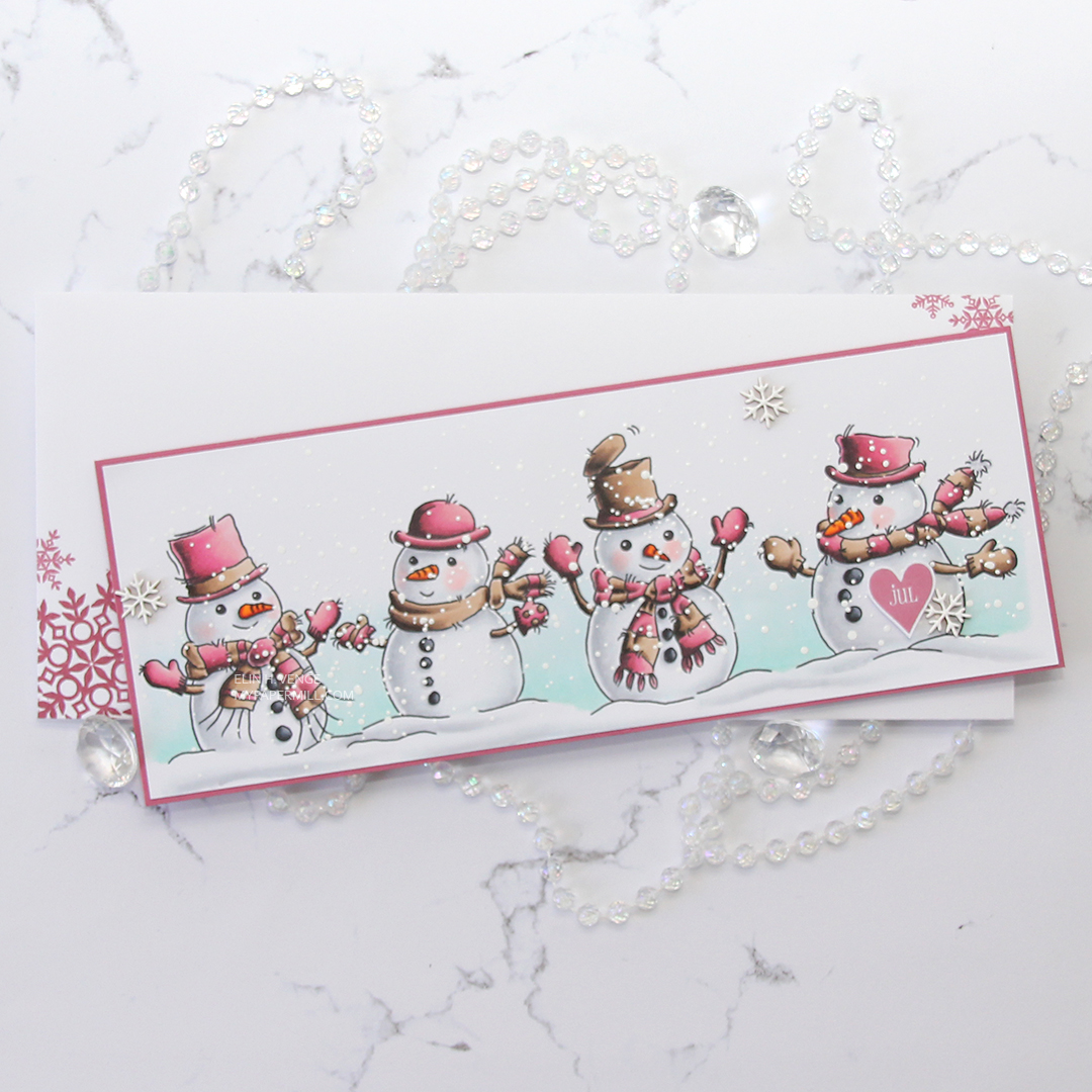 This color palette is definitely not the norm for me, but I was surprised at how much I like it. I think the secret was finding a pink combo I liked that wasn’t a screaming hot pink, and that also had a bit of contrast within it. Even better – my pink color combo matches the Autumn Rose color from Papertrey Ink, so I created my cardbase from a sheet of Autumn Rose cardstock and even stamped a few snowflakes from an old Simon Says Stamp stamp set (Holiday Envelope Sentiments) on the envelope using Autumn Rose ink. The envelope itself is a Deluxe white slimline envelope from My Favorite Things.
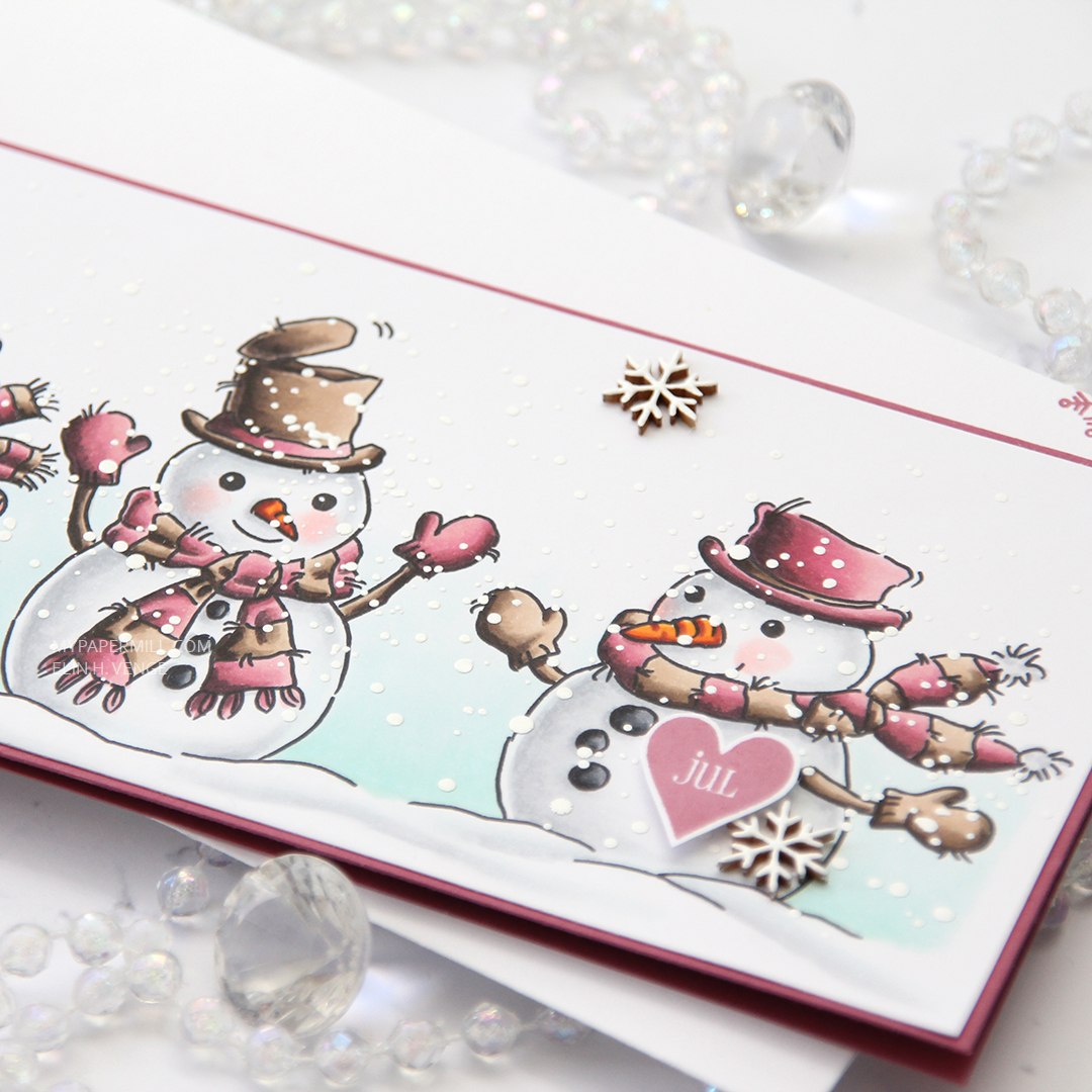 After coloring all my snowmen with Copics, I added a sprinkling of chunky white embossing enamel from Stampendous and heated my panel from the back until all the granules had melted. It warped quite a bit, so I ran the panel through my Gemini Jr without any dies, just sandwiching the panel between my cutting plates. That took care of the warping, and I could continue by gluing the panel of snowmen to the cardbase, before popping up a Norsk Stempelblad AS heart sentiment that I stamped using Autumn Rose ink. I also added a few Crafty Moly snowflakes that I covered in three layers of white embossing powder.
 RV99, R56, RV34 and RV32 – who would have guessed that it made such a pretty pink? Not me, that’s for sure, but I’m glad I stumbled upon this combo.
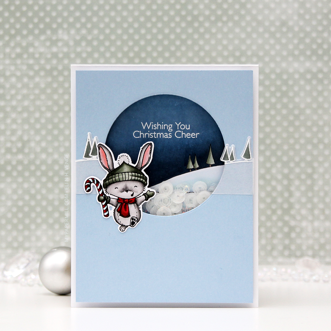
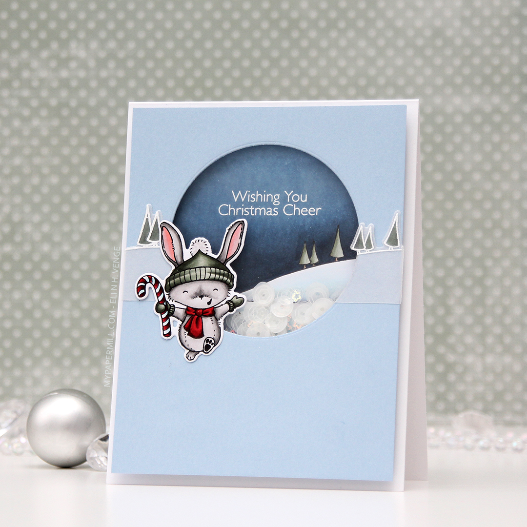 I stamped, colored and diecut the bunny a couple of days ago, so he was ready to go. I wanted the background stamp from that same stamp set to be in the shaker, and also going across. The shaker portion was stamped using Extreme Black ink, then colored with Copics, while the parts on the outside were stamped and white heat embossed on vellum and colored on the back. You don’t want to ruin the tips of your Copics by touching the embossing, so the back’s a great option when using vellum, because it still shows through.
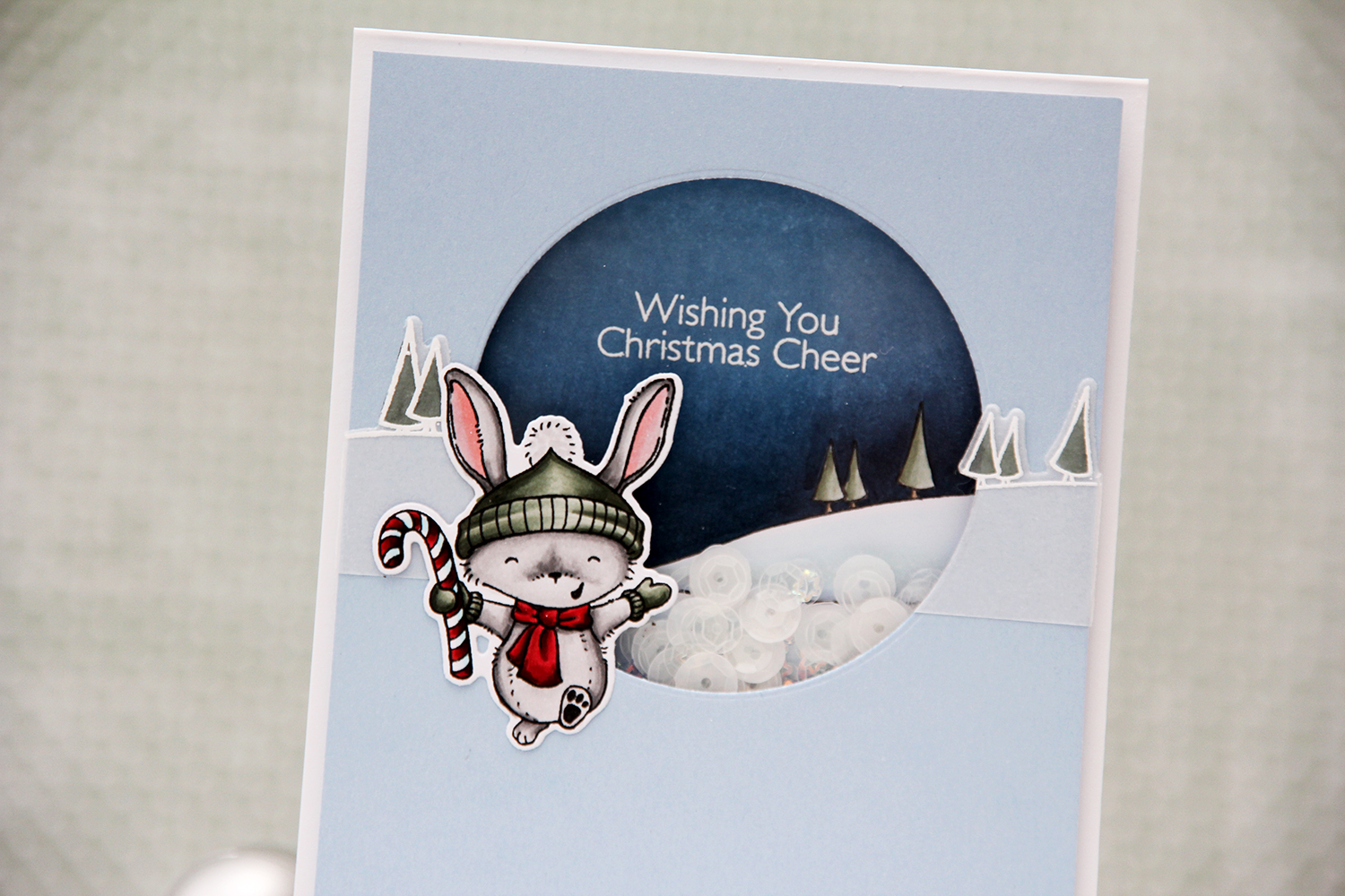 I like my shakers done a certain way. I use a die slightly bigger than my shaker window to die cut several times from white cardstock. I stack my negative die cuts (for this card it was 7), glue them together and glue a thin strip of cardstock to the inside of my negative diecut stack. That way, none of the sequins or other bits in the shaker get stuck anywhere, but can shake freely in their little confined space.
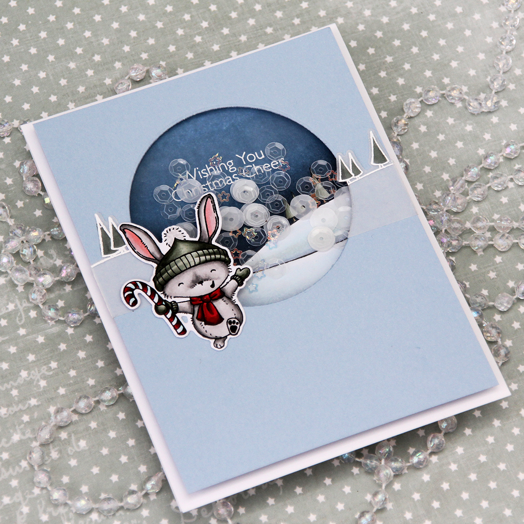 I used a sequin mix from Hero Arts for the inside of the shaker. It’s a mix of matte white sequins and clear sequins, as well as iridescent star confetti. I’m not usually a fan of iridescent elements on my cards, but for a night time Christmas shaker, I don’t mind.
 Not too many Copics used for this one! And the red one that says B97 should say R27, I must have undone the correct one before I saved my graphic in Photoshop.
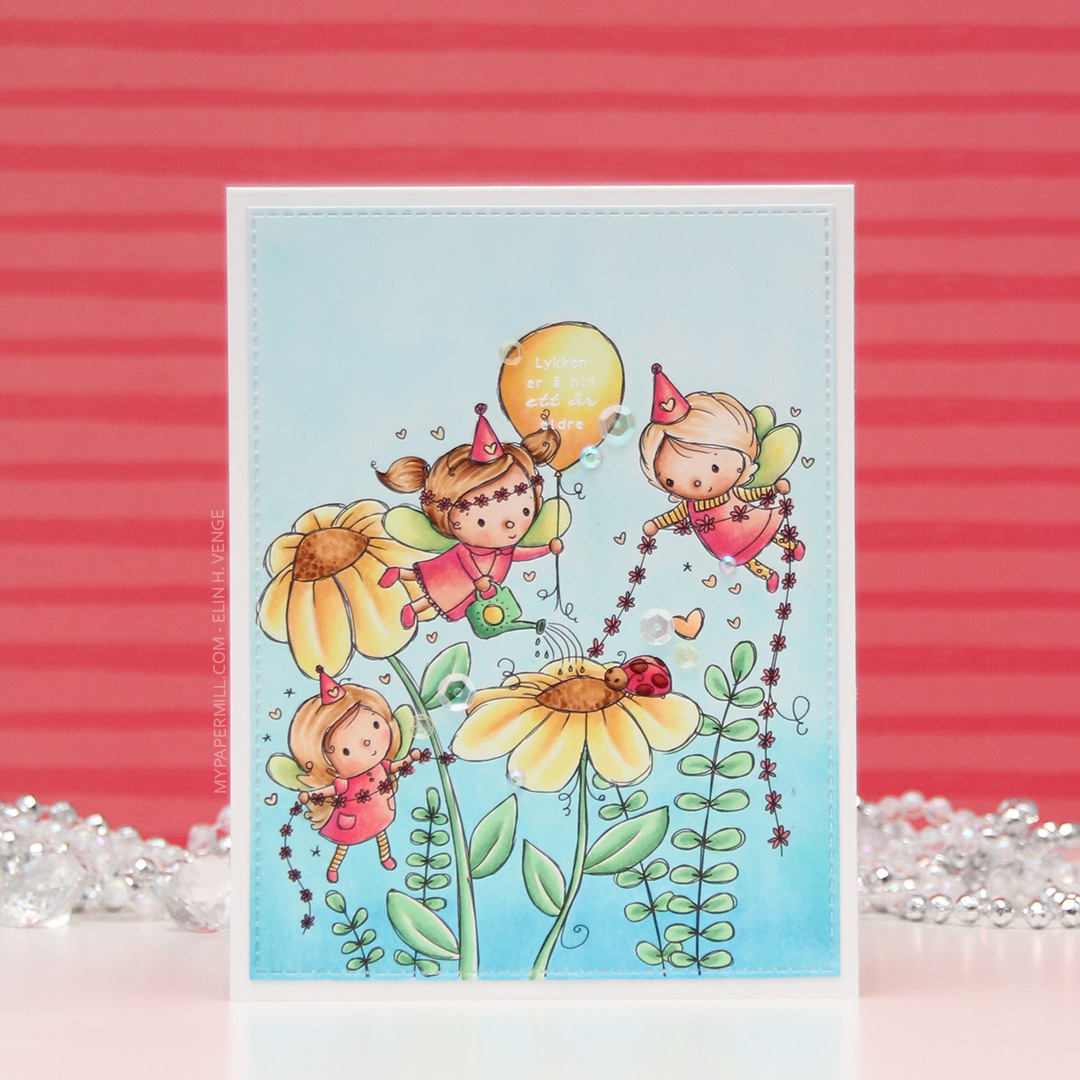 I wanted a soft color palette for my card, so I have no colors that are really dark in this image. The darkest marker I used is E57, and it’s contained to the hair on one of the fairies, the flower centers and the ladybug.
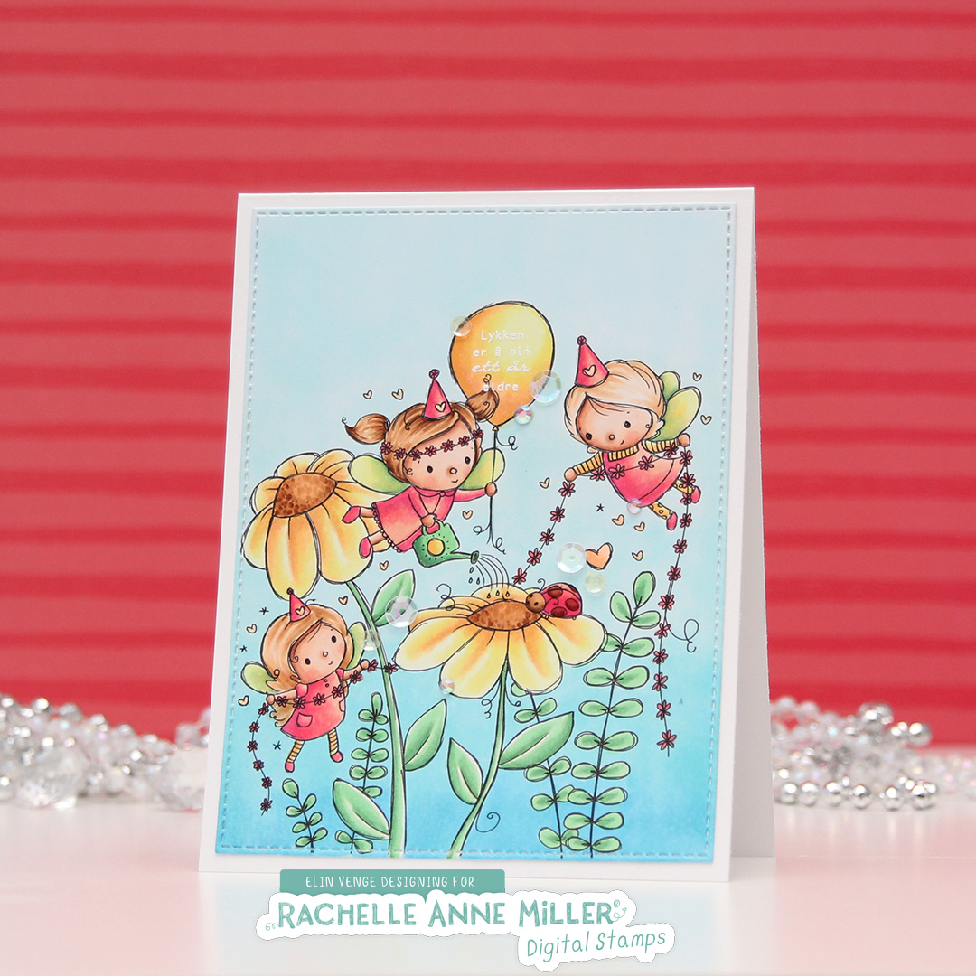 Once I’d colored the entire panel, I took the largest of the dies from the Stitched Rectangles STAX 1 set from My Favorite Things to turn it into a panel and create a nice border on the front of my card. I knew from the start that I wanted my sentiment inside the balloon, but I couldn’t decide on white or black. I thought the white might not pop enough against the yellow balloon, but I also knew that the end of the pigtail on the fairy would mess with any black stamping, making the letter illegible. In the end, I went with the white, but you can hardly see it in the photos against that lightest yellow. I might go in with a water brush and the refill for the darkest color I used on the balloon to darken it up later. I don’t want to ruin the nibs of my markers by touching the embossing, but refill and water brush with a little bit of blender solution will work without ruining anything.
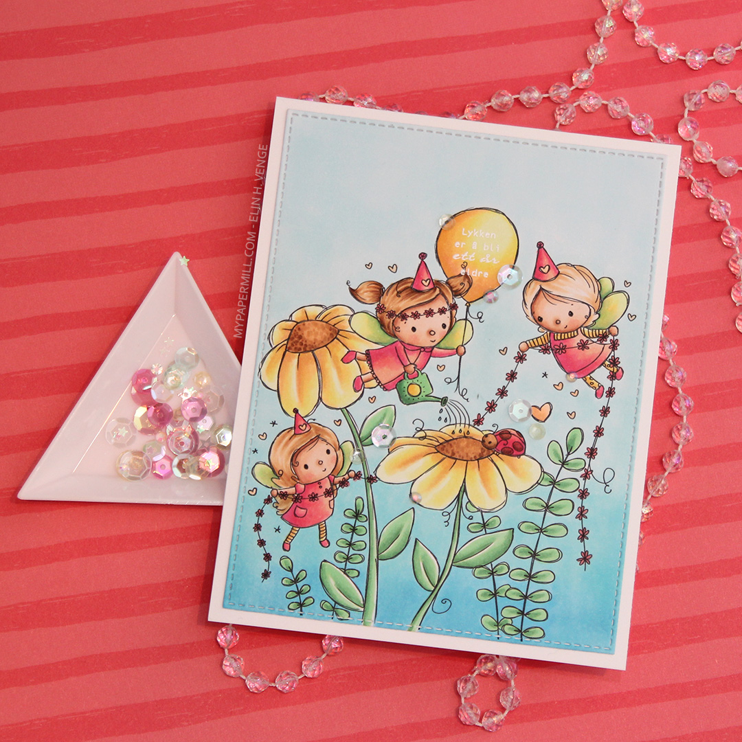 I finished my card by adding some groupings of sequins and Jewels from Little Things from Lucy’s Cards. I used the Iced Sherbet mix for this card.
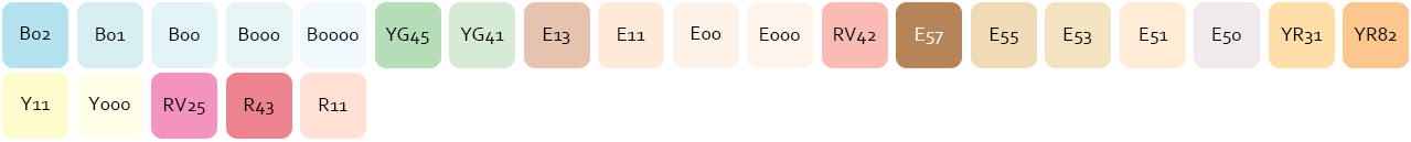 Last, but certainly not least, are the colors I used for my image.
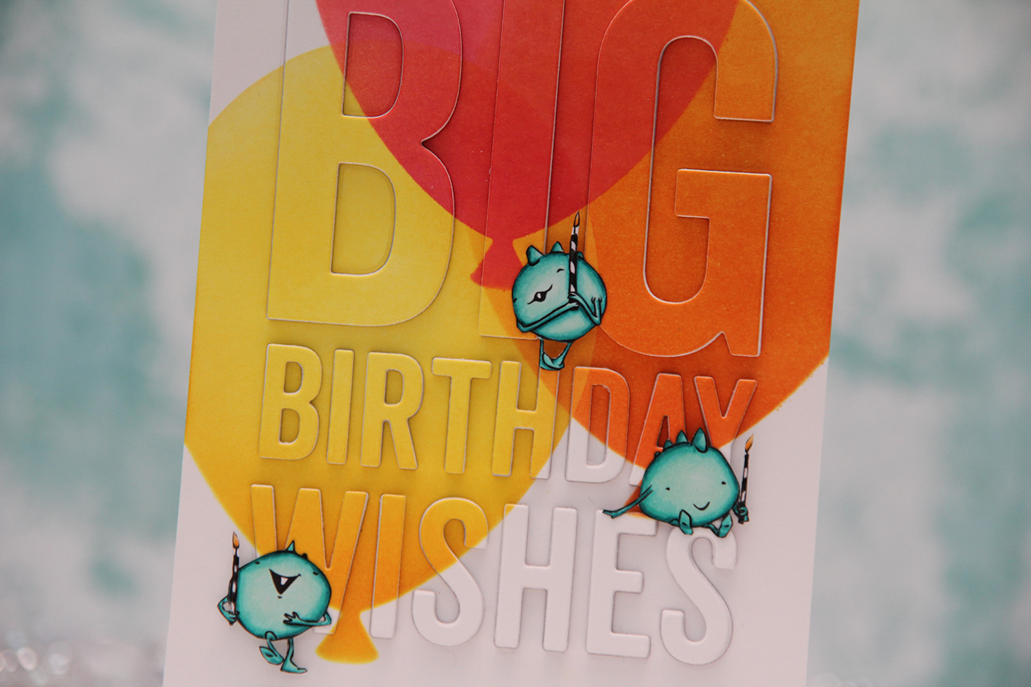
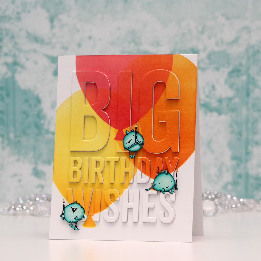 I needed to make a quick card last night, and decided to color up three of the small monsters from the Cupcake Monster set from Mo Manning (I have
 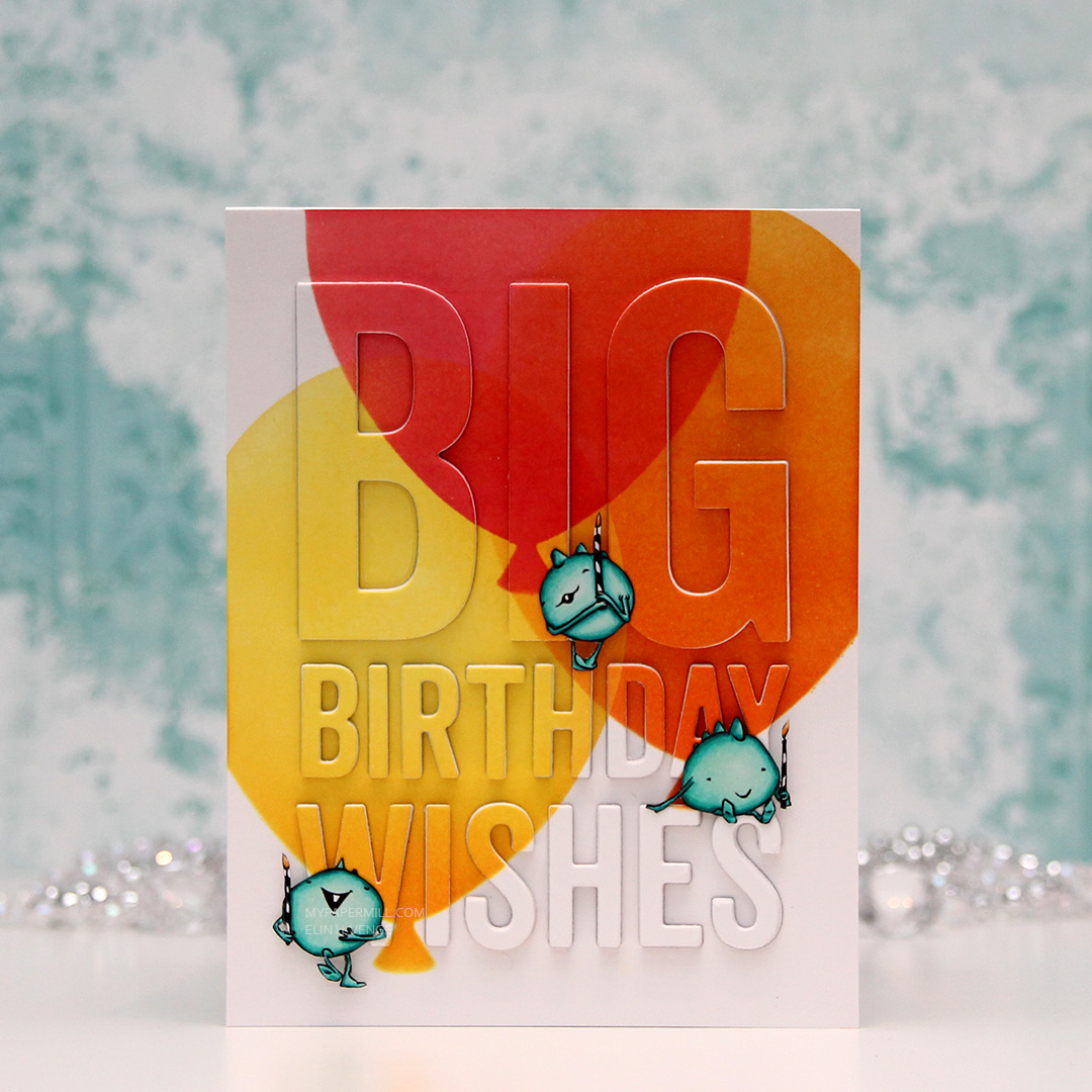 When my little monsters were all colored in with my Copics, I pulled out the Big Balloon stencil from My Favorite Things along with four different colors of distress ink. I created three balloons that overlap. All the balloons are ink blended using two colors. The yellow one is Squeezed Lemonade with Spiced Marmalade toward the base of the balloon, the orange one is Spiced Marmalade with Worn Lipstick at the base, and the top one is Worn Lipstick with Picked Raspberry at the base.
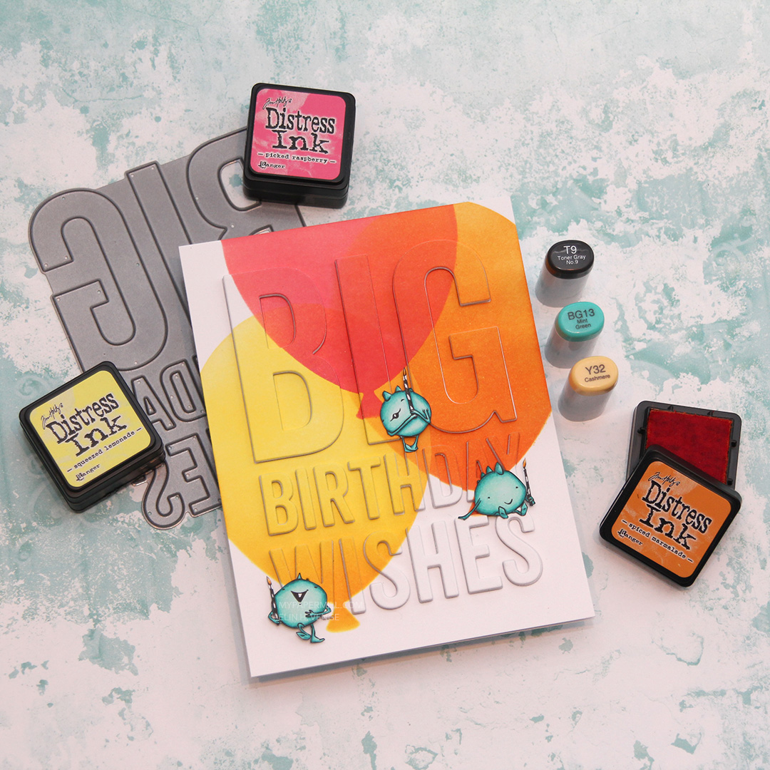 I die cut the Big Birthday Wishes die from My Favorite Things five times from Stamper’s Select White card stock from Papertrey Ink, as well as from the blended piece, which is also Stamper’s Select White. It’s my favorite white card stock, I haven’t found one that’s more white than this, and it’s also wonderfully sturdy at 110 lb. I did a layered inlay, then fussy cut my monsters and placed them strategically on my card. I love that the top one looks like he’s balancing on the top of the H, and the one on the right is leaning on the E while dangling his feet from the top of the S.

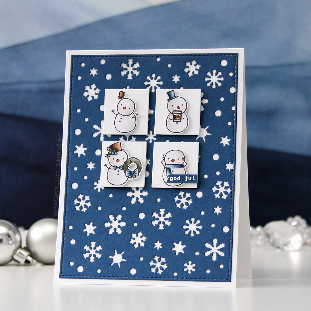
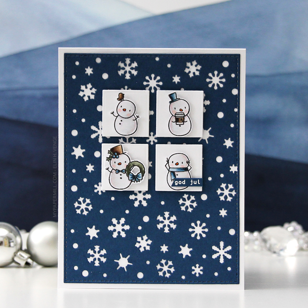 I had loads of diecut squares left over from my previous card, they were the interior pieces of the stacked frames I used. Instead of letting them go to waste, I thought I’d put them to good use. I took four squares and mounted them to my blue snowflake panel using 1 mm foam squares. Believe it or not, but this was the part that took the longest. Getting them centered perfectly near the top with equal spacing between them all and equal distances to both sides and the top of the panel took…. well, it felt like forever. With this kind of design, though, you have to get it just right, or it’ll throw off the balance of the entire card. They’re equally distanced down to 1/32″, that’s about as good as it gets.
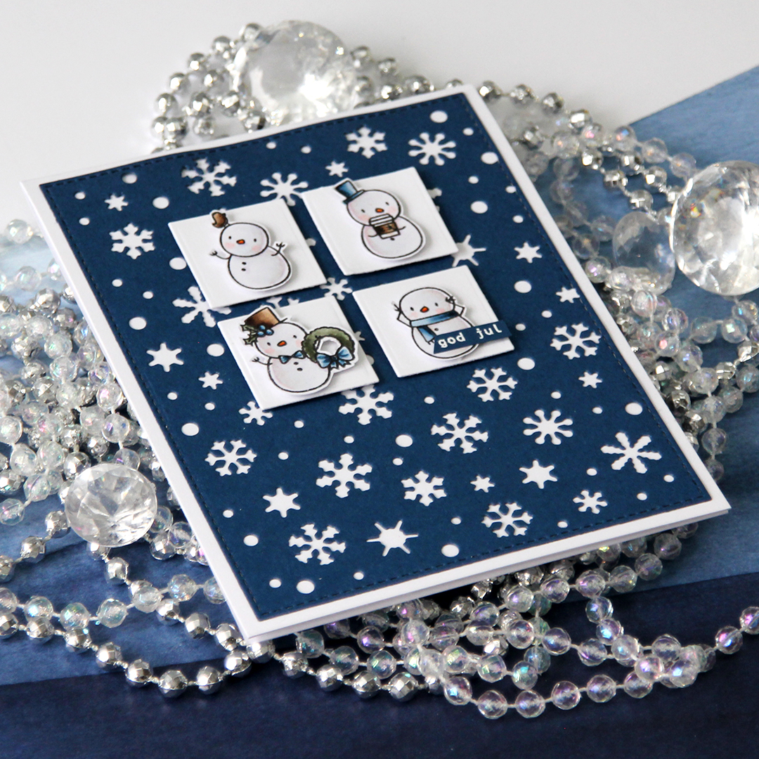
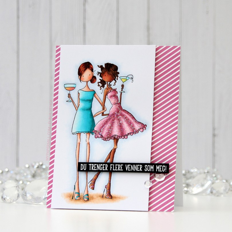
 I colored my image with Copics on X-Press It blending card and added
  I put a piece of patterned paper from the Party Patterns paper pad from My Favorite Things on the card front, and mounted the image on foam tape. Lots of foam tape, I was not shy!
 I stamped and white heat embossed a