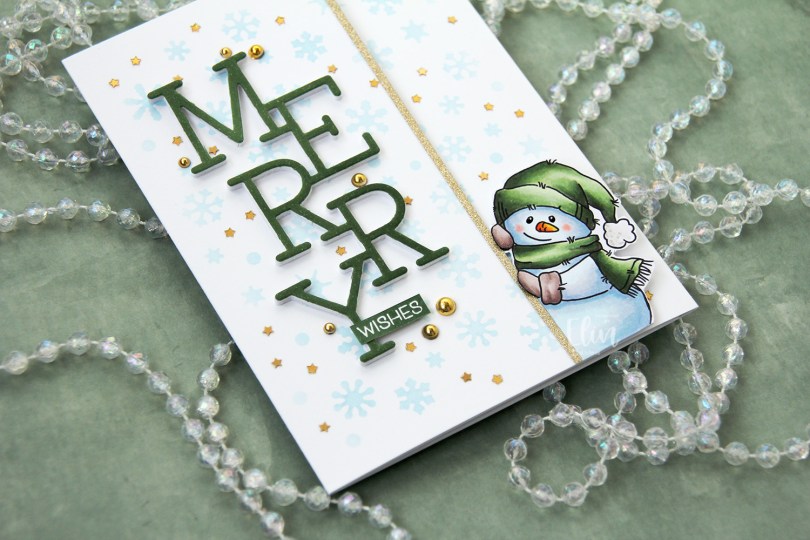
Hi, crafty friends. I’m still creating holiday cards, I still have no idea how many I’ve made this year, but I do know that this snowmen stamp set from the latest Lili of the Valley release is a must have.

I’ve actually created a tri-fold card this time. There are several images in this stamp set that lend themselves very well to this kind of off the edge design. I colored my snowman with Copics, before adhering him towards the right edge of a half sheet (8 x 5 1/2″) of Stamper’s Select White cardstock from Papertrey Ink. I fussy cut to the right of him, leaving a white trim and used a steel ruler and a craft knife on the left to create a vertical edge. Adhering him to the white cardstock did two things: 1 – it added strength, and 2 – it covered up the back of my coloring for a clean look when the card is open.
 This is the card closed. I created this by gluing 2 side fold A2 card bases together; the half with the snowman with the fold on the left and the other one with the fold on the right.
 I used the Snowflake Confetti fancy die from Hero Arts to die cut from Gina K Masking Magic to create a stencil to ink blend through. I used Iceberg ink from Altenew to create subtle blue snowflakes in the background on the front of the card to the left of the snowman and also on the other flap.
 I adhered an 1/8″ gold glitter cardstock strip from Kort & Godt for the snowman to hold on to for a defining edge and used the Stacked Merry die from My Favorite Things to die cut 6 times for a stacked look. 5 layers from white cardstock, the top layer from a piece of X-Press It blending card that I colored to match the green on the snowman. I stacked the six layers and adhered them in the center of the left front panel, stamped and white heat embossed a sub sentiment from the Christmas Greetings stamp set from Lili of the Valley, before adhering it on top of the stem of the Y with a few additional layers of cardstock behind it for dimension and strength.
 I embellished with a combination of gold pearls around the sentiment and tiny confetti stars all across the background. Both are from the Vanilla Kiss mix from Little Things from Lucy’s Cards. I also added a bit of black glaze pen to the eyes of the snowman. It adds a tiny bit of dimension and some shine. Once dry, I went over with a dot of white, using a Gelly Roll 05.
 On the inside flap, behind the snowman, I stamped another sentiment from the Christmas Greetings stamp set from Lili of the Valley, this time using Jalapeño Popper ink from My Favorite Things.
 Simple color palette for this one. Lots of colors for the snow, though, I can’t seem to help it.
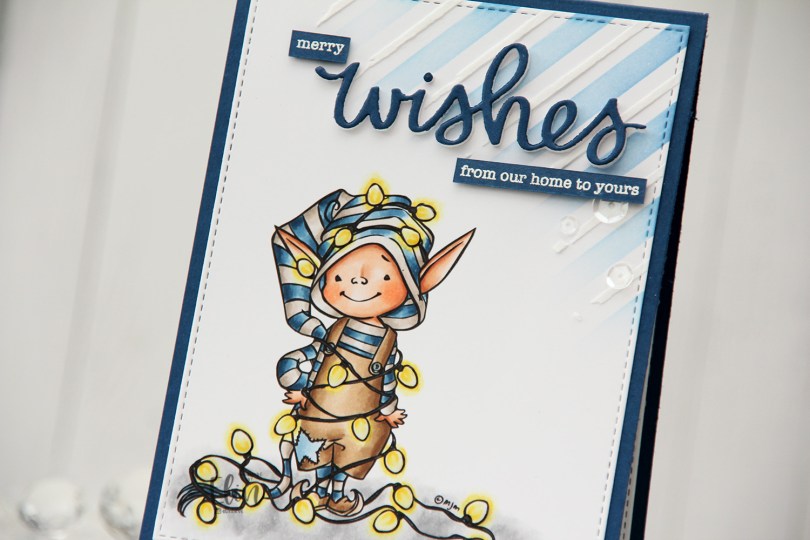

 I had to go for my traditional Christmas colors for this one with blue, brown and grey, it’s such a good combo. I made all the lights the same color. I know some people prefer the differently colored lights, but as a Scandinavian minimalist, my color palette for Christmas is very toned down, including my Christmas lights, which are all white.
 Once I’d colored my image, I used the largest die in the Stitched Rectangles STAX 2 set from My Favorite Things to create a faux stitch border around my panel. I then took the Plaid builder stencil set from My Favorite Things and ink blended using Blue Yonder ink from My Favorite Things in the top right corner with the stencil with the wide stripes. On top of the stencil with the smaller stripes, I used Light & Fluffy Modeling Paste from The Crafter’s Workshop for a little bit of added dimension and interest to the background.
 I adhered my panel to an A2 top fold card base I created from Enchanted Evening cardstock from Papertrey Ink. Using the scripty wishes die from Mama Elephant, I die cut three layers of white and one blue on top for a stacked look and adhered it on top of my stenciled background. I also stamped and white heat embossed a couple of sentiments from the Holiday messages stamp set from Mama Elephant to add to the wishes to make my sentiment complete. I cut them down to strips and added a few layers of cardstock behind each of them for dimension, before finishing off the card with a few sequins from the Starry Night mix from Little Things from Lucy’s Cards, as well as Glossy Accents for the lightbulbs.
 I love the glow and shine from the lightbulbs.
 Fairly simple color palette for this one.
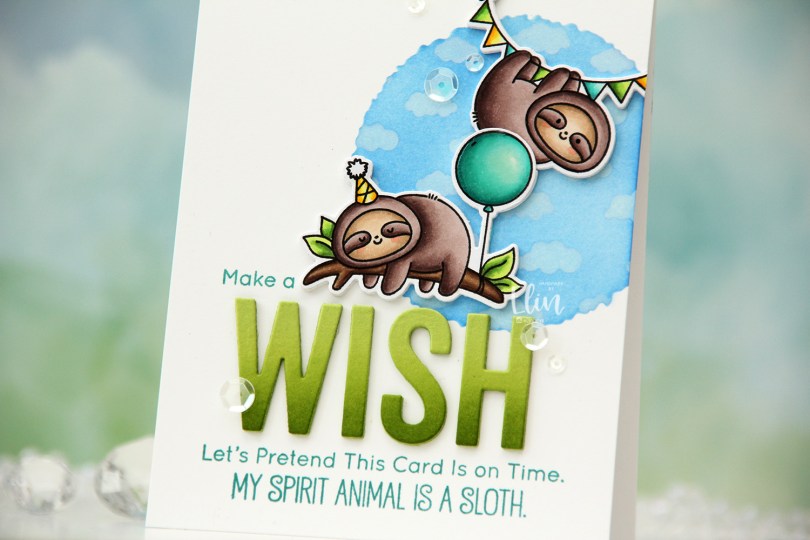
 I colored up these two sloths from the Hang Out and Celebrate stamp set. I stamped using Extreme Black ink from My Favorite Things, which is a hybrid ink safe to use with alcohol markers. I colored the sloths with Copics, then re-stamped over the black lines, this time using Obsidian ink from Altenew. This is a pigment ink that is super crisp, but it’s not compatible with Copics, so I need to stamp with an alcohol friendly ink first, do my coloring, then stamp on top with the pigment ink. Once the ink was dry I used the coordinating dies to cut out these cute sloths.
 I created an A2 top fold card base from Stamper’s Select White cardstock from Papertrey Ink and decided to do a little ink blending near the top right. Using the Watercolor Circle stencil from My Favorite Things (which was also new in the July release), I ink blended Eastern Sky and Iceberg inks from Altenew to create a soft sky. I eventually realized it needed to be darker for my clouds to show up over top, so I also went in with Ultramarine, which is one shade darker than Eastern Sky. These three blues are all in the same color family from Altenew.
 With the circle mask still in place, I added the Tiny Clouds stencil from My Favorite Things on top, and used Fresh Snow hybrid ink from Papertrey Ink to create soft clouds on top of the blue I’d already ink blended.
 At the bottom center of the card, I stamped a sentiment from the stamp set with the sloths, this time using Caribbean Sea ink from My Favorite Things. I also stamped “Make a” from the older Birthday Chicks stamp set and adhered die cut letters between my stamping to complete the sentiment. I die cut the word with from the Wish Big Today die that also came out in the July release from My Favorite Things (it was such a good release). I used Sour Apple cardstock, and at the base of the letters I ink blended using Sour Apple ink, and a little bit of Jalapeño Popper ink for extra oomph. I put three additional die cuts behind each letter and adhered them to my card.
 Time for the sloths. I die cut three additional layers of cardstock to go behind each of my die cut sloths, and glued them directly to the card base. I cut off a portion of the balloon on the back layers, so I could overlap the colored one with the other sloth. I added a dot of black glaze pen to the eyes of the sloth that’s awake, and Glossy Accents to the balloon for a bit of shine.
 To finish off the card I used some sequins from the Waterfall mix from Little Things from Lucy’s Cards. I packed a lot into this card, and the sentiment wound up taking much more space than I’d sketched out in advance, but I still like it. This is the part where I usually show a graphic of the Copics I used, but I simply can’t locate the post-It I used to write them down.
 Hot pink and orange/yellow/gold. It’s not a Christmas color palette you see every day, and when I did the actual coloring, I wasn’t sold on this. I wasn’t sold when the card was done, either, but it’s grown on me, and I’m now in a place where I like it. That might change again, though, ask me tomorrow 😉
 I printed the image on the bottom half of a quarter sheet of X-Press It blending card, did my coloring, then used the Basket Weave stencil from My Favorite Things to add a little bit of interest to the panel. Above the image, I used Puffy Heart and Rose Quartz inks from Altenew, underneath the image I used Scattered Straw Distress Ink. I trimmed off 1/4″ on each side and mounted it with foam tape onto a card base I created from Ripe Raspberry cardstock from My Favorite Things.
 I added black glaze to the eyes for some shine and Glossy Accents to the lightbulbs, before stamping and white heat embossing a sentiment from the Holiday Messages stamp set from Mama Elephant onto a scrap piece of pink cardstock. I cut the sentiment down to a strip, added a few more layers behind it and added it to my card, before finishing off with a few gold jewels from the Fesitivities mix from Little Things from Lucy’s Cards.
 The Glaze, Glossy Accents, sub sentiment and gems all work together to add interest to what is otherwise a very simple card.
 I colored Mae with Copics, opting for one of my go to summer color palettes. There’s something about pink, yellow and orange that just screams summer to me. Once colored, I fussy cut her, leaving a white border around the image. The white border makes her stand out against a colorful background, and with that hair, there’s no way I was cutting right up against the black lines in the image.
 I created an A2 top fold card base from Stamper’s Select White cardstock from Papertrey Ink, and did some ink blending directly on the front. I first used the Watercolor Circle stencil from My Favorite Things and ink blended using Squeezed Lemonade and Mustard Seed Distress inks. I removed the circle stencil, added the Geometric mosaic stencil, also from MFT, and used Spiced Marmalade Distress ink for an orange pattern on top, extending out from the circle a bit. I didn’t think the orange was dark enough, so I went over it with Orange Peel ink from Simon Says Stamp and even added a little bit of Abandoned Coral Distress ink on top to amp up the contrast.
 I mounted Mae on foam tape, before adding a couple of Kort & Godt sentiment stickers, which I also put foam tape on the back of.
 I love dimension on my cards, and by popping up the image and the sentiments, they stand out a little against a fairly busy background.
 To finish the card, I added a few pearls, hearts and gems from the Chrysanthemum mix from Little Things from Lucy’s Cards. I love her mixes, and use them on most of my cards, they add the perfect finishing touch.
 Meet
Meet  I colored the scene with Copics, cropped down the panel and white heat embossed a sentiment from the coordinating sentiment set using VersaMark ink and Super fine detail embossing powder from Ranger. I added a few white dots to the wave using a Sharpie and put the panel to the side while I worked on the rest of the card.
 I thought the Stitched Ripple Backdrop die from Lawn Fawn would work perfectly for a subtle wave pattern in the background. It’s a landscape oriented die and I wanted a portrait oriented card, so I die cut it twice from Stamper’s Select White cardstock from Papertrey Ink, before adding colored strips along the seam for a little bit of added interest. I colored the strips with a few of the Copics I used for my scene and used a die from the Blueprints 27 die set from My Favorite Things to turn them into strips of the same width.
 I mounted my scene to the center of the card using foam tape, before embellishing with sequins and raindrops from Little Things from Lucy’s Cards. The sequins are from her Ice Water mix.
 The finished card is a simple looking one. I love adding dimension, the sequins and raindrops work perfectly with the colors and Kalei’s making the most of her summer. I hope you are too 🙂 And if you’re in the Southern hemisphere in the middle of winter right now, I feel your pain.
 I tend to go overboard whenever I color skies or water.
 These mitten dies from Kort & Godt are perfect for gift tags. There are three dies in the set: the cuff, a base layer and a top layer. I only used the cuff on one of these, but used the base layer and top layer for all of them.
 I used scraps of patterned paper from Maja Design for all three of the mittens, stamped and white heat embossed a sentiment on one of them and added a gold gem stone to the center of each of the snowflakes. I also pulled some string through a hole I made at the top left corner and added a couple of bells to each.
 On the back I stamped to and from using ink colors that matched the mittens. I used Dark Chocolate ink from Papertrey Ink for the brown mitten, Scarlet Jewel ink (also from PTI) for the red mittens.
 I love hydrangeas, and this image was is one I just HAD to color. Even though I’m more confident with my Copics because I use them so much, I love the soft look and those edges lines you get with watercolor. I stamped the image on a piece of Fabriano Artistico Extra White watercolor paper using Obsidian ink from Altenew. This is a pigment ink, which makes it perfect for embossing. I sprinkled on clear embossing powder from Ranger and melted the powder.
 I grabbed a couple of paint brushes and my Mijello Mission Gold watercolor set and mixed pinks and purples for my flowers, and a bunch of different greens for the stems and leaves. I’m no expert watercolorist (if you want to watch an expert watercolor, head over to Debby Hughes’
  This stamp set actually comes with a couple of additional leaves and petals and dies to cut them out, but there’s no die for this large image. Fussy cutting it was easy enough, though. I stamped and white heat embossed a sentiment from the stamp set onto a piece of True Black cardstock from Papertrey Ink. I dry embossed a piece of patterned paper from the Watercolor Wishes 6×6 inch paper pack from Lawn Fawn using the Geometric Landscape stencil from Altenew. I wanted a little bit of texture to create interest in the background without distracting from the main image, and this did the trick.
 I added a few more layers of cardstock behind my black strip for dimension, popped the flower up on foam tape and finished off the card with a few faceted pearls. Or are they gems? No matter what they are, they’re gorgeous, and I have a feeling I’ll use up the entire pack of these in no time, I love them so much.
 Meet
Meet  I colored in the scene with Copics, stamped the sentiment using VersaMark ink and sprinkled on Super fine detail embossing powder from Ranger, before melting in it from the back for a smooth look. Did you know that you get smoother embossed results if you use the heat gun from the back of the paper instead of the front? It makes quite a bit of difference, actually. I urge you to try it if you haven’t already.
 It looks like I wrote down the Copics I used for this card in a bit of a haste, because I see I’ve left out the blues, both for the water and the jetski. I made this card at the end of May, so I don’t really remember which ones I did use, but I believe it’s the B10 family (B18, 16, 14 and 12) for the water, and the B30 family (B39, 37 and 34) for the jetski.
 I printed my image so it would fit a mini slimline card nicely, and didn’t feel like choosing colors, so I asked my color buddy Liz for suggestions. She really wanted to challenge me and said “red (not E), green (not BG) and gold”. She knows I don’t like red and green together, she knows I use the Es to create red on my Christmas cards and she knows I use BG colors or greys in combination with those Es. It’s kind of scary how well she knows what I like and use. I admit I was a little reluctant to try this at first, but I always run with her suggestions anyway, and I think it turned out okay (except for the huuuuge white dots on the green scarf).
 Once I finished my coloring, I stamped and white heat embossed a sentiment from the Christmas greetings stamp set from Lili of the Valley, white heat embossed a few details in the image, then die cut it using partial die cutting and the largest die in the Slimline Double Stitched Rectangle STAX die set from My Favorite Things. I added a couple of layers of white cardstock behind the colored panel and mounted it all to a card base I created from Amarena Cherry cardstock from My Favorite Things. The finished card measures 6 3/8 x 3 1/2″.
 No Es. And even though I used BG99 in my green combo, it still reads green and not BG. BG99 is great to use for dark green.