
Hi, crafty friends. Can you believe it’s July already? Can it be July all year? Summer’s by far my favorite season, I don’t like the cold, and today’s card really is a summery one.
 Meet Skeeter, Splash and Beaks. These summer loving friends are part of the Charmed by the Sea release from Purple Onion Designs, which was released mid-June. The Sunrise Sunset stamp in the background is also part of the release, and the sentiment is from the coordinating Seaside sentiment set.
 I colored in the scene with Copics, stamped the sentiment using VersaMark ink and sprinkled on Super fine detail embossing powder from Ranger, before melting in it from the back for a smooth look. Did you know that you get smoother embossed results if you use the heat gun from the back of the paper instead of the front? It makes quite a bit of difference, actually. I urge you to try it if you haven’t already.
 It looks like I wrote down the Copics I used for this card in a bit of a haste, because I see I’ve left out the blues, both for the water and the jetski. I made this card at the end of May, so I don’t really remember which ones I did use, but I believe it’s the B10 family (B18, 16, 14 and 12) for the water, and the B30 family (B39, 37 and 34) for the jetski.

 I printed my image so it would fit a mini slimline card nicely, and didn’t feel like choosing colors, so I asked my color buddy Liz for suggestions. She really wanted to challenge me and said “red (not E), green (not BG) and gold”. She knows I don’t like red and green together, she knows I use the Es to create red on my Christmas cards and she knows I use BG colors or greys in combination with those Es. It’s kind of scary how well she knows what I like and use. I admit I was a little reluctant to try this at first, but I always run with her suggestions anyway, and I think it turned out okay (except for the huuuuge white dots on the green scarf).
 Once I finished my coloring, I stamped and white heat embossed a sentiment from the Christmas greetings stamp set from Lili of the Valley, white heat embossed a few details in the image, then die cut it using partial die cutting and the largest die in the Slimline Double Stitched Rectangle STAX die set from My Favorite Things. I added a couple of layers of white cardstock behind the colored panel and mounted it all to a card base I created from Amarena Cherry cardstock from My Favorite Things. The finished card measures 6 3/8 x 3 1/2″.
 No Es. And even though I used BG99 in my green combo, it still reads green and not BG. BG99 is great to use for dark green.
 I started with a quarter sheet of Stamper’s Select White cardstock, the Wintry Forest stencil set from Pinkfresh Studio and the Northern Shore color family from Altenew. The stencil set has 6 different stencils that you layer to create a gorgeous wintry forest. I started with stencil number 1 (the Pinkfresh Studio stencils are numbered, which makes it really easy) and Polar Bear ink, which is the lightest of the four colors in the Northern Shore color family. I then moved on to stencil number 2, but didn’t change the color. Since I had to stretch my four colors and use them on five stencils (the last stencil adds snow on the trees), I kept the lightest one for this second layer and ink blended with a heavier hand, which makes the color appear darker. I used stencil number 3 with Icy Water ink, which is the next shade, then stencil number 4 with Winter Lake ink, and finally stencil number 5 with Arctic Mountain ink, which is the darkest color in this set of four gorgeous blues.
 On top of the ink blending, I stamped a snow flurry background stamp from Kort & Godt (M-428) using Fresh Snow hybrid ink from Papertrey Ink, which added lots of white snowy dots to my background. I then used a die in the DIE240 set from Kort & Godt to die cut the banner directly from my background. I put it to the side, placed the last stencil on my background and spread a layer of Light & Fluffy modeling paste from The Crafter’s Workshop through the stencil, before sprinkling on Rock Candy Distress Glitter and let that dry. Onto my banner, I stamped a sentiment from the M-467 stamp set from Kort & Godt using Arctic Mountain ink. I ink blended a little bit of Winter Lake ink to the edges to make it stand out a little bit more, added a stack of white die cuts behind it for dimension and adhered a couple of faceted iridescent pearls (ST178) to finish off the card.
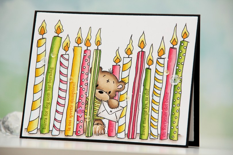
 I printed the image fairly large and chose a summery color palette of hot pink, apple green and bright yellow. I colored the image with Copics and used the largest die in the Additional A2 Layers die set from Waffle Flower to turn it into a nice rectangular panel. I put the panel in my MISTI, and used the A06 stamp set from Norsk Stempelblad AS to stamp sentiments on the plain candles. I used Jalapeño Popper ink from My Favorite Things for the green candles, Raspberry Fizz ink from Papertrey Ink for the pink candles and Spiced Marmalade distress ink from Ranger for the yellow candle, with a little bit of help from VersaMark to prevent the distress ink from beading up on the photopolymer.
 Once all my stamping was done, I adhered the panel onto a black card base I created from True Black cardstock from Papertrey Ink. I also die cut a panel to go on the inside from Stamper’s Select White cardstock from Papertrey Ink for a place to write my personal greeting. I used my black Glaze pen from Sakura to create a little bit of shine to the eyes and the nose of the bear, and added sequins from the Seashore and Iced Sherbet mixes from Little Things from Lucy’s Cards for a finishing touch.
 Simple color palette for this one 🙂
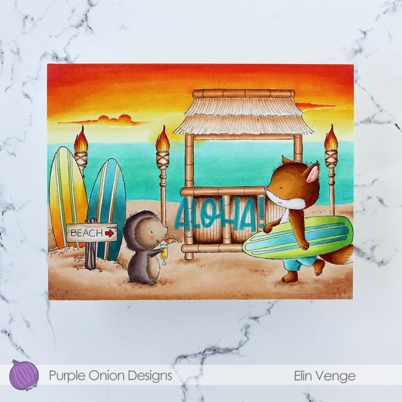
 I did a ton of masking for this card. I love creating stories in my head with these images, then stamping them and making them come to life.
  I colored in my scene using Copics, then stamped the
  I used a lot of colors for this card.
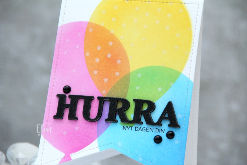
 I used a banner die with faux stitching to create a shaped card. This banner die is about 4″ wide, making it the perfect size for a decent size card. I used partial die cutting to create the card base, but die cut a separate piece that I used for my ink blending, which I then adhered to the card base once finished.
 I used the Big Balloon stencil set from My Favorite Things to create my balloons, and used Distress Inks for my ink blending. Faded Jeans, Mermaid Lagoon and Salty Ocean for the blue balloon, Picked Raspberry for the pink balloon and Mustard Seed and Squeezed Lemonade for the yellow balloon. Where they overlap, they create new colors, which is half the fun of ink blending, right? With the balloon stencil still in place, I added the Falling Stars stencil from Simon Says Stamp on top and ink blended white stars onto the balloons using Fresh Snow hybrid ink from Papertrey Ink.
 I stamped a sentiment onto the front using Obsidian ink from Altenew and added a stacked die cut HURRA above it. I layered six black die cuts, before adding this glitter one on top and finished off the card with a few black pearls.
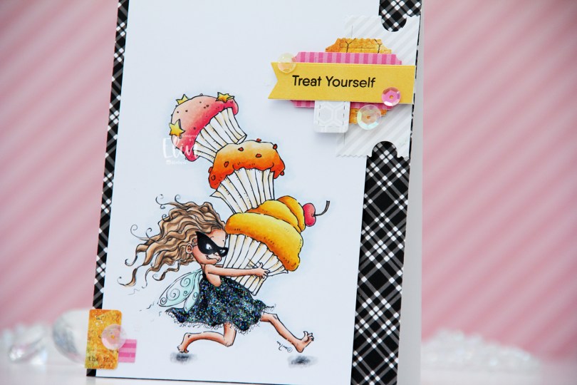
 This is Cupcake Thief. I’ve used the image once before. This time, I flipped it so she’s facing right, it’s one of the many advantages of using digital stamps. I colored her with Copics and cut my panel down to a width of 3 1/2″. I put it aside, covered a white card base with the black and white plaid patterned paper from My Favorite Things, then mounted the colored panel on foam tape, leaving a little bit of the patterned paper showing on one side, and more showing on the other.
 On my desk, I keep storage pockets of die cut patterned paper scraps that I use on my cards. I keep them organized by color family, and pulled out the pink, orange and yellow ones for this, as well as a grey/white/neutral one. The great thing about this system is that everything’s already die cut (using the Happy Days Ticket Stubs die from XCut [which cuts 9 different tickets with one die] and the Fishtail Flag Frames die set from My Favorite Things), so I just play with sizes, colors and composition of the different pieces until I’m happy with the result. For this particular card I used a combo of patterned papers from Sunny Studio, P13 and Bo Bunny. Onto one of the die cut banners I stamped a sentiment from the Little Birthday Notes stamp set from My Favorite Things using Obsidian ink from Altenew. I finished off the card with a few sequins from the Sweet Shop mix from Little Things from Lucy’s Cards and some Stardust Stickles to the dress.
 Quite a few Copics for this one. I also used B90, which is a color I’ve made myself, for a subtle hint of a sky.
 I colored the scene with Copics, then used The Perfect Spot again to stamp on white cardstock (Stamper’s Select White from Papertrey Ink, my favorite white cardstock), this time using Memento Espresso Truffle ink. I wanted this to be more visible than the background without being stark black, and this color is perfect. I then die cut the white panel using two dies: a rectangle die from Waffle Flower to make it smaller and the Watercolor Wash Free Form die from My Favorite Things to create a window.
 I added foam tape on the back of my white panel for dimension and lined up the stamped lines on the two panels as best as I could, before adding my double panel to a card base I created from Soft Stone cardstock from Papertrey Ink. I then stamped a sentiment from the
  Fairly simple color palette for this one. I also used B90, which is a color I’ve made myself.
 Lili of the Valley critters are among the cutest in the stamping world, and I just couldn’t resist these bunnies carrying a big cake. I colored the image with Copics, before die cutting it using the largest die in the A2 Stitched Rectangle STAX die set from My Favorite Things. I adhered the panel to a card base I created from Autumn Rose cardstock from Papertrey Ink.
 I used my Quickie Glue pen on the flames and sprinkled on Rock Candy distress glitter for added sparkle. Using foam tape, I popped up a sticker sentiment from Kort & Godt before finishing off the card with sequins from the White Orchid Sequin mix from Little Things from Lucy’s Cards.
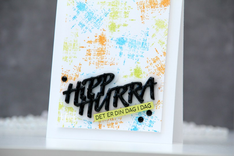
 I started by creating a colorful background. Using one of the stamps in the M479 stamp set, I stamped repeatedly across the background using Distress Oxide inks in the colors Salty Ocean and Twisted Citron, as well as regular Distress ink in Spiced Marmalade. I cut the panel down to be 3 1/2 x 4 7/8″ and mounted it to a white top fold card base using foam tape.
 Using the DIE294 die set, I die cut 8 layers of the words from True Black cardstock from Papertrey Ink and one shadow layer using heavyweight translucent vellum from My Favorite Things. I stacked three of the black layers, added the vellum layer on top and then the last five black layers. I even added a coat of Nuvo Crystal Drops in the Ebony Black color to the top layer for extra dimension and shine. On a piece of Limeade Ice cardstock from Papertrey Ink, I stamped a sentiment from the M458 stamp set using Obsidian ink from Altenew, before adhering both the stacked die cut and my stamped sentiment strip at an angle, before finishing off the card with a couple of crystals (BE107). And that’s a wrap for my first DT card for Kort & Godt – I can’t wait to play more, and hope this inspired you.