
Hi, crafty friends. I have a somewhat untraditional Christmas card to share today, featuring this Christmas Joy stamp from Rachelle Anne Miller. I love all her Australian themed stamps, and this one’s a beaut (had to throw in a little Australian there)!
 Hot pink and orange/yellow/gold. It’s not a Christmas color palette you see every day, and when I did the actual coloring, I wasn’t sold on this. I wasn’t sold when the card was done, either, but it’s grown on me, and I’m now in a place where I like it. That might change again, though, ask me tomorrow 😉
 I printed the image on the bottom half of a quarter sheet of X-Press It blending card, did my coloring, then used the Basket Weave stencil from My Favorite Things to add a little bit of interest to the panel. Above the image, I used Puffy Heart and Rose Quartz inks from Altenew, underneath the image I used Scattered Straw Distress Ink. I trimmed off 1/4″ on each side and mounted it with foam tape onto a card base I created from Ripe Raspberry cardstock from My Favorite Things.
 I added black glaze to the eyes for some shine and Glossy Accents to the lightbulbs, before stamping and white heat embossing a sentiment from the Holiday Messages stamp set from Mama Elephant onto a scrap piece of pink cardstock. I cut the sentiment down to a strip, added a few more layers behind it and added it to my card, before finishing off with a few gold jewels from the Fesitivities mix from Little Things from Lucy’s Cards.
 The Glaze, Glossy Accents, sub sentiment and gems all work together to add interest to what is otherwise a very simple card.
![]() The coloring is pretty simple too 🙂
The coloring is pretty simple too 🙂
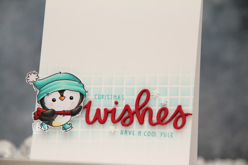
 There are five adorable penguins in this stamp set, and I chose two to color, with a vague idea for a card in the back of my mind as I was coloring. Once I’d colored both penguins and fussy cut them, I realized splitting them up and creating two cards would be better. For this card, I placed the Grid stencil from My Favorite Things at a bit of an angle directly on my top fold card base I created from Stamper’s Select White cardstock from Papertrey Ink. Using Sno Cone ink from My Favorite Things and a blender brush, I created a soft blend near the bottom of the card front, fading to white above and below.
 The wishes die from Mama Elephant is probably my most used word die, I love it so much. I die cut it five times from Wild Cherry cardstock from My Favorite Things and stacked the die cuts for dimension. Onto the background I stamped a sub sentiment and the word Christmas from the
 This time I’m focusing on
  I colored the image with Copics, then used the largest die in the Blueprints 27 die set from My Favorite Things to turn it into a rectangle with faux stitching and a scalloped edge, just for something different from my usual faux stitch rectangles. I die cut another piece from white cardstock to put on the inside of the card.
 Before adhering my panel, I sprinkled on Chunky White embossing enamel from Stampendous, and melted the granules from the back of the panel. I also used a black glaze pen from Sakura to create a tiny bit of dimension and shine to the penguin’s eyes. I adhered the panel directly to a top fold card base I created from After Midnight cardstock from My Favorite Things, which is a nice dark blue color.
 From the same color cardstock, I die cut God jul four times using a die from Papirdesign. I stacked the layers and adhered it to the left of the image, before finishing off the card with a few hearts from the Festivities mix from Little Things from Lucy’s Cards.
 This is a fairly flat card for me. Other than the sentiment and the white hearts, there’s nothing that adds a lot of dimension. I considered mounting the panel on foam tape, but in the end decided against it. The sentiment and the hearts still pop and add interest, as does the snow, which has a bit of texture to it.
 I used mostly blue Copics for this card. Not really a surprise, huh?
 I printed my image so it would fit a mini slimline card nicely, and didn’t feel like choosing colors, so I asked my color buddy Liz for suggestions. She really wanted to challenge me and said “red (not E), green (not BG) and gold”. She knows I don’t like red and green together, she knows I use the Es to create red on my Christmas cards and she knows I use BG colors or greys in combination with those Es. It’s kind of scary how well she knows what I like and use. I admit I was a little reluctant to try this at first, but I always run with her suggestions anyway, and I think it turned out okay (except for the huuuuge white dots on the green scarf).
 Once I finished my coloring, I stamped and white heat embossed a sentiment from the Christmas greetings stamp set from Lili of the Valley, white heat embossed a few details in the image, then die cut it using partial die cutting and the largest die in the Slimline Double Stitched Rectangle STAX die set from My Favorite Things. I added a couple of layers of white cardstock behind the colored panel and mounted it all to a card base I created from Amarena Cherry cardstock from My Favorite Things. The finished card measures 6 3/8 x 3 1/2″.
 No Es. And even though I used BG99 in my green combo, it still reads green and not BG. BG99 is great to use for dark green.
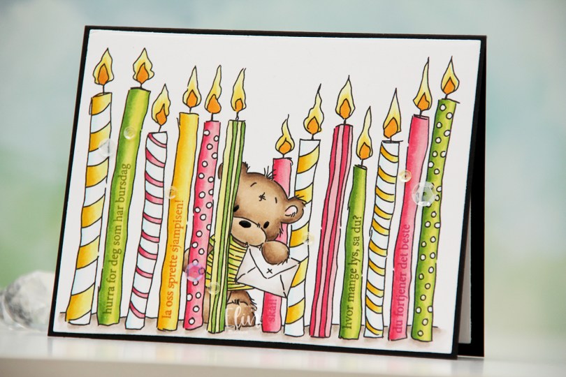
 I printed the image fairly large and chose a summery color palette of hot pink, apple green and bright yellow. I colored the image with Copics and used the largest die in the Additional A2 Layers die set from Waffle Flower to turn it into a nice rectangular panel. I put the panel in my MISTI, and used the A06 stamp set from Norsk Stempelblad AS to stamp sentiments on the plain candles. I used Jalapeño Popper ink from My Favorite Things for the green candles, Raspberry Fizz ink from Papertrey Ink for the pink candles and Spiced Marmalade distress ink from Ranger for the yellow candle, with a little bit of help from VersaMark to prevent the distress ink from beading up on the photopolymer.
 Once all my stamping was done, I adhered the panel onto a black card base I created from True Black cardstock from Papertrey Ink. I also die cut a panel to go on the inside from Stamper’s Select White cardstock from Papertrey Ink for a place to write my personal greeting. I used my black Glaze pen from Sakura to create a little bit of shine to the eyes and the nose of the bear, and added sequins from the Seashore and Iced Sherbet mixes from Little Things from Lucy’s Cards for a finishing touch.
 Simple color palette for this one 🙂
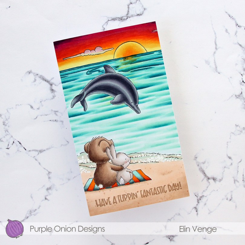
 I wanted a bit of a dramatic sunset for this card, and also for the critters (
 I adhered my colored panel to a card base I created from Stamper’s Select White cardstock from Papertrey Ink, stamped a sentiment from the
  Lots of colors for this one.
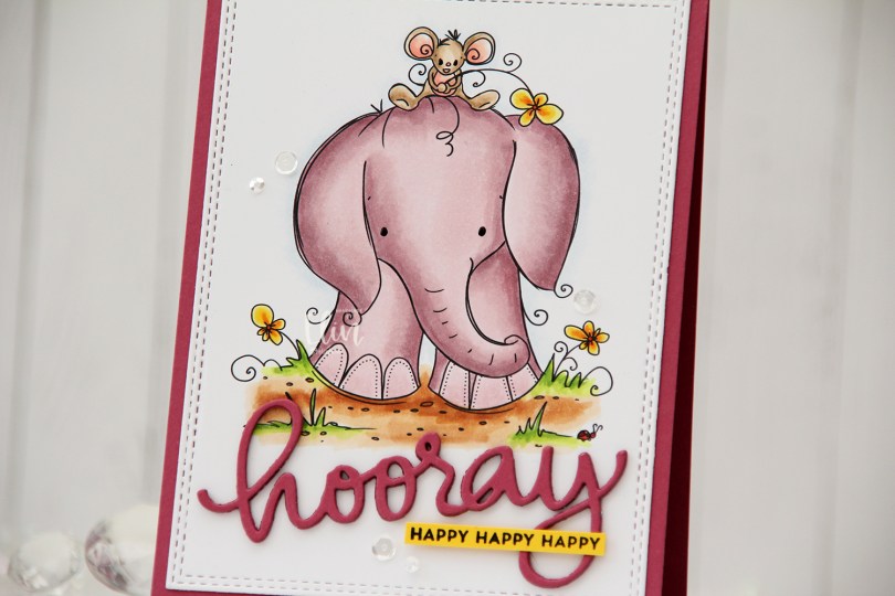
 Aren’t these guys cute? The image is called
  Using the Hooray Script die from Mama Elephant, I die cut the main sentiment from the same color cardstock. I stacked four layers for a dimensional look and stamped a sub sentiment from the Itty Bitty Birthday stamp set from My Favorite Things onto Bright Buttercup cardstock from Papertrey Ink using Obsidian ink from Altenew. To finish off the card I added a few sequins from the Seaglass mix from Simon Says Stamp, as well as a dot of black glaze pen to their eyes.
 A bit of a different color palette for me. Years and years ago, I used the RV90 family a lot, I rarely do anymore. It’s a nice one, though, so I don’t know why I stopped using it. Maybe I should use it more often again.
 Lili of the Valley critters are among the cutest in the stamping world, and I just couldn’t resist these bunnies carrying a big cake. I colored the image with Copics, before die cutting it using the largest die in the A2 Stitched Rectangle STAX die set from My Favorite Things. I adhered the panel to a card base I created from Autumn Rose cardstock from Papertrey Ink.
 I used my Quickie Glue pen on the flames and sprinkled on Rock Candy distress glitter for added sparkle. Using foam tape, I popped up a sticker sentiment from Kort & Godt before finishing off the card with sequins from the White Orchid Sequin mix from Little Things from Lucy’s Cards.
 I colored and fussy cut the sloth, colored in the party hat and fussy cut that, before putting both pieces aside while I worked on the rest of my card. I created a card base from Blue Breeze cardstock from My Favorite Things and created a wall for the sloth to hang onto using Stamper’s Select White cardstock from Papertrey Ink. To create a bit of texture to the wall, I stamped the Touch of Texture background stamp from My Favorite Things using Soft Stone ink from Papertrey Ink. It’s subtle, but still adds a little bit of interest.
 I stamped a sentiment from the Anything-but-Basic Birthday Wishes stamp set from My Favorite Things using Obsidian ink from Altenew, before adding the wall to the card base with 1 mm foam squares. I added the sloth using foam tape and finished off the card with a few Starry Sky Ombré Glitter Drops from Pinkfresh Studio. I also added a dot of Black Glaze pen to his eyes for a bit of shine and dimension, which is easy to see in real life, but tricky to photograph.
 This was initially a very muted, very simple color palette. Let’s just say things changed when I decided to add the party hat 🙂
 I added a bunny to the top of the teacup stack and colored the image with Copics, before fussy cutting, leaving a thin white border around the edge. I used a black glaze pen from Sakura to add shine and a tiny bit of dimension to the bunny’s eyes, then a white dot of Gelly Roll 05 on top of the black, once the black was dry. The glaze pen dries fairly quickly once applied, so I didn’t have to wait long.
 I adhered a panel of Blueberry cardstock from My Favorite Things to my white card base. Using a die in the A2 Double Stitched Rectangle STAX die set, also from My Favorite Things, I die cut a piece of patterned paper from Sunny Studio to adhere on top of the blue. This patterned paper is from the Subtle Grey Tones pack, and it really is subtle.
 I realized I hadn’t made any of my signature clusters in a while, and decided to pull out my die cut scraps of patterned paper and have a play. These patterned papers are from Sunny Studio (more from the subtle grey pack), Kaisercraft (light blue with dots), Papirdesign (dark blue with smaller dots) and Maja Design (pink floral), all die cut using a combination of the Happy Days Ticket Stubs die from XCut and the Fishtail Flag Frames dies from My Favorite Things. I used a mini paper doily from Doodlebug to mat my little clusters, and embellished with sequins from Pretty Pink Posh and Simon Says Stamp.
 The sentiment is from the Coffee and Chocolate stamp set from hÄnglar & Wings, white heat embossed on a strip of the same color cardstock I used for the card front. I then die cut it using one of the dies in the Itty Bitty Banners die set from My Favorite Things.
 The interactive element that I mentioned at the beginning of the post is actually the image. As you can see in this photo, it sits pretty high off the base. The reason for that is that it’s on an action wobble, so it’ll shake and move once you help it along a tiny bit.
 Fairly simple color palette for this one.