
Hi, crafty friends. I have a sweet, simple birthday card to share with you today, featuring Mae from Mo’s Digital Pencil. I love this image, and I’ve used it once before, on this card. I made sure to use a different color palette and different design for today’s card.
 I colored Mae with Copics, opting for one of my go to summer color palettes. There’s something about pink, yellow and orange that just screams summer to me. Once colored, I fussy cut her, leaving a white border around the image. The white border makes her stand out against a colorful background, and with that hair, there’s no way I was cutting right up against the black lines in the image.
 I created an A2 top fold card base from Stamper’s Select White cardstock from Papertrey Ink, and did some ink blending directly on the front. I first used the Watercolor Circle stencil from My Favorite Things and ink blended using Squeezed Lemonade and Mustard Seed Distress inks. I removed the circle stencil, added the Geometric mosaic stencil, also from MFT, and used Spiced Marmalade Distress ink for an orange pattern on top, extending out from the circle a bit. I didn’t think the orange was dark enough, so I went over it with Orange Peel ink from Simon Says Stamp and even added a little bit of Abandoned Coral Distress ink on top to amp up the contrast.
 I mounted Mae on foam tape, before adding a couple of Kort & Godt sentiment stickers, which I also put foam tape on the back of.
 I love dimension on my cards, and by popping up the image and the sentiments, they stand out a little against a fairly busy background.
 To finish the card, I added a few pearls, hearts and gems from the Chrysanthemum mix from Little Things from Lucy’s Cards. I love her mixes, and use them on most of my cards, they add the perfect finishing touch.
![]() Simple color palette.
Simple color palette.
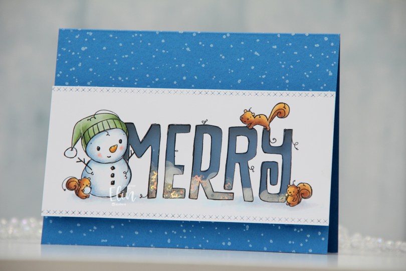

 I colored the image with Copics, then used a craft knife to cut away the insides of the letters. I used a die from the Stitched borders die set from Lawn Fawn to create a defined edge on my colored panel and added a piece of acetate from Simon Says Stamp behind the letters. I’d made sure to keep the counters on the Rs intact when I did my cutting, so I could add them back in once the acetate was in place.
 I used Cornflower cardstock from My Favorite Things to create the shaker well. I doubled up on foam tape and put sequins and confetti from the Icicle Sequin mix from Hero Arts in the well, then adhered the window on top.
 I created a top fold A2 landscape card base using Cornflower cardstock once again. I stamped the Paint Splatter background stamp from My Favorite Things onto the card base using Fresh Snow hybrid ink from Papertrey Ink, and adhered my shaker panel on top. Easy peasy.
 By doubling up on the foam tape, the sequins and confetti have lots of room to shake.
 Super simple color palette for this one.
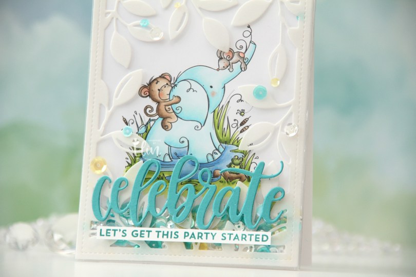
 I actually decided to create a shaker card this time. I colored in the
  I put an adhesive sheet from Altenew on the back of a piece of heavyweight translucent vellum from My Favorite Things, before using the Leafy Cover die from Mama Elephant to die cut a frame to put on my card front. I cut off a couple of leaves where I thought they covered up too much of the image and adhered the rest directly onto the bottom of a large stamp storage pocket from Avery Elle. The storage pocket was just wide enough for my colored panel to fit when I turned it 90 degrees. I trimmed off a tiny bit of my panel (1/16″) so it would be less snug in the pocket, and cut off a couple of inches from the top of the pocket. This way I could put the panel inside the pocket, and there would only be one side of the pocket that needed to be sealed once my shaker bits were in place.
 I adhered my shaker pocket to a top fold card base I created from Stamper’s Select White cardstock from Papertrey Ink. I die cut the sentiment using the Celebrate die from My Favorite Things. I used Caribbean Sea cardstock from My Favorite Things for the top layer and a few layers from white cardstock behind it for dimension. I also stamped a sentiment from the Bitty Birthday Wishes stamp set from My Favorite Things onto white cardstock using Caribbean Sea ink, also from My Favorite Things, turned it into a strip and placed it directly underneath the die cut word. To finish the card, I adhered some sequins from the Seashore mix from Little Things from Lucy’s Cards, as well as from the Seaglass mix from Simon Says Stamp. These two mixes work really well together, and they’re also what I used to fill my shaker.
 Speaking of, here they are. Full shaker cards are fun, and I’d say they’re a lot easier to create than regular shaker cards, where you need to create dimension for the shaker bits to shake around.
 The storage pocket works so well as a shaker pouch, and because of it, it gives everything a bit of a lift off the card. It looks like the vellum and the die cut sentiment both float on top, even though they’re both adhered directly to the pocket.
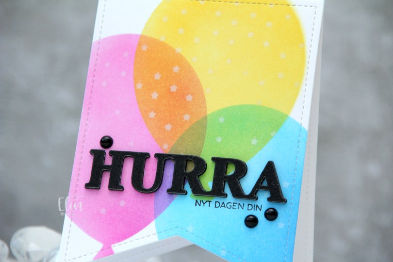
 I used a banner die with faux stitching to create a shaped card. This banner die is about 4″ wide, making it the perfect size for a decent size card. I used partial die cutting to create the card base, but die cut a separate piece that I used for my ink blending, which I then adhered to the card base once finished.
 I used the Big Balloon stencil set from My Favorite Things to create my balloons, and used Distress Inks for my ink blending. Faded Jeans, Mermaid Lagoon and Salty Ocean for the blue balloon, Picked Raspberry for the pink balloon and Mustard Seed and Squeezed Lemonade for the yellow balloon. Where they overlap, they create new colors, which is half the fun of ink blending, right? With the balloon stencil still in place, I added the Falling Stars stencil from Simon Says Stamp on top and ink blended white stars onto the balloons using Fresh Snow hybrid ink from Papertrey Ink.
 I stamped a sentiment onto the front using Obsidian ink from Altenew and added a stacked die cut HURRA above it. I layered six black die cuts, before adding this glitter one on top and finished off the card with a few black pearls.
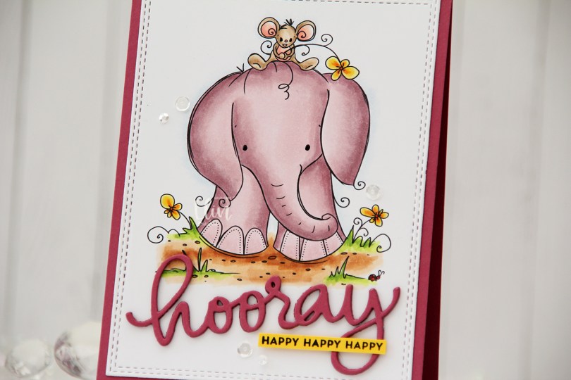
 Aren’t these guys cute? The image is called
  Using the Hooray Script die from Mama Elephant, I die cut the main sentiment from the same color cardstock. I stacked four layers for a dimensional look and stamped a sub sentiment from the Itty Bitty Birthday stamp set from My Favorite Things onto Bright Buttercup cardstock from Papertrey Ink using Obsidian ink from Altenew. To finish off the card I added a few sequins from the Seaglass mix from Simon Says Stamp, as well as a dot of black glaze pen to their eyes.
 A bit of a different color palette for me. Years and years ago, I used the RV90 family a lot, I rarely do anymore. It’s a nice one, though, so I don’t know why I stopped using it. Maybe I should use it more often again.
 I actually made a 4 Bar card this time, which is a smaller size than my regular A2 cards. It’s 3 1/2 x 4 7/8″ and it’s basically a one layer card. I admit I added my panel to a card base, but I don’t like working directly on my card base, and Copics bleed through most cardstocks. I don’t want my coloring to be visible from the inside of the card, and adhering the full size panel to the card keeps that from happening.
 I colored the image with Copics and added a watercolor circle around it to fill in some of the white space on the card. There’s still plenty of white space left. I added a sentiment from the stamp set and finished off with a couple of sequins from the Seaglass mix of sequins from Simon Says Stamp.
 Super simple color palette to go with this super simple card.
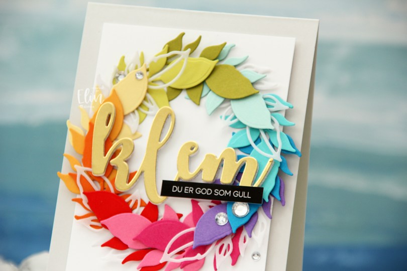
 Kort & Godt Die 335 is a die set with two leaves. One is an open outline, the other closed, and I actually used both for this card. I die cut the open one a few times from Heavyweight Translucent vellum from My Favorite Things, and nestled them in between the solid colored ones, which are (in order from the top going clockwise) Papertrey Ink (PTI) Simply Chartreuse, PTI Aqua Mist, PTI Hawaiian Shores, Simon Says Stamp Island Blue, PTI Amethyst Allure, PTI Raspberry Fizz, PTI Hibiscus Burst, Concord & 9th Poppy, PTI Orange Zest, PTI Summer Sunrise, PTI Harvest Gold, PTI Limeade Ice.
 I lightly traced a circle die onto a white cardstock panel that I needed to adhere my wreath to. I only glued down the end of the stem for each of the leaf die cuts and did my best to arrange them evenly around the circle, with the vellum pieces after every third colored leaf.
 Using foam tape, I adhered the white panel with my wreath onto a card base I created from Soft Stone cardstock from Papertrey Ink for a neutral on neutral look.
 Using Kort & Godt DIE 244, I die cut the word klem (translation: hug) from gold cardstock (Gold Shine cardstock from My Favorite Things), as well as four additional ones from white cardstock to stack behind the gold for added strength and dimension.

 I decided to cut off about half of the bench. Since I’m only using one of the kids, I didn’t need the whole thing. If you want, there’s also a
  I adhered my panel directly to a card base I created from Green Parakeet cardstock from Papertrey Ink. I stamped a sentiment from Norsk Stempelblad AS onto a strip of the same color cardstock using Green Apple ink from Simon Says Stamp and put the sentiment aside while I worked on the rest of my card.
 I die cut the word hipp 8 times from Tropical Teal cardstock from Papertrey Ink using a die from Kort og Godt, and created two stacks of four each for a dimensional look. I adhered my stacked die cuts to the card and put the green cardstock strip on top of the bottom hipp.
 To finish off the card I added a few enamel dots from Papirdesign. I decided to go for orange ones to pick up the color from the little boy’s ice cream.
 It’s a fairly simple card, but the clouds add a little something to the white space, and the die cuts and dots add dimension.
 For such a small image, I used a lot of colors.
 My last holiday card was blue, so I needed a new color. Green to the rescue, with a little bit of “gold” and a touch of pink. Somehow, I think it works.
 I printed the image twice: once onto X-Press It blending card, which is what I use for all my Copic coloring, and once onto Stamper’s Select White cardstock from Papertrey Ink. I wanted to fussy cut my colored image right up against the lines, but Rachelle’s images come with these great squiggly lines that I didn’t want to lose, they add such a unique look. By printing twice, I could mount my colored piece onto the other one and maintain the wonderful linework.
 For the background, I ran my printed white cardstock through my die cutting machine using the Magic Snow Cover die from Mama Elephant, which adds a nice faux stitch snow flurry look. I used an embossing mat to make the details stand out even more, then adhered my white panel to a white cardbase and mounted the colored image using 1 mm foam squares – I wanted a little bit of lift, but not too much dimension.
 I then used the sentiment from the Let It Snow die set from Mama Elephant to die cut 5 times from Meadow cardstock from Hero Arts. Before die cutting, I colored one of the pieces with my G46 Copic marker to better match my coloring, stacked the five layers together with the colored one on top and added the stacked die cut sentiment to the card.
 I finished off the card with a few sequins. These are a mix of Sparkling Clear sequins from Pretty Pink Posh and select sequins from the Sea Glass mix from Simon Says Stamp.
 I used my favorite green combo AND my favorite “holiday pink” combo for this card. I hope they inspire you.
 I added a bunny to the top of the teacup stack and colored the image with Copics, before fussy cutting, leaving a thin white border around the edge. I used a black glaze pen from Sakura to add shine and a tiny bit of dimension to the bunny’s eyes, then a white dot of Gelly Roll 05 on top of the black, once the black was dry. The glaze pen dries fairly quickly once applied, so I didn’t have to wait long.
 I adhered a panel of Blueberry cardstock from My Favorite Things to my white card base. Using a die in the A2 Double Stitched Rectangle STAX die set, also from My Favorite Things, I die cut a piece of patterned paper from Sunny Studio to adhere on top of the blue. This patterned paper is from the Subtle Grey Tones pack, and it really is subtle.
 I realized I hadn’t made any of my signature clusters in a while, and decided to pull out my die cut scraps of patterned paper and have a play. These patterned papers are from Sunny Studio (more from the subtle grey pack), Kaisercraft (light blue with dots), Papirdesign (dark blue with smaller dots) and Maja Design (pink floral), all die cut using a combination of the Happy Days Ticket Stubs die from XCut and the Fishtail Flag Frames dies from My Favorite Things. I used a mini paper doily from Doodlebug to mat my little clusters, and embellished with sequins from Pretty Pink Posh and Simon Says Stamp.
 The sentiment is from the Coffee and Chocolate stamp set from hÄnglar & Wings, white heat embossed on a strip of the same color cardstock I used for the card front. I then die cut it using one of the dies in the Itty Bitty Banners die set from My Favorite Things.
 The interactive element that I mentioned at the beginning of the post is actually the image. As you can see in this photo, it sits pretty high off the base. The reason for that is that it’s on an action wobble, so it’ll shake and move once you help it along a tiny bit.
 Fairly simple color palette for this one.