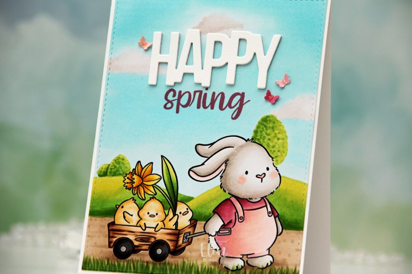
Hi, crafty friends! We’re almost a month into spring already, and it’s starting to feel like it, even though we had a bit of sleet earlier in the week. I haven’t seen anything starting to bloom yet, but I’m actively on the lookout for Coltsfoot, which is the first flower to pop out to greet the sun in the spring. On today’s card, however, spring is more advanced, and the cute Bunny and Besties stamp from Purple Onion Designs are taking a stroll through a wonderfully green landscape.
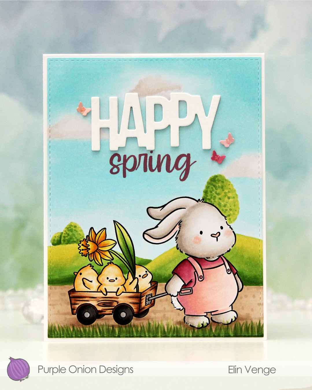 I colored the image with Copics, adding a simple free hand background of a couple of hills with a few trees, a path for the bunny to walk on and some blades of grass in front. My original plan wasn’t a scene at all, I had planned to add a big Happy Easter die cut, but changed my mind and added the hills and sky instead. I think this looks better than what I had planned.
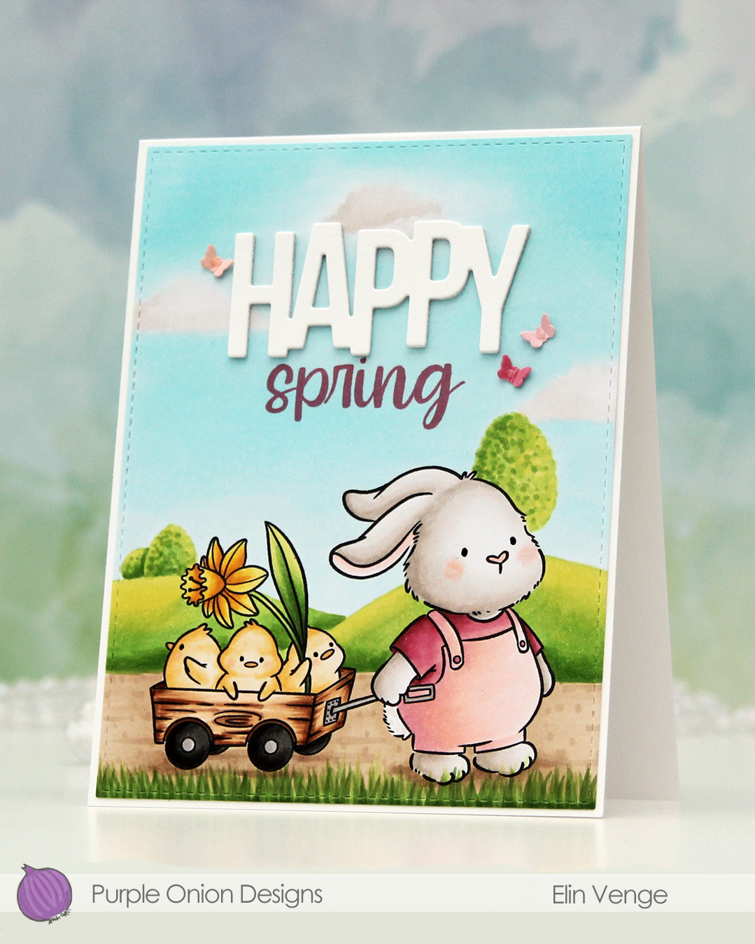 I used the largest die in the A2 Stitched Rectangles STAX 1 set from My Favorite Things to create a little bit of interest along the perimeter of my panel. I stamped the word spring from the Happy hello sentiment set using Autumn Rose ink from Papertrey Ink to match the bunny’s shirt. I also used a Glaze pen from Sakura to create some shine (and a tiny bit of texture) to the eyes.
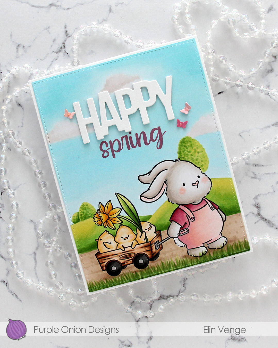 I die cut the word HAPPY from the Birthday Script die set from Kristina Werner three times from Stamper’s Select White cardstock from Papertrey Ink (the same cardstock that I used for my card base, I love this cardstock) and stacked them. I adhered my stacked word above the stamped spring to complete my sentiment.
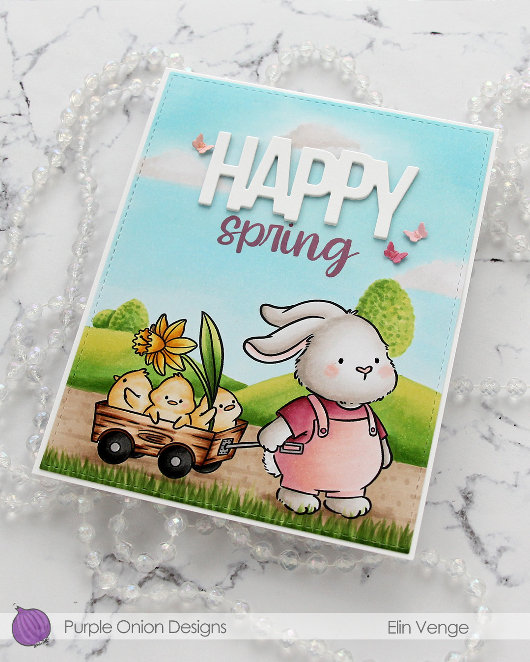 I decided to die cut tiny butterflies to use for embellishment. I didn’t have any cardstock in the color I wanted, so I colored scraps of X-Press It blending card with the same colors I used for the bunny’s outfit, before using the butterflies die from the Greenhouse Greetings die set from Concord & 9th (it’s a die set from the 2024 C9 summer camp). I scored my tiny butterflies down the body, adhered each of them with a tiny bit of glue and added Rosewater Jewel Drops from Tonic on the bodies of the butterflies to finish.

I used quite a few Copics for this one.

 I created a white card base from Stamper’s Select White cardstock from Papertrey Ink, and on the left side of the card, between the center and the bottom, I placed a circle I die cut from the Watercolor Wishes paper pack from Lawn Fawn. I cut off the piece of the circle the left of the fold, I actually created a side fold card this time. I die cut a leaf cluster from heavyweight translucent vellum from My Favorite Things using a die from Kort & Godt, and I also die cut for you from the Sweet Sentiments die set from Altenew from Berry Sorbet cardstock from Papertrey Ink. I stacked four die cuts for each of the words, so they’d stand out on my card. I put foam tape on the back of my colored vase, added the vellum behind it and adhered it to my die cut patterned paper circle. The vellum leaves are only adhered to the card behind the vase, the rest is floating. I added my die cut sentiment and finished off the card by adding Nuvo Jewel Drops in the Limoncello color to the yellow berries in my vase.
 Super simple color palette for this one.
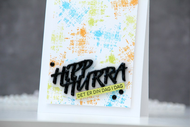
 I started by creating a colorful background. Using one of the stamps in the M479 stamp set, I stamped repeatedly across the background using Distress Oxide inks in the colors Salty Ocean and Twisted Citron, as well as regular Distress ink in Spiced Marmalade. I cut the panel down to be 3 1/2 x 4 7/8″ and mounted it to a white top fold card base using foam tape.
 Using the DIE294 die set, I die cut 8 layers of the words from True Black cardstock from Papertrey Ink and one shadow layer using heavyweight translucent vellum from My Favorite Things. I stacked three of the black layers, added the vellum layer on top and then the last five black layers. I even added a coat of Nuvo Crystal Drops in the Ebony Black color to the top layer for extra dimension and shine. On a piece of Limeade Ice cardstock from Papertrey Ink, I stamped a sentiment from the M458 stamp set using Obsidian ink from Altenew, before adhering both the stacked die cut and my stamped sentiment strip at an angle, before finishing off the card with a couple of crystals (BE107). And that’s a wrap for my first DT card for Kort & Godt – I can’t wait to play more, and hope this inspired you.
 Three same, but different gift tags using all the gingerbread people in the stamp set. I created the tags themselves using dies (two of them are actual tag dies, I used the topper from the ornament die set to create a topper for the heart to create a tag from that too). I used the Itty Bitty Gifting stamps and the Itty Bitty Strips dies, both from My Favorite Things, for all my to/from strips.
 I used Classic Kraft and Stamper’s Select White cardstock for most of my die cutting, both from Papertrey Ink. For the ornament I also used a piece of silver cardstock from Rayher. I did all my Copic coloring on 120 lb white cardstock from Simon Says Stamp. This isn’t the cardstock I normally use with my Copics, but it’s great for one layer cards and elements that you can see the back of, because the markers don’t bleed through. Getting smooth color blends with Copics is trickier on this cardstock than my beloved X-Press It blending card, but the thickness saves me from having to fussy cut each of those gingerbread twice to cover up any bleed through. It’s worth the trade off, I think.
 For the yellow one, I used the Snøfnugg, stor die from Papirdesign to create the snowflake tag. I added Nuvo Jewel Drops in the Key Lime color to the green buttons on the belly, and used a couple of pearls from the Igloo mix from Little Things from Lucy’s Cards for a little bit of embellishment. I put a piece of Divine Twine in the Lemon color through the hole at the top, making it easy to add to a gift.
 For the pink one I used the Hjerte 3 die from Papirdesign to create the tag (and the Julekule die to create the hole at the top). The sequins are from the same Igloo mix that I used for the yellow, and I also added Jewel Drops in the color Key Lime to the buttons on her belly. The twine is Divine Twine in the Cotton Candy color.
 And finally the green one. I used the Julekule die set from Papirdesign to create the actual tag, Nuvo Jewel Drops in the Limoncello color for the star on his sweater, and green dots from Papirdesign to embellish. The twine is Divine Twine in the color Green Apple.
 Very simple color palette for these.


 I stamped the word happy repeatedly in a column on a piece of X-Press It blending card, stamped birthday close to the bottom and colored in all the individual happy words using Copics.
 I trimmed my panel down significantly, before adding plenty of foam tape to the back of it and mounting it to a card base I created from Soft Stone cardstock from Papertrey Ink.
 I wanted to add even more dimension by having one of the happy words popped up, but the letters are so narrow, they were too tricky to put foam tape on the back of. I decided to add dimension in another way by covering the green letters with Nuvo Jewel Drops in the color Key Lime. It makes the happy slightly raised and also gives it some shine.
 Clean, simple, colorful – what more could you want from a card?
 Lots of Copics used for this one.
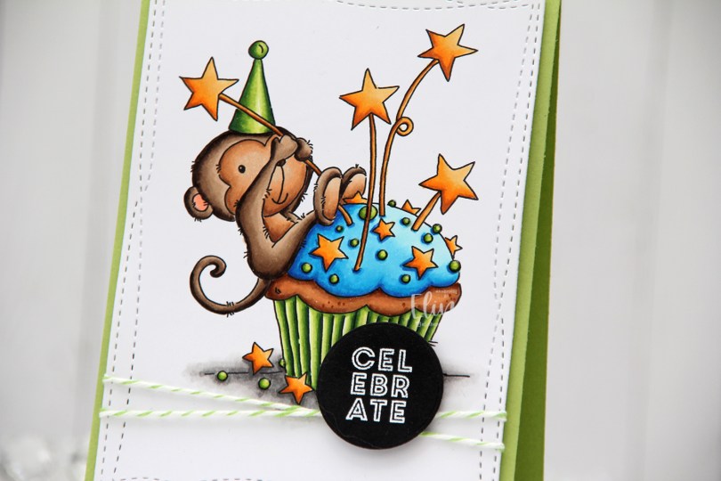
 I love this image, and I went with bright, bold colors for my Copic coloring, before using the largest of the Wonky Stitched Rectangle STAX dies from My Favorite Things to create some interest to the edges of the panel.
 I wrapped some Green Apple twine around my panel twice and tied a knot, and adhered the panel to a card base I created from Sour Apple cardstock from My Favorite Things. The twine adds a little bit of dimension behind the panel, so I put some extra layers of cardstock and some foam tape behind it to make the layer even.
 I stamped and white heat embossed a sentiment from the Mini messages stamp set from Mama Elephant on a scrap of black cardstock from Papertrey Ink and die cut it with a circle die from Lifestyle Crafts. I adhered the circle on top of the knot of my twine and put a double layer of foam tape behind it for extra dimension.
 I added Nuvo Jewel Drops in the color Key Lime to the green sprinkles. It doesn’t show up very well in the photos, but it adds a little bit of shine and dimension in real life. Using Sour Apple ink from My Favorite Things, I stamped the Number Jumble background stamp from My Favorite Things to the flap of the envelope, which is a Limelight envelope from My Favorite Things.
 Bright, happy colors for this one. I hope you have a great weekend!
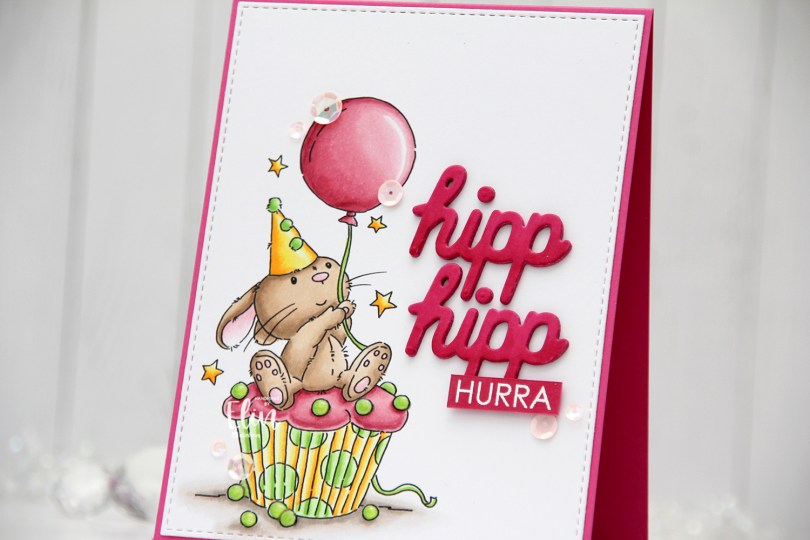


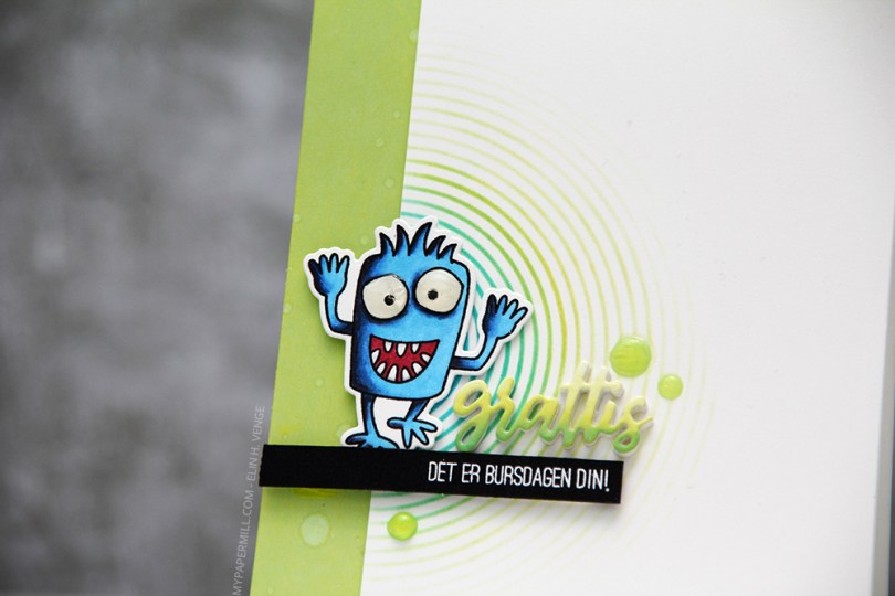
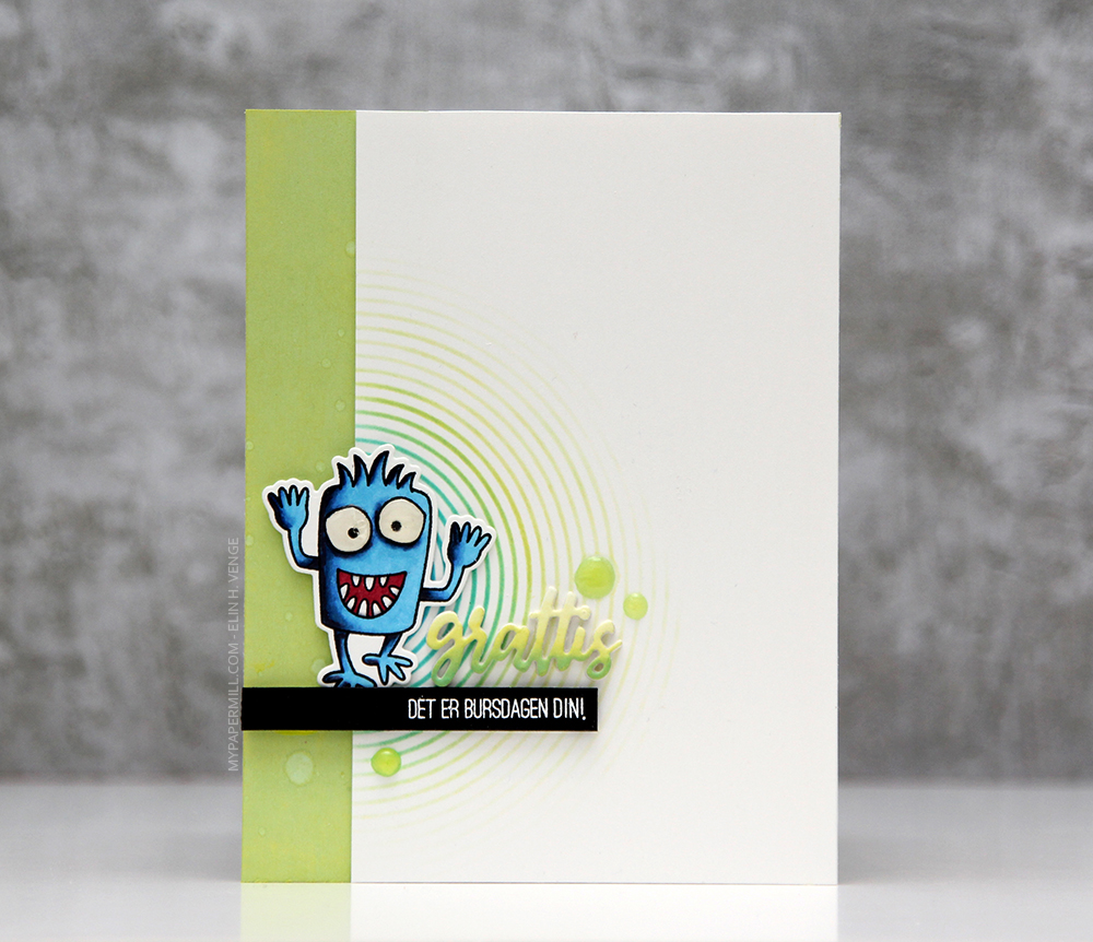 Jeg stemplet et av monstrene fra
 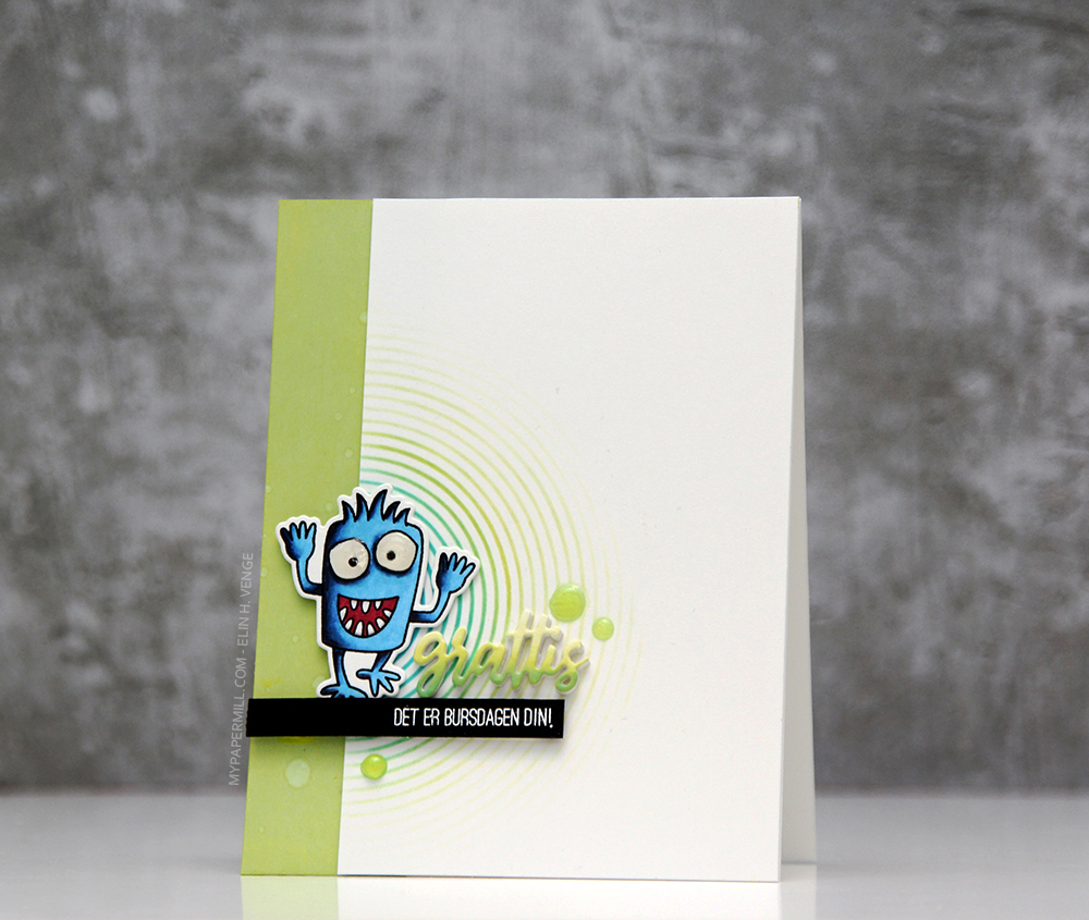 Jeg svertet Distress Oxide-blekk i fargen
  Jeg stemplet en tekst fra
 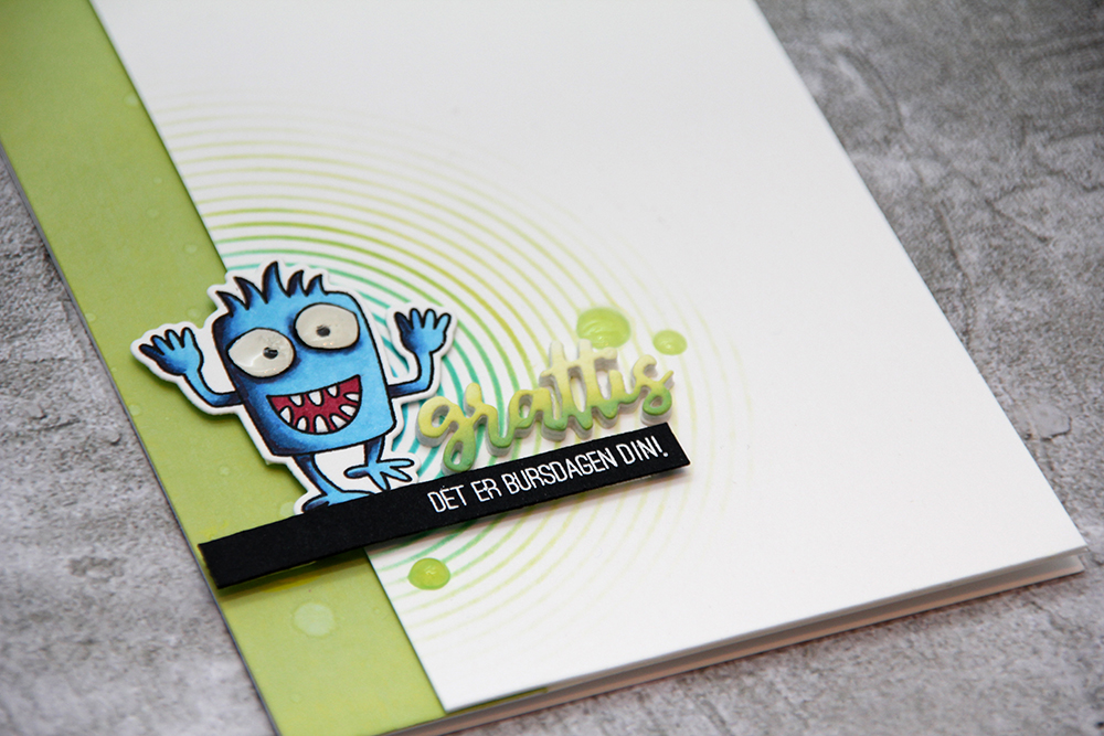 Til slutt pyntet jeg enkelt ved å legge på noen dråper Nuvo Jewel Drops i fargen Key Lime rundt teksten. Jeg liker veldig godt å lage kort der alle elementene på kortet er samlet på ett sted. Da får man enkelt fokus på riktig sted, man får masse ledig plass som gjør at kortet får et rent og enkelt uttrykk, og man sprer ikke møkka, som jeg så fint pleier å si 😉
 Jeg stemplet robotene med Extreme Black blekk fra My Favorite Things på en kortbase av 120 lb Ultra Thick White kartong fra Simon Says Stamp. Kartongen er veldig tykk og laget på en måte som gjør at fargeleggingen ikke vises fra baksiden, som er veldig praktisk når man skal lage ettlagskort. Jeg sørget for at ca halvparten av hver robot faktisk ikke fikk plass på kortet, jeg syns det var en morsom vri.
 Fargeleggingen er veldig enkel, jeg har faktisk holdt meg til åtte tusjer (selv om den ene fargen ikke vises i oversikten under her, den har jeg nemlig laget selv)! Da jeg var ferdig med begge robotene stemplet jeg en tekst fra Norsk Stempelblad AS mellom dem med VersaFine Onyx Black blekk og embosset med klart embossingpulver.
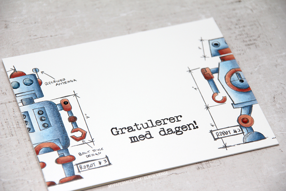 Her vises effekten man får med embossingen, teksten blir hevet og blank. På flere av boltene og øynene til robotene la jeg på Glossy Accents og Nuvo Crystal Drops i fargen Granite. LITT pynt må man jo ha, selv på et meget enkelt herrekort.
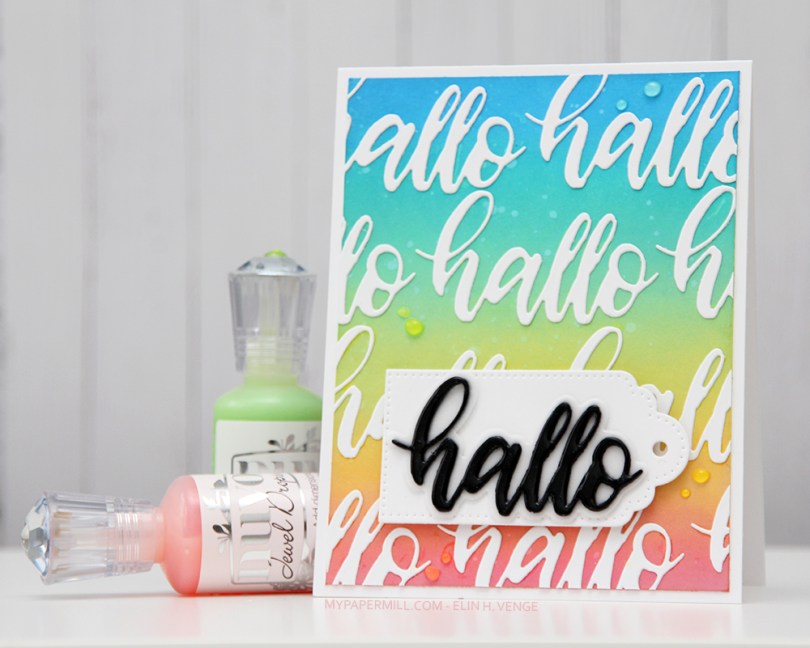
 Jeg svertet Distress Oxide (Picked Raspberry, Fossilized Amber, Twisted Citron, Cracked Pistachio, Peacock Feathers og Salty Ocean) på et panel Stamper’s Select White kartong og sprutet litt vann over. Jeg stanset ut den superkule hallo-dieen til Papirdesign flere ganger i den samme hvite kartongen og limte dem på det svertede panelet før jeg limte det til kortbasen min.
 Jeg stanset ut et par halloer til i svart kartong og limte dem oppå hverandre for litt dimensjon, med skyggen stanset ut i vellum under. Jeg dekket det svarte først med et strøk Wink of Stella, så et tykt lag Glossy Accents, før jeg limte det hele på den hvite tagen min, som igjen er satt på resten med 3D-teip.
 Jeg pyntet det hele veldig enkelt med Juvo Jewel Drops i Fargene Rosewater, Limoncello, Key Lime og Sea Breeze.