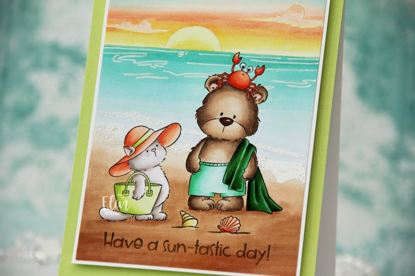
Hi, crafty friends. I probably shouldn’t have favorites, but I do, and this card is my favorite I’ve made with the Sunshine & Daydreams collection from Purple Onion Designs, beautifully illustrated by Pei. It features Beach Besties, and I paired them with the Sunrise Sunset horizon stamp from an older collection from Stacey Yacula.
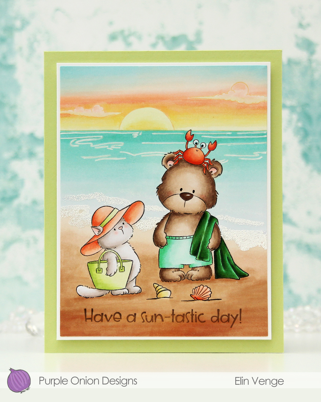 I stamped Tofu and Brownie in Extreme Black ink from My Favorite Things, placed a mask over top and stamped the Sunrise Sunset with Altenew Golden Honeycomb ink. I colored in my scene and decided to try a new twist for the sky. I don’t think I’ve ever used these particular color for a sky before, but I think it worked out well.
 I imagine they’re in a tropical location where the ocean has this very peaceful aqua color that fades into nothing as it reaches the shore. I tried to give the whole panel a dreamy vibe, and there’s not a whole lot of dark markers used. I did include a dark green towel and used more of the YR09 on the crab than I did on Tofu’s hat (believe it or not, it was used on Tofu’s hat, albeit in a very small amount). The greens play well together and work with the ocean, while the more corally color for the hat, seashell and crab play off the peach in the sunset.
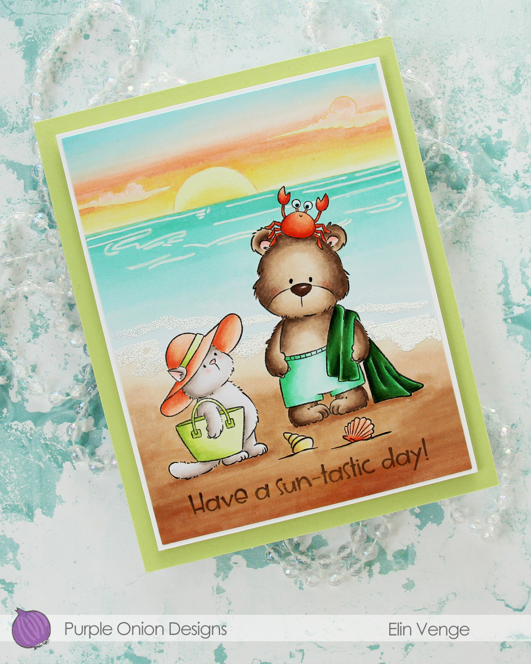 Once my image was colored, I cut my panel down using the larges die in the Additional A2 Layers die set from Waffle Flower. I stamped a sentiment from the Sunshine & Rainbows sentiment set using second generation stamping with Memento Espresso Truffle ink. For these scene cards I create for Purple Onion Designs, I prefer a colored sentiment that doesn’t stand out too much from my scene, and second generation stamping is a good way to achieve that look.
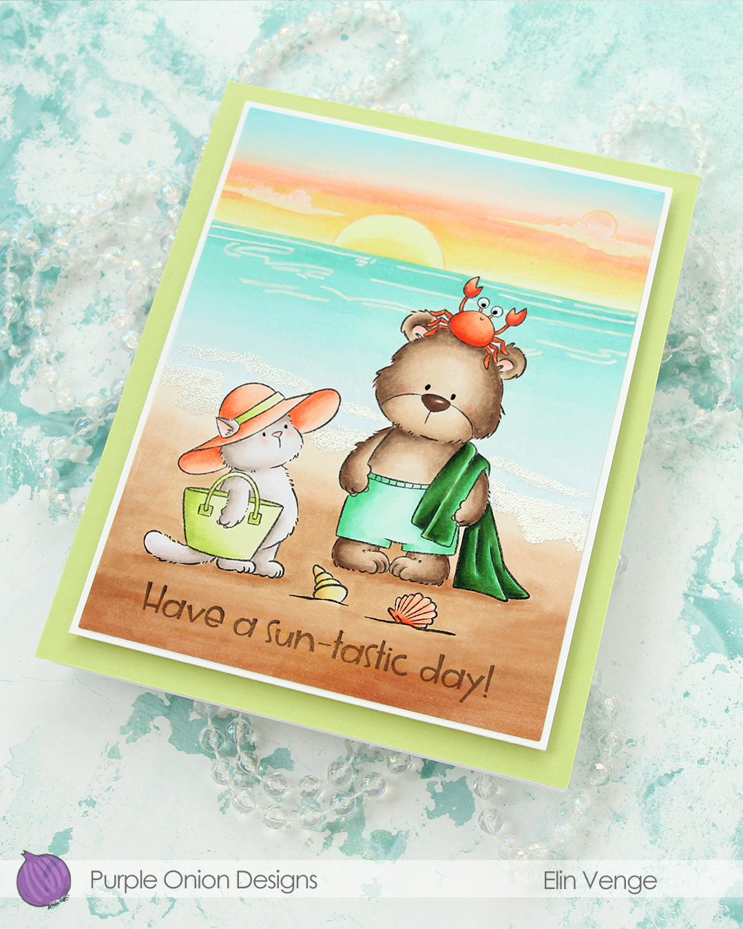 I used an extra fine point white Sharpie to add the ripples in the ocean, and used White puff embossing powder from Wow! to create the seafoam on the beach. I added a bit of black glaze pen to their eyes, and the glaze made the crab’s eyes bigger, which made him even funnier than he was originally. I adhered my colored piece to a panel of white cardstock cut to 4 1/4 x 5 1/2″, then mounted the whole thing onto a 4 3/4 x 6″ white card base covered with a panel of Sprout cardstock from Concord & 9th.
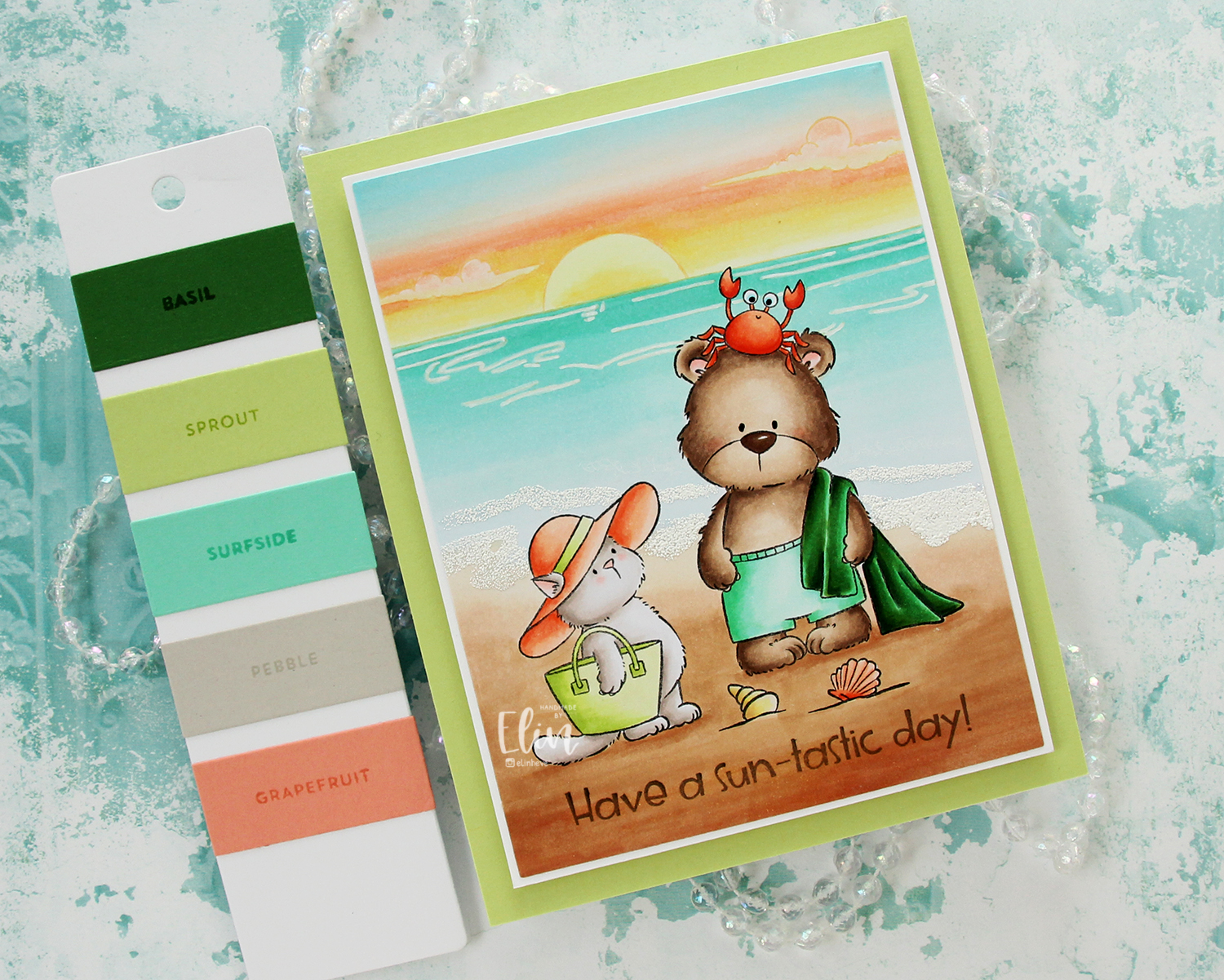
The color palette I wanted to focus on was the Garden gate palette from Concord & 9th. It’s very summery, and I love these colors together!
 Speaking of colors, I used a ton of Copic colors for this card. By the time I had colored the sky, I’d already used 11 colors; they add up fast!
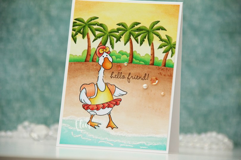
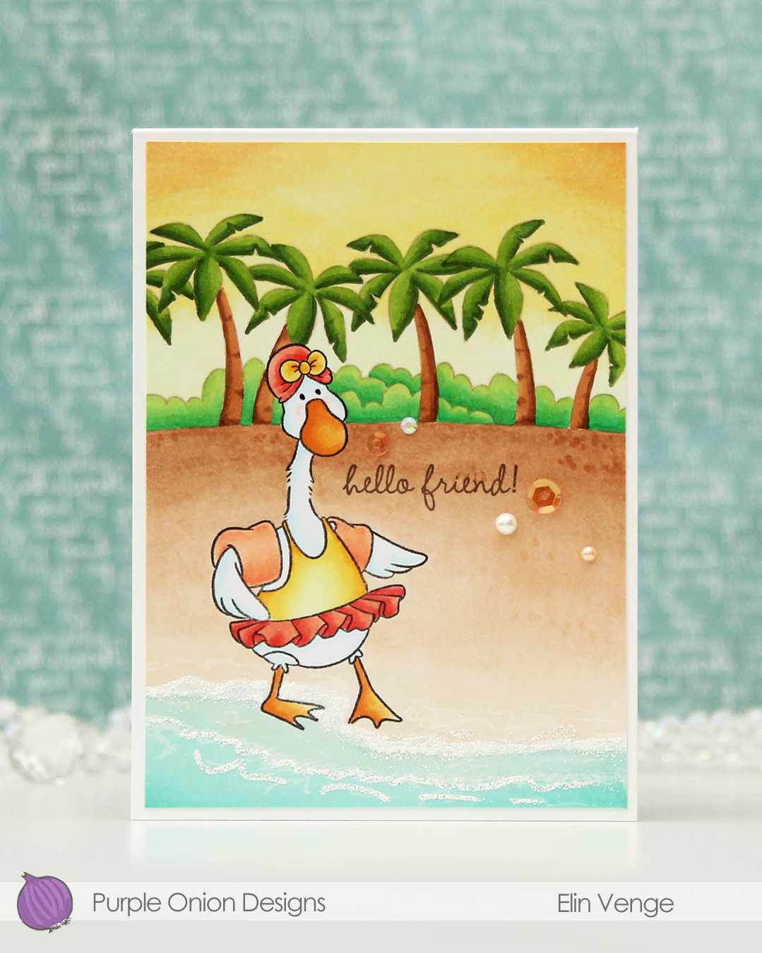
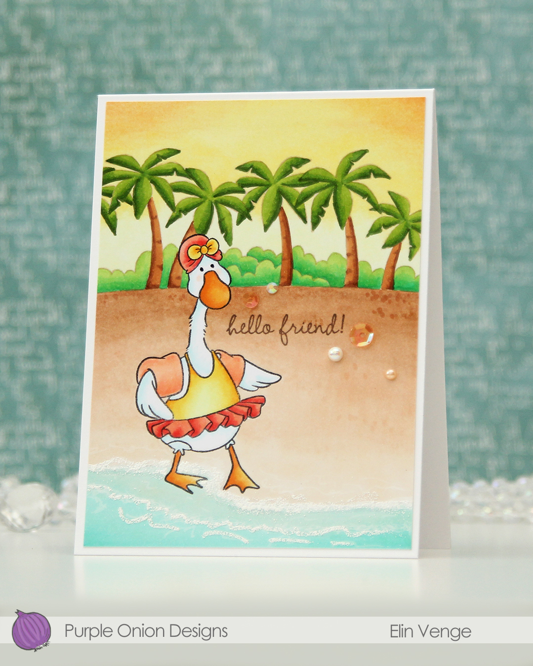
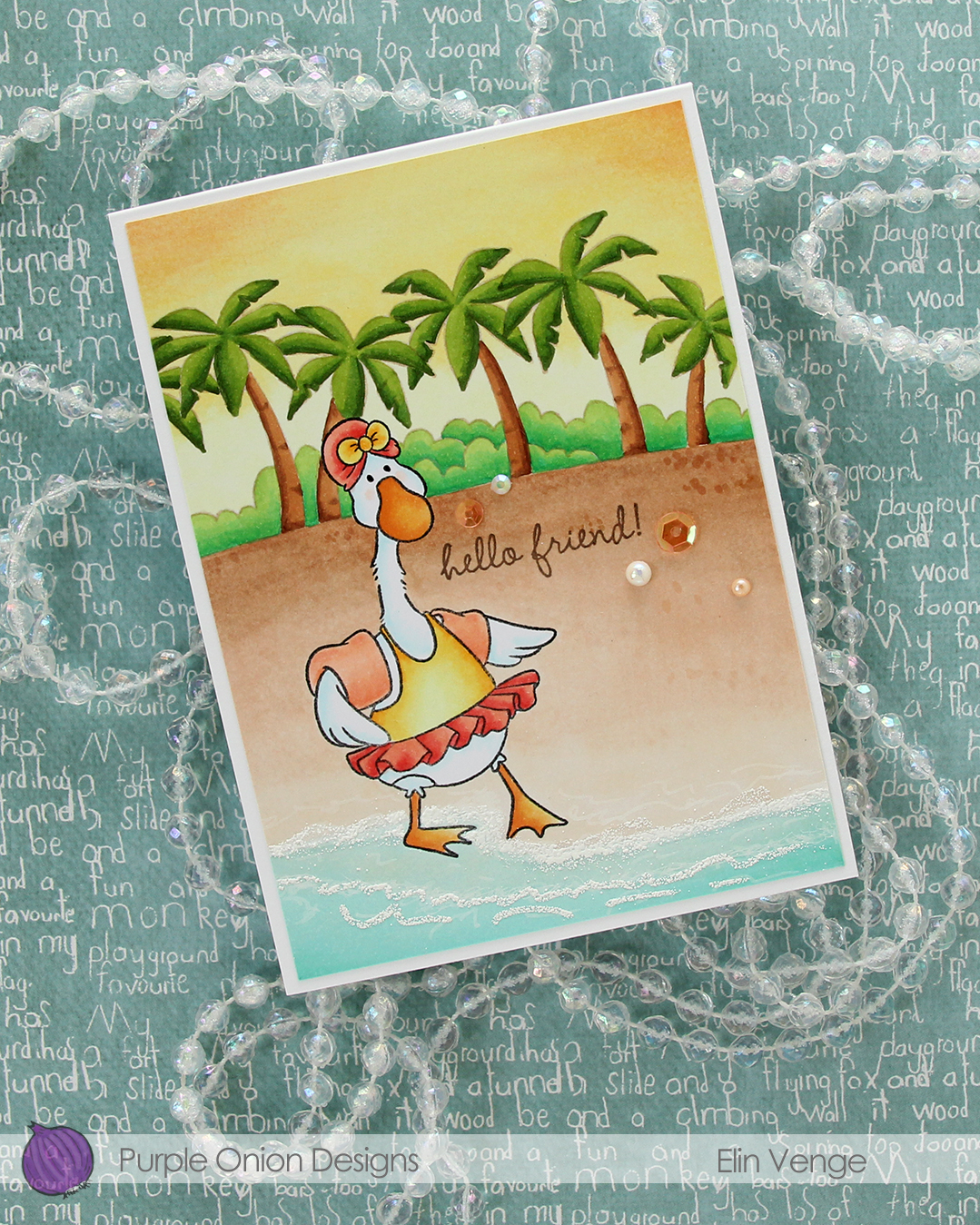 I added White puff embossing powder from Wow! for a seafoam look near the bottom of my panel and stamped a sentiment from the much older
 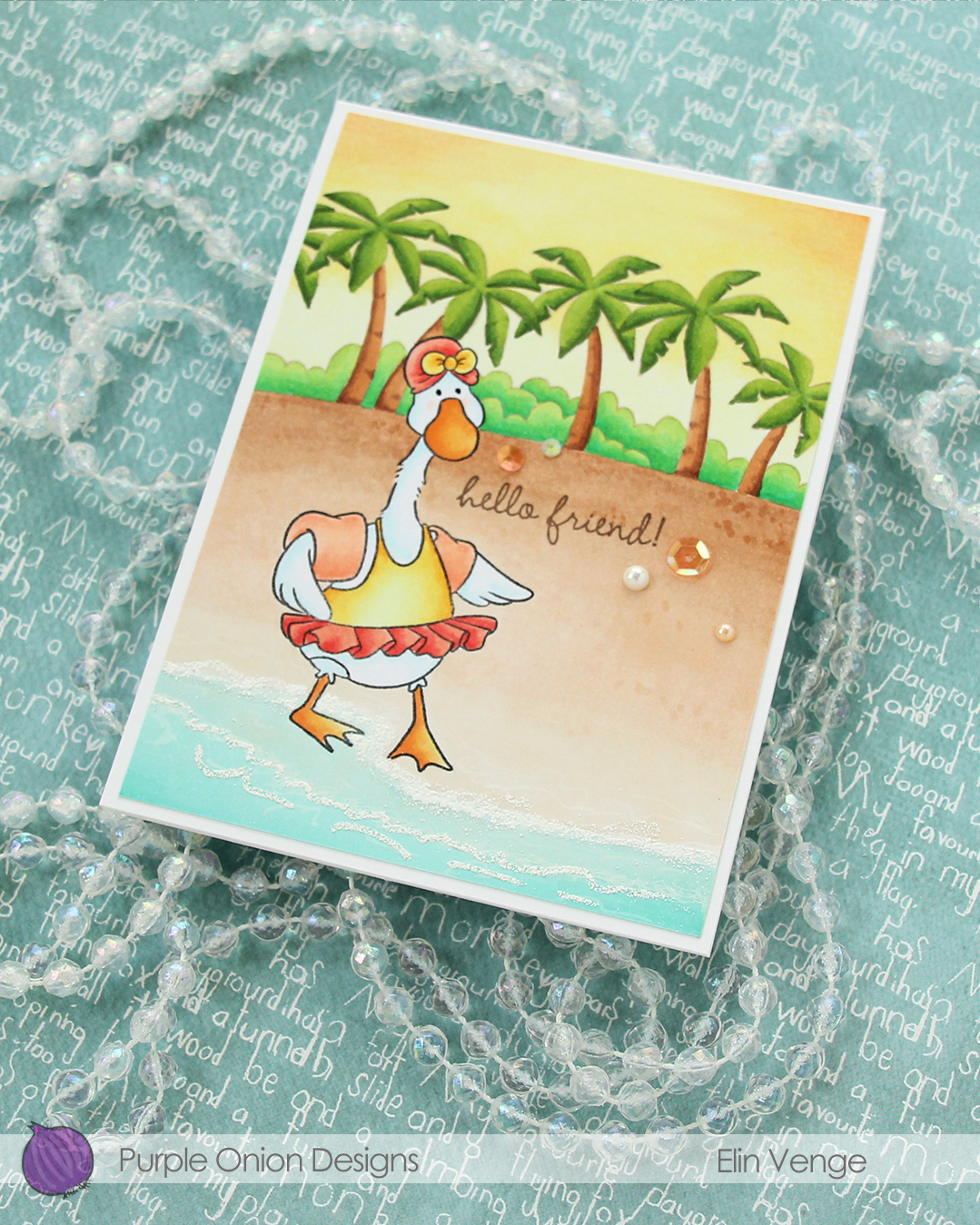 To finish off the card, I added a few sequins, gems and pearls from the Melon embellishment mix from Little Things from Lucy’s Cards.
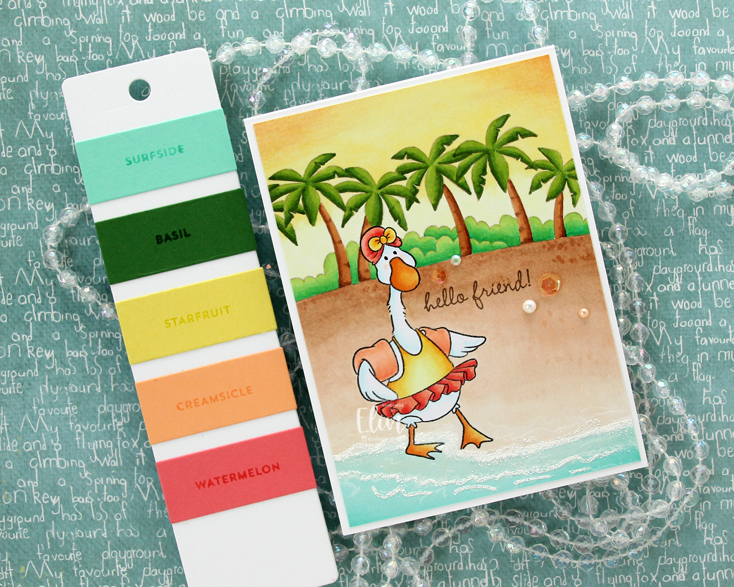 This Tropic color combination from Concord & 9th was my inspiration for this card.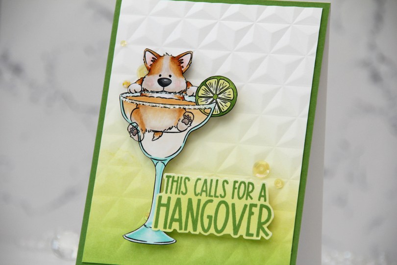
 I knew I had to color up this image as soon as I saw it. This is so adorable with the corgi hanging off the top of the glass. And so funny, and very typical of Pei’s illustration style. I love it!
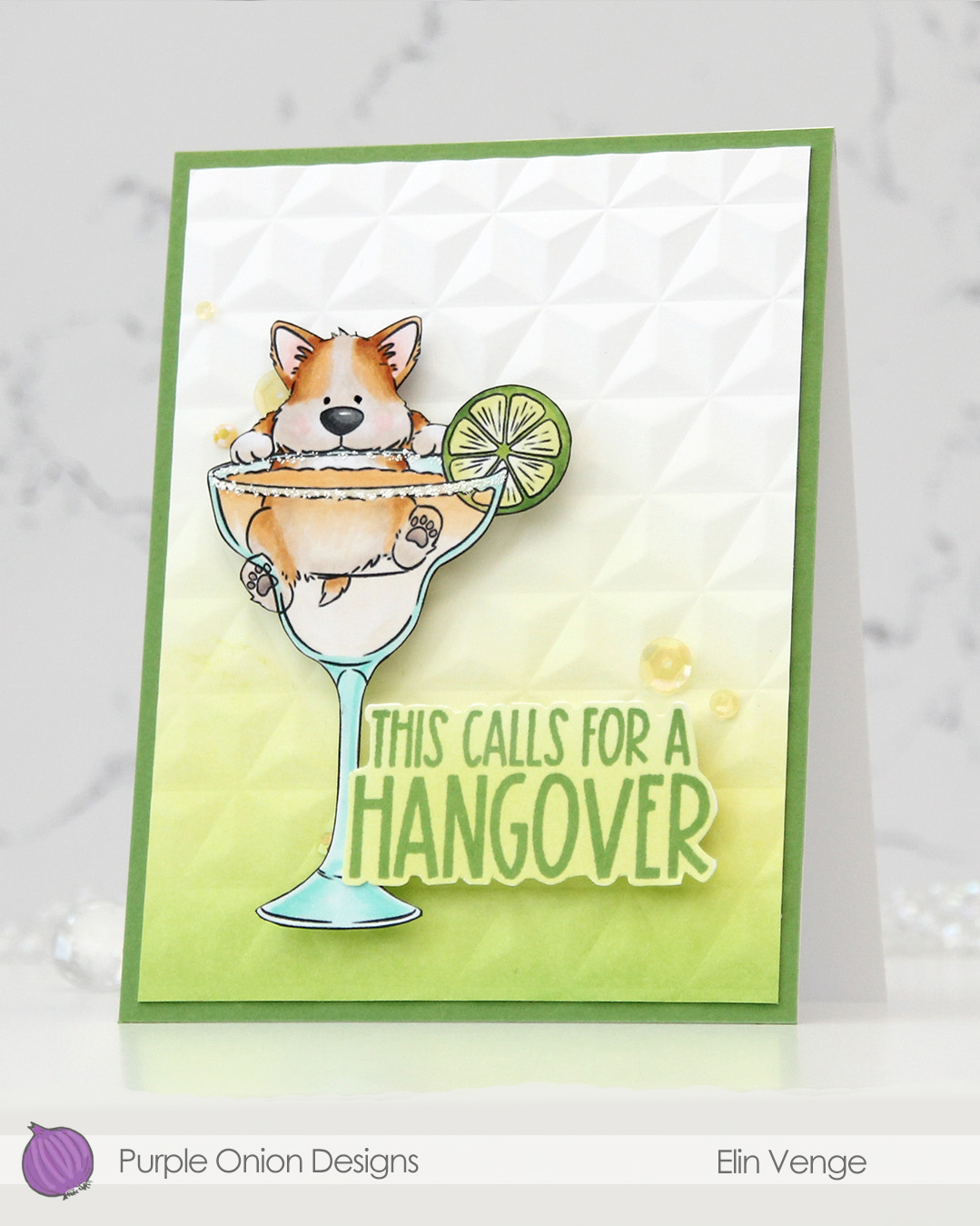 I colored the image with Copics, fussy cut him, then added VersaMarker pen to the rim of the glass and used white puff embossing powder from Wow! to mimic a salt rim. The embossing also adds some fun texture to the glass. I also used a black glaze pen to add a little bit of shine and dimension to his eyes.
 I ink blended Parsley and Starfruit inks from Concord & 9th onto a white cardstock panel for an ombré effect, then used the Geometric embossing folder from WRMK to create some subtle dimension. I added the panel to a card base I’d covered with Parsley cardstock from Concord & 9th, before mounting the image using foam tape.
 In this release there are also a few sentiment sets, and this one from the
  Simple color palette for this one. This was so fun to color!!!
