 The last two weeks of April were very busy for me. I had plenty of orders for cards, and anyone who’s ever met me knows that my cardmaking process is painfully slow. I did, however, manage to make five cards in two weeks, that’s a LOT for me. This was the first one that I completed.
 The order for this one and the wedding card I posted on Sunday came in on the same day. Naturally, I started with the wedding card since the wedding was Saturday and this lady’s birthday is today. I was working steadily on the wedding card when I got a phone call a Tuesday night way back in April. Could I have this birthday card finished by Thursday?? I had to put my wedding project on hold, and actually managed to make this card with the little time I had from Tuesday to Thursday. Apparently, the woman receiving this card likes purple, a lot of embellishments and has a good sense of humor. Try incorporating all those aspects into a card when you’re on a tight deadline…
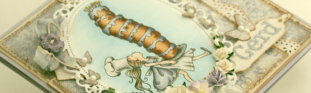
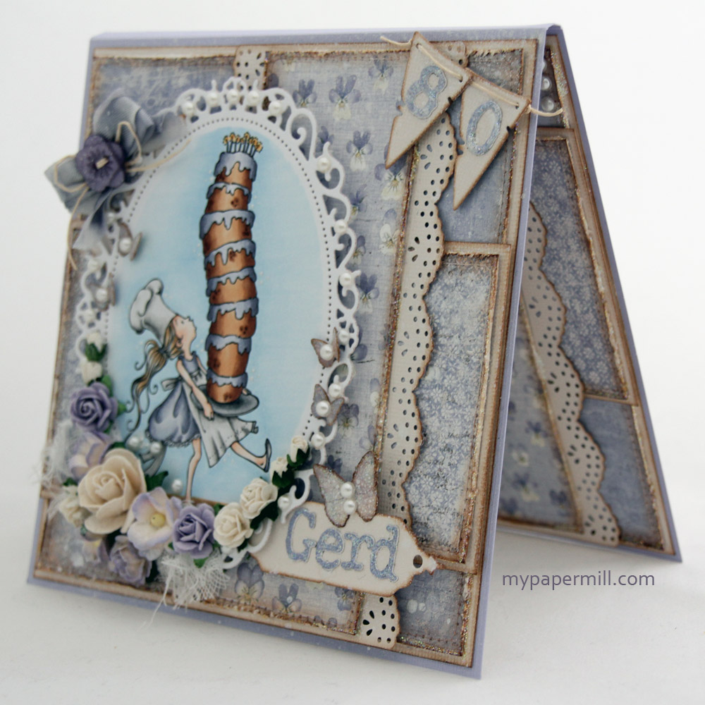
 I think I did okay given the criteria I had to work with. I did realize one thing, though: Inking, sewing, distressing and then adding stickles to all the panels is quite time consuming. Obviously, I already knew this, which is why I don’t do it as often as I used to, but going through that process for all the panels on a card (12 panels on this card) is madness when time is already working against you. The image I used is a Mo Manning one: Tall Cake. It’s colored with Copics, and as usual the colors I used are at the bottom of the post. I’ve used Bazzill Lavender Twilight as my card base, and Bazzill Vanilla along with three different papers from the “Vintage Spring Basics” collection by Maja Design for the rest of the card: 9th of April, 10th of April, and 11th of April. I placed some cheesecloth on my card before adding a bunch of flowers from Wild Orchid Crafts. The pearls are all by FabScraps. I diecut the pendants with a Magnolia die, adding the numbers before mounting them on foam.
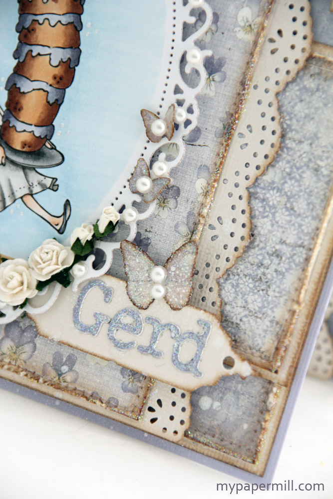 The nameplate is made with a Memory Box die (Bistro Label). It’s mounted on foam for dimension, and I’ve diecut the letters in the name using design paper and a Sizzlitz die (TH – typeset). The butterflies are made with a Martha Stewart punch, I inked the edges with distress ink Vintage Photo before adding stickles and crackle accents to them. The entire card (not the image) has been doused with Perfect Pearls mist, which adds a nice shimmer! The edge of the panel behind the nameplate is made with my Vintage Doily PATP punch by Martha Stewart.
 A tag hidden behind my image, diecut with a Magnolia die. I wrote the text (A balanced diet is a cake in each hand. But on birthdays calories don’t count, so now you can eat as much cake as you want!) with a distress marker (dusty concord). I colored winter white seam binding with Copics – BV27 (a color I’ve made myself), BV23 and BV20, in addition to the blender. The button is from Papertrey Ink and I also used some Karen Foster scrapper’s floss.
 Roughly the same layout on the insides. I stamped a text by Kort & Godt (You’re like a good wine: better and better every year) on one of the panels inside using Memento Espresso Truffle, leaving the other for a personal greeting.
 Again, familiar layout on the back of the card. The butterflies are made using Kort & Godt stamps. I inked the stamps with Copics (BV27 and BV23) and spritzed Activator on the cardstock before stamping. The text (Once a year the day is unique; Because that day is yours and no other day is the same) is also a Kort & Godt stamp, Memento Espresso Truffle was used for this one as well.
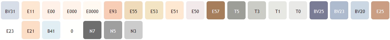 As promised: the colors I’ve used for my image. I’ve also used BV27, which is a color I’ve made myself.
