Hi, everyone! Time for yet another Christmas card today. This could technically work as a regular winter card, too, and those cards are good to have on hand to send out during those dark winter months to brighten someone’s day.
 I used Anyu and Nanook Igloo for my card today. They’re part of the Anyu and Nanook set. I set the opacity to 10 % in Photoshop and printed my image. I love the look of no line coloring, especially when doing snow and ice. I colored in my little image using Copics, and wasn’t too sure at first what I wanted to do with it. I debated my regular cluster with a sentiment in the top right corner, but felt I needed to do something different because I had so much white space below the image.
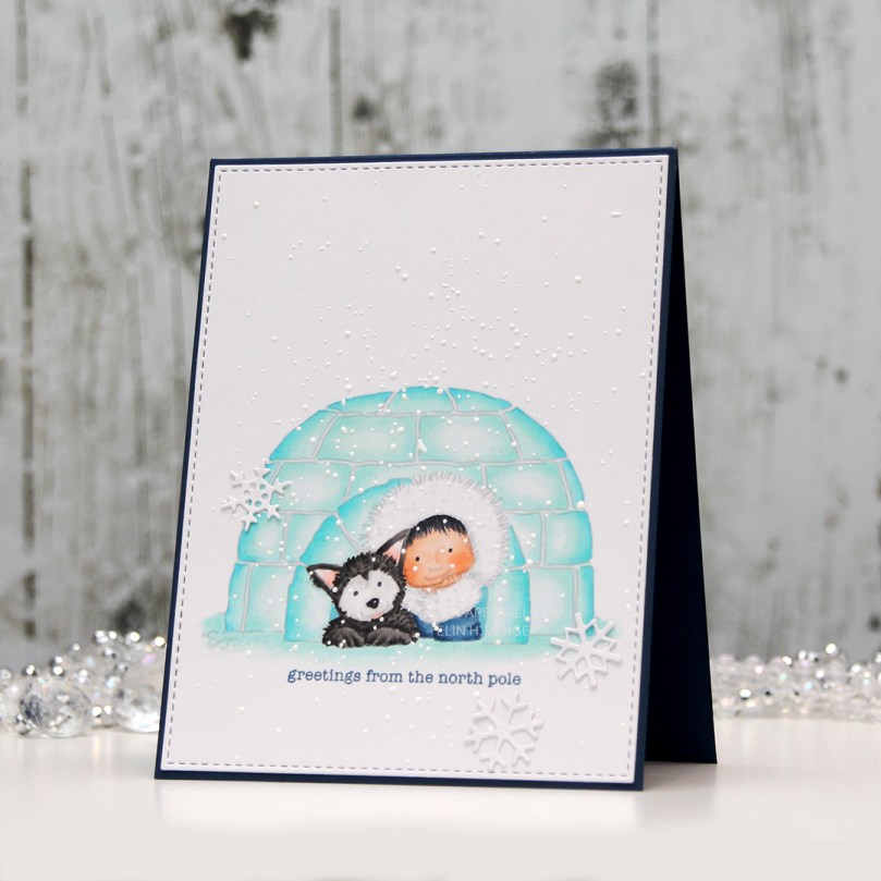 I used my trusty faux stitch rectangle die from My Favorite Things to turn my colored piece into a panel before stamping the perfect sentiment from Mama Elephant’s Holiday Messages stamp set using Enchanted Evening ink. I wanted to pick up the blue from the little girl’s coat, and this is such a pretty blue. I sprinkled on chunky white embossing powder and heated the panel from the back to create my snowy look, before adhering my panel onto a cardbase I made from After Midnight cardstock from My Favorite Things. I added a few snowflakes that I diecut using an old Marianne Design die that I absolutely love, and my card was finished.
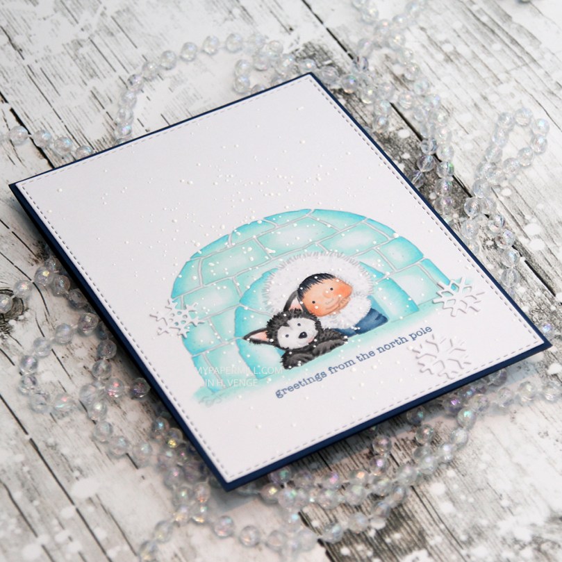 Here you can see the effect of the chunky white embossing enamel. It’s nice and thick and adds a bit of texture to the card, it kind of feels like braille when you touch it, it’s really cool, not to mention quicker than drawing on snowflakes with a white pen, also with the added bonus of it being more random than you’re able to achieve on your own.
 No surprise that I used mostly cool tones for this card, except for the skin colors and the ears and tongue of the dog.
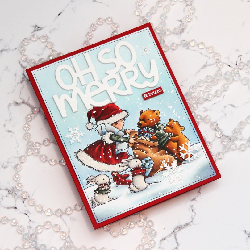
 For today’s card, I used the image “
 I die cut the words oh so merry from the Penguin’s Waddle die set from Mama Elephant a few times from white cardstock and stacked them for a dimensional look. I added chunky white embossing enamel to my scene, glued my panel onto a card base made from Pure Poppy cardstock from Papertrey Ink and glued my diecut words in the sky. I stamped and white heat embossed “& bright” from the Holiday messages stamp set from Mama Elephant onto a scrap of the same red cardstock and glued that below my diecut words. I added a few diecut snowflakes with pearls in the centers as my finishing touch.
 Lots and lots of marker, many of them used on the snow, believe it or not.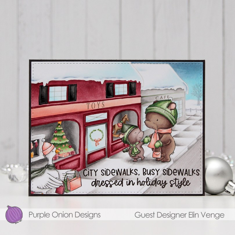
 I love these stamps!! And I do believe this is the first time I’ve colored a goose! And it’s such a cute goose too, she (her name is
 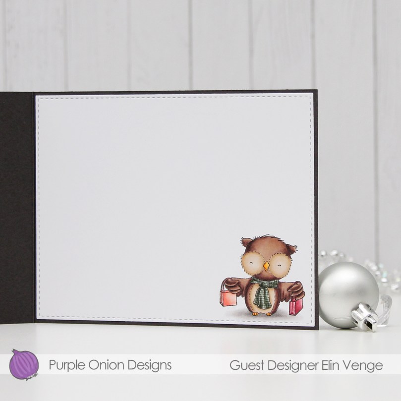 I was going to make a 5×7″ card, but changed my mind. It meant that
  The bears are
 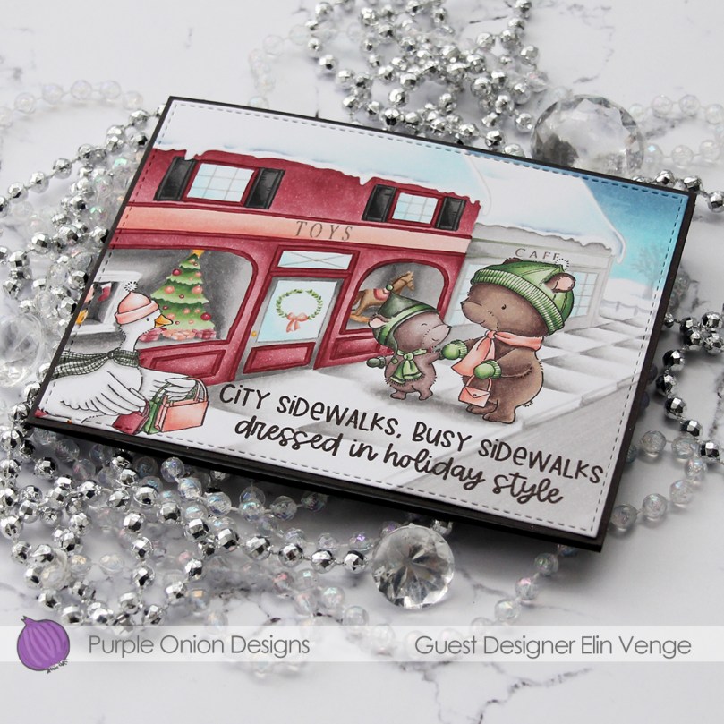 To me, this color scheme is a bit untraditional, but I didn’t want to go with the same red and green combo I used for my last card, so I had to come up with something new. Somehow, I had it in my head (thanks to Liz) that my toy store needed to be red, so I came up with a combination of a pink based red, a light, peachy color and a brighter green than the greens I usually go for.
 Lots of Copics used for this one, I did color in the whole front of the card, after all. I stamped the background using Fadeout ink from Inkon3, so once my Copic coloring was done, I went in with a gray Prismacolor for details on the windows and a little bit of brown for the horse and the ribbon on the presents in the display windows.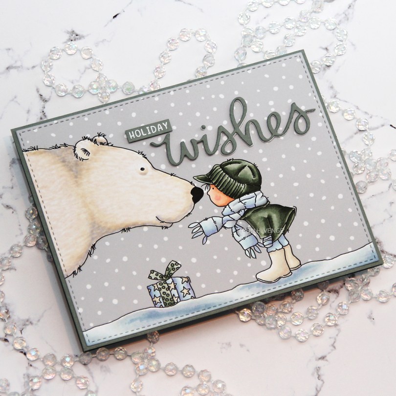
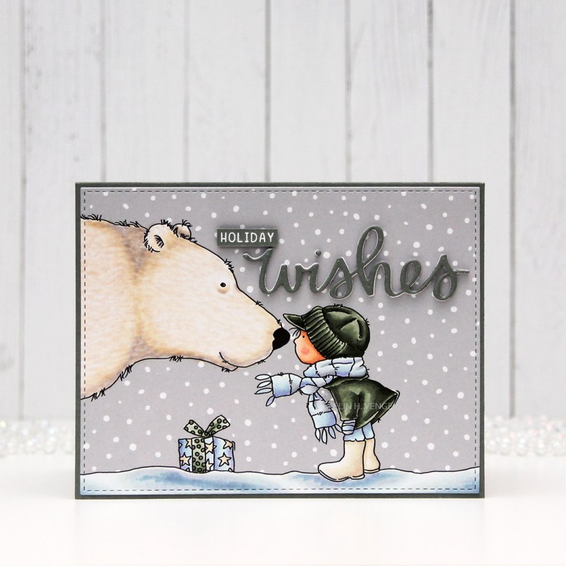 Once I’d colored the image with Copics, I used the largest die in the A2 Stitched Rectangle STAX Set 2 from My Favorite Things to die cut a landscape oriented panel that would fit perfectly on my card base with a 1/16″ border around. I like the 1/16″ little frame, AND it’s the same width as the distance from the faux stitching to the cut line. I like having them the same. Little details like that matter, to paraphrase a famous German architect (Ludwig Mies van der Rohe, who coined the term “God is in the details”).
 I created a top fold card from Stormy Sea cardstock from Papertrey Ink. It’s a color that matches the BG90 family from Copic really really REALLY well. I need to order more, I only have half a sheet left of this color. I used the same color cardstock to diecut the word wishes using a die from Mama Elephant that was free with purchase if you spent a certain amount during their birthday extravaganza back in September. Normally I’d diecut the word several times in the color I wanted, but since I was running super low on this particular grayish green, I used a few layers of white diecut words, and only one layer of the colored cardstock on top. I stamped and white heat embossed the word “holiday” from the Iconic Ornament stamp set from Mama Elephant, also free with purchase over a certain amount on the Mama Elephant site back in September. I added a few more layers of cardstock behind it for dimension and glued it to my sky using Gina K liquid glue, which I also used for the die cut word.
 I decided not to add any additional elements. No embellishments, no nothing, I didn’t want to distract too much from that adorable image.
 Not a lot of Copics for this one, and 14 of these were used for the snow and polar bear.
 I used a very bright red for the hat and sweater on the mouse, and the only color that really goes with it, in my opinion, is gray. I found some red and gray die cut scraps from a couple of Maja Design collections (Fröjdefull Jul and Joyous Winterdays) and made a little mini cluster in the top right corner.
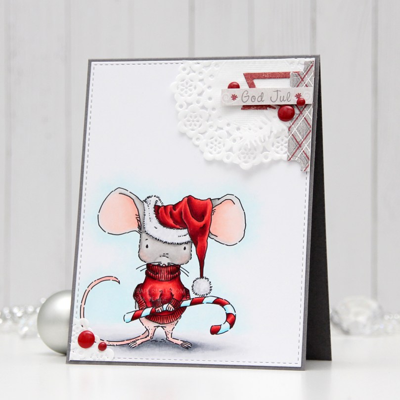 I started with a mini paper doily from Doodlebug Design, added a red fishtail flag frame die cut with a die from My Favorite Things, then a piece of a ticket die cut with a Docrafts die. I used some 1 mm foam squares for that. I added my sentiment at the end, which is from one of those strips at the bottom of the 12×12″ papers that you usually cut off. Maja Design has always had some kind of pattern on the back of theirs, which means that nothing needs to go to waste. This one was perfect in gray with a hint of red, and I used 1 mm foam squares to add it. I even doubled up on the foam on the left hand side of it.
 I added some red enamel dots from Papirdesign to finish it off, and glued a leftover piece of the doily to the bottom left corner and an additional two dots. I added my panel to a top folding card base I made from Gravel Gray card stock from My Favorite Things.
 This was a very simple image to color, so obviously I didn’t use a lot of colors.
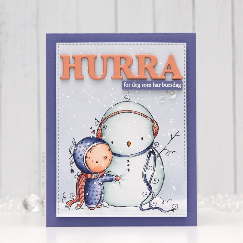 I started by coloring my little snowman and his friend using my Copics. I went with a bit of a split complementary color scheme on this one. I’m no fan of complementary colors, but split complementary are infinitely better, and blue green (which I used for the snow on the snowman), purple and orange are split complementary colors. I didn’t want a bright orange, though, so I went more coral, and I love how it turned out.
 I used a faux stitch rectangle die from My Favorite Things to turn my colored piece into a nice panel. I love these dies, they add such a finished look. I sprinkled on a moderate amount of chunky white embossing enamel from Stampendous and melted the powder. I love the snowy look this gives.
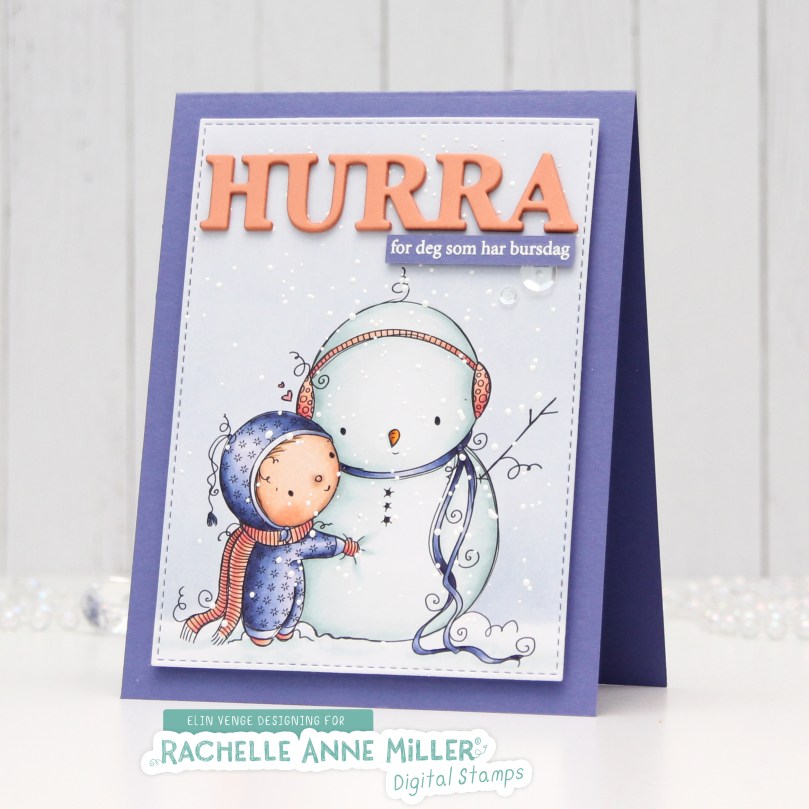 I mounted my die cut piece onto a card base made from Lavender Fields cardstock from My Favorite Things using plenty of foam tape. This color perfectly matched the purple in my image, something I always try to accomplish in my cards for a nice, cohesive design. I die cut and stacked four Hurra from Melon Berry cardstock from Papertrey Ink using a Kort & Godt die. I love stacking die cuts, it adds a super nice look of dimension. I also white heat embossed a sub sentiment from Norsk Stempelblad AS onto more of that Lavender Fields cardstock, and stacked that, as well, making it flush with the die cut word.
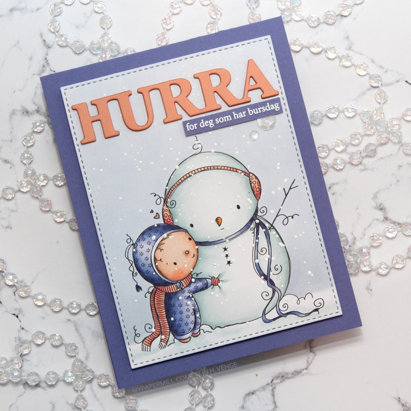 I added a couple of sparkling clear sequins from Pretty Pink Posh and my card was complete. I cut a little bit off the largest one with my scissors to make it look like it’s tucked behind that sentiment strip.
 Last, but not least, the Copic markers I used to color my image. I also used B40 and BG71, which are colors I’ve made myself.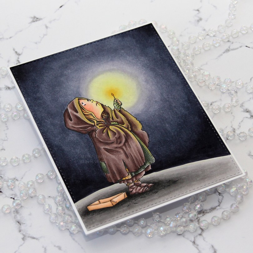
 I couldn’t have kept this card any simpler. I used the largest of the A2 stitched rectangle dies from My Favorite Things to die cut the image and glued it to a white card base. That’s it, I didn’t add a sentiment or any embellishments.
 The story is about a little girl, barefoot and cold, out in the streets on New Year’s Eve trying to sell matches. Afraid to go home thinking her father will beat her for not selling any matches, she huddles in between two houses and lights the matches to warm herself.
 In the flames of the matches, she sees wonderful imagery; food, warmth, happy families. But the images all disappear as soon as the flame dies. When she sees her late grandmother, she begs her to take her to Heaven. In an attempt to keep the visions of her grandmother, she keeps lighting the matches, until there’s only one left. When the flame of that one goes out, too, her grandmother takes her hand and they fly to Heaven.
 The next morning, the little girl is found frozen to death on the street, her cheeks red and with a smile on her lips. Everyone thinks it’s a tragedy, but no one understands the joy she felt right before she died.
 A few Copic colors to finish off today’s story time. I also used BV27, which is a color I’ve made myself.
 This card was a bit of an evolution. Things really didn’t go my way, but I was able to fix it all in the end. The piece of Papertrey Ink Stormy Sea card stock I was planning to use was a teeny tiny bit smaller than I needed to be (and I’m running seriously low on that particular color), so I used a die from Waffle Flower to cut it down a little, and it’s now 4-1/8 x 5-3/8″. I cut the center portion out to use for later, no one will ever know that there’s a whole in the center of it. I glued it to a top folding white card base, creating a nice 1/16″ border around the perimeter. Problem number 1 solved.
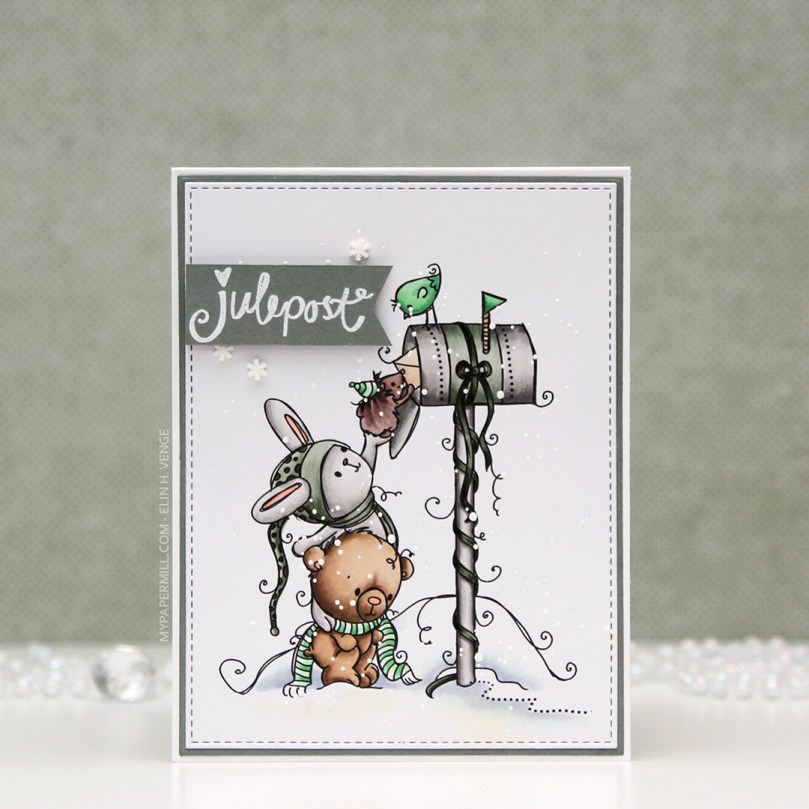 Problem number 2: My hair was wet from showering when I started assembling this card, and there was a drop of water that fell on the bear’s head. Solution: Sprinkle on chunky white embossing powder from Stampendous and melt the powder with my heat gun…
 … which led me to problem number 3. My heat gun was too hot and I burned the panel. It’s not super visible in the photo, but it tuned the piece yellowish right underneath the pole. Solution: use Copics to color the snow under the bear in a similar color, making everything look intentional.
 My final struggle was figuring out where to put the sentiment from Norsk Stempelblad AS. I wanted it on the right side of the card, but it just wasn’t working, so I stamped and heat embossed it a second time with the fishtail end on the right and put it on foam tape on the left side of the front instead. I think it worked pretty well. I added a few snowdrift sprinkles from Little Things From Lucy’s Cards as my final touches.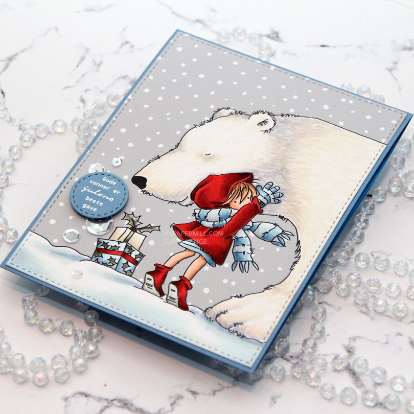
 I colored this image a while back, but only now had time to turn it into a card. I considered using a red card base for this, but really wanted the girl to pop, so I went with my trusty blue. This time I chose Blue Yonder card stock from My Favorite Things.
 I die cut the panel with the girl and the polar bear with the largest faux stitch rectangle die from My Favorite Things from their Stitched Rectangles STAX 2 set of dies.
 I used another faux stitch die to create the little circle for my sentiment, which is a stamp from Norsk Stempelblad AS. I stamped the sentiment in VersaMark ink and sprinkled on super fine detail embossing powder from Ranger before heating that until it melted.
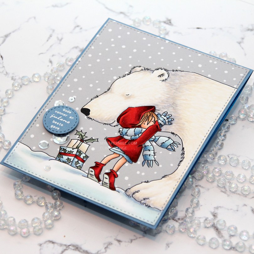 I mounted my little circle sentiment with foam tape and had planned to leave it at that, but I managed to spill a drop of coffee on the snow portion of my image and needed to cover that up. One single sequin would look silly, so I added a few more to make it look intentional. No one will ever know that there’s a coffee stain under that smallest one. The sequins are sparkling clear from Pretty Pink Posh.
 I use a crazy amount of markers to color snow…
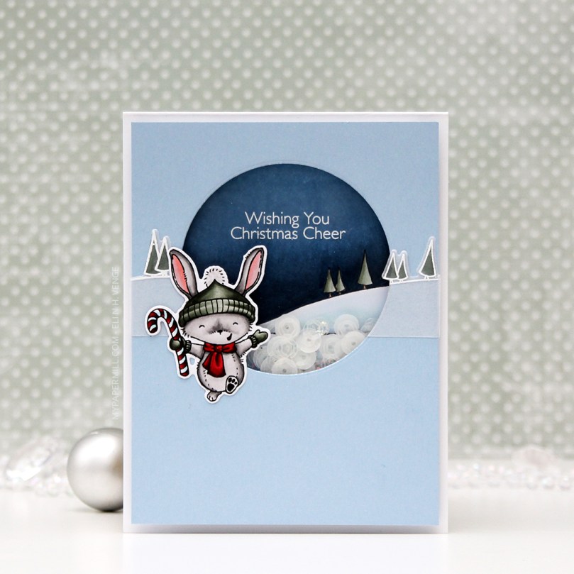
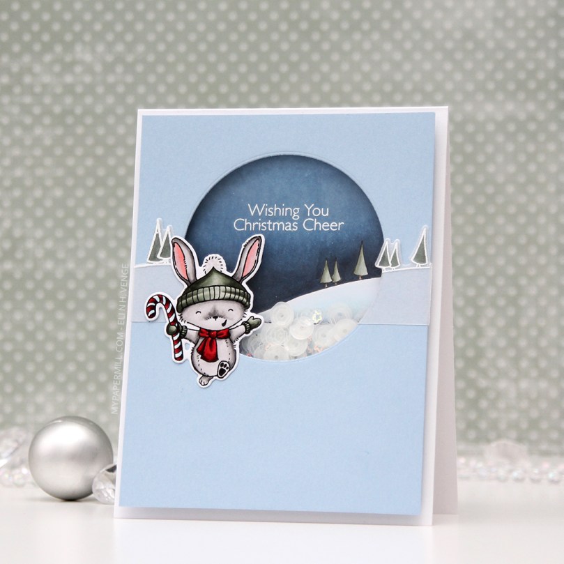 I stamped, colored and diecut the bunny a couple of days ago, so he was ready to go. I wanted the background stamp from that same stamp set to be in the shaker, and also going across. The shaker portion was stamped using Extreme Black ink, then colored with Copics, while the parts on the outside were stamped and white heat embossed on vellum and colored on the back. You don’t want to ruin the tips of your Copics by touching the embossing, so the back’s a great option when using vellum, because it still shows through.
 I like my shakers done a certain way. I use a die slightly bigger than my shaker window to die cut several times from white cardstock. I stack my negative die cuts (for this card it was 7), glue them together and glue a thin strip of cardstock to the inside of my negative diecut stack. That way, none of the sequins or other bits in the shaker get stuck anywhere, but can shake freely in their little confined space.
 I used a sequin mix from Hero Arts for the inside of the shaker. It’s a mix of matte white sequins and clear sequins, as well as iridescent star confetti. I’m not usually a fan of iridescent elements on my cards, but for a night time Christmas shaker, I don’t mind.
 Not too many Copics used for this one! And the red one that says B97 should say R27, I must have undone the correct one before I saved my graphic in Photoshop.
