I’m back with a happy, bright birthday card.
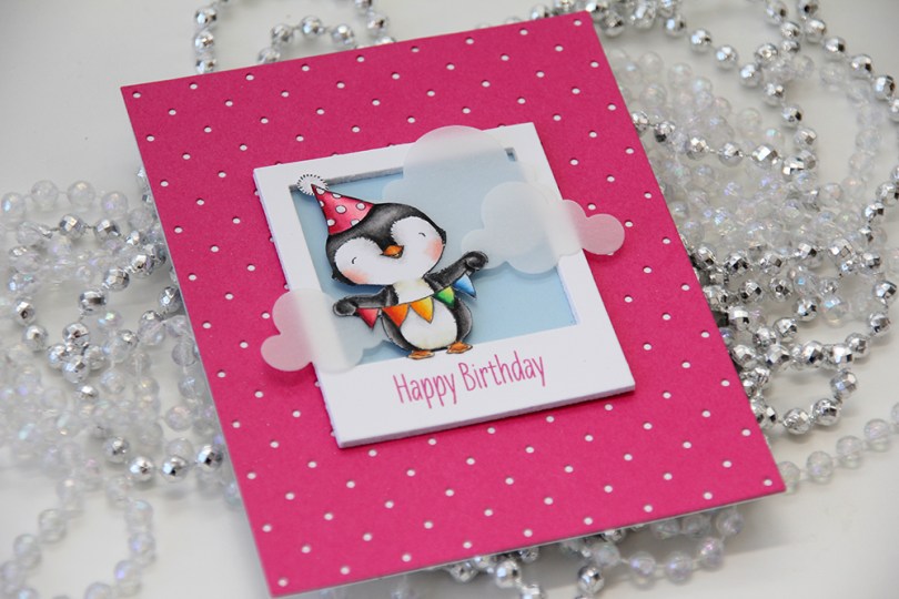
 I love every image Stacey Yacula designs. This little penguin, from the Sending Sweet Celebration Wishes stamp set from My Favorite Things, is no exception. I stamped him in Extreme Black ink from My Favorite Things onto X-Press It blending card and colored him in with Copics.
 I created a polaroid frame by diecutting the polaroid shaker frame die from My Favorite Things five times from white cardstock and stacked them together. I stamped a sentiment from the stamp set on the top frame using Doll Pink ink from Simon Says Stamp. The color matches the pink cardstock I used pretty nicely.
 I wanted a little bit of interest to my background and diecut a piece of Raspberry Fizz cardstock from Papertrey Ink with the Itsy Bitsy Polka Dot Backdrop die from Lawn Fawn. The pink matches the color of the sentiment, and the polka dots match the polka dots on his hat, I love little details like this.
 I glued my polaroid frame in the center of the card and added a few strategically placed vellum clouds. Because they hang off the edge of the frame, they break up the rigid rectangular look a little bit.
 I colored up
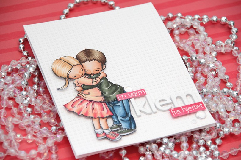
  This card is somewhat different for me. It has a lot of white space, which is fairly common for me, but I used a stencil and texture paste on the card base to change it up a bit, which definitely isn’t normal for me. I even sprinkled distress glitter all over the texture paste while it was still wet, so the card sparkles when you tilt it in the light. Glitter is a nightmare to photograph, though, so it doesn’t show up in the photos very well.
 I used the Parker alpha set from Memory box to diecut the word klem, which means hug in Norwegian. I diecut each letter five times and glued them together for a stacked, dimensional look. I created a couple of pink cardstock pieces by using one of the Copic markers I used on the skirt, stamped the remainder of my sentiment and heat embossed in white before glueing them on with clear foam tape.
 By adding part of my sentiment on top of the image, I get a more cohesive design than I would have if I had put my little sentiment strip above the word only. Just a little design tip. I finished off the card by adding a few raindrops from Little Things from Lucy’s Cards.
 These are all the Copics I used, and I must admit that I really love the pink and peach combos I came up with for this one.
 I colored up
  I used a Docrafts die to create those tickets from scraps of patterned paper from Maja Design, popping them up on foam squares from Gina K designs to give them a little bit of dimension. I white heat embossed a sentiment from Ladybug & Friends on one of the tickets and tucked a diecut pine branch behind it. I finished by adding a few red enamel dots from Papirdesign, tying in the red details from the colored image.
 As usual, I finish with the Copic colors I used to color my image.
 Jeg startet med å stemple den søte reven fra
  Jeg stemplet en
 I colored up
  I’ve had this image for so long, and it really felt good to finally color it up. I used the largest of the dies in the Stitched Rectangles STAX (2) set from My Favorite Things, before heat embossing a Norsk Stempelblad AS sentiment in white using super fine detail embossing powder from Ranger.
 I love the look of those heart shaped raindrops from Little Things from Lucy’s Cards. They’re part of the crystal collection and add the perfect little touch to such a simple card.

 I turned my image into a card last night by stamping a sentiment, diecutting the entire panel with a faux stitch rectangle die, adding that to my card front and embellishing very sparingly with three clear crystals from the Ice Water mix from Little Things from Lucy’s Cards. That’s it.
 The sentiment is from the B04 stamp set from Norsk Stempelblad AS. I love the stamps Åshild has designed and am so glad I have so many different sets from them. I used Enchanted Evening ink from Papertrey Ink. It’s a beautiful dark blue color.
 Cards don’t get much simpler than this. And cards like this are so fun to make, too.
 Would you believe I used 10 (yes, ten) different colors for the fur?? Am I crazy?
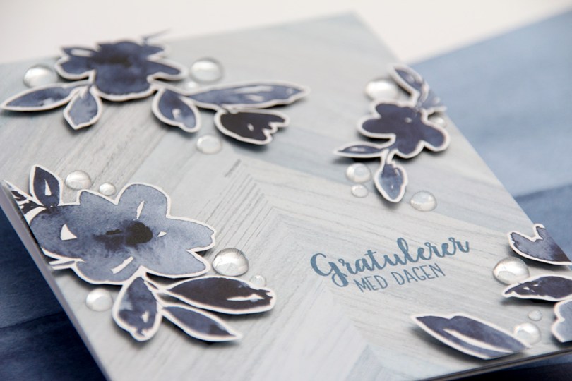
 Utrolig nok er det faktisk kun ett mønsterark som er brukt på dette kortet. Den lysere, mer diskrete bakgrunnen er nemlig baksiden av mønsterarket med alle blomstene.
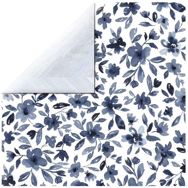 Jeg bestemte meg for å klippe rundt noen av blomstene og bruke dem som elementer på kortet mitt. Vanligvis liker jeg å klippe helt til kanten, men stilkene på disse blomstene er ganske spinkle, så jeg syns det var best med en hvit kant rundt for å spare meg for mye trøbbel.
 Jeg satte lave 3D-puter bak blomstene mine og monterte dem der jeg ville ha dem på kortet. Nede i det høyre hjørnet ser du også at jeg har brukt det jeg hadde til overs på innsiden, der har jeg riktignok kun limt det rett på uten 3D-puter bak, med en tynn strimmel av det lyseblå tvers over nederst på innsiden. Tekststempelet på fronten kommer fra Fleksitekstplaten til Huldra designstudio og er stemplet med Papertrey Ink Enchanted Evening blekk. Den er egentlig ganske mørk, men mulig jeg burde ha gått for en farge som er enda mørkere, jeg syns den ser litt blass ut mot det mørkeste i blomstene.
 Her syns det godt at blomstene sitter litt opp fra fronten av kortet. Jeg har brukt svarte 3D-puter, syns de ofte er bedre å bruke enn hvite, de er nemlig mindre synlige fra siden.
 Til slutt limte jeg på raindrops fra Little Things from Lucy’s Cards i forskjellige størrelser rundt blomstene mine. Vanligvis setter jeg småpynt som dette rundt teksten, to under og en over, men her har jeg fokusert på blomstene istedenfor. Pynten gjør at øynene dras mot blomstene, og gratulerer-teksten blir mer som et bakgrunnselement.
 I dag slår jeg et slag for alle småstemplene. Ofte i et stempelsett finnes det i tillegg til de litt større stemplene noen mindre som fyller ut plassen på stempelplaten. Disse blir ofte glemt, da vi gjerne kjøper stempelplatene for de store stemplene. I dag har jeg brukt flesteparten av småstemplene i et stempelsett fra Pretty Pink Posh og stemplet dem over hele fronten av kortet mitt.
 Å stemple såpass mange stempler tar litt tid. Ikke bare skal de stemples, men for at det hele skal se litt vilkårlig ut til slutt stemples de ikke i noe mønster, og hvert stempel må derfor plasseres på nytt for hver stempling. Jeg brukte vel omtrent en time på å stemple alle disse småstemplene, før jeg fargela dem med Prismacolor-blyanter.
 Jeg prøver så godt jeg kan å bruke rester av mønsterark på kortene mine, så her fant jeg noen Maja Design-rester i farger som matchet fargeleggingen min. Det rødstripete er fra Home for the Holidays-kolleksjonen, mens det øverste er fra Vintage Frost Basics-serien, som kom ut helt tilbake i 2013. Jeg er jo ikke akkurat kjent for å være den som bruker mest ark på kortene mine, så det minker ikke så fort av restelageret, men litt og litt er bedre enn ingenting.
 Jeg brukte et
  Jeg avslutter med fargene jeg har brukt. Veldig uvant å bruke Prismacolor-blyantene mine istedenfor Copics (tregere går det selvfølgelig også), men jeg prøver å bli flinkere til å bruke det jeg har, og det er jo litt synd om de bare blir liggende i en skuff uten å bli brukt, ikke sant?
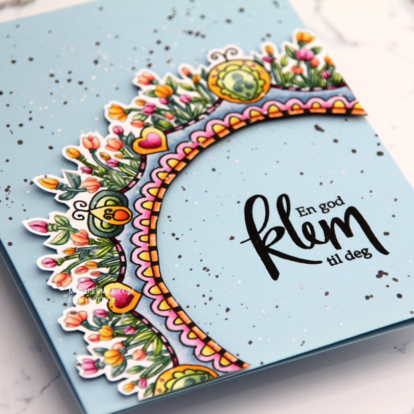
 This is a lot more artsy than what I normally do. I printed the image with an opacity setting of 25%, colored it with Copics and then used a Copic multiliner to add back in some black lines in selected areas before fussy cutting my image with a thin, white border on the outside and straight up to the black line on the inside.
 I used foam tape from Gina K to pop up my colored piece onto a cardbase I made from Spring Rain cardstock from Papertrey Ink.
 I stamped a Norsk Stempelblad AS sentiment using VersaFine Onyx Black ink, and added splatters across the entire card with white liquid watercolor from Hero Arts and a watered down black ink.
 Not exactly my usual style of card, this one. What do you think?
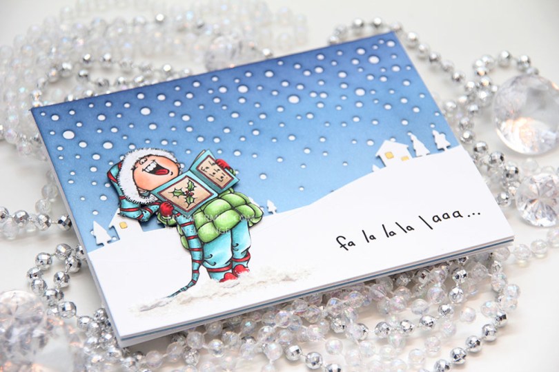

 I diecut a panel of Spring Rain cardstock from Papertrey Ink using the Snowfall Backdrop die from Lawn Fawn and ink blended over the top. I used Chipped Sapphire Distress ink, Faded Jeans Distress ink, Stormy Sky distress ink and Spring Rain dye ink working my way from top to bottom, dark to light. I glued the piece straight onto my white cardbase.
 I used the Country Landscape die from Memory Box to diecut the background hills from Stamper’s Select White cardstock from Papertrey Ink. I used the same die to diecut the windows using Harvest Gold cardstock, also from PTI, and inlaid them. I popped the entire panel on low foam tape for a little bit of dimension. I then diecut my panel with the sentiment already printed using a die from the Stitched Hillside Borders die set from Lawn Fawn. I’m a huge fan of faux stitch dies, but since the Memory Box die doesn’t have the faux stitching, I didn’t want it on my top panel either, so I used the die upside down and glued this snow bank on with low foam tape. To ground my image I used snow paint just below it as snow, and sprinkled rock candy distress glitter on top while the snow paint was still wet.
 I changed up the sentiment a little. There’s an exclamation mark at the end, but I wanted that to be on the inside, so I added three dots instead and printed the same sentiment on the inside with the three dots in the beginning and the exclamation mark at the end.
 I was a little hesitant about using my blue background at first, because I didn’t think the image stood out enough against the blue. When I created the snow banks, the whole thing transformed, and I’m glad I stuck with the blue.
 Not a lot of markers for this one.