
Hi, crafty friends. Today is the first Friday of the month, which means it’s RAM Stamps release day. This month’s release is a birthday creator set. If you’re not familiar with the creator sets, they contain lots of different images that you can put together to create different scenes. There are so many options, the sky’s the limit for these. I chose to use this Balloon stamp only for this card, but do know there are lots of other images to choose from in this release.
 I printed the image fairly small, I wanted it to fit the width of a portrait style A2 sized card. I colored the image with my Copics, going in somewhat of a rainbow order.
 I covered the front of a card base with a piece of pink patterned paper with hearts. I don’t know where this patterned paper is from, it came in a mystery box from Simon Says Stamp a few years ago. I think it might be Doodlebug, based on some of the other patterns in the pack, but I’m not sure.
 Above and below my colored piece, I added thin strips of Gold Shine cardstock from My Favorite Things, before mounting it all on foam tape near the top of the card.
 I used the Sweet Sentiments die set from Altenew to die cut the word celebrate. I die cut four out of white cardstock and one from the gold shine cardstock I used for the strips. I stacked them all together for dimension, and adhered the sentiment onto the balloon strings, before finishing off the card with a few sequins from the Heaven Sent mix from Little Things from Lucy’s Cards.
 Happy color palette.
P.S. I apologize for the stray hair in the background on the flatlay photos, I didn’t notice it until I wrote this post. #keepingitreal
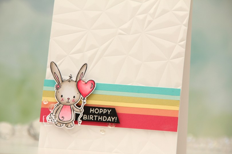
 I colored the bunny with my Copics (I actually only used 6 Copics for this card) and fussy cut around it, leaving a white trim to prefer the whispy lines and squiggles that are so characteristic of Rachelle’s images. I created a card base from Stamper’s Select White cardstock from Papertrey Ink and ran it through my die cutting machine with the Crystal Distortion embossing folder from Simon Says Stamp to create some texture.
 Onto a piece of scrap paper, I adhered strips of solid colored cardstock. I didn’t measure, they’re all different widths for a playful look. The colors are (bottom to top) Honeysuckle and Grapefruit, both from Concord & 9th, and then Lemon Tart, Spring Moss, Aqua Mist and Hawaiian Shores, all from Papertrey Ink. I put a few layers of cardstock behind my strips and adhered them near the bottom of the card. I stamped and white heat embossed a sentiment from the Easter bunnies stamp set from Simon Hurley onto a piece of True Black cardstock from Papertrey Ink, cut it down to a strip and used a craft knife (I don’t trust scissors) to create the angle at the end. I glued the piece left of the sentiment to the back of the bunny, put 2mm foam squares behind everything and adhered it on top of the colored strips, before finishing off with a few sequins from the White Orchid Sequin mix from Little Things from Lucy’s Cards.
 Color palettes don’t get much simpler than this.
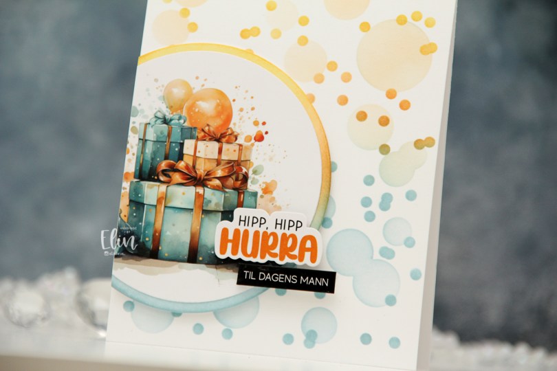

 I mounted my circles on foam tape, cut off the excess, then added a couple of pre cut stickers to finish off the card. I love these stickers!
 I did a lot of coloring the day I colored these monkeys. As you can probably tell by their fur, my markers needed to be reinked at this point. I could have chosen a different brown combo. I could have taken the time to refill my markers, but I had colored so much the day I colored this that I just wanted to keep coloring. I probably should have stopped and taken the time to refill or chosen a different combo that didn’t need reinking. This is a good reminder to reink your markers. You can be an amazing colorist, but if you don’t take care of your markers, your coloring will look uneven. I went with it anyway. The 5 year old getting this card is not going to notice that my coloring’s not perfect, and it doesn’t always have to be. I’m trying to let go of my perfectionist tendencies, and this was a good exercise. I will refill these markers before I use them again, though, don’t you worry.
 The card itself is very simple. I stamped a sentiment from the A06 stamp set from Norsk Stempelblad AS below the image, using Cornflower ink from My Favorite Things. I then used the second largest die in the Watercolor Rectangle STAX die set from My Favorite Things to turn it into a panel with a fun edge, before I added dimension behind it and adhered it to a top fold card base I created from Cornflower cardstock from My Favorite Things. I finished off the card with some enamel dots from Papirdesign.
 Simple color palette. And I really do need to refill those browns. Even E23 was giving me trouble.
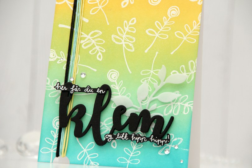
 I started with an A2 top fold white card base. I stamped and white heat embossed two stamps repeatedly across the background, before ink blending on top with Distress Oxide inks. From bottom to top, I used Peacock Feathers, Cracked Pistachio, Twisted Citron and Fossilized Amber. I die cut klem four times from True Black cardstock from Papertrey Ink and stamped and heat embossed coordinating sentiments. I figured they’d be too tall if I cut them down to regular sentiment strips, so I fussy cut around them. So far, so good, right? Yeah, that’s when I hopped on the struggle bus. I figured the sentiment on its own was a bit meh against the background, and it wasn’t exactly revolutionary. Also, the first part of the sentiment was floating on its own, which I also didn’t like too much.
 I used a leaf die to cut some leaves from vellum (Heavyweight Translucent Vellum from My Favorite Things), hoping that would work. It helped, but the first part of the sentiment was still floating. I needed an anchor point. I tried adding some thread on the side. Better already. I decided to cut a half circle notch from the bottom and top of the card for the thread to be looped around. Two strands each of three colors that matched the card. I was quite happy with that and decided to add the die cut word, and also adhered the stamped pieces of the sentiment on top of the die cut. Instant anchor points, and the first part of the sentiment was no longer floating on its own. I finished off with diamonds that framed the sentiment, and felt like it all ended up as a cohesive design in the end, even if it took me a while to get there.
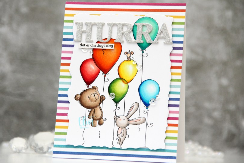
 I colored my image with (a lot of) Copics, before using the second largest die in the Watercolor Rectangle STAX die set from My Favorite Things to cut it out. Onto a top fold white card base, I adhered a piece of patterned paper from the Rainbow Love paper pad from My Favorite Things. I added some dimension behind my colored panel and adhered it in the center of the card.
 Using a die from Kort & Godt, I die cut three layers of the word HURRA; twice from white cardstock, and once from silver glitter cardstock from Kort & Godt. I stacked the three and adhered my layered die cut near the top of the card. I added a sentiment sticker strip, which I also popped up, before finishing off the card with sequins from the Seaglass mix from Simon Says Stamp.
 I used way more colors than normal for this card, and probably a few more than I technically needed. I probably could have skipped a couple of colors on the orange balloon, as well as on the teal balloon.
 I used the Big Balloons stencil from My Favorite Things and did a rainbow of balloons going across the card. Each balloon is a gradient color, from dark at the bottom right, to a lot lighter at the top left. I used sooooo many ink colors to achieve this look.
 I die cut the word bursdag from Gold Shine cardstock from My Favorite Things. This is a very dainty die cut, so I chose to put double sided adhesive (I used a sheet from Altenew) on the back of the cardstock before die cutting, which made everything easy once it came to assembly. I die cut the shadow layer from True Black cardstock from Papertrey Ink and used black foam tape to pop it up in the center of my card. I used some sticker strips to fill out my sentiment, and added those using foam tape as well, before finishing off with a little gold bling.
 I colored the image with Copics, and after a couple of cards recently with very muted, vintage colors, I went super bright with this one. I love penguins done with BGs instead of grays, it’s like they’re happier, somehow.
 I stamped and white heat embossed a sentiment from Huldra Designstudio directly onto my card base, which I made from Oceanside cardstock from Concord and 9th.
 Above and below the colored panel, I added strips of patterned paper from the Party Patterns paper pad from My Favorite Things, before mounting it all on foam tape for dimension. I finished off the card with enamel dots. The bright green ones are from Papirdesign, the teal and yellow ones from the Cool Summer Nights and Pocketful of Sunshine packs from Altenew. The Papirdesign ones have more dimension to them than the ones from Altenew, which creates a little more variety.
 By using an untraditional color palette and a non holiday sentiment (winter hug), this image can be used for more than just Christmas. I’m thinking this would make a great wintery birthday card.
 Fun colors used for this one!
 I knew one of the elves at the bottom would get his head cut off (the one wearing blue), so I created a copy with just his head, rotated it and put it in the top right corner to include another kid peeking in.
 I colored in the scene with Copics, choosing very bright colors. I then took my white Gelly Roll 05 to create patterns on most of the kids’ clothes. I used the largest die in the Watercolor Rectangle STAX die set from My Favorite Things to create a fun edge to my panel, before using the Connected alphabet die set, also from MFT, to spell out the name of the recipient. At first, I thought of cutting them straight, but realized that a wonky look would work well with the card and also be less time consuming.
 I wanted to include her age too, but didn’t have any number dies that matched the letters. There was just enough room on her apron for me to sketch in a couple of stick figures holding signs. I used my 0.03 Copic multiliner, and I think it’s running out of ink, which only enhanced the sketchy look I was going for. I die cut six more of each of the letters from True Black cardstock from Papertrey Ink, stacked them and added the colored pieces on top for a stacked inlay look. I mounted the panel on foam tape and adhered it to a card base I created from True Black cardstock from Papertrey Ink. I decided not to add any embellishments, I figured this card is colorful and really doesn’t need it.
 For the inside, I stamped a fun sentiment (You’re not thaaaat old – you were just born too soon) from the Til mannen stamp set from Norsk Stempelblad AS using Summer Splash ink from My Favorite Things.
 I stamped a sentiment from the Go’klem stamp set from Norsk Stempelblad AS onto a Summer Splash envelope from My Favorite Things using Summer Splash ink. I thought the envelope and ink matched the dress nicely.
 Here you can see those popped up letters a bit better.
 I used a lot of Copics for this one. Skin tones (and hair) make up that entire top row. I wanted different skin tones for the kids, and even though they don’t look that different in my photos, the difference is more pronounced in real life.
 I colored the bear with Copics and fussy cut right up against the black stamped lines, I added shine and dimension to his eyes with a black Glaze pen, followed by a white dot using a Gelly Roll 05. I put the bear aside while I worked on the rest of my card. I printed a sentiment from the stamp set on a piece of Stamper’s Select White cardstock from Papertrey Ink that I’d cut down to fit the front of my card with a little bit of a border. I then took the single line die from the Hexagon Pops die set from My Favorite Things to cut a row of hexagons below the sentiment, before lining up the die a second time for a second row of hexagons.
 I added foam tape to the back of my die cut piece and adhered it to a top fold card base I created from Summer Sunrise cardstock from Papertrey Ink. I popped the bear on foam tape and added some sequins from the Meadow mix from Little Things from Lucy’s Cards to finish. Super simple, right?
 Simple color palette, too!