Hi, everyone! Today, I have no less than three cards to share, and they all share bold, geometric card stock backgrounds. It all started with the über talented Laura Bassen, and a die set she designed for the Stamptember release from Simon Says Stamp that came out a few months ago. It’s the Geometric Builder Squares die set (there’s also the Geometric Builder Circles set, but I haven’t had time to play with that yet). In the set there are eight square dies of the same size. One of them is solid, but the remaining 7 die cut smaller squares, triangles and some other fun shapes that you can use to build up a cool, geometric pattern. I focused all my efforts for these cards on the die that cuts out eight triangles.
 I have this throw pillow on my couch that jump started my inspiration. It’s got a nice geometric look, but it’s not too colorful (I prefer a neutral interior to a super busy colorful one, I put all my color into my cards), and the best thing is those blue triangles (it’s a darker blue in real life than in the photo, I need to compensate for bad winter lighting these days). I love blue (as evidenced by the blue throw pillow behind it, the blanket on the left that has lots of blue in it and the light blue walls in the background)!
 My first card uses the exact same pattern as the one that’s on the pillow, but in other colors. I used the After Midnight color from My Favorite Things, Tickled Pink and Grout Gray, also from My Favorite Things, along with Berry Sorbet and Stamper’s Select White from Papertrey Ink for the vibrant pink and white, respectively.
 I popped my panel of triangles onto a 4 3/4″ square card base using lots of foam tape. On a die cut circle I stamped and gold heat embossed a sentiment from the Courageous You stamp set from Altenew, before finishing off the card with a few matte gold sequins from the Mint Gold mix from Little Things from Lucy’s Cards.
 Being told “you are great” is something we all could use at times, right?
 My next card features basically the same pattern, but I changed up the colors and extended the pattern to make it a rectangle. I wish I hadn’t cut the top part off, or cut even more off to make the pattern end in a full size or half size rectangle instead of what I ended up with, but it’s the sacrifice I made to make my card an A2 size with 1/4″ border around the triangles.
 The card stock colors I chose for this card are Orange Zest, Summer Sunrise, Lemon Tart, True Black, and Rustic White, all from Papertrey Ink, as well as Blue Breeze from My Favorite Things. The Rustic White is more of a grungy white (is that a thing? It’s not bright white) with dark speckles here and there, it’s really cool. I used the Sweet Hello die from My Favorite Things to die cut hello six times from the Rustic White card stock, and the shadow once from the True Black. I stacked three of the hellos on top of each other, glued the shadow on top of that, and then another three hellos on top. It’s very substantial! With the stacked hello die cut and the the panel of triangles on foam tape, the card is about 3/8″ thick. I love dimension, even though the added weight of all those layers requires extra postage.
 Below the die cut hello, I added a sub sentiment from the Leaf Clusters stamp set from Altenew. I stamped it in VersaMark onto black card stock and added super fine detail embossing powder from Ranger before heat setting it. I then took my cut-align ruler from Misti to turn it into a small strip, before gluing three more black strips of cardstock behind it and adding it below the hello. I finished off the card by adding a few sparkling clear sequins from Pretty Pink Posh.
 For my last card I decided to go rainbow. No chunky 1/4″ frame, I wanted the colorful triangles to go all the way to the edge in this one. The card measures about 4 1/4 x 5 1/4 (I learned from last card and didn’t want any weird looking shapes). The card stock colors (except for the white, which is Stamper’s Select White from Papertrey Ink) are all from My Favorite Things. They are, from top to bottom, Blue Yonder, After Midnight, Field Day, Limelight, Pineapple, Orange Zest, Red Hot, Razzle Berry, Grape Jelly and Wild Wisteria.
 I didn’t want to cover up too much of the background, so I took out my Impact Alphabet die set from My Favorite Things and die cut the letters H and I six times from white card stock. I stacked two of each letter, added two layers of vellum on top, then the remaining four layers of the letters on top for a dimensional look. By having a couple of layers of the letters behind the vellum, it makes the vellum float. I added a few raindrops from Little Things from Lucy’s Cards for a finishing touch.
 This one is definitely less dimensional than the other two cards, but the colors and the stacked sentiment still make it pop.
 There you have it – 3 same but different cards using one fabulous geometric builder die. Obviously you could create triangles on your own without the die, but the die makes it so much easier and more accurate than I could ever hope to do on my own. And I’m super detail oriented and a bit of a perfectionist, so I’d definitely use the die!
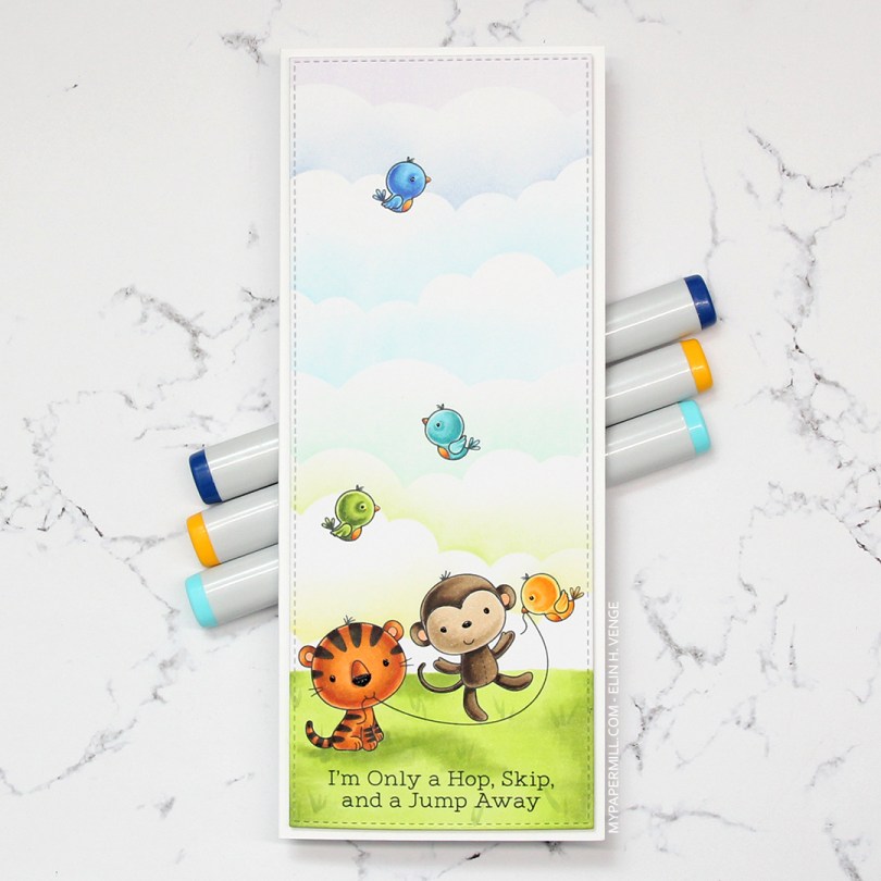
 I colored in all the critters using Copics, before masking them off and creating clouds behind them using a cloud stencil and various inks. Most of the colors were distress inks (I use the minis), but I’m thinking I probably used an Altenew ink at the very top, as I don’t have any purple distress inks. Using one of the dies from the slimline starter die set from My Favorite Things, I die cut the colored panel so it would have a nice finished edge and mounted it with foam tape onto a card base made from Stamper’s Select White card stock from Papertrey Ink. I also added a black glaze pen to the eyes and noses of these cute critters.
 I stamped the bears randomly across a piece of X-Press It blending card using Extreme Black ink from My Favorite Things. It’s a great all around ink that you can use for both watercolor and alcohol markers. I colored the bears and realized I needed some colors for the accessories. I didn’t want to mess up, so I called my niece. She didn’t hesitate for even a fraction of a second, she wanted red, blue and purple. I wish I could make decisions that quickly. She actually colored one of the cupcakes herself. I wasn’t done when it was time to head to dinner at my parents’, so I brought the markers and a few other bits with me so I could finish it there.
 I think it looks kind of cool with the silicone cover on the back, all glittered up. 10 year olds like glitter, I suppose.
 I colored the skater boy using Copics, then fussy cut him right up against the black stamped lines.
 I don’t often use green as my main color in my cards, but on boy cards, I think it’s one of the best colors out there, even better than blue. And coming from me, that’s saying a lot. For this one, I used the Geometric Landscape stencil from Altenew, along with five different colors of Altenew ink for my background; Bamboo, Parrot, Grass Field, Shadow Creek and Evergreen. I smooshed the Grass Field onto an acrylic block and added some water to it, before using a paint brush to create green paint splatter in the background. I also pulled out my Black Marble ink spray from Ranger (Dylusions) and did the same with that.
 I mounted my ink blended background to a white card base using lots of foam tape, before adding the skater boy on top using some
  Blues, greens, gray and a little bit of skin and hair.
 I have a great crafty friend who suggested I
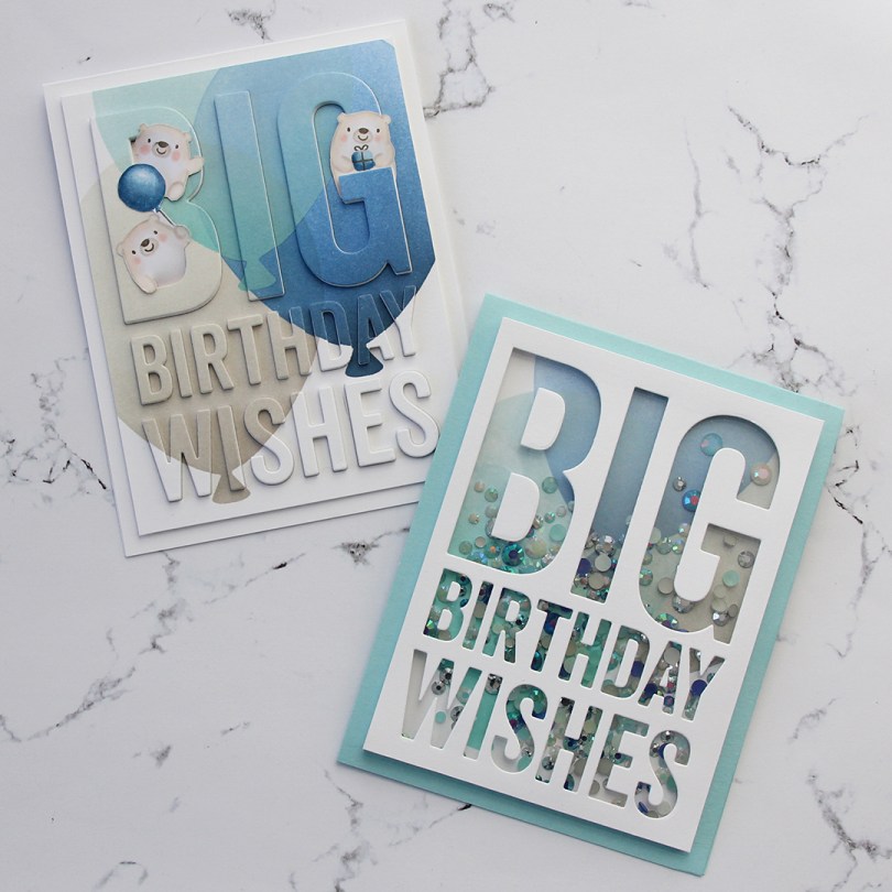
  Starting with the raised die cut inlay card, I did some serious ink blending. I love the look of ink blending, but I have a shoulder that protests every time I do it, meaning it doesn’t happen every day. I don’t have colored inks from MFT, so I used the brands I have and made it work. I used Hero Arts Wet Cement and Papertrey Ink Soft Stone inks for the gray balloon, Papertrey Ink Hawaiian Shores and Distress Ink Speckled Egg for the teal balloon, and Altenew Dark Night, Azurite, Ultramarine and Eastern Sky for the blue balloon.
 Once the panel was inked, I used the Big Birthday Wishes die to die cut the panel, making sure to keep all the little pieces for the stacked inlay technique. I die cut five more pieces from white card stock and stacked all the individual letters, putting the inked piece on top, giving me a total of six layers for each letter. I no line colored a few of the bears from the Bitty Bears stamp set to look like polar bears, and added them to the big letters at the top.
 For the second card I used the same color inks to ink blend the balloons, cut off the edges to make it a smaller panel and used the negative of a die cut for the shaker window. I built up the walls of the shaker using thin strips of white card stock. I’m not a fan of foam tape for shaker windows, I prefer to take the extra time and effort to build dimension with cardstock. It’s fiddly and time consuming, but I love it!
 I glued the negative die cut onto a piece of acetate, and filled the shaker with the Starry Sky Mix of jewels from Pretty Pink Posh before adding the piece of acetate and negative die cut on top, sealing in the jewels. The colors of the jewels are perfect for the color palette I was going for. I glued the finished shaker piece onto a top fold card base I made from Berrylicious card stock, and my card was finished.
 I had so much fun creating these two cards, but will admit that I struggled with which bears to use, I’d colored all but one bear from the stamp set. Indecisive is my middle name. So is procrastinator, perfectionist and a whole bunch of other descriptors.
 All the bears (except for the one that couldn’t fit on this panel) all colored up like polar bears. While the stamps were still in my Misti, I used a Memento Rich Cocoa dual marker on the eyes, noses and mouths and stamped them on top of the fadeout ink from Inkon3 I’d already used. This is a trick I like to use, and it saves me from having to draw eyes and mouths in after my coloring and risk ruining my images.
 I had a leftover piece from a card I made earlier this year, so the dark blue base and the
 I used the slimline starter die from My Favorite Things to die cut a panel of Blue Breeze cardstock for my card front. I stamped the
  I didn’t want to add my colored pieces directly to the blue underneath. I decided to add a mat behind each of the images, and I cut them down to be slightly larger than the images themselves. We’re talking super thin frames, I think they wound up being about 1/32″ all around. They might be small, but it was enough that I didn’t have room for a sentiment between my images, so I cut apart the Ho ho ho sentiment from the
 I used a square die from Lifestyle Crafts to die cut my elf down to the size I wanted, in this case 4″.
 I then stamped a sentiment from the Scripty Xmas stamp set from Mama Elephant using Enchanted Evening ink from Papertrey Ink, before gluing my panel to a 4 1/4″ square card base made from Dark Indigo cardstock, also from Papertrey Ink. I finished off my card by gluing on some stars from a sequin mix from Hero Arts. They’re iridescent, which I’m normally not a big fan of, but it worked on this card.
 I love the ease of clear stamps, but rubber stamps like this one have much finer lines, and they stamp beautifully every single time, I love that. I also love blue for Christmas, but that’s hardly a secret 😉
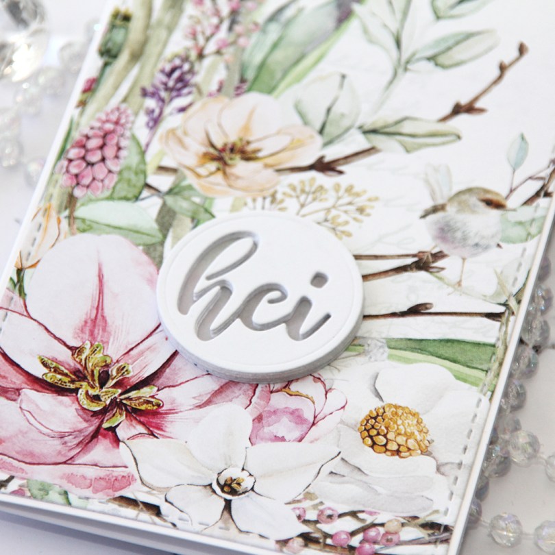
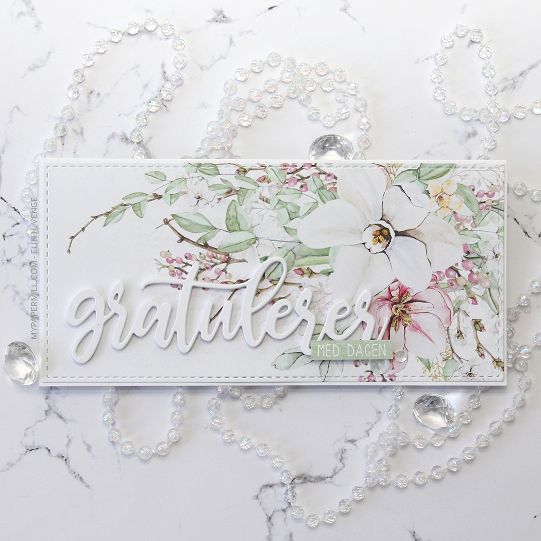 This first one might not even technically be a proper slimline card. It’s about 7-3/4 x 3-3/4″. I’ve used beautiful patterned paper from P13 for both my cards. I wanted the paper to be the hero, so I didn’t do too much to it. The sheet I used for this card is
  I used a
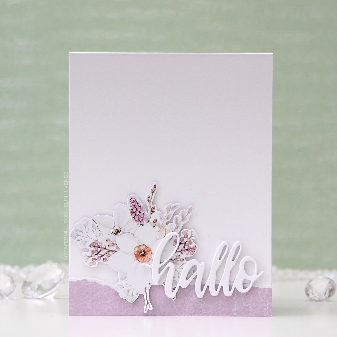
 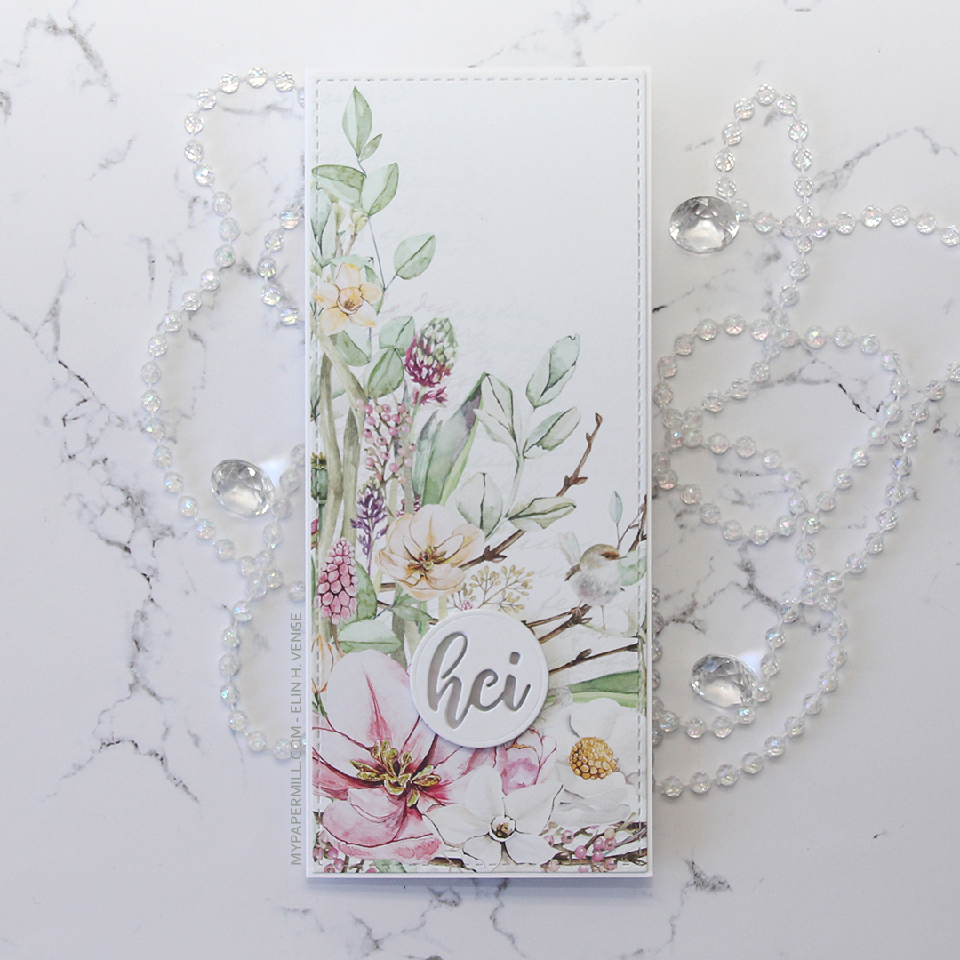 My second card uses a different part of that same sheet of patterned paper, as well as the same slimline die from Pinkfresh Studio. The sentiment is even die cut using a die from the same set as the sentiment on my first card.
 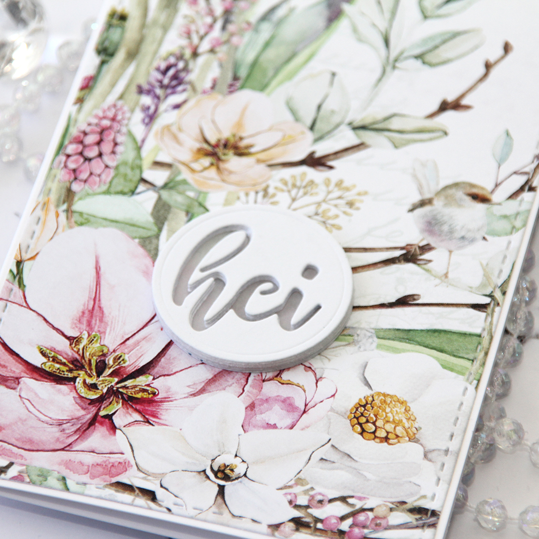 On this one I have four layers stacked on top of each other, then a vellum circle, then another four layers of the negative word die, making this sentiment really stand out as a statement on my card.
 Let’s talk for a minute about P13. They’re a Polish company, and they make beautiful, thick patterned paper. That’s really all you need to know, because it’s all I know. When I say thick, I mean thick. I don’t know their exact weight, but it’s close to card stock weight! I’m telling you, these are wonderful. They’re double sided, and the little strip you see at the bottom here with the torn edge is the back of that very same sheet (
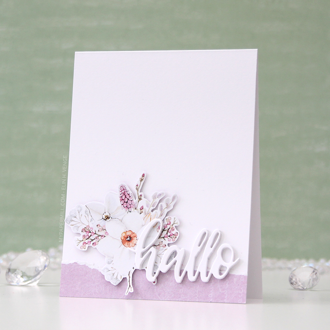
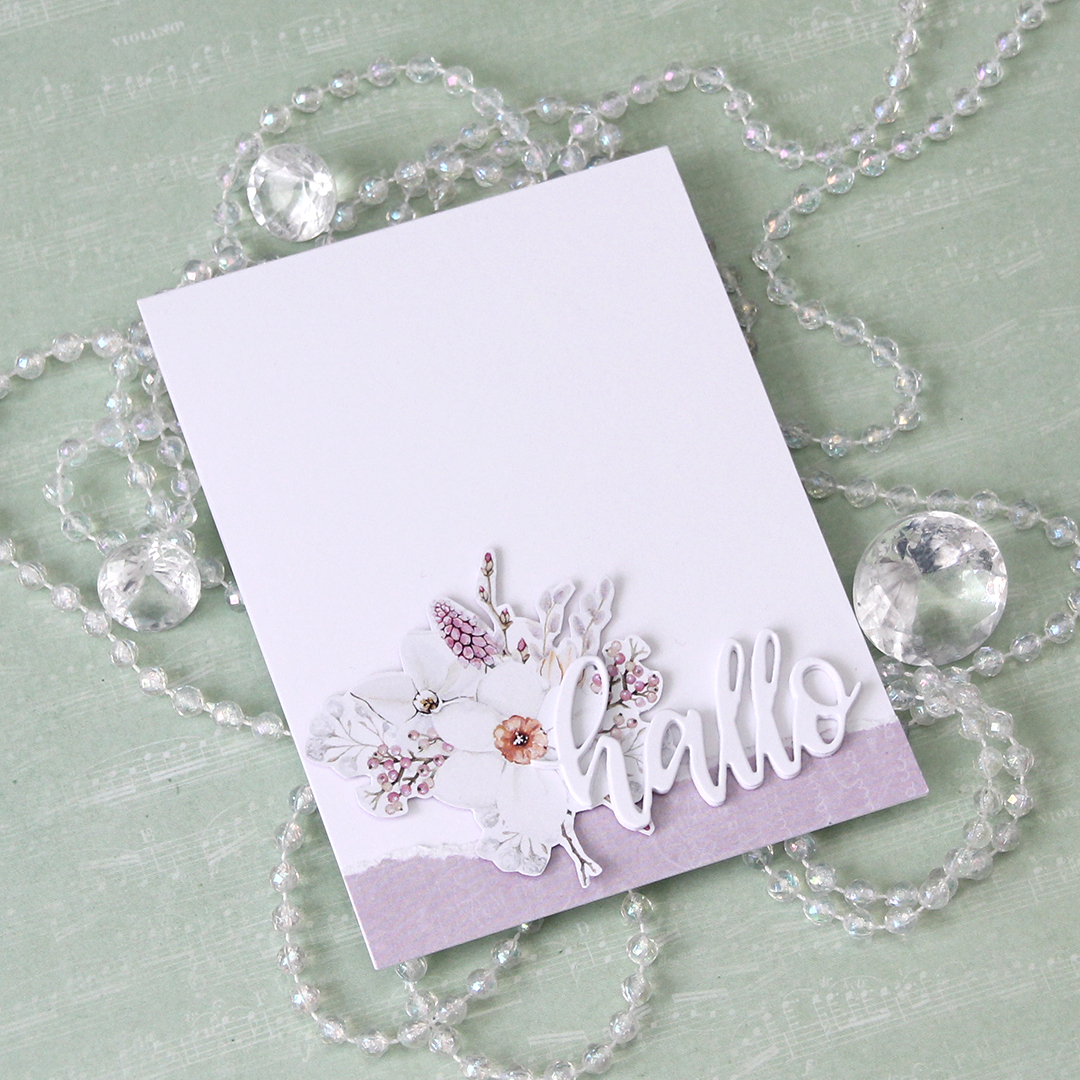 I have tons of floral clusters left over from the patterned paper, and one of the wonderful things about the P13 papers is that the design isn’t repetitive. This specific sheet of patterned paper had plenty of florals on the front, but they were all a little different, which means creating different cards from them will be a breeze.