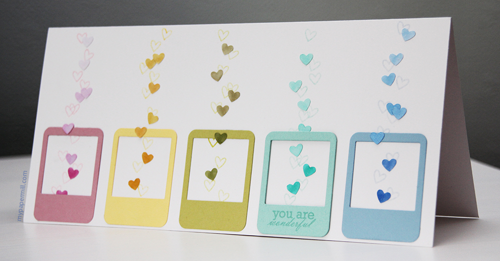
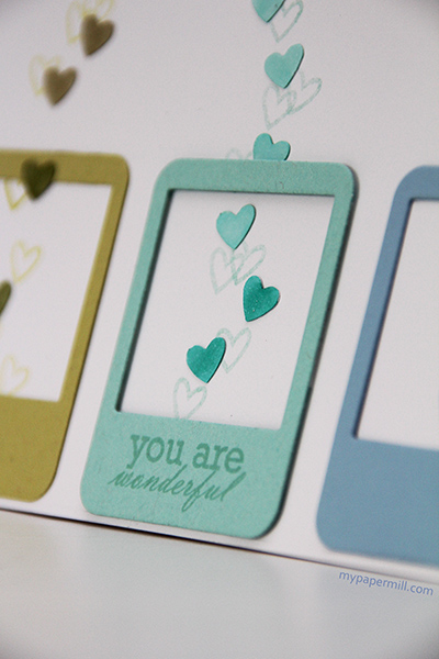
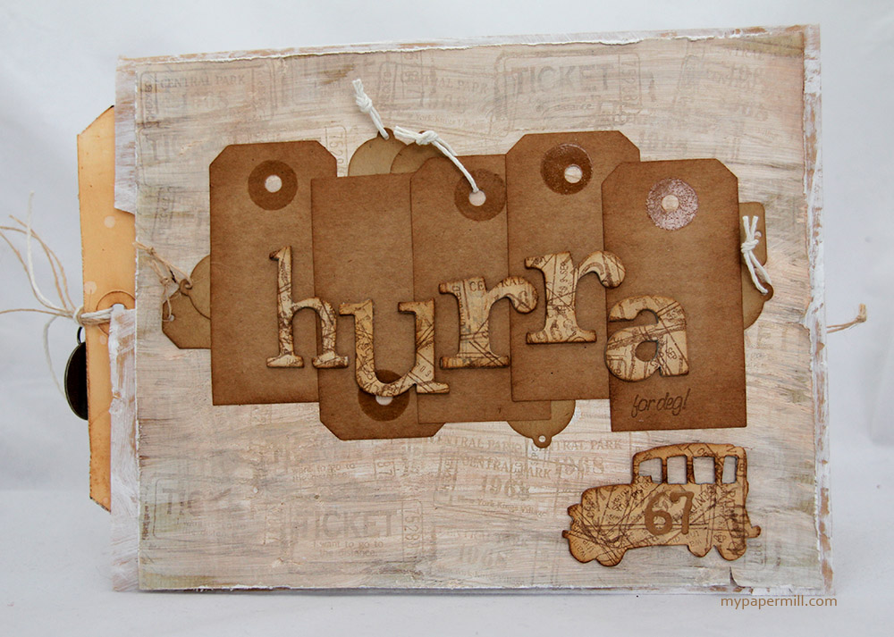
Appropriate title for a blog entry considering it’s been a few weeks since my last one. Yikes! Sometimes life just gets too busy. It’s not that I haven’t made any cards recently, because I have, but they’re either not completely finished or just not ready for the world wide web quite yet. I could make up some excuse about not writing any entries because my new laptop keys haven’t arrived yet, making it difficult to type (which is totally true, btw), but I won’t. 😉
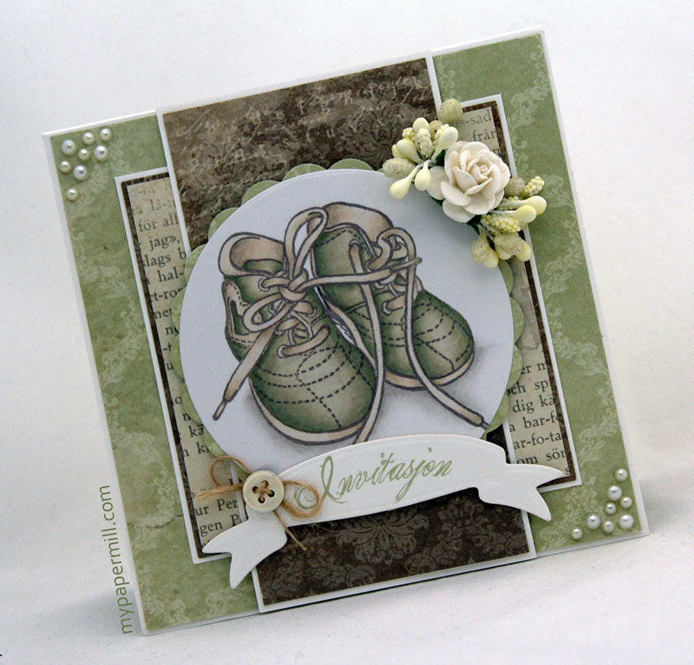
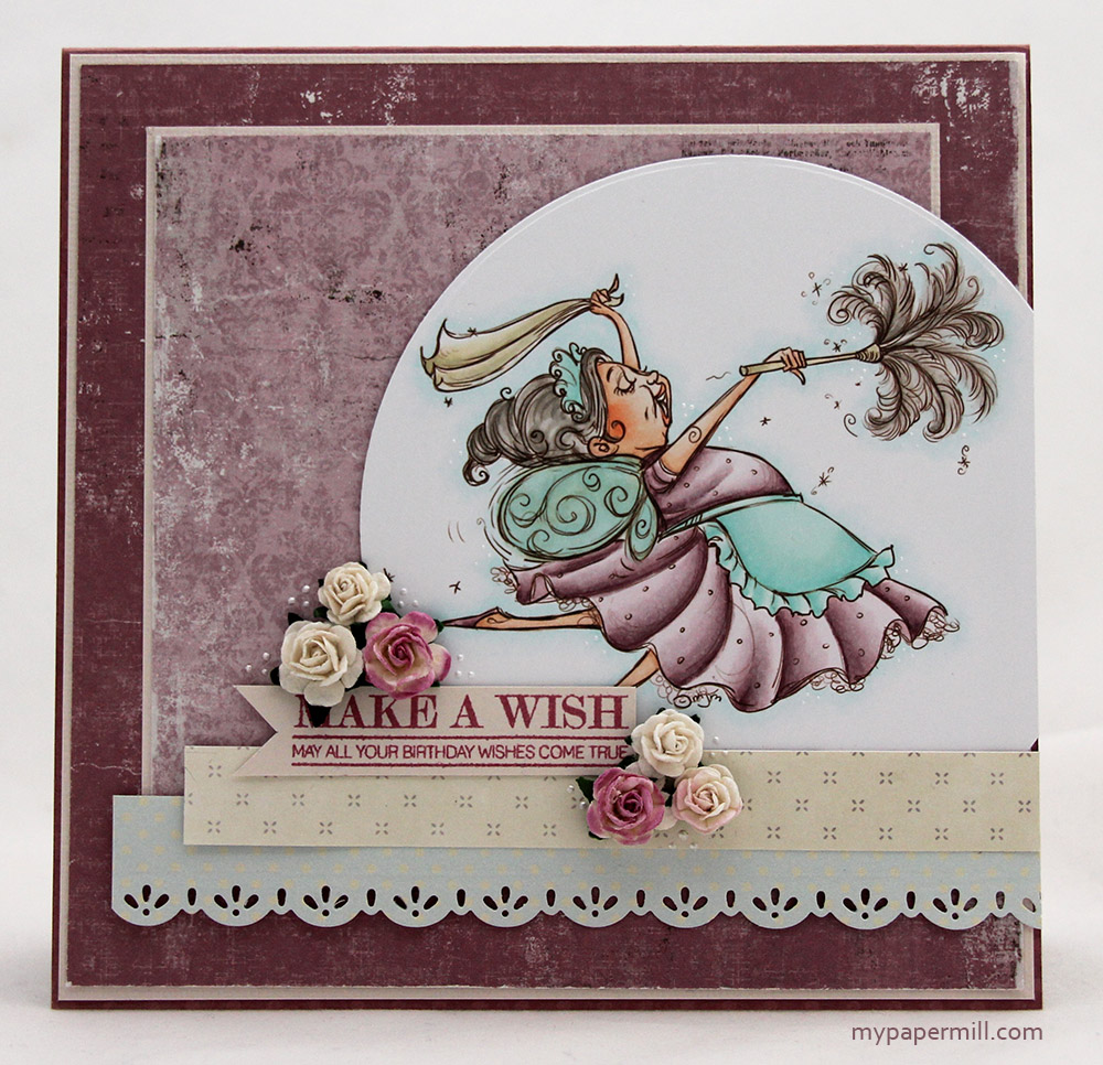
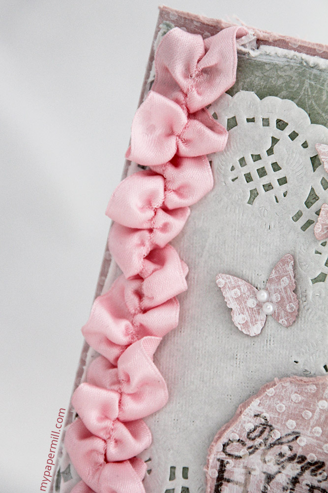
 This card was made to order for a woman who just turned 60. She cleans floors, and although I couldn’t find an image of an old lady with a bucket and a mop, I did find this Mo Manning fairy dust image, which I think fits. This card also happens to be my contribution to our current challenge at CopicMarkerNorge – anything goes. There are still plenty of days left before the Sunday deadline, so join us, won’t you? I printed the image in brown on Perfect Colouring Paper. I couldn’t find my X-Press It at the time, and I’ve got plenty of PCP. I don’t really like PCP to color on, so I even used it for the insides and the back of the card. I’m sure it’s no surprise that I’ve used patterned paper by Maja Design. This time I pulled out some scraps (this card is made entirely from scraps!) from the Vintage Summer Basics line (1922, 1923, and 1899), as well as some Inkido scraps – the cream one is “Pink Newspaper”, and I don’t know what the blue one’s called, only that it’s by Inkido. Bazzill Vanilla cardstock (as usual), paired with Bazzill Dotted Swiss – Romantic Mauve (also scraps, btw). The sentiment on the banner is from the “Mum’s the Word” stamp set from Papertrey Ink.
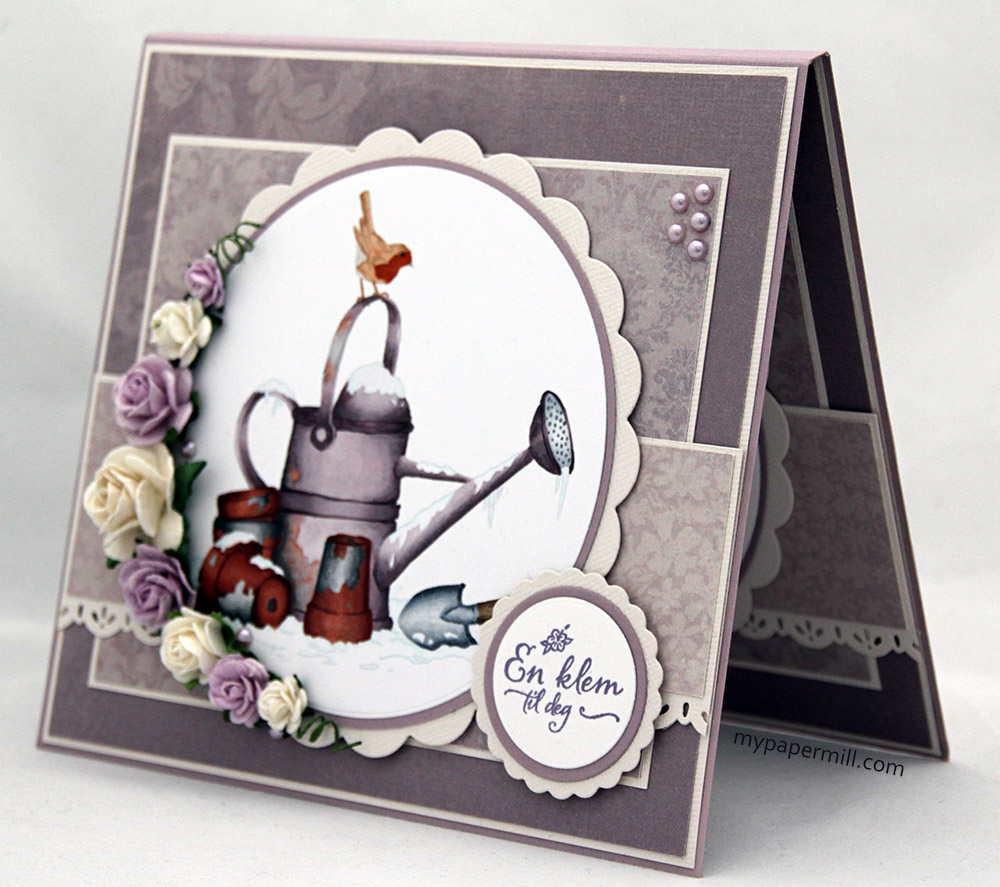
 I didn’t really have a lot of time with this card, it was thrown together in less than a day, including coloring, which – for me – is warp speed. This meant really simple insides, the first one includes a stamped sentiment from the “Over Under Easy” stamp set by Papertrey Ink, stamped in Autumn Rose ink – also from PTI.
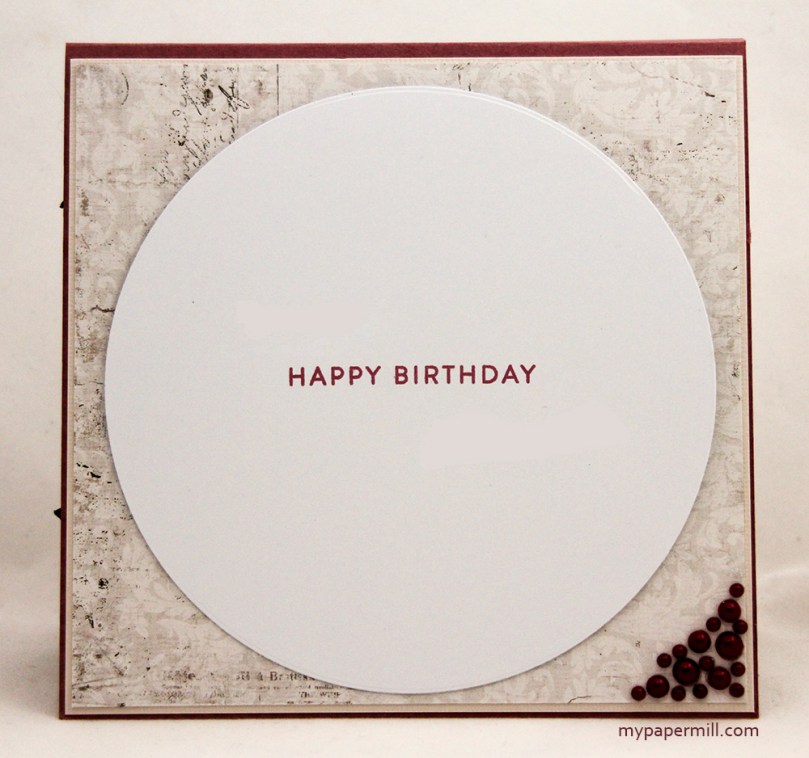 The second inside is just as simple. Just a birthday stamp (from the same stamp set as the first inside) and a few really dark pink pearls from Inkido in the bottom right corner. I needed a really big panel on the inside, there were 30 different signatures going on this card, so I had to make sure there was plenty of space.
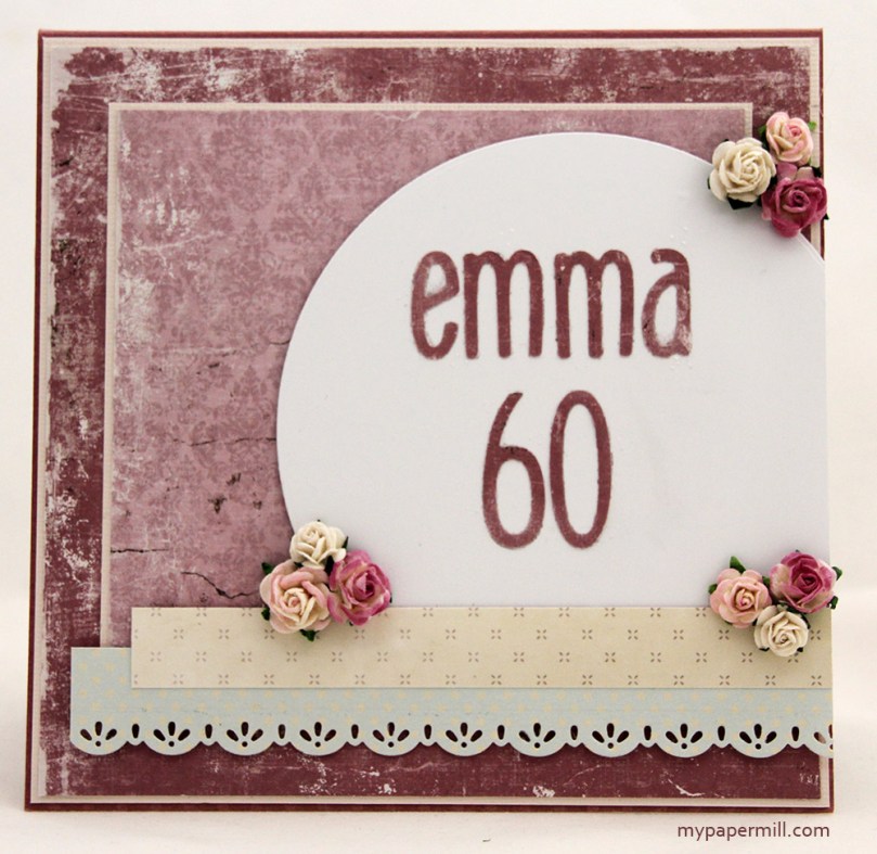 The back – pretty similar to the front. The lovely edge of the blue paper is made with a Magnolia die (Old Swedish Lace). I’m not too sure where the flowers are from, some are from Wild Orchid Crafts, others might be from Papirloftet (yes, I’m a paper flower hoarder – who isn’t?) The letters and numbers are diecut from the patterned paper using the Santa’s workshop alphabet by Quickutz. It’s an alphabet I really, really like, the size is perfect and the alphabet itself is sans serif, another huge pluss (although I do like Tim Holtz’ typeset alphabet, which is definitely not sans…)! I prefer the much cleaner, graphic look of sans serif types to serif ones (there are a few slab serifs I like, though)!
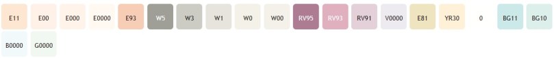 Enough about my preferences in type faces – these are the colors I used for the dust fairy. I also used RV97, which is a color I’ve made myself.
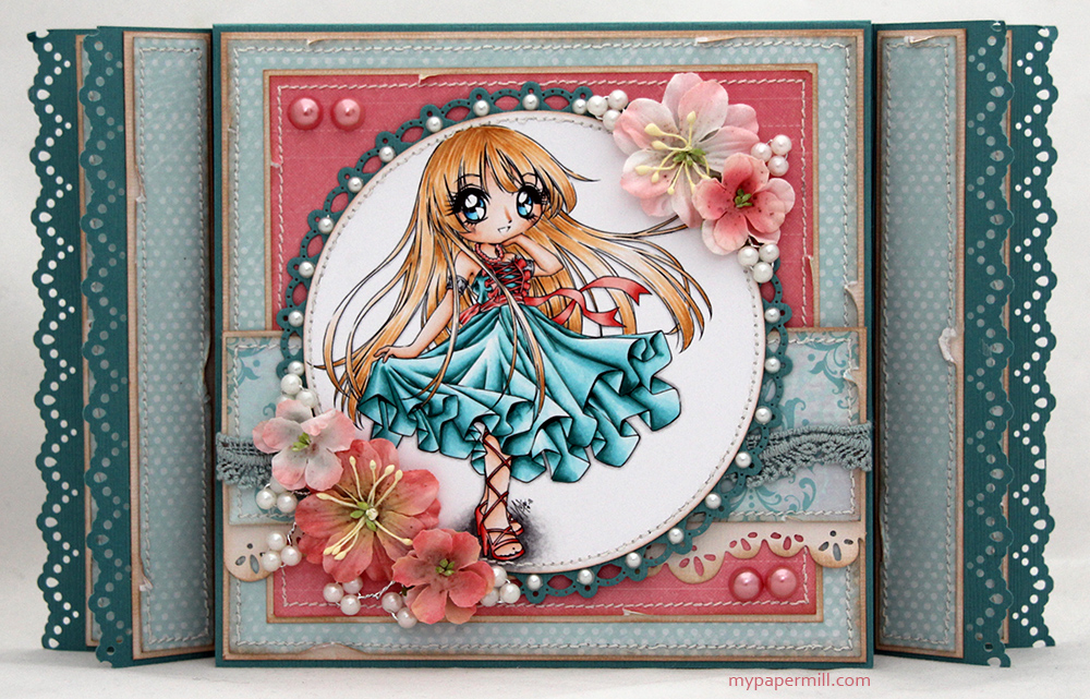
 Dagens lille oppdatering er et kort laget for et av fargeleggingsheftene til Ett Trykk, der jeg har bidratt med Copic-fargelegging fra og med det første påfyllingsheftet. Til pastellheftet ville de også at jeg skulle lage et kort av det ferdige motivet mitt, og da var valget enkelt. Jeg har ikke fått brukt Sofiero-arkene mine fra Maja Design så mye som jeg skulle ønske, så jeg tok dem frem for anledningen og storkoste meg med mitt aller første gatefold-kort!
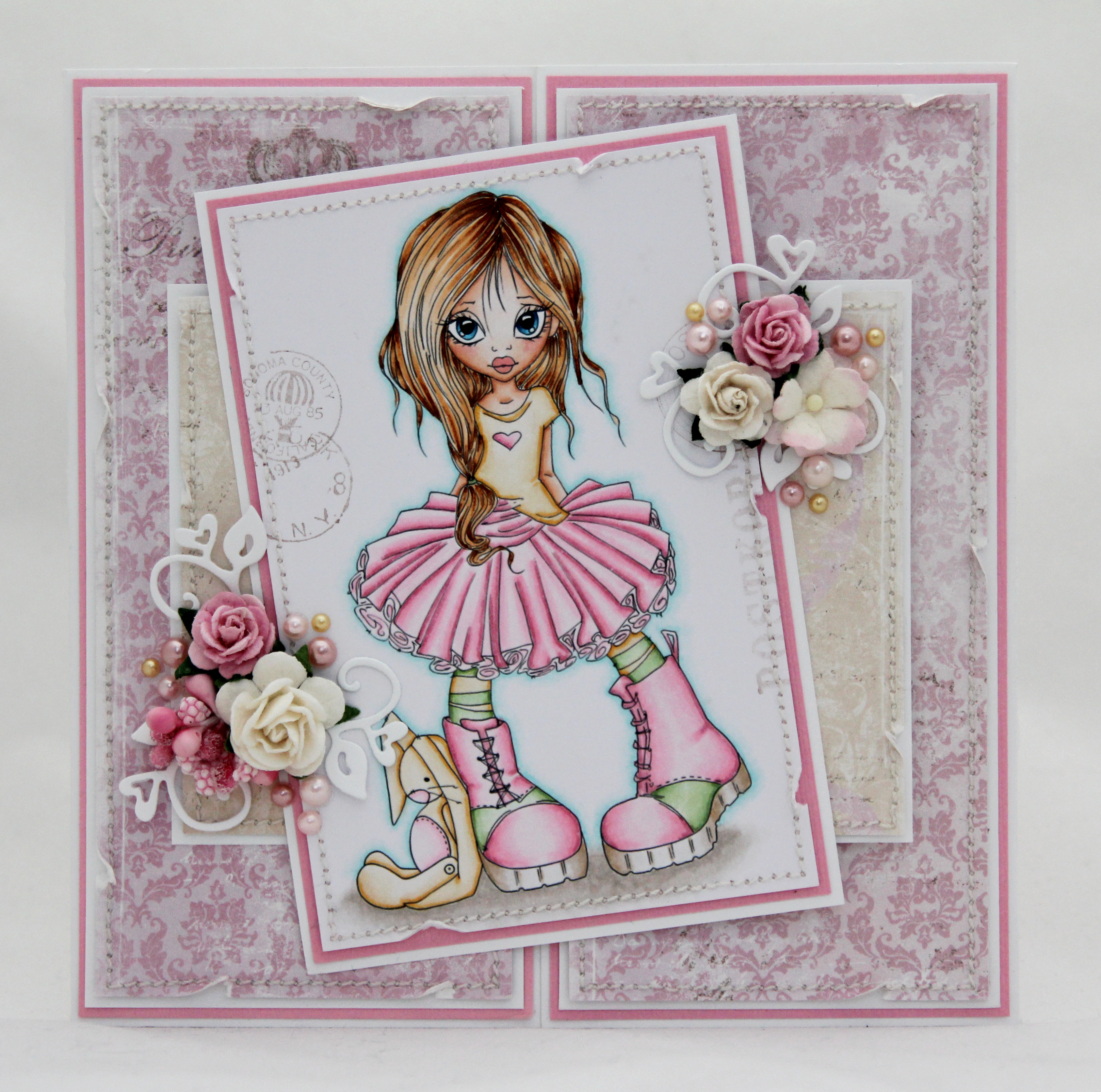 Motivet er Honey fra Saturated Canary, selvfølgelig fargelagt med Copics. Kortet er laget med Classic Smooth White og Chablis kartong fra Bazzill, med Royal Summer Residence og Strolling Down the Rose Path-arkene fra Maja Design. Alle panelene er sydd og revet litt, og jeg har bakgrunnsstemplet diverse stempler fra Kort & Godt, Magnolia, Basic Grey og Marianne Design på selve motivet og også inni kortet.
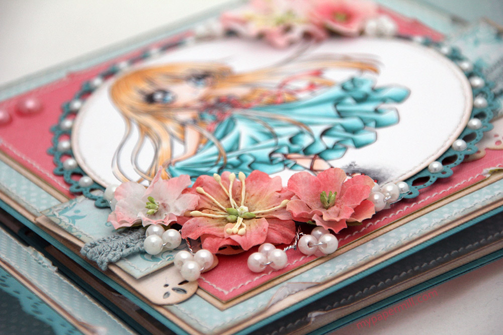
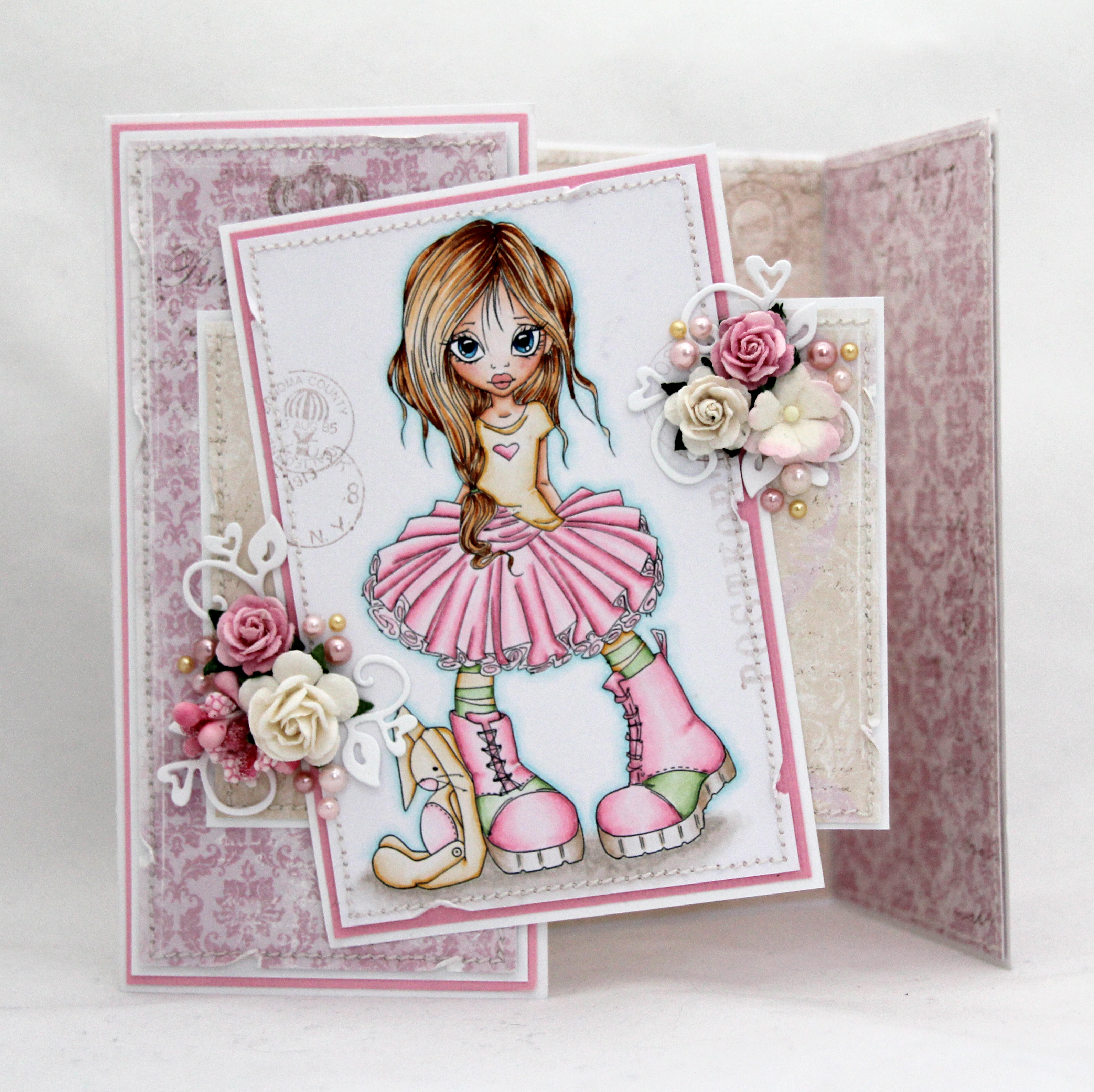 Kortet holdes lukket med skjulte magneter fra Basic Grey. Jeg har pyntet kortet med blomster fra Wild Orchid Crafts og pyntebær fra Magnolia, og har også brukt en Magnolia-die (Heart Swirls) til å lage snirkler under blomstene. Jeg har også satt på rosa halvperler fra Staz og gule halvperler fra Papirdesign.
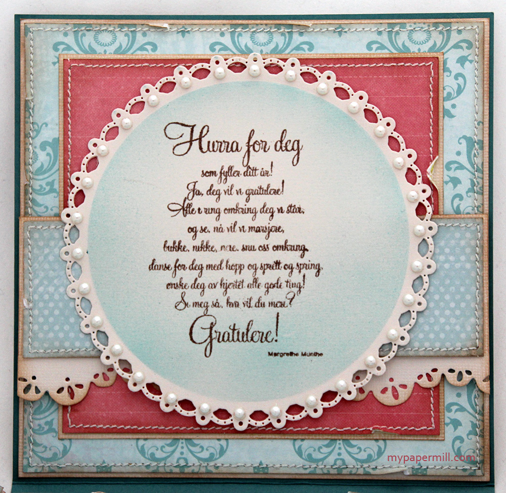
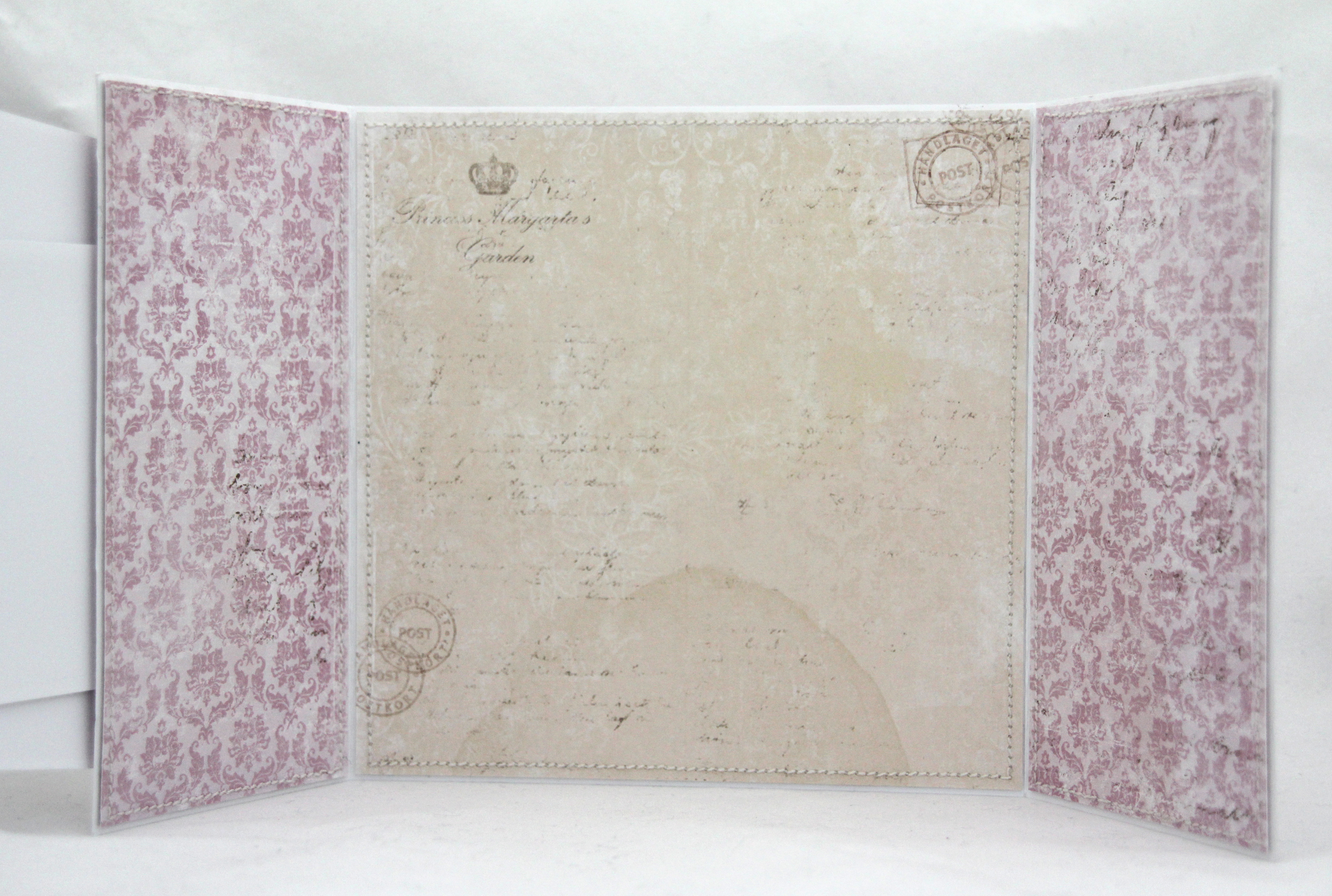 Innsidene har jeg laget meget enkle, med plass til mye tekst.
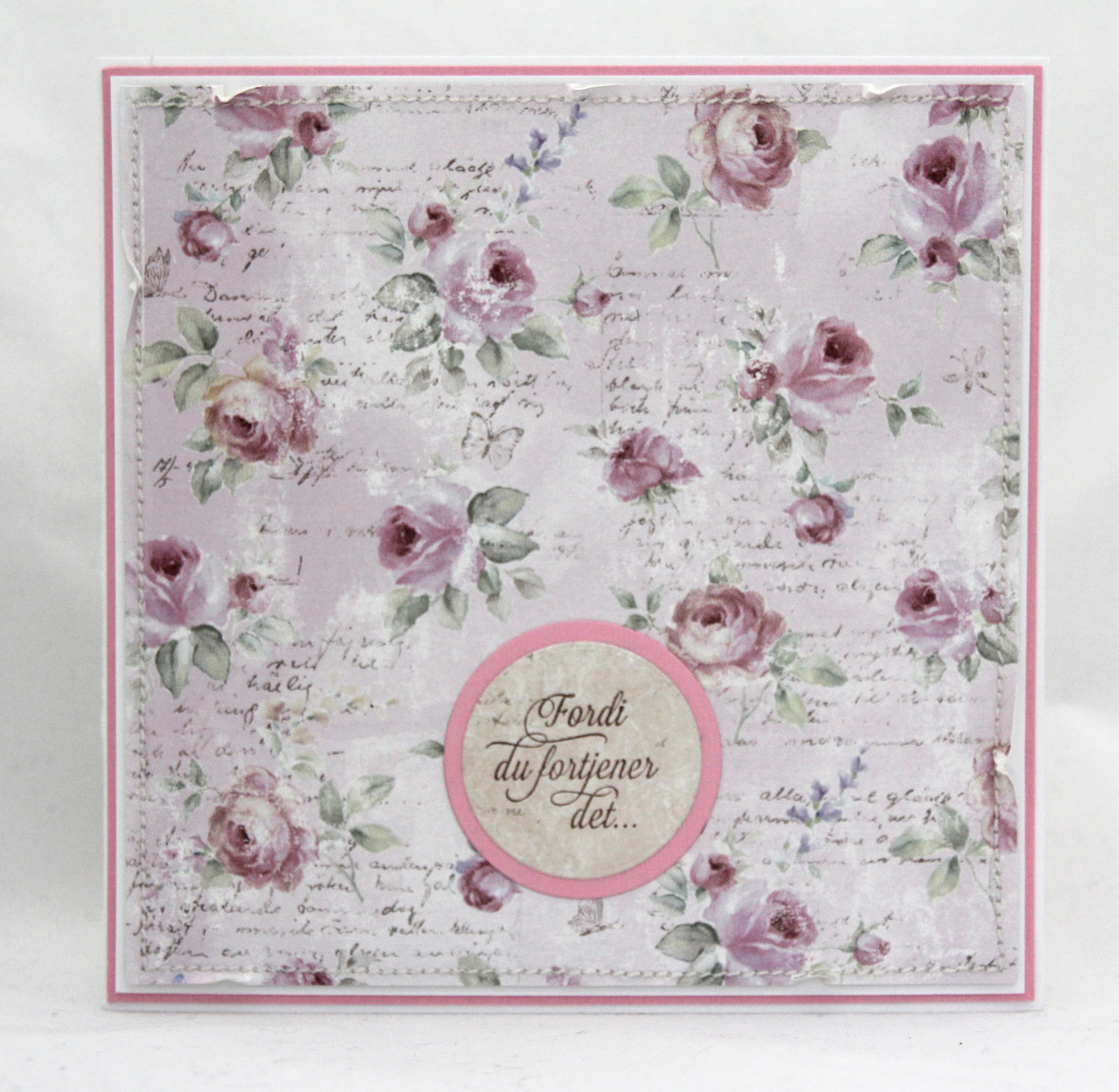 Baksiden har jeg også gjort enkel, med noen runde diecuts av kartong og mønsterark og et tekststempel fra Papirdesign som siste finish.