Hi, crafty friends! We’re halfway through spring, and I’m still really looking forward to summer, as evidenced by my card today. Spring is nice, but summer’s the best, and these images really capture that summer feeling!
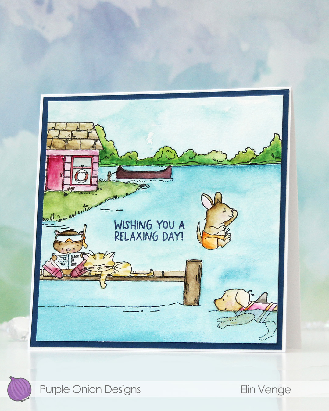
 I created a scene with quite a few images from the Lakewood collection from Purple Onion Designs, illustrated by Holly Mabutas. Oliver reading to swim, Sleepy Sampson, Ollie swims, Bruno Jumps In, Boat house and Pier are all used in this one scene. It’s still not a very busy card, and I got away with only masking the guys on the pier.
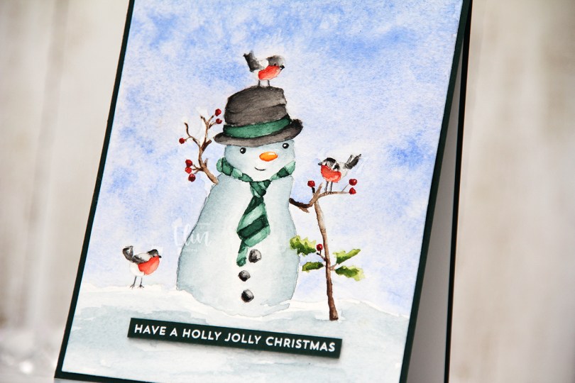
 I don’t use watercolor a lot, but a palette with watercolor paint is a lot more travel friendly than 360 Copic markers, and I was on vacation in the mountains when I painted this last summer. Only having access to watercolor forces me to play with them and familiarize myself with them, which is a good thing.
 The images are all stamped using Obsidian ink from Altenew, which is a pigment ink that works well with watercolor. The paper is Fabriano Artístico cold pressed watercolor paper. I used my Mijello Mission Gold watercolor paints and brushes of varying sizes. I’m not an expert watercolorist, so the coloring’s pretty basic.
 I trimmed my panel, stamped a sentiment from the Summer Days Sentiment set using Winter Lake ink from Altenew, matted the panel with a piece of Enchanted Evening cardstock from Papertrey Ink, then adhered that to a square card base (5 5/8″ x 5 5/8″) that I created from Stamper’s Select White cardstock, also from Papertrey Ink.
 I stamped the
 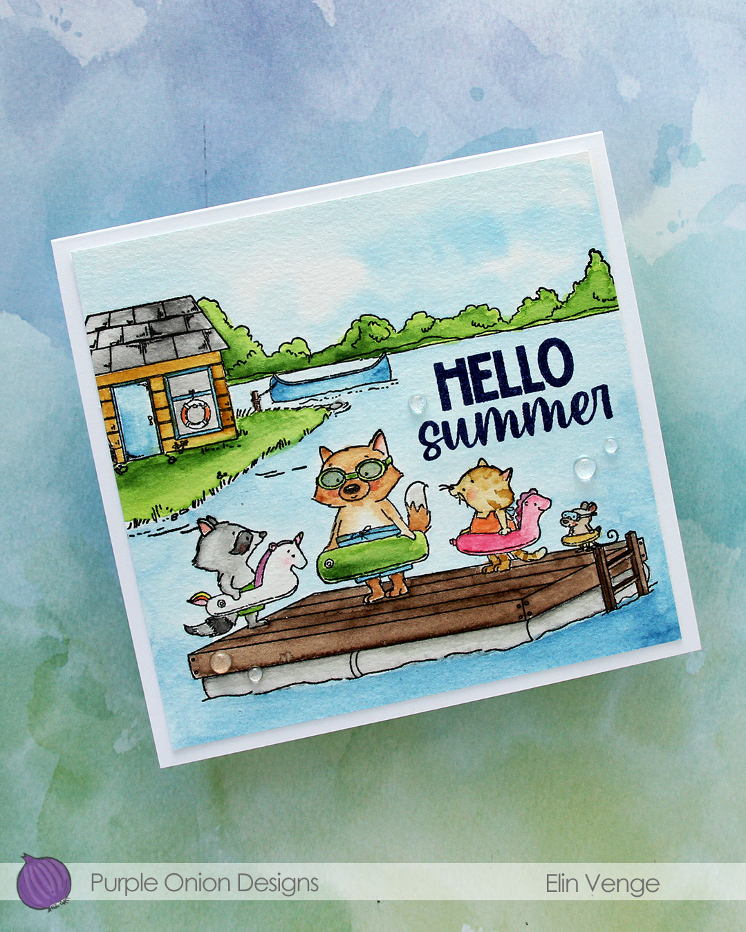 I used my Mijello Mission Gold watercolors and brushes in varying sizes to color in my scene, cut it down and stamped a sentiment from the
  I adhered the panel to a 5 3/4 x 5 1/2″ top fold card base I created from Stamper’s Select White cardstock from Papertrey Ink, before finishing off with a few Raindrops from Little Things from Lucy’s Cards.
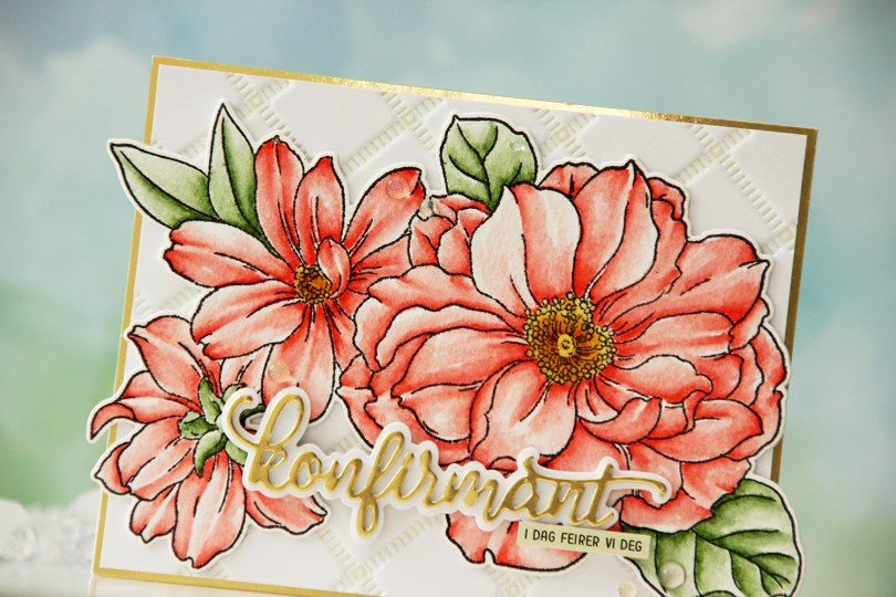
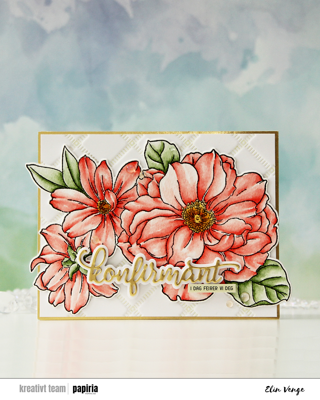 I started by stamping the big floral stamp in the Blooming Delight stamp set from Altewew using Altenew Obsidian ink onto watercolor paper (cold pressed Fabriano Artístico), before coloring with Zig Clean Color Real Brush markers. When my coloring was complete, I die cut the flower with the coordinating die and also cut a few extra from white cardstock to build dimension.
 I used the Stippled Plaid press plate from Pinkfresh Studio with Pistachio ink from Altenew to create a subtle background. I matted it with some gold shine cardstock from My Favorite Things and adhered my florals pretty much in the center. The flowers stick out on both sides, but I just made a larger envelope to accomodate the larger size.
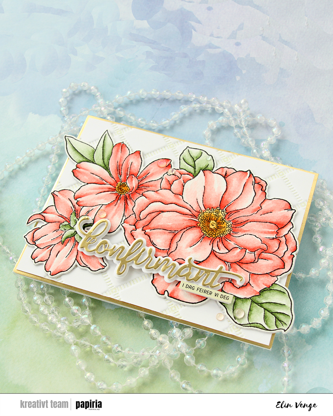 For the sentiment, I used a konfirmant die set from Papirdesign. I die cut the shadow layer from white cardstock and the word itself from the same gold cardstock that I used previously, with a few white die cuts stacked behind it for dimension. I even stacked a few behind the shadow, so it looks like the shadow floats on top of the flowers. For a sub sentiment, I used a sentiment sticker strip from Kort & Godt that I ink blended with Misty Sage ink from Altenew, before finishing off the card with a few Iridescent Dew Drops from Pinkfresh Studio.
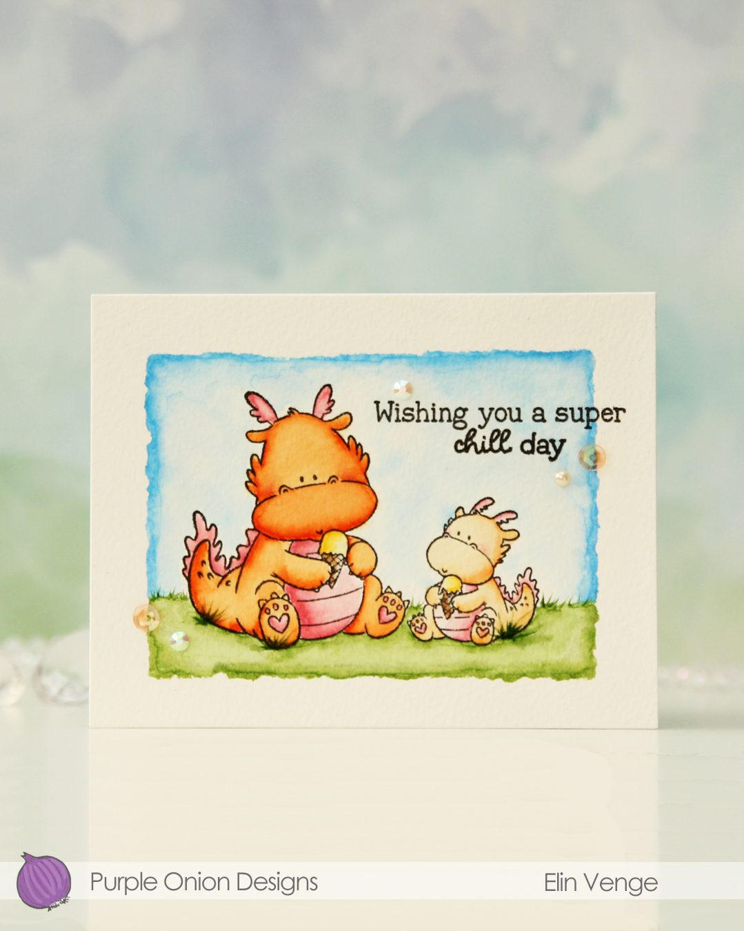
 I added some tufts of grass to my coloring. The markers make it super easy because of their actual brush.
 Once all my coloring was dry, I stamped a sentiment from the

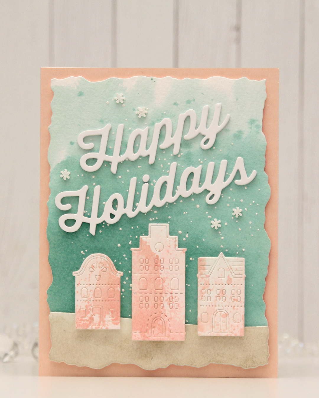 For this card, I really tried. I chose a color combo of Pebble, Ballet Slipper, Brickyard, Cranberry, Cobblestone and Tidepool from C9. I wanted to focus on Ballet Slipper, Cranberry and Tidepool for the Gummiapan diecut houses, but Tidepool and Ballet Slipper created mud when they mixed, while ink smooshed Cranberry looked like an episode of Dexter. I switched gears and ink smooshed Ballet Slipper on its own on watercolor paper. When it dried it looked like Grapefruit. So much for not using peach tones. I watercolored a background using Tidepool reinker and did the same with Pebble reinker on a separate piece of watercolor paper. Once dry, I die cut the Pebble piece with a curved landscape die from the Slim Card Basics die set from Mama Elephant, then layered the two pieces together and die cut them using the largest die in the Watercolor Rectangle STAX die set from My Favorite Things.
 I sprinkled on Chunky white embossing enamel from Stampendous onto the background, heat set it so the granules melted to look like snow, adhered the slope with 1 mm foam squares and mounted the entire panel onto a card base that I covered with a piece of Nectar cardstock from Concord & 9th. I tried Grapefruit first, but felt it was too dark against the background. I mounted the houses using foam tape, die cut and stacked four layers of Happy Holidays from the Jolly Holidays Greetings die set from Concord & 9th and adhered the greeting at an angle above the houses, before finishing off with Snowdrift Sprinkles from Little Things from Lucy’s Cards.
 I love hydrangeas, and this image was is one I just HAD to color. Even though I’m more confident with my Copics because I use them so much, I love the soft look and those edges lines you get with watercolor. I stamped the image on a piece of Fabriano Artistico Extra White watercolor paper using Obsidian ink from Altenew. This is a pigment ink, which makes it perfect for embossing. I sprinkled on clear embossing powder from Ranger and melted the powder.
 I grabbed a couple of paint brushes and my Mijello Mission Gold watercolor set and mixed pinks and purples for my flowers, and a bunch of different greens for the stems and leaves. I’m no expert watercolorist (if you want to watch an expert watercolor, head over to Debby Hughes’
  This stamp set actually comes with a couple of additional leaves and petals and dies to cut them out, but there’s no die for this large image. Fussy cutting it was easy enough, though. I stamped and white heat embossed a sentiment from the stamp set onto a piece of True Black cardstock from Papertrey Ink. I dry embossed a piece of patterned paper from the Watercolor Wishes 6×6 inch paper pack from Lawn Fawn using the Geometric Landscape stencil from Altenew. I wanted a little bit of texture to create interest in the background without distracting from the main image, and this did the trick.
 I added a few more layers of cardstock behind my black strip for dimension, popped the flower up on foam tape and finished off the card with a few faceted pearls. Or are they gems? No matter what they are, they’re gorgeous, and I have a feeling I’ll use up the entire pack of these in no time, I love them so much.
 I bought a 36 tube set of Mijello Mission Gold watercolors last September, and they’ve been sitting in their palette scaring me, but I’ve recently started dabbling a little bit. Images like this with big open areas are great for practice, and this is my third proper watercolor piece. Yes, I’m keeping track, haha. The previous two attempts were both noline. One was a background, and the other a digital stamp. My printer ink doesn’t play well (or at all, really) with water, so I had to opt for the noline look to prevent visible bleeding. I dove right into the deep end, hoping I could pull it off.
 I stamped the image onto Fabriano Artistico Extra White watercolor paper using VersaFine Onyx Black ink. I’ve created a birthday card with these two once before (blog post
  For my last card with this image, I used my Copic BV20 series for a purply gray elephant. This time, I went for a bluer version to get a nice contrast. I actually decided to mute my pink a little before painting with it. The Bright Opera color from Mijello is a super bright pink, and I added a tiny bit of Hooker’s Green to dull it a little, it was just too bright a pink straight from the palette for what I wanted.
 Once I’d painted my scene, I went back over with a black pen to trace the lines of the image. I would have restamped if I could, but I stamped the image weeks before I painted it and removed the stamp from my MISTI in the meantime. Black pen to the rescue. I just wanted crisp black lines. I stamped a sentiment from the stamp set using VersaFine Onyx Black ink and heat embossed that using clear embossing powder.
 I cut down my colored panel slightly and adhered it to an A7 top fold card base I created from two pieces of Poppin’ Pink cardstock from Papertrey Ink. To finish the card I adhered sequins, beads, confetti and other various little bits from the Sweet Shop mix from Little Things from Lucy’s Cards. I don’t usually put this many sequins on my cards and scatter them like this, but I wanted to really keep the party vibe from these two going across the entire card front.