Hi! I have a 50th birthday card to share today, featuring the Teeing Off image from Lili of the Valley that was released a few weeks ago.
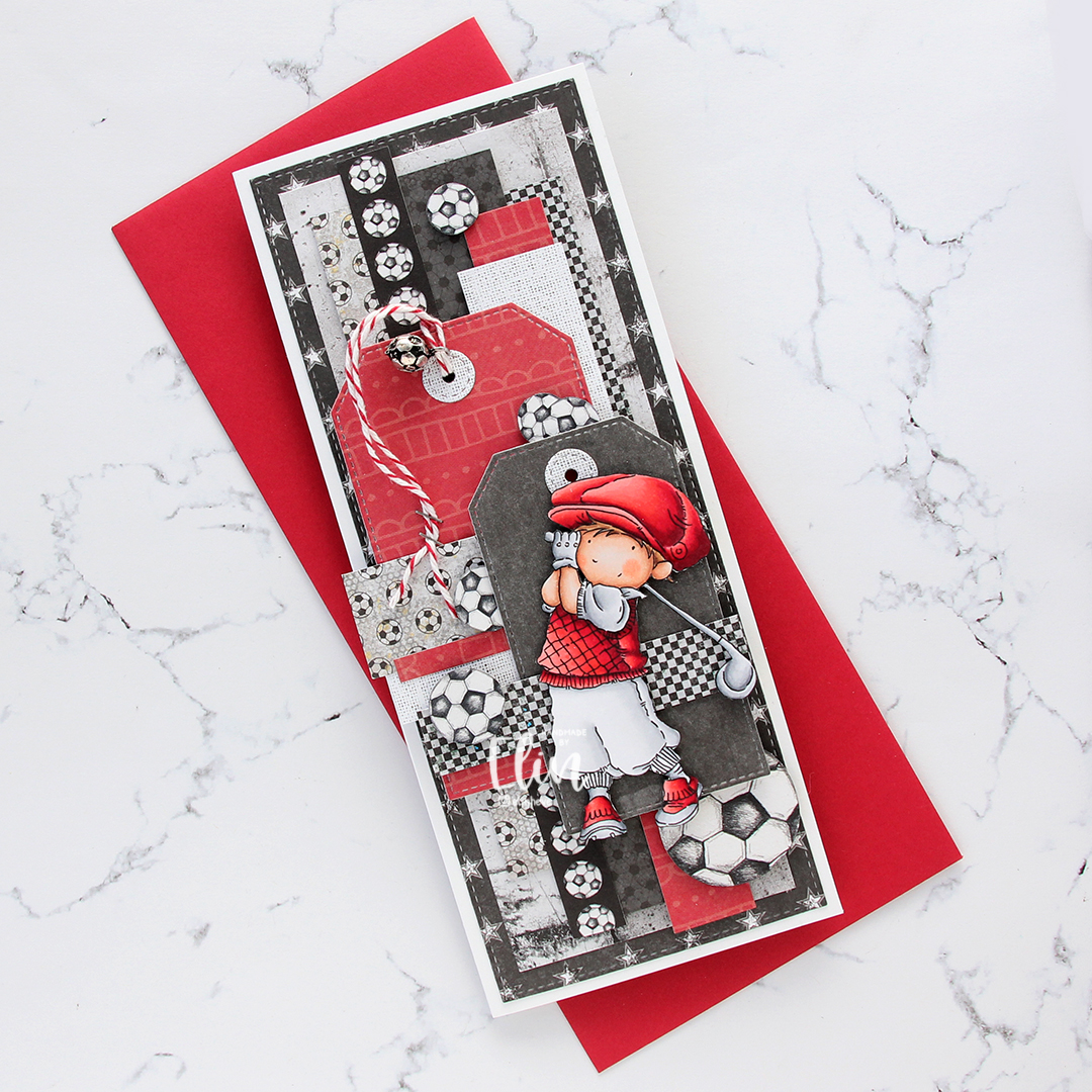
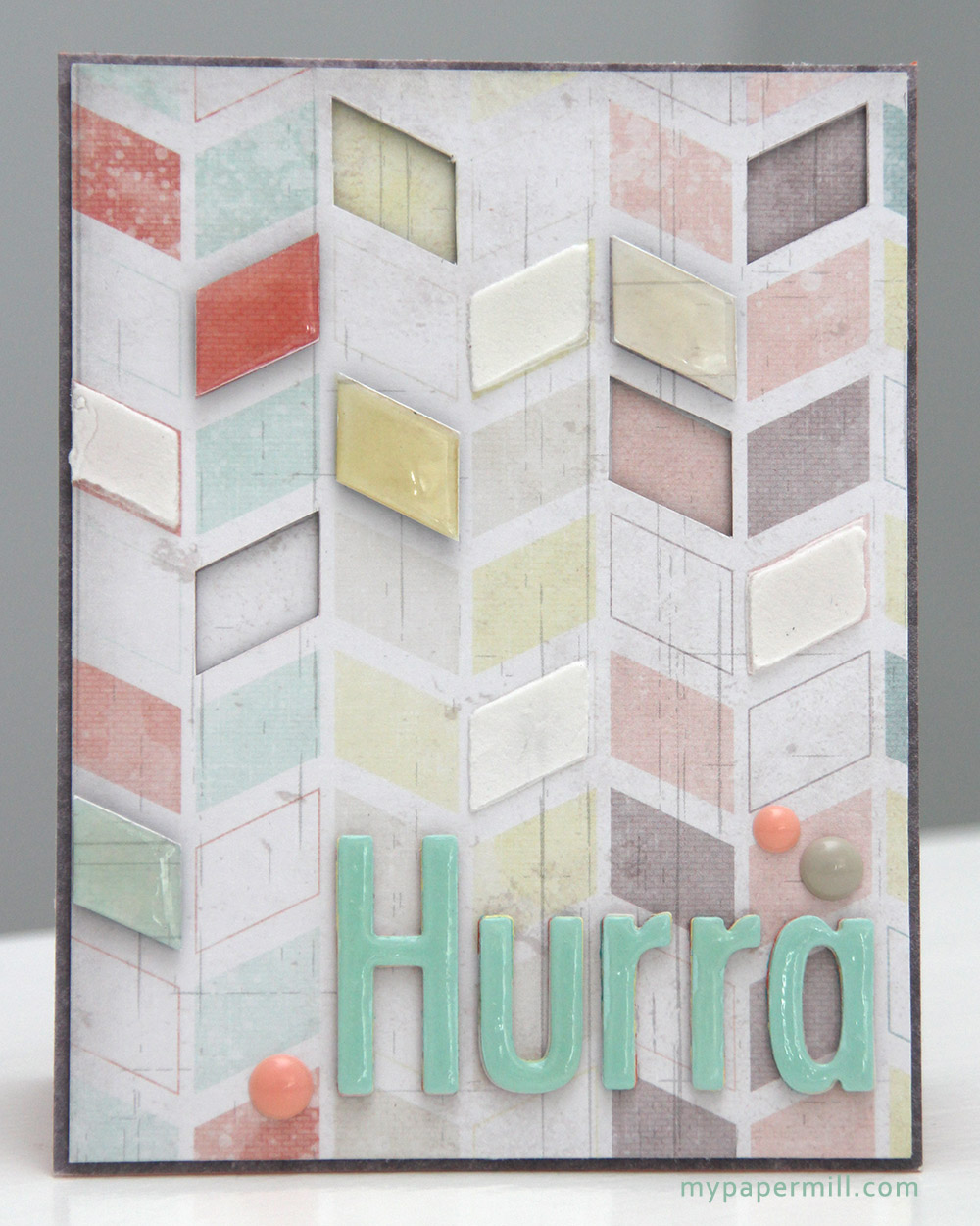
The card was made on order for a golf-playing tinsmith whose favorite football team (European football) is Liverpool. I wanted to include as many of the elements as possible, and made a slimline card with patterned paper from Papirdesign, P13 and 7 Dots Studio.
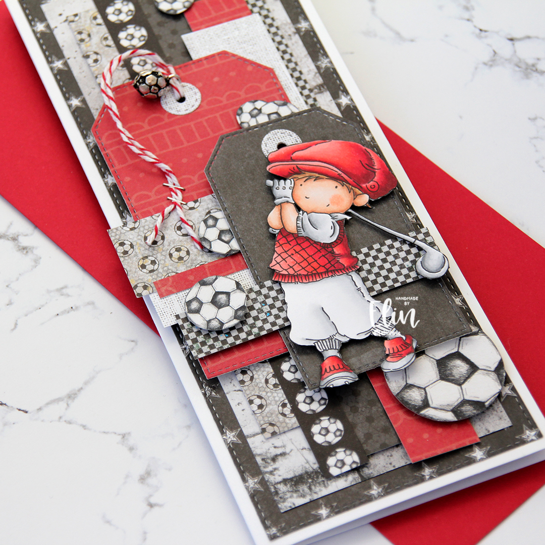
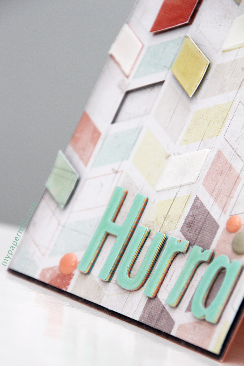
I used lots of foam tape for dimension, and varying widths of the patterned paper layered and criss-crossed across the card. I used the Slimline Starter die set from My Favorite Things and also the Stitched Trad. Tag STAX dies to create the tags. The reinforcers are made with the Tag Builder Blueprints 6 die set, also from MFT.

Through one of the reinforced holes, I pulled a piece of Cherry twine from Whisker Graphics and dug through my stash to find a ball charm, perfect for a football fan. I wanted to include a little bit of metal because of his profession, and started by stapling the twine to the tag. I also fussy cut a few footballs from patterned paper from Papirdesign that I scattered across the front.

I fussy cut my golfer and added him to the front of the card using foam tape.
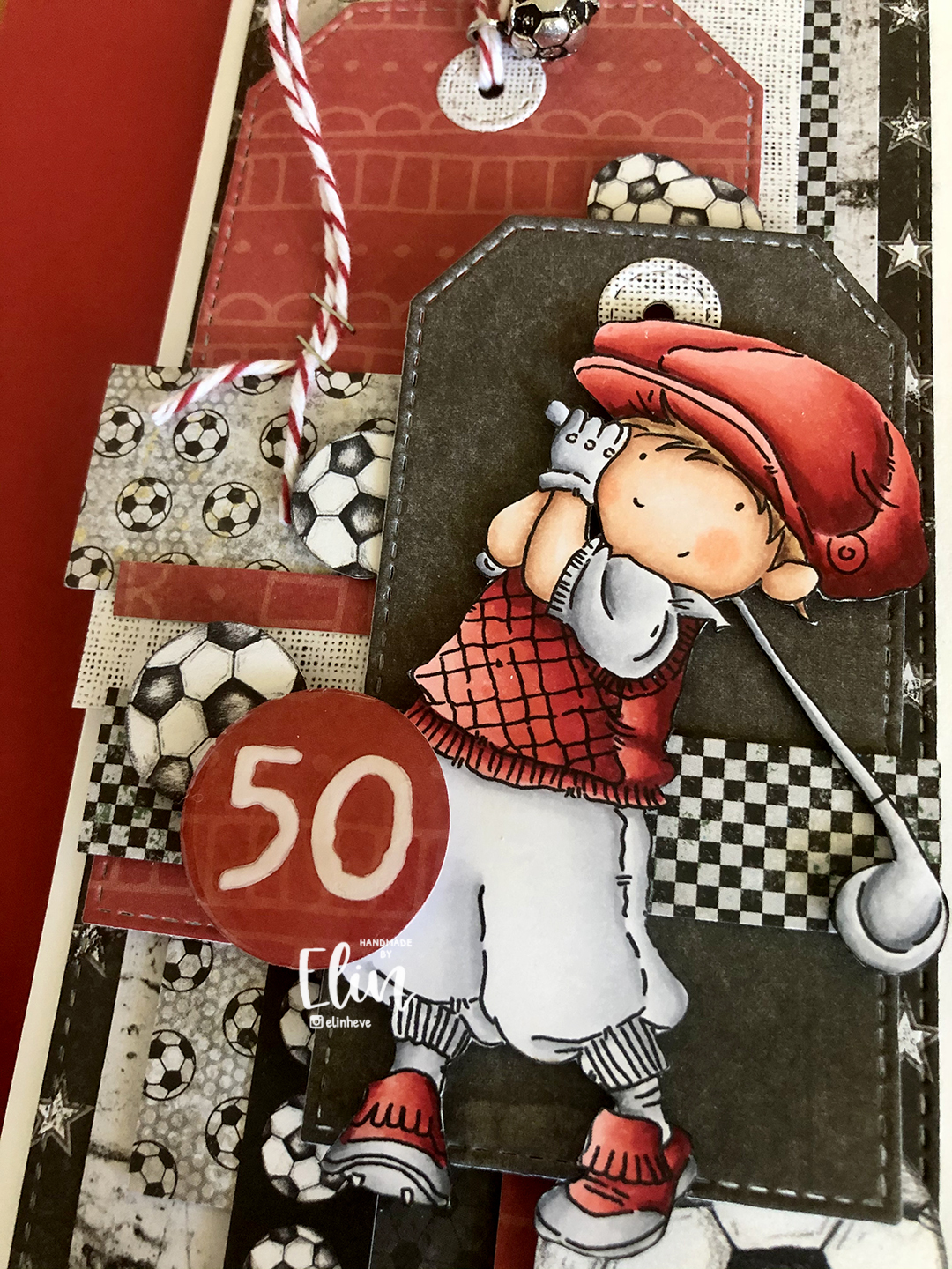
I created a circle with the recipient’s age and covered it with a thick layer of Glossy Accents. Glossy Accents takes a long time to dry, so I made this little piece before starting on the rest of the card and put it somewhere safe to dry for a few hours. Once it was time to put the card together, I’d completely forgotten about this little 1″ circle, and only found it after I’d handed the card over to the woman who ordered it. Thankfully, I was able to meet up with her the following day to add it to the card, but of course, all my photos were already taken, so I snapped this super quickly with my phone just to show what the card should have looked like all along.
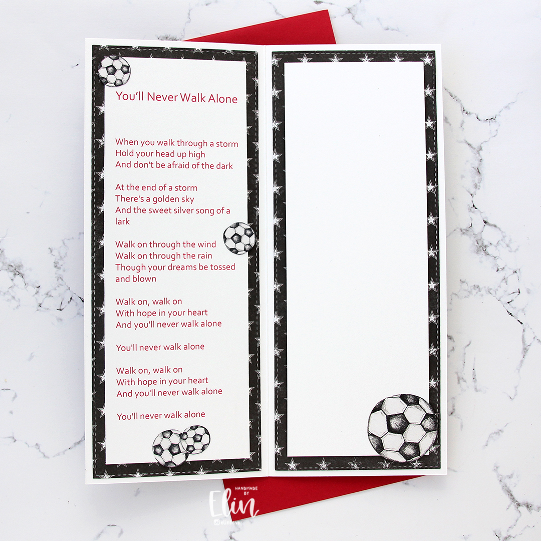
I was asked to try to put the Liverpool team song somewhere on the card, and I figured that one of the insides had just enough space. The other inside has plenty of room for a personal message to the recipient.
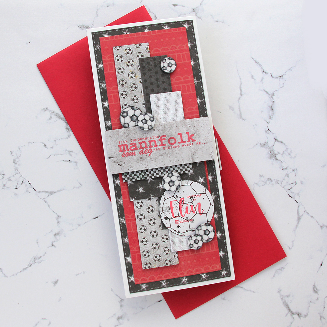
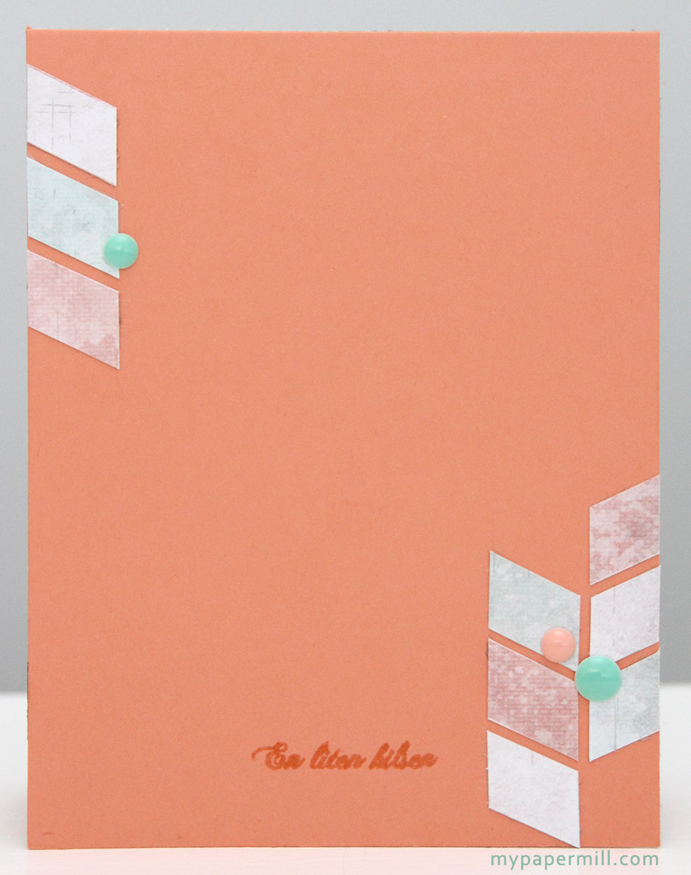
On the back of the card I used more patterned paper, more fussy cut footballs and also a sentiment from Norsk Stempelblad AS stamped in Memento Ladybug ink.
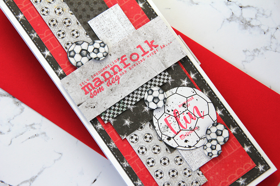
I also added my personal stamp to the back of the card, on a white football with splatters. Back in February, Create a Smile had a two week collaboration with Sommerabend where you could order personal stamps. I got this one and an address stamp. I’ve been creating cards for over 10 years, but never had a personal stamp until now, and I’m so happy with how they both turned out.
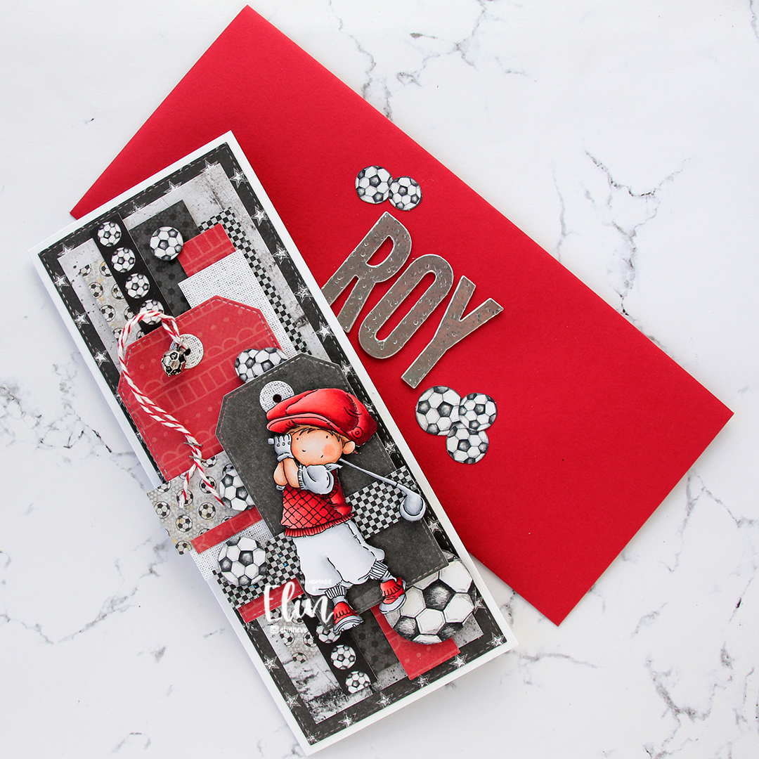
I felt like I hadn’t hit the brief in terms of the tinsmith part, so I decided to die cut the letters of his name in foil sheet and add to the front of the envelope. I put a couple of layers of plain card stock die cuts behind each foiled letter for dimension, and used an old hammer from Tim Holtz to add a little texture to the letters. A few footballs on either side of his name to complete the look.

Not a whole lot of Copics required for an image that mostly reads as red and white.
 I’ll admit, I struggled putting this one together. I had a stray pink Copic streak on the left side of the image, and no matter how times I used my blender on it, it was just too stubborn to go away. I decided to cut it off, I wasn’t about to redo the entire image. I sort of had a plan, but that didn’t really work, so I wound up diecutting a scrap piece of 7 Dots Studio patterned paper to go behind my image.
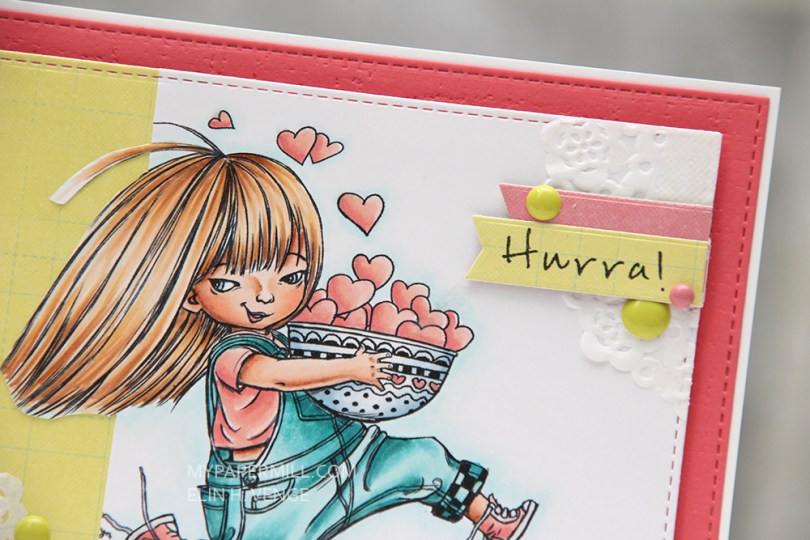
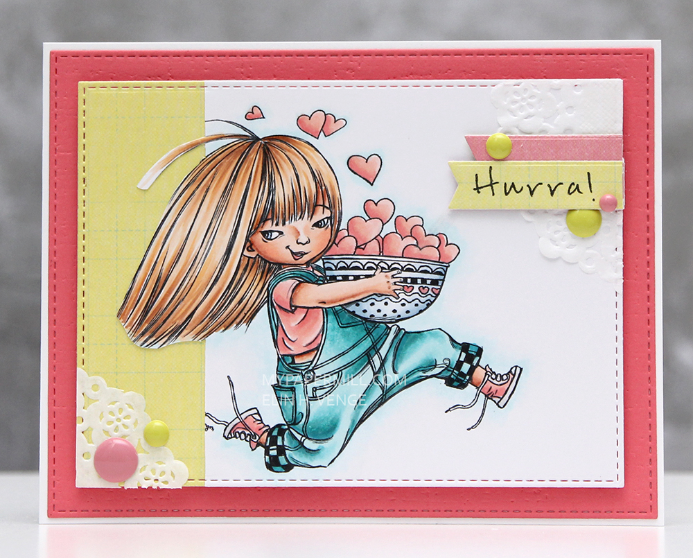
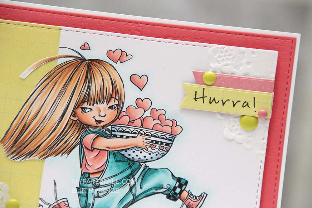 I used the same patterned paper for my sentiment strip, which I stamped with a Norsk Stempelblad AS stamp and then diecut using one of the Fishtail Flag Frames dies from My Favorite Things. The pink patterned paper behind the sentiment strip is actually the other side of that same patterned paper. I thought it fit my Papertrey Ink Berry Sorbet cardstock pretty well, in addition to the pink in the actual image. The pink cardstock is debossed with an impression plate from Papertrey Ink and then diecut with a stitched rectangle die from My Favorite Things. I also added some enamel dots in coordinating colors, as well as a couple of scraps of some doilies I had in my stash.
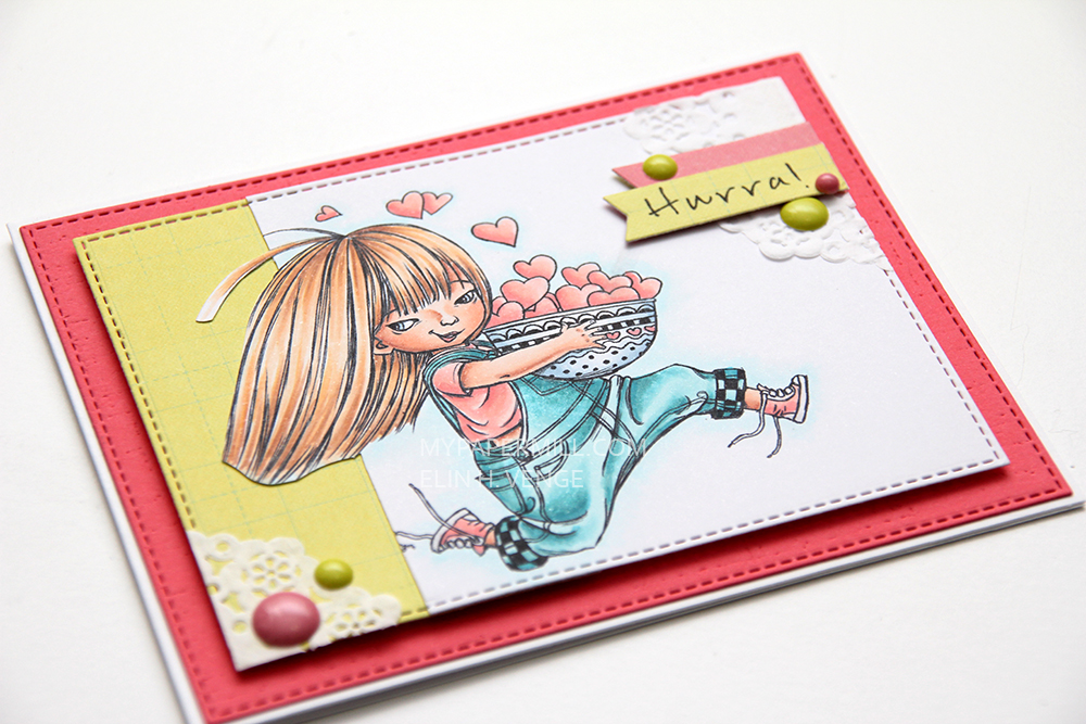 I popped up the entire image using foam tape – lots of it, I’m not shy when I use foam tape.

 This time I chose
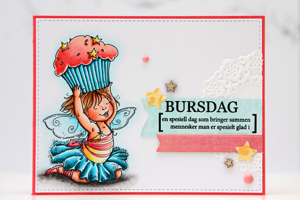
 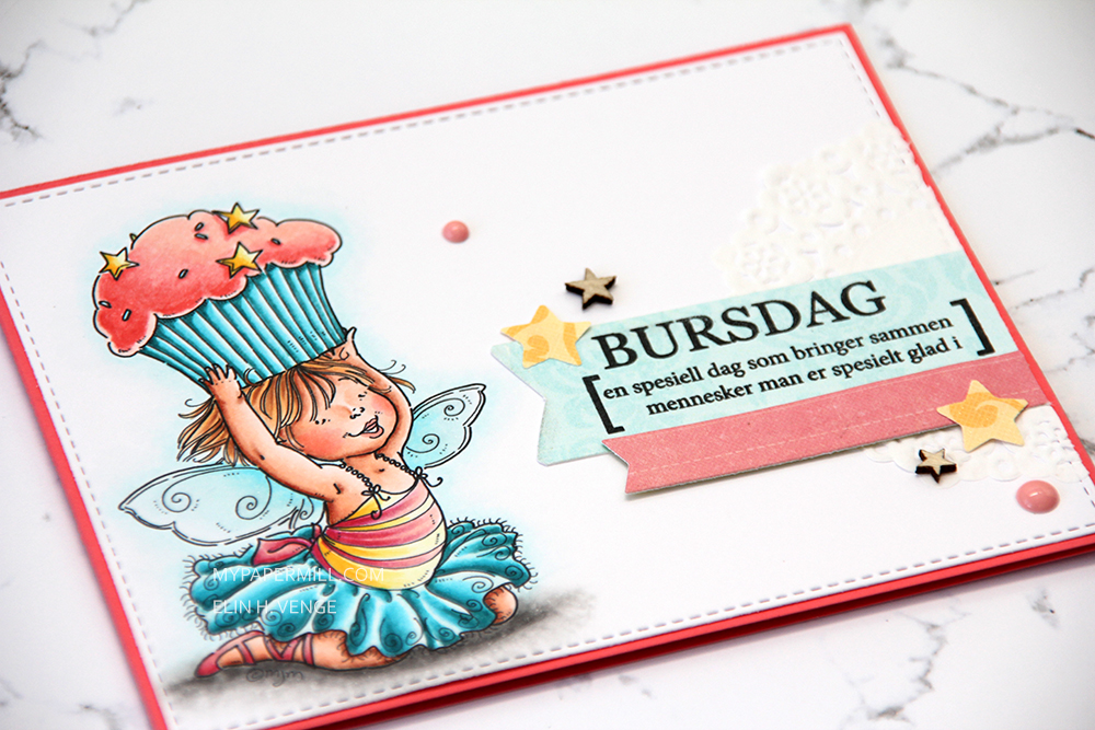 I diecut the banners, as well as the main panel, using dies from My Favorite Things. MFT dies are my favorite, they’re so versatile. I glued part of a doily underneath my banners and stamped a Norsk Stempelblad AS sentiment on the biggest one (It says “BIRTHDAY – a special day that brings together people you love” in Norwegian).
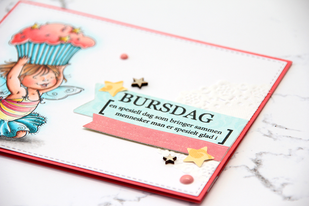 I used a small star punch for my yellow stars, and added a few veneer ones from Studio Calico to put something on the front that wasn’t made from paper. I added a couple of enamel dots to finish it off, simply because the pink color matched everything else perfectly.
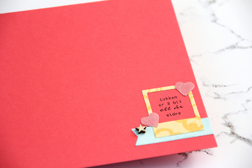 I put a tiny cluster on the inside. Another banner diecut using an MFT die, another veneer star and also a polaroid frame, diecut with another MFT die – told you they’re my favorite. A couple of punched little pink hearts and another Norsk Stempelblad AS sentiment (Happiness is being one year older), and my card was done.
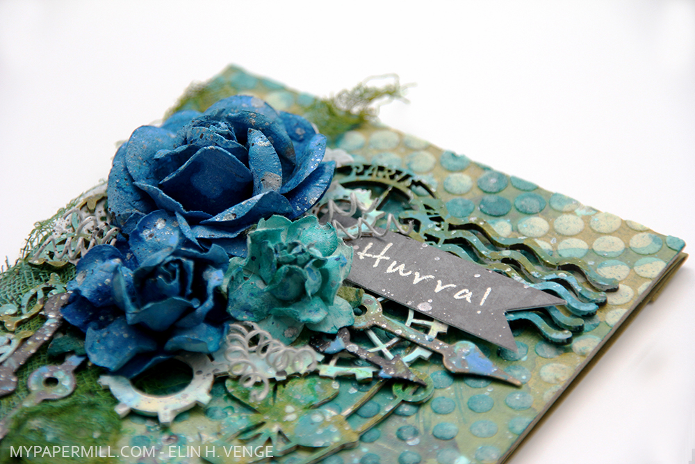

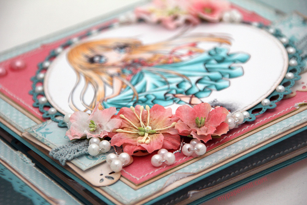
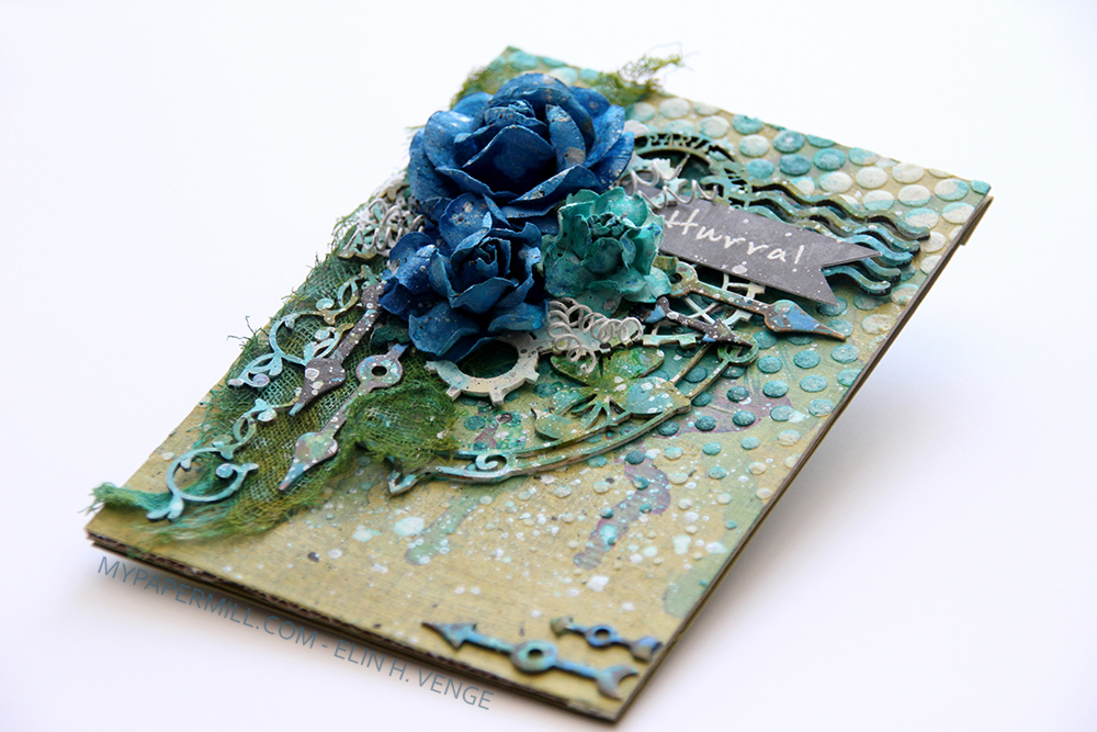 Vanligvis lager jeg relativt enkle kort, så mange operasjoner med stensiler, maling og uvante måter å gjøre ting på er ikke hverdagskost hos meg. Men jeg har da prøvd, og det er kanskje vel så viktig som noe annet.
 Da hele kortet var ferdig sprutet jeg hvit, svart og sølvfarget maling over hele kortet. Spesielt blomstene blir mer livlig av det, men det er jo smådråper over resten av kortet også.
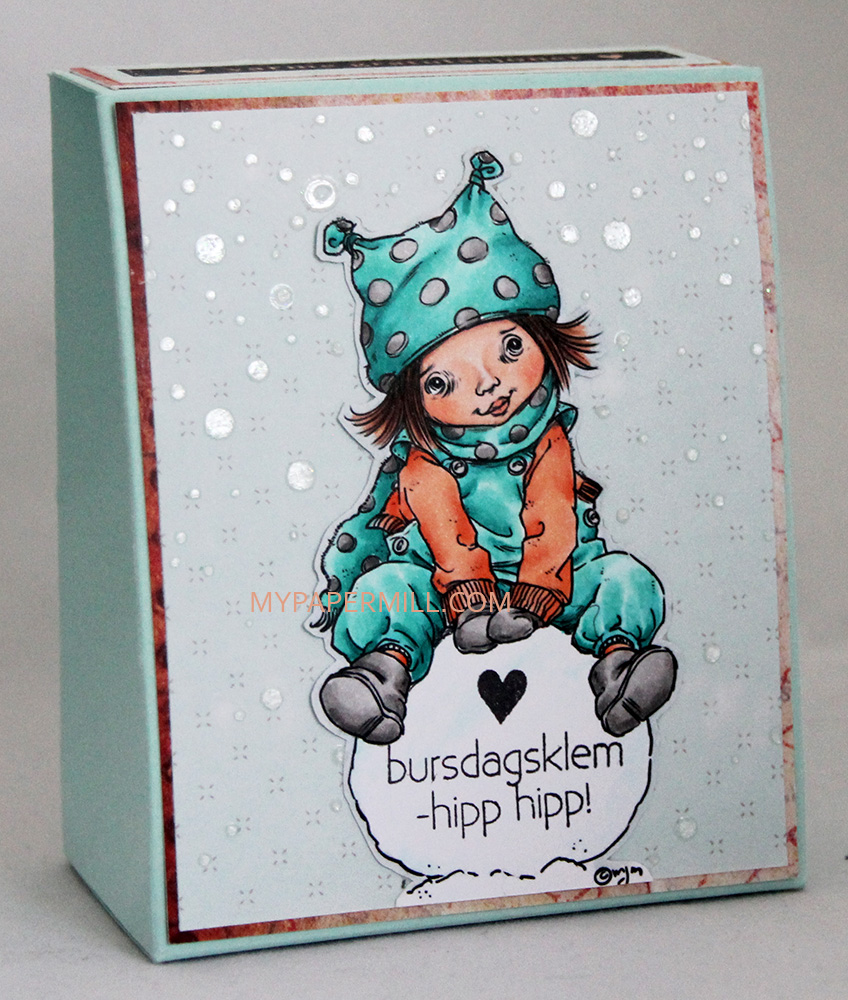 Oppi esken skal jeg legge en hjemmestrikket klut som jeg holder på med – i turkis for å matche motivet og esken. En liten bursdagsoppmerksomhet, resten av bursdagsprosjektet kommer senere. Jeg har stemplet tekststempler fra en stempelplate fra Norsk Stempelblad AS på snøballen.
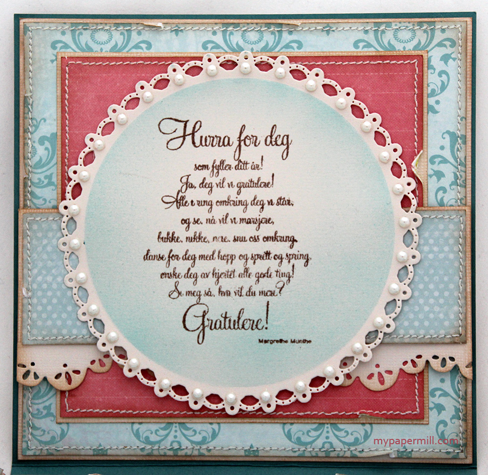
 Som vanlig avslutter jeg med fargene jeg har brukt. I tillegg har jeg også brukt B90, som er en farge jeg har laget selv.