
Hi, crafty friends. I’m back today with another card featuring one of the cute images from Rachelle Anne Miller. This time it’s Kitty Love, and who doesn’t love a litter of kittens? I grew up with cats, and they’re the absolute cutest.
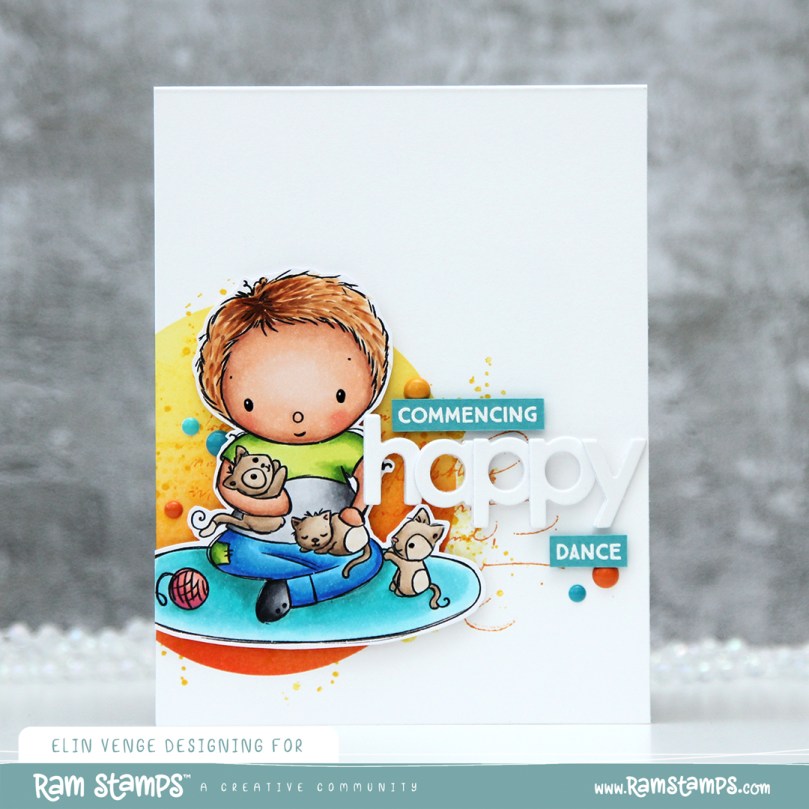 I colored the image with Copics and fussy cut around it, leaving a white border. This image is pretty easy to fussy cut, so it didn’t take long. I’m trying to get out of my standard “full panel with cluster” mode, and fussy cutting the image gives me endless possibilities.
 I needed something in the background behind my image, and decided to create a circle stencil to ink blend into. I used Distress Ink from Ranger in Abandoned Coral, Spiced Marmalade and Squeezed Lemonade, before I removed the stencil and looked through my stash of background stamps I could use to add some more interest. I wound up with a mixture of stamps from Inkido, Tim Holtz and My Favorite Things, and used Distress Ink once again for the stamping. This time Spiced Marmalade and Mustard Seed for a bit more of an intense yellow on top of the ink blending.
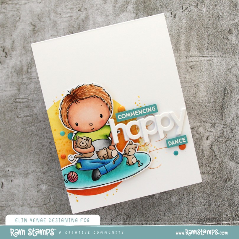 I mounted the image using foam tape, and die cut the word happy from the Bold Happy Birthday die set from My Favorite Things. I die cut four of each letter and stacked them for a dimensional look, overlapping them on my card to make them fit.
 I stamped and white heat embossed a sentiment from the Anything-but-Basic Birthday Wishes stamp set from My Favorite Things onto a piece of Caribbean Sea cardstock, also from MFT. The sentiment actually says Commencing Happy dance, but since I already had a diecut happy, I only needed the first and last word for my card. I added three additional strips of cardstock behind the words for dimension, and finished off the card with a few enamel dots. The teal ones are from the Cool Summer Nights pack from Altenew, the orange ones from a Halloween pack from Papirdesign. I also added a dot of black Glaze pen to the kittens’ eyes and the boy’s eyes, then a white dot using the Gelly Roll 05 from Sakura once the black had dried on the boy.

Fairly simple color palette for this one.
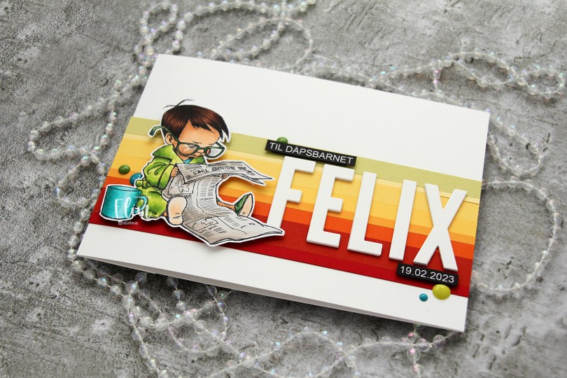
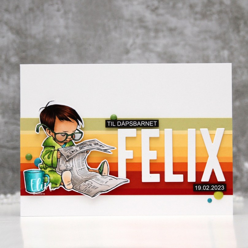 I colored the image with My Copics and decided to fussy cut around it this time. I tend to turn my colored pieces into panels for my card and work from there, but I wanted to do something a little different today.
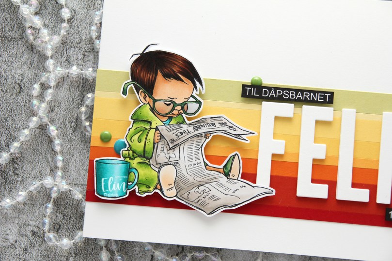 I left a white border around the image to make it easier on myself. You tend to lose some of the details in the hair if you cut up close to the line, and I wanted to keep the hair intact. I also added Glossy Accents to his glasses for shine and a touch of dimension.
 I wanted to include his name on the card, but had printed my image fairly large. My solution was to make a landscape A7 card (7×5″). I rarely make landscape cards (trickier to photograph) and the same goes for A7, but it’s fun to shake things up. I also shook things up by adding cardstock strips going across the card. I tried with cool colors first, but the image got lost, so I went through my solid colors of cardstock again and made a version with warm tones. From top to bottom they are:
 I used the Impact Alphabet die set from My Favorite Things to spell the name. I die cut four of each letter and stacked them for a dimensional look, gluing them right onto the stripped background, before adding the sentiment and date in white on black.
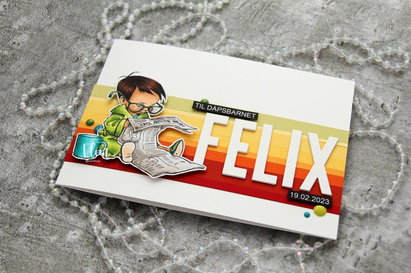 I mounted the image on foam tape and added a few enamel dots from Altenew (teal dots from the Cool Summer Night pack) and Papirdesign to finish the card.

 Aren’t these bunnies cute? I paired the three bunnies in the Teacup Bunnies stamp set with a digital sentiment. The sentiment will be a freebie digi, along with a few others in the same style and sub sentiments to pair with it.
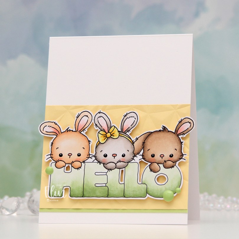 I colored the bunnies and letters with Copics and did some fussy cutting, leaving a thin white border to preserve the “fuzzies” that are part of the signature Lili of the Valley style. I used a black glaze pen for their eyes to make them pop and shine, and once dry, added a tiny white dot to each eye using a white Gelly Roll 05 pen.
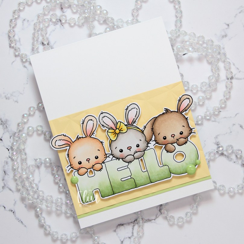 I used the Crystal Distortion Embossing folder from Simon Says Stamp on a piece of Lemon Tart cardstock from Papertrey Ink to create a little bit of interest in the background. Below the yellow panel, I added a strip of Sprout cardstock from Concord & 9th for a little bit of extra green.
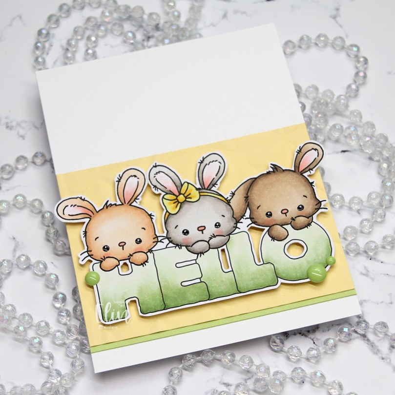 I adhered the cardstock pieces to a white top fold card base and mounted the teacup bunnies and sentiment on foam tape for dimension, before finishing off with a few enamel dots from the Tropical Forest set from Altenew.
 I’m using the new
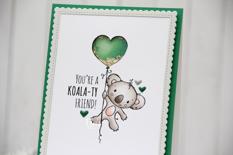
  I adopted Laura Bassen’s new coloring motto for 2023 for this card: “no muss no fuss coloring”. This was very simple, a few grays and a little bit of pink for the cheeks, the inner ears and the belly. I used a craft knife to cut out the interior of the balloon and printed another panel with just the balloon in the same size. I colored that balloon in green (thanks for the color suggestion, Liz) and added foam strips along the outer edge of the balloon, before filling it with tiny iridescent stars from the Icicle sequin mix from Hero Arts. I then added a piece of acetate on top to complete my shaker, and adhered the koala panel to the shaker, making sure to line up the window with my shaker heart balloon as best I could.
 I added foam tape on the back of the rest of the panel and adhered it to a top fold card base. The card base is actually Stamper’s Select White cardstock from Papertrey Ink, but I adhered a panel of Clover cardstock from Concord & 9th on top to create the green front. The color matched with my green balloon, but I don’t have unlimited amounts of Concord & 9th cardstock, so I’m trying not to use it all at once. Also, it’s a thinner cardstock, and not sturdy enough on its own to hold the weight of lots of foam tape and a shaker.
 Using the largest of the dies in the Stitched Rectangle Scallop Edge Frames die set from My Favorite Things, I die cut a frame from Soft Stone cardstock from Papertrey Ink. This is such a perfect soft grey, I love it. I finished off the card with a few enamel hearts from Altenew, from the Green Fields pack and the Rock Collection.
 The iridescent stars inside the shaker heart really catch the light nicely.
 Super simple color palette, as I mentioned.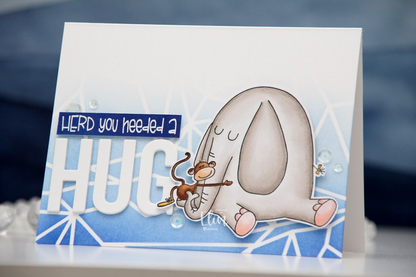
 I chose to color Elliot in a very soft grey, and once fully colored, fussy cut the image leaving a thin white border. I put the image aside and started working on the rest of the card.
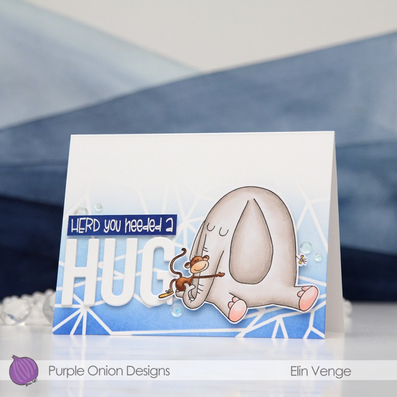 I felt a landscape design would work best for what I had in mind, and used the Geometric Landscape stencil from Altenew to create some interest in the background with blue inks, also from Altenew. I used the entire Lapis Lazuli color palette from Altenew for my blending, (Azurite, Ultramarine, Eastern Sky, Iceberg) which fades to white at the top.
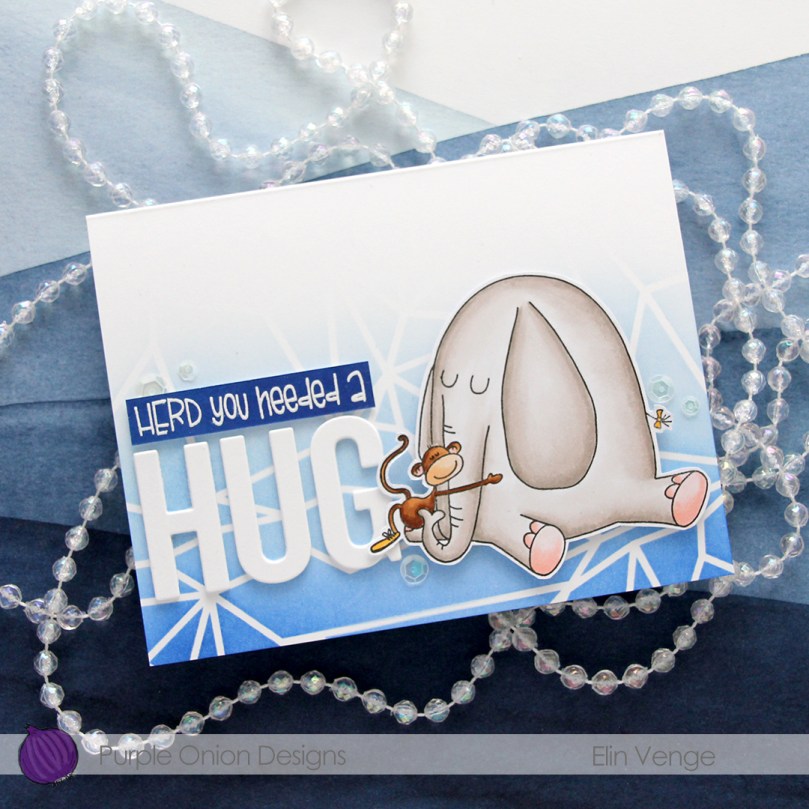 Using the Sending You Hugs die from My Favorite Things, I die cut the letters to spell out HUG four times from white cardstock from Papertrey Ink, which happens to be the same cardstock I used for my cardbase. I love their white cardstock, it’s the best by far. I stacked the letters for dimension and stamped and white heat embossed a punny sentiment that comes with Elliot & Marcel. There are actually a few more sentiments in the set, and I added another one to the inside of the card. I didn’t have the right color cardstock, though, so I cheated and covered white cardstock with the Azurite color, which is the darkest of the four blues I used for the blending of the background. To create the sentiment strip, I went direct to paper, and used my heat tool to speed up the drying process of the ink so I could stamp and heat emboss on top. I added three additional strips of cardstock behind it to make it flush with the die cut letters, adhered it to the card and finished off with a few sequins from the White Orchid Sequin mix from Little Things from Lucy’s Cards.
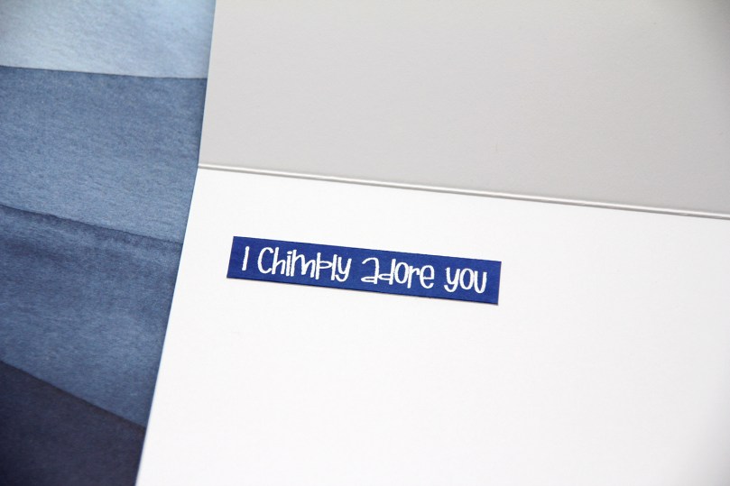 I chimply love punny sentiments and couldn’t resist.
 Very simple color palette for this one. This was fast to color.
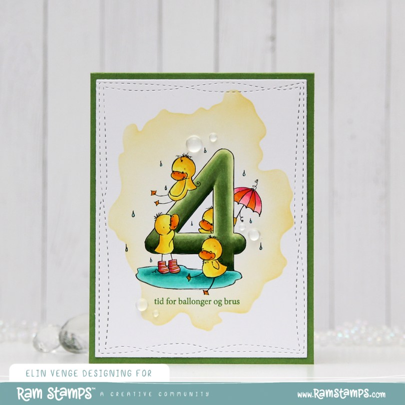 I love these animal number images from Rachelle, and these ducks are sooo cute. Perfect for a birthday card, I think. I colored the image with my Copics, before temporarily adhering the Watercolor Wash Free Form stencil from My Favorite Things and ink blending with Harvest Gold ink from Papertrey Ink. I then stamped a sentiment from the A06 stamp set from Norsk Stempelblad AS using Shadow Creek ink from Altenew.
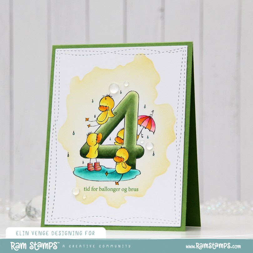 I used the largest of the Wonky Stitched Rectangle STAX dies from My Favorite Things to create a quirky faux stitch interest around the edge and adhered my panel to a top fold card base I created from Meadow cardstock from Hero Arts.
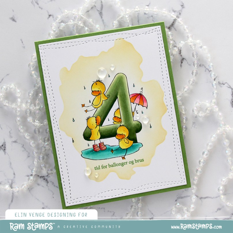 To finish off the card I added a few raindrops from Little Things from Lucy’s Cards, I thought they fit well with the water theme in the image.
 Simple, yet bright color palette for this one 🙂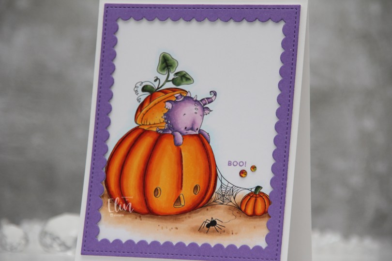
 Halloween isn’t really a big thing in Norway, but this image was so cute I just couldn’t resist. I colored up the ground, pumpkins and leaves before asking my “twin” Liz for a color suggestion for the actual dragon, thinking in my mind “please don’t say purple”. What did she choose? It was inevitable, I knew she’d say purple, she even said which purples to use. I actually think he’s cute in purple, and I don’t think I’ve colored one of Lee’s dragons purple before, so I guess it was about time.
 Once I finished coloring, I embraced the purple, stamping the Boo! sentiment from the Itty Bitty Boos stamp set from My Favorite Things using Deep Iris ink from Altenew. I then die cut the largest frame in the Scallop Frames die set from Pretty Pink Posh from Amethyst Allure cardstock from Papertrey Ink, adding two additional white die cuts behind it for dimension.
 The outside dimensions of the die cut frame are 4 x 5″, so I cut 1/4″ off the height of my card base, making it 4 1/4 x 5 1/4″ instead of the normal A2 size to get an even white border on the outside of it.
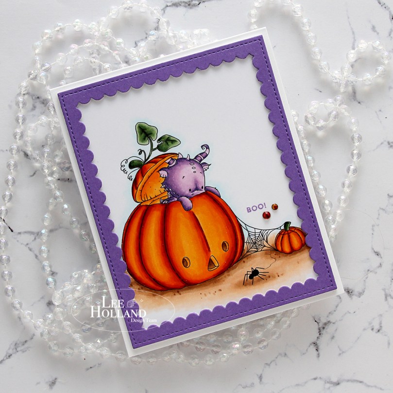 The sentiment is tiny, and to draw the eye to it I decided to add a couple of gems. These are from the Meraki Sparkle Red Illusion jar. They’re color changing glass rhinestones, and this color was perfect for this card.
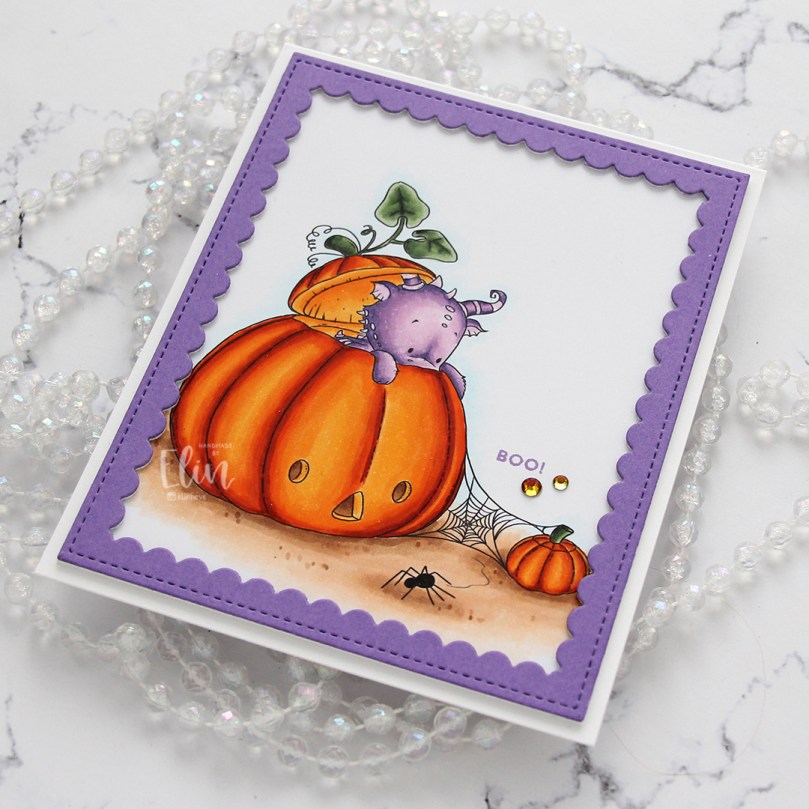 If you look at the various photos in this post, you’ll see that these rhinestones appear to have different colors depending on how the light hits them, it’s a really cool effect. In this photo, you can also see the dimension added by using stacked die cuts.
 Fairly simple color palette for this card. It was a pretty quick image to color too!
 I’ve created a very simple card this time, featuring this cute little car from the new
  I did some simple no line coloring of the image. I hadn’t done no line in a while when I created this, so opting for this tiny image was perhaps not the most brilliant idea ever. It’s kind of what I do, though, I jump in. I used a grey Copic to give the illusion of someone sitting in the car, used a couple of blues for some simple shading near the tires and kept everything very simple.
 Using four different shades of blue ink (Distress Inks in the colors Chipped Sapphire, Faded Jeans and Stormy Sky, in addition to Iceberg ink from Altenew), I softly ink blended an ombre sky before sprinkling on Chunky White embossing enamel for a snowy effect that I love having on my cards. I heated the panel from the back, melting the granules and adhered the panel onto a top fold card base I created from white cardstock from Papertrey Ink.
 Using the sentiment die from The Penguin’s Waddle die set from Mama Elephant, I created a chunky sentiment by adding several die cuts together for a stacked, dimensional look. I adhered it to the top center of my card and finished it off by placing a few snowdrift sprinkles from Little Things from Lucy’s Cards near the car.
 I love a dimensional die cut sentiment, it kind of says I mean business and adds so much to a simple card!
 Simple color palette for this one. It’s a simple card with a tiny image, so it’s kind of a given.
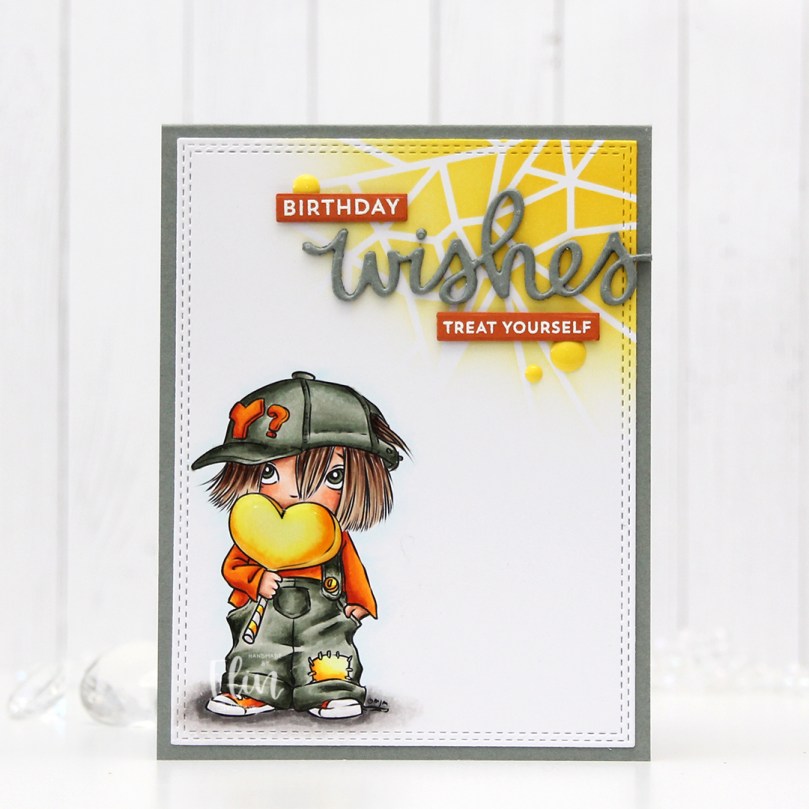 I colored up
  Once the coloring was complete, I used the largest die in the A2 Double Stitched Rectangles STAX die set from My Favorite Things to turn my panel into a rectangle with a nice faux stitch around the edges. I then added a thick layer of Glossy Accents to the heart and let that dry.
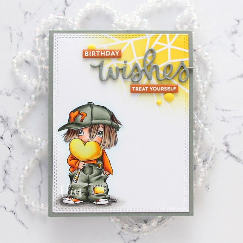 Using the Geometric Landscape stencil from Altenew, I ink blended a bit of yellow in the top right corner using Distress Inks in the colors Mustard Seed and Squeezed Lemonade, letting the lighter shade of the two fade to white. I then adhered my panel onto a top fold card base I created from Stormy Sea cardstock from Papertrey Ink.
 I die cut the word wishes four times from the same color cardstock using a die from Mama Elephant. I stacked the die cuts for a dimensional look and adhered them on top of my ink blended section.
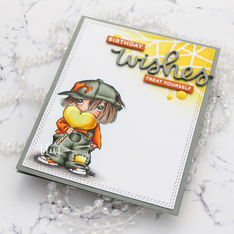 Using two stamp sets from My Favorite Things (Bitty Birthday Wishes and Itty Bitty Gifting), I heat embossed sub sentiments onto strips of Canyon Clay cardstock from Papertrey Ink. I die cut those using the Itty Bitty Strips dies, also from My Favorite Things, before finishing off the card with a few yellow enamel dots from the Pocketful of Sunshine pack of enamel dots from Altenew.
 This was a fun color palette to work with, and I think the finished card echoes that. I’d say it’s my usual style of card, just not my usual color palette. I need to branch out more often, I had a blast using these colors.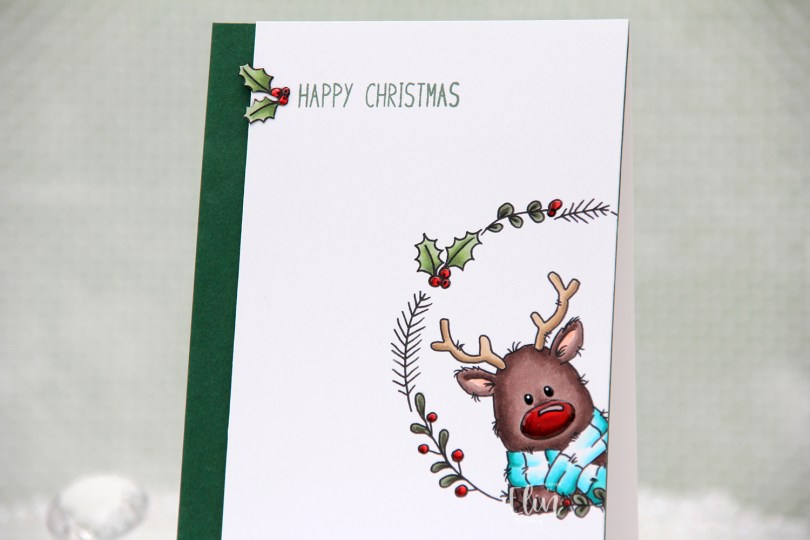
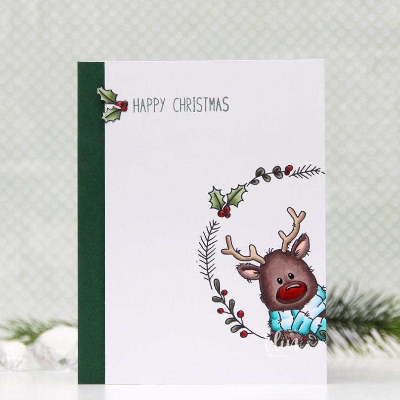 There’s a stamp set in the release which includes a wreath and six different critters you can put inside, as well as a few individual stamps that go well with the wreath. I chose the wreath and the reindeer in the set for this card, making sure Rudolph was stamped a little crooked peeking into the front of the card from the side, I thought that made for a dynamic card design.
 Using my Copics, I colored Rudolph and the wreath and also one of the smaller images, which I also fussy cut.
 I trimmed my panel down so that it was 1/2″ more narrow than the card base and mounted it on foam tape onto a 4 1/4 x 5 1/2″ piece of Clover cardstock from Concord & 9th. They have the most gorgeous color range! Their cardstock isn’t very thick, so I don’t use it for card bases, but their colors are magical. This panel I adhered to a top fold card base I created from Stamper’s Select White cardstock from Papertrey Ink.
 I stamped a sentiment from the
 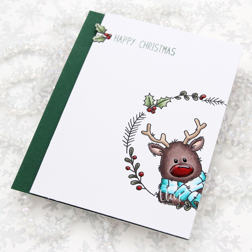 To finish off the card, I decided to add a layer of black glaze pen to Rudolph’s eyes. This makes them shiny and also adds a tiny bit of dimension. Once dry, I put a white dot in each eye using a 05 Gelly Roll pen. I also added Glossy Accents from Ranger to the berries and Rudolph’s nose for some extra shine.
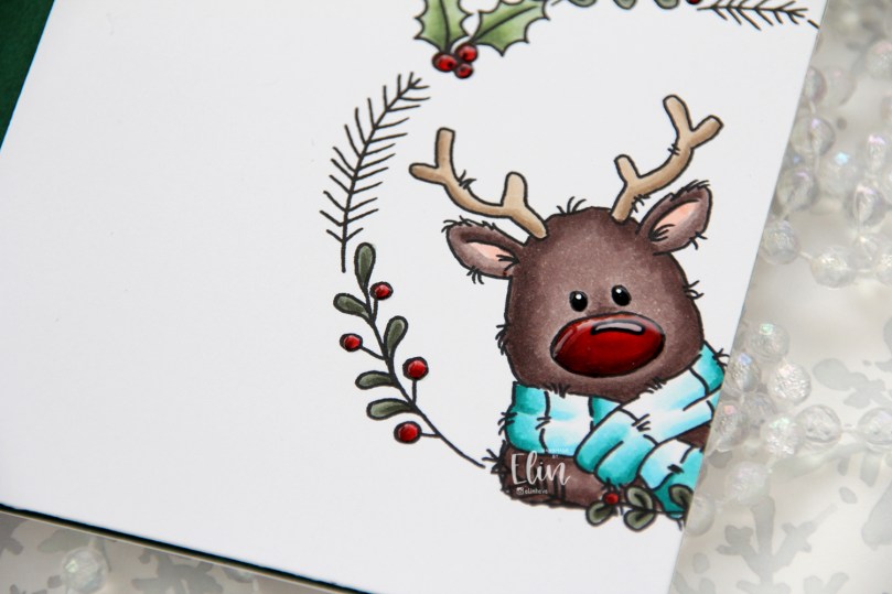 Rudolph and his shiny nose say hi. It’s really shiny!
 Fairly simple color palette. This card was so much fun to make, I love the playfulness of Rudolf with his head tilted in from the side of the card.
 Papirmølla