
Hi, crafty friends. Earlier this week, the new Christmas collection from Lili of the Valley was launched on Create and Craft TV in the UK. Six stamp sets were released and my cards were shown on TV, that’s so freaky. You can watch the replay here – and I would because it was a fun show. And a funny show, the hostess couldn’t even finish her sentences because the products sold out so quickly.
 This card features the same stamp from the Snow Cute stamp set that I used on the previous card I made with stamps from this release (it’s this one). For today’s card, I isolated the penguin in the stamp, fussy cut him and put him in a polaroid frame.
 I created my card base from Stamper’s Select White cardstock from Papertrey Ink, and I wanted a blue gradient near the bottom, fading into white at the top. I pulled out a couple of blender brushes, the Lapis Lazuli inks (Azurite, Ultramarine, Eastern Sky and Iceberg) from Altenew and started blending from the darkest at the bottom to the lightest at the top.
 Once I was happy with my blending, I die cut a bunch of snowflakes. I used an old die from Marianne Design (CR1335) which cuts plenty of snowflakes, as well as the Snowflake Confetti Fancy Die from Hero Arts. This is actually a cover plate, but as the name suggests, it creates confetti in the shape of snowflakes. I put the positive die cut back into the packaging to use for another card and glued the snowflakes to my background. The stark white of the snowflakes was a little too white for the sentiment I was putting on top to stand out, so I went back over with more blue ink once the snowflakes were adhered. This toned them down a bit, just enough for my die cut word to stand out.
 Speaking of die cut word, I used this wishes die from Mama Elephant and die cut three layers of white cardstock, which I glued together for dimension. For the polaroid frame, I used the Precious Polaroids die set from My Favorite Things and die cut three of those as well.
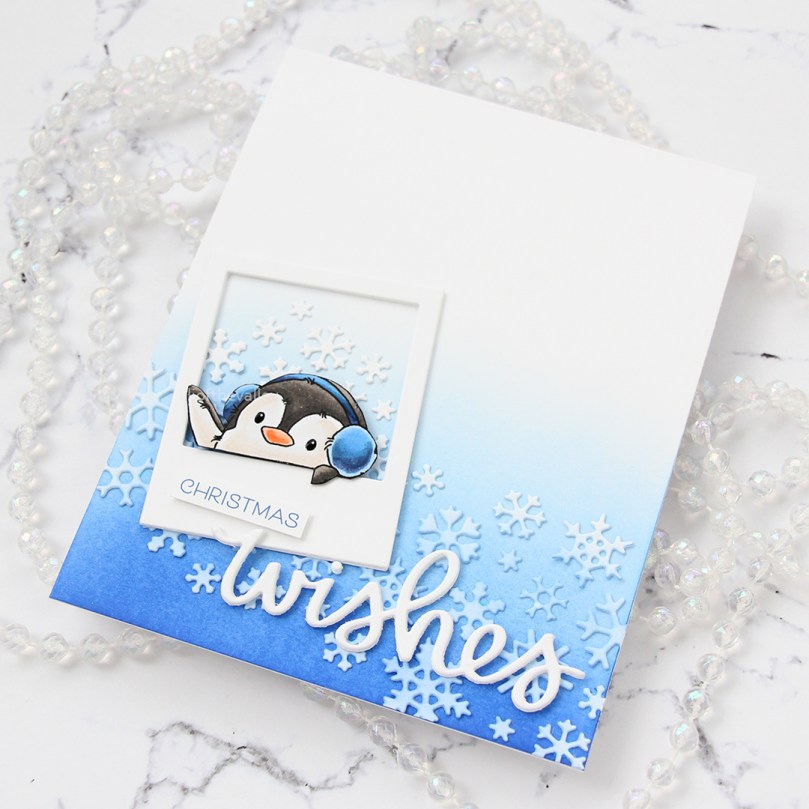 I adhered the polaroid frame and the die cut word to the card front, popped the little penguin into the opening of the polaroid using some foam tape and completed the sentiment with a stamped word from the new sentiment set from Lili of the Valley, cut down to a strip and adhered with a couple of additional strips of cardstock behind it. Because dimension is life!
I hope you check out the new release from Lili of the Valley, there are so many great images and sentiments in these sets, the possibilities are endless!
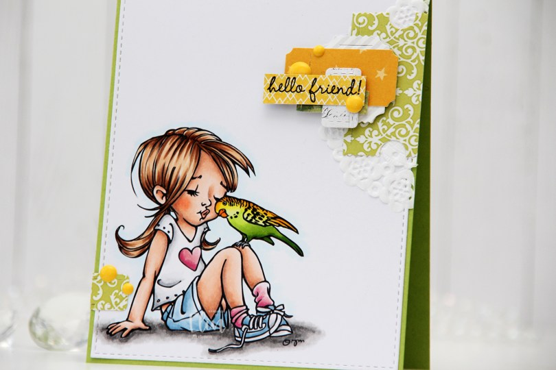
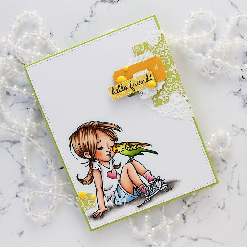
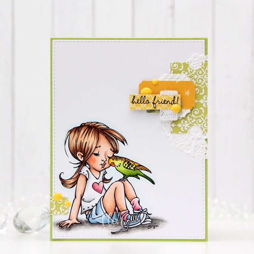 I colored the image with Copics and die cut the panel using the largest die in the A2 Stitched Rectangles STAX 1 die set from My Favorite Things, before adhering it to a card base I created from Sour Apple cardstock, also from My Favorite Things.
 On my cluster cards, I usually choose two to three colors from the image to create scraps from. This time I chose green and yellow with a little bit of gray. Neutrals are always a good thing to add. I keep die cut scraps in stamp storage pockets on my desk, sorted by color. Whenever I want to create a cluster, I choose the storage pockets with the colors I want, dump the contents on my desk and start PLAYING.
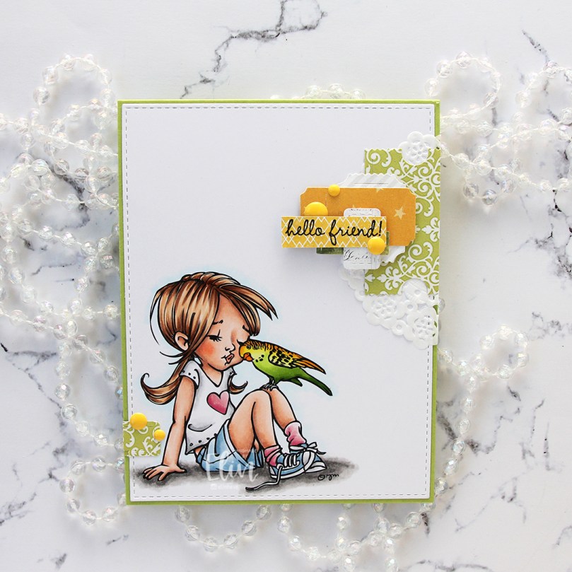 For this card I wound up using scraps from 3ndypapir, Karen Foster, Sunny Studio, P13, Magnolia and Papirdesign. By limiting the size and colors of my clusters, the design stays harmonious and you can’t tell that I’ve used patterned paper from 6 different companies. I adhere some directly to the layer below, some using foam squares. As a base, I used half a doily from Doodlebug Design that I had in a drawer. I love these tiny paper doilies, they’re perfect for this.
 Using VersaFine Onyx Black ink, I stamped a sentiment from the
  These cluster cards are so fun to make. They make my piles of scraps shrink EVER so slightly, but anything’s better than nothing, and I love the dimension they add to the card.
 I used quite a few colors for this one.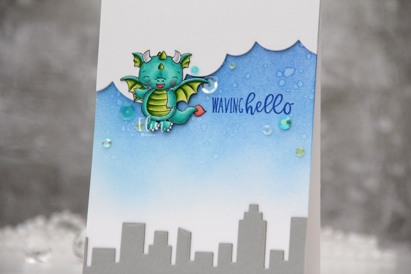
 I colored the dragon with my Copics and fussy cut him right up against the black lines of the image. I put him aside while I worked on the rest of the card.
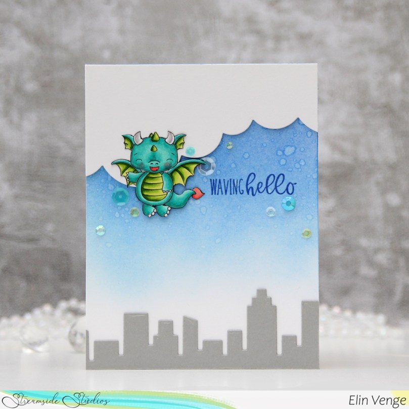
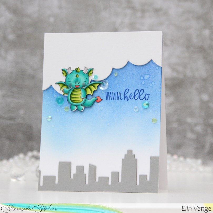 Onto a top fold white A2 card base I created from Stamper’s Select White cardstock from Papertrey Ink, I ink blended Azurite, Ultramarine and Eastern Sky inks (all from Altenew) towards the top of the card, fading to white near the bottom. I splashed some water droplets on top for a cool effect. Dye inks are water based and react with water, so this works with most inks you probably have. The darker the color, the bigger the impact.
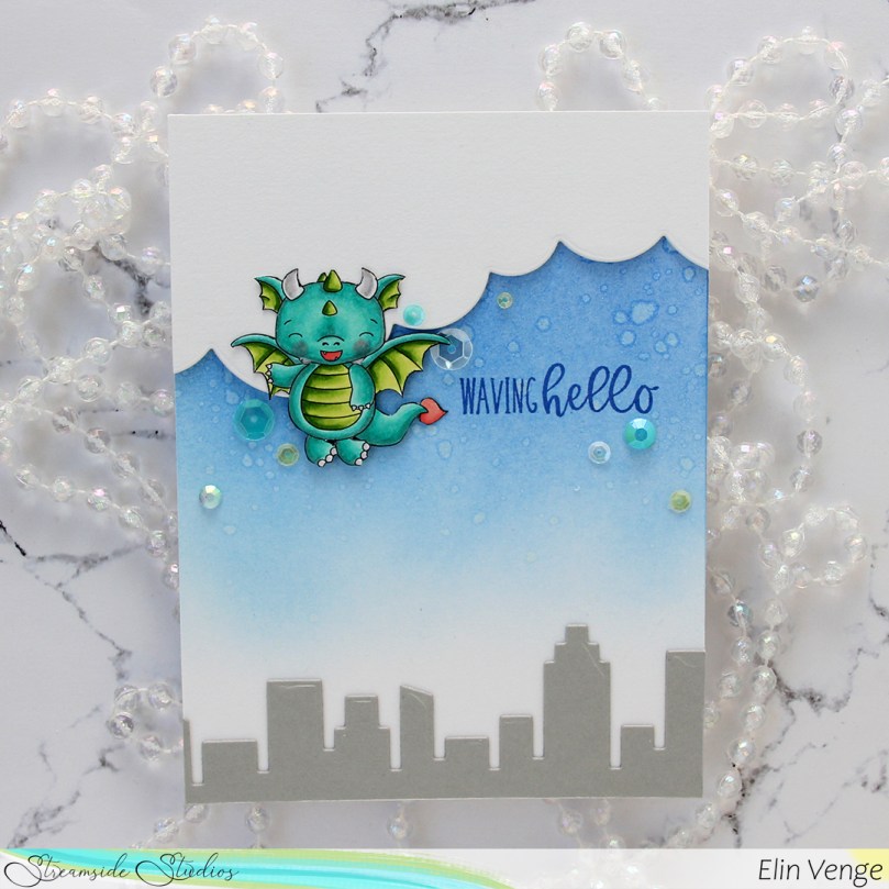 From Cement Gray cardstock from My Favorite Things, I die cut two layers of the skyscraper skyline in the Slim Film City die set from Mama Elephant and adhered them at the bottom of my card. Using the cloud die in the Slim Basics die set, also from Mama Elephant, I die cut the cloud shape three times from Stamper’s Select White cardstock, stacked them and adhered them to the top of the card.
 Onto the card base, I stamped a sentiment from the
  I adhered the dragon partially on top of the clouds, using foam squares behind the parts hanging off the clouds for even dimension, and sprinkled a few gems and sequins from the Seashore mix from Little Things from Lucy’s Cards around the dragon and sentiment to finish the card.
 Suuuuper simple color palette for this dragon.

 I wanted to add a little bit of interest to my flowers and did some simple ink blending. I used Mustard Seed and Spiced Marmalade Distress inks for the yellow, Fresh Leaf ink from Altenew for the green and Vintage Timber from My Favorite Things for the brown. I also added additional diecuts to build dimension and interest to these flowers.
 Onto a white card base I created from Stamper’s Select White cardstock from Papertrey Ink, I stamped a sentiment from the
  This is a very simple card, and in hindsight I kind of wish I’d used a different color for my card base, or even ink blended a gradient blue with on the card base, but the white makes the yellow pop and is very clean, which is usually my preference on simple cards.
 Here you can see a little bit of the dimension on the card. I used white diecuts behind the the yellow ones (I don’t have a lot of that Buttercup cardstock and wanted to use as little of it as possible), which worked out great. The white almost disappears against the white of the background, making it look like the flowers are floating on the card, it’s such a cool effect!
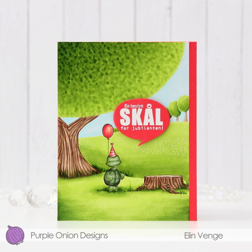 This time I’m keeping the focus on
  I used a lot of green for this card. Not too many markers, but I feel like most of the card is green. I actually had to refill all the greens I used for the fields and trees halfway through. They hadn’t been refilled in a couple of years, so it was about time, I use these greens a lot.
 I needed a pop of color to counteract all the green and decided on a corally pink color combination that I used for the party hat and balloon. I dug through my colored cardstock looking for a match, and wound up with Fire Coral cardstock from My Favorite Things. I created a top fold A2 card base from it and adhered my colored panel onto it to the left side, it wasn’t wide enough to cover the entire card front.
 In the fall of 2020 I was running seriously low on X-Press It blending card, which is the only cardstock I use for my Copic coloring. It was hard to get hold of back then, but I lucked out and got a pack from Amazon UK. It was A4, which kind of blew my mind a little bit. Up until that point, I didn’t even know A4 X-Press It existed, I’ve always bought letter size. A4 is less wide and taller than letter size, which means I only get two panels that cover an A2 card front from one sheet. I used one of the narrower pieces on this card, which left me with about 1/4″ extra width on the card base. I debated cutting it off, but I feel like the pink strip on the right provides a little bit of balance, the card would be very green without it.
 Onto a separate piece of Fire Coral cardstock, I stamped and white heat embossed a sentiment from the Til mannen stamp set from Norsk Stempelblad AS, before die cutting it using a speech bubble die from Altenew. I popped it up on 1/16″ foam squares from Gina K for a tiny bit of dimension.
 You’d think that with a close to full panel of coloring that I’d use a lot more colors than this, but the four greens near the left end of this graphic were all I used for the grass and the trees, which covers most of the card.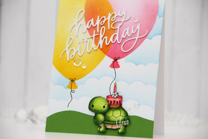
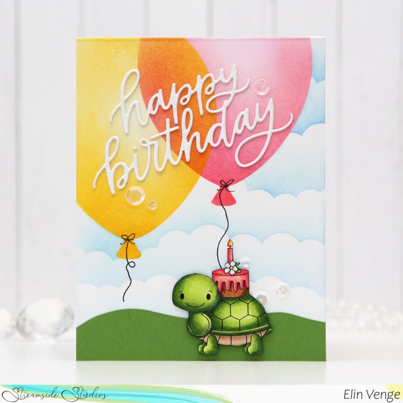 I colored in the image using Copics, before fussy cutting it, right up against the black lines of the image. I put the image aside while I worked on the rest of my card.
 I actually worked directly on the card base for this one. Using the Big Balloon stencil from My Favorite Things, I ink blended two balloons using Distress inks – one using Picked Raspberry, Worn Lipstick and Abandoned Coral; the other using Mustard Seed and Squeezed Lemonade. And in the words of Laura Bassen – the magic’s in the overlap.
 Once the balloons were done, I used the mask in the Big Balloon stencil set to mask off the balloons while I used the Slimline Cloud Edges stencil, also from MFT, to create the illusion of clouds in the distance. I used Eastern Sky ink near the top of the card, Iceberg ink towards the bottom, both are gorgeous colors from Altenew.
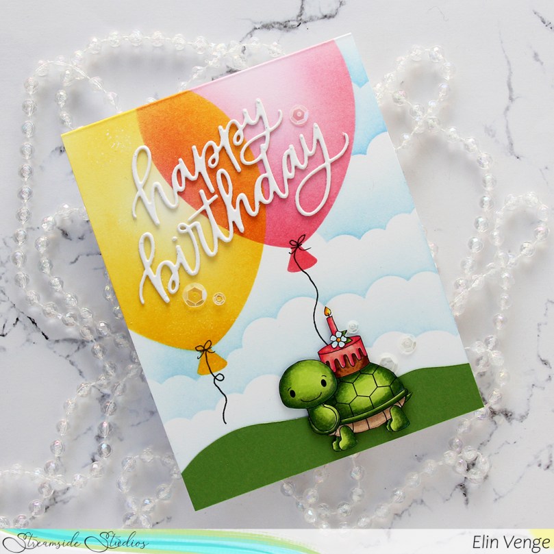 I free hand cut a grassy hill from Parsley cardstock from Concord & 9th and adhered it to the bottom of my card. I die cut the Happy Birthday die from My Favorite Things twice using white cardstock from Papertrey Ink (same cardstock as my card base) and adhered the two layers together for a tiny bit of dimension and adhered my layered die cut on top of the balloons.
 To finish off the card, I drew in balloon strings using a 0.35 Copic Multiliner, popped the tortoise (I can’t bring myself to write the word “turtle” when this is clearly a tortoise) up using some 1/16″ foam squares and added sequins from the White Orchid sequin mix from Little Things From Lucy’s Cards for a bit of sparkle and shine.
 Simple color palette for this small image.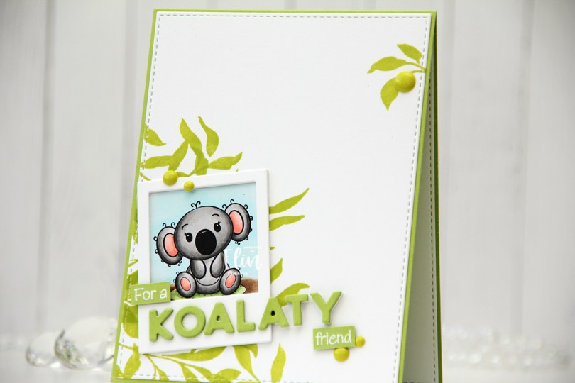
 This koala was so quick and easy to color. If you’re new to coloring, or enjoy coloring but don’t want to spend an eternity coloring one image, I’d recommend her images. They’re not super detailed, which makes them easy and fast to color.
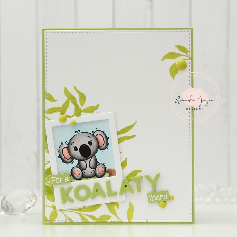
 I decided to put my colored koala in a polaroid frame, and used the largest of the dies in the Precious Polaroids die set from My Favorite Things to die cut three times from white cardstock for a stacked look on top of the cute koala.
 I created a top fold A2 card base using Green Parakeet cardstock from Papertrey Ink. Onto the left bottom corner of a piece of Stamper’s Select White cardstock from Papertrey Ink, I stamped some leaves from the Leaf Clusters stamp set from Altenew, using Limelight ink from My Favorite Things. This is a much more vibrant, yellowy green than what you’ll find in eucalyptus leaves, but I wasn’t going for realism with this card and happen to like the bright green – it really pops. I made sure to stamp a large enough area that some of the leaves would be visible around the polaroid frame with my koala. I also stamped the smallest leaf cluster in the Altenew stamp set near the top right corner for a little bit of balance and die cut the white panel using the largest die in the A2 Stitched Rectangles STAX 1 set from My Favorite Things.
 I wanted a punny koala themed sentiment on my card, and the word koalaty (quality) came to mind. I needed something to use with it, and dug through my sentiment sets for one with the word friend in it. A sentiment in a stamp set from InkyWings was perfect, it said For a sweet friend. I stamped it in VersaMark ink and white heat embossed it using Super fine detail embossing powder from Ranger. I cut the sentiment down to a strip, removed the word sweet and had the perfect start and finish to my punny sentiment. Using the Connected alphabet die set from My Favorite Things, I die cut the letters to spell koalaty three times from Green Parakeet cardstock and stacked them for a dimensional look. I die cut an additional three white ones for the letters that hang off the polaroid (ATY) and glued these behind the green ones so the letters would all be flush on the card. I also added some additional layers of cardstock behind the white heat embossed strips for that little bit of added dimension, before finishing off the card with a few enamel dots from Papirdesign.
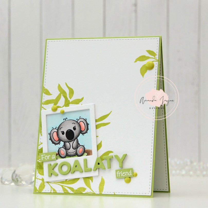
 The dimension is more visible in this photo, I love adding dimension to my cards. Dimension is life 😉 I cut the layered up white A in half, because only half the letter hangs off the edge. The letters that have the white die cuts behind them kind of look like they’re floating on the card.
 Super simple color palette for this one.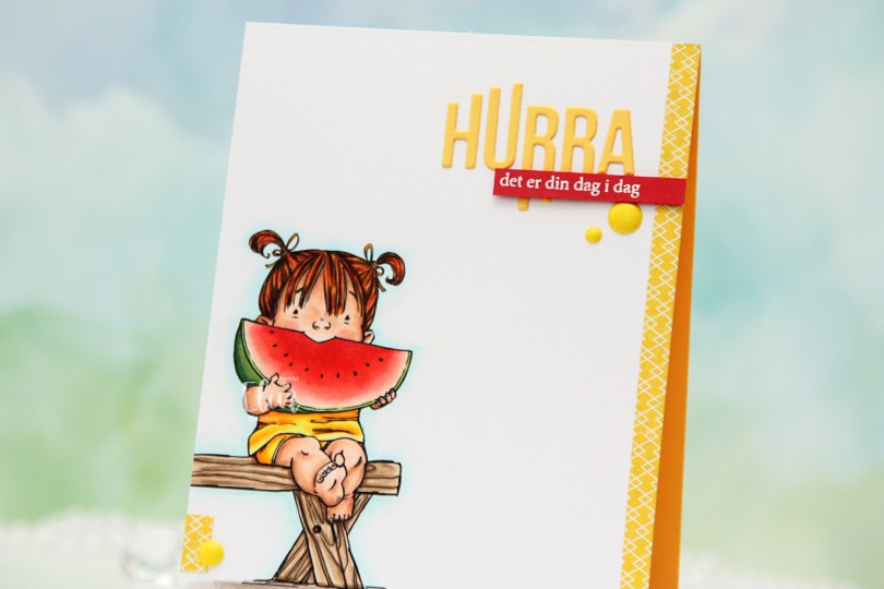
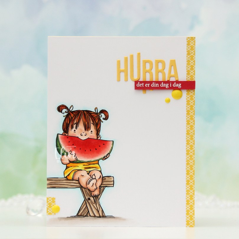 I printed the image towards the bottom left of my panel of X-Press It blending card and colored it with Copics. I’ve colored this girl once before, but I decided to go for a different color scheme this time, I think the only thing that’s stayed the same since the last card is the coloring on the watermelon. The printer doesn’t print all the way to the edge, so I cut off a little strip on the left side and decided to add a strip of yellow patterned paper from Papirdesign on the right to balance out the design and fill the front of this A2 card.
 And as usual, I finish with the Copics I used. Quite a few for this super simple image, I reckon.
 The dragon has a little friend handing him a note, and it’s just so cute. I colored the image with Copics, fussy cut it leaving a thin white border and put it aside while I worked on the rest of the card.
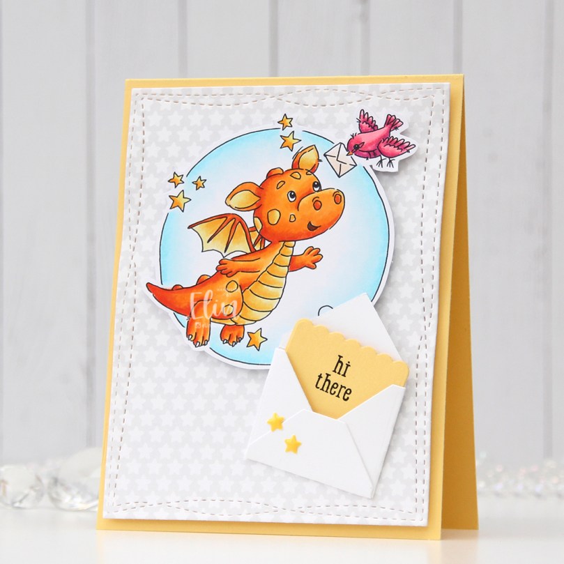 I really like the stars scattered around in the image, and decided to die cut a piece of patterned paper from the Subtle Grey Tones 6×6 pack of patterned paper from Sunny Studio using a die from the Wonky Stitched Rectangle STAX die set from My Favorite Things. I mounted it on foam tape on a card base I created from Harvest Gold cardstock from Papertrey Ink.
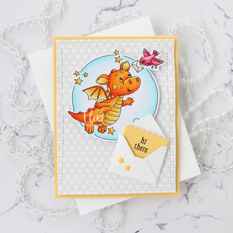 I mounted the colored image on foam tape and added it to the top center of the card. I die cut and folded and envelope from the Mini Mail die set from My Favorite Things and glued it below the colored image.
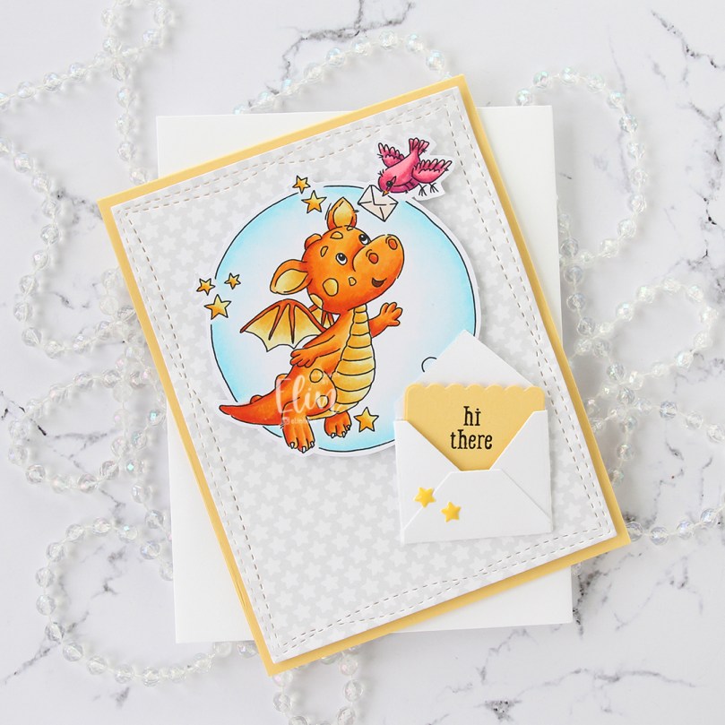 Inside the envelope, I die cut another piece from Harvest Gold cardstock using the same die set. I love the little scalloped edge at the top. I stamped a sentiment from the Monster Hugs stamp set from the Concord & 9th/Simon Says Stamp collaboration stamp set from Stamptember 2018 using VersaFine Onyx Black ink and slid it into the envelope. I didn’t glue it down, it can be a nice little interactive element on the card, it fits perfectly inside the envelope on the front. To finish I added a couple of enamel stars from the Pocketful of Sunshine enamel dots pack from Altenew.
 Lots of dimension on this card, but it’s still simple. The envelope with the message inside is a nice nod to the image with the dragon and the bird.
 Aside from the colors I used for the background, this is a very warm color palette.
 I recently made a full shaker card with another image from Rachelle with lots of balloons. That card was all in warm tones, so I thought I’d use cool tones for this one. I did add a few orange balloons, though, I think orange is a fun color to use with teal and green. I used a die from the Stitched Mini Slimline STAX set from My Favorite Things to turn my colored piece into the perfect rectangle to fit a mini slimline card. I stamped a sentiment from the Birthday messages stamp set from Mama Elephant using Prickly Pear ink from My Favorite Things and put the panel aside while I worked on the rest of my card.
 I ran a piece of Sour Apple cardstock from My Favorite Things through my die cutting machine with a Geometric embossing folder from WRMK, and adhered it to a mini slimline card base I created from Stamper’s Select White cardstock from Papertrey Ink, leaving a white frame on the outside. I used foam tape to mount my colored and die cut piece in the center of the card.
 I wanted another element and used the Cloud 1 & 2 die set from Papertrey Ink to die cut a couple of clouds from vellum. I mounted the clouds on 1 mm foam square to give them a little bit of lift, making sure to put the foam squares in strategic spots so I could cover them with enamel dots in matching colors (green and orange dots from Papirdesign, teal dots from the Cool Summer Night pack of enamel dots from Altenew).
 Simple, yet fun color palette for this image.
 Papirmølla