Hello {Purple Onion Designs}

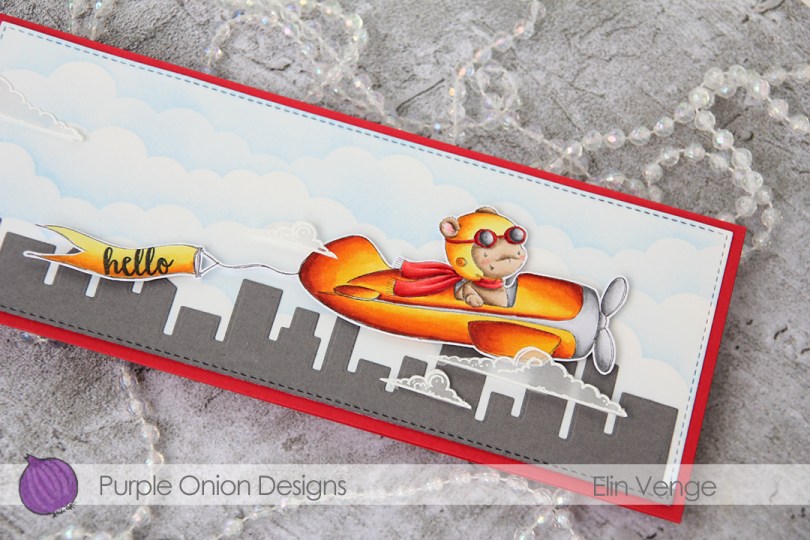
Hi, there! I hope you’ve had a good week so far. Summer’s finally here, and I for one couldn’t be happier about it. More sunlight, warmer weather and looooong days (sunrise before 4 AM and sunset around 11 PM right now). When the weather gets warmer, we always see more planes in the air. Not commercial flights, but smaller planer and seaplanes (we’re on a fjord). I love this time of year and seeing all these cute (can planes be cute?) planes, and I thought this T-bird image from Purple Onion Designs was the perfect image to represent the season.

Purple Onion Designs - Elin Venge - T-Bird and Banner and Clouds and journey sentiment set

I used reds, yellows and oranges for my image, colors I definitely don’t use a lot, but I thought it would be a nice contrast to the ink blended cloud background and my gray skyscraper skyline. I stamped the T-Bird and the banner on one piece of X-Press It blending card, wanting the two images to look like one. I fussy cut them and stamped hello from the Journey sentiment set onto the banner, before mounting the plane and banner on 1/16″ foam tape. For the background I used the slimline cloud edges stencil from My Favorite Things along with Eastern Sky ink from Altenew which I ink blended onto a piece of Bristol Smooth cardstock that I’d die cut using one of the dies from the Slimline Starter die set from My Favorite Things. I used the same die on a piece of Gravel Gray cardstock from MFT to get the nice faux stitched edge going all the way around my card and a die in the Slim Film City die set from Mama Elephant to create the skyline. Everything’s adhered onto a top fold slimline card base that I made out of Red Hot cardstock from My Favorite Things.

Purple Onion Designs - Elin Venge - T-Bird and Banner and Clouds and journey sentiment set detail

Doesn’t this bear look cute in his plane?? I stamped and white heat embossed some clouds onto vellum and adhered them using slivers of clear foam tape behind the white embossed lines. It would have been easier to glue them straight onto the card, but I like a bit of dimension, which is tricky with vellum, because pretty much everything shows through. The white embossed lines hide my foam tape pretty well.

Purple Onion Designs - T-Bird Copics

Like I said initially, these warm colors aren’t the ones that I reach for the most, but I love how they pop against the ink blended clouds and skyline in the background.

Get happy! {Mo’s Digital Pencil}

Hi, there! Today, I have a bright, sunshiny card to share featuring the We Go Together image from Mo Manning. I shared the colored image on Instagram a couple of months back, and for the card I wanted to feature the one color out of the four main ones (blue, teal, pinky peach and yellow) that I use the least. That’s definitely yellow, so I pulled out yellow cardstock, patterned paper, ink and enamel dots.

Mo Manning We Go Together front

I cut the colored piece down more than I normally would to let quite a bit of the yellow patterned paper from Papirdesign show around my image, and mounted my die cut colored piece on foam tape in the center of the card. I adhered pieces of a mini paper doily from Doodlebug to opposite corners of my die cut piece for a little bit of added texture and interest.

Mo Manning We Go Together front skrått

Onto a scrap piece of X-Press It blending card I stamped a sentiment from the Journey sentiment set from Purple Onion Designs using Fossilized Amber Distress Oxide ink. I love how well the Distress Oxide inks stamp. I cut it down to a strip using the medium sized die in the fishtail flag frames die set from My Favorite Things, and added it to the card using foam tape and foam squares. To finish off I added three enamel dots from the Pocketful of Sunshine pack from Altenew.

Mo Manning We Go Together Copics

Quite a few Copics on this one, I rarely feature four different colors in one piece.

Happiness is… {Mo’s Digital Pencil}

…the art of making a bouquet of those flowers within reach. This Bob Goddard quote was the perfect phrase to put on today’s card featuring Billy Boy from Mo’s Digital Pencil. I think he looks pretty happy with the flowers in his hands. Not yet a bouquet, but I’m sure he can pick a few more.

Mo Manning Billy Boy front rett

I don’t know how I’ve done it, but this is actually the 100th card I’ve made in 2021. I usually reach 100 right before the new year starts, but this year is obviously different, we’re only at the start of June and I have plenty of cards left to create over the next seven months before the year is up.

Mo Manning Billy Boy front skrått

I colored up Billy Boy about a week ago and shared the coloring on Instagram (@elinheve), so all I had left to do was turn it into a card. I went super simple by die cutting it with the largest of the dies in the A2 Stitched Rectangles STAX set from My Favorite Things and added it to a top fold card base made out of Tropical Teal cardstock, also from MFT.

Mo Manning Billy Boy flatlay

I recently ordered a few of the new inks from My Favorite Things. My order arrived on Monday, and I tested them out on my sentiment. They’re kind of unique in that they’re dye inks, but the pad is squishy, and they’re super juicy. I stamped the Bob Goddard quote (stamp from Norsk Stempelblad AS) using Caribbean Sea (a teal leading towards green) first, and then stamped on top of that with Lazy Day, which is a blue ink. The two together create a color that’s pretty similar to Tropical Teal, which is what I was going for (the Tropical Teal ink was sold out when I placed my order, which is why I didn’t just use that). I’m not used to the squishy pads, but the ink stamped beautifully.

Mo Manning Billy Boy flatlay høyre

To finish off the card I added a few enamel dots near the sentiment. The teal ones are from the Cool Summer Night set from Altenew, the yellow from the Cambridge Court pack from My Mind’s Eye.

Mo Manning Billy Boy Copics

Last, but not least, some bright Copic colors to finish.

Mr. Fixit {Purple Onion Designs}

Hi, there! I’ve got a simple card with some dimension and fussy cutting to share today, featuring a couple of stamps from the latest release from Stacey Yacula and Purple Onion Designs.

I started by stamping Milton the bear and the ivy cottage in Extreme Black ink from My Favorite Things, coloring in both images with my Copics. I fussy cut both right up to the stamped lines, and used a die from the A2 Stitched Rectangles STAX 1 set from MFT to do some partial die cutting of the cottage. I wanted the foreground to have that nice stitched edge, but not cut off the tree – partial die cutting is great for that. 

On a piece of white cardstock, I used the cloud stencil from My Favorite Things to ink blend some puffy clouds with Iceberg ink from Altenew. I die cut this panel with that same die that I used for the ivy cottage, adhered it directly onto a white top fold card base, and mounted the ivy cottage onto that using 1 mm foam squares. I added Milton on top with more 1 mm foam squares, stamped a sentiment from the Around the Town sentiment set using Soft Granite ink from Hero Arts, and added the sentiment towards the top of the card using foam tape. I adhered a few sequins from the white orchid sequin mix from Little Things from Lucy’s Cards to finish my card. I need to create a slightly bigger envelope than usual for this card. The tree hanging out from the edge means it won’t fit in a standard envelope for A2 cards.

Not a whole lot of Copics for this one. Lots of green, though.

You are sweet {Mo’s Dream Team}

Hi! Today I have a sweet card (pun intended) to share featuring one of the kids from the 3 on a bench stamp set from Mo Manning. There are two options in the store: you can by the merged stamp with 3 kids sitting on a bench or opt for the separated version, which has the bench and each of the kids as 4 separate image files. I used the latter for my card today, and chose to use just the girl eating the watermelon and the bench.

Mo Manning 3 on a bench watermelon front rett

I colored the girl with my Copics and fussy cut her. I put her to the side while I worked on the rest of my card.

Mo Manning 3 on a bench watermelon front skrått

I wanted to repeat the blue from the image in my card, and found a scrap of Fancy Pants patterned paper that was already cut down to fit the front of an A2 card. It’s a beautiful blue, and it has a little bit more interest to it than card stock, without distracting too much from the image.

Mo Manning 3 on a bench watermelon flatlay rett

I used the cloud die in the slim card basics die set from Mama Elephant to create my clouds. The die was long enough that I only had to die cut it once, and cut my finished cloud border into two pieces that are both 4 1/4″ wide. I mounted them to the bottom of my card with 1 mm foam squares for both layers, creating a little bit of depth and dimension in my card, and also an anchor point for the remaining elements. I even stamped part of a background stamp from Tim Holtz on the left half using Spring Rain ink from Papertrey Ink, which is a very light blue ink. Again, it adds a little interest to the background without being too distracting.

Mo Manning 3 on a bench watermelon flatlay skrått

I put 1 mm foam squares on the back of the little girl and adhered her near the left edge of my card. I think she’s so cute with that big slice of watermelon!

Mo Manning 3 on a bench watermelon flatlay detalj

I used the Parker alphabet die set from Memory Box to die cut the letters to spell “sweet” six times from Red Hot heavyweight card stock from My Favorite Things. I glued them together for a stacked look and adhered the word to my cloud. I stamped and white heat embossed the words “you are” from the Courageous You stamp set from Altenew on a scrap piece of that blue patterned paper, cut the words apart and adhered them to the card using clear foam tape from KoolTak. Those little word strips are so small, I thought clear would be best. I added a couple of light blue enamel dots from Papirdesign to finish.

Mo Manning 3 on a bench watermelon Copics

Not a whole lot of colors used for this one. I also used B90, which is a color I’ve made myself.

Surprise {Mo’s Digital Pencil}

Hi, there! I can’t believe it’s May and the last month of spring already. It doesn’t really feel like spring, though, it’s still really cold with snow in the forecast for today. What do I do when it’s cold? I escape by coloring summery images, like this I like you image from Mo’s Digital Pencil.

Mo Manning I like you front

For someone who claims that her favorite color is blue, I haven’t really used a lot of blue lately. It might have something to do with the fact that I associate blue with Christmas, but it might also be that I’ve found myself a new favorite. A double favorite, even. I’ve used the combination of teal and peach on so many of my cards lately, I might have to put away those markers for a bit and try some other colors. 😉

Mo Manning I like you front skrått

I changed up my teal combo a little bit for this girl and even introduced a green in my combo, making her shirt super light in the highlight areas. I even tried a new combo for her hair, which matched surprisingly well with those yellow flowers she’s holding. Once I was done coloring, I used the largest of the A2 Stitched Rectangles STAX dies from My Favorite Things to turn my colored piece into a panel with nice faux stitch edges.

Mo Manning I like you cluster

On my desk I keep a tub of die cut paper scraps that I use for my embellishment clusters. I dug through it and found various pieces that I thought would fit this card well. They’re from a mix of companies: Maja Design, Studio Light, P13 and Sunny Studio. I love creating these clusters, they’re so fun to put together, and a great way to make use of scraps (not that my pile of scraps shrinks too much with each card). At the bottom is part of a mini paper doily from Doodlebug, and I added some enamel dots from the Warm and Cozy set from Altenew to finish.

Mo Manning I like you flatlay

I white heat embossed the sentiment from the Hilsninger stamp set from Norsk Stempelblad AS and die cut that using the smallest of the fishtail flag frames dies from My Favorite Things. After chopping off the overhang, I had a little piece of that doily left and the end of the sentiment banner, which I adhered in the bottom left corner of the card. I like not wasting my scraps, and this is a great way to use them.

Mo Manning I like you flatlay venstre

Most of the pieces in my embellishment cluster are mounted on 1 mm foam squares for dimension. Foam without a ton of dimension is key for this, otherwise the card gets super thick from all the layers.

Mo Manning I like you Copics

Quite a few Copics for such a simple image.

Miss you, my friend {Streamside Studios}

Hi, there! I’m sharing a very simple card today, featuring this rainbow image from Streamside Studios.

Streamside Studios Rainbow front rett

I colored in the image with a whole bunch of different Copics, I kind of went overboard for this one. I knew I wanted a frame around the image, so I colored the background as well.

Streamside Studios Rainbow front skrått

I stamped and white heat embossed a sentiment from the Leaf Clusters stamp set from Altenew on the heart. The red color is dark enough for the white to stand out, and the size of the stamp was perfect. I dry embossed the card base using the Watercolor Stripes stencil from Altenew, I wanted a little interest in the background, without it being too distracting.

Streamside Studios Rainbow flatlay venstre

I die cut one of the dies in the Stitched Rectangle Scallop Edge Frames die set (that’s a mouthful) from My Favorite Things four times from white card stock and stacked them for a dimensional frame on top of my colored panel, and adhered the frames with the colored panel in the center of the card front.

Streamside Studios Rainbow flatlay høyre

I added Wink of Stella to the stars in the stamp, but I forgot that I’d put water in my brush, and the printed lines of the stamp started bleeding. I was not about to start over, so I dug through my stash of card stock and found a scrap of Harvest Gold card stock from Papertrey Ink that I die cut using the stars in the Say What? Gift Tags die set from Lawn Fawn. I stacked the stars for dimension and added a little bit of Copic Y17 and Y00 to them, so they have a little bit of a gradient and don’t look too flat.

Streamside Studios Rainbow Copics

Like I said – lots and lots of Copics!

I adore you {Lili of the Valley}

Hi, there! I have a simple card with a fun technique to share today, featuring the pencil sketch version of Grace Beauty from Lili of the Valley. I love the pencil sketch versions of these images, and I’ve done some faux watercoloring for this one.

Lili of the Valley Grace Beauty front rett

I printed the image onto Fabriano Artistico Extra White watercolor paper and did some Copic coloring. Yes, this is done with Copics, but not with the markers. Copic markers and watercolor paper are a bad match, the paper will ruin the nibs. I thought these sketchy images would be perfect with watercolor, but my printer and watercolor aren’t a good match either. That, and my watercolors still scare me. What never scares me are my Copics, so I filled a little bit of Copic blender solution into a water brush (one that I’ve designated for use with Copics) and used that as my paint brush, picking up drops of refill in various colors from a smooth, slick surface.

Lili of the Valley Grace Beauty front skrått

It’s not as precise as regular Copic coloring, but it’s a pretty fast, forgiving technique, and it’s a lot of fun to get more uses out of the markers (and the refills). It ticks all the boxes for me. I get the watercolor look that I like, without having to wait for things to dry (because the alcohol in the Copics evaporates a lot faster than water does), I can “watercolor” digital images with Copics because the ink won’t bleed. You don’t need a lot of colors either, and if you don’t have the refills, you can use the actual marker to scribble onto an acrylic block or another slick, non absorbent surface. One of these days I’ll practice coloring regular stamps with my actual watercolors, I just have to carve out the time. Even though they scare me, my watercolors don’t deserve to just be sitting unused in their palette, that’s not the reason I bought them.

Lili of the Valley Grace Beauty flatlay venstre

I wanted to let the image shine and kept the card pretty simple. I used a rectangle die to cut a window in the center of a panel, mounting the negative on foam tape to frame the image.

Lili of the Valley Grace Beauty flatlay høyre

I glued a couple of pieces of a mini doily from Doodlebug into the corners of my colored piece. I just wanted a little something. These go well with the soft look I was going for. I stamped a sentiment from the Leaf Clusters stamp set from Altenew in Soft Granite ink from Hero Arts onto a scrap piece of Sweet Blush card stock from Papertrey Ink, and added it in the top left corner, along with some pearls from Little Things from Lucy’s Cards. The pearls are the perfect matching color, they were a sampler pack in a big order I placed from her a while back, so unfortunately, I don’t know the color name.

Lili of the Valley Grace Beauty Copics

When I do normal Copic coloring I tend to go overboard and use a ton of colors to achieve the look I’m after. With faux watercolor, it’s the opposite, the color palette is always very limited, because I can get a lot of gradient with just one color, depending on how much I dilute it with the blender solution in the water brush. The pink on her dress, the bows in her hair and the flowers is all made with just R43, I’d never be able to achieve this ombré effect using just one color with the markers themselves.

Hello my friend {Hobbykunst}

Hi! I have a floral card to share today, featuring a gorgeous magnolia blossom from My Favorite Things.

mHK My Favorite Things Magnolia Blossoms front rett
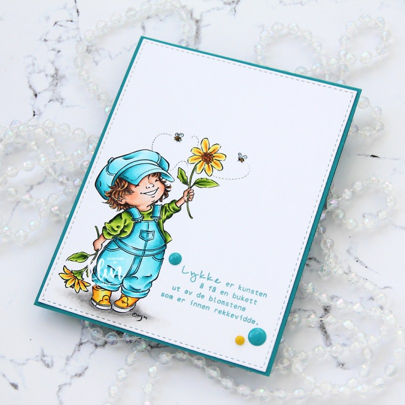
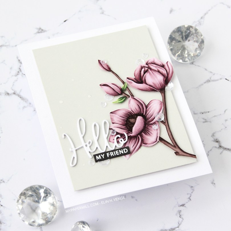
I stamped the flowers in fadeout ink from Inkon3, before coloring them in with Copics and fussy cutting up to the line.

HK My Favorite Things Magnolia Blossoms front skråttI splattered some white liquid watercolor from Hero Arts onto a panel of Soft Stone card stock from Papertrey Ink, before adding the panel onto my card base using lots of foam tape. I put 1 mm foam squares behind the flowers and adhered them onto the gray panel.

HK My Favorite Things Magnolia Blossoms flatlay venstre
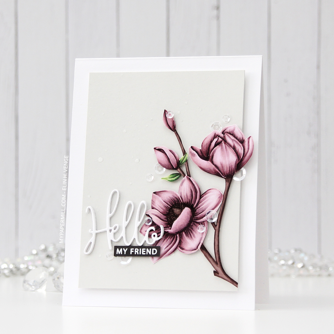
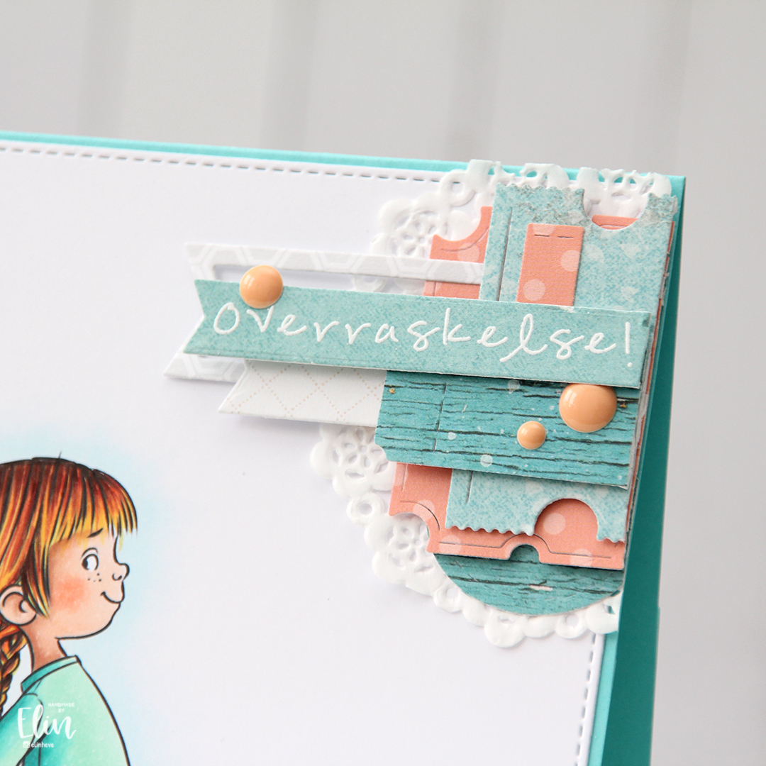
I die cut Hello three times from white card stock and stacked the die cuts for dimension. The die is from a die set that came with my Gemini when I bought it two years ago, and this is the first time I used it. It has a swirl going down at the bottom of the H that connects to the o, but I chopped that off. 

HK My Favorite Things Magnolia Blossoms flatlay rettI stamped and white heat embossed a sub sentiment (from the Leaf Clusters stamp set from Altenew) onto Smokey Shadow card stock from Papertrey Ink, and added an additional two strips of card stock behind it for dimension, I wanted it flush with the die cut word above it. 

HK My Favorite Things Magnolia Blossoms flatlay høyre
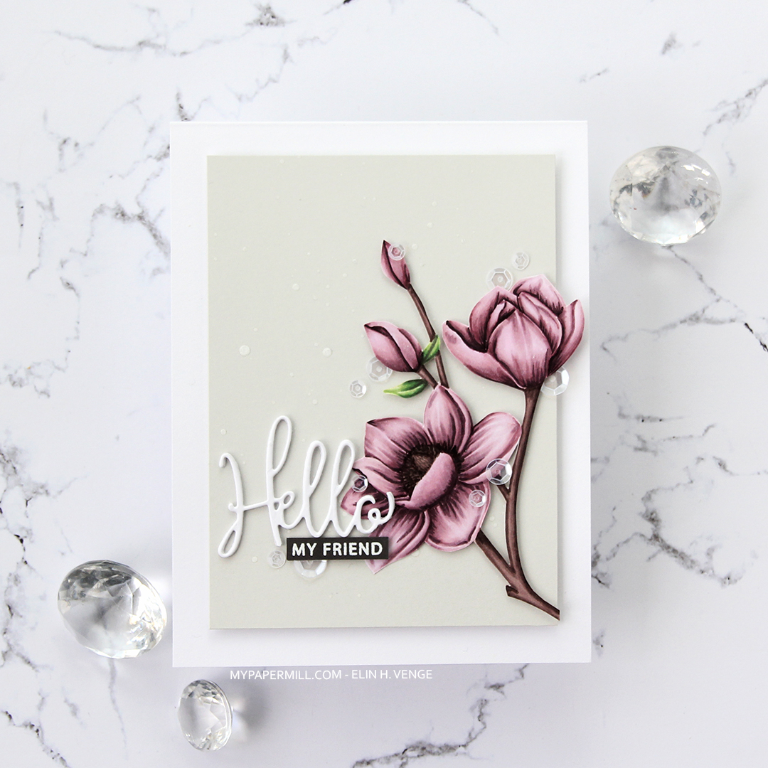
I added sequins from the White Orchid Sequin mix from Little Things from Lucy’s cards on or near the flowers and the sentiment, and my card was complete.

My Favorite Things Magnolia Blossoms CopicsJust a few Copics for this one. 


A little princess {Lili of the Valley}

Hi! I have a simple baby card to share today, featuring the adorable Baby Scales image from Lili of the Valley.

Lili of the Valley Baby Scales front rett

I colored the image with Copics and fussy cut it, leaving a thin white border. Normally, I’d cut right up to the stamped lines, but with the baby’s strands of hair sticking out from the top of its head, that wasn’t going to happen.

Lili of the Valley Baby Scales front skrått

I ran a piece of Lilac Grace card stock from Papertrey Ink through my Gemini Jr. with the Linen & Canvas impression plate, also from Papertrey Ink, for a little bit of subtle texture in the background. I love this particular impression plate, but it’s the first time I’ve used this side of it, I usually use the other. I cropped the panel down significantly and added it with foam tape to my card base. I used 1 mm foam squares behind the image, and adhered that to the bottom left.

Lili of the Valley Baby Scales flatlay

I used a stamp from Norsk Stempelblad AS with Altenew Amethyst ink to create my sentiment strip. I found a scrap corner of a mini paper doily from Doodlebug Design that I adhered directly to my textured panel, before mounting the sentiment strip on top with more of those 1 mm foam squares, finishing off with a few enamel dots from Papirdesign.

Lili of the Valley Baby Scales Copics
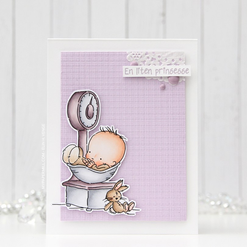
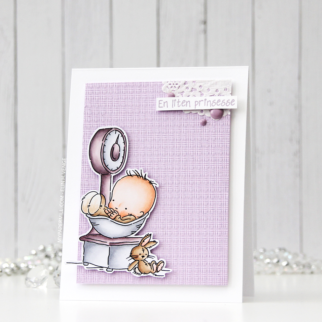
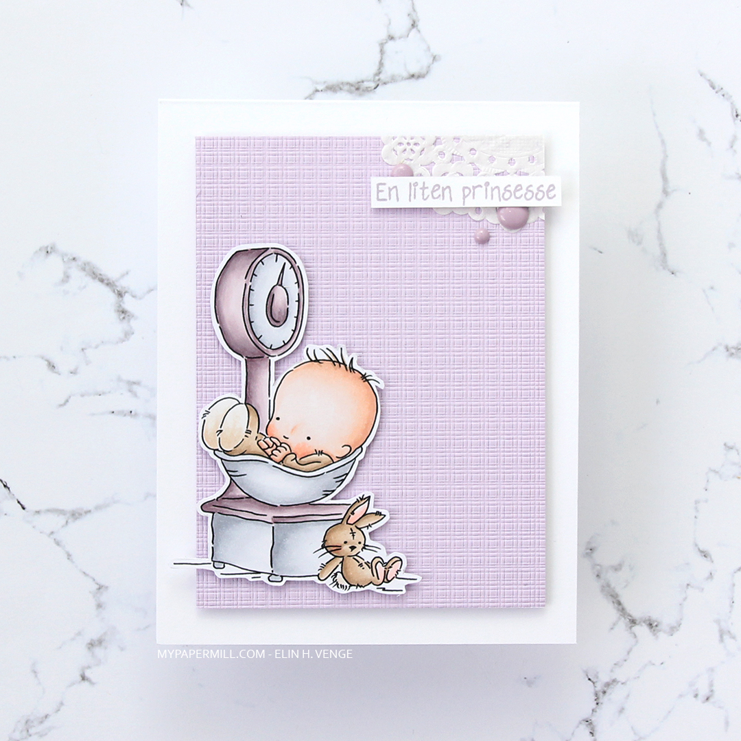
Not a whole lot of Copics used for this image, it IS simple, after all. I also used V97, which is a color I’ve made myself.