
Hi, there! I have a simple card with a fun technique to share today, featuring the pencil sketch version of Grace Beauty from Lili of the Valley. I love the pencil sketch versions of these images, and I’ve done some faux watercoloring for this one.
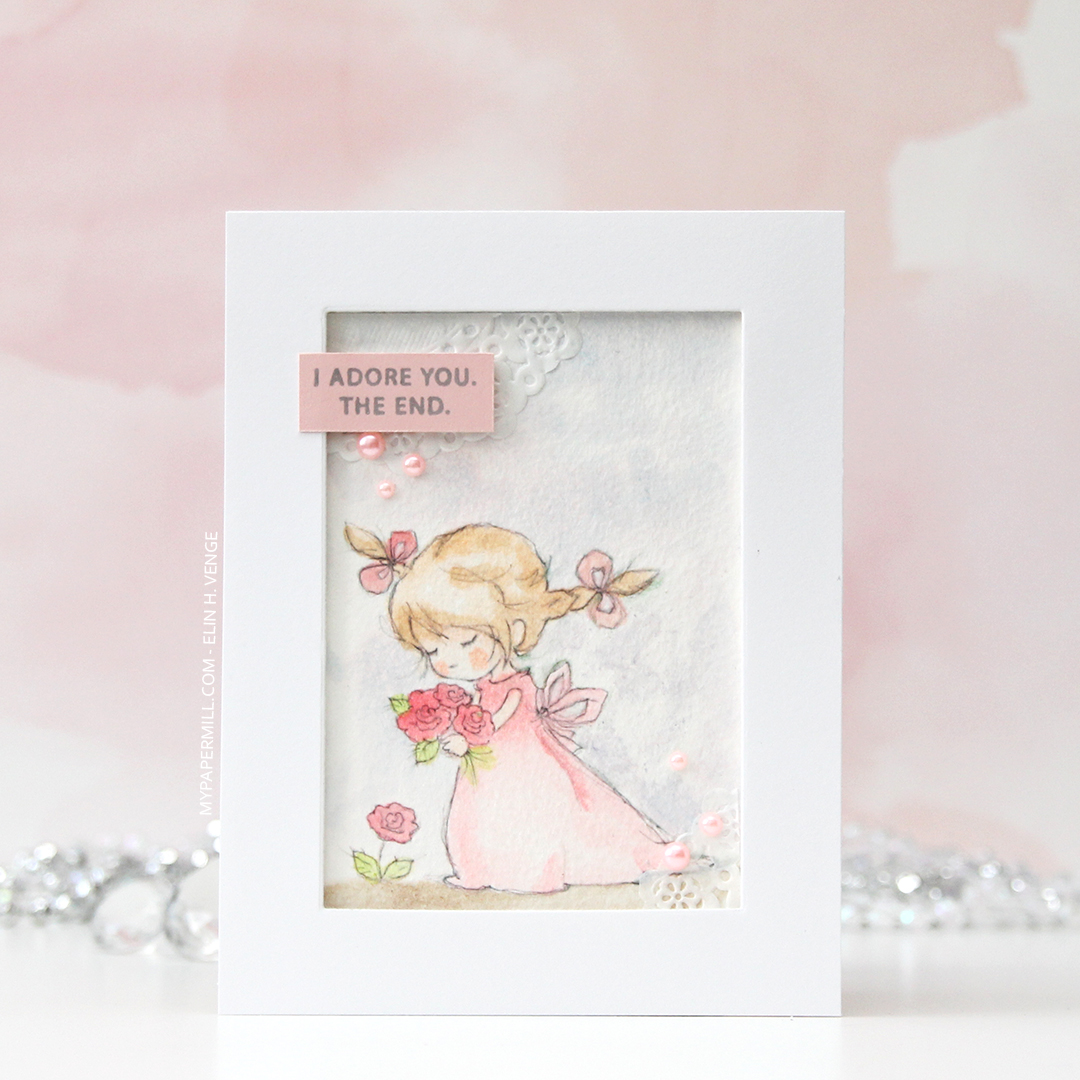
I printed the image onto Fabriano Artistico Extra White watercolor paper and did some Copic coloring. Yes, this is done with Copics, but not with the markers. Copic markers and watercolor paper are a bad match, the paper will ruin the nibs. I thought these sketchy images would be perfect with watercolor, but my printer and watercolor aren’t a good match either. That, and my watercolors still scare me. What never scares me are my Copics, so I filled a little bit of Copic blender solution into a water brush (one that I’ve designated for use with Copics) and used that as my paint brush, picking up drops of refill in various colors from a smooth, slick surface.
It’s not as precise as regular Copic coloring, but it’s a pretty fast, forgiving technique, and it’s a lot of fun to get more uses out of the markers (and the refills). It ticks all the boxes for me. I get the watercolor look that I like, without having to wait for things to dry (because the alcohol in the Copics evaporates a lot faster than water does), I can “watercolor” digital images with Copics because the ink won’t bleed. You don’t need a lot of colors either, and if you don’t have the refills, you can use the actual marker to scribble onto an acrylic block or another slick, non absorbent surface. One of these days I’ll practice coloring regular stamps with my actual watercolors, I just have to carve out the time. Even though they scare me, my watercolors don’t deserve to just be sitting unused in their palette, that’s not the reason I bought them.

I wanted to let the image shine and kept the card pretty simple. I used a rectangle die to cut a window in the center of a panel, mounting the negative on foam tape to frame the image.

I glued a couple of pieces of a mini doily from Doodlebug into the corners of my colored piece. I just wanted a little something. These go well with the soft look I was going for. I stamped a sentiment from the Leaf Clusters stamp set from Altenew in Soft Granite ink from Hero Arts onto a scrap piece of Sweet Blush card stock from Papertrey Ink, and added it in the top left corner, along with some pearls from Little Things from Lucy’s Cards. The pearls are the perfect matching color, they were a sampler pack in a big order I placed from her a while back, so unfortunately, I don’t know the color name.

When I do normal Copic coloring I tend to go overboard and use a ton of colors to achieve the look I’m after. With faux watercolor, it’s the opposite, the color palette is always very limited, because I can get a lot of gradient with just one color, depending on how much I dilute it with the blender solution in the water brush. The pink on her dress, the bows in her hair and the flowers is all made with just R43, I’d never be able to achieve this ombré effect using just one color with the markers themselves.
