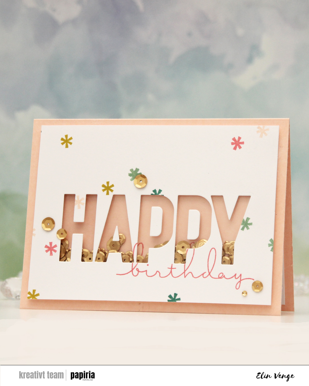
Hi, crafty friends! Today is Mother’s Day in Norway, and I probably should have thought ahead enough to make a Mother’s Day card to share today, but I’m not always a good thinkaheader and have a birthday card to share instead. My design is pretty generic, though, and it would be easy to swap out “birthday” for “Mother’s Day”. I even think the color scheme is perfect for mother’s day.

So many things went wrong in the creation of this card, but I fixed/covered up most of my mistakes and I’m pretty happy with the end result. I started by stamping birthday from the All the birthdays stamp set from Concord & 9th onto an A6 panel of Stamper’s Select White cardstock from Papertrey Ink, as well as onto a piece of Nectar cardstock from Concord & 9th that was large enough to cover the shaker area. I didn’t want to stamp it directly onto the card base, that would have made it harder to line up. More on that later. So far, so good, right? I then die cut the HAPPY from the Happy Birthday words dies from Kristina Werner into my white panel, and kept the counters of the A and the Ps to put back in later. Things were still going according to plan. There’s a small asterisk looking stamp in the All the birthdays stamp set. I wanted to stamp that randomly across my white panel and pulled out an acrylic block. We used to stamp with acrylic blocks all the time before the Misti was invented. I’m not a ding dong, surely, I’m capable of stamping this tiny stamp a few times with an acrylic block without messing up, right? Turns out I AM a ding dong and royally messed up on the Eucalyptus colored asterisk above the A and P. Pretty much in the middle of the card, isn’t that typical? I knew I was going to add sequins, and I could strategically place one to cover up my boo boo. I cut off 3/16″ on all sides to allow the card base color to work as a frame once the card was complete.
I then adhered a piece of acetate behind my letters, glued the counters (interior pieces of the letters) back in onto the acetate, flipped the panel over and added tons of foam tape around the shaker window pretty close to the window, even putting tiny strips behind the counters of the Ps, before putting a few sequins from Altenew into the shaker well before sealing it shut with another piece of acetate. I made sure to add the sequins the right side up. That was not a good idea, but I didn’t realize at the time and adhered my shaker piece onto the stamped piece of Nectar cardstock to line up the stamping on the two pieces. The problem with the sequins all facing the same way is that once they shook around, they clumped together like stacks and were pretty much impossible to separate by flicking the card. The other mistake? Adding the foam tape so close to the letters and behind the counters, my sequins didn’t really have a chance to move much. I had adhered everything to the card base at this point.
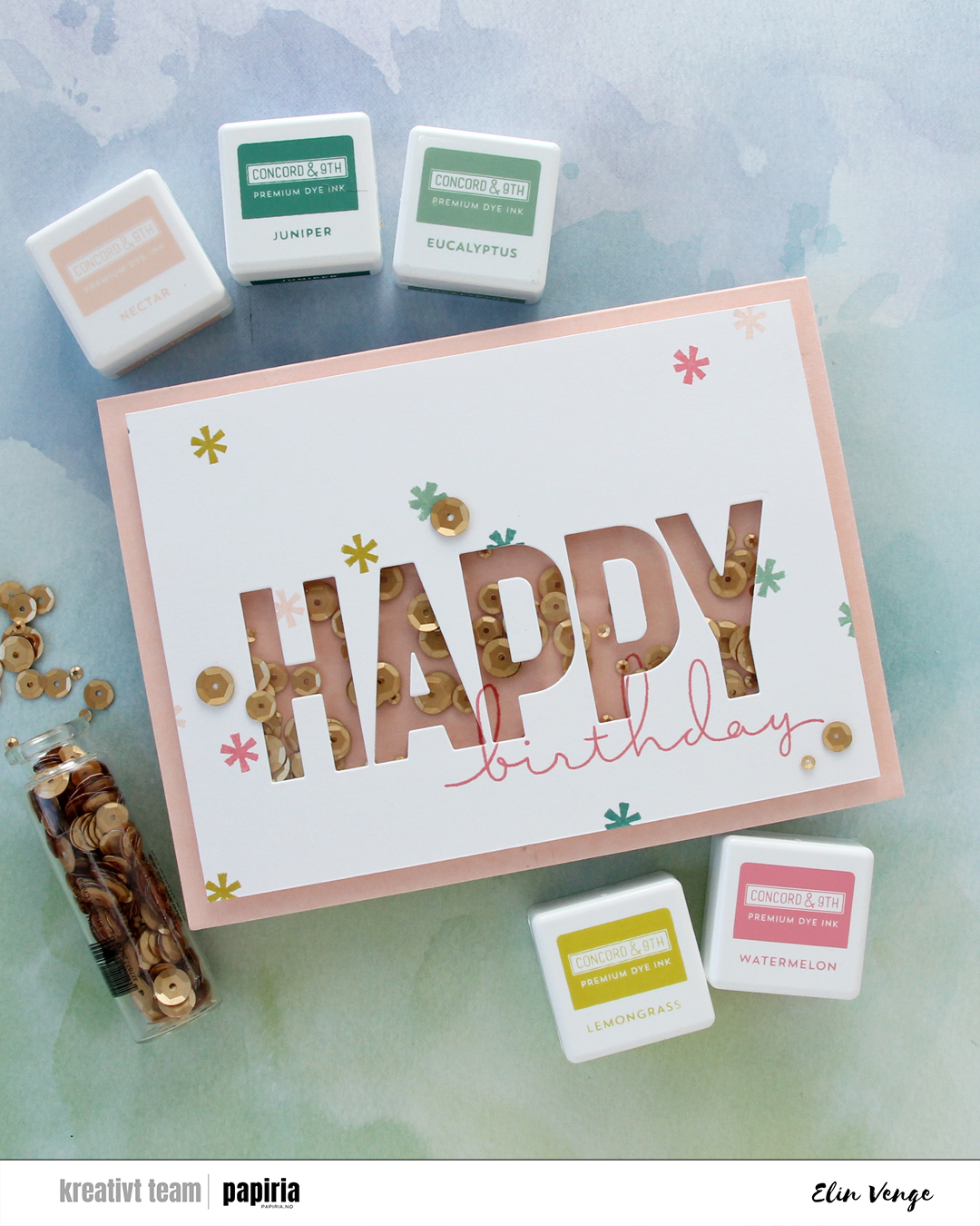
I’m not shy with glue when adhering things, but I was able to slide a thin 6″ steel ruler under my shaker panel and basically used it as a saw to cut it away from the card base, cutting horizontally so I would preserve the card base as well as I could. I didn’t have another sheet of Nectar cardstock to create a new A6 card base, so this was the way to fix it. I then pulled off the nectar piece with the stamping, then the back acetate piece, which took with it a few of the small pieces of foam tape that were in the way anyway, and then I emptied out the sequins, made sure there were no sticky pieces left behind, put sequins back into the now rectangular shaker window, this time randomly with some upside down and some right side up – and I added way more sequins too, before sealing it shut with a new piece of acetate. The piece of Nectar cardstock I’d stamped on initially had crease lines after being pulled off, so I had to restamp birthday on a new piece of Nectar. Evidently, I didn’t put the stamp into the Misti the same way as I had the first time, because the new stamping wouldn’t really line up with the old stamping – part of the nature of photopolymer stamps, they’re soft and can be curved. The loops on the b and h don’t perfectly line up with the stamping on the white panel the way they initially did, but this is me embracing imperfection, I wasn’t redoing the white panel too.
 I adhered my shaker panel to the card base and cut a couple of additional white panels to put on the inside of the card. This means I have a white panel to write my personal message, the card is a little sturdier because it’s now thicker, and the piece I adhered on the back of the front covers up the fact that I could actually see through parts of the card base after my little sawing earlier. Not shy about glue, remember? Yeah, the glue does its job, and I tore parts of it down to almost printer paper thickness. I added sequins to the front of the card (one covering up my stamping mishap) and I was done. At least I thought so… I was happy with the card, but then noticed as I was writing up the blog post for Papiria that the counter of the second P had slipped a little and wasn’t in the right spot anymore. It was bugging me. It was *really* bugging me, so I peeled it off, die cut a new one that I adhered in the right spot and took a couple of new photos. You can still see the droopy counter in the first two photos here, but that’s my card. I got there in the end.

 I started by stamping the large flower in the Pristine Peonies stamp set from Altenew using VersaMark ink. I added Gilded embossing powder from Brutus Monroe and melted the powder before die cutting the flower and then using the coordinating stencils to quickly color in the flower and leaves. I used Nectar, Grapefruit, Sorbet and Cayenne inks from Concord & 9th for the florals, and Pistachio, Misty Sage, Mossy Meadow and Green Opal Fresh dye inks from Altenew for the leaves and buds.
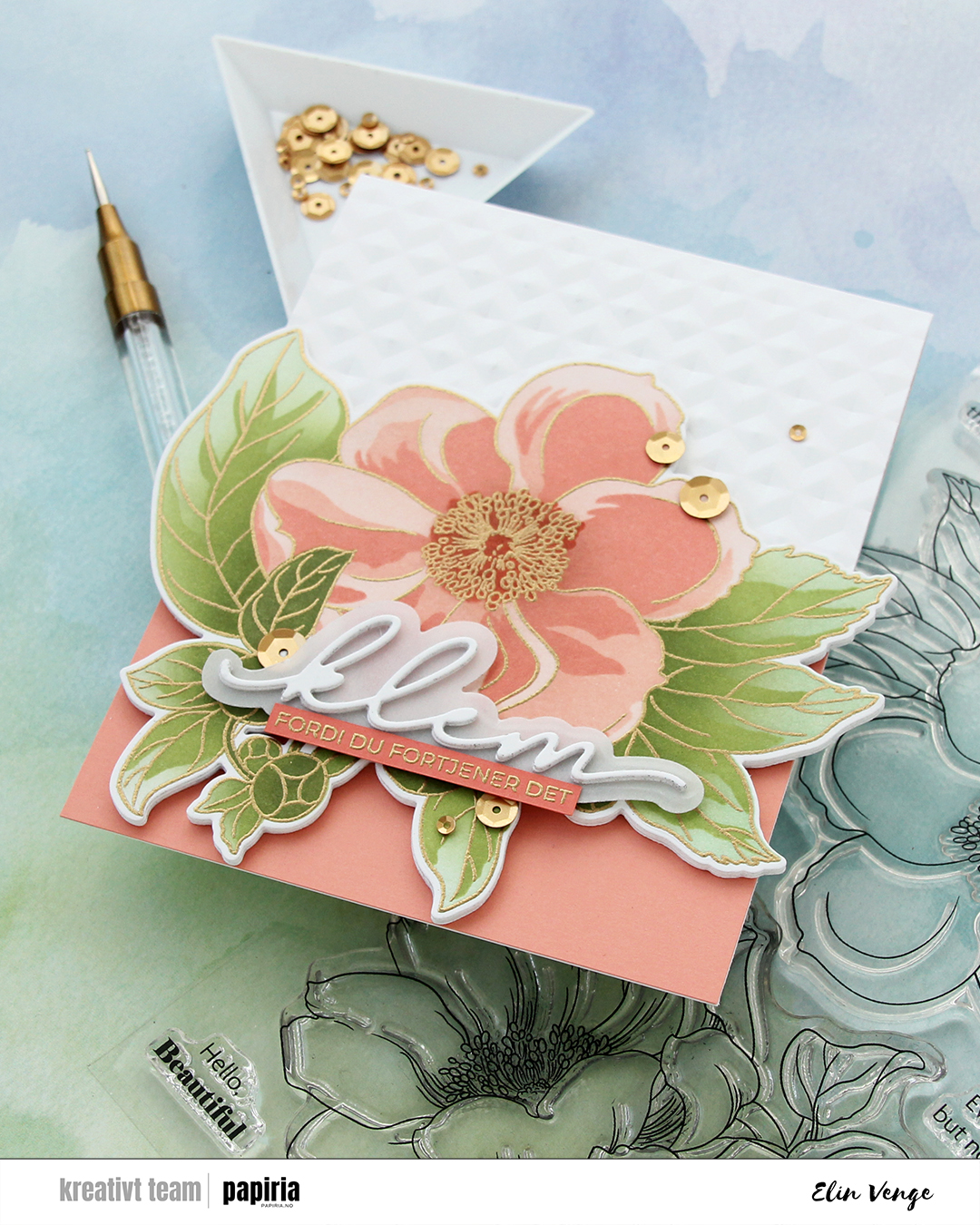 I die cut an additional three layers of the floral from white cardstock to glue behind my colored one, did partial die cutting on the card base using the same die and then ran the base through my Gemini Jr. with the Angled Mosaic embossing folder from Altenew to create some texture to the card front.
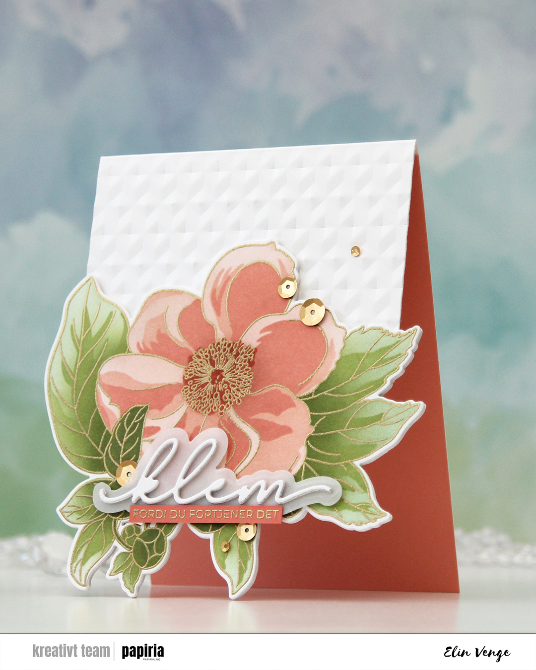 I adhered a panel of Grapefruit cardstock from Concord & 9th to the inside to accentuate the look of the open front, and added my stacked die cuts to the front of the card base. Even though the tips of the leaves touching the table when the card is on display are pointy, all the layers make for a very sturdy front, so they won’t bend.
 I actually used a Christmas die for the sentiment. The die cuts out the word juleklem (Christmas hug), but by omitting the first four letters, I was left with klem (hug). I die cut two stacks of three layers each and die cut the shadow layer from Heavyweight Translucent vellum from My Favorite Things. I sandwiched the vellum between the two stacks and adhered my stacked die cut on top of the flower. I stamped and gold heat embossed a coordinating sentiment (translation: because you deserve it) onto a strip of Sorbet cardstock from Concord & 9th, adhered it to the vellum and added a few more layers on the back for strength and dimension, before finishing off the card with satin gold sequins from Altenew.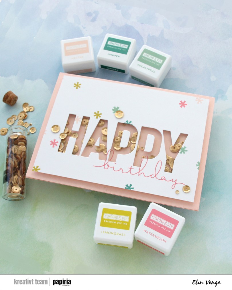

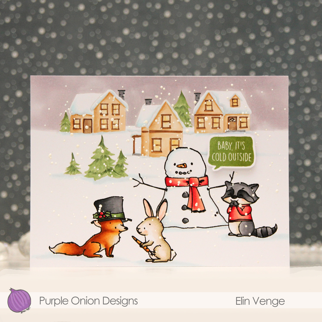 These images in this scene are all from the Winterwood collection from Purple Onion Designs, illustrated by Holly Mabutas. We have
  I colored the scene with Copics, then stamped the critters and the snowman again, this time using Obsidian ink from Altenew to get crisp black lines. This is a pigment ink, which doesn’t play nice with Copics, but as long as the coloring’s already complete, using this ink is totally fine. I sprinkled on Chunky White embossing enamel from Stampendous, melted the granules from the back of the paper and finished off the card with a sentiment from the
  Not a whole lot of colors used given the large scene, but I did use 7 for the fox alone. But he came out so cute, it was totally worth it!
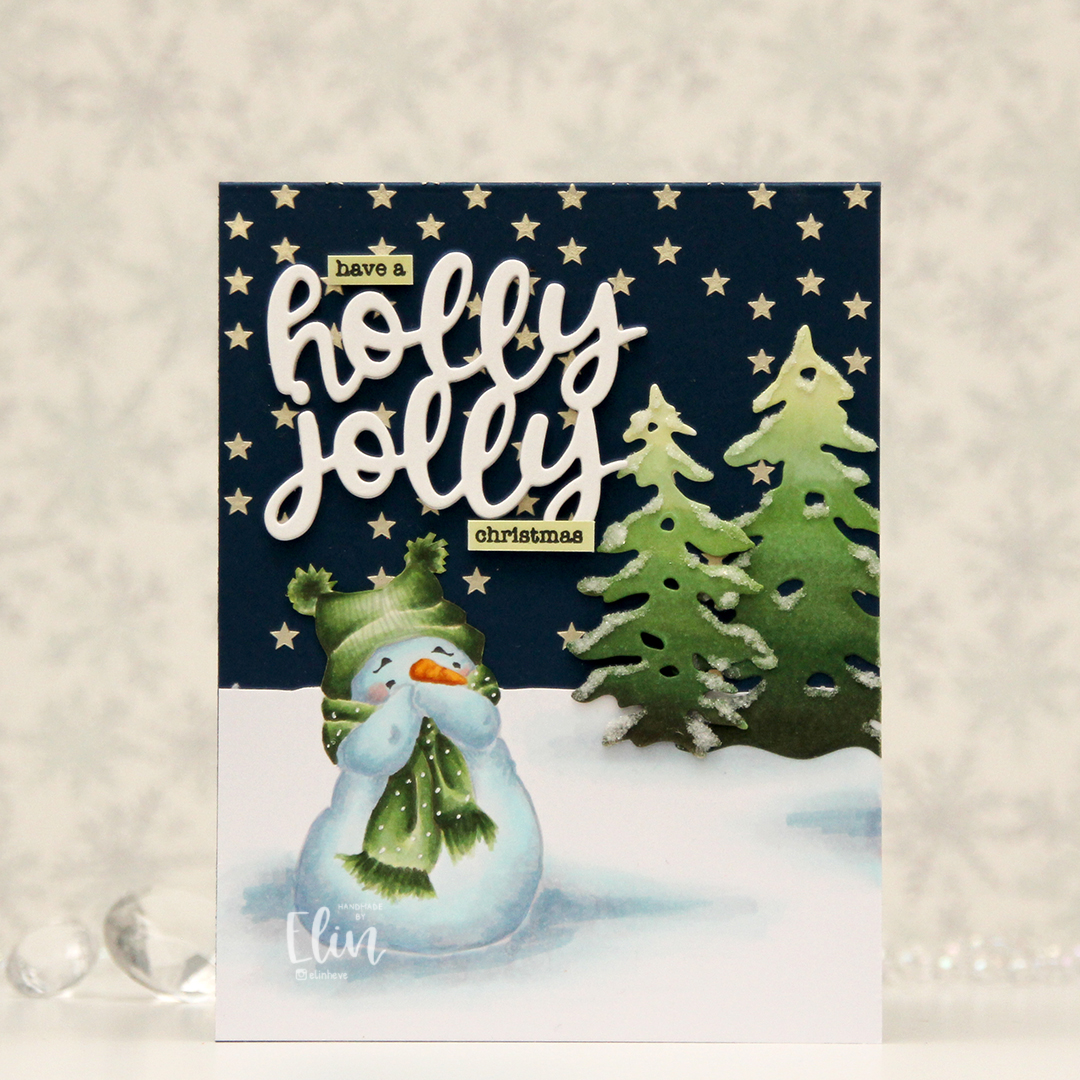 I love coloring this image in noline versions. I usually print with his eyes and eyebrows in a dark brown and the rest of him in a super light grey. I kept the snow on the ground around him this time, and cut away the part of the panel that above my imagined horizon line. I created stars in the sky by using solar paste from Simon Hurley (in the golden hour color) through the Falling stars stencil from Simon Says Stamp onto the front of an A2 card base I created from After midnight cardstock from My Favorite Things.
 Once the stars were dry, I adhered my panel with my snowman, adding die cut trees a little bit below the horizon line. I created the trees by coloring a scrap piece of X-Press It using the same green markers I used for the image, before die cutting them using the Silhouette Snow Trees die set from Mama Elephant. I finished off the trees with some liquid glue and Rock Candy distress glitter for a sparkly, snowy look. For a sentiment I die cut the words holly jolly from the Jolly Holiday greeting die set from Concord & 9th five times from white cardstock and adhered them all together for a stacked, dimensional look and completed the greetings with some small words from the Holiday messages stamp set from Mama Elephant that I stamped in Obsidian ink from Altenew onto pieces of cardstock I colored with the lightest of the green markers I used for the snowman and the trees.
 Fairly simple color palette for this one, although I don’t think I’ll ever have a limited color palette for snow, I always choose a lot of colors to create snow.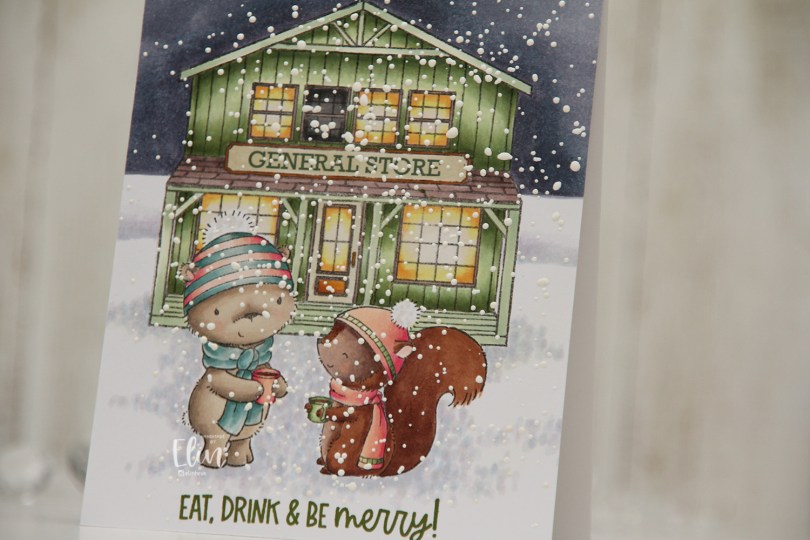
 Meet
Meet  Once everything was colored in, I stamped Santa’s Silhouette using Obsidian ink from Altenew. This is a pigment ink, which doesn’t really play well with Copics, so it’s best to use it once the coloring’s complete. I then stamped a sentiment from the Home for the Holidays sentiment set using Jalapeño Popper ink from My Favorite Things, before I sprinkled on chunky white embossing enamel from Stampendous, which I melted from the back for a textured snow look. I adhered my panel to a top fold card base and my card was complete.
 I used a lot of Copics for this scene. A lot.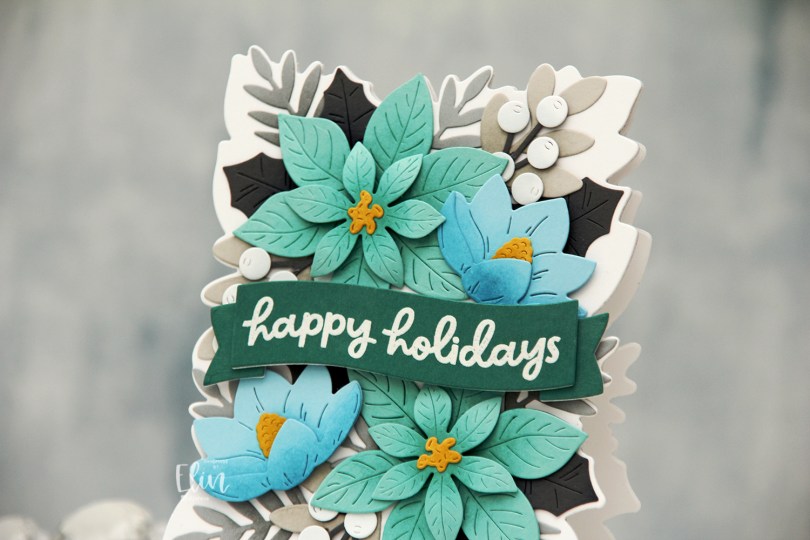
 This die set is massive, there are 18 dies to cut out everything I’ve used on this card. Included in the die set is also a large die that leaves a faux stitch outline of this arrangement. I didn’t use that for this card, but I’ve used all the other dies in the set.
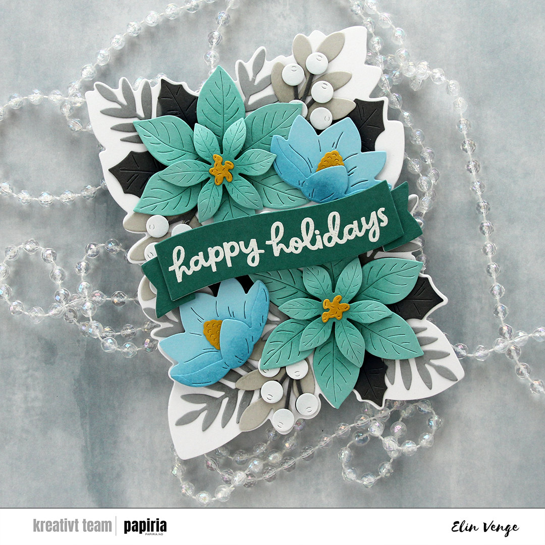 I used the outline die in the die set to cut my card base from Stamper’s Select White cardstock from Papertrey Ink. I folded half a sheet (4 1/4 x 11″) and did partial die cutting, so the top of the die wouldn’t cut. I then adhered a white panel I cut with the same die and then arranged my florals on top. I glued some pieces flat down and added others with diemension behind them.
 I stamped and white heat embossed a sentiment from the Festive Blooms stamp set onto Juniper cardstock, die cut it into a banner and added a couple of white die cuts behind it for strength and dimension, before popping it up on foam tape in the center of the card.
 I started with the Snowfall Backdrop Landscape die from Lawn Fawn, which I die cut from white cardstock (Stamper’s Select White from Papertrey Ink). I did a bit of ink blending with Fresh Dye inks from Altenew, using Arctic Mountain, Winter Lake and Icy Water inks going from top to bottom for a gradient effect.
 I used the Snøkrystall ramme 2 die from Papirdesign to cut my border of trees and snowflakes. This die set actually has two borders – one that cuts out the trees and snowflakes I used here, and the other one does snowflakes and stars. I thought the trees went well with my snowfall backdrop, which is why I opted for that.
 I trimmed down my snowfall backdrop, adhered it to a white cardbase and layered my die cut border on top, before adding a sentiment that I created with the Juleklem die from Kort & Godt. I cut two layers from the same white cardstock I’ve used throughout the card and one layer from an ink blended piece using the same inks that i used for the sky for a very clean look. This card is so simple, and you could easily mass produce this if you wanted to. I only make one offs, but it’s totally up to you.
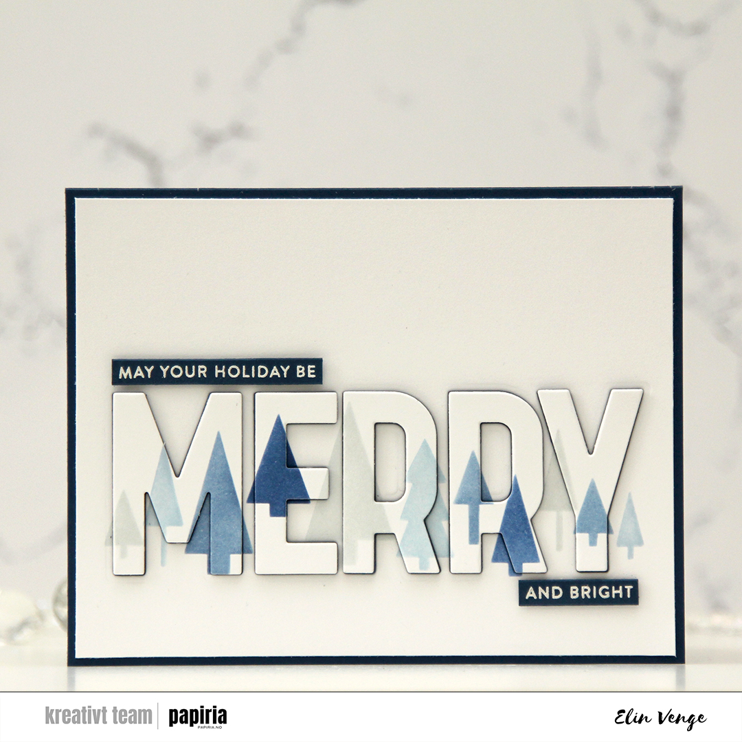 I wanted to create a blue Christmas card. Blue’s my jam, and I had this idea as soon as I saw the release. I started with the Merry Trees stencil set, which is a set of two stencils that creates a line of trees. Each of the stencils has two “layers”, and if you layer all four you have the full line of trees in up to four colors. I used the Northern Shore family of Fresh dye inks from Altenew for my stenciling, it’s a great blue family of inks.
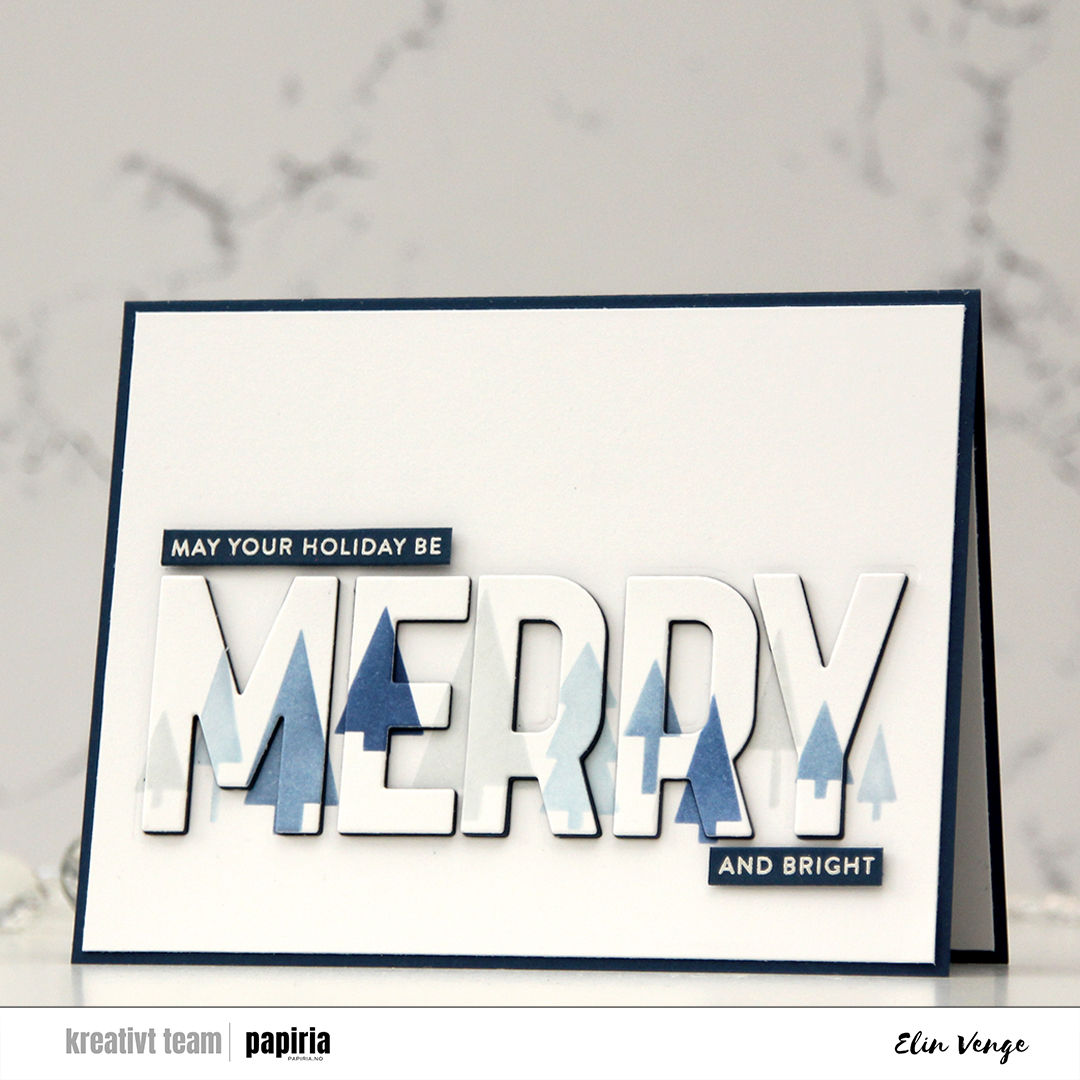 Using the Merry Trees die set, I took the big MERRY die and die cut it straight out of my ink blended trees. I also die cut an additional four layers of using After Midnight cardstock from My Favorite Things. I cut off a little on each side of the white panel, adhered it to a card base in that same dark blue color and puzzle pieced the letters back in. The fact that they’re stacked with a dark color makes the word easier to read than if I’d used white to stack.
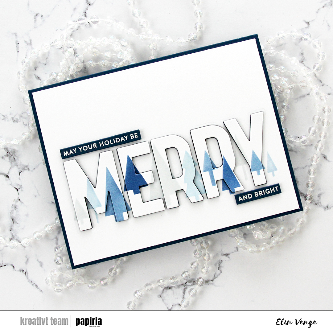 I white heat embossed a couple of sentiments from the Merry Greetings builder stamp set onto After midnight cardstock and cut them down to sentiment strips using the Merry Greetings builder die set. I usually use a steel ruler and craft knife to create my sentiment strips, but there’s something about the roundness of the edge that you get by using a die. I added a few more strips of cardstock behind each of the sentiment strips for dimension and placed them above and below the die cut MERRY to complete the sentiment.
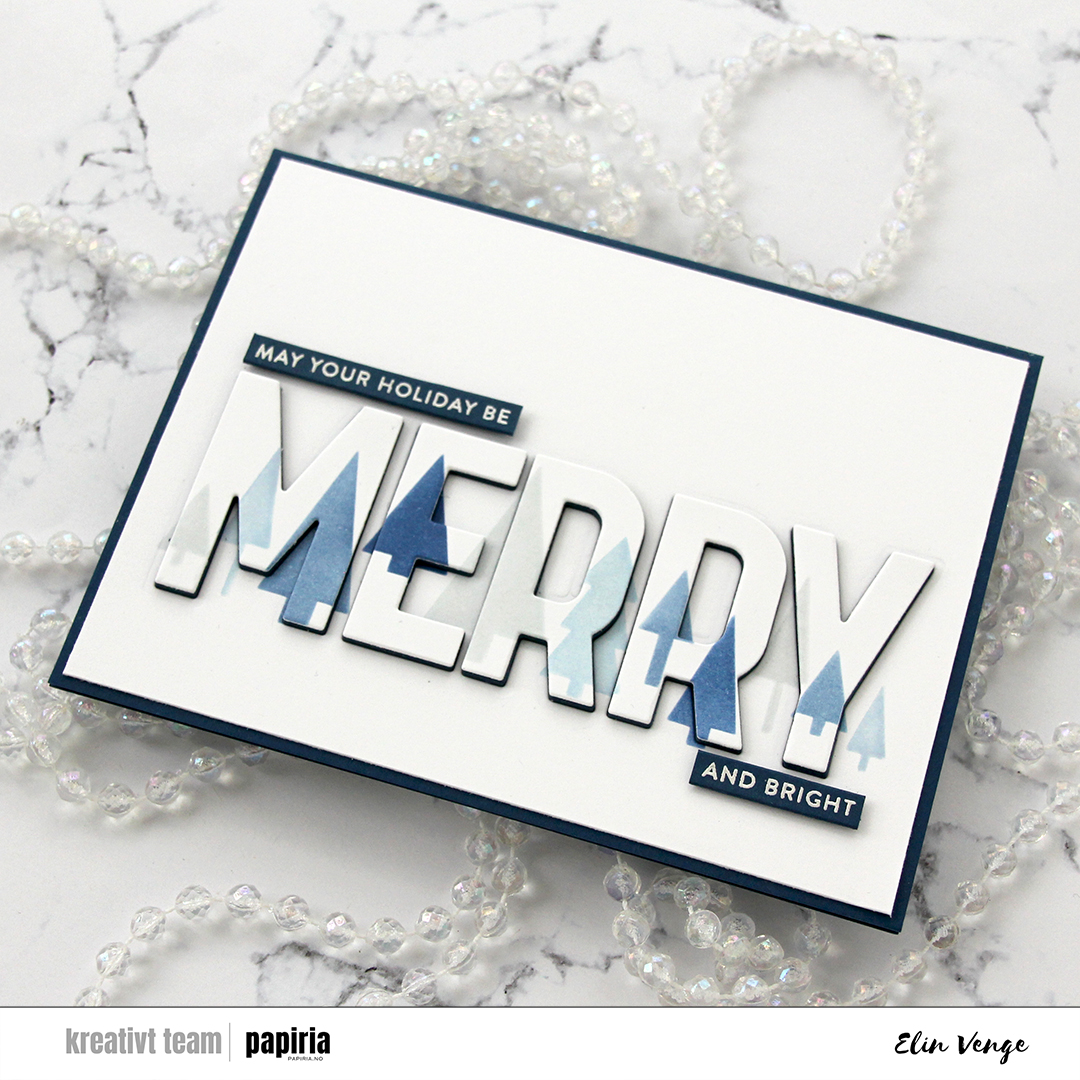 I decided not to use any embellishments on this card. Sometimes I feel like the colors and cardstock do all the work for me, and I love how this one turned out.
 I started by stamping the large floral image using Obsidian ink from Altenew. This is a very crisp, dark black pigment ink, so I heat set it before moving on to avoid the risk of the ink smearing. I used the stencils to color them in with Fresh dye inks from Altenew. I used the Sun-Kissed Delights collection for the yellow, the Blushberry Bliss collection for the pink and the Jade Dreams collection for the green. I left out the darkest shade in each of the color families, and opted for Wheat and Nutmeg inks from Concord & 9th for the center of the yellow flower.
 Once the image was properly inked, I used a die from the die set to cut out the image. I put foam tape on the back before adhering it to a top fold landscape card base I created from Stamper’s Select White cardstock from Papertrey Ink, which is the same cardstock I used for the flowers. I trimmed off the small bits that were hanging over the edge of the card base.
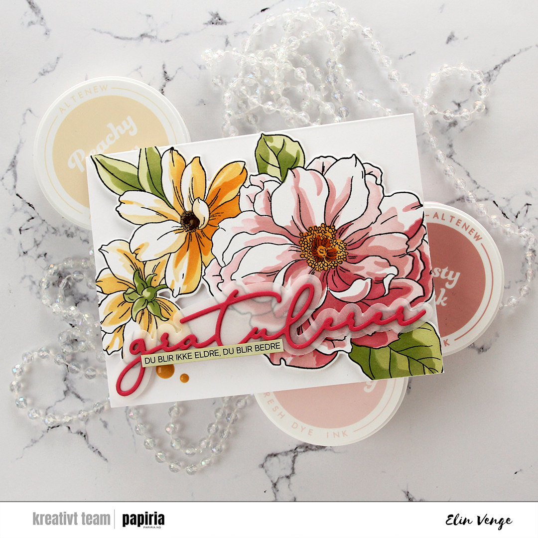 Using a die set from Kort & Godt, I cut the word gratulerer a few times from Honeysuckle cardstock from Concord & 9th, and the shadow layer from 40 lb vellum. I stacked two of the pink on top of the shadow and another two behind the shadow, giving it a little bit of lift off the flowers.
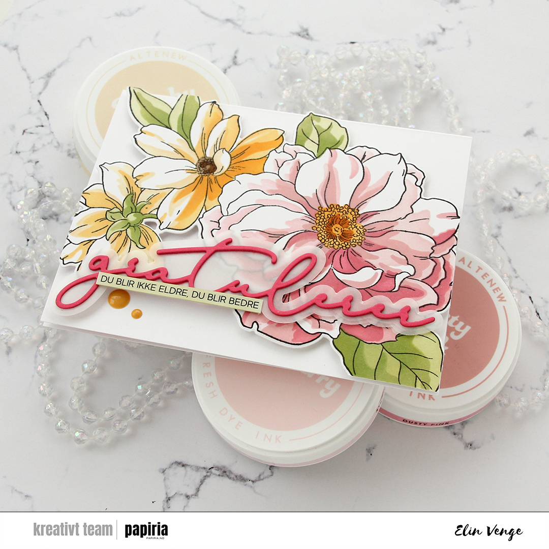 I used a sentiment sticker strip from Kort & Godt for the sub sentiment. The sticker was originally white, but I ink blended with Misty Sage, which is the second lightest color in the Jade Dreams family of fresh dye inks from Altenew. I then trimmed it down to be a little bit narrower and adhered it to the word die cut, before finishing off the card with a couple of enamel dots from the Fall Harvest pack from Altenew.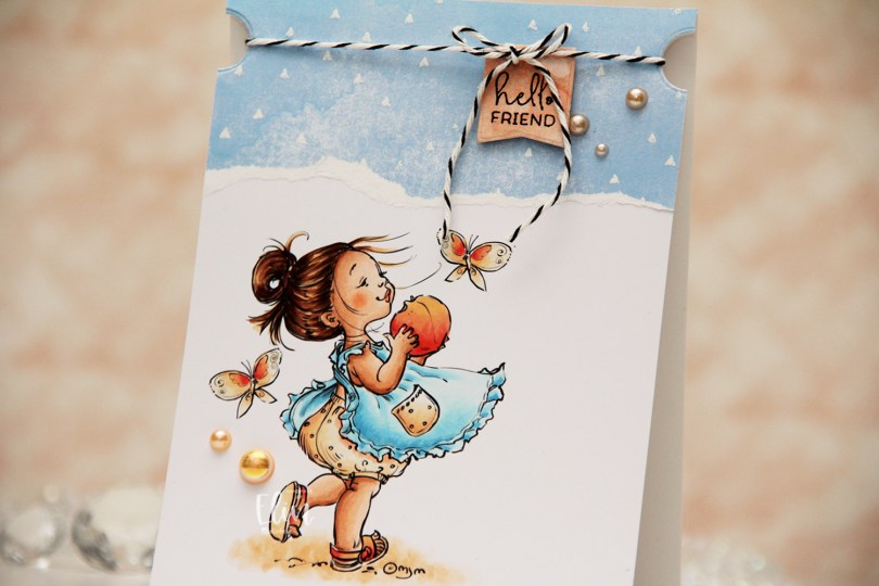
 I colored her up with my Copics and kept the panel intact this time. No die cutting, no nothing. I adhered it directly to a top fold A2 card base and put a torn piece of patterned paper at the top. The paper is from the Watercolor Wishes pad from Lawn Fawn, and I white heat embossed triangles onto it to create a little more interest, using the Scattered Triangles Background stamp from My Favorite Things.
 I used a small circle die to create notches near the top of the card. I stamped a sentiment from the Mini messages stamp set from Mama Elephant using Obsidian ink from Altenew onto a piece of patterned paper from the Watercolor Wash Brights paper pad from My Favorite Things, and die cut it with one of the dies in the Blueprints 27 die set from My Favorite Things. I put foam tape on the back and adhered it to my card, before adding some black twine to the card, tying it in a bow at the top of the die cut. The notches help keep the twine in place. I finished off with a few pearls from the Meadow mix from Little Things from Lucy’s Cards.
 I love using Rs and YRs to create peach colors.
