Hi! Part of me is struggling to believe it’s been a week since my last post, but it totally has been. I was so good and efficient in my craft room before going on vacation, getting lots of stuff done and scheduling everything for when I was away, and let me tell you, getting back into the swing of things is not easy, I feel like I’m still in vacation mode. I’ll get there, though, it just takes a little while.
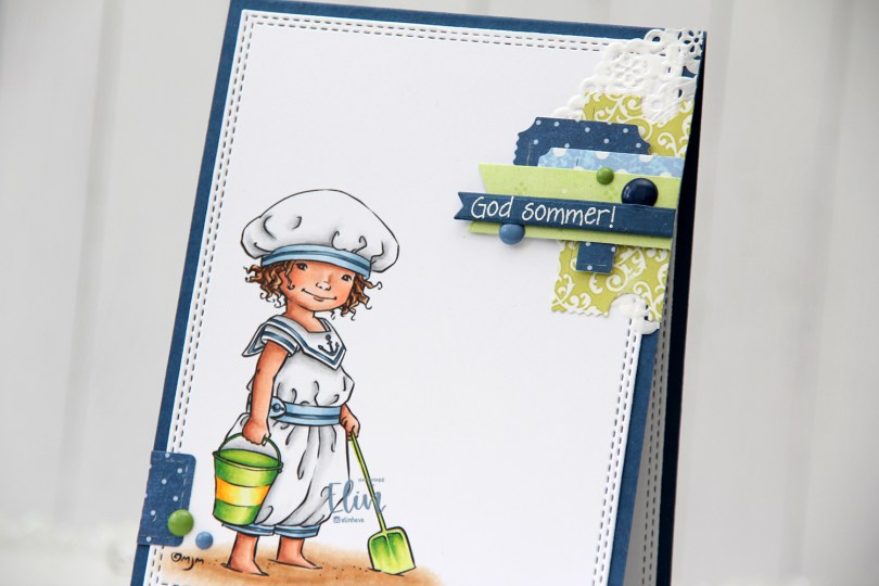
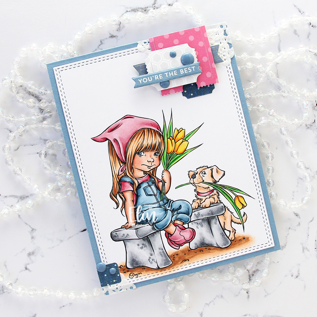
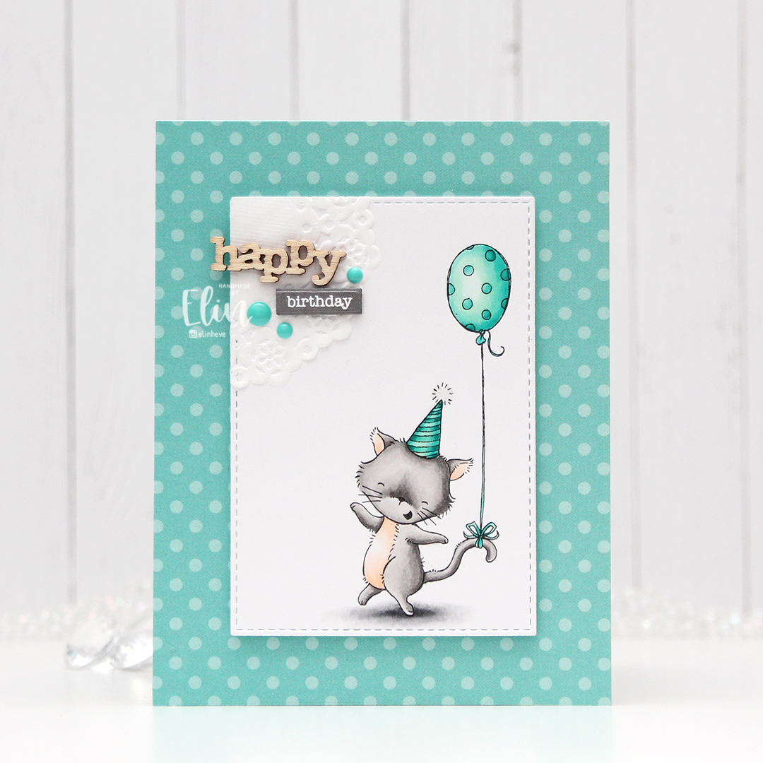
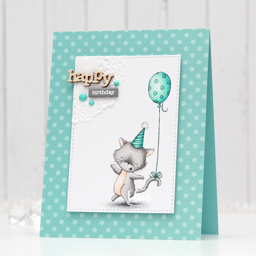
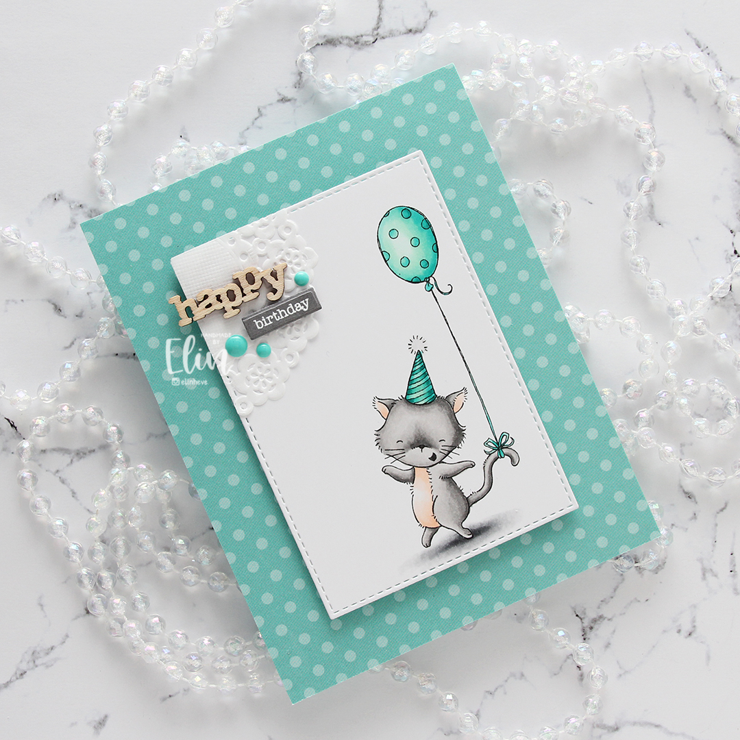
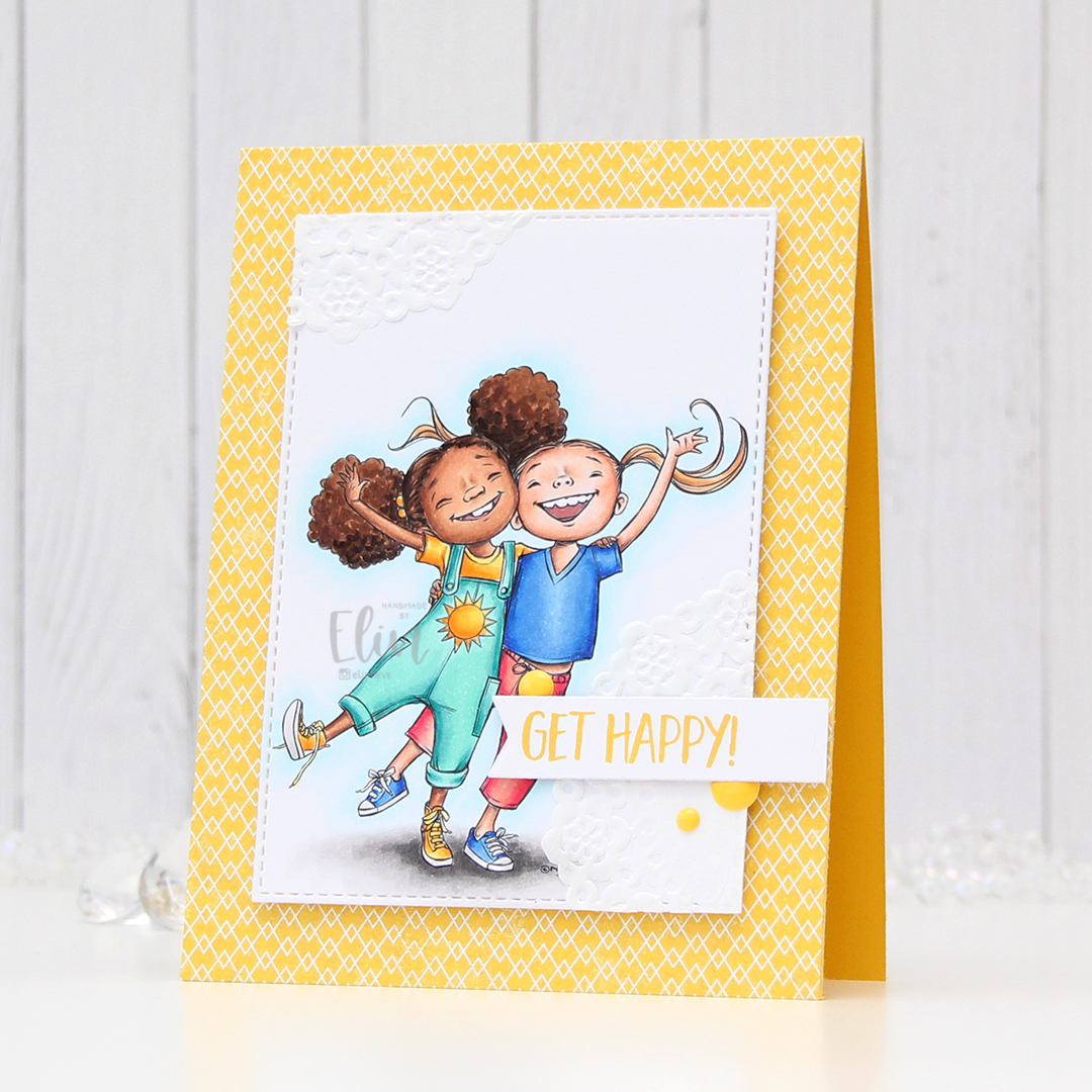
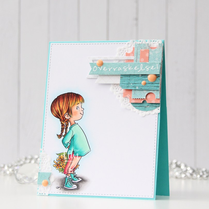
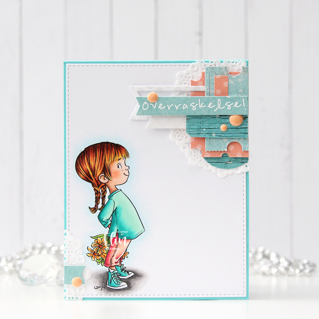
 Technically, I should have made this card at the beginning of the summer, but it’s a recent image from Mo and I couldn’t NOT make a summer card using it. The air is definitely getting cooler here, and I’m very well aware of the fact that summer officially ends in two weeks. I kind of want to go back to June and warmer temps, I don’t like the cold.
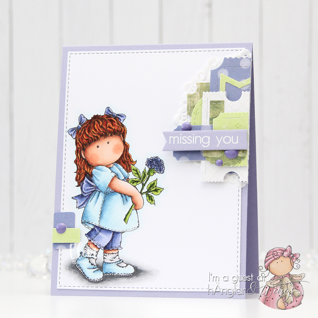
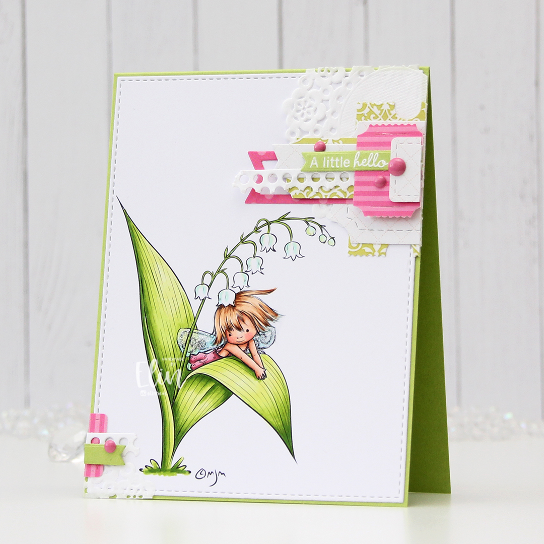
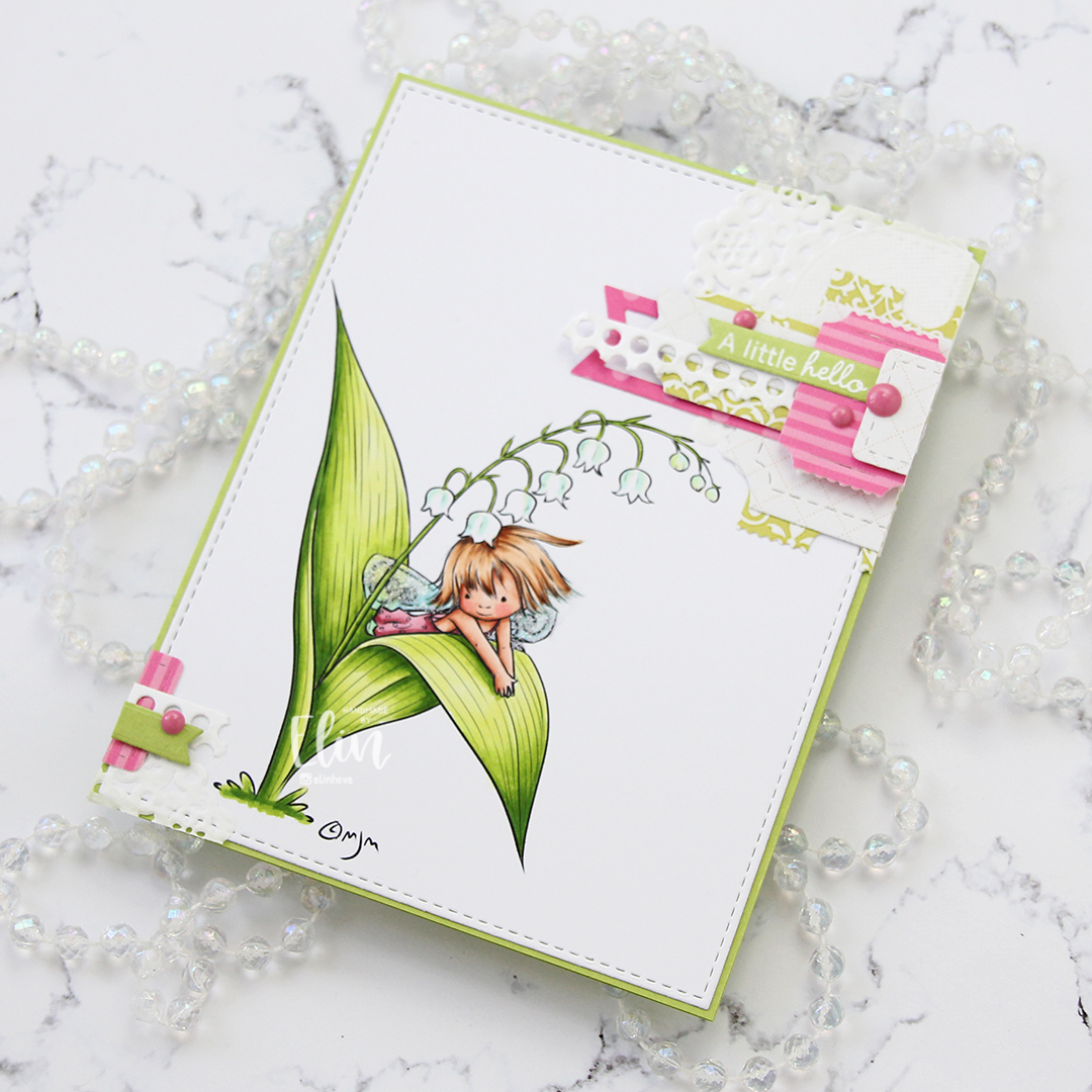
 Onto the card. I colored the image with Copics and used a double stitch rectangle die from My Favorite Things to turn it into a nice panel, before adhering it to a top fold card base I made out of Enchanted Evening cardstock from Papertrey Ink. I love their cardstocks.
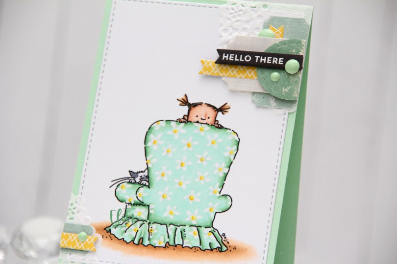
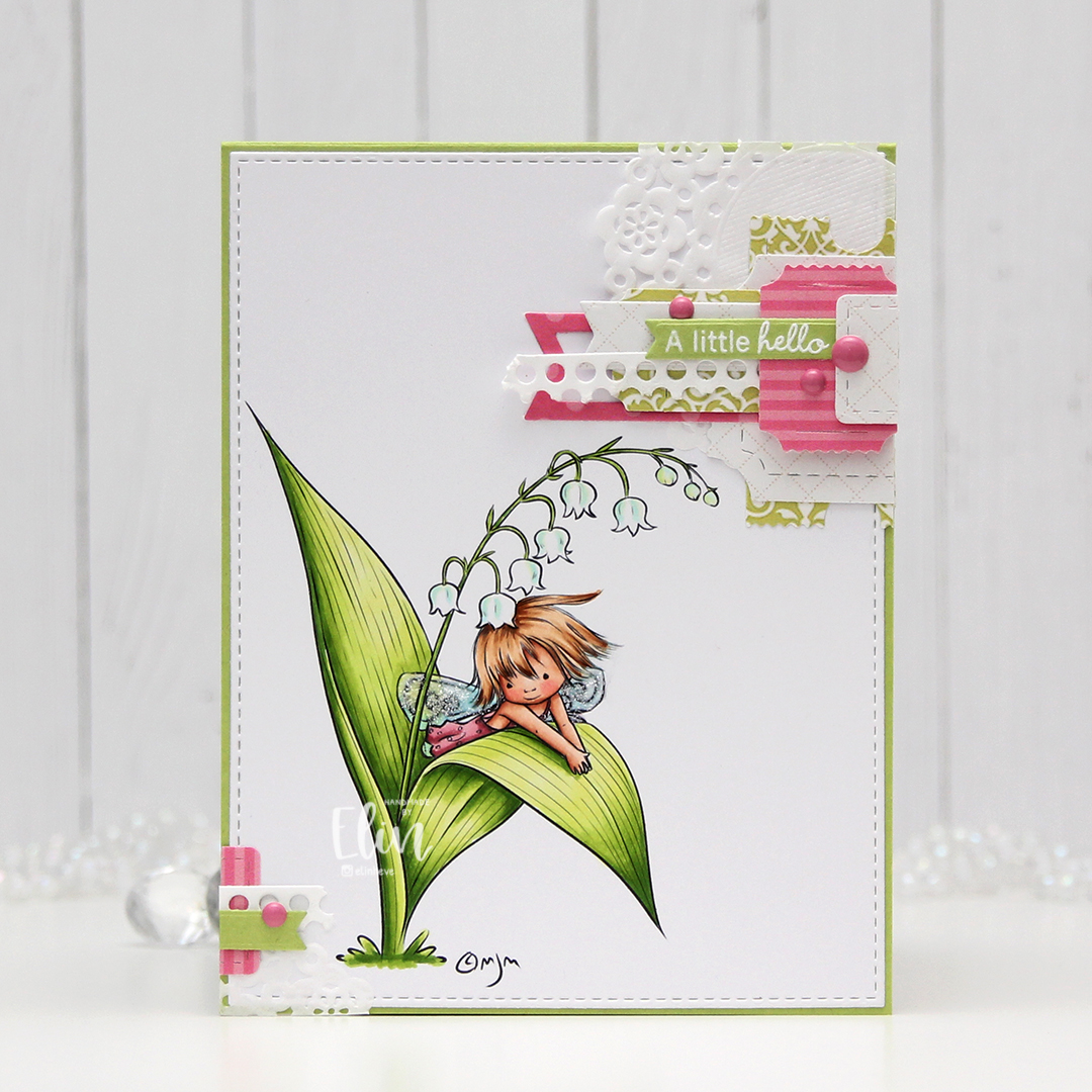
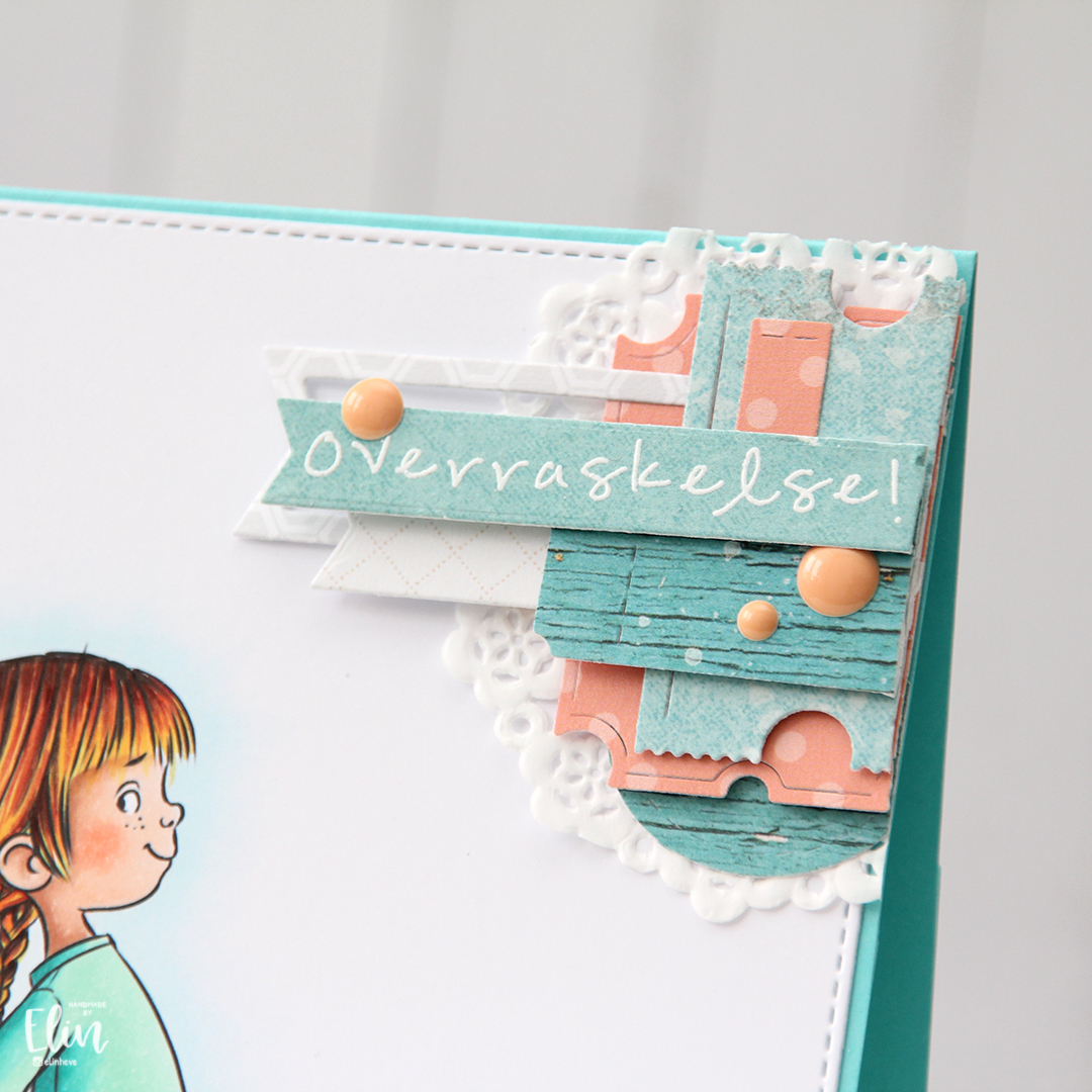
 When I don’t have a clear idea for a card, I turn to embellishment clusters of patterned paper scraps. These are so easy to put together and a great way to add SOMETHING when I’m out of ideas and my mojo’s low.
 I’ve sorted my die cut patterned paper scraps by color, so I pull out colors that will match my card and just start playing. I used patterned paper from 3ndypapir, Papirdesign, Kaisercraft and Imaginisce for this card, and the dies I used to cut them out are from XCut and My Favorite Things.
 I white heat embossed a sentiment from Norsk Stempelblad AS onto a scrap piece of Enchanted Evening cardstock and used one of the Itty Bitty Strips dies from My Favorite Things to diecut it, before using 1 mm foam squares to mount it onto my cluster. I added a few enamel dots from Papirdesign to finish my card.
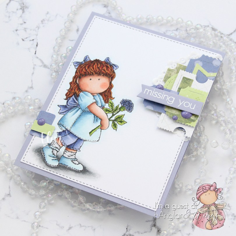
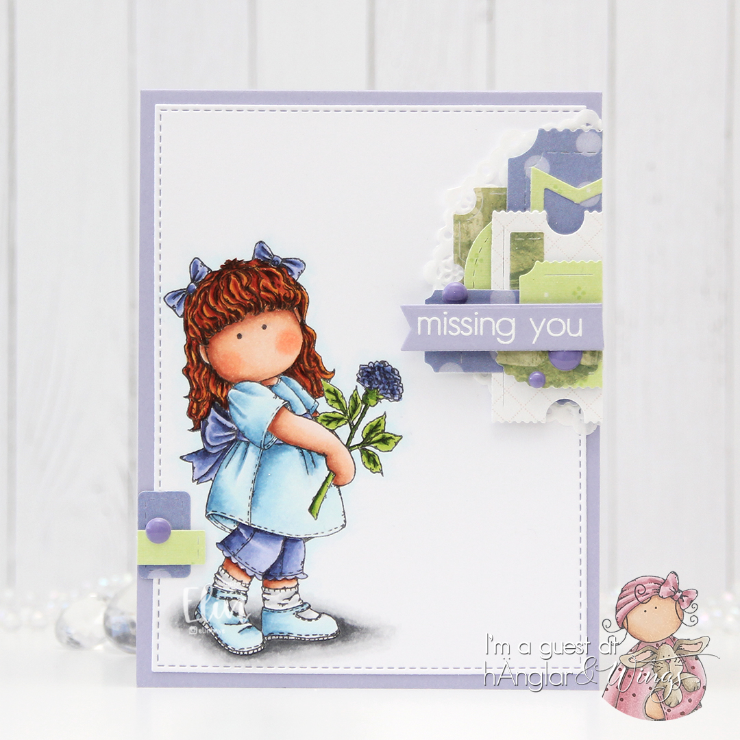
 Fairly limited color palette for this one.
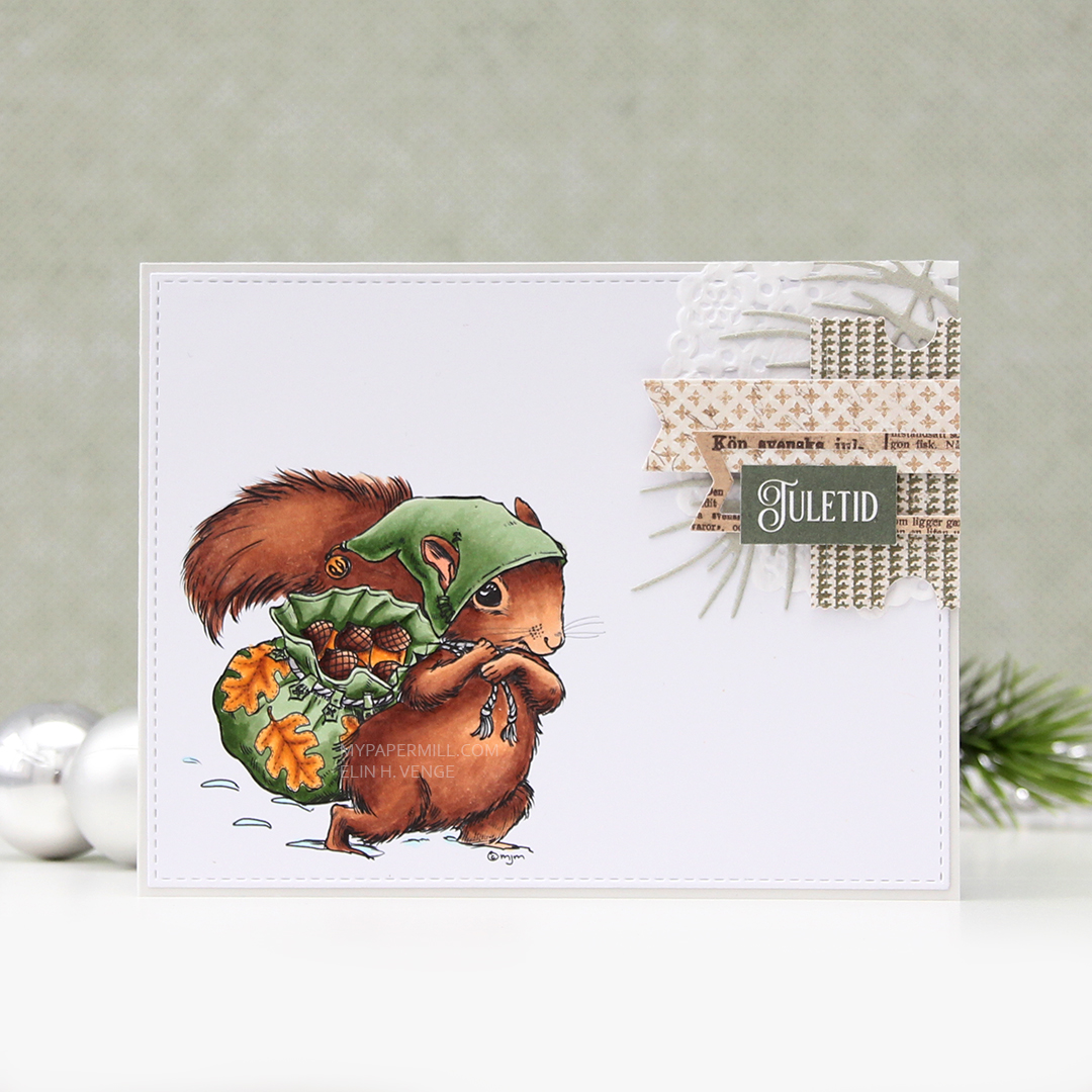
 You can actually get the image I used for FREE if you spend $20 or more during Mo’s summer sale, which ends today, so you’d better be quick.

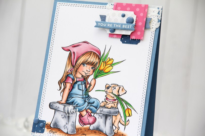
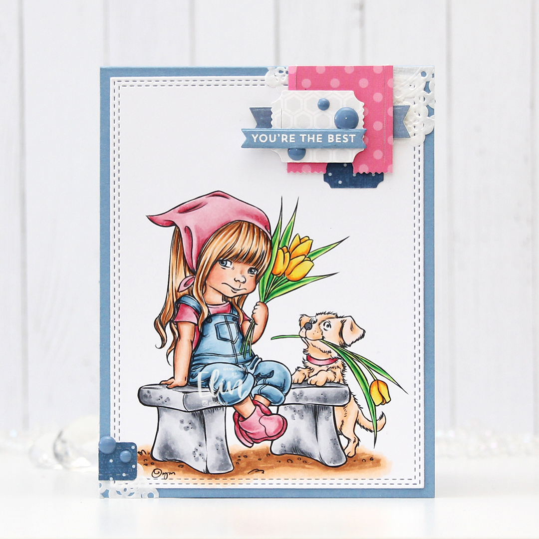
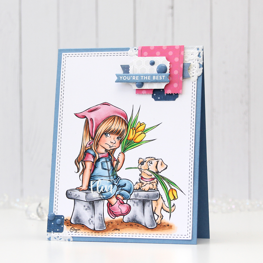
 I colored the image with my Copics, die cut her using the largest of the A2 Double Stitched Rectangle STAX dies from My Favorite Things and sprinkled on a generous amount of chunky white embossing enamel from Stampendous, which I then melted.
 I adhered my panel onto a top fold cardbase I created from Cranberry cardstock from Concord & 9th, before adding a piece of a mini paper doily from Doodlebug and a sentiment from My Favorite Things that I white heat embossed onto a separate piece of the Cranberry cardstock, with three additional layers behind for a little dimension. I added a few Snowdrift sprinkles from Little Things from Lucy’s Cards, and my card was complete. Super simple.
 As usual, I finish with the Copics I used for my image.