
Hi, there! I have a simple card with a fun technique to share today, featuring the pencil sketch version of Grace Beauty from Lili of the Valley. I love the pencil sketch versions of these images, and I’ve done some faux watercoloring for this one.
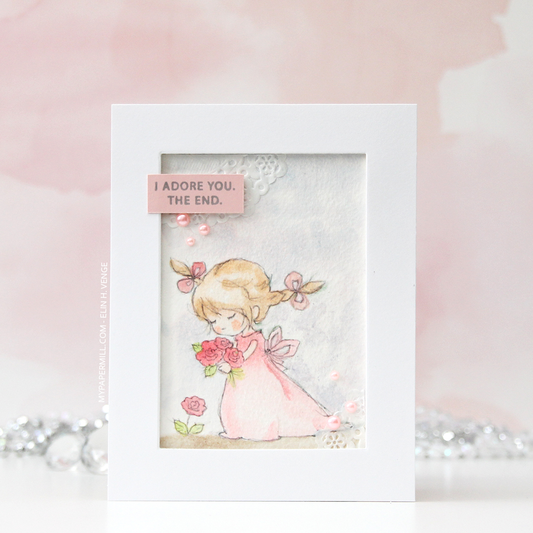
I printed the image onto Fabriano Artistico Extra White watercolor paper and did some Copic coloring. Yes, this is done with Copics, but not with the markers. Copic markers and watercolor paper are a bad match, the paper will ruin the nibs. I thought these sketchy images would be perfect with watercolor, but my printer and watercolor aren’t a good match either. That, and my watercolors still scare me. What never scares me are my Copics, so I filled a little bit of Copic blender solution into a water brush (one that I’ve designated for use with Copics) and used that as my paint brush, picking up drops of refill in various colors from a smooth, slick surface.
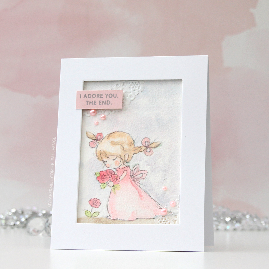
It’s not as precise as regular Copic coloring, but it’s a pretty fast, forgiving technique, and it’s a lot of fun to get more uses out of the markers (and the refills). It ticks all the boxes for me. I get the watercolor look that I like, without having to wait for things to dry (because the alcohol in the Copics evaporates a lot faster than water does), I can “watercolor” digital images with Copics because the ink won’t bleed. You don’t need a lot of colors either, and if you don’t have the refills, you can use the actual marker to scribble onto an acrylic block or another slick, non absorbent surface. One of these days I’ll practice coloring regular stamps with my actual watercolors, I just have to carve out the time. Even though they scare me, my watercolors don’t deserve to just be sitting unused in their palette, that’s not the reason I bought them.

I wanted to let the image shine and kept the card pretty simple. I used a rectangle die to cut a window in the center of a panel, mounting the negative on foam tape to frame the image.

I glued a couple of pieces of a mini doily from Doodlebug into the corners of my colored piece. I just wanted a little something. These go well with the soft look I was going for. I stamped a sentiment from the Leaf Clusters stamp set from Altenew in Soft Granite ink from Hero Arts onto a scrap piece of Sweet Blush card stock from Papertrey Ink, and added it in the top left corner, along with some pearls from Little Things from Lucy’s Cards. The pearls are the perfect matching color, they were a sampler pack in a big order I placed from her a while back, so unfortunately, I don’t know the color name.

When I do normal Copic coloring I tend to go overboard and use a ton of colors to achieve the look I’m after. With faux watercolor, it’s the opposite, the color palette is always very limited, because I can get a lot of gradient with just one color, depending on how much I dilute it with the blender solution in the water brush. The pink on her dress, the bows in her hair and the flowers is all made with just R43, I’d never be able to achieve this ombré effect using just one color with the markers themselves.


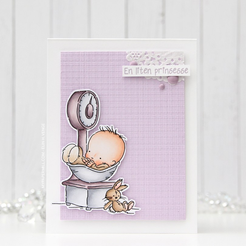

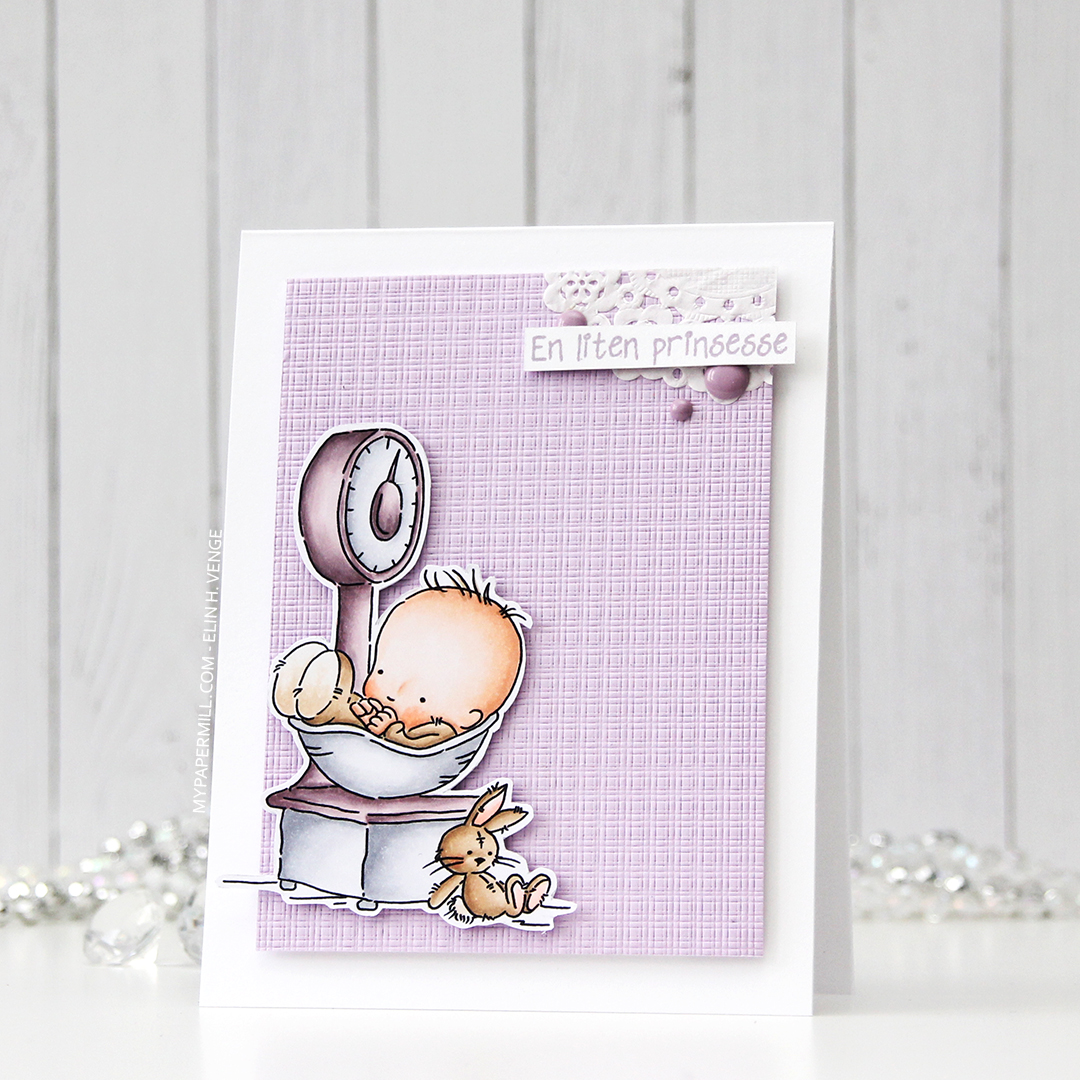
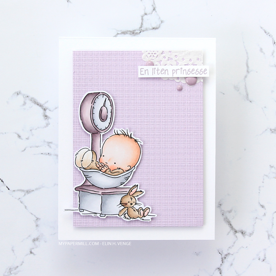
 Not a whole lot of Copics used for this image, it IS simple, after all. I also used V97, which is a color I’ve made myself.
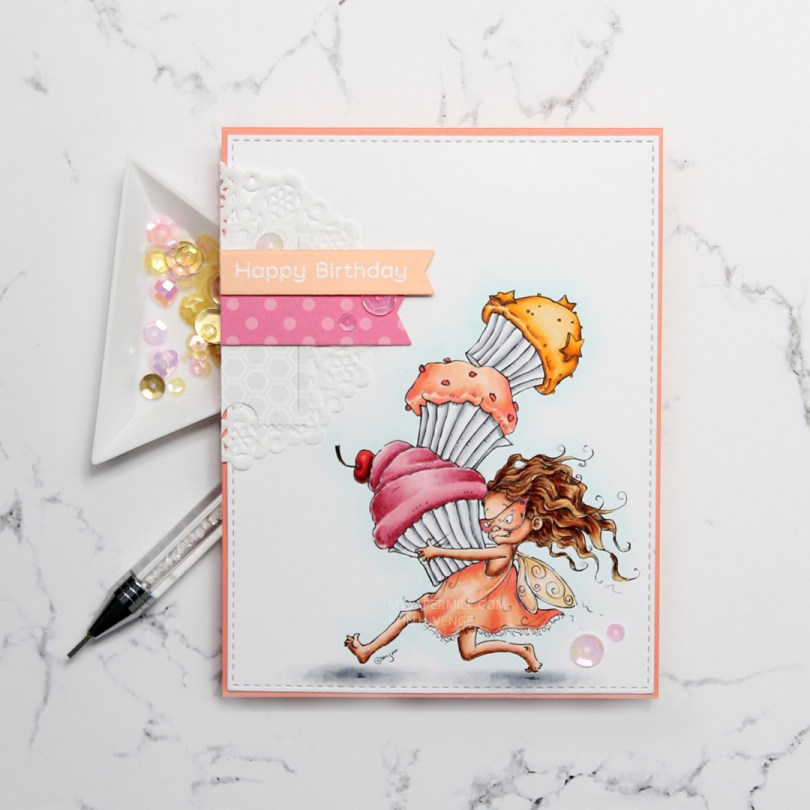
 I colored my image onto X-Press It blending card using my Copics, before using the largest of the A2 Stitched Rectangles STAX dies from My Favorite Things to turn it into a nice panel with faux stitching around the edge. I adhered it onto a card base I made from Coral Crush card stock from My Favorite Things. Sadly, the color’s discontinued, but they have loads of other gorgeous card stock colors at My Favorite Things.
 I added a small cluster of scraps to the top left of my card. About half a mini doily from Doodlebug Design is at the bottom, followed by die cut pieces of patterned paper from Sunny Studio and a sentiment banner on top. I white heat embossed a sentiment from the Bitty Bears stamp set from My Favorite Things onto a banner of Peach Bellini card stock, also a discontinued MFT color.
 My embellishments tend to be sequins or enamel dots centered around the sentiment on my cards. For this one, I added another two sequins in the bottom right corner, just to do something different than my standard three sequins. These sequins are from the Heaven Sent mix from Little Things from Lucy’s Cards.
 I used quite a few colors for this one. For the frosting on the pink cupcake, I also used R87, which is a color I’ve created myself.
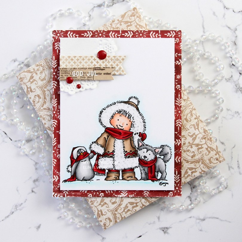
 I don’t know what’s going on with me, but I’ve made another red Christmas card. I love creating Christmas cards, but I’m not a fan of red, not even for Christmas. The best thing about creating cards is that they get sent to someone else, so even if I personally don’t like certain colors, I’m getting rid of them eventually anyway, so it doesn’t matter. 😉
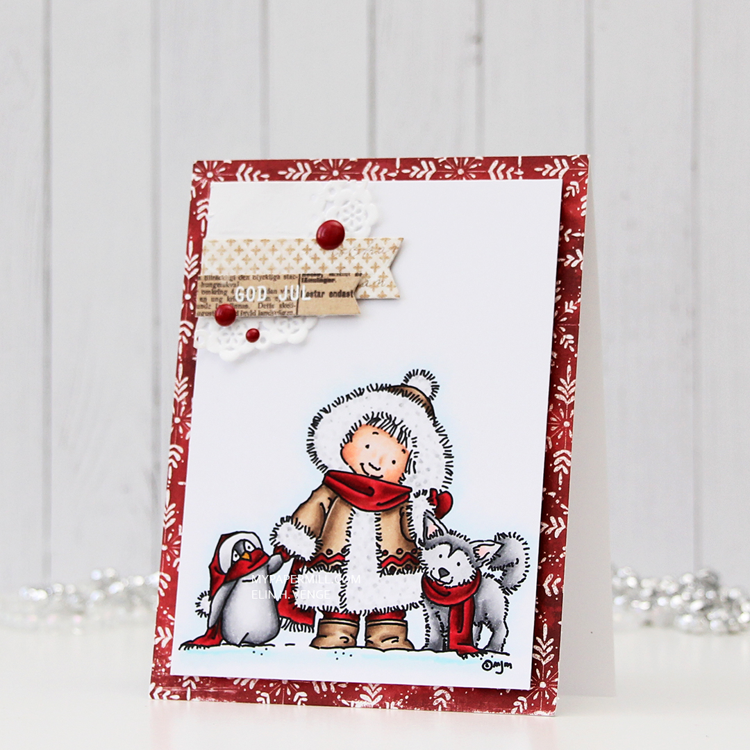 Once I’d colored the image with my Copics, I trimmed 1/4″ off each of the four sides and covered the back with foam tape. I found an old scrap of patterned paper from Magnolia that was already cut down to 4 1/4 x 5 1/2″, probably a reject from a previous project, but perfect for this one, the red matches my coloring! It has white “snowflakes” on it. These have 8 points, so they’re not actually snowflakes. There’s no such thing as an eight pointed snowflake (or a five pointed, for that matter), it has to do with how water molecules are formed.
 I die cut a couple of scraps of Maja Design patterned paper using two of the Fishtail Flag Frames dies from My Favorite Things. I stamped and white heat embossed a sentiment from Norsk Stempelblad AS onto one of the die cut banners, adhering it to the larger one using 1 mm foam squares for a little bit of dimension. I used the same foam squares on the back of the bigger one and glued both banners to part of a mini doily from Doodlebug adhered to the top left corner of my colored panel. I added a few enamel dots from Papirdesign, and my card was done.
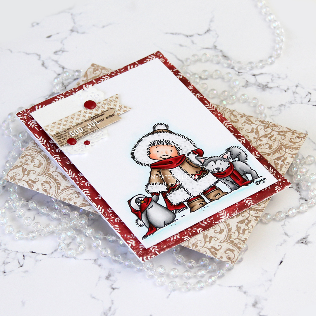 I found an old scrap of patterned paper from 3ndypapir that was just large enough to create an envelope from using the A2 V flap envelope dies from Simon Says Stamp. I thought the color matched the brown in my card nicely.
 Not a lot of colors used for this one.
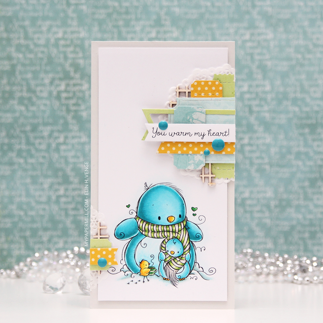 My card measures 3 1/2 x 6 1/2″. I printed the image onto X-Press It blending card and colored it with my Copics. I was planning on doing a split complementary color scheme, but went with an analogous in the end, which is never a bad idea, in my opinion. I adhered the colored panel onto a card base I made from Soft Stone card stock from Papertrey Ink, adding two layers of cardstock behind the image for added dimension.
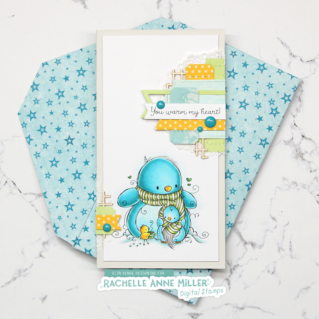 It’s no secret that I love enamel dots, and the Cool Summer Night enamel dots from Altenew were the *perfect* color to match my penguin. Since I didn’t have any envelopes in the right size for this card, I created my own using patterned paper from Papirdesign and my envelope punch board from WRMK.
 I love this color palette. In addition to these colors, I also used BG71, which is a color I’ve created myself.
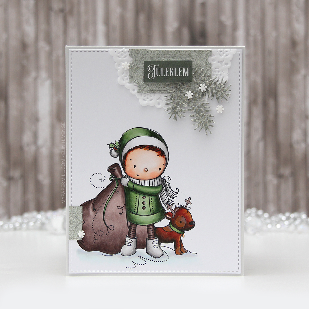 I wanted my cluster with the sentiment to be more to the right than to the left, so I flipped my image in Photoshop to make the boy and the dog look to the right instead of the left, it fit my card better. It’s one of the great advantages of digital stamps.
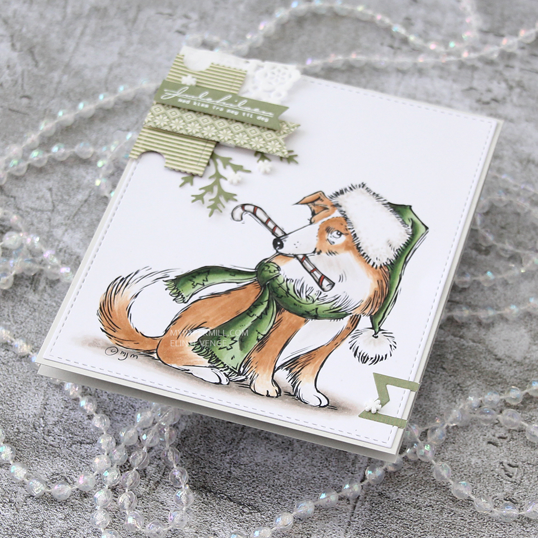
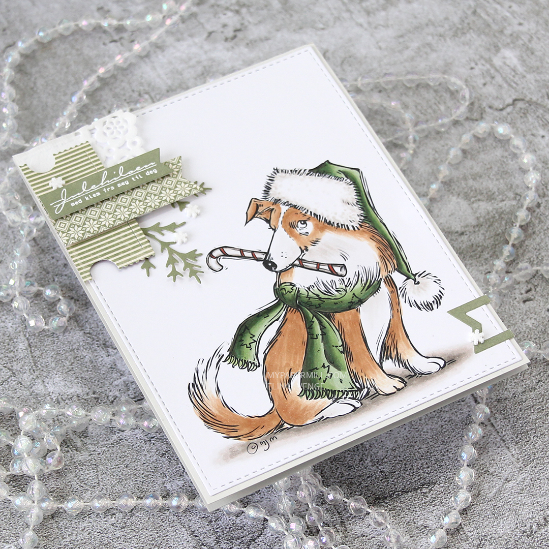
 Once I’d colored in my image, I used my favorite faux stitch rectangle die from My Favorite Things to turn my colored piece into a panel for the front of my card. I added about half a tiny paper doily from Doodlebug Design, and some die cut scraps of Maja Design patterned paper, before adding a green strip with a word (Christmas hug) from Papirdesign using foam tape.
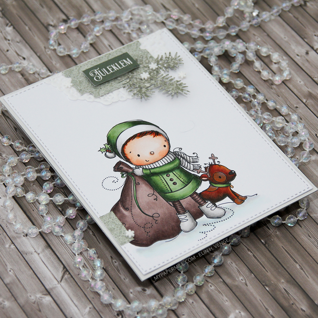 I added another little piece of the green patterned paper from Maja Design towards the bottom of the left hand side and glued on a few snowdrift sprinkles from Little Things from Lucy’s Cards, before adhering everything to a card base I made out of Soft Stone cardstock from Papertrey Ink. Easy peasy, lemon squeezy, right?
 I tried to limit the amount of Copics I used on the snow for this one. Only five (plus the blender) isn’t too shabby.
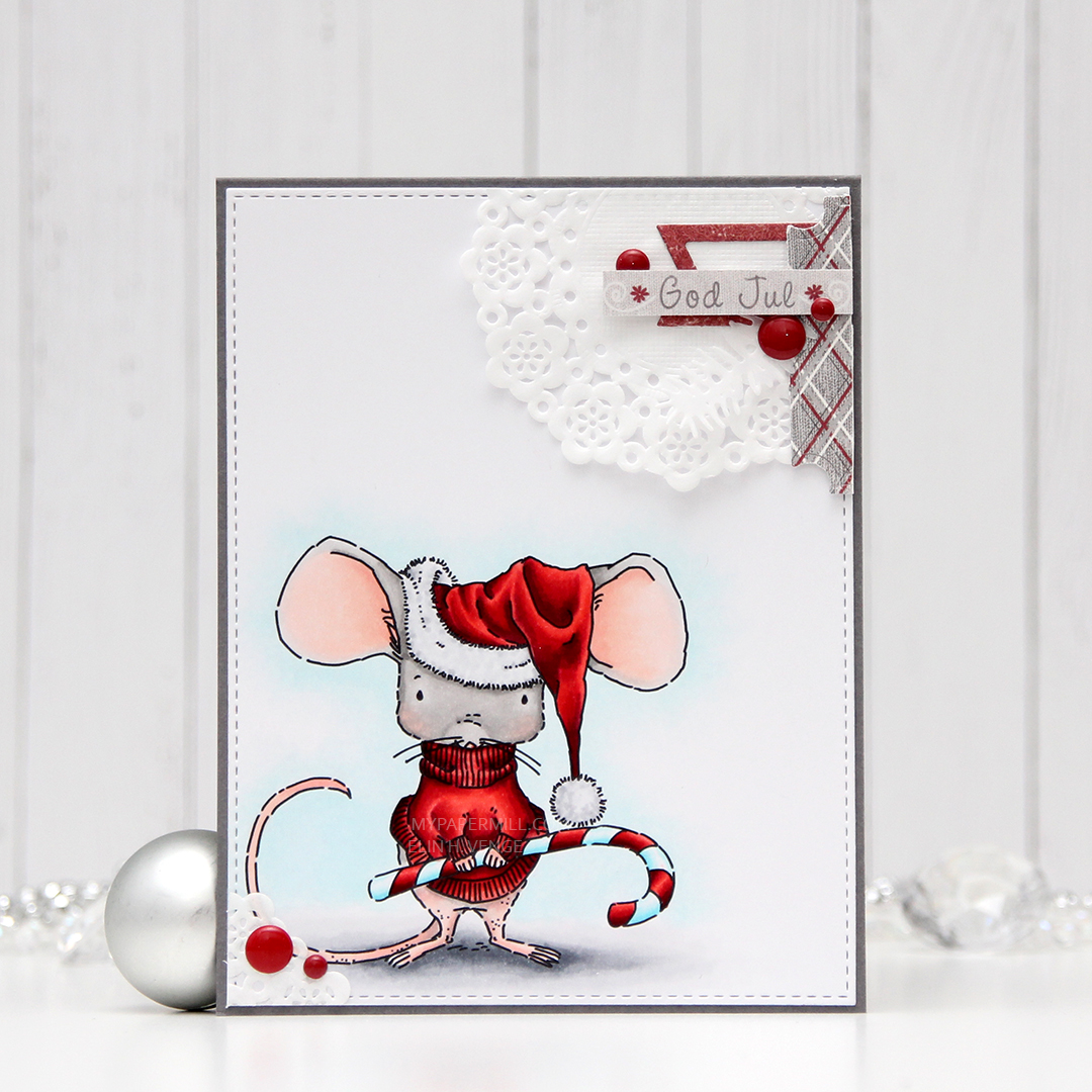 I used a very bright red for the hat and sweater on the mouse, and the only color that really goes with it, in my opinion, is gray. I found some red and gray die cut scraps from a couple of Maja Design collections (Fröjdefull Jul and Joyous Winterdays) and made a little mini cluster in the top right corner.
 I started with a mini paper doily from Doodlebug Design, added a red fishtail flag frame die cut with a die from My Favorite Things, then a piece of a ticket die cut with a Docrafts die. I used some 1 mm foam squares for that. I added my sentiment at the end, which is from one of those strips at the bottom of the 12×12″ papers that you usually cut off. Maja Design has always had some kind of pattern on the back of theirs, which means that nothing needs to go to waste. This one was perfect in gray with a hint of red, and I used 1 mm foam squares to add it. I even doubled up on the foam on the left hand side of it.
 I added some red enamel dots from Papirdesign to finish it off, and glued a leftover piece of the doily to the bottom left corner and an additional two dots. I added my panel to a top folding card base I made from Gravel Gray card stock from My Favorite Things.
 This was a very simple image to color, so obviously I didn’t use a lot of colors.
 This image was part of the Christmas release from Lili of the Valley that came out a few weeks ago, you can find the stamp

 I feel like every other day is Wednesday, and today’s another one. Time just goes by so incredibly quickly, it’s hard to keep up and keep track of the weekdays. I colored up
  I haven’t made one of my cluster cards in quite some time, but I really enjoy the process of putting these clusters together, so I decided to do it for this card. It’s a great way to use some patterned paper scraps, and one of these patterned papers is actually from 2007! It’s from Autumn Leaves. Remember them? I think it’s been a while since they ceased to exist. Now, when you go to autumleaves.com, you get to a site for assisted living communities for those with dementia. It’s a Texas based company, and definitely not a maker of pretty patterned paper. The other papers I’ve used are also what we’d call old in the card making world, the yellow one is from My Mind’s Eye and was released in 2011, and the remaining two were both released in 2013, they’re from Maja Design and Inkido, respectively.
 I use a couple of different dies to make these clusters, I make the banners using the Fishtail Flag Frames set from My Favorite Things, and I use the Happy Days Ticket Stubs die from Xcut for all those tickets. It’s one die that cuts nine different tickets, and I love that I get that many from one run through my diecutting machine. I mounted some of my diecut pieces on 1 mm foam tape, and glued others down using just double sided tape. Behind the whole thing I put half a mini paper doily from Doodlebug Design. I used the other half for the card I posted yesterday. On top I added a sentiment from Norsk Stempelblad AS stamped in Ocean Tides ink from Papertrey Ink. I mounted that on foam squares, and tripled up the foam squares on the left side of the banner. Finished off with a few pink dots from Papirdesign.
 I leave you with the colors I used for the adorable little girl. Not too many today.